What is Cohort Analysis and How to Improve Customer Retention?
You’ve achieved your first thousand customers. Congratulations! What do you know about them? What do they need now? Moreover, what will you offer them (and when) to tie them closely to your brand?

To answer these and other important questions, we suggest you try cohort analysis. It will be best for your business if you learn how to apply it as soon as possible to make your retention measures more data-driven.
This article was originally created in 2020 and was updated in October 2023 to cover most of the recent technology updates.

What is cohort
A cohort, in the world of marketing, can be best defined as a specific group of individuals who have executed a certain action within a defined time frame. This commonality in behavior sets the cohort apart from all your other clients.
Let's illustrate this concept with a few examples. Consider a group of users who visit your site for the first time in a particular month, such as September. They form a unique cohort. Another cohort could be customers who made their initial purchase in a particular week, say, between November 1 and 7. It is their specific action that sets this cohort apart from your entire customer base.
"A cohort is a marketing term referring to a distinctive group of customers who have shared a particular experience within a specified period."
What is cohort analysis
Cohort Analysis is a type of behavioral analytics that allows you to understand the behavior of your user groups (called cohorts) over time. It's essentially about segmenting the user data into related groups for specific and effective analysis. These cohorts commonly share similar characteristics within a defined timeframe.
This type of analysis helps you understand how your digital marketing campaigns affect key acquisition performance indicators such as conversion rates, ROI, CAC, as well as retention metrics and churn rate, ARPU (average revenue per user), CLV, etc. After all, retaining existing customers can often be much more cost-effective than acquiring new ones.
"Your most unhappy customers are your greatest source of learning."
- Bill Gates
Cohorts can be defined by:
- The time a user becomes a customer
- User demographics such as age, gender, location
- User behavior patterns such as purchase history, browsing habits, their behaviors
If you use a digital reporting or analytics tool like Google Analytics 4, OWOX BI or Google Sheets, you can easily pull cohort reports for
Imagine if you could truly understand the behavior of your users, watch it change over time, and gather actionable insights to increase their loyalty and retention....
Cohort analysis tools help to visualize these user groups, patterns, and how these behaviors change over time. Whether you're using the free Google Analytics 4, the accurate and reliable OWOX BI, or you're just data-savvy and you are using Google Sheets on a daily basis for reporting, you have the ability to build comprehensive cohort reports, just follow this guide.
Let's take a closer look at the examples and how to read, analyze, and act on cohort reports to improve your digital marketing strategy.

Gain clarity for better decisions without chaos
No switching between platforms. Get the reports you need to focus on campaign optimization
Cohort analysis report in Google Analytics 4
To create a report on cohorts in Google Analytics 4, go to the Explore in the left bar, at the top of the screen, click Template Gallery, then select the Cohort exploration template.
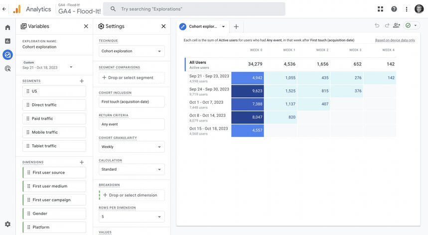
Here you can set the parameters:
- cohort technique,
- segment selection,
- cohort inclusion (the condition that adds a user to a cohort),
- return criteria (a subsequent condition these users meet to remain in your cohort),
- cohort granularity (daily, weekly, monthly)
- Calculation type (standard, rolling, cumulative)
- Breakdown field to select a desired dimension
- Values filed to add a metric and select the metric type
When doing so, you'll be able how the report changes when you make necessary edits.
At the left top corner, you can also change the exploration name (name of your report) and play with the date range to monitor how your users' behavior changes over time by looking at cohorts from different dates.
Cohort analysis in Google Analytics 4 limitations:
- You can analyze only one metric per report
- You can't set the customer cohort granularity - just three predefined options available: day, week, and month.
- Just one date range per report. For example, you can't see the sales distribution in August for those customers, who made their first purchase in May)
- You can’t set a relatively long reporting period, since the date range is limited and depends on the cohort granularity. For example, the maximum reporting period for cohorts created by day is 30 days; by week, 12 weeks; and by month, 3 months.
- You can’t filter data in the standard settings, for example by traffic type, device type, or another parameter. For this, you need to create segments first.
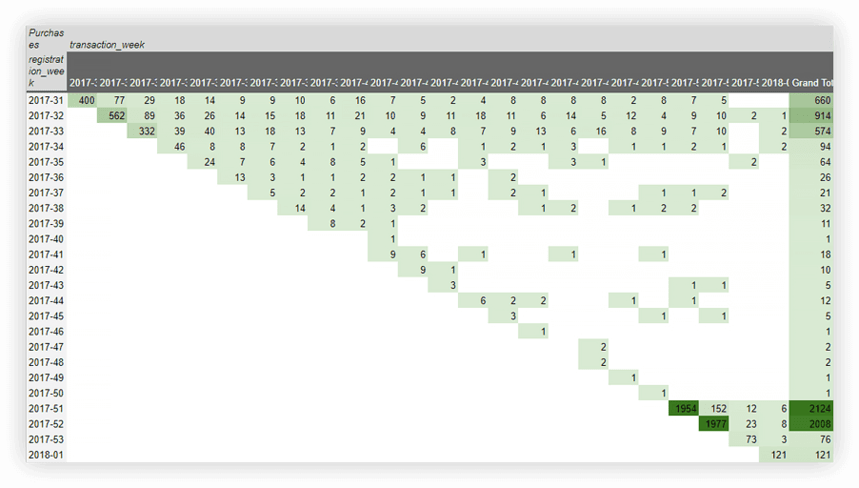
By default, you’ll see a table with data for each cohort for the entire reporting period. Let’s figure out how to interpret it. For example, let’s choose:
- Return Criteria — session_start
- Cohort granularity — weekly
- Data range — the last 6 weeks
- Values - Visit
- Mertic type - Per cohort user
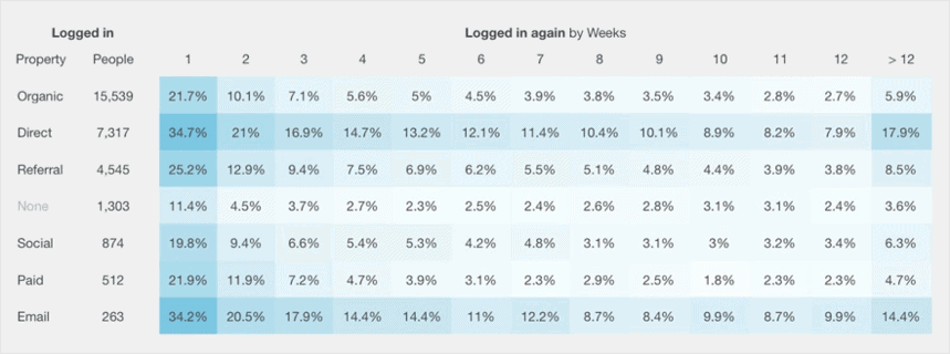
As a result, we get this table:
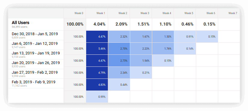
In the first column, we see how many people visited the site during the reporting period as well as the number of users in each weekly cohort. The remaining columns’ meaning is how the cohort returning page view behavior has changed for all users and for each group from week to week. The higher the retention rate, the darker the color of the cell.
From the screenshot above, it’s clear that from December 30 through January 5, 6,604 new users logged on to the site. A week later, only 4.47% of them returned to the site; after two weeks, 2.32% returned, and so on.
In general, cohort analysis in Google Analytics 4 helps you understand your data in more detail.
For example, you might see that sales per quarter are growing due to the inflow of new customers. However, if you dig deeper and look at the report by weeks, you may notice that sales in all groups fall sharply on the sixth week. Now you know when to launch remarketing.
Measure CPO and ROAS in GA4
Automatically link your Ad Platforms cost data to Google Analytics 4 conversion data, so you can analyze your marketing KPIs and make fully informed decisions

Cohort analysis in Google Sheets
If you lack the cohort reporting capabilities you need in Google Analytics 4 and you don’t use other analytics systems, you can build this type of report manually in Google Sheets. You can do this in one of four ways, which we’ll discuss in more detail below: pivot tables, formulas, filter formulas, and Apps Script.
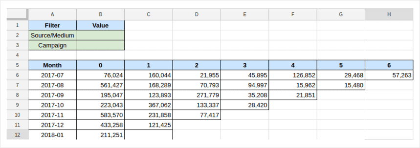
To build a cohort report using the first three methods, you should prepare and upload the data you are going to analyze to Google Sheets. If you are going to analyze sales data, you can structure them in the following way:
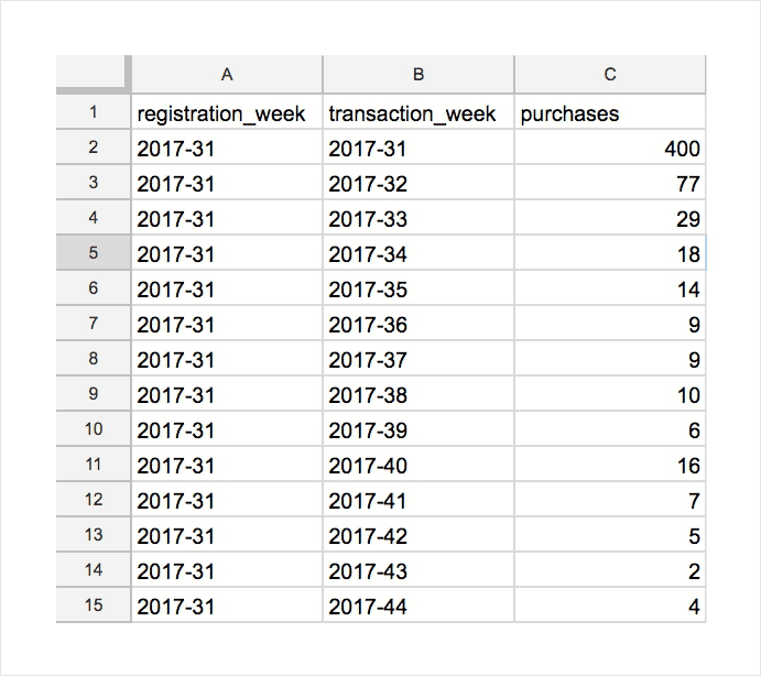
It’s important that in the first column you have a start month/week/day for cohort formation (registration_week), in the second column you have the transaction month/week/day (transaction_week), and then in the third column you'll have purchases (or the other data about the metric you’re analyzing).
You can upload data to Google Sheets in any convenient way. In our example, we use raw data that we collected from the website with OWOX BI Streaming and stored in Google BigQuery.
Then, using OWOX BI Transformation we've generated an SQL code from a template to query the data:
SELECT
registration_week,
transaction_week,
SUM ( purchases ) AS purchases
FROM (
SELECT
IFNULL ( user.id, clientId ) AS userID,
STRING ( YEAR ( date )) + ’-’ + RIGHT ( ’0′ + STRING ( WEEK ( date )), 2 ) AS registration_week
FROM TABLE_DATE_RANGE ( [projectID:datasetID.session_streaming_], TIMESTAMP ( ’2017-08-01′ ), CURRENT_TIMESTAMP ())
WHERE hits.eventInfo.eventCategory = ’registration’ ) AS t1
LEFT JOIN EACH (
SELECT
IFNULL ( user.id, clientId ) AS userID,
EXACT_COUNT_DISTINCT ( hits.transaction.transactionId ) AS purchases,
STRING ( YEAR ( date )) + ’-’ + RIGHT ( ’0′ + STRING ( MONTH ( date )), 2 ) AS transaction_week
FROM TABLE_DATE_RANGE ( [projectID:datasetID.session_streaming_], TIMESTAMP ( ’2017-08-01′ ), CURRENT_TIMESTAMP())
WHERE hits.eCommerceAction.action_type = ’purchase’
GROUP BY userID, transaction_week) AS t2
ON t1.userID = t2.userID
WHERE REPLACE ( registration_week, ’-’, ’’ ) <= REPLACE ( transaction_week, ’-’, ’’ )
GROUP BY registration_week, transaction_week,
ORDER BY registration_week, transaction_week,
In the first part of the request, we select the users depending on the week in which they've registered. So the cohort inclusion is registration, and the cohort granularity = weekly.
In the second part of the template, we choose the number of purchases per week. This is the metric we want to analyze. We link all parts of the request by User ID.
Then we upload the data to Google Sheets using the OWOX BI BigQuery Reports Add-on. One of the advantages of this add-on is that you can set calculations to happen at any frequency you need and the report will be updated automatically.
1. Cohort report using pivot tables
The easiest way to build a cohort report is using a pivot table. Remember that we already have the data in the necessary structure in Google Sheets: column A is the week of registration, column B is the week of transactions, and column C is the number of purchases.
Now let's select the relevant date range, open the Insert tab and select Pivot Table. You’ll see a panel with settings on the right:
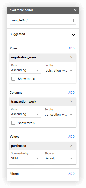
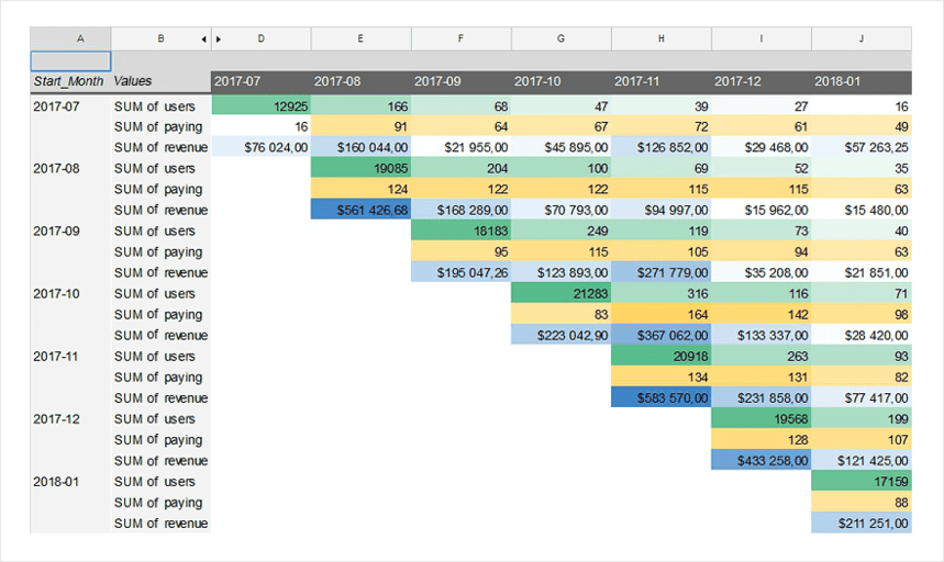
In the Rows block, select the week of registration; in the Columns block, select the transaction week (additional columns show the following weeks); and in the Values block, select the number of purchases. Then apply conditional formatting to make the report more convenient and you’ll get this table:
If you’ve analyzed several metrics, the report may look like this:
You can also add filters in the pivot table if you want. Every time you want to filter the data, you’ll have to open the table and check the value you need.
2. Cohort report using formulas
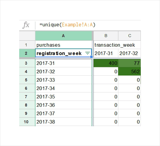
The same report can be built using three simple formulas. For this purpose, we need to create a new sheet and apply these formulas:
- =UNIQUE (Example! A: A)
We insert this formula into cell A2. It pulls all weeks of cohort inclusion from the source data table into column A.
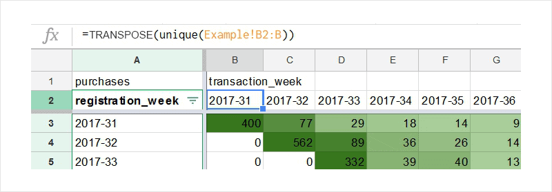
- =TRANSPOSE (unique (Example! B2: B))
This formula is used in cell B2. It pulls all transaction weeks from the column in the source data table and converts them into a row.
- =SUMIF (Example!$C:$C, Example!$A:$A,$A3, Example!$B:$B, B$2)
We insert this formula into cell B3 at the intersection of the week of registration and the week of the transaction. This formula summarizes all purchases from column C of the source data table.
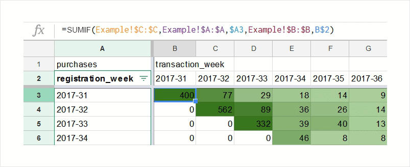
Note: Example in these formulas is the name of the spreadsheet with the source data.
Last touch, we need to stretch these formulas over the entire sheet and apply conditional formatting. Then the report is ready.
3. Cohort report using formulas and filters
If you want to filter data in the report by any parameter, you can use the third formula from the previous section can be modified. Let’s figure out how to do it.
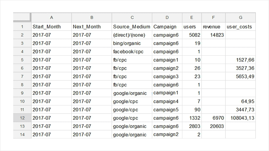
First, you need to add source data parameters to the table to filter the data for the report. In our example, we have a traffic source, a channel, and a campaign name. You can add any parameter you need to explore: location data (continent, country, city), mobile application version, product category, or anything you want.
We have added more metrics to the report and also changed the cohort size from weekly to monthly. As a result, we got this table with the source data:
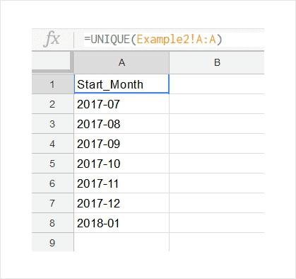
After that, we've created an additional sheet and pull all registration months from the source data table using the first formula: = UNIQUE (Example! A: A).
This would make it easier to access the data. Let’s name this sheet «Month»
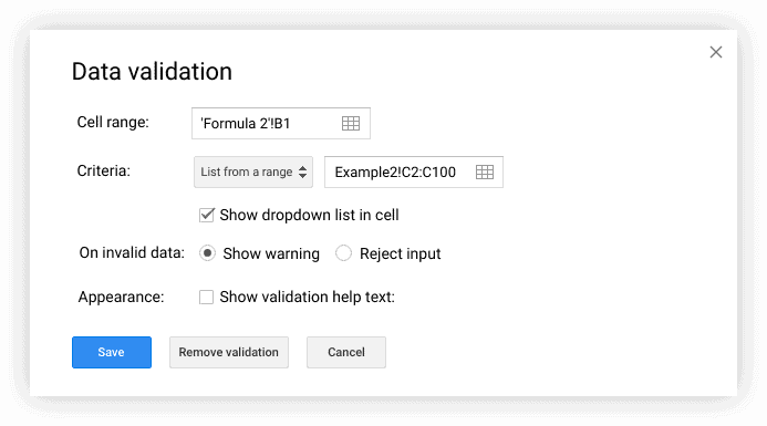
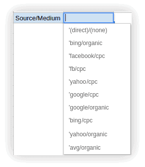
Later on, we’ll add a new sheet that will contain our report and create two filters by Source/Medium and Campaign.
To do this, open the Data —> Data Validation tab.
In the Cell range field, enter the cell address to specify which cell will display the filter drop-down list.
In the Criteria field, leave the List from a range condition and specify the column address with the necessary parameters from the source data table.
Click Save.
As a result, we got this filter:
Then, using the formula =Month! A$2, we pull up the months of registration from the Month sheet in column A.
Each value should be repeated as many times as the metrics are (in our example, we have three metrics). That’s why we pulled up months of the cohort formation in a separate sheet.
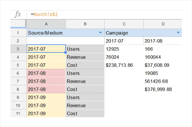
Since we have only three parameters in our example (Users, Revenue, Cost) and they’re the same for all cohorts, we enter the names manually in order not to use formulas to pull them from another sheet.
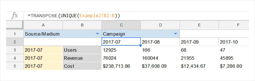
In cell C2, we use the formula =TRANSPOSE (UNIQUE (Example2! B2: B)), which pulls up months of transactions from the source data table and converts them into a row:
And finally, at the intersection of the month of registration, the subsequent month, and a specific metric, we insert our third formula:
=IF (AND ($B$1="",$D$1=""), SUMIF (Example2!$E:$E, Example2!$A:$A,$A3, Example2!$B:$B, C$2), IF (AND ($B$1=""), SUMIF (Example2!$E:$E, Example2!$A:$A,$A3, Example2!$B:$B, C$2, Example2!$D:$D,$D$1), IF (AND ($D$1=""), SUMIF (Example2!$E:$E, Example2!$A:$A,$A3, Example2!$B:$B, C$2, Example2!$C:$C,$B$1), SUMIF (Example2!$E:$E, Example2!$A:$A,$A3, Example2!$B:$B, C$2, Example2!$C:$C,$B$1, Example2!$D:$D,$D$1))))
This formula calculates the required metric in the desired cell based on filters.
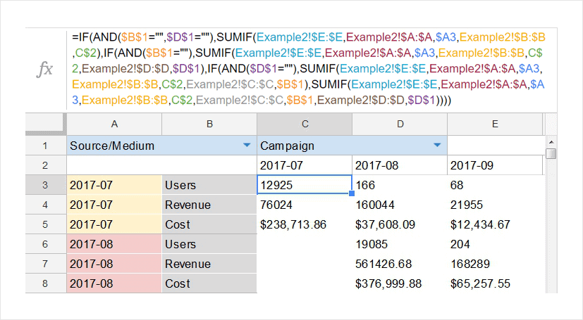
Since we have two filters, we need to include all possible combinations in the formula:
- Both filters are empty
- Both filters are filled
- Only the first filter is filled
- Only the second filter is filled
For each metric, the formula in the cell remains unchanged; only the column by which the sum of a specific metric is calculated changes.
For example, for the Users metric, we calculate the sum of the column Example2!$E:$E; for the revenue metric, the column Example2!$H:$H; and for the Cost metric, the column Example2!$I:$I.
If you want to have more than two filters in your report, you’ll need to increase the number of conditions and the size of the formula.
Watch our webinar Cohort Analysis 101 to learn more. In this training, you’ll learn which part of the formula is responsible for which specific area. You'll figure out how to build all the reports described in this article in Google Sheets in detail.
4. Cohort report using Google Apps Script
Google Apps Script is a programming language that allows you to add features and process data in Sheets and other Google services. To build a cohort report using Apps Script, you don’t need to transfer data to Google Sheets.
The table with the source data is created in Google BigQuery, and from there the Apps Script exports the data to the report.
Using this script, you can:
- Create a menu on the Google Sheets toolbar to run your own calculations in a click.
- Execute data queries in BigQuery and access the results of these queries.
- Create cells that will be used as filters. Parameters in such cells must be entered manually. This means the filter won’t have a drop-down list, as in a report built using formulas. You specify the value by which you want to filter the data in the cell yourself, and this value is used in the SQL query to the data in Google BigQuery.
- Change the way the report is displayed: apply conditional formatting, make the necessary breaks and indents, change the order of items, flip tables, and much more.
To connect Apps Script to Google Sheets, open the Tools —> Script editor tab. In the opened editor, select Resources —> Additional functions of Google Services and activate the BigQuery API and the Google Sheets API:
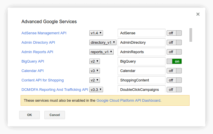
Then go to Google Cloud Platform to activate these APIs there as well. After that, you can run scripts in the Script editor that will take data from Google BigQuery and generate cohort reports in Google Sheets.
We have created a script template for a report with one parameter and two filters. You can create a data table in Google BigQuery with the structure described above. Then you can insert a project name into the script template as well as tables in BigQuery and get a ready-made report:
In addition, you can easily modify the script template to build a report with the fields and number of metrics you need. Here’s an example of how we've helped Boodmo to evaluate customer acquisition channels using cohort analysis.
Measure CPO and ROAS in GA4
Automatically link your Ad Platforms cost data to Google Analytics 4 conversion data, so you can analyze your marketing KPIs and make fully informed decisions

Cohort reports in other services
Built-in cohort reports are available in many advertising and analytics services. They are found in almost all the analytics systems for mobile applications.
AppsFlyer provides with more flexible settings than Google Analytics 4, allowing you to add multiple filters to a cohort report. You can also set a minimum size to exclude cohorts with too few users.
Cohort reports in Adjust are used mainly to track retained users. In Adjust, you can add a second indicator for analysis, for example the number of sessions per user.
Mixpanel also supports cohort analysis. These are also analytics systems for websites and mobile applications that work with data at the scale of users, not visits and page views. The report settings in these services are very similar to the settings in GA4, but there are some differences.
In Kissmetrics, you can create a cohort by two attributes at a time.
For example, you can build a group of users who visited the site and converted to a subscription. You can also group people not only by time, as is commonly done in cohort analysis, but also by any other attribute such as purchase amount, location, and traffic source.
Here is an example of a cohort report in Kissmetrics:
How cohort analysis helps to improve customer retention
All methods of behavioral research are aimed at improving customer engagement and retention metrics. Cohort analysis gives you hints on when it’s the best time to remind customers about your company or product with a good-looking offer, who exactly is more likely to buy, and who the best buyers are based on their sequence of actions.
Analyzing your data from the acquisition point of view, you can see how long customers stay interested and continue to buy from you or continue to use your app or service. Segments based on behavioral characteristics let you understand if sending a particular offer changes the behavior of the whole cohort and enlarges its CLV.
To improve retention, you can apply the results of analysis in your bid management, personalized emails and offers, and ad targeting.
Cohort data
Cohort analysis helps you to correlate user cohorts and see how exactly behavior of various cohorts differs. You can divide users into cohorts for analysis based on their first sighup for your product (acquisition cohorts) or their behavior within a selected period (behavioral cohorts).
Acquisition cohorts
This approach presumes that you divide users by when they first signed up for your product. You can check what day, week, or month your users first accessed your website or app, and track daily, weekly or monthly cohorts.
Acquisition cohorts help you figure out how long customers continue to use your app from their starting point.
Behavioral cohorts
In contrast with the approach above, according to this approach you should track users by actions they take or don’t take in your app or website within a particular time period. You can select any actions that are important for you to track — registration, click a Play button, adding items to cart, etc.
For example, a group of users who performed specific actions within a selected timeframe can form one cohort. You can monitor it and compare to other ones to discover for how long different users stay active after they do specific actions.
Cohort analysis for business
Predict and increase your CLV
Customer lifetime value (CLV) is the revenue a company receives from a customer over the course of their relationship. You’ll clearly see when your customers stop buying from you and will be able to calculate CLV for each customer segment to make precise predictions. With this information, you can better plan your advertising expenses, tuning your campaigns for each segment based on acquisition channel.
Retain your best customers
You can use cohort analysis to find out who your most loyal customers are and then encourage them to stay with your company longer. It will be cheaper than acquiring new customers, in any case.
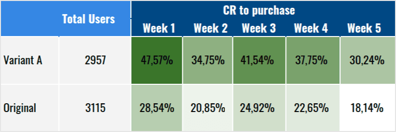
Improve A/B testing
Standard A/B tests won’t tell you how a new design or any other change may affect conversions in the long run. To find out, create a cohort based on interactions with a new design. Then compare its conversion rate with cohorts that didn’t interact with the new design. In this way, you’ll see how the new design affects conversions.
Research app performance
Cohort analysis is a favorite method of mobile app analytics, showing user interest in an app, activity inside an app, etc. It helps app marketers understand bottlenecks and places where users have difficulty using an app so developers can improve it.
Consider OWOX BI as both an advanced solution for cohort analysis and part of your business analytics (BI) toolbox.
Conclusions
If we compare the methods of cohort analysis by complexity, then the simplest option is Google Analytics 4. However, its capabilities and settings are limited.
The second easiest method is pivot tables in Google Sheets. Here you can form cohorts by any parameter, not just by the date of the first visit as in Google Analytics.
Formulas and Apps Script are a bit more complicated, as they require additional technical knowledge and expertise, but they allow you to dig deeper.
If you need to use filters often, the most convenient option is to create a report using formulas: then all filters will be in a drop-down list.
Sure, you can use filters in all Google Sheets reports; but in the pivot table, you need to go to the table settings. With the Apps Script method, you have to specify the filter values manually in each cell. If you make a mistake, your SQL query will return nothing.
FAQ
-
What are some metrics used in cohort analysis?
Common metrics used in cohort analysis include retention rate, lifetime value, churn rate, and conversion rate. These metrics can help businesses understand customer behavior and track the success of marketing campaigns. -
Why is cohort analysis important?
Cohort analysis helps businesses understand how different groups of customers behave over time. It can help identify trends, track customer retention, and uncover insights that can improve marketing strategies, product development, and customer experience. -
What is cohort analysis?
The idea of cohort analysis is to divide users into groups based on certain criteria and examine how the behavior of these groups changes over time. Cohort analysis helps you understand how your marketing efforts affect key performance indicators: conversion and retention rates, LTV, ROI, CAC, etc.