
The Modern SaaS Reporting Stack: From Data Warehouse to Product Insights
Learn how a modern SaaS reporting stack connects your data warehouse to product insights — without dashboard bottlenecks.

Most SaaS product teams have no shortage of tools, yet getting answers from data is still painfully slow. Dashboards are often ignored, ad hoc questions accumulate, and decision-making stalls. While infrastructure has evolved, reporting workflows haven't kept pace. It's time for a better way to connect data to product insights.
In this article, we'll break down what a well-designed SaaS reporting stack looks like and why static BI dashboards no longer work.
You'll learn how product teams are replacing dashboard bottlenecks with governed data models, scheduled reporting, and flexible tools like Google Sheets. More importantly, you'll see how OWOX acts as the hand-off layer that helps teams ask, analyze, and act without waiting on analysts.
What is a modern reporting stack?
A reporting stack for SaaS product teams is built to serve real decisions, not just data teams. It's a system that begins with event tracking, flows into a centralized data warehouse, applies governed data modeling, and delivers outputs that anyone can use – whether that's a chart, a spreadsheet, or a scheduled narrative summary.
Unlike traditional stacks that rely on complex dashboards and BI bottlenecks, a well-designed reporting workflow focuses on speed, clarity, and accessibility. Product managers, analysts, and RevOps teams can ask questions, get answers, and move faster – without waiting in a queue for data.
Benefits of a SaaS reporting stack
A well-structured reporting stack enables SaaS teams to shift from infrastructure-heavy operations to insight-driven workflows. Here's how the approach helps your team:
- Business-first, not IT-heavy: Designed for PMs, analysts, and RevOps – not just engineers. It enables self-serve access and frees data teams for high-impact work.
- Plug-and-play flexibility: Cloud-native tools remove setup delays, maintenance overhead, and lock-ins. Swap tools without disrupting workflows.
- From once-off to always-on insight: Enables operational analytics and scheduled delivery, allowing continuous monitoring – not just one-time reports.
- Built-in governance and security: Data privacy, access control, and compliance are defaults, not extras. Governance is integrated throughout the entire pipeline.
Why traditional reporting stacks break down
The traditional reporting stack wasn't built for speed, flexibility, or scale – and it shows. As data volumes grow and product questions become more complex, older systems crumble under pressure. Here's why teams are rethinking the approach:
1. Long turnaround times for setup and change
On-premise systems require large engineering teams and ongoing maintenance. Even a small tweak can trigger downstream issues, making improvements slow and risky. Infrastructure is deeply entangled, and changes often require weeks of planning and testing.
2. Slow response to new information
Scaling is manual and costly. Traditional ETL pipelines take hours – sometimes days – to refresh insights. Teams act on stale data or miss opportunities entirely because reporting can't keep up with business pace.
3. Expensive and manual reporting
Pulling data from scattered sources into spreadsheets means wasted time, increased errors, and burned-out analysts. Reporting becomes a bottleneck. Data engineers get stuck solving operational issues instead of building scalable systems.
Components of a SaaS reporting stack
A solid SaaS reporting stack is more than tools stitched together – it's a structured flow from raw data to actionable insights. Each layer plays a specific role in streamlining the reporting process and enabling product teams to make faster, more informed decisions.
Data pipelines
Data pipelines serve as the entry point, moving data from its source to a centralized system such as a data warehouse. They automate the flow of data from databases, APIs, apps, or event tracking into a processing environment.
Key stages in a pipeline:
- Ingestion: Collecting data from various systems or services in real time
- Processing: Cleaning, deduplicating, and preparing data for use
- Orchestration: Scheduling and managing pipeline workflows
- Delivery: Storing data in cloud platforms like BigQuery, Snowflake, or Redshift
Data storage
Once data is collected, it needs to be securely stored and made accessible for analysis. Two storage systems handle this: data warehouses and data lakes.
Data warehouses
Optimized for structured data, warehouses support fast SQL queries and BI tools. Cloud warehouses such as BigQuery, Redshift, and Snowflake offer elastic scaling, fast performance, and easy integration with reporting platforms. Critically, data stays in your warehouse – your team owns the SQL and the history, with no vendor lock-in.
Data lakes
Built to store unstructured or semi-structured data like logs, images, or JSON. Ideal for big data analytics and machine learning. They hold raw data until it's ready to be processed or modeled.
Data transformation
Data transformation converts raw data into structured, business-ready formats. This includes cleaning, reshaping, filtering, and enriching data for analysis. It ensures consistency across sources, aligns data to business logic, and prepares it for reporting.
Types of transformation:
- Cleaning: Fixing missing or inconsistent values
- Normalization: Aligning units and scales
- Aggregation: Summarizing rows (e.g., totals, averages)
- Joining: Merging tables from different sources
- Encoding: Converting text to numeric formats for analysis
In practice, analysts write the transformation SQL and publish it as governed Data Marts. The platform then governs, schedules, and fans out the results to the teams who need them – eliminating one-off requests and keeping every report traceable to source SQL.
Data visualization
This is where analysis meets action. Visualization tools help product teams see trends, identify issues, and present insights clearly. Well-designed visuals turn complex datasets into intuitive charts and dashboards that support faster, data-informed decisions.
Whether it's tracking feature adoption or identifying churn risks, visualization bridges the gap between data and strategy.
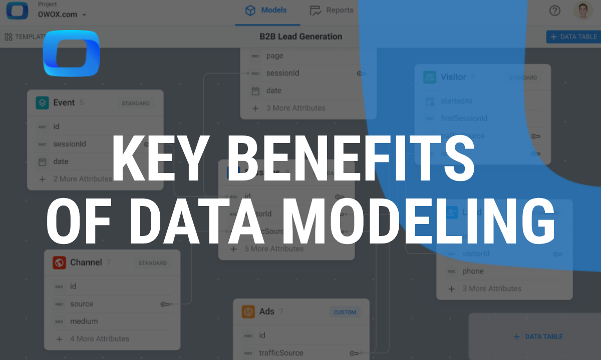
Understanding the role of governed data models in product reporting
As companies move away from out-of-the-box analytics tools, more teams are realizing the value of owning their entire data pipeline – especially the data modeling layer. The key shift is from black-box processing to analyst-controlled, governed data artifacts.
.png)
Instead of sending data into a black box and hoping for useful output, product teams can now shape their data to match how their business actually works. This is especially important for companies with complex or non-standard models – like SaaS platforms or two-sided marketplaces.
When you control the data model, you make data more usable across the company. Teams can explore insights independently, align around a shared source of truth, and apply logic tailored to their product and customers. A well-built model isn't just about cleaner reports – it's a foundation for better decisions, scalable reporting, and smarter product growth.
Critically, this approach does not require building a separate semantic layer. Metrics and business logic live at the Data Mart level – defined once by analysts, reused everywhere, and maintained without a months-long semantic-layer project.
Why Google Sheets is a better alternative to dashboards for product teams
Dashboards are often rigid, complex, and slow to update – especially when product teams need quick answers. Google Sheets offers flexibility, speed, and ease of use that dashboards rarely match.
Familiarity and accessibility
For product managers, spreadsheets feel second nature. Many still prefer Google Sheets over newer tools because they already know how to accomplish tasks quickly. There's no onboarding, no complex UI – just a familiar grid. This ease of use means PMs can focus on the work, not the tool.
Editable
Unlike dashboards that often require technical changes or developer input, Google Sheets allows product teams to work directly with the data. PMs can filter results, highlight issues, leave comments, and add annotations – all in real time.
Cost considerations
Spreadsheets are a cost-effective option for growing product teams, especially in startups or smaller organizations with tight budgets. Google Sheets is often already available, eliminating the need for additional software expenses. It offers enough functionality for planning, tracking, and analysis without the overhead of complex platforms.
Simplicity
One of the biggest advantages of Google Sheets is its simplicity. There's no setup process, no new training, and no steep learning curve. PMs can jump in, create a plan, and share it with their team all in minutes. For teams that move quickly or experiment frequently, simplicity is crucial.
Seamless for planning and growth
Google Sheets integrates easily with popular planning tools like Notion, Confluence, and Google Docs, making it ideal for managing growth workflows. Whether tracking experiments, logging user feedback, or syncing across teams, Sheets provides a flexible and central hub for data-driven planning.
How product teams can use OWOX to ask, analyze, and act
OWOX changes how product teams work with data by enabling governed, no-code insights within familiar tools like Google Sheets. Teams get answers quickly and take action immediately – without relying on dashboards, delays, or technical dependencies.
Access analyst-approved metrics without SQL
Product managers, analysts, and RevOps teams can browse the Data Mart library inside the OWOX Sheets Extension and pull approved metrics directly into a spreadsheet – no SQL required. The analyst defines and governs the metric logic; the business user self-serves from a curated library.
How it works:
- The analyst writes session logic, churn calculations, or feature adoption metrics as a SQL Data Mart in OWOX
- OWOX publishes and governs that data mart – making it available to the whole team
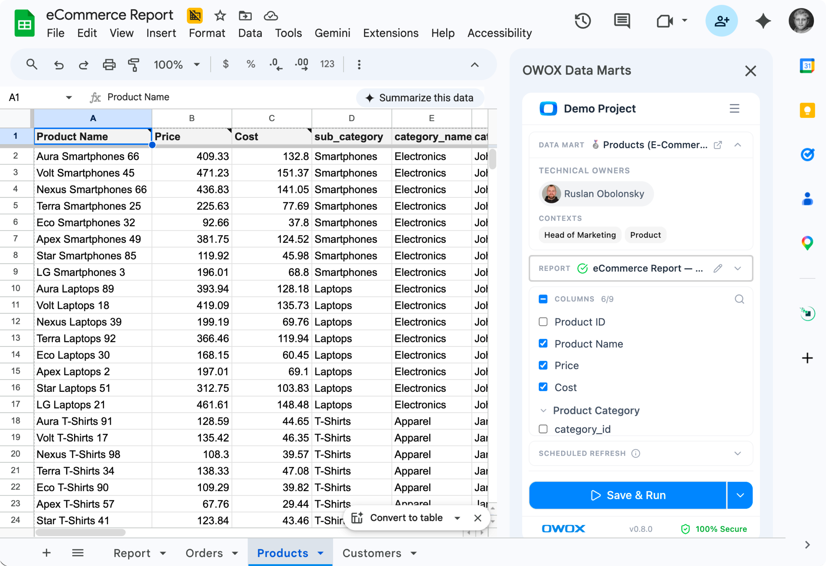
Every number a business user sees traces back to analyst-approved SQL – no hallucinations, no guesswork, no black-box AI summaries. This is OWOX's patented approach: deterministic SQL first, narrative layer second. Responses are always grounded in data your team already validated.
Why it matters:
- Enables true self-serve product analytics: Product managers no longer need to rely on analysts for everyday questions.
- Makes insights accessible to everyone: Even non-technical stakeholders can pull meaningful reports without learning SQL or BI tools.
- Eliminates reporting delays and bottlenecks: No more waiting for the data team to prioritize requests – teams get answers from pre-approved, always-fresh Data Marts.
Send results to Google Sheets
Once a product question is answered, users can instantly route the result to Google Sheets – eliminating manual steps. It's fast, automated, and removes the friction of traditional reporting workflows. Teams get data where they already work, without switching tools or losing context.
ow it works:
- Data from a chosen Data Mart is formatted and pushed directly into a Google Sheet
- No downloading CSVs or copy-pasting values
- Sheets auto-refresh on schedule, keeping data live and ready for reporting, testing, and planning
Why it matters:
- PMs and growth teams work in a familiar, flexible environment
- Fits seamlessly into docs, slides, roadmaps, and sprint workflows
- Supports real-time collaboration without touching raw data or dashboards
Learn how to connect BigQuery to Google Sheets for fast, flexible reporting. This guide covers setup steps, automation tips, and how to keep your product data fresh and collaborative. Read the full guide.
Explore, analyze, and drive product growth
Once in Google Sheets, data isn't just viewable – it's fully flexible. Product teams can filter, sort, and customize it to match specific goals, use cases, or experiments. It becomes a hands-on workspace for continuous product growth.
How it works:
- Data from analyst-governed Data Marts arrives clean and structured – ready to use
- Supports growth experiments, cohort tracking, and retention analysis
- Enables impact measurement after feature launches
- Sheets can be shared, embedded in Docs, or linked to planning tools for ongoing visibility
Why it matters:
- Turns raw warehouse data into real-time, usable insights
- Encourages faster decisions and experimentation
- Moves teams beyond static dashboards into continuous product discovery
Key product use cases powered by OWOX
OWOX gives product teams governed, reusable insights that go far beyond static dashboards. From understanding feature adoption to identifying churn risks, these use cases help teams make faster, data-driven decisions that directly impact product growth and user retention.
Feature usage reporting
Analysts define feature-usage logic as a SQL Data Mart. Once published, the whole team can see which features are used the most and by whom. Whether you're segmenting by user role, plan, or cohort, you can quickly identify what drives engagement and what's being ignored. These insights help prioritize roadmap features, sunset unused tools, and double down on what delivers real value.
Trial conversion analysis
With an analyst-defined conversion Data Mart, you can track behaviors, pinpoint drop-offs, and identify the key actions that lead to paid subscriptions. These insights help refine onboarding flows, prioritize features that impact activation, and improve overall trial-to-paid conversion rates.
Retention by subscription plan
Breaking down retention by pricing tier lets you identify which plans deliver long-term value and which struggle with churn. By comparing engagement trends across free, standard, and premium plans, product teams can optimize features, rework pricing strategies, and invest in plans that drive stickiness and growth.
Post-churn behavior insights
Churn doesn't happen overnight. By publishing a churn-signal Data Mart, you can track user actions leading up to cancellation – feature drop-off, support tickets, error spikes. Analyzing these signals helps you understand why users leave, build targeted win-back campaigns, and proactively reduce churn before it happens.
Explore how OWOX can support your product team
OWOX helps product teams move faster by turning raw warehouse data into clear, governed, reusable insights – no dashboards or complex BI tools required. Analysts define and publish Data Marts; business users self-serve from Google Sheets; scheduled AI Insights deliver narrative summaries to Slack or email – all grounded in analyst-approved SQL with a full audit trail.
Whether it's tracking feature usage, improving trial conversion, or understanding churn, OWOX delivers answers directly into the tools your team already uses. Data stays in your warehouse – no vendor lock-in, no copying data to a third-party cloud. It's built for speed, flexibility, and collaboration, making data truly accessible across your entire product organization.
Frequently asked questions


Finally, a tool that doesn't ask business users to learn a new dashboarding UI. Our marketing team already knows Sheets. OWOX just delivers the right data.
Joinable data marts concept was the thing that sold us. We can now use the semantic layer without building one.
Self-hosted the OSS version on Digital Ocean. Zero vendor lock-in. Contributed a Shopify connector back in week two.