How to make a bar graph in Google Sheets, with error bars
To make a bar graph in Google Sheets, select the data, click Insert > Chart and choose a bar chart in the chart editor. This guide covers the data layout, stacked and 100% stacked bars, comparing two series, titles and data labels, and error bars: constant, percent and standard deviation.
To make a bar graph in Google Sheets:
- Select the data, including the header row.
- Click Insert > Chart.
- In the chart editor on the right, open Chart type and choose Bar chart.
The chart appears on the sheet and stays linked to the range: when a number changes, the bar changes with it.
Google Sheets uses two names for what most people call a bar graph. A bar chart has horizontal bars, a column chart has vertical ones. Both are built in the same way and have the same settings, so everything below applies to both.
| You want to | Where to set it |
|---|---|
| Turn the bars from horizontal to vertical | Setup > Chart type > Column chart |
| Stack the series in one bar | Setup > Chart type > Stacked bar chart |
| Show each bar as shares of 100% | Setup > Chart type > 100% stacked bar chart |
| Put the header row on the axis instead of the first column | Setup > Switch rows / columns |
| Change the title or the axis titles | Customize > Chart & axis titles |
| Change the color of the bars | Customize > Series |
| Show the value on each bar | Customize > Series > Data labels |
| Add standard deviation bars | Customize > Series > Error bars |
Lay out the data first
A bar chart reads the range in a fixed way:
- First column: the labels, one for each bar or group of bars, such as product IDs or months.
- Other columns: numbers. Each column becomes one series, with its own color.
- First row: the headers. They become the names in the legend.
Three things spoil a chart more often than any setting. Numbers stored as text are not plotted, so check that the values are right-aligned. Empty rows inside the range leave gaps between the bars. A total row at the bottom is drawn as one more bar, far longer than the others, so leave it out of the selection.
Make a bar graph step by step
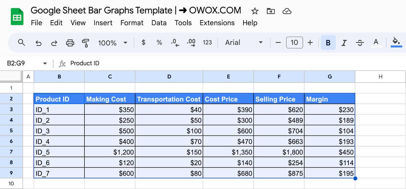
Step 1: Select the data
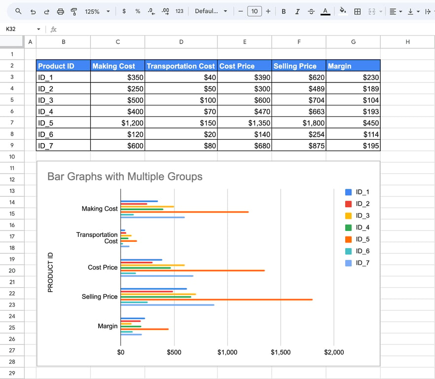
Select the whole table with its headers. In the example it is B2:G9: product IDs in the first column and five numeric columns.
Step 2: Insert the chart
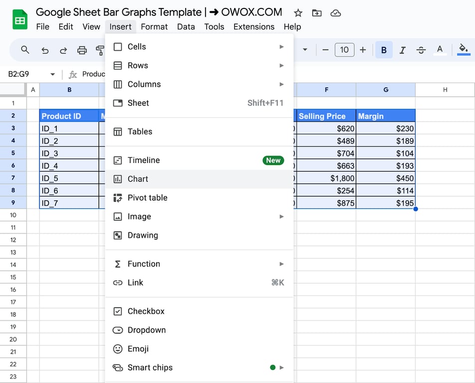
Click Insert > Chart. Sheets adds a chart and opens the chart editor on the right.
Step 3: Choose the bar type
Sheets suggests a chart type on its own. To change it, open Chart type in the Setup tab and scroll to the Bar group, which holds the bar chart, the stacked bar chart and the 100% stacked bar chart. The Column group has the same three types with vertical bars.
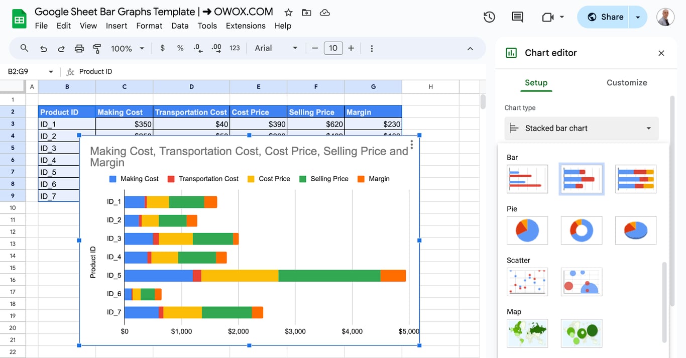
The rest of the Setup tab controls what is plotted:
- Data range: the range behind the chart. Edit it when rows are added below the table.
- X-axis and Series: the label column and the numeric columns. Remove a series here to drop it from the chart without touching the data.
- Switch rows / columns: plots the headers on the axis and the first column as the series.
- Use row as headers and Use column as labels: tell Sheets that the first row and the first column are names, not data.
OWOX Data Marts
See your first report built in real time. 15 minutes.
- Connect your data warehouse
- Pick your metrics
- Get a live Google Sheets report
In the time it takes to write a ticket. Then imagine never writing that ticket again.
Book a DemoWe'll use your actual use case
Customize the bar graph
Double-click the chart to reopen the editor, then open the Customize tab. It is divided into sections: Chart style, Chart & axis titles, Series, Legend, Horizontal axis, Vertical axis, and Gridlines and ticks.
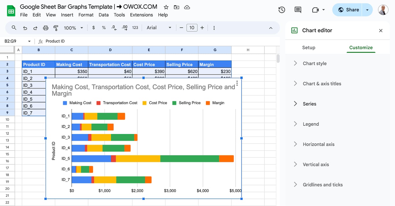
Chart style
Background color, font and border color of the whole chart. The checkboxes below them are Maximize, which stretches the plot to the edges of the chart area, 3D, and Compare mode, which shows the values of all series when you hover over a bar.
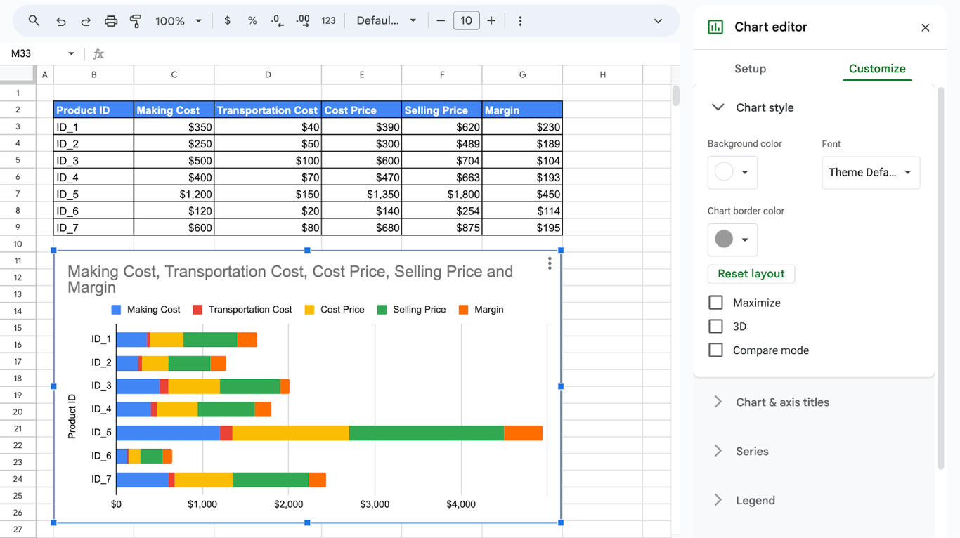
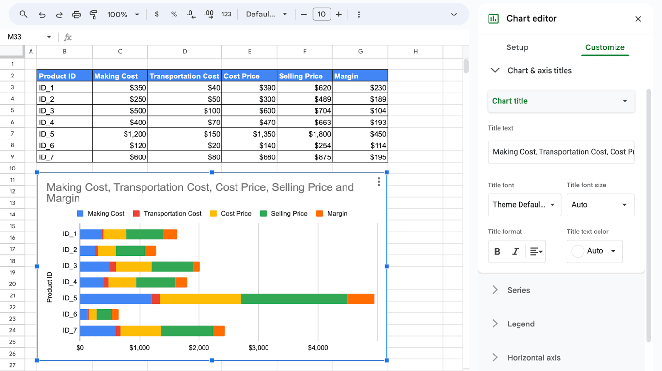
Chart and axis titles
Pick which title to edit in the dropdown (chart title, subtitle, horizontal or vertical axis title), type the text, and set its font, size, format and color. Sheets builds the default title from the column headers, which is rarely what a reader needs: replace it with a short statement of what the chart shows.
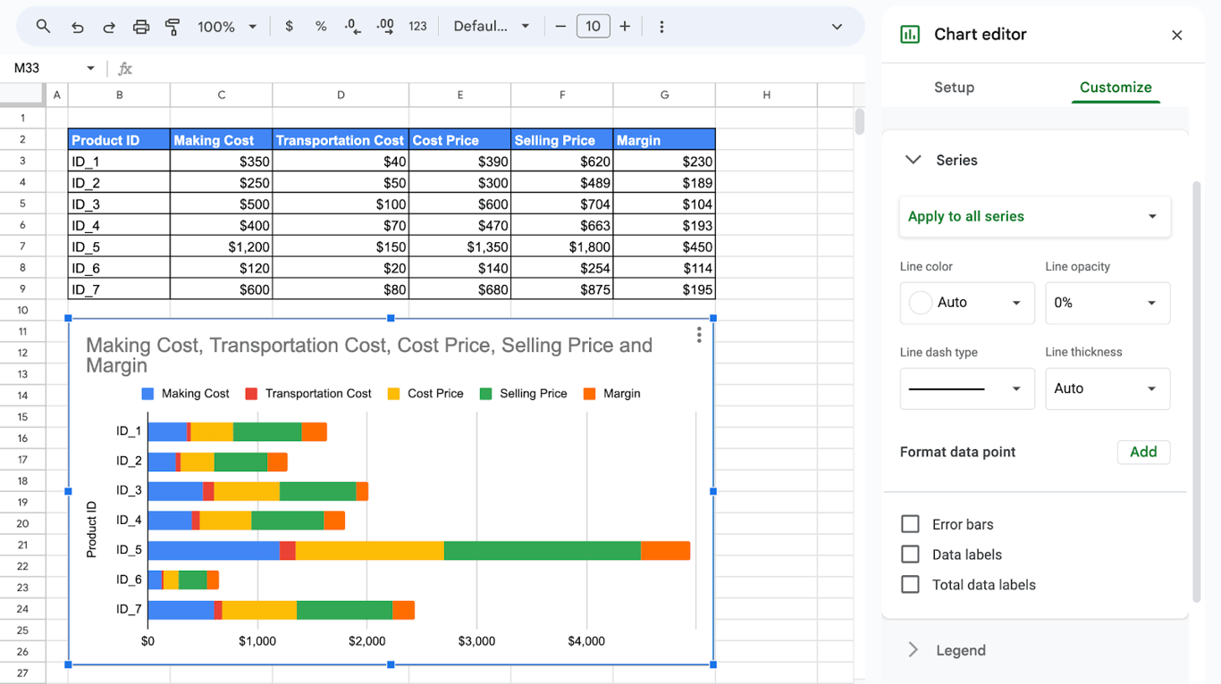
Series
The series section controls the bars themselves. Choose one series in the dropdown, or leave Apply to all series, then set the fill color and opacity and the line around the bars. Below are the checkboxes for error bars, data labels and, in stacked charts, total data labels.
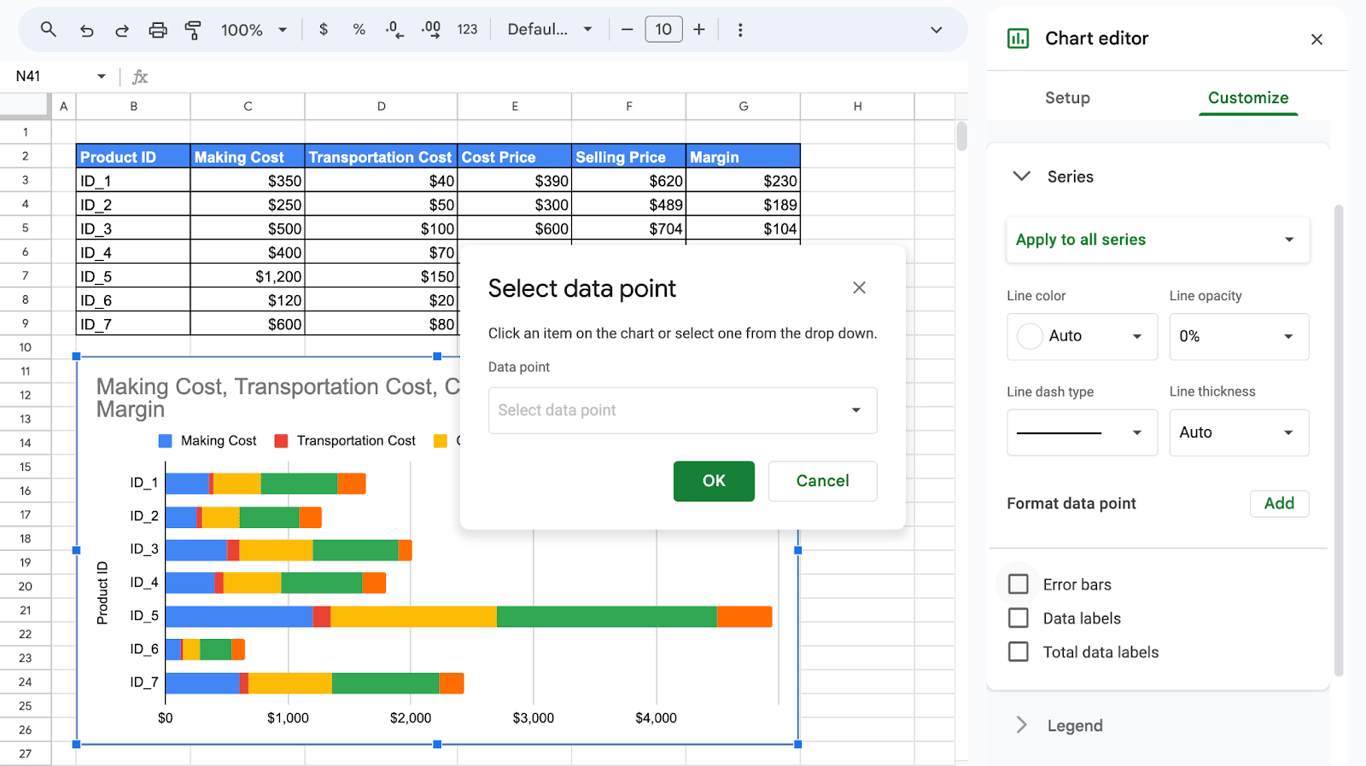
One bar in a different color
To highlight a single bar, click Add next to Format data point, choose the data point and give it its own color.
Data labels
Check Data labels to print the value on each bar. The settings under the checkbox set the position, the font and the number format. In a stacked chart, Total data labels adds the sum of the stack at the end of the bar.
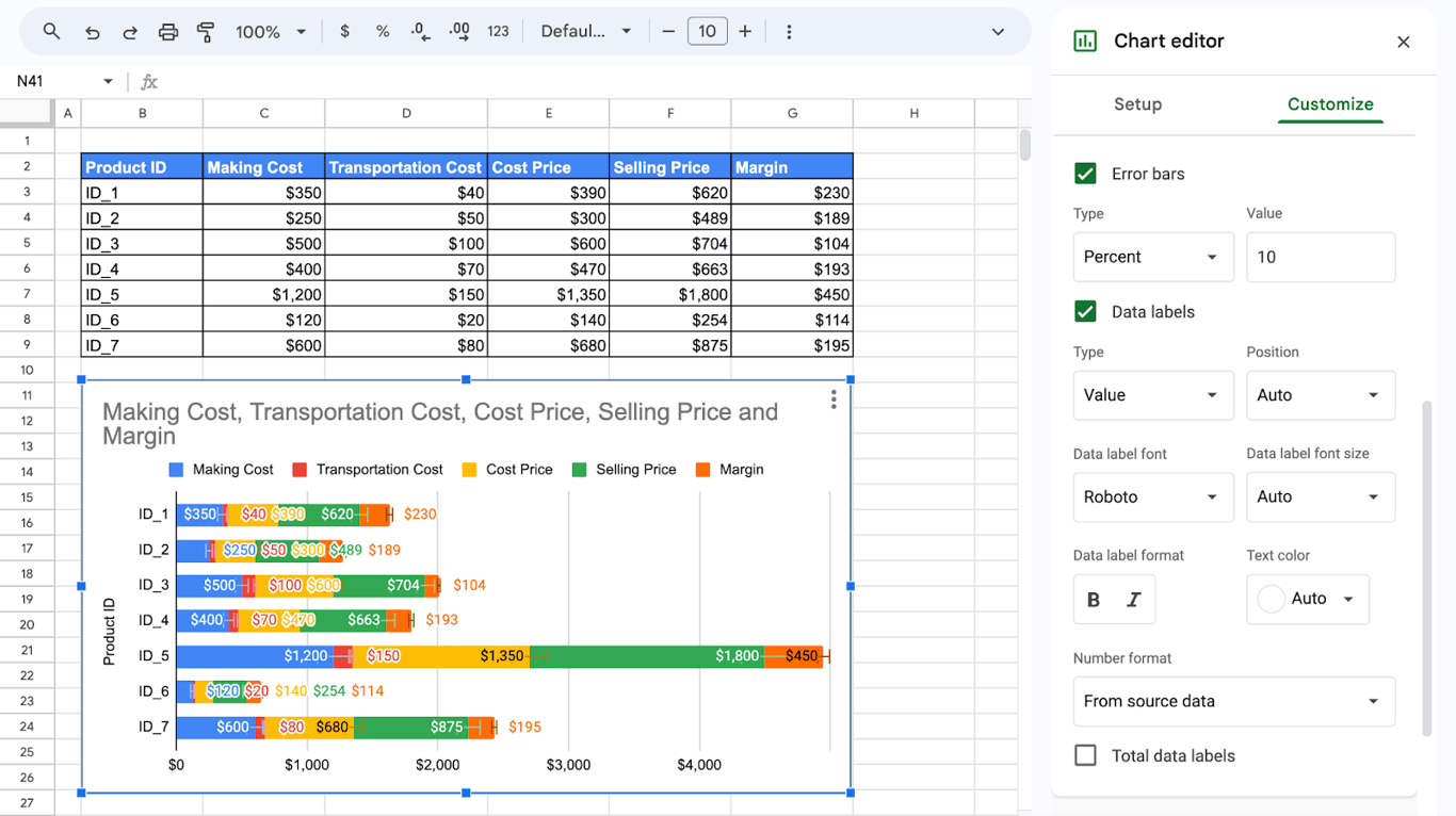
With five series the labels overlap, as in the screenshot. Labels work best on charts with one or two series; with more, keep the axis and drop the labels.
Stacked and 100% stacked bar graphs
Stacked and 100% stacked bar graphs
A stacked bar chart puts the series of one row end to end in a single bar, so the bar length is the total and the segments are the parts. Choose Stacked bar chart in Chart type.
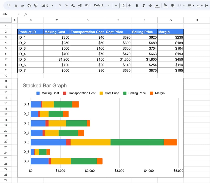
A 100% stacked bar chart stretches every bar to the same length and shows each segment as a share of the total. Use it to compare the mix, not the amounts.
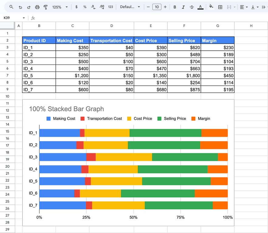
Both types need at least two numeric columns. Stack only values that add up to something meaningful. The example charts stack making cost, cost price, selling price and margin, which overlap with each other, so the total of a bar there means nothing: it shows how the chart looks, not how to choose the columns.
Compare two series side by side
Compare two series side by side
A double bar graph is a plain bar chart with two series. Select only the label column and the two columns to compare (hold Ctrl, or Cmd on a Mac, to select columns that are not next to each other), or build the chart from the whole table and remove the other series under Series in the Setup tab.
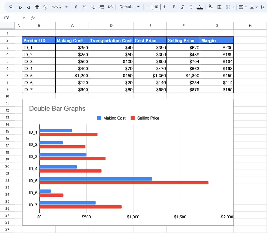
To group the bars the other way round, check Switch rows / columns in the Setup tab. The headers move to the axis and each product becomes a series.
How to add error bars and standard deviation bars
How to add error bars and standard deviation bars
Error bars are thin lines at the end of each bar that show a range around the value.
- Double-click the chart.
- Open Customize > Series.
- Check Error bars.
- Choose the Type and enter the Value.
Google Sheets has three types of error bars:
| Type | What the bar shows |
|---|---|
| Constant | The same amount above and below every bar, in the units of the data |
| Percent | A percentage of each bar’s own value |
| Standard deviation | The standard deviation of the series |
Standard deviation bars
Choose Standard deviation as the type and Sheets calculates the deviation of the series for you. There is one thing to know before using it. According to Google’s help page on error bars, bars of this type are centered on the mean of the series, not on the value of each bar. They show how the whole series is spread, and they look the same on every bar.
To draw the deviation around each bar’s own value, calculate it in a cell and enter the result as a Constant:
=STDEV(C3:C9)
STDEV treats the range as a sample. For a whole population use =STDEVP(C3:C9).
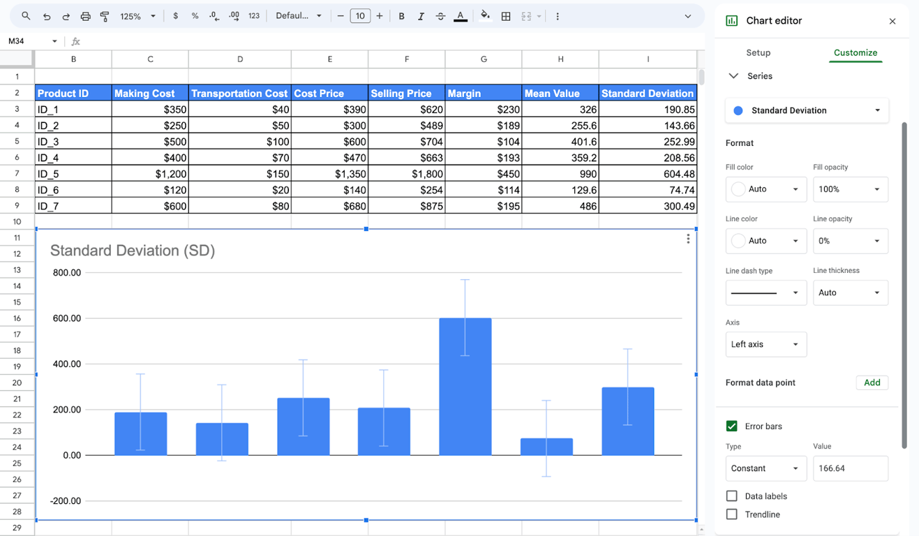
In the screenshot the error bars are of the Constant type with a value of 166.64, so every column gets a bar of the same length, 166.64 above and below its top.
Standard error bars
Sheets has no separate type for the standard error. Calculate it and enter it as a Constant:
=STDEV(C3:C9)/SQRT(COUNT(C3:C9))
What error bars in Sheets cannot do
All three types apply one rule to the whole series. The help page lists no type that reads a separate error value for each bar from a column, so a chart where every bar has its own standard deviation cannot be set up in the Series section. If you need that, say so in the caption, or show the deviations in a column of the table next to the chart.
Common problems with bar graphs
Common problems with bar graphs
⚠️ Problem: The chart is empty, or a series is missing.
✅ Solution: The numbers are stored as text. Text is left-aligned in the cell; convert it with Format > Number, or remove the stray symbols with SUBSTITUTE and VALUE.
⚠️ Problem: One bar is many times longer than the rest.
✅ Solution: The total row is inside the data range. Shorten the range in the Setup tab.
⚠️ Problem: The header row is drawn as a bar, or the legend says “Series 1”.
✅ Solution: Check Use row as headers in the Setup tab, and make sure the headers are in the first row of the range.
⚠️ Problem: New rows do not appear in the chart.
✅ Solution: The data range ends at the old last row. Extend it, or set it to whole columns such as B2:G so that new rows are picked up.
⚠️ Problem: The bars are in the wrong order.
✅ Solution: A bar chart follows the order of the rows. Sort the table, or build the chart on a sorted copy made with SORT.
⚠️ Problem: The labels on the axis are cut off.
✅ Solution: Make the chart wider, shorten the labels, or switch from a column chart to a bar chart: horizontal bars leave room for long names.
Related guides
- Charts in Google Sheets: The other chart types and when to use each.
- Pivot charts: Charts built on a pivot table.
- Pivot tables: Summarize the rows before you plot them.
- SPARKLINE: A small bar or line chart inside one cell.
- Slicers: Filter a chart without changing the data.
- MAX, MIN and MEDIAN: The numbers behind the bars.
- AVERAGE functions: The mean that standard deviation bars are built around.
A chart is only as current as the range behind it
A chart is only as current as the range behind it
A bar graph redraws itself when the cells change, but it cannot tell whether those cells are current. If the table under the chart was pasted from an export last month, the chart shows last month, with the same confident bars. The part of the work that no chart setting covers is getting the same, agreed numbers into the range every time.
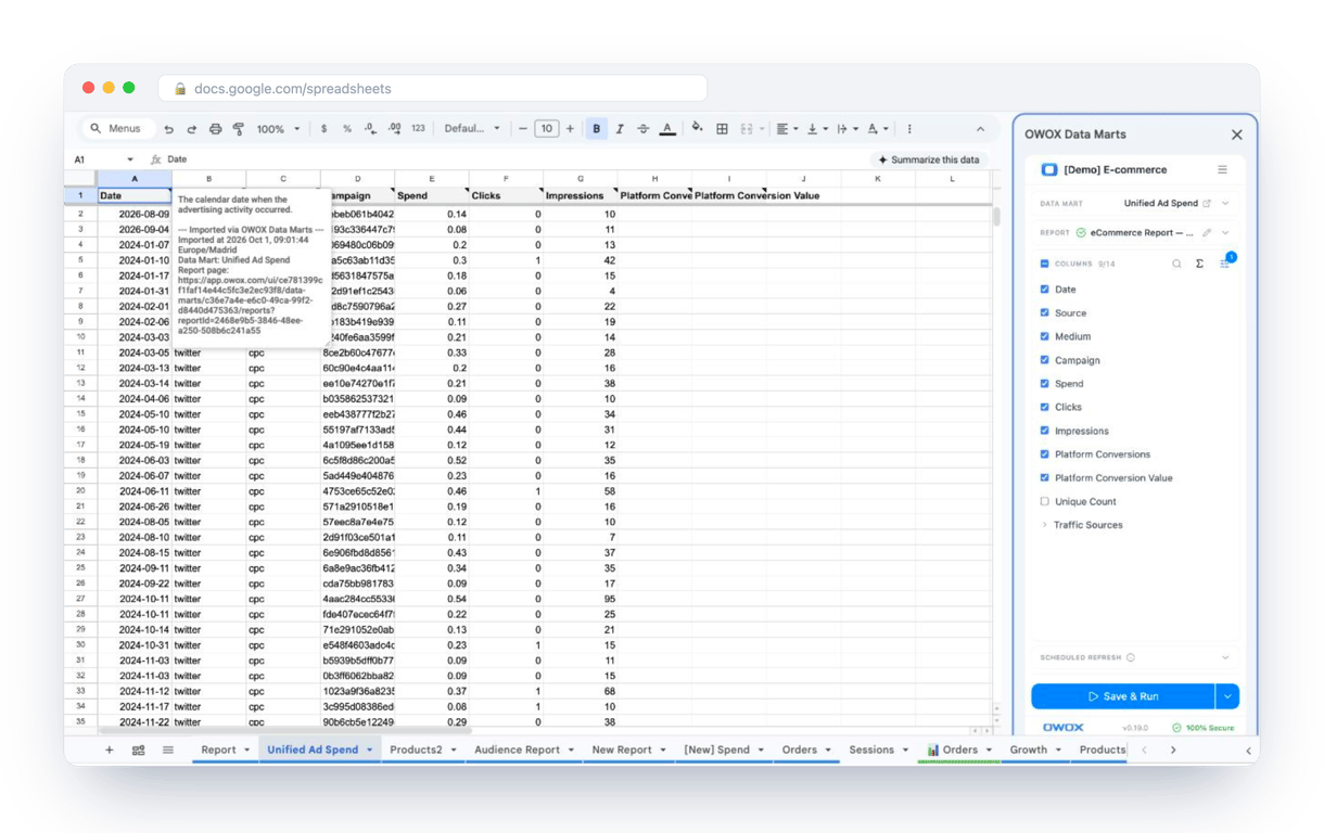
The OWOX Data Marts extension for Google Sheets covers that half. A data analyst publishes a data mart (a table or an SQL query in your data warehouse) and makes it available for reports. In Sheets you open the extension, pick the data mart, tick the columns you want and run it. The rows land in a tab, ready for your formulas.
What changes for the person who maintains the sheet:
- Refresh replaces re-export. Refresh current report in the extension menu re-runs the same pull, and a scheduled refresh keeps the tab current without anyone touching it.
- The source is written on the sheet. The header cell of an imported tab carries a note with the data mart it came from, the time of the import and a link to the report.
- No SQL and no warehouse access needed. The analyst decides which data marts and columns are available. You choose from that list.
The extension does not write or change the analyst’s SQL. The chart on top of that range then redraws from the refreshed rows, and nobody has to paste a new export under it. The extension comes with the OWOX Cloud plans of OWOX Data Marts; spreadsheet reporting describes both ways data reaches a sheet.
Turn your data into decisions.
Governed data marts give you the clean foundation ML needs to actually work.
- No AI hallucinations
- Analyst-governed definitions
- Every number traces to SQL
Frequently Asked Questions
How Can I Add Error Bars to a Bar Chart in Google Sheets?
Double-click the chart, open Customize > Series and check Error bars, then choose the type and enter the value. Google Sheets has three types: Constant, Percent and Standard deviation. Bars of the Standard deviation type are centered on the mean of the series, not on each bar. To draw the deviation around each bar, calculate it with STDEV and enter the result as a Constant.
How Do I Create Bar Charts with Multiple Groups in Google Sheets?
Select the table with the label column and all the numeric columns, click Insert > Chart and choose Bar chart. Each numeric column becomes one series, so every label gets a group of bars. To group the bars by the column headers instead, check Switch rows / columns in the Setup tab of the chart editor.
How Do I Create a Double Bar Graph in Google Sheets?
A double bar graph is a bar chart with two series. Select the label column and the two columns to compare, click Insert > Chart and choose Bar chart. If the chart was built from a wider table, remove the extra series under Series in the Setup tab.
Why Should I Use Bar Graphs in Google Sheets?
Bar graphs in Google Sheets are essential for data visualization due to their simplicity and effectiveness in presenting categorical data. They enable quick comparisons between categories, facilitating a clearer understanding of data patterns and trends. Google Sheets provides intuitive tools to create and customize bar graphs, allowing users to tailor the visualizations to their needs. Using bar graphs helps straightforwardly communicate complex data, making it accessible for stakeholders and aiding in data-driven decision-making.
How Do I Label a Bar Graph in Google Sheets?
Labeling a bar graph in Google Sheets involves adding descriptive titles and data labels to enhance interpretability. In the Chart Editor, use the Customize tab to add a chart title, horizontal axis title, and vertical axis title. Additionally, it enables data labels to display exact values on each bar. Adjust the font size, style, and color to ensure readability. Proper labeling ensures viewers can quickly and accurately understand the presented data, making the graph more informative and user-friendly.
What are Bar Graphs in Google Sheets?
Bar graphs in Google Sheets represent data, with individual bars representing categorical data points. These bars can be arranged vertically or horizontally, and their lengths are proportional to the values they represent. Bar graphs are handy for comparing discrete categories, making it easier to visualize differences and trends. Google Sheets offers robust customization options for bar graphs, including color coding, data labels, and error bars, enhancing the clarity and impact of data presentations.