Pivot tables in Google Sheets: how to create, customize and use them
A pivot table turns a long list of rows into a summary by category. This guide shows how to create one in Google Sheets, then how to add calculated fields, group dates by month, filter with slicers, combine data from several tabs, format the result and fix the problems that come up.
To create a pivot table in Google Sheets, select your data, go to Insert → Pivot table, choose where to put it and click Create. Then, in the editor on the right, add a field to Rows, optionally one to Columns, and a number field to Values. The table summarizes the numbers for every combination of the categories you chose.
This guide walks through those steps with screenshots, then covers calculated fields, grouping dates by month, filters and slicers, sorting, data from several tabs, formatting, and the problems people run into.
Note: Originally published in July 2024. Fully updated in October 2026: corrected how pivot tables refresh in Google Sheets (they update by themselves), the spreadsheet size limit and the calculated field example, and removed advice that applied to Excel.
What is a pivot table?
A pivot table is a summary of a larger table. You choose one or two columns to group by and a number to aggregate, and Google Sheets builds the summary: totals by product, averages by region, counts by month. The source data is not changed, and the same data can feed any number of pivot tables.
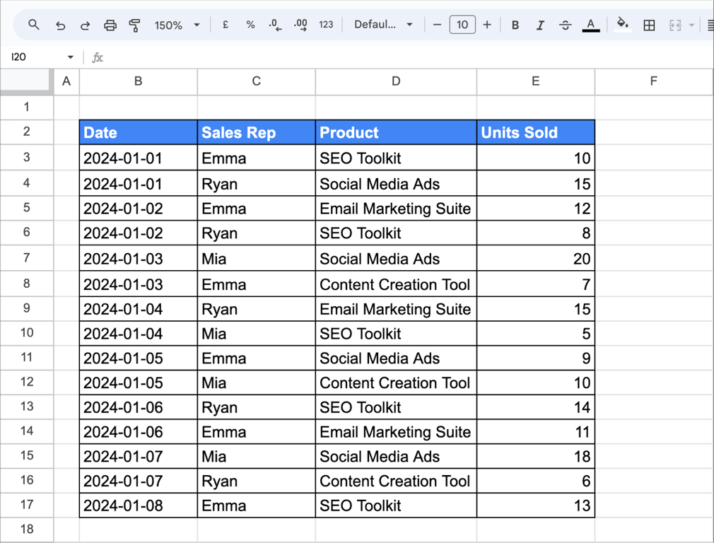
Imagine you have a spreadsheet tracking sales data. Each row represents a sale, detailing the sales rep, product sold, and units sold.
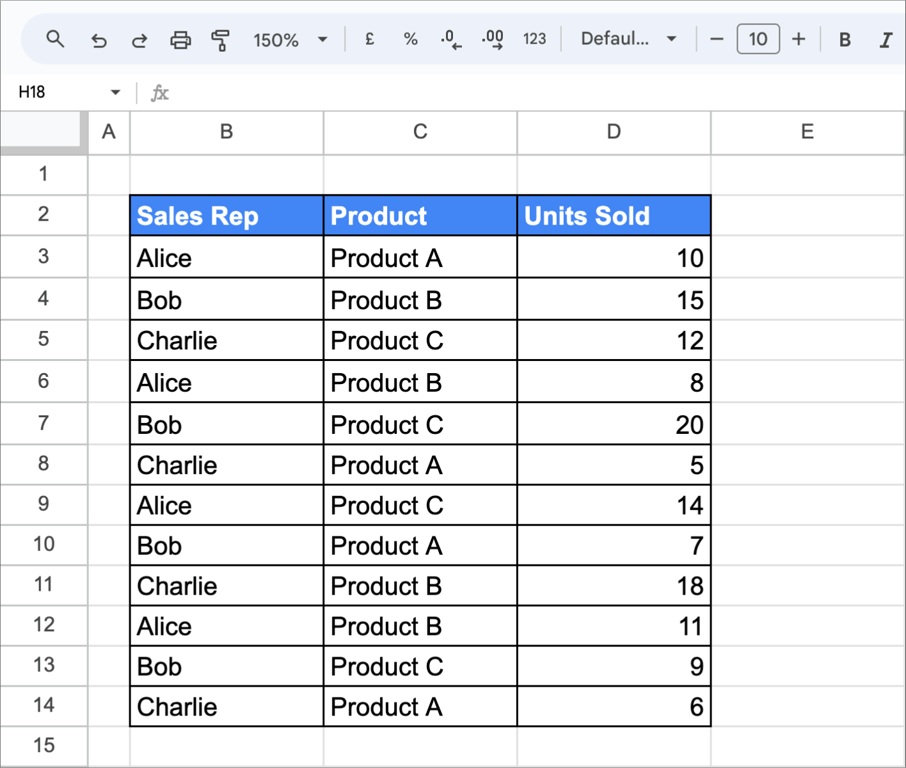
As a list, the data shows single sales and hides the totals. A pivot table shows the total units each rep sold of each product:
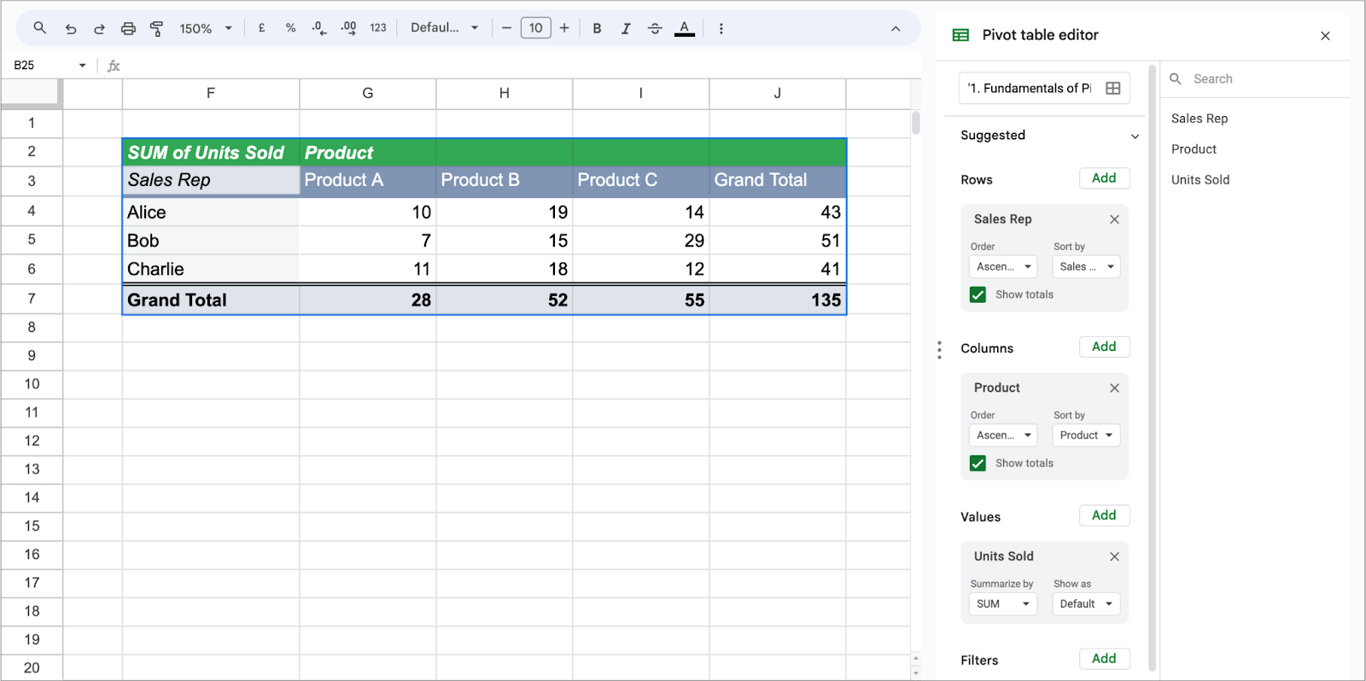
The same summary could be built with SUMIFS formulas. A pivot table gets there without formulas, and can be rearranged in a few clicks when the question changes.
How to create a pivot table in Google Sheets
How to create a pivot table in Google Sheets
Step 1: Select the data
Select the range you want to analyze. Each column needs a header in the first row, and there should be no empty rows inside the data.
Suppose your data is spread across cells B2 to E17, with “Date” in column B, “Sales Rep” in column C, “Product” in column D, and “Units Sold” in column E. In this case, you would highlight the range from B2 to E17 to include all relevant data.
Step 2: Insert the pivot table
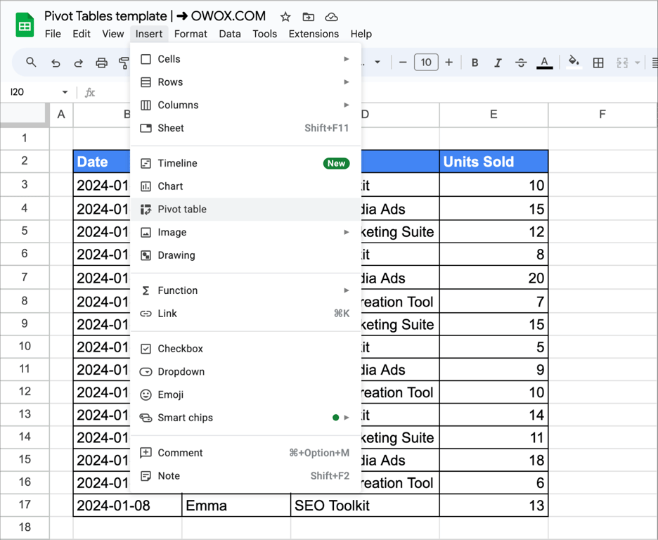
In the menu, choose Insert → Pivot table.
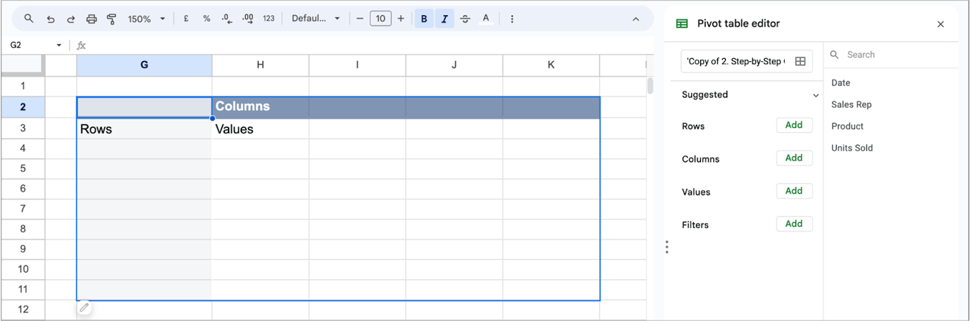
A dialog asks whether to put the pivot table on a new sheet or on an existing sheet. This example uses the existing sheet, starting at cell G2.
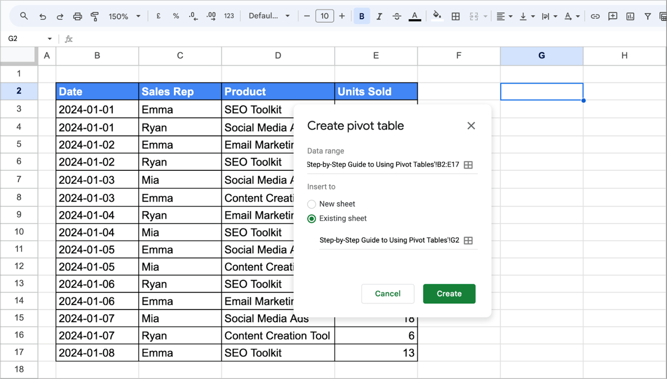
Click Create. An empty pivot table appears, with the pivot table editor on the right:
Step 3: Add rows, columns and values
The editor has four sections. Click Add next to a section and pick a field.
1. Rows and columns. Add Product to Rows: every product gets a row. Add Sales Rep to Columns: every rep gets a column.
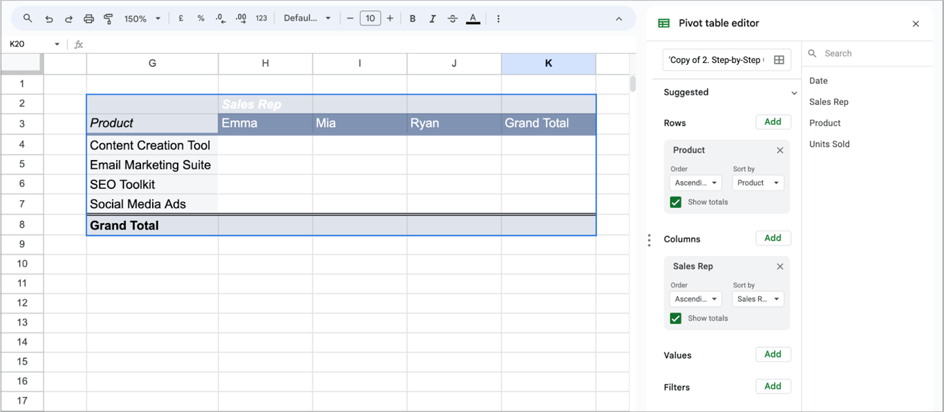
2. Values. Add Units Sold to Values. Google Sheets sums the units for each product and rep, and adds grand totals.
Google Sheets may also offer ready-made pivot tables under Suggested at the top of the editor. They are a quick start when the data is simple.
OWOX Data Marts
See your first report built in real time. 15 minutes.
- Connect your data warehouse
- Pick your metrics
- Get a live Google Sheets report
In the time it takes to write a ticket. Then imagine never writing that ticket again.
Book a DemoWe'll use your actual use case
The parts of a pivot table
- Rows: the field whose values run down the left side. One row per distinct value.
- Columns: the field whose values run across the top. One column per distinct value. Optional.
- Values: the numbers in the middle, and how they are aggregated: SUM, AVERAGE, COUNT, MAX, MIN and others.
- Filters: conditions that decide which rows of the source data are included.
- Totals: the grand total row and column, which can be switched off per field with Show totals.
Customizing a pivot table
Adding multiple value fields for diverse data views
A pivot table can show several values side by side. Suppose you have a marketing dataset with columns for:
- “Campaign Type”
- “Clicks”
- “Conversions”
- “Cost”
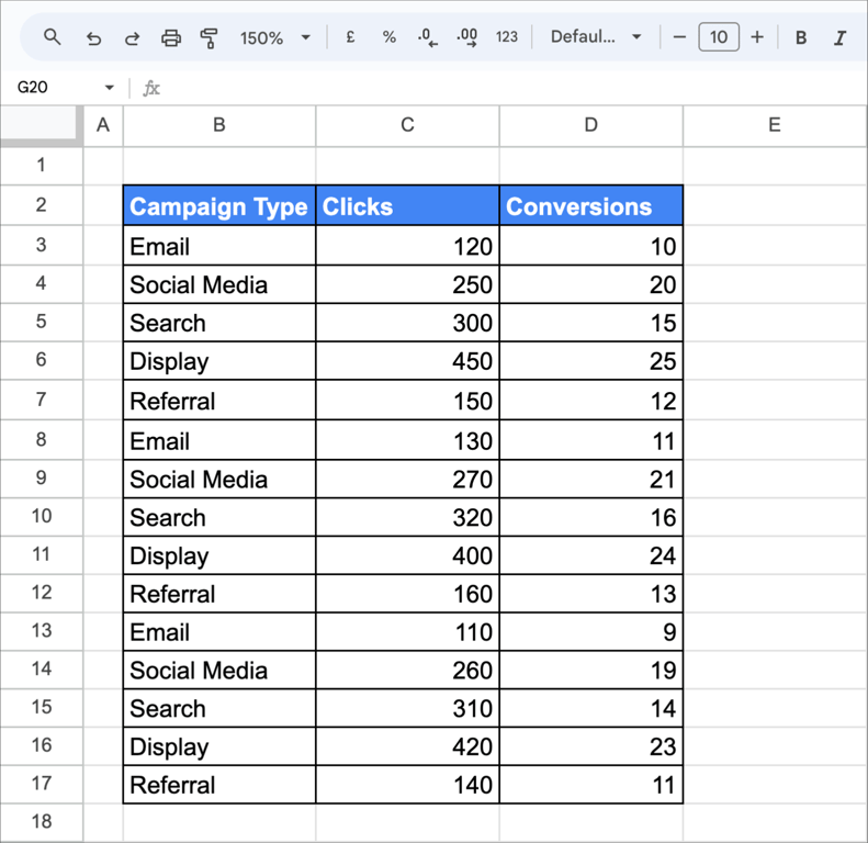
To see clicks and conversions for each campaign type:
- Select your dataset.
- Create a pivot table.
- Add “Campaign Type” to Rows.
- Add “Clicks” and “Conversions” as Value fields.
- Customize aggregation types (e.g., sum, average) for each value field.
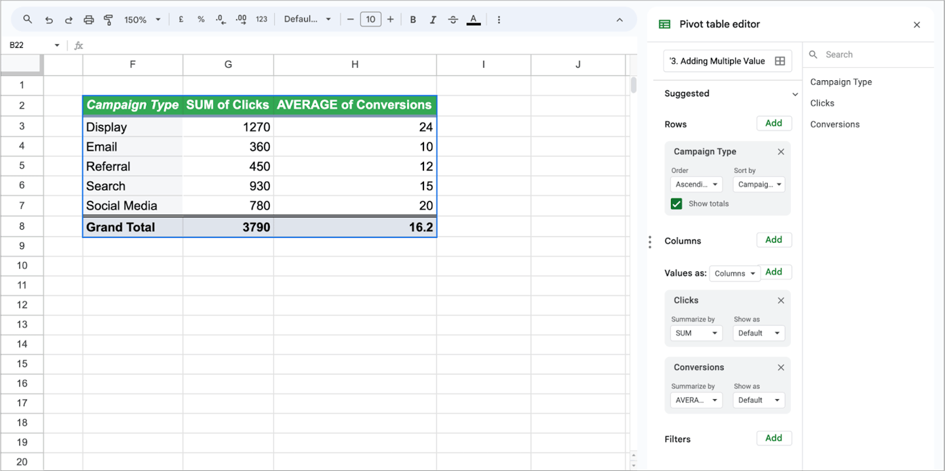
Each value keeps its own aggregation, so one column can be a sum and the next an average.
Changing aggregation types to enhance data interpretation
Every field in Values has a Summarize by setting: SUM, AVERAGE, COUNT, MAX, MIN and more. Take a month of daily website traffic data.
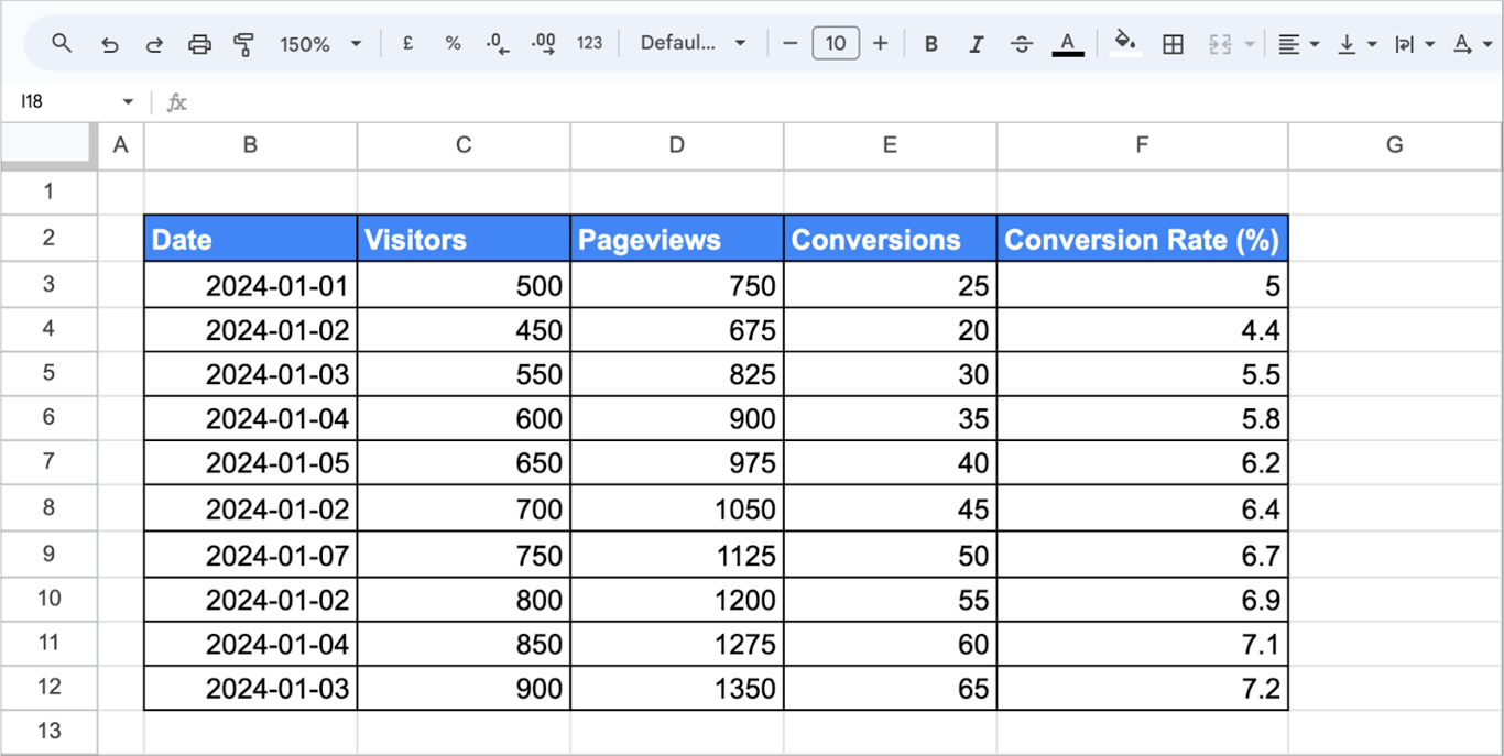
Each row represents a day, and columns include metrics like “Visitors,” “Pageviews,” and “Conversion Rate.”
Here are the steps:
- Data Selection: Choose the dataset with your website traffic data.
- Pivot Table Creation: Create a pivot table with “Date” as rows and “Visitors,” “Pageviews,” and “Conversion” as values.
- Aggregation types: Open the Summarize by drop-down of each field under Values and choose the aggregation.
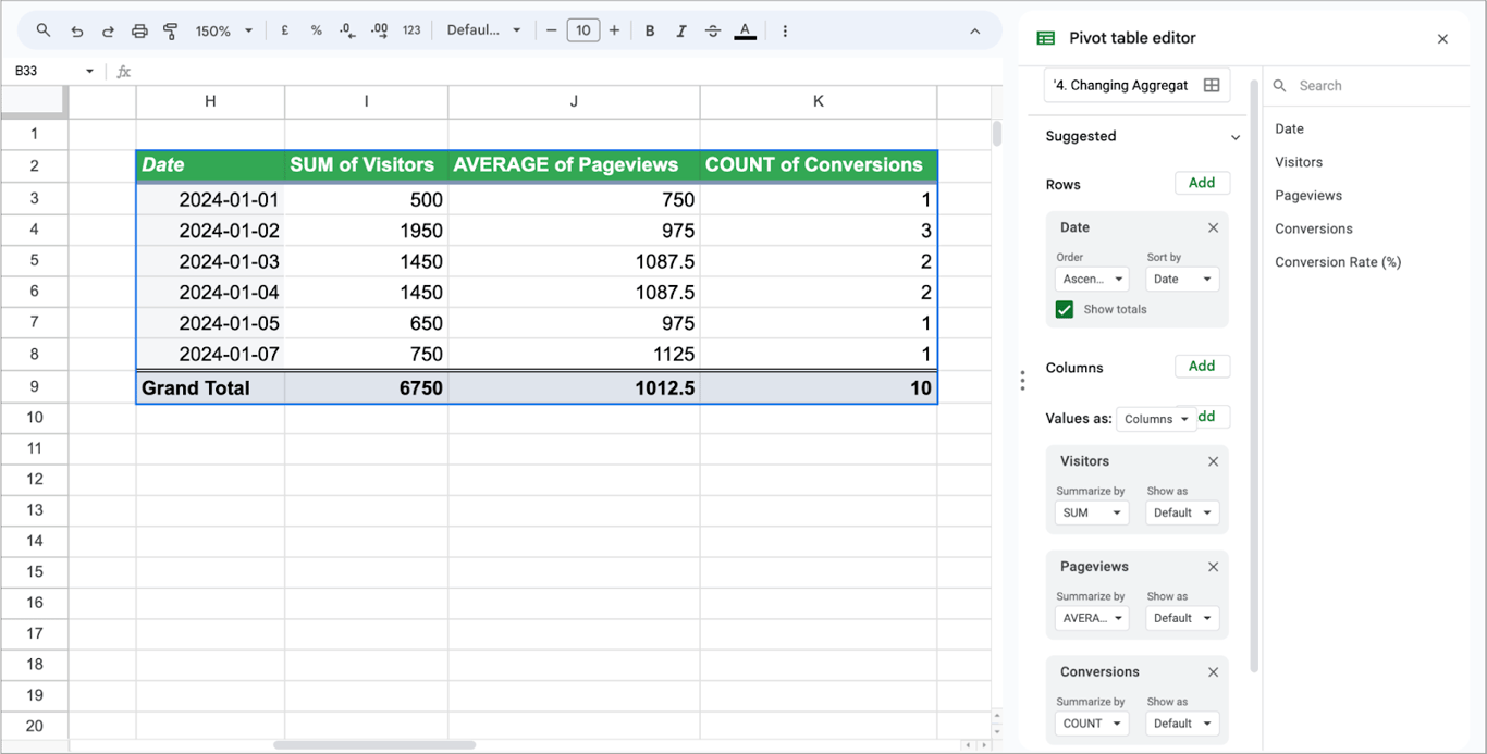
Here we have used:
- Sum of Visitors: This reveals the total number of visitors for each day.
- Average Pageviews: Shows the average pageviews per day.
- Count of Conversions: Indicates how many times conversions occurred each day.
A rate such as Conversion Rate should not be summed or averaged across rows of different size. Rebuild it from its parts with a calculated field, as shown below.
Implementing filters for targeted analysis
A filter limits the pivot table to part of the source data. Consider a dataset of website visitors. This dataset includes columns like date, traffic source (e.g., organic search, social media, paid ads), page views, and conversion rate.
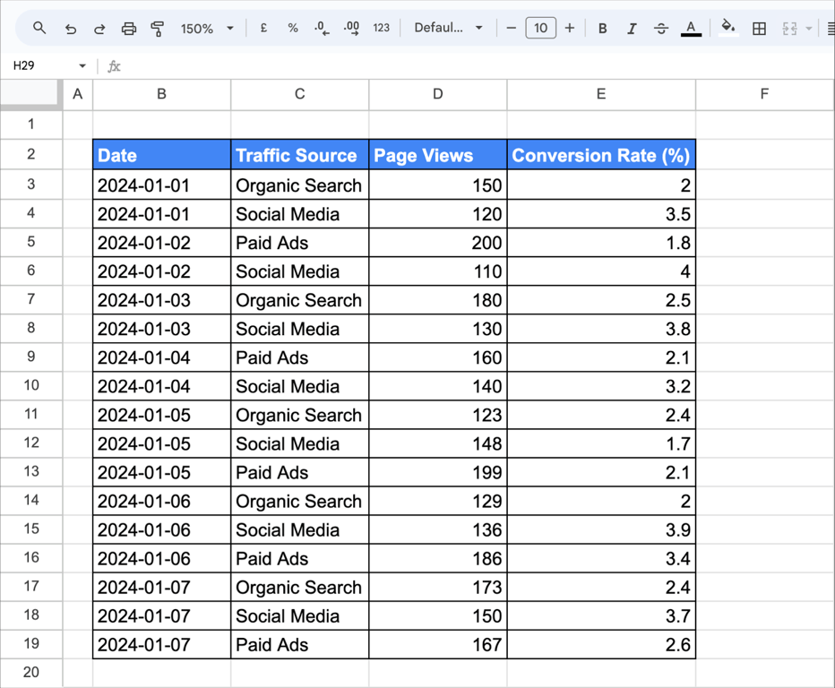
To look at one traffic source only:
- Click any cell in the dataset and choose Insert → Pivot table.
- Add Date and Traffic Source to Rows, and Page Views to Values.
- Next to Filters, click Add and choose Traffic Source.
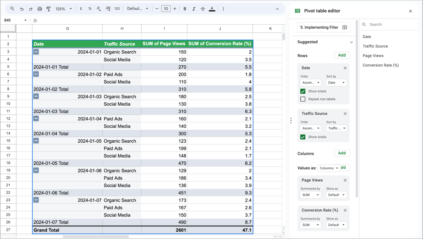
- Open the filter drop-down, click Clear, tick Social Media and click OK.
The pivot table now shows only the rows for social media traffic:
Pivot table features with examples
Pivot table features with examples
How pivot tables refresh
A pivot table in Google Sheets updates by itself when the data in its source range changes. There is no Refresh button to press. What it cannot do is notice rows added below the range it was built on.
Suppose a pivot table summarizes revenue by product and salesperson from the range B2:E17.
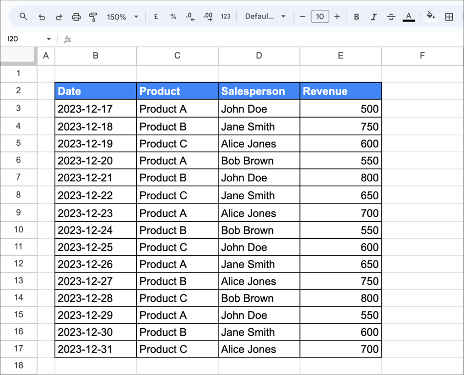
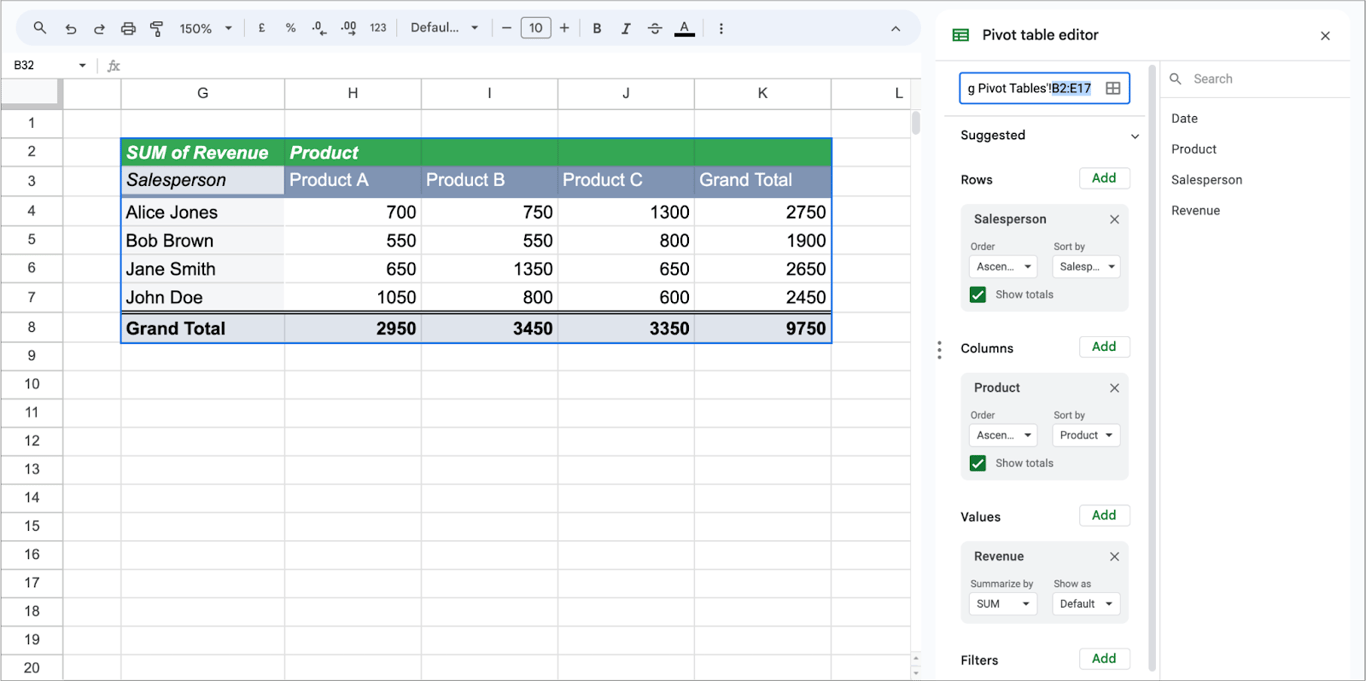
New sales are then added in rows 18 to 22:
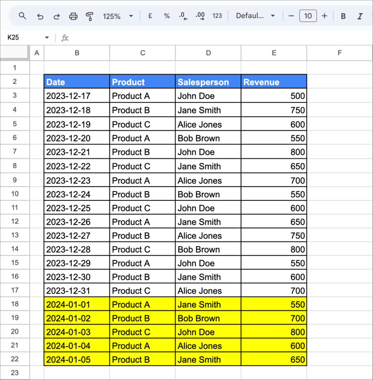
The pivot table does not change, because those rows are outside B2:E17. To include them:
- Click the pivot table to open the editor.
- At the top of the editor, change the data range from B2:E17 to B2:E22.
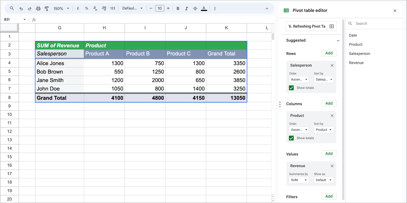
To avoid doing this every time, give the pivot table an open-ended range from the start, as described under dynamic ranges below.
Calculated fields in pivot tables
A calculated field is a value that the pivot table computes from other fields. Take a table with the columns Product, Sales in Jan and Sales in Feb, where you want the total of both months.
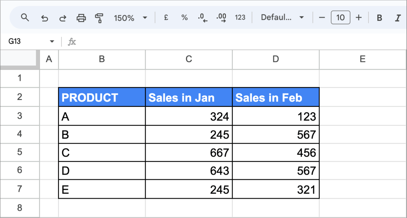
1. Create the pivot table: select the data and choose Insert → Pivot table.
2. Set it up: add Product to Rows.
3. Add a Calculated Field:
- In the editor, next to Values, click Add and choose Calculated field.
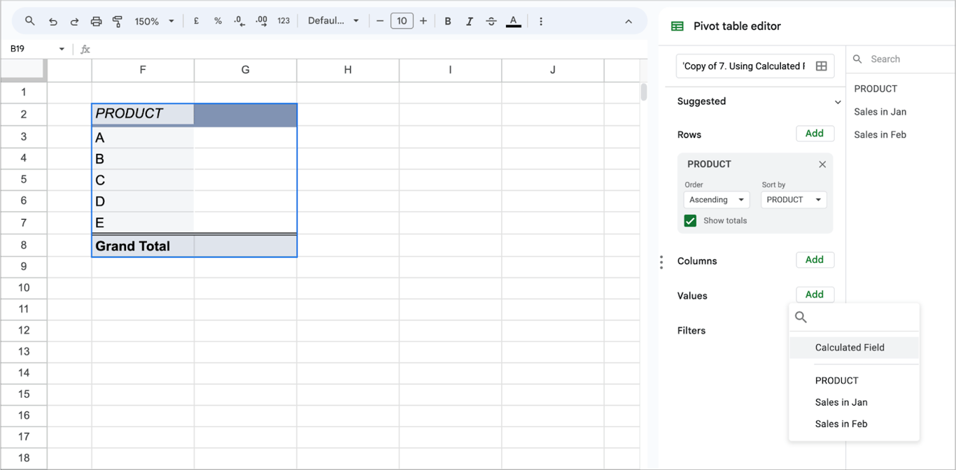
- Enter the formula. Field names that contain spaces go in single quotes:
='Sales in Jan'+'Sales in Feb'
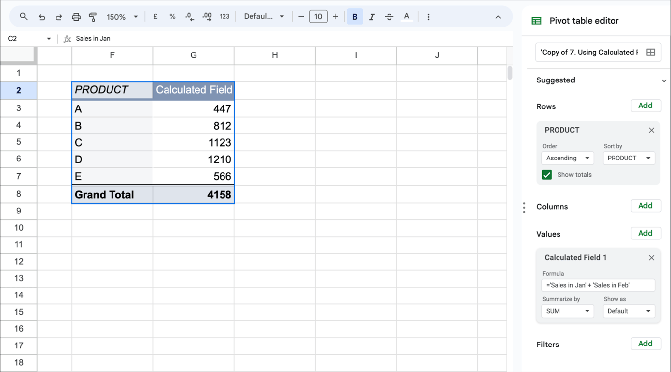
The pivot table now shows the total of both months for each product.
For a ratio, such as a conversion rate, set Summarize by to Custom and aggregate inside the formula: =SUM(Conversions)/SUM(Clicks). This divides the totals, which is the correct rate for each row of the pivot table and for the grand total.
Sorting data in pivot tables
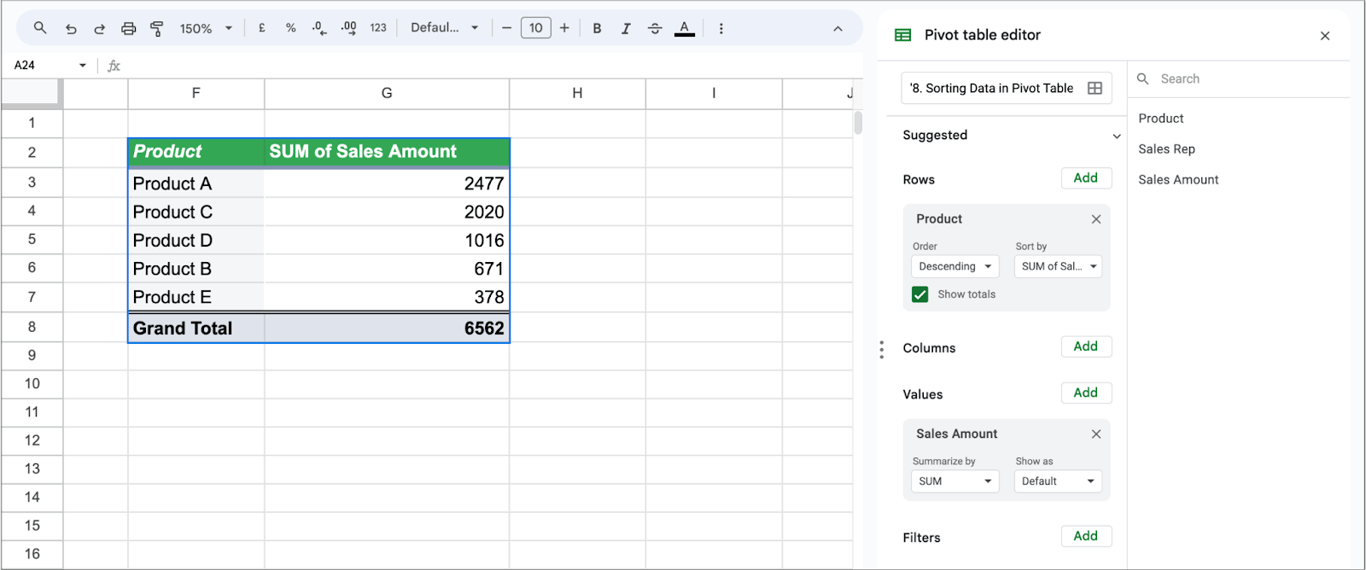
By default the rows of a pivot table are sorted by their labels, from A to Z. To rank them by a value instead, use the Sort by setting of the row field. Take a sales dataset with products, sales reps and amounts.
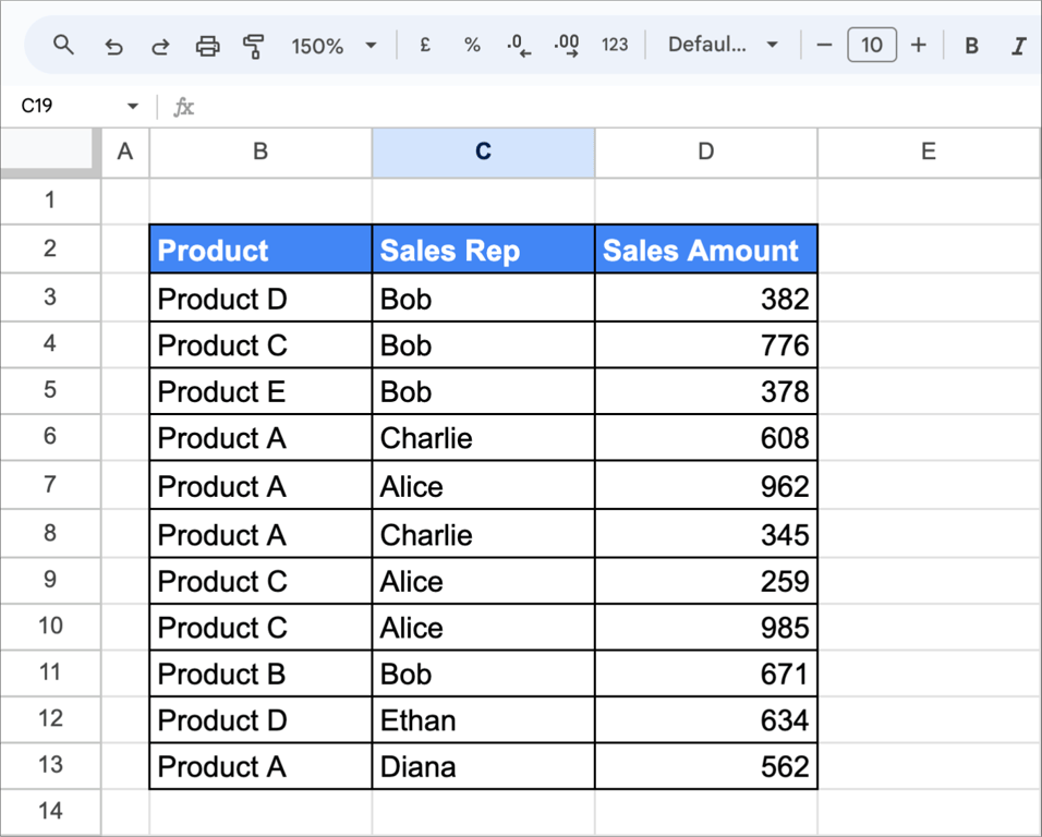
In the editor, under the Product field in Rows, set Order to Descending and Sort by to SUM of Sales Amount. The best-selling products move to the top:
Editing and updating pivot tables
A pivot table can be rearranged at any time. Click it, and the editor opens again. Suppose a pivot table shows total sales by product category (Electronics, Clothing, Accessories).
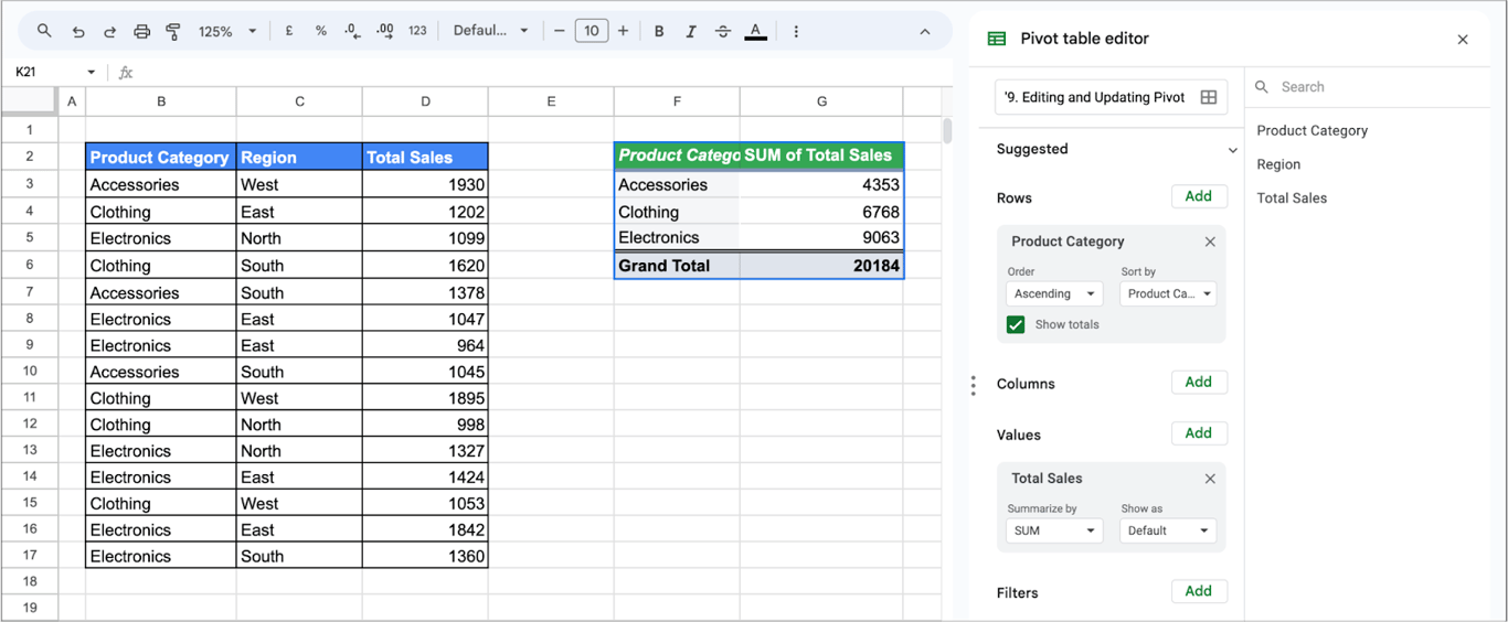
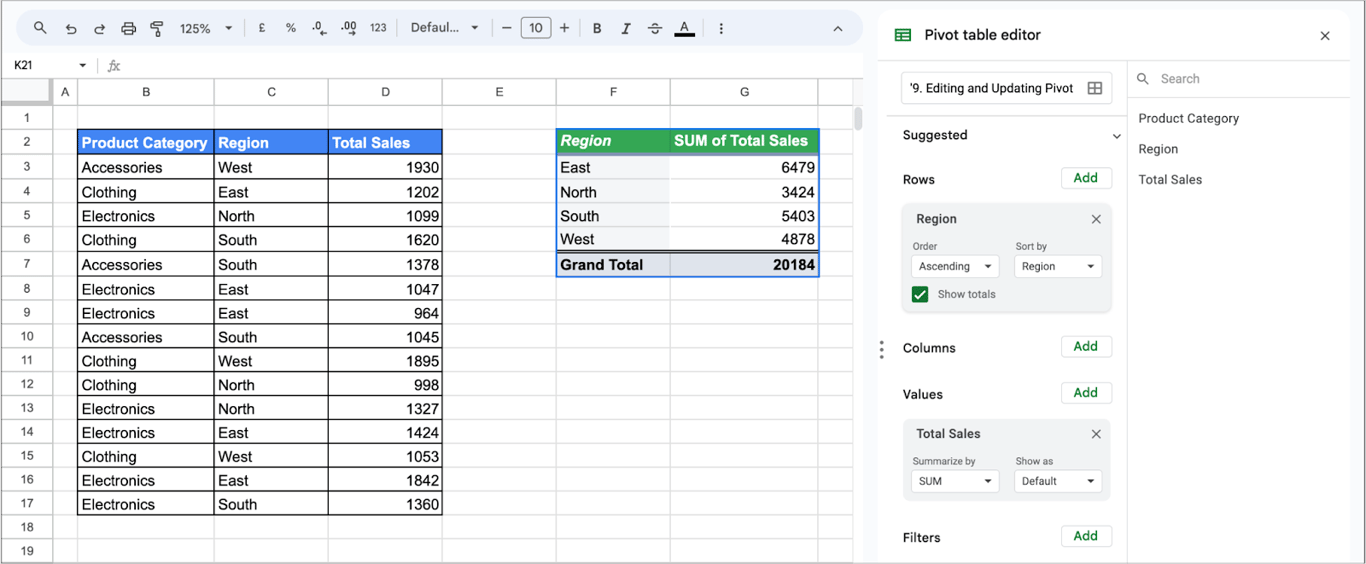
To see sales by region instead, remove Product Category from Rows with the X next to it, and add Region.
Grouping data by month and date in pivot tables
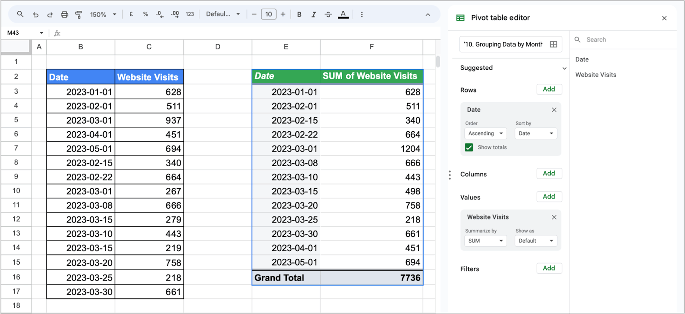
A date field in Rows gives one row per day. To summarize by month, quarter or year, group the dates. Take a year of daily website traffic.
1. Create a Pivot Table:
- Select your dataset.
- Choose Insert → Pivot table.
2. Set Up the Pivot Table:
- In the pivot table editor, add “Date” to the Rows area.
- Then, add “Website Visits” to the Values area, usually setting it to SUM to get the total visits per date or period.
3. Grouping by Month:
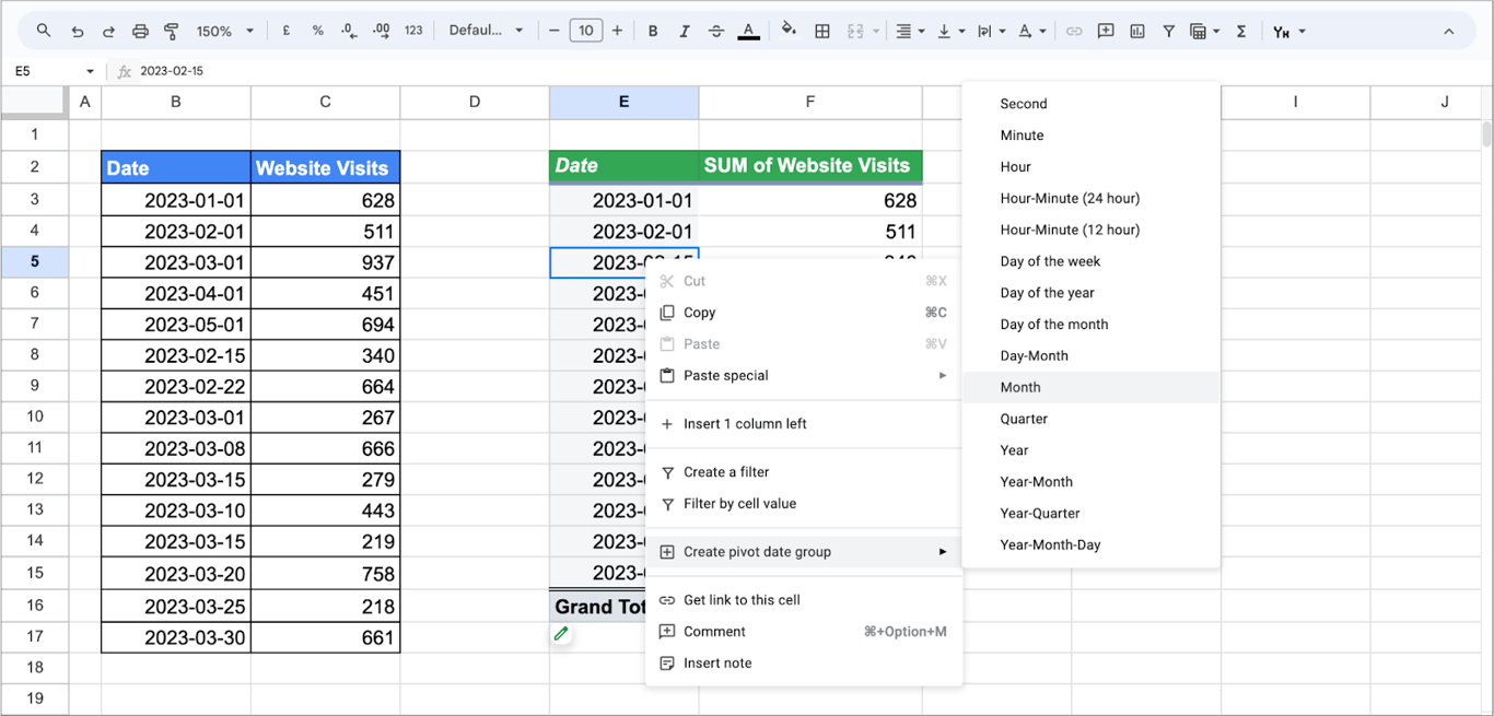
- Right-click any date in the pivot table.
- Choose Create pivot date group.
- Select Month. If the data covers more than one year, select Year-Month instead, so that the same month of different years is not added together.
4. Adjusting the Pivot Table:
- After grouping, the pivot table will show a summary of website visits for each month.
- You can adjust other settings, like sorting or filtering, based on your analysis needs.
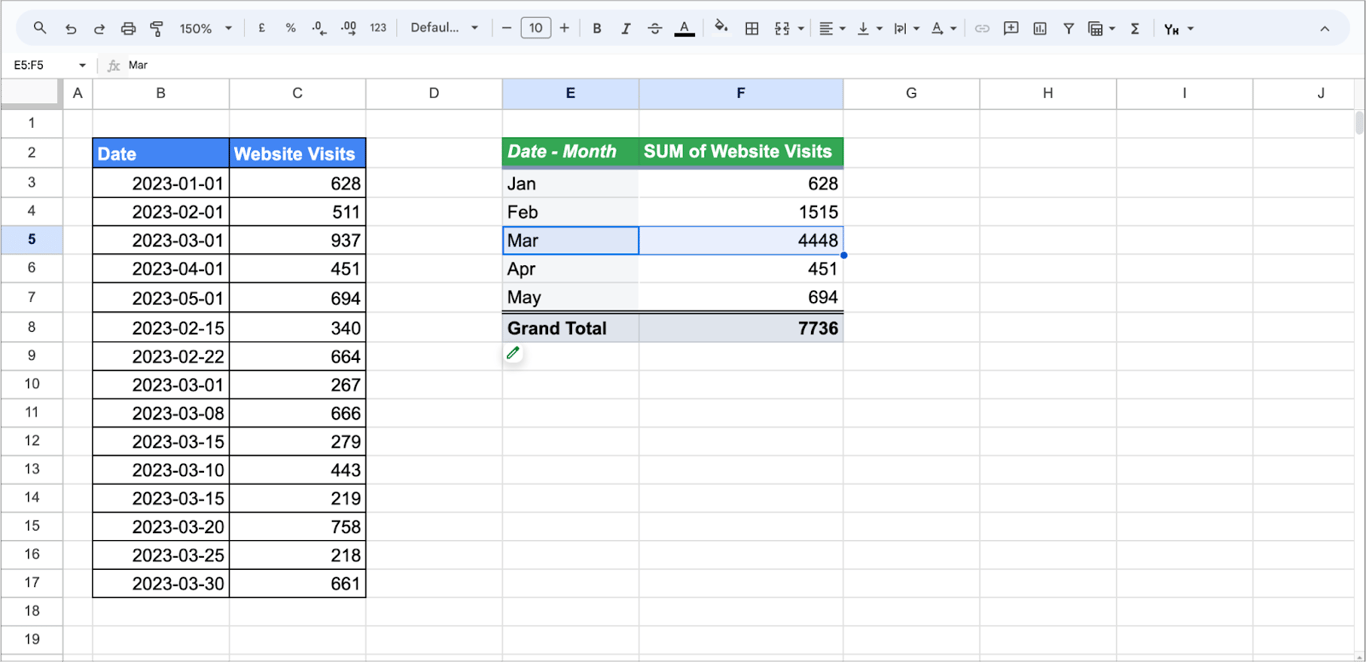
The grouping only works on real dates. If the option is missing, the column contains dates stored as text.
Using data from multiple sheets in a pivot table
A pivot table reads one range. To analyze data that lives on several tabs, for example website visits, email click-through rates and social media engagement, combine it into one table first.
1. Prepare the Data:
- Ensure each sheet (website visits, email click-through rates, social media engagement) has a common key for merging. Usually, this is the date or a unique campaign identifier.
- Each sheet should be structured similarly, with the key column (like the date) in the same relative position.
2. Create a Master Sheet:
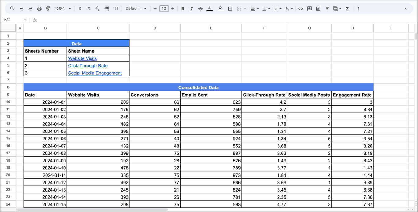
- Create a new sheet to consolidate the data.
- Use formulas like QUERY, VLOOKUP or ARRAYFORMULA to combine data from different sheets based on the common key.
- This master sheet will have columns for all the metrics you want to analyze (e.g., date, website visits, email click-through rate, social media engagement).
Here, we have used the following method:
- Use VLOOKUP to Pull Data: In the row below your headers, use the VLOOKUP function to pull data from each sheet. Assuming your date is in column B, and each sheet is named appropriately, your formulas in each cell might look like this:
- C10: =VLOOKUP(B10, ‘Website Visits’!B:D, 2, FALSE) - for Website Visits.
- D10: =VLOOKUP(B10, ‘Website Visits’!B:D, 3, FALSE) - for Conversions.
- E10: =VLOOKUP(B10, ‘Email Click-Through Rate’!B:D, 2, FALSE) - for Emails Sent.
- F10: =VLOOKUP(B10, ‘Email Click-Through Rate’!B:D, 3, FALSE) - for Click-Through Rate.
- G10: =VLOOKUP(B10, ‘Social Media Engagement’!B:D, 2, FALSE) - for Social Media Posts.
- H10: =VLOOKUP(B10, ‘Social Media Engagement’!B:D, 3, FALSE) - for Engagement Rate.
- Drag the formulas down as far as you need to cover all your dates.
3. Build the Pivot Table:
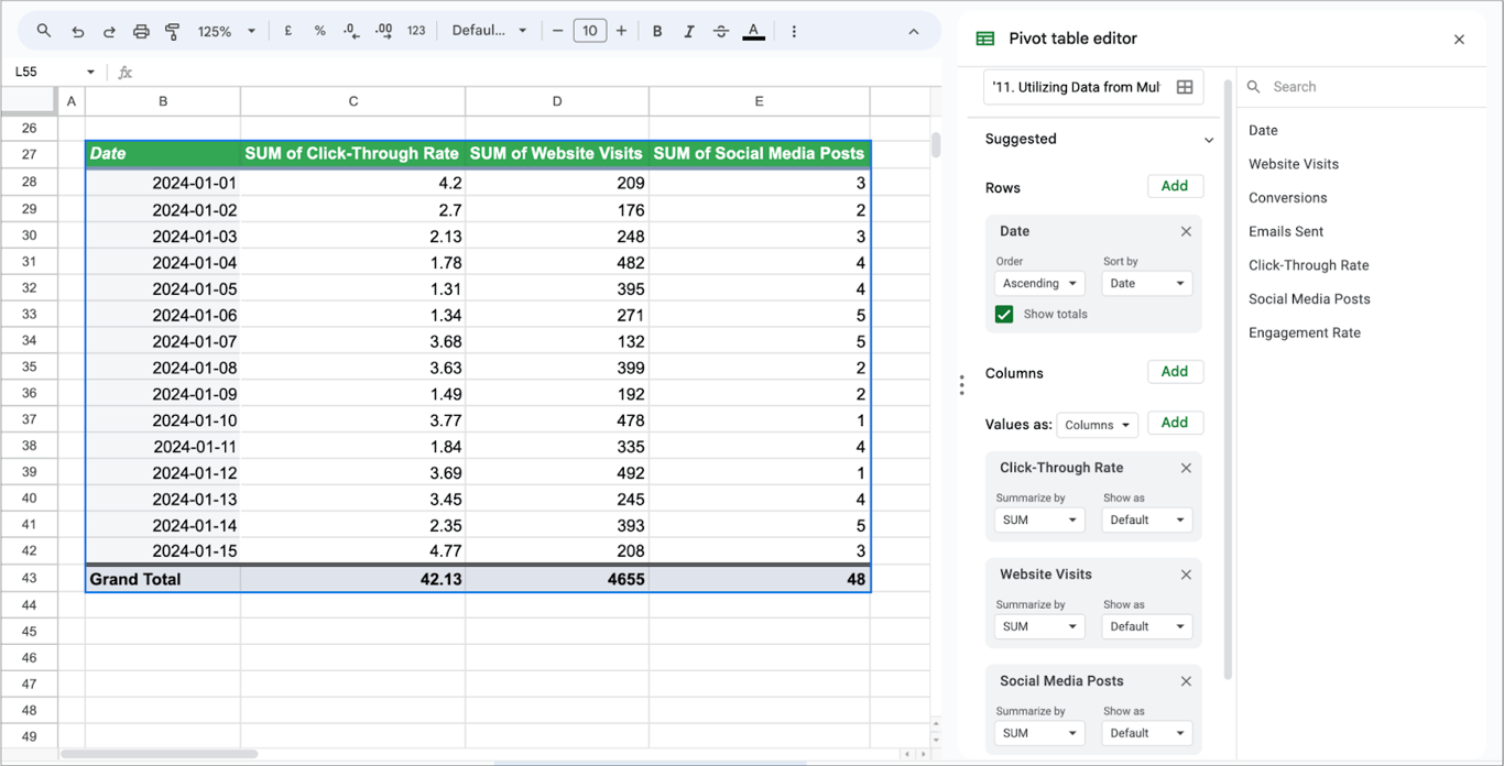
- Select the consolidated data in the master sheet.
- Choose Insert → Pivot table.
- In the pivot table editor, arrange the fields as needed. For example, you might put the date as rows and the different metrics (website visits, click-through rates, engagement rates) as values.
When the tabs have the same columns and you want the rows stacked instead of matched by date, combine them with curly braces and a semicolon, for example ={'January'!A2:D; 'February'!A2:D}, and build the pivot table on the result.

Handling multiple columns in pivot tables
Several number columns can be summarized at once. Take campaign data with the columns Campaign Type, Budget Spent, Clicks and Conversions. Select the data and insert a pivot table.
-
Rows: Add “Campaign Type” to the Rows section. This categorizes the data by the type of marketing campaign.
-
Values: Add “Budget Spent” and “Clicks” to the Values section. This allows you to analyze these metrics for each campaign type.
-
Adjust the settings for “Budget Spent” and “Clicks” to summarize the data appropriately (e.g., SUM, AVERAGE).
-
Add Conversions as a third value.
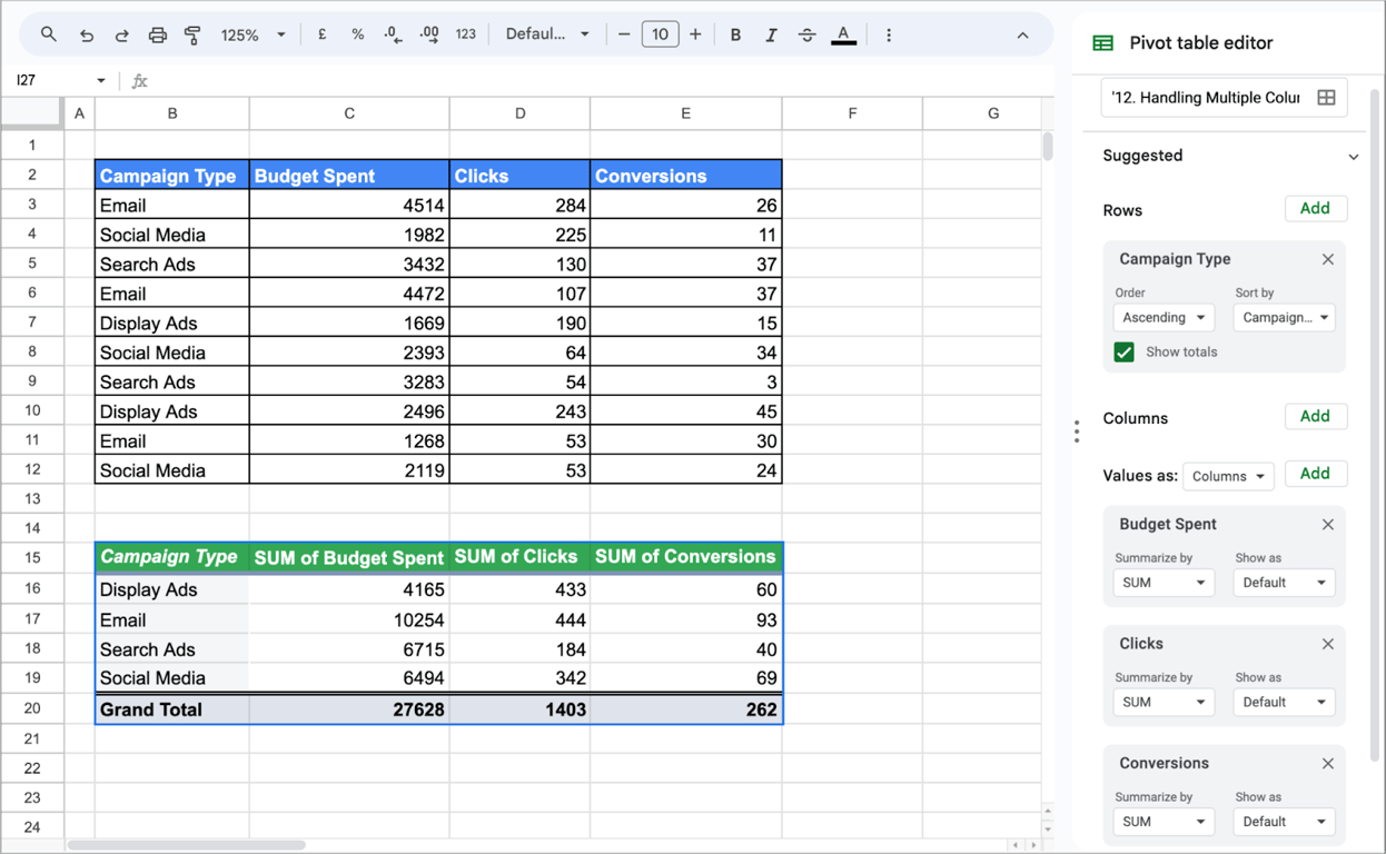
The pivot table shows budget, clicks and conversions for each campaign type in one row, which makes the campaign types easy to compare.
Using COUNT functions in pivot tables
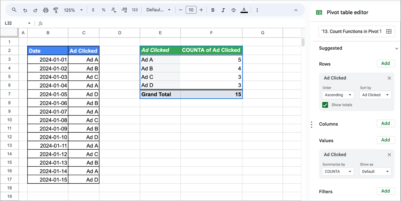
With Summarize by set to COUNTA, a pivot table counts rows instead of adding numbers. COUNTA counts every non-empty cell, so it also works on text; COUNT counts only numbers. See our guide to the count functions for the difference.
To see how many clicks each ad received, with one row per click in the source data, add the ad to Rows and to Values, summarized by COUNTA:
Using pivot table slicers
A slicer is a filter that sits on the sheet as a button. Readers of the report can change it without opening the pivot table editor, and one slicer can control several pivot tables and charts built on the same data.
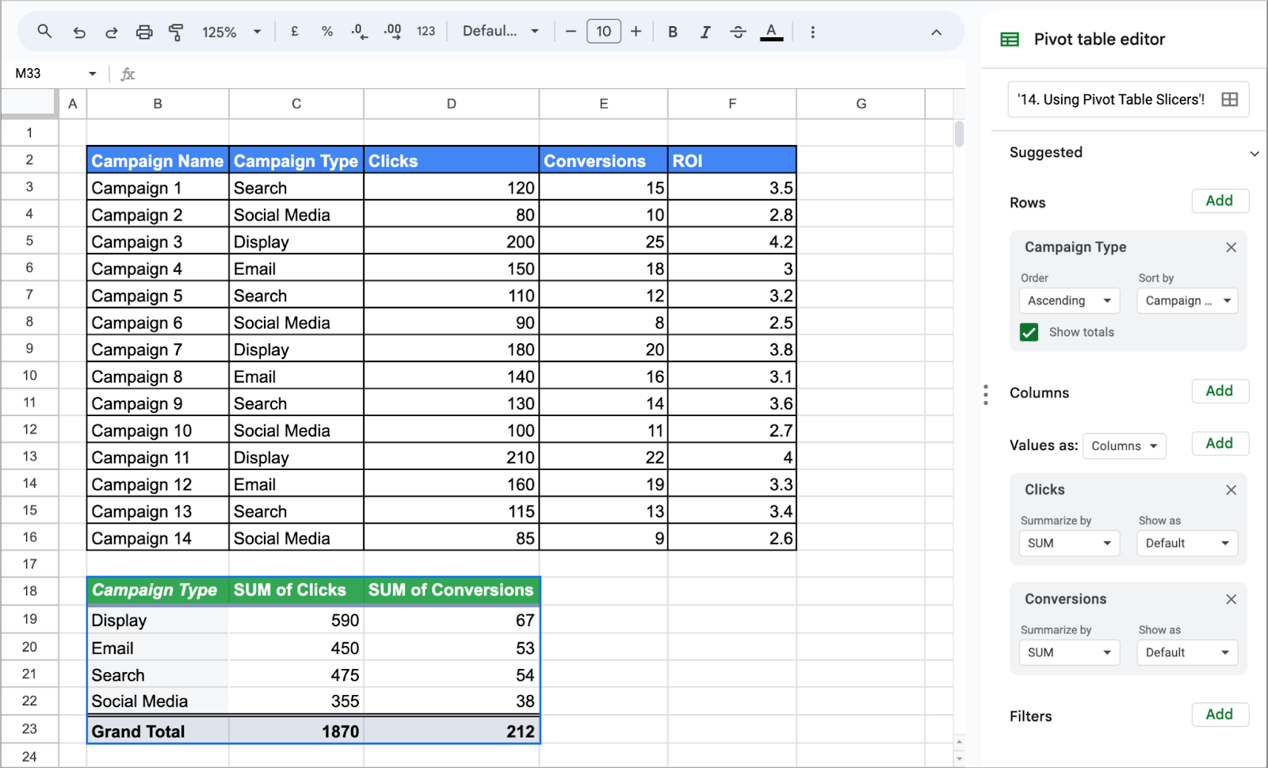
1. Create the Pivot Table:
- Select your dataset.
- Choose Insert → Pivot table.
- Set up the pivot table with relevant rows, columns, and values.
2. Add Slicers:
- Click anywhere inside the pivot table to activate it.
- In the menu, click on “Data” and select “Add a slicer.”
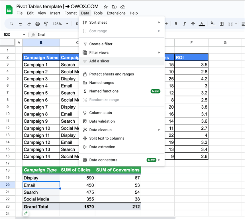
- Choose the variable you want to use as a slicer, in this case, we have selected “Campaign Type.”
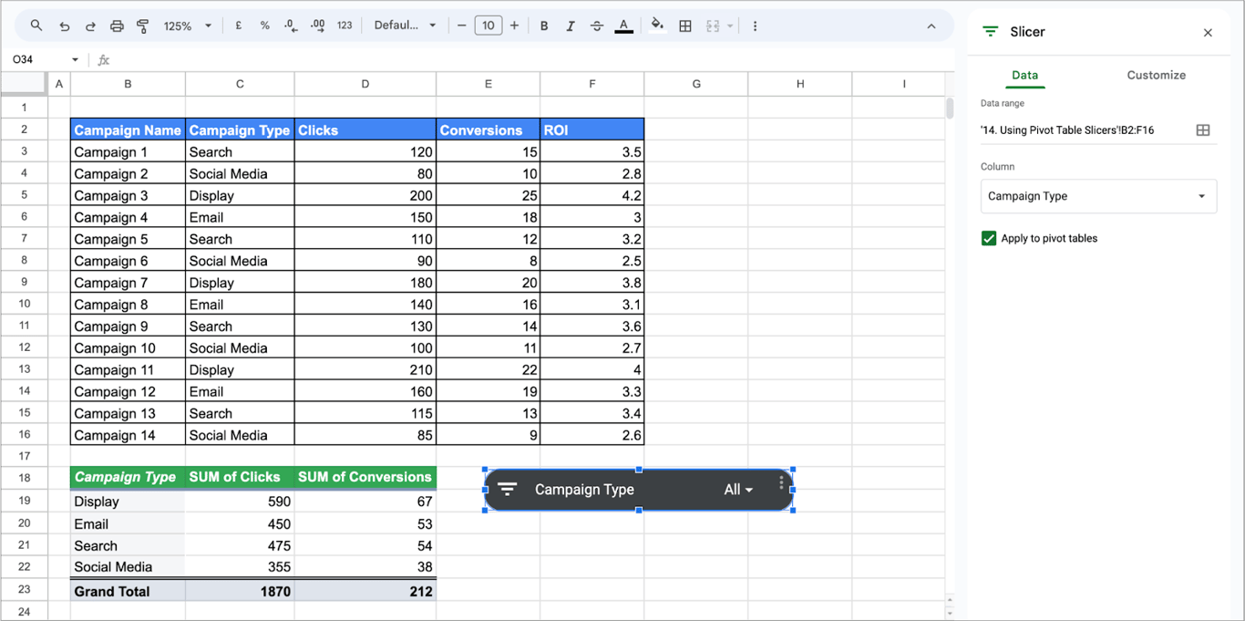
3. Use Slicers for Filtering:
- A slicer control panel will appear on your sheet.
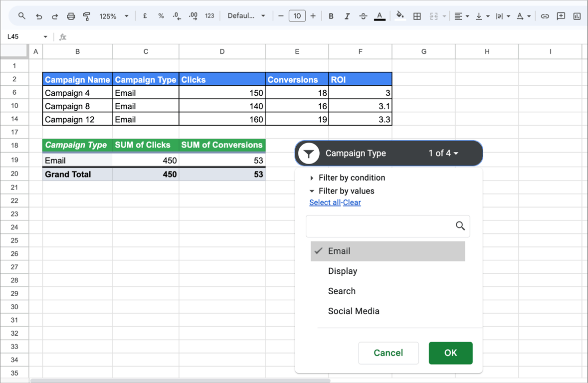
- Click on a specific campaign type in the slicer panel.
- The pivot table will instantly update to display data only for the selected campaign type.
💡 To filter with a formula instead, see our guide to the FILTER function.

Creating dynamic ranges in pivot tables
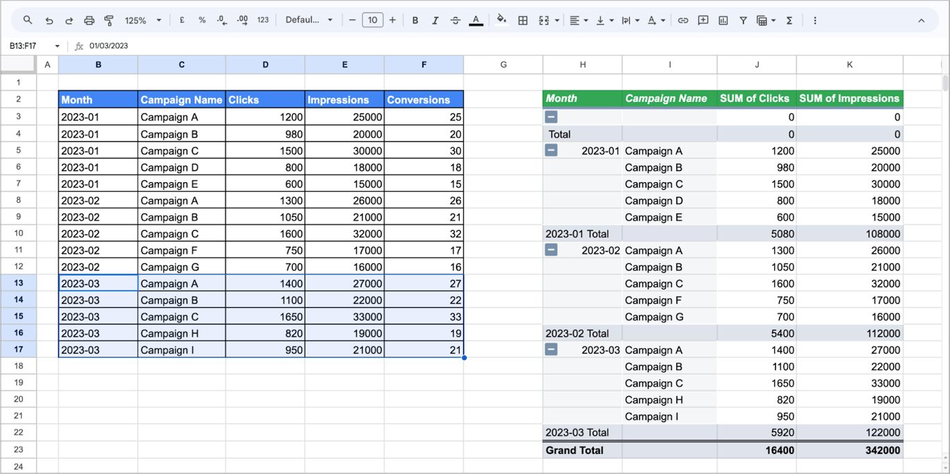
An open-ended range lets a pivot table pick up new rows without any editing. Take a monthly marketing report that gets new campaign rows every month.
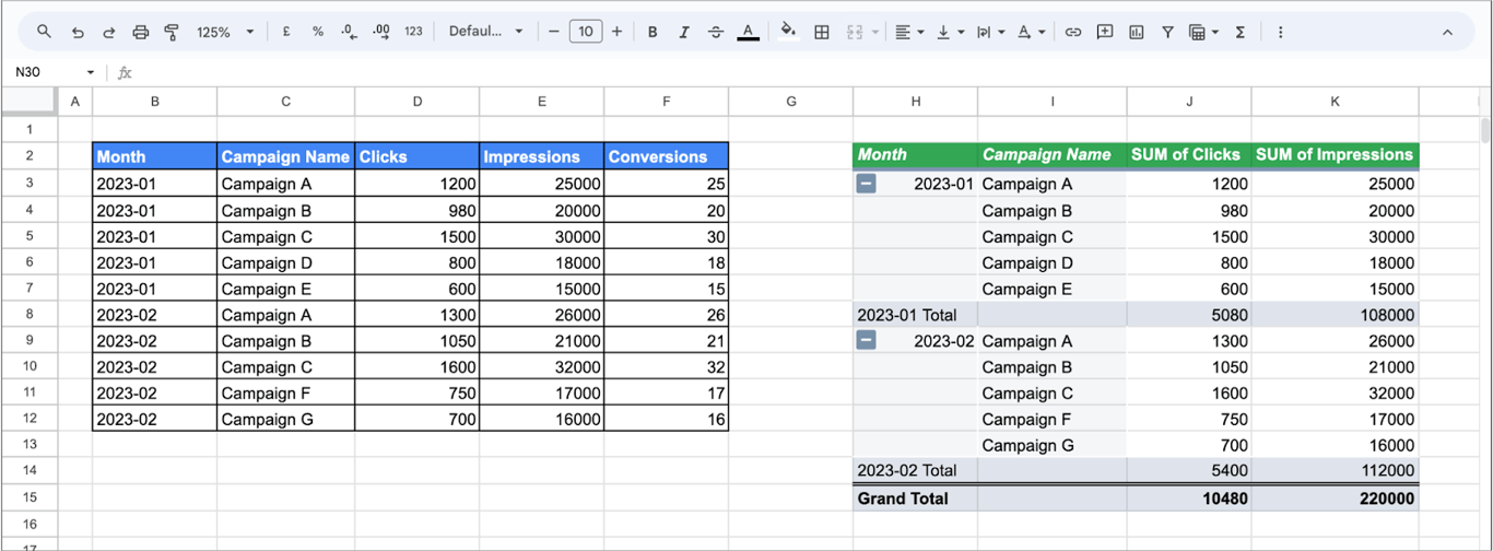
Click the pivot table and, at the top of the editor, change the range from B2:F12 to B2:F. Without a row number at the end, the range reaches to the bottom of the sheet.
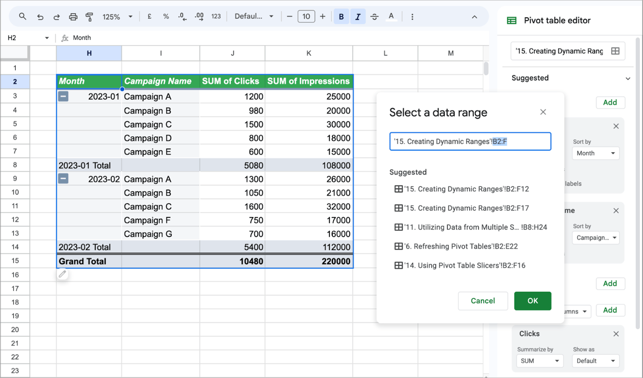
Rows added later are included automatically:
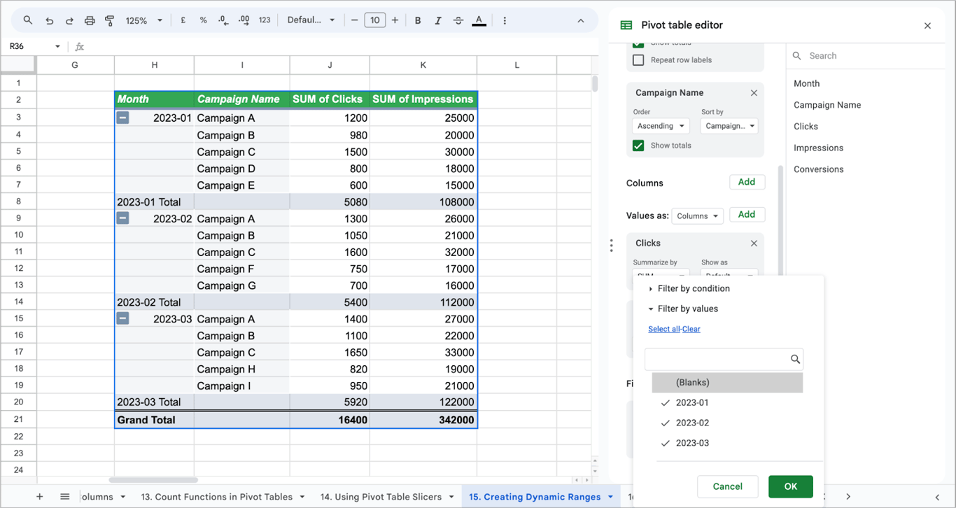
Tip: An open range also includes the empty rows below the data, which show up as a blank row in the pivot table. To hide it, click Add next to Filters, choose the row field and untick (Blanks).
Handling text values in pivot tables
Text fields are what a pivot table groups by: product names, categories, sales reps. Take a sales dataset with the columns Product Name, Sales Rep and Units Sold.
- Rows: Place “Product Name” in the rows section to list all products.
- Columns: Add “Sales Rep” to the columns section to see sales by each salesperson.
- Values: Place “Units Sold” in the values section to calculate the total units sold.

In Rows and Columns, text works without any setup. In Values, a text field can only be counted (COUNTA or COUNTUNIQUE), because there is nothing to add up.
Conditional formatting in pivot tables
Conditional formatting makes high and low values stand out. Take a pivot table of sales by product and sales rep.
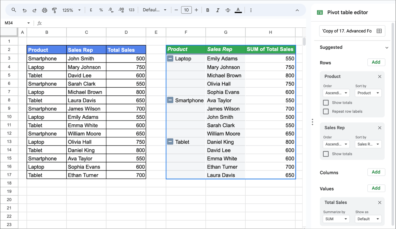
1. Select your pivot table.
2. Choose Format → Conditional formatting.
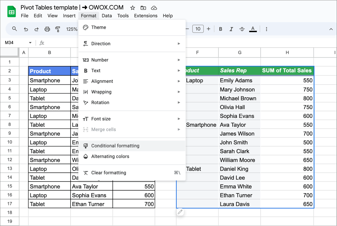
3. Check the range the rule applies to (here H3:H17).
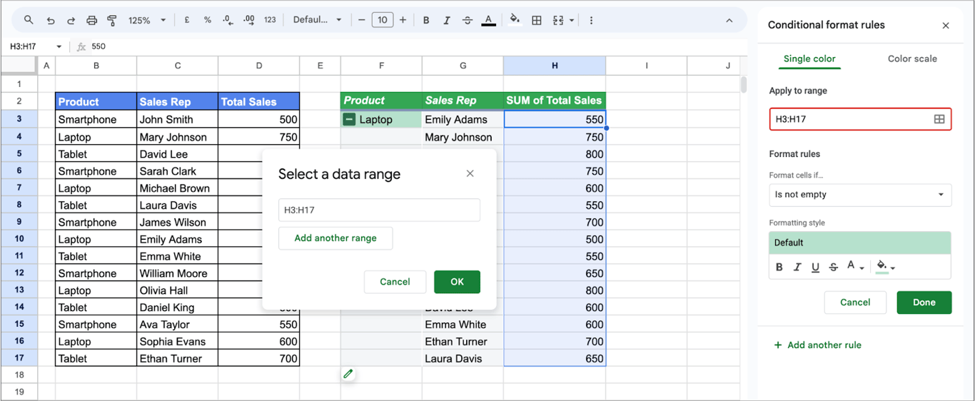
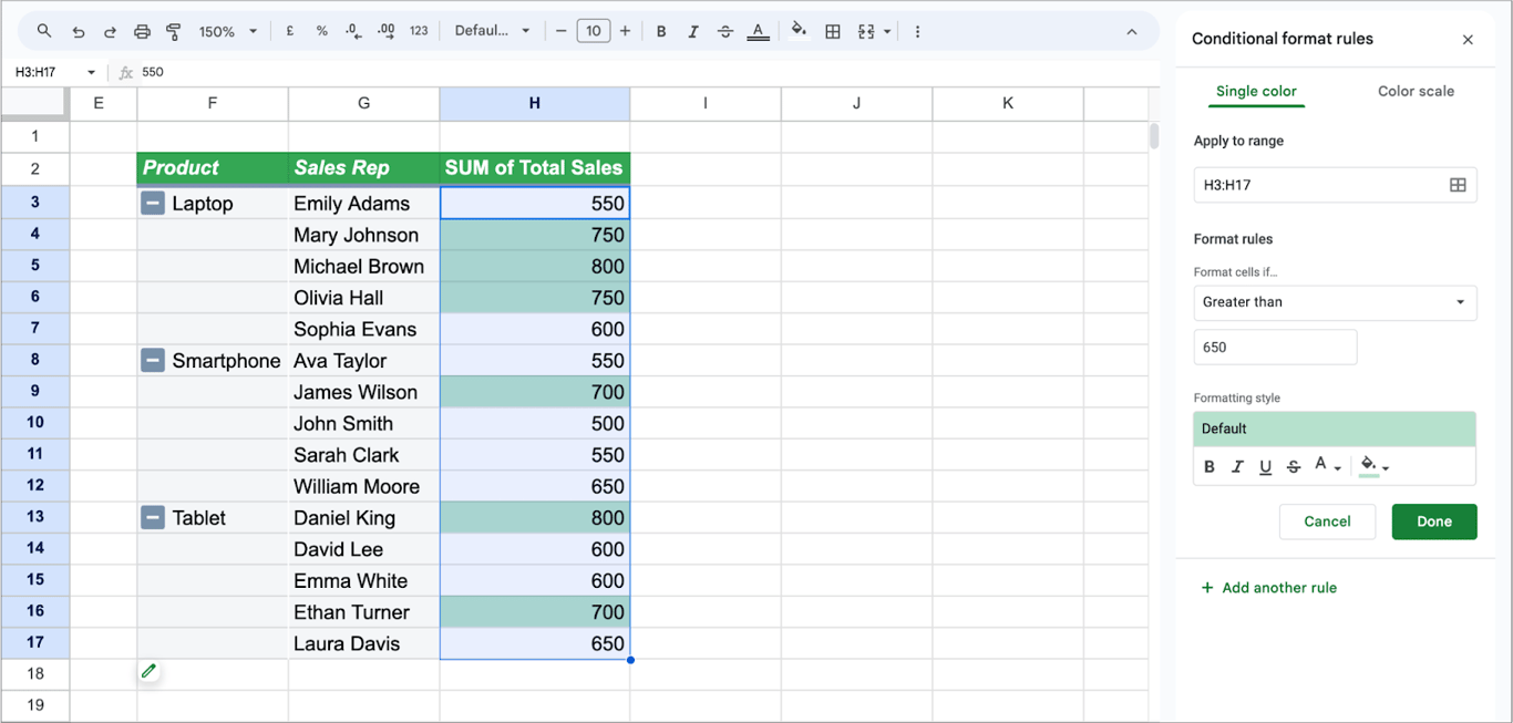
4. Under Format cells if…, choose a condition.
- Here the condition is Greater than with the value 650, which highlights every cell above 650.
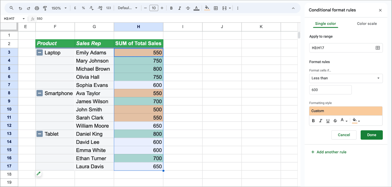
- To mark low values as well, click Add another rule and use Less than.
The Color scale tab of the same panel shades the cells from low to high instead of using fixed thresholds.
Removing grand totals in pivot tables
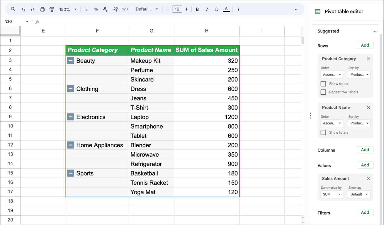
Totals and subtotals can be switched off when they get in the way, for example when the pivot table feeds a chart.
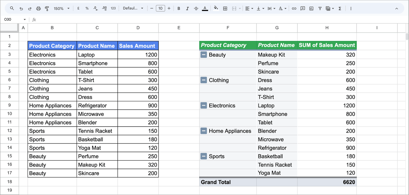
Click the pivot table and, in the editor, untick Show totals under the field in Rows or Columns.
Deleting a pivot table
Deleting a pivot table does not touch the source data.
- Select all the cells of the pivot table.
- Press the Delete key.
If the pivot table is on its own sheet, deleting the sheet does the same.
Common problems with pivot tables
Common problems with pivot tables
New rows are missing
⚠️ Problem: Data was added below the source range, and the pivot table does not show it. ✅ Solution: Open the editor and extend the range, or use an open-ended range such as B2:F so that new rows are always included.
The numbers do not change after an edit
⚠️ Problem: The source data was edited, and the pivot table still shows the old result. ✅ Solution: Pivot tables in Google Sheets recalculate on their own; there is no Refresh command. Check that the edited cells are inside the source range, and reload the page if the sheet is very large. If the source is filled by IMPORTRANGE or another import function, the delay is in the import.
A blank row or column appears
⚠️ Problem: The pivot table has a row or column with no label. ✅ Solution: The source range includes empty rows. Add a filter on the row field and untick (Blanks).
The same category appears twice
⚠️ Problem: “Email” and “email”, or “Email” with a trailing space, are shown as two rows. ✅ Solution: A pivot table groups by exact text. Clean the column in the source data.
Dates cannot be grouped
⚠️ Problem: Create pivot date group is not available. ✅ Solution: The dates are stored as text. Convert the column to real dates.
A ratio is wrong in the totals
⚠️ Problem: A rate column that is summed or averaged gives a meaningless grand total.
✅ Solution: Use a calculated field summarized by Custom, for example =SUM(Conversions)/SUM(Clicks).
The spreadsheet is slow
⚠️ Problem: Pivot tables on very large ranges make the file slow. ✅ Solution: A spreadsheet can hold up to 10 million cells, but it slows down well before that. Remove columns you do not need, pre-aggregate the data, or keep the detail in a data warehouse and bring only the summary into the sheet.
💡 To turn a pivot table into a chart, see our guide to pivot charts in Google Sheets.
Related Google Sheets functions
Related Google Sheets functions
Functions and features that are often used next to pivot tables, each with its own guide:
- XLOOKUP: An improved version of VLOOKUP, providing greater flexibility and modern functionality for data lookup.
- UNIQUE: Filters a data range to eliminate duplicate values, ensuring only unique data points are presented.
- CONCATENATE: Joins two or more text strings into one.
- IMPORTXML, IMPORTHTML and IMPORTFEED: Import data from web pages and feeds into a spreadsheet.
- SEARCH Function: It is used to find the position of a specific substring within a text string. It is particularly useful for data analysis and text manipulation tasks
- Exploratory data analysis: Walks through summarising and visualising a dataset before building reports on it.
- SPARKLINE: Draws a miniature chart inside a single cell.
- SPLIT: Divides the text in a cell into separate columns around a delimiter such as a comma or a space.
A pivot table summarizes whatever is in the range
A pivot table summarizes whatever is in the range
A pivot table is honest about one thing only: it adds up the rows it was given. Whether those rows are complete, current and counted once is decided before the pivot table exists. In most reporting sheets, the range under the pivot table is an export somebody pasted in, and the summary on top of it is presented as if it came straight from the source.
The OWOX Data Marts extension for Google Sheets covers that half. A data analyst publishes a data mart (a table or an SQL query in your data warehouse) and makes it available for reports. In Sheets you open the extension, pick the data mart, tick the columns you want and run it. The rows land in a tab, ready for your formulas.
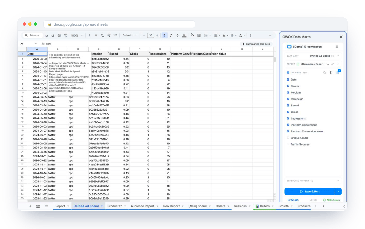
What changes for the person who maintains the sheet:
- Refresh replaces re-export. Refresh current report in the extension menu re-runs the same pull, and a scheduled refresh keeps the tab current without anyone touching it.
- The source is written on the sheet. The header cell of an imported tab carries a note with the data mart it came from, the time of the import and a link to the report.
- No SQL and no warehouse access needed. The analyst decides which data marts and columns are available. You choose from that list.
The extension does not write or change the analyst’s SQL, and it does not replace the pivot table: you still decide how to slice the data. With an open-ended range on the imported tab, a refreshed import flows into the pivot table without anyone touching either. The extension comes with the OWOX Cloud plans of OWOX Data Marts; spreadsheet reporting describes both ways data reaches a sheet.
Turn your data into decisions.
Governed data marts give you the clean foundation ML needs to actually work.
- No AI hallucinations
- Analyst-governed definitions
- Every number traces to SQL
Frequently Asked Questions
Are pivot tables the same in Excel and Google Sheets?
Pivot tables in Excel and Google Sheets share many similarities in functionality, but there are differences in features and interface. Excel offers more advanced features for pivot tables, whereas Google Sheets is simpler and more user-friendly but with fewer advanced options.
How do I get pivot data in Google Sheets?
To get pivot data in Google Sheets, first create a pivot table from your dataset. Then, select the data you want to analyze and drag fields into the row, column, value, or filter sections of the pivot table to display the data as required.
How do I do a pivot table in Google Sheets?
To create a pivot table in Google Sheets, select your data range, go to the "Insert" menu, and choose "Pivot table." You can choose to open a new sheet for the pivot table or select a cell in the current sheet, where you can arrange your data fields into rows, columns, values, and filters to analyze your data.
What is a pivot table used for?
A pivot table is a powerful tool used to summarize, analyze, explore, and present large datasets in a spreadsheet. It allows users to dynamically reorganize and group data, perform calculations like sums and averages, and identify patterns or trends, facilitating efficient data-driven decision-making.