
Types of Charts and Graphs for Data Visualization: A Complete Guide
Find the right chart for your data! Explore visualizations like histograms, line charts, Pareto charts, and more to clarify your data insights.

Data is everywhere, but understanding it? That’s the real challenge. The difference between insight and information often comes down to one thing: how it’s visualized. A well-chosen chart can turn complex data into a clear, actionable message. But use the wrong one, and even the best data gets lost in translation.
This guide dives into the most powerful types of charts and graphs for visualizing data. From simple line charts to advanced Sankey diagrams, readers will learn when to use each format, what it reveals, and how to apply it in real-world dashboards.
What Is Data Visualization?
Data visualization is the process of using visuals, like charts, graphs, and maps, to represent information clearly and effectively. It helps people see patterns, trends, and relationships in data that might be hard to spot in raw numbers.
Even with large or complex datasets, the right visual can make insights easier to understand and share. Whether you're analyzing performance or presenting findings, data visualization turns information into something people can quickly grasp and act on.
What’s the Difference Between a Chart and a Graph?
Charts and Graphs are tools used to visualize data, but they serve slightly different purposes.
A chart is a broad term that includes visuals like bar charts, pie charts, and line charts, often used to compare categories or summarize trends in a simple format.
A graph, on the other hand, typically focuses on relationships between variables, using points or lines to highlight patterns or changes over time. While all graphs are charts, not all charts are graphs. Choosing the right one depends on whether you're explaining categories, trends, or correlations.
21 Most Commonly Used Charts and Graphs for Data Visualization
With so many chart types available, it’s important to choose the one that best fits your data and message. Below are 21 of the most widely used charts and graphs.
Line Charts
A line chart is a type of data visualization that uses a series of data points connected by straight lines. It is commonly used to show the relationship between two variables over a continuous period of time.
When to use Line charts:
- To display how values change over time
- To compare trends across multiple groups or variables
- To highlight increases, declines, or seasonality in your data
Example:
Imagine a marketing analyst reviewing monthly sales data for three product categories, electronics, apparel, and home goods, over the past six months. A line chart visualizes each category’s sales trend side by side.

This makes it easy to identify steady growth in electronics, fluctuations in apparel, and a gradual rise in home goods. It helps the team quickly spot performance patterns and adjust strategies accordingly.
Best practices:
- Ensure the data has a logical order, typically time-based on the x-axis.
- Add context with clear labels, annotations, or reference lines to guide interpretation.
- If the dataset is large, apply transparency, smoothing, or spacing to avoid visual clutter.
Bar Charts
A bar chart is a type of diagram that uses rectangular bars to represent data. The length or height of each bar reflects the value of a specific variable. Bar charts are ideal for comparing categories or tracking changes across groups. They can be displayed vertically or horizontally, depending on the context and clarity needed.
When to use Bar charts:
- To compare values across different categories or groups
- To show the distribution of data at a single point in time
- To highlight standout performers or low performers in a dataset
Example:
Imagine a marketing team analyzing total ad spend across five channels, Google, Facebook, Instagram, LinkedIn, and Twitter, for Q2. A bar chart displays the spend per channel.

This helps make it easy to spot which platform received the largest budget and which is underperforming.
Best practices:
- Clearly label each bar and both axes with meaningful, concise text.
- Limit the number of bars to maintain readability and focus.
- Use color strategically to draw attention to key data points or outliers.
Column Charts
A column chart is a simple yet powerful data visualization that displays values using vertical bars. Each column represents a category, with the height indicating its value. Column charts are widely used in data analytics to show comparisons, rankings, or shifts across categories at a glance.
When to use Column charts:
- To compare values across multiple categories
- To rank items based on performance or frequency
- To highlight trends, peaks, or gaps in a dataset
Example:
Imagine a sales manager reviewing quarterly revenue for five regional teams: North, South, East, West, and Central. A column chart is used to visualize each team’s performance side by side.

A column chart makes it easy to compare performance across regions and quickly spot the highest and lowest-earning teams.
Best practices:
- Minimize visual clutter, such as 3D effects or excessive gridlines.
- Emphasize the most relevant data points for quick insight.
- Use contrasting colors to highlight key columns or outliers.
- Keep axis scaling consistent to avoid misleading visual interpretations.
Pie Charts
A pie chart is a circular chart divided into slices to show the relative proportions of different categories. Each slice represents a part of the whole, with the entire pie equaling 100%. Pie charts are especially effective for displaying percentages or share-based data in a visually simple format.
When to use pie charts:
- To show proportions or percentages of a whole
- When the number of categories is limited (ideally fewer than 6)
- To highlight dominant segments or relative share at a glance
Example:
Imagine a marketing team analyzing the source of website traffic in a given month. A pie chart is created to visualize the percentage of visits coming from Organic Search, Paid Ads, Direct Traffic, Referral Links, and Social Media.

This helps the team quickly understand which channels are performing best and adjust budgets accordingly.
Best practices:
- Keep the number of slices limited to 5–6 to ensure readability.
- Label each slice clearly with either the category name or the percentage.
- Use consistent, distinct colors to help viewers associate each slice with its category.
- Avoid using 3D effects, which can distort the size perception of slices.
💡 Want to turn raw spreadsheet data into clear, visual insights? This guide on Pivot Charts shows you exactly how to create them in Google Sheets to break down complex tables and uncover trends in just a few clicks.


Area Charts
An area chart is a visual tool used to represent quantitative data, similar to a line chart, but with the space under the line filled in. This emphasizes the total magnitude of values over time and is especially effective when showing how multiple categories contribute to a whole.
When to use Area charts:
- To visualize cumulative values over time
- To show how multiple data series contribute to a total
- To highlight trends while emphasizing volume or scale
Example:
Let's assume a sales analyst tracking monthly revenue generated by three product lines, Software, Services, and Hardware, over the first half of the year. An area chart shows how each product line contributes to the total revenue.

This area chart helps make it easy to identify growth patterns and shifting contributions over time.
Best practices:
- Always include a zero baseline to accurately compare values.
- Use multiple data series for comparison, not a single one.
- Limit the number of categories to 2–4 to avoid clutter.
- Use semi-transparent fills to clearly differentiate overlapping areas.
Histogram
A histogram is a type of data visualization that displays how data is distributed across intervals or ranges. It helps you see the shape, spread, and frequency of values in a dataset.
While it may look like a bar chart, its purpose is different; it’s designed to show how data clusters or varies over time or quantity. It’s especially useful for identifying patterns like skewness, gaps, or outliers in numerical data.
When to use Histograms:
- To explore the distribution or spread of numerical data
- To identify patterns, gaps, clusters, or outliers
- To analyze variability within a dataset, such as customer behavior or product engagement
Example:
A marketing team is analyzing the number of email opens based on the time of day the emails were sent. A histogram groups open rates into hourly intervals and shows how many recipients opened emails during each time slot.

This helps pinpoint peak engagement times and optimize future campaign scheduling.
Best practices:
- Choose an appropriate number of bins to balance detail and clarity.
- Use consistent bin widths to ensure accurate comparisons.
- Ensure your dataset is large enough to reflect meaningful distribution patterns.
- Avoid overly wide or narrow bins that can hide important insights.
Scatter Plots
A scatter plot chart displays the relationship between two numerical variables. It uses a Cartesian coordinate system, where each data point is represented by a dot or marker on the chart. The x-axis represents one variable, while the y-axis represents the other variable. By plotting the data points on the chart, you can visually analyze the correlation or pattern between the variables.
When to use Scatter plots:
- To explore relationships between two continuous variables
- To detect trends, correlations, or clusters
- To identify outliers or gaps in the data
Example:
Assume a marketing analyst studying the relationship between monthly online ad spend and e-commerce revenue. A scatter plot maps each month’s spend and corresponding revenue.

The upward trend of the points suggests that as ad spend increases, so does revenue, indicating a positive correlation.
Best practices:
- Add a trend line to emphasize the direction of the relationship.
- Highlight outliers that deviate significantly from the main pattern.
- Use different colors or marker sizes to improve visibility when data points overlap.
- Keep axis scales proportional to avoid distorting the relationship.
Treemap Charts
A treemap is a type of data visualization that displays hierarchical data using nested rectangles. Each rectangle represents a category, and its size is proportional to the value it represents. Treemaps are especially useful for exploring part-to-whole relationships within complex structures.
When to use Treemap charts:
- To visualize hierarchical data in a compact space
- To show part-to-whole relationships at multiple levels
- To compare categories and subcategories in one view
Example:
Imagine a sales team evaluating product performance by category and brand. A treemap displays sales data grouped into three categories, Electronics, Apparel, and Home Essentials, with each category broken down by brand.

At a glance, the manager sees that Apparel is the top category, while Brand X within Apparel drives the highest revenue at the brand level.
Best practices:
- Make sure the rectangle size accurately reflects category or subcategory values.
- Keep labels short and readable to avoid overlap or clutter.
- Use a single color family with gradient shading to show variations clearly
- Avoid too many small subdivisions, which can reduce readability
Heatmap Charts
A heatmap is a data visualization that uses color to represent values within a grid or matrix. Each cell is color-coded based on its magnitude, making it easy to spot highs, lows, and patterns. Heatmaps are especially useful when analyzing performance metrics across two dimensions, like time and category.
When to use Heatmap charts:
- To analyze relationships between two variables (e.g., product vs. time)
- To spot trends, patterns, or anomalies at a glance
- To visualize dense data across categories and time intervals
Example:
Imagine a digital marketing team analyzing hourly ad conversion rates across multiple campaigns. A heatmap is used to visualize how each campaign performs throughout the day, with darker colors indicating higher conversion rates.

This makes it easy to spot peak performance hours, like early evening, and underperforming time slots, helping the team optimize ad scheduling for better results.
Best practices:
- Use a color scale that clearly reflects differences in value (e.g., light to dark).
- Highlight important values or thresholds using bold shades or annotations.
- Leave enough white space around cells to maintain clarity and avoid crowding.
- Keep the color legend visible, so users can interpret the heatmap accurately.
Pareto Charts
A Pareto chart is a combination of a bar chart and a line graph. It displays individual values in descending order as bars alongside a line representing the cumulative percentage. This format helps highlight the most significant factors contributing to a result, aligned with the 80/20 rule, where a few causes often drive most outcomes.
When to use Pareto charts:
- To identify the most significant contributors to a result or problem
- To prioritize actions based on frequency, cost, or impact
- To highlight which categories have the most influence
Example:
Assume a marketing team is investigating why certain digital ad campaigns underperform. A Pareto chart is created to rank the most common issues, such as poor targeting, low CTR, or ad fatigue, based on how frequently they occur across campaigns.

The chart helps the team see that just a few core problems account for the majority of underperformance, allowing them to focus on the most impactful fixes first.
Best practices:
- Always sort categories from highest to lowest impact.
- Use a consistent color for bars and a contrasting color for the cumulative line.
- Add precise labels and a secondary axis for cumulative percentages to improve readability.
Geo Charts
The geo chart is a simple one. It’s used when you need to demonstrate a certain data distribution across regions, countries, and continents. By visualizing data on a map, a geo chart provides a clear and intuitive way to understand spatial patterns and user behavior.
When to use Geo charts:
- To visualize how a variable (e.g., sales, traffic, sign-ups) varies by region
- To identify top-performing or underperforming locations
- To uncover regional patterns that might affect business decisions
Example:
A global sales team is reviewing Q1 revenue by country. A geo chart in Google Sheets allows them to see which regions performed best.

Darker colors highlight higher sales, revealing top markets like the U.S., Germany, and Japan at a glance.
Best practices:
- Choose a map projection that suits your audience and dataset (e.g., U.S., world, continent-specific).
- Use a gradient color scale to clearly show data magnitude across regions
- Keep borders, tooltips, and labels readable to enhance user understanding
- Avoid using too many similar shades – contrast is key for clarity
Waterfall Charts
A waterfall chart is a visual tool that breaks down how a starting value increases or decreases through a series of contributing factors. Each step in the chart shows a positive or negative change, making it easy to track the flow toward a final total. Its cascading shape gives it the name "waterfall."
When to use Waterfall charts:
- To show how different factors contribute to a total
- To explain increases and decreases in performance metrics
- To visualize the impact of sequential changes over time or by component
Example:
Imagine a marketing team analyzing how different campaign channels contributed to total revenue in a quarter. A waterfall chart shows how starting with zero, each channel, Email, Paid Ads, Social Media, and Influencer Campaigns, adds or subtracts from the revenue total.

This waterfall chart makes it easy to see which marketing efforts contributed most to overall revenue.
Best practices:
- Use different colors for positive and negative bars to enhance clarity.
- Add clear labels at each step to explain value changes.
- Keep axis scaling consistent to accurately show impact.
- Begin with an initial value and logically build toward the total.
Donut Charts
A donut chart is a circular chart with a hole in the center that displays how categories contribute to a total. Compared to a pie chart, it offers better readability and more space for labeling, especially when dealing with several categories.
When to use Donut charts:
- To show how multiple parts make up a whole
- To compare category proportions in a clean, visual format
- To simplify complex data in dashboards or reports
Example:
Imagine a marketing team reviewing where their monthly leads came from. A donut chart is used to represent lead sources, such as Web Forms, Live Chat, Social Media, Events, and Referrals.

This helps the team identify their strongest lead generators at a glance and assess channel performance.
Best practices:
- Limit categories to 6–7 for clarity.
- Use distinct, meaningful colors to represent each source.
- Include percentages or values for each segment to provide context.
- Avoid visual effects that could distort proportions.
Funnel Charts
A funnel chart is a visual representation that shows how data flows through different stages of a process. It starts wide at the top and narrows down, making it easy to see drop-offs or conversions at each step. This format is especially useful for understanding progression or attrition in sales or marketing pipelines.
When to use Funnel charts:
- To show how data narrows through stages (e.g., leads to sales)
- To analyze conversion rates at different steps
- To identify where most drop-offs occur in a process
Example:
A growth team is tracking how users move through a website’s subscription journey. The funnel chart shows the number of users at each key touchpoint, from landing on the homepage to finally renewing their subscription.

This makes it easy to see where users are dropping off and which steps need optimization.
Best practices:
- Use at least three clear stages for meaningful comparison.
- Highlight key drop-off points with color or annotations.
- Make sure the funnel widths match the values to avoid misrepresentation.
- Label each stage clearly to help viewers follow the flow.
Bubble Charts
A bubble chart is a variation of a scatter plot that displays three dimensions of data in a single view. The x and y axes represent two continuous variables, while the size of each bubble shows a third variable. This format helps reveal patterns, correlations, and outliers quickly.
When to use Bubble charts:
- To identify relationships or patterns between three numeric variables
- To compare performance across categories in a single view
- To spot clusters, trends, and outliers in large datasets
Example:
Imagine a marketer is comparing performance across multiple ad campaigns. A bubble chart plots click-through rate (CTR) on the X-axis, conversion rate on the Y-axis, and uses budget spend as the bubble size.
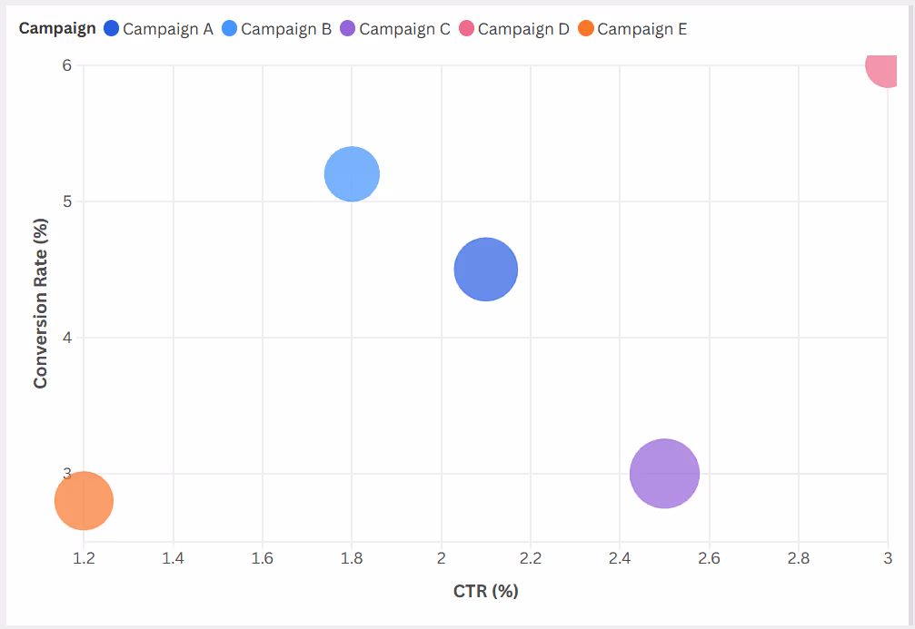
This helps the team quickly identify which campaigns are the most cost-effective performers and which are underdelivering despite high spending.
Best practices:
- Use consistent scaling for bubble sizes to avoid visual distortion.
- Apply transparency or spacing to minimize bubble overlap.
- Always include a legend or labels to explain the meaning of bubble sizes.
- Avoid clutter by limiting the number of categories shown in a single view.
Candlestick Charts
A candlestick chart is a popular financial chart used to display the price movements of an asset over time. Each “candlestick” represents one time period and shows four key values: opening, closing, highest, and lowest price. The body reflects the open-close range, while the thin lines (wicks) show highs and lows, making it ideal for spotting patterns and determining market sentiment.
When to use Candlestick charts:
- To analyze price movement in stocks, currencies, or commodities
- To identify short-term trends and reversal signals in the market
- To support technical analysis in trading or financial forecasting
Example:
A sales-driven tech company is reviewing its stock performance after a major product launch. A candlestick chart displays daily stock price activity over two weeks, helping the leadership team and investors track market reaction.

This candlestick chart helps the team quickly assess market reactions following the product launch, showing both volatility and recovery over the 10-day period.
Best practices:
- Use clear, contrasting colors (e.g., green for bullish, red for bearish) to differentiate price movements.
- Avoid overcrowding with too many technical indicators - keep the chart readable.
- Highlight key trend shifts or price zones with annotations.
- Ensure consistent date intervals for accurate visual flow.
KPI Charts
KPI (Key Performance Indicator) charts are visual tools used to track how well an organization or business process is performing against set goals. They provide a quick overview of progress on key metrics, such as revenue, conversion rate, or retention, making it easier to monitor performance.
When to use KPI charts:
- To track critical business metrics over time
- To monitor real-time progress toward targets or quotas
- To support data-driven decision-making across departments like sales, finance, or operations
Example:
Let’s assume a sales manager wants to evaluate individual performance for April 2025. The data is visualized to show how each salesperson performed against their revenue targets.

This format offers clear insights into who met their goals and who fell short, enabling accurate performance reporting and decision-making.
Best practices:
- Use real-time or regularly updated data to keep charts relevant.
- Limit the number of KPIs to focus on the most impactful metrics.
- Apply color coding to distinguish between met and unmet targets.
- Use a consistent format across dashboards for easier comparison.
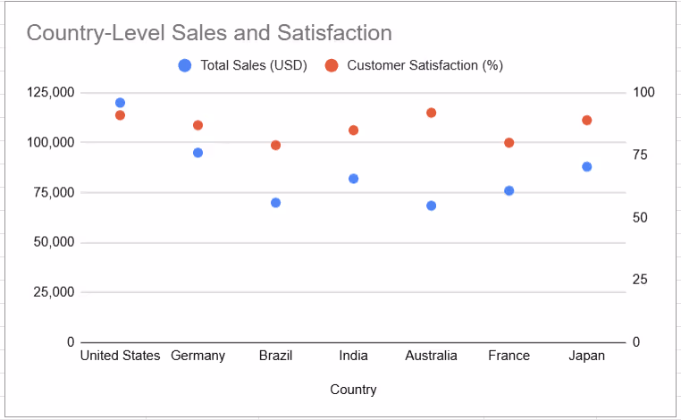
Scatter Maps
A scatter map is a geographic visualization that places individual data points on a map to represent the relationship between variables and their spatial location. Like a scatter plot, each point’s position reflects geographic coordinates, while size, color, or shape can represent additional data variables like volume or intensity.
When to use scatter maps:
- To analyze relationships between variables across different locations
- To identify geographic clusters, gaps, or outliers
- To visualize how business metrics like sales, foot traffic, or delivery time vary by region
Example:
Imagine an international sales team evaluating performance across global markets. A scatter map shows one data point per country, where:
- The size of each bubble reflects the total sales
- The color represents customer satisfaction
Best practices:
- Avoid clutter by limiting the number of data points or zooming in on regions of interest
- Use consistent and meaningful color schemes (e.g., green for high satisfaction, red for low)
- Include a legend that explains what the bubble size and color represent
- Make sure the geographic scale and map projection suit your audience and context
Sankey Charts
A Sankey chart is a flow-based diagram that shows how values move between different categories or stages. The chart uses nodes and links, where the width of each flow is proportional to its value.
When to use Sankey charts:
- To show how multiple values split or merge across different categories.
- To visualize many-to-many relationships, like campaign sources and resulting actions.
- To depict movement or conversion across sequential stages (e.g., funnels, product usage).
Example:
Imagine a digital marketing team analyzing how leads from various traffic sources behave after landing on the website. A Sankey chart is used to map traffic sources (like Organic, Paid, and Email) to the next actions (like Sign-Up, Purchase, or Exit).
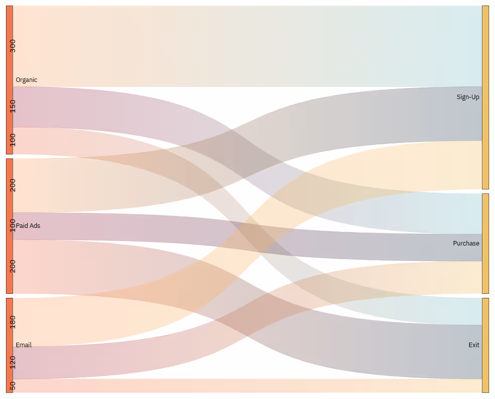
The width of each flow represents the number of users, making it easy to spot where engagement drops and which source drives the most conversions.
Best practices for Sankey charts:
- Ensure the flow width accurately represents the quantity or impact.
- Use clear, contrasting colors for high-importance paths.
- Keep labels concise to avoid clutter.
- Always include at least two dimensions (e.g., Source and Outcome) and one measure (e.g., leads).
Radar Charts
Radar charts, also called spider web charts, display multivariate data in a two-dimensional space using axes that start from the same point. Each axis represents a variable, and the resulting shape formed by connecting the data points allows for quick visual comparisons across multiple categories.
When to use Radar charts:
- To compare performance or attributes across multiple variables
- When you want to identify strengths, weaknesses, or imbalances in a dataset
- Ideal for rating-based data like KPIs, satisfaction scores, or team competencies
Example:
A regional sales manager is evaluating five product categories across multiple sales metrics: monthly revenue, customer satisfaction, return rate, delivery time, and upsell success. A radar chart compares how each product performs across these dimensions.

The radar chart gives the manager a clear visual of strengths and weaknesses across products.
Best practices for Radar charts:
- Use a consistent scale across all axes to ensure valid comparisons.
- Limit to 3–5 entities and 5–8 variables to avoid visual clutter.
- Use different line styles or colors to distinguish each item clearly.
- Avoid using radar charts for large datasets or when precision is required.
Gantt Charts
Gantt charts are specialized bar graphs used to visualize project timelines, schedules, and task progress. Each task is represented by a horizontal bar whose length corresponds to its duration. These charts often include milestones, deadlines, and task dependencies, making them essential for planning and tracking complex projects.
When to use Gantt charts:
- To organize project timelines and clearly map out tasks
- To show the sequence and duration of activities
- To identify dependencies and manage overlapping workflows across teams
Example:
Imagine a sales enablement team planning a product launch campaign. The Gantt chart includes key tasks like asset creation, internal training, email rollout, and launch day.

The Gantt chart provides a roadmap from planning to launch. It helps align teams, manage dependencies, and ensure the campaign stays on schedule.
Best practices for Gantt charts:
- Add milestones: Use markers for key deadlines or deliverables
- Update regularly: Reflect real-time progress to maintain accuracy
- Set realistic timelines: Ensure task durations are achievable and dependencies are clear
- Use color coding: Differentiate task types or teams for better visual clarity
- Highlight critical paths: Identify tasks that directly impact project completion
How to Choose the Right Chart or Graph for Your Data Visualization
The success of any data visualization depends not just on clean design but on strategic choices behind the scenes. Below are six key considerations to guide you in selecting the most effective chart or graph for your dataset.
1. Identify Your Goals
Before choosing a chart, define what you want the viewer to understand or do. Are you showing change, comparing values, or revealing a pattern? Your intent should shape the type of visual you use.
Ask yourself:
- What insight am I trying to highlight?
- Am I explaining, convincing, or comparing?
- Do I want to show a trend, relationship, or distribution?
2. Understand the Data You’re Visualizing
A good visualization starts with a strong idea of the data itself. Explore what the dataset represents, its size, structure, and variability. This helps you choose a chart that supports, not distorts, the insight.
Ask yourself:
- What’s the nature of this dataset?
- Are the values continuous or categorical?
- What patterns or outliers am I looking for?
3. Know Your Audience and Their Expectations
Your audience’s background affects how they read and interpret charts. Executives may want high-level visuals; analysts may want details. Tailor your visuals to their expectations and skill levels.
Ask yourself:
- What is their familiarity with data?
- What decisions will they make using this chart?
- Do they prefer simplicity or detail?
4. Adopt Simplicity and Clarity
Complex visuals don’t impress, they confuse. Use the simplest format that clearly conveys your message. Limit colors, avoid chart junk, and label data precisely to avoid ambiguity.
Ask yourself:
- Is this the clearest way to show the data?
- Are all labels readable and logical?
- Have I removed unnecessary elements?
5. Add Interactivity
Interactive charts let users drill down, filter, or explore trends at their own pace. This increases engagement and reveals deeper insights. Use interactivity where it enhances, not distracts from the message.
Ask yourself:
- Will interactivity help users find answers?
- What filters or drill-down options add value?
- Is the interactivity intuitive for the audience?
6. Combine Charts Carefully
Sometimes, one chart isn’t enough to tell the full story. But mixing chart types can backfire if not done thoughtfully. Use combinations that reinforce each other and avoid visual overload.
Ask yourself:
- Do these charts work together to support the same message?
- Am I using too many formats in one view?
- Would a multi-panel layout be clearer?
Common Mistakes to Avoid in Data Visualization
Even well-intentioned visuals can fall short if they're designed poorly or interpreted incorrectly. Let’s look at frequent data visualization mistakes and how to avoid them clearly and confidently.
Choosing the Wrong Type of Chart or Graph
⚠️ Mistake: Using a chart that doesn’t match your data’s purpose, like using a pie chart for time-based trends or a line chart for unrelated categories – can confuse viewers and obscure insights.
✅ Solution: Match your chart to the story you want to tell. Use bar or column charts for comparisons, line charts for trends, scatter plots for relationships, and pie charts only for simple part-to-whole visuals.
Overdesigning Your Chart
⚠️ Mistake: Adding too many visual elements – like gradients, shadows, 3D effects, or dozens of colors – can overwhelm the viewer and hide what matters.
✅ Solution: Keep charts clean and minimal. Stick to 2–3 key colors, avoid decorative elements that don’t add meaning, and focus on readability. A simple, well-labeled chart is always more effective than a flashy one.
Misleading with Scale and Axis Manipulation
⚠️ Mistake: Altering axis scales, using inconsistent intervals, or starting the y-axis above zero can exaggerate trends and misrepresent the data.
✅ Solution: Use honest and consistent scales across your charts. Always start bar chart axes at zero, and clearly label any non-linear or logarithmic scales if used. Visual integrity should always come before impact.
Ignoring Data Context and Background
⚠️ Mistake: Presenting data without explaining its source, scope, or influencing factors can lead to false assumptions or incomplete understanding.
✅ Solution: Provide context alongside your visuals. Include time ranges, benchmarks, or relevant comparisons. Add brief annotations or captions to clarify what the data includes and what it leaves out.
Manipulating Axes or Scale in a Misleading Way
⚠️ Mistake: Intentionally compressing or expanding axes to distort the visual impression can mislead viewers and damage credibility.
✅ Solution: Maintain proportional and clearly labeled axes. If you're zooming in or applying a unique scale for clarity, make it obvious to the viewer and explain why it’s done.
Presenting Data Without Sufficient Context
⚠️ Mistake: A standalone chart without titles, legends, or data labels often leaves viewers unsure of what they’re looking at or why it matters.
✅ Solution: Always include enough context to guide interpretation – titles that explain the insight, clear legends, labeled axes, and source notes when relevant. The viewer should never have to guess.
Overlooking Accessibility in Visual Design
⚠️ Mistake: Charts that rely only on color, use low-contrast palettes, or lack alternative text aren’t usable for viewers with visual impairments or color blindness.
✅ Solution: Use color-blind–friendly palettes, combine colors with shapes or textures for differentiation, and provide alt text or summaries for all charts. Accessibility improves clarity for everyone, not just those with impairments.
Visualize Your Data with OWOX: Reports, Charts & Pivots Extension for Google Sheets
The OWOX: Reports, Charts & Pivots extension turns your Google Sheets into a full-featured reporting tool. With just a few clicks, you can create interactive charts, build pivot tables, and track KPIs, all without leaving your spreadsheet. It’s designed to help analysts and marketers work faster and smarter. No more manual updates or clunky exports.
Whether you're building dashboards, monitoring performance, or preparing reports, OWOX makes data visualization simple and scalable. You can generate waterfall charts, Pareto visuals, and dynamic funnels directly in Sheets. Plus, it connects with multiple data sources for real-time updates. It’s everything you need to make data-driven decisions right where your data lives.
Frequently asked questions


Finally, a tool that doesn't ask business users to learn a new dashboarding UI. Our marketing team already knows Sheets. OWOX just delivers the right data.
Joinable data marts concept was the thing that sold us. We can now use the semantic layer without building one.
Self-hosted the OSS version on Digital Ocean. Zero vendor lock-in. Contributed a Shopify connector back in week two.