Pivot charts in Google Sheets: how to make a chart from a pivot table
Google Sheets has no separate pivot chart type: a pivot chart is a regular chart whose data range is a pivot table. Build the pivot table, select it and click Insert > Chart. This guide shows the steps, how to keep the Grand Total out of the chart, how to make the chart pick up new rows, and how to filter it with slicers.
To make a pivot chart in Google Sheets:
- Select the data and click Insert > Pivot table.
- In the pivot table editor, add the fields to Rows, Columns and Values.
- Select the pivot table and click Insert > Chart.
Sheets has no separate “pivot chart” object, as Excel does. The result is a regular chart whose data range is the pivot table. That has two consequences. The chart follows the pivot table: change the fields or the source data, and it redraws. And the chart has no field controls of its own: what it shows is decided in the pivot table editor, and filtering is done with the pivot table’s filters or with slicers.
Make a pivot chart step by step
Make a pivot chart step by step
Step 1: Insert a pivot table
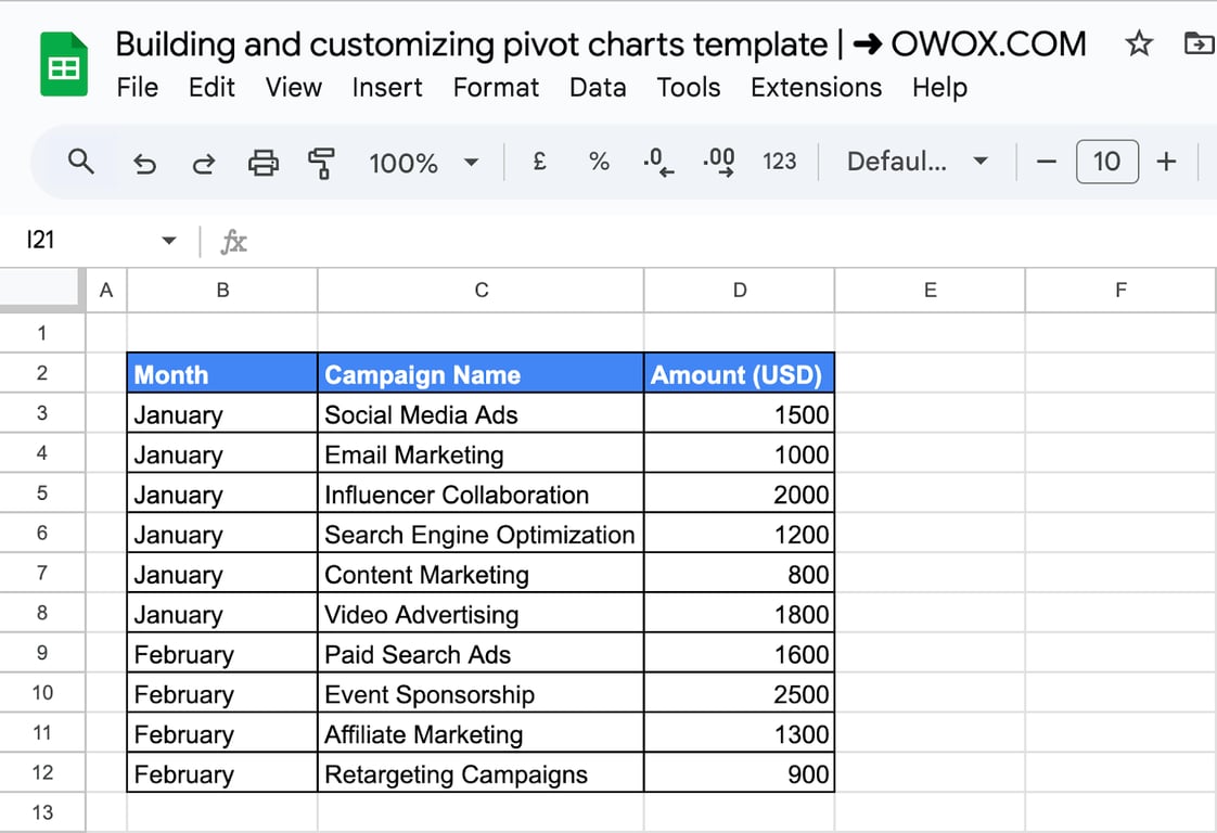
The example is a table of campaign costs in B2:D12: the month, the campaign name and the amount.
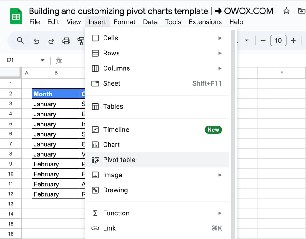
Select the table with its headers and click Insert > Pivot table.
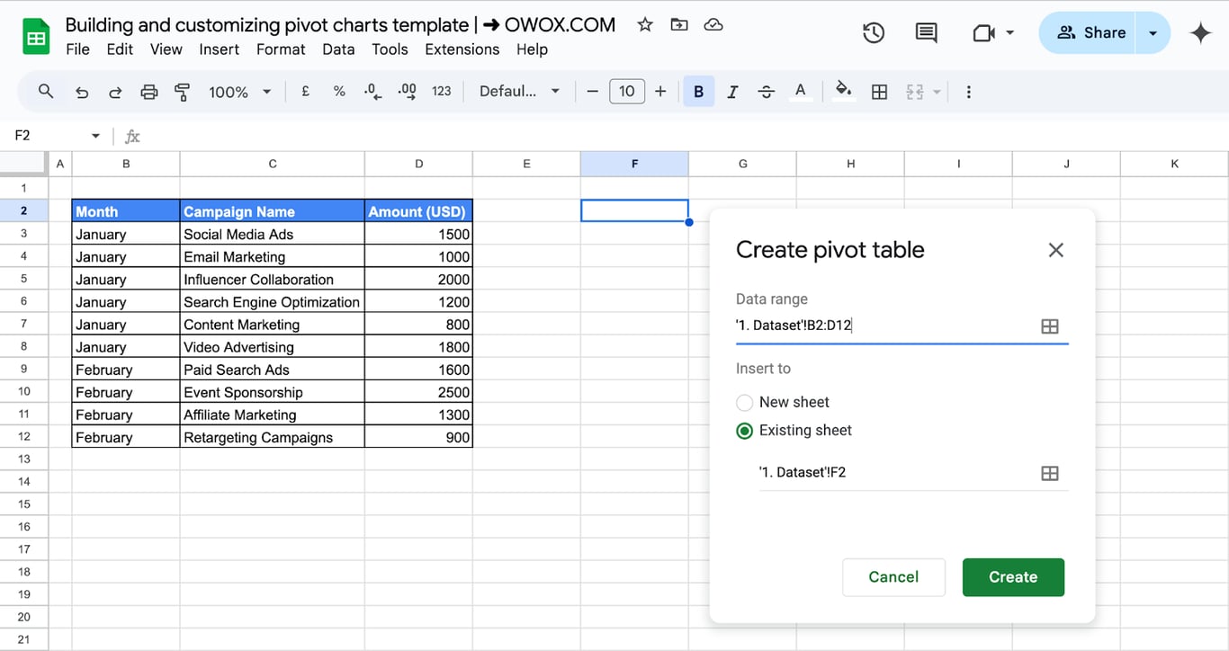
Choose where to put it. A new sheet keeps things tidy; here it goes on the same sheet, starting at F2, so that the data, the pivot table and the chart are visible together.
Step 2: Add rows, columns and values
In the pivot table editor on the right, click Add next to Rows and choose Campaign Name. Each campaign becomes a row.
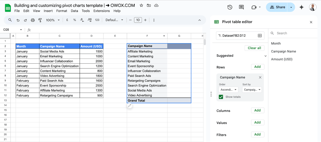
Add Month to Columns to split the amounts by month, and Amount (USD) to Values, summarized by SUM.
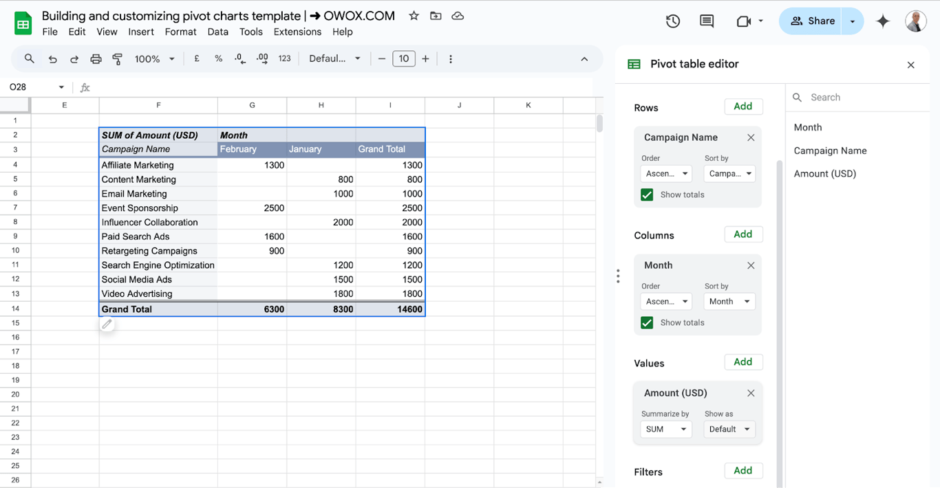
Each field in Rows becomes a label on the chart axis, and each column of numbers becomes a series. A pivot table with one or two row fields and a handful of columns makes a readable chart; anything larger is better split into several.
Step 3: Insert the chart
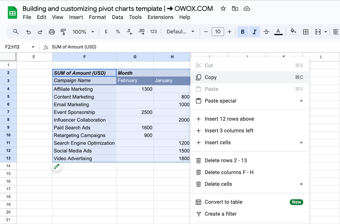
Select the pivot table and click Insert > Chart.
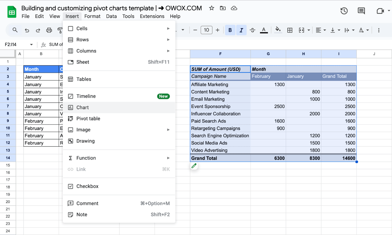
Sheets draws a chart from the selected range and opens the chart editor.
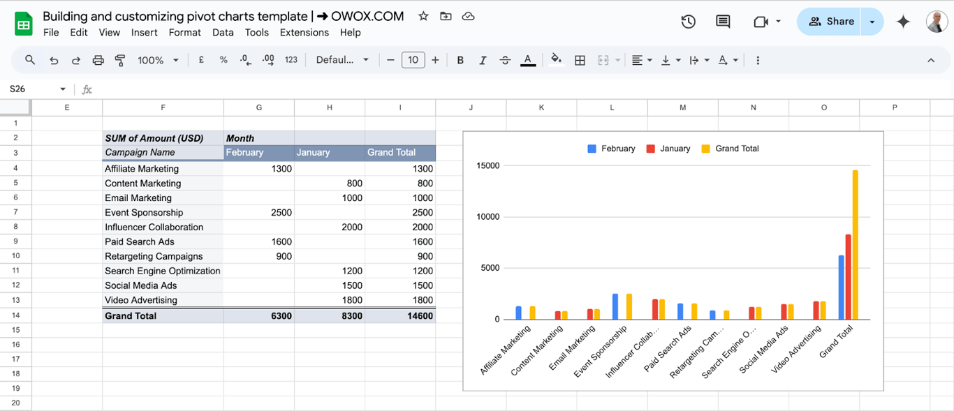
The first result usually needs one correction: the totals.
Keep the grand total out of the chart
Keep the grand total out of the chart
The Grand Total row and column are part of the pivot table range, so they are plotted like any other value. The total bar is far taller than the rest and flattens the chart. There are two ways to remove it.
Switch the totals off in the pivot table. In the pivot table editor, untick Show totals under the Rows field and under the Columns field.
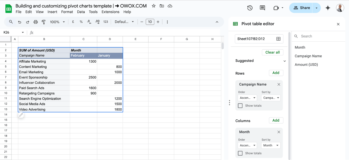
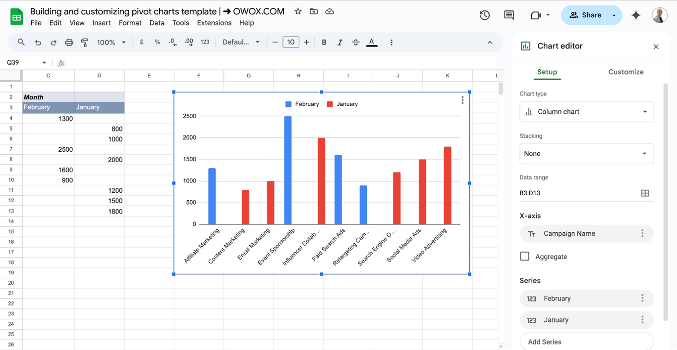
Or keep the totals in the table and shorten the chart range. Double-click the chart, open Setup and edit Data range so that it ends one row above and one column before the totals.
If the totals are useful on the sheet but not in the chart, a common arrangement is two pivot tables: copy the pivot table, paste it on another tab, switch the totals off in the copy and build the chart on the copy.
OWOX Data Marts
See your first report built in real time. 15 minutes.
- Connect your data warehouse
- Pick your metrics
- Get a live Google Sheets report
In the time it takes to write a ticket. Then imagine never writing that ticket again.
Book a DemoWe'll use your actual use case
Choose the chart type
Double-click the chart and pick the type under Setup > Chart type.
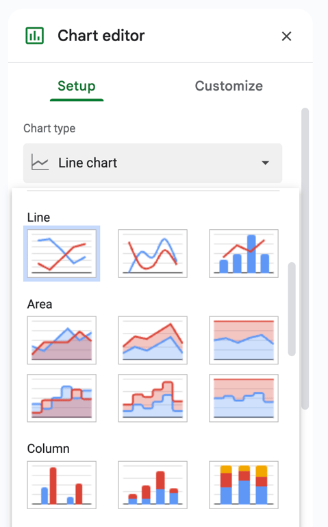
- Column or bar: compare categories; the default for most pivot tables.
- Stacked column: a pivot table with a field in Columns, to show the parts of each total.
- Line: a pivot table with dates or months in Rows.
- Pie: only for a pivot table with one column of values.
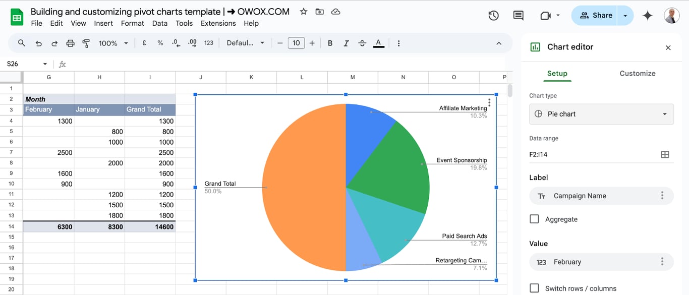
A pie chart plots a single series. Built on a pivot table with several month columns, it shows only one of them, so use it when the pivot table has one value column. Titles, colors, legend and axes are set in the Customize tab, the same as for any chart; see the guide to charts in Google Sheets.
A pivot chart that grows with the data
A pivot chart that grows with the data
Two ranges decide whether new data reaches the chart: the source range of the pivot table and the data range of the chart.
The pivot table. If it was created on B2:D12 and a row is added in row 13, the pivot table does not see it. Give it room from the start: select extra empty rows when you create it, or edit the range in the pivot table editor.
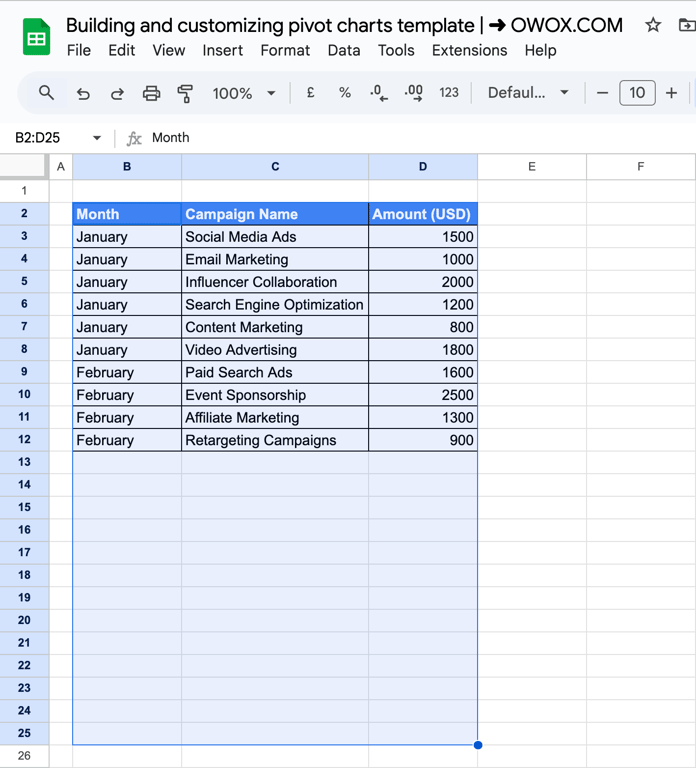
The empty rows appear in the pivot table as one blank group. Hide it with a filter in the pivot table editor: add the row field to Filters and untick (Blanks).
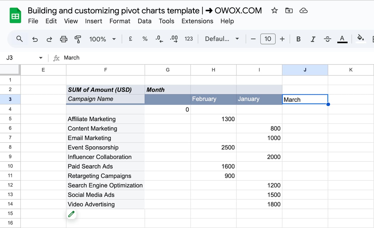
The chart. New rows of the pivot table have to fall inside the chart’s data range as well, and a new month adds a column. Make the chart range larger than the pivot table is today. In the example, the range is extended by one column, with a temporary header typed above it so that the chart accepts the column as a series:
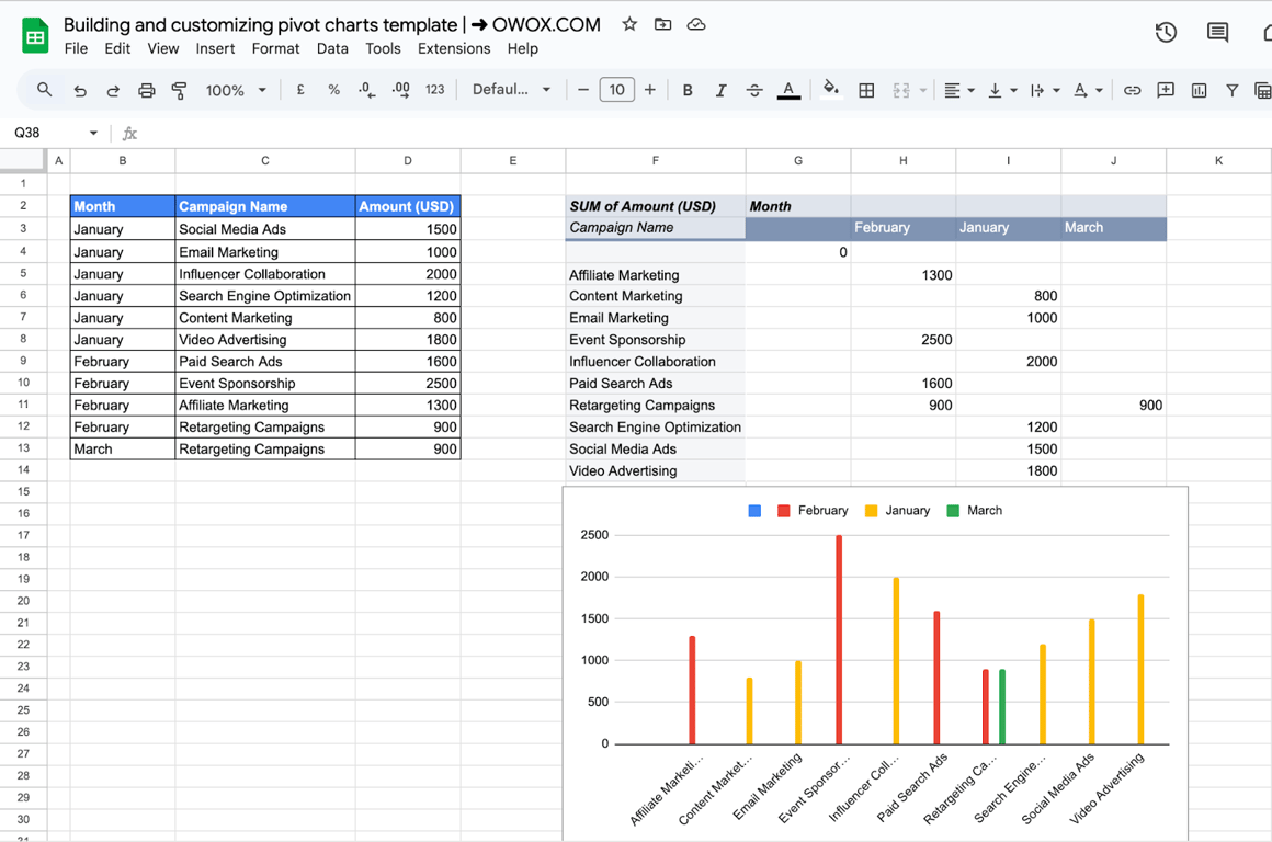
After March rows are added to the source, the pivot table gets a March column and the chart a third series, with no further editing:
Filter a pivot chart
The chart shows what the pivot table shows, so filter the pivot table:
- Filters in the pivot table editor. Add a field to Filters and choose the values to keep. The filter is saved with the pivot table.
- Slicers. A slicer is a filter control on the sheet that readers can use without opening the editor. One slicer filters every pivot table and chart on the sheet that is built on the same data. See the guide to slicers.
Common problems
⚠️ Problem: One bar is many times taller than the others.
✅ Solution: The Grand Total is plotted. Untick Show totals or shorten the chart range.
⚠️ Problem: New data does not appear in the chart.
✅ Solution: Check both ranges: the source range of the pivot table and the data range of the chart. A pivot table in Google Sheets recalculates by itself, there is no Refresh button to press, but only for rows inside its range.
⚠️ Problem: The chart has a bar with no label.
✅ Solution: The pivot table range includes empty rows. Filter out the blanks in the pivot table.
⚠️ Problem: The chart breaks after a field is added to the pivot table.
✅ Solution: The pivot table changed shape and its cells moved or outgrew the chart range. Reselect the range under Setup > Data range. Keep empty space below and to the right of a pivot table that feeds a chart.
⚠️ Problem: The months are in alphabetical order.
✅ Solution: Month names are text. Use a real date in the source and group it by month in the pivot table, or add a month number column and sort by it.
Related guides
- Pivot tables: Rows, columns, values, filters and grouping.
- Pivots and charts: Both in one report.
- Charts in Google Sheets: Chart types and the Customize tab.
- Bar graphs: Stacked bars, labels and error bars.
- Slicers: Filter controls for pivot tables and charts.
- QUERY: A summary table by formula, as another source for a chart.
The chart follows the pivot table, the pivot table follows the rows
The chart follows the pivot table, the pivot table follows the rows
A pivot chart is the end of a chain: source rows, pivot table, chart. The last two links update by themselves. The first one does not: someone has to bring this month into the sheet, in the same columns as last month, and extend the ranges. Most “the chart is wrong” messages are about that first link.
The OWOX Data Marts extension for Google Sheets covers that half. A data analyst publishes a data mart (a table or an SQL query in your data warehouse) and makes it available for reports. In Sheets you open the extension, pick the data mart, tick the columns you want and run it. The rows land in a tab, ready for your formulas.
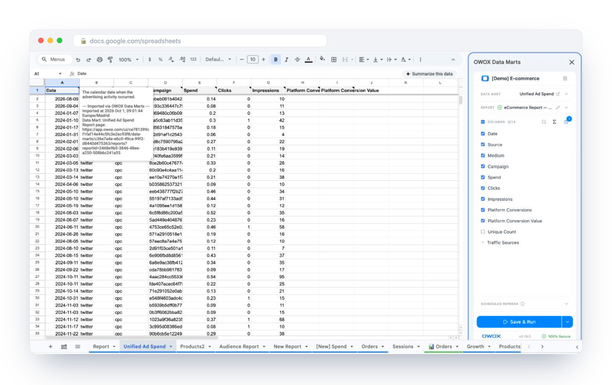
What changes for the person who maintains the sheet:
- Refresh replaces re-export. Refresh current report in the extension menu re-runs the same pull, and a scheduled refresh keeps the tab current without anyone touching it.
- The source is written on the sheet. The header cell of an imported tab carries a note with the data mart it came from, the time of the import and a link to the report.
- No SQL and no warehouse access needed. The analyst decides which data marts and columns are available. You choose from that list.
The extension does not write or change the analyst’s SQL. With the first link automated by the refresh, the pivot table and the chart built on that tab stay current without anyone pasting a new export. The extension comes with the OWOX Cloud plans of OWOX Data Marts; spreadsheet reporting describes both ways data reaches a sheet.
Turn your data into decisions.
Governed data marts give you the clean foundation ML needs to actually work.
- No AI hallucinations
- Analyst-governed definitions
- Every number traces to SQL
Frequently Asked Questions
How do I change the type of chart used for a pivot table in Google Sheets?
Select the chart, go to the chart editor, and choose a different chart type under the "Chart type" dropdown.
What should I do if my Pivot Chart isn’t reflecting changes made in the Pivot Table?
A pivot table in Google Sheets recalculates by itself, so there is nothing to refresh. If the chart does not change, check two ranges: the source range of the pivot table must include the new rows, and the data range of the chart (Setup > Data range in the chart editor) must cover the whole pivot table, including rows or columns it gained.
What are the supported chart types in a pivot chart in Google Sheets?
Supported types include bar, column, line, pie, and scatter charts, each offering unique ways to visualize summarized data.
What are the pros and cons of using a pivot chart?
A chart built on a pivot table summarizes the data without formulas and redraws when the pivot table changes. Its limits come from the pivot table: the chart has no field controls of its own, the Grand Total is plotted unless you switch it off or shorten the range, and a pivot table that changes shape can outgrow the chart's data range.
When should you use a pivot chart?
Use a pivot chart when you need a visual summary of data trends, comparisons, or metrics that update dynamically as your pivot table data changes.