Pivot tables and charts in Google Sheets: from a raw table to a report
A pivot table summarizes a raw table, and a chart shows the summary. This guide walks through the whole path in Google Sheets on one small example: prepare the data, insert a pivot table, use the suggested layouts or build your own, read the result, and turn it into a chart that stays in step with the pivot table.
A pivot table turns rows of raw data into a summary, and a chart turns the summary into a picture. In Google Sheets the path from one to the other takes five steps and no formulas. The example below is a table of seven campaigns with a channel, a start date, a cost and a revenue.
| Step | Where |
|---|---|
| 1. Prepare the table | One header row, one record per row |
| 2. Insert the pivot table | Insert > Pivot table |
| 3. Choose the layout | A suggestion, or Rows, Columns and Values by hand |
| 4. Read the result | Totals by group, plus calculated fields |
| 5. Chart it | Select the pivot rows, Insert > Chart |
Step 1. prepare the table
A pivot table needs a plain list:
- One header row with a unique name in every column. The names become the field names of the pivot table.
- One record per row, with no subtotals, blank rows or merged cells inside the data.
- One spelling per category. “Search” and “search “ are two groups to a pivot table. Clean the column first; see TRIM and data validation.
- Real numbers and dates. Values stored as text are counted, not summed.
Converting the range to a table is optional and helps: the columns get types, and the table has a name.
Step 2. insert the pivot table
Step 2. insert the pivot table
Select the data, or any cell inside it, and choose Insert > Pivot table. The dialog asks for the data range and for the place of the result. A new sheet is the safe choice: a pivot table changes size as the data changes and overwrites nothing there.
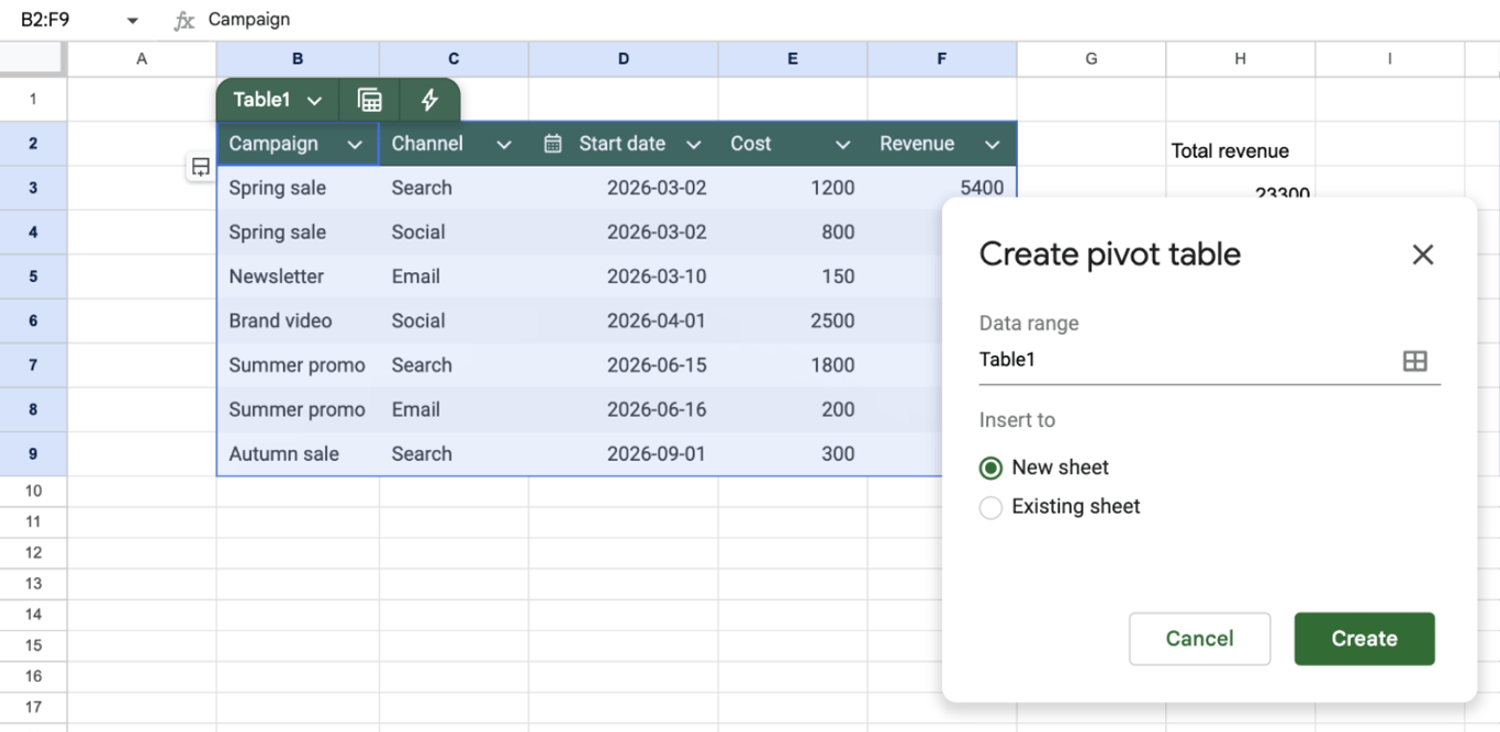
In our file the data was a table, and the dialog offered its name, Table1, as the data range.
OWOX Data Marts
See your first report built in real time. 15 minutes.
- Connect your data warehouse
- Pick your metrics
- Get a live Google Sheets report
In the time it takes to write a ticket. Then imagine never writing that ticket again.
Book a DemoWe'll use your actual use case
Step 3. choose the layout
The new sheet shows an empty pivot table and the editor on the right.
Start from a suggestion
The Suggested section at the top of the editor lists ready layouts that Sheets derives from the columns. For our table it offered “Sum of Cost, Revenue for each Channel”, “Sum of Revenue, Cost for each Channel” and “Sum of Revenue for each Channel”. One click on the first built the whole pivot table:
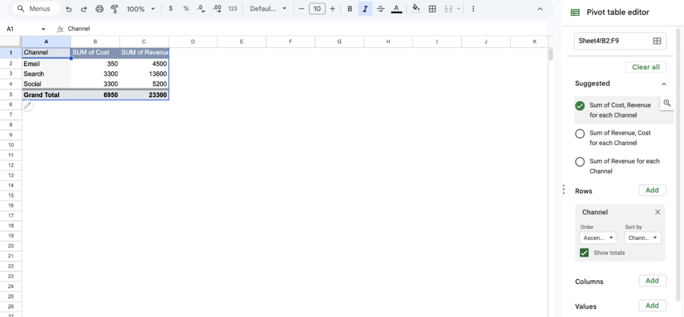
A suggestion is a starting point: after it is applied, the same layout appears under Rows and Values, where it can be changed.
Or build it by hand
The editor has four areas, each with an Add button:
- Rows: the field whose values become the lines of the summary, here Channel. A second field adds a level inside each line.
- Columns: a field whose values become columns, for a cross-table such as channel by month.
- Values: the numbers to calculate, with Summarize by set to SUM, COUNT, AVERAGE, MAX, MIN, MEDIAN and others.
- Filters: conditions that exclude rows of the source from the calculation.
Everything about the editor is in the guide to pivot tables.
Step 4. read the result
| Channel | Cost | Revenue | Revenue per unit of cost |
|---|---|---|---|
| 350 | 4,500 | 12.9 | |
| Search | 3,300 | 13,600 | 4.1 |
| Social | 3,300 | 5,200 | 1.6 |
| Total | 6,950 | 23,300 | 3.4 |
The first two columns of numbers are the pivot table; the last one is what they are for. Search and Social cost the same, and Search brought more than twice the revenue. Email is tiny in cost and by far the most efficient.
To have such a ratio inside the pivot table, add a calculated field. As Google’s help describes it: under Values choose Add > Calculated field, enter a formula over the field names, such as =SUM(Revenue) / SUM(Cost), and set Summarize by to Custom. The ratio is then calculated from the totals of each group, which is the correct way: an average of the row ratios would give another, misleading number.
Step 5. chart it
Select the rows of the pivot table without the Grand Total line and choose Insert > Chart. Sheets picks a chart type and opens the chart editor. For our pivot table it drew a column chart with the two measures side by side for each channel:
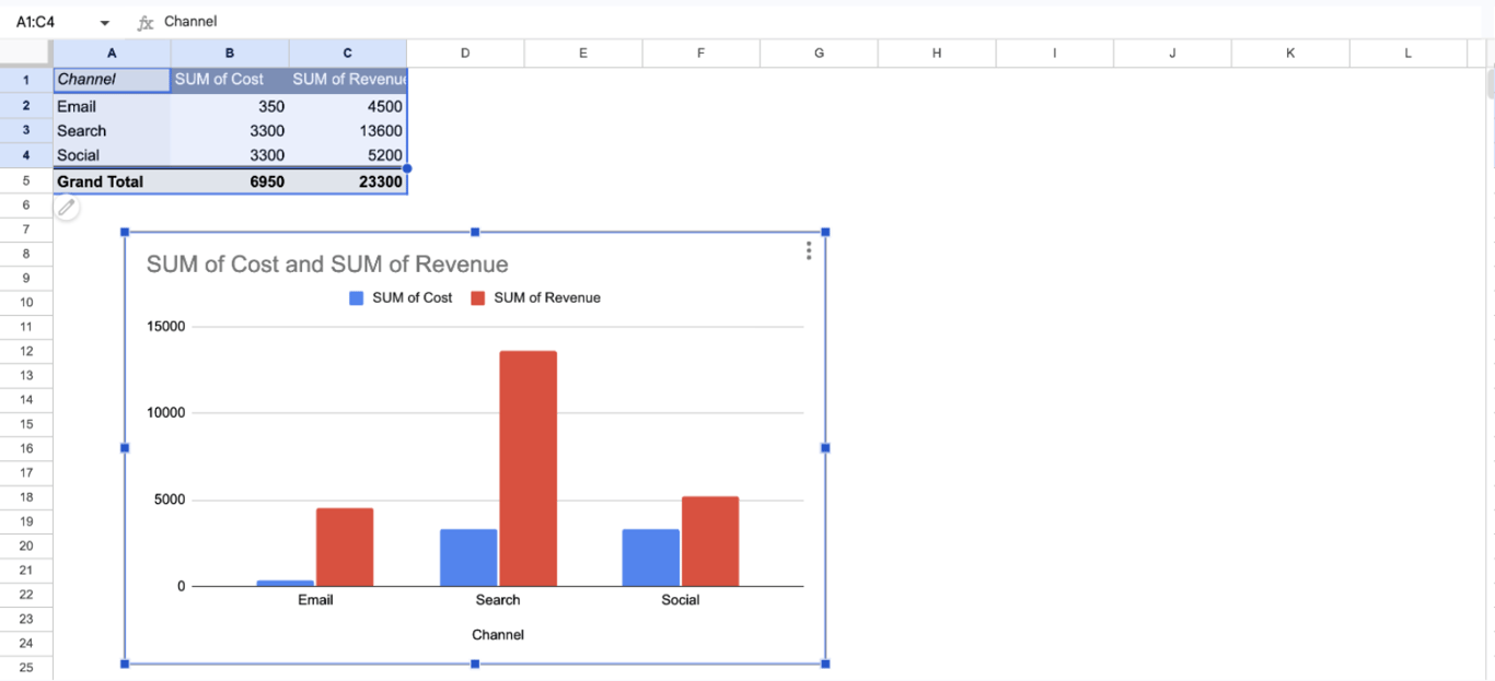
Leave the total out of the selection: as a bar it would be taller than all the others together and flatten them.
In the chart editor, Setup holds the chart type, the data range, the X-axis and the series, and Customize the titles, colors and axes. Which type fits which pivot table:
| The pivot table has | Chart |
|---|---|
| One field in Rows, one or two values | Column or bar chart |
| Dates in Rows | Line chart |
| A field in Rows and another in Columns | Stacked column chart |
| Shares of one total, a few categories | Pie chart |
| Two values to compare for a relation | Scatter chart |
More in pivot charts, charts for visualization and bar graphs.
Keep the report up to date
- Changed values. The pivot table recalculates when the source cells change, and the chart follows the pivot table.
- New rows. The pivot table reads the range it was given. After our pivot table was created, the editor showed the range as B2:F9, so a campaign added in row 10 would be outside it. Check the data range in the editor after adding rows, or give the range without an end row, such as B2:F.
- New groups. A new channel adds a line to the pivot table. A chart whose range ends at the old last line will not show it, so include a few spare rows in the chart range.
- Filters for readers. A slicer on the sheet lets a reader filter the pivot table and its chart without opening the editor.
Problems and fixes
⚠️ Problem: A category appears twice in the pivot table.
✅ Solution: The two spellings differ, often by a space at the end. Clean the source column.
⚠️ Problem: A value shows a count where a sum was expected, or 0.
✅ Solution: The numbers of that column are stored as text. Convert them to numbers, then set Summarize by to SUM.
⚠️ Problem: New data is missing from the pivot table.
✅ Solution: It is outside the data range. Extend the range in the editor.
⚠️ Problem: The chart has one enormous bar.
✅ Solution: The Grand Total is in the chart range. Select the rows without it, or switch off Show totals for the row field.
⚠️ Problem: The chart lost its shape after the pivot table changed.
✅ Solution: The pivot table grew or shrank and the chart range no longer matches it. Edit the data range under Setup in the chart editor.
Related guides
- Pivot tables: The editor, grouping, filters and calculated fields.
- Pivot charts: Charts built on pivot tables.
- Charts for visualization: Chart types and when to use them.
- Slicers: Filters on the sheet for pivot tables and charts.
- Tables: Named, typed ranges as a source.
- QUERY: The same summary as a formula.
- Exploratory data analysis: Where pivot tables fit in a first look at data.
The pivot table is quick; the table under it is the work
The pivot table is quick; the table under it is the work
Once the data is in the sheet, the five steps take minutes. Getting it there is what takes the hours: exports from each ad platform and the CRM, pasted under one another, with columns that have to be matched by hand each time. And the pivot table and its chart show whatever was pasted last.
The OWOX Data Marts extension for Google Sheets covers that half. A data analyst publishes a data mart (a table or an SQL query in your data warehouse) and makes it available for reports. In Sheets you open the extension, pick the data mart, tick the columns you want and run it. The rows land in a tab, ready for your formulas.
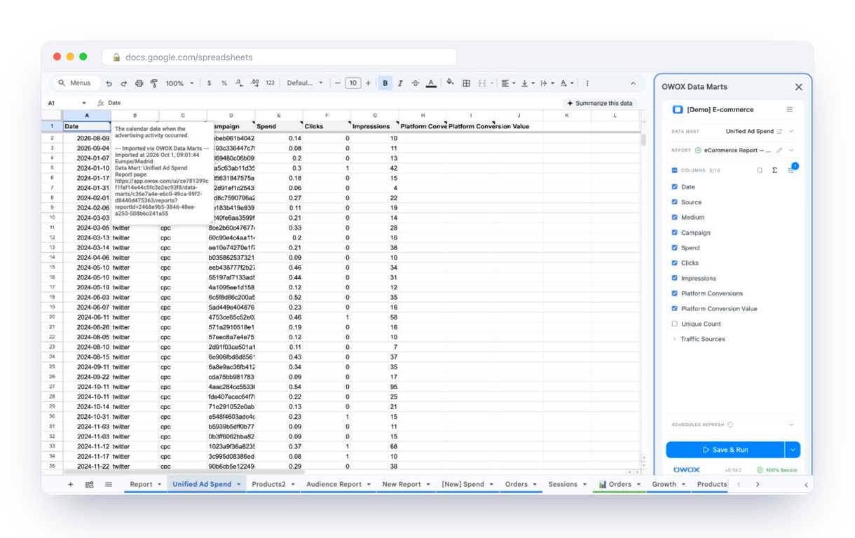
What changes for the person who maintains the sheet:
- Refresh replaces re-export. Refresh current report in the extension menu re-runs the same pull, and a scheduled refresh keeps the tab current without anyone touching it.
- The source is written on the sheet. The header cell of an imported tab carries a note with the data mart it came from, the time of the import and a link to the report.
- No SQL and no warehouse access needed. The analyst decides which data marts and columns are available. You choose from that list.
The extension does not write or change the analyst’s SQL. The pivot table and the chart stay as they are and recalculate on the refreshed rows. The extension comes with the OWOX Cloud plans of OWOX Data Marts; spreadsheet reporting describes both ways data reaches a sheet.
Turn your data into decisions.
Governed data marts give you the clean foundation ML needs to actually work.
- No AI hallucinations
- Analyst-governed definitions
- Every number traces to SQL
Frequently Asked Questions
How do I share a pivot table and its chart with other people?
Share the spreadsheet with the Share button: viewers see the pivot table and the chart, editors can change them. A chart can also be published or downloaded as an image from its three-dot menu, and copied into Google Docs or Slides, where it can be updated from the sheet.
Can I change a pivot table after applying a suggested layout?
Yes. A suggestion only fills in Rows and Values in the pivot table editor. After it is applied, you can add or remove fields, change Summarize by from SUM to COUNT or AVERAGE, add filters and calculated fields, and change the chart type in the chart editor.
What does the data need to look like before I insert a pivot table?
A plain list: one header row with a unique name in every column, one record per row, no blank rows, subtotals or merged cells inside the data, one spelling per category, and numbers and dates stored as real numbers and dates, not as text.
How do I keep a pivot table and its chart up to date?
A pivot table recalculates when its source cells change, and a chart built on it follows. New rows are included only if they are inside the data range of the pivot table: check the range in the editor after adding data, or give a range without an end row, such as B2:F.
How do I create a chart from a pivot table in Google Sheets?
Select the rows of the pivot table without the Grand Total line and choose Insert > Chart. Sheets picks a chart type and opens the chart editor, where the type, the data range and the series can be changed.
What are suggested pivot tables in Google Sheets?
The Suggested section at the top of the pivot table editor lists ready layouts that Sheets derives from the columns of the data, such as the sum of revenue for each channel. Clicking one builds the pivot table, and the layout can then be edited like any other.