
What Questions Should Your Product Team Be Asking About Data?
Discover key questions your product team should ask about data to make informed decisions and improve performance.

Product analytics isn’t just about tracking numbers; it’s about asking better questions. Teams that grow faster and build stronger products don’t settle for dashboards; they dig deeper into user behavior, feature usage, and retention patterns. Great questions open the door to insights that can reshape your roadmap, onboarding, and strategy. It all starts with knowing what to ask.

In this guide, you’ll find 15+ essential product questions every team should explore. These questions will help you move from scattered data to smarter decisions. Additionally, we’ll demonstrate how utilizing a structured product data model enables faster and easier responses with tools like OWOX BI.
Why It’s Crucial to Ask Product Teams About Data
Building data-driven products requires more than just technical skill. Product teams must combine domain expertise with a deep understanding of how users want to access, analyze, and act on data. It's not enough to offer surface-level dashboards or standard reports; users often need more flexibility to explore insights on their terms.
Without asking the right product questions early, even polished in-product analytics can miss critical user needs and create growing demand for custom data solutions.
From working closely with product teams and data PMs, it’s clear that successful products are those built with a strong focus on real data consumption needs. Whether it's syncing data to user environments, offering advanced exports, or designing richer reporting experiences, teams that ask the right questions upfront can better align features with user expectations.
15 Must-Ask Product Questions for Smarter Team Decisions
Asking the right product questions helps teams move beyond surface metrics to uncover real growth opportunities. Here’s a breakdown of key questions across feature usage, onboarding, trials, retention, and segmentation.
Feature Usage & Engagement
Understanding feature usage is key to improving product adoption and engagement. By analyzing which features users interact with most and how that usage changes over time, product teams can shape a roadmap that truly aligns with user behavior.
Which features are used most frequently by active users?
Knowing which features are most frequently used by active users is crucial for product teams to understand and optimize. It highlights the core functionalities delivering the most value and informs where to focus development efforts. These insights help prioritize improvements, plan feature expansions, and ensure ongoing user satisfaction.
When you ask this question in OWOX AI Assistant, you might get the clarification question:
To answer "Which features are used most frequently by active users?", I will:
- Use the event table for feature usage.
- Join with feature for feature names.
- Assume "active users" means users with events in the last 180 days.
- Count events per feature, sorted by most used.
Assumption:
"Active users" = users with activity in the last 180 days. And it would kindly ask you: “Is this what you want to see?”
And when you say “Yes, let’s proceed”, the OWOX Reports AI Assistant answers this question directly in your sheet by analyzing feature usage from your product data:
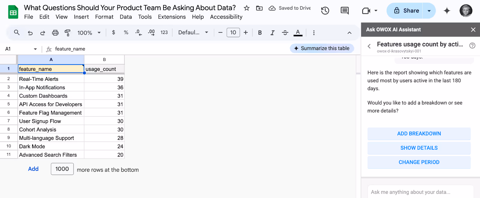
After you get your answer, you can add more dimensions to it by clicking the ‘add breakdown’ button, getting more details about how this report was built, or changing the period for counting ‘Active Users’.
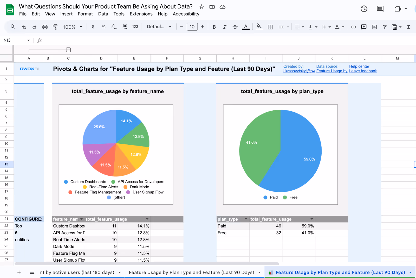
How does feature usage differ between free and paid plans?
Feature usage often varies between free and paid users. Paid users tend to engage more with advanced features, while free users generally stick to the basics.
Analyzing these differences helps teams tailor experiences to each segment, design effective upsells, and better align feature sets with user needs.
If you ask this question directly in OWOX AI Assistant, here is the clarification question you’d be answered:
To answer "How does feature usage differ between free and paid plans?", I will:
- Use the event table for feature usage.
- Use the subscription and plan tables to identify free vs paid plans.
- Join these tables using user and plan relationships.
Assumption:
I will compare feature usage counts for free vs paid plans in the last 90 days. Is this what you want to see?
Here is the report: it’s how the OWOX reports Assistant in Google Sheets compares feature usage for free and paid plans, broken down by feature, for the last 90 days.

Next, you can get the trends over time or visualize this data with the Pivots & Charts feature.
How do usage patterns change after a feature release?
Tracking usage patterns after a new feature release is critical. Shifts in engagement reveal whether the feature meets user expectations or needs refinement. This analysis provides early feedback, helps prioritize follow-up improvements, and ensures that new releases drive real value for users.
Clarification question: To answer how usage patterns change after a feature release, I need to know:
- Which feature(s) to analyze?
- What time period before and after the release should we compare?
Assumption:
You want to compare user events for a feature, 30 days before and after its release date. Is this correct? If yes, please specify the feature name or confirm the assumption.
When you say yes, let’s proceed - OWOX reports will can compare feature usage before and after a release to evaluate engagement changes and validate feature impact:

Which days of the week have the highest feature engagement?
User activity often fluctuates throughout the week. Identifying the days with the highest engagement helps teams optimize product updates, marketing campaigns, and in-app communications. Aligning activities with peak usage times ensures better visibility and more effective user interactions.
If you ask this question directly in OWOX AI Assistant, here is the clarification question you’d be answered:
To answer your question, I will:
- Use the "event" table to analyze feature engagement.
- Group by day of the week using the "timestamp" field.
- Assume you want results for the last 30 days (assumption).
Question: Which days of the week have the highest feature engagement in the last 30 days?
Once you agree with the assumption (logic), select “Yes, proceed with the report”. You can also add your point if the logic seems to be missing some part required for the analysis.
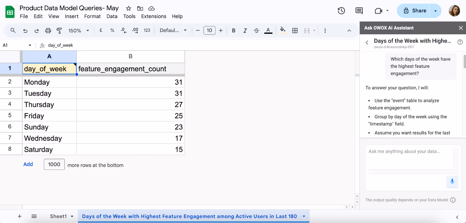
With OWOX reports, you can evaluate feature engagement trends across the week by analyzing total event counts by weekday
Onboarding & Activation
Early user engagement is a strong predictor of long-term product success. By tracking how quickly new users interact with core features and progress through key milestones, product teams can create a more seamless first-time experience that drives retention.
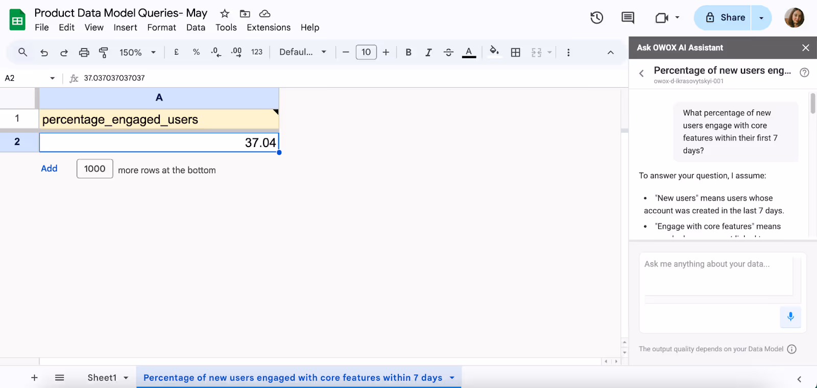
What percentage of new users engage with core features within their first 7 days?
Understanding the percentage of new users who engage with core features within the first week is crucial for assessing the effectiveness of your onboarding process. A higher engagement rate indicates that users are quickly finding value in your product, which can lead to improved retention and increased lifetime value.
With OWOX reports, you can measure what percentage of new users engage with core features within their first 7 days. The OWOX Reports will present you with the logic first:
Assumption:
- "New users" means users whose account was created in the last 7 days.
- "Engage with core features" means users who have an event linked to any feature within 7 days of their signup.
- The percentage is: (new users who engaged with any feature within 7 days) / (total new users in the last 7 days).
What’s the average time between account creation and first feature usage?
Measuring the time it takes for users to engage with a feature after account creation helps identify potential friction points in the onboarding flow. Reducing this time can enhance user satisfaction and increase the likelihood of long-term engagement by helping users experience value earlier in their journey.
With OWOX reports, you can calculate the average number of days it takes users to engage with a feature after account creation.
When the question is asked, the OWOX Reports AI Assistant will share the logic that will be used behind the calculation:
Assumption:
To answer your question, I will:
- Use the "user" table for account creation time.
- Use the "event" table for first feature usage (by user).
- Calculate the average time between "user.created_at" and the earliest "event.timestamp" per user.
Assumption:
All time periods included (no date filter).
Would you like to limit this to a specific time period (e.g., last 30 days)?
You can proceed as per your report requirements.

How long does it take users to complete key product milestones?
Tracking the duration it takes users to achieve significant milestones provides valuable insights into the user journey and highlights areas where the process can be streamlined. Efficient milestone completion is often linked to higher user satisfaction and retention, as users who reach value faster are more likely to stay engaged.
When you ask this question in OWOX Reports AI Assistant, you will be presented with a logic that’s used to get you the required data:
Assumptions:
- "Key product milestones" are tracked in the milestone and user_milestone tables.
- Time to complete is measured from user creation (user.created_at) to milestone achievement (user_milestone.achieved_at).
- All available time data will be checked for each milestone.

Here in OWOX reports, you can track how long users take to complete important product milestones, revealing where they slow down and how to accelerate time-to-value.
Plans, Trials & Conversion
Understanding how users navigate through your plans, trials, and subscriptions reveals where your product is delivering value and where it falls short. These questions help teams refine pricing, optimize trials, and design a conversion flow that aligns with real user behavior.
Which subscription plan has the highest long-term retention?
This question helps identify which subscription tier keeps users engaged over time. Analyzing retention across plans shows which ones deliver the most lasting value. These insights inform pricing strategies, feature packaging, and product development, all of which are aimed at enhancing customer lifetime value and minimizing churn.
In OWOX reports, you can assess long-term retention rates across subscription plans, highlighting which tiers keep users engaged over time and drive greater lifetime value.
You will get the logic before the report is created:
Assumption:
There is no direct "retention" metric in your data model.
I will define "long-term retention" as the percentage of users whose subscription end date is at least 12 months after their start date, grouped by plan. Is this definition of long-term retention okay for you?
How many users upgrade or downgrade their subscription each month?
Tracking monthly plan changes gives visibility into customer satisfaction. Frequent upgrades may indicate strong product-market fit, while downgrades could highlight pricing friction or feature gaps.
This data helps teams adjust plan structures, improve upsell opportunities, and deliver more value where it matters most.
OWOX reports makes it easy to track the number of users who upgrade or downgrade their plans each month, providing teams with insight into plan performance and customer satisfaction trends.

What percentage of users become inactive after their trial ends?
This metric indicates the effectiveness of your trial in converting users into active customers. A high drop-off rate may signal unclear value or onboarding challenges. Understanding what happens after trials end can help improve messaging, support, and feature exposure.
The report below, built with OWOX reports, shows the percentage of trial users who became inactive, shedding light on how effectively your trial converts users into engaged customers.
Assumption:
To answer your question, I will assume:
- "Inactive" means users who had no events after their trial ended.
- We want the percentage of such users among all who finished a trial.
- Calculating for all time unless you want a specific period.

What is the average number of sessions before a user subscribes?
Knowing how many sessions it takes for a user to subscribe reveals how quickly your product demonstrates value. If conversion takes too long, onboarding or messaging might need refinement. If it’s quick, you may have a strong product hook and an opportunity to scale adoption faster.
Built with OWOX reports, the below report shows the average number of sessions users complete before subscribing, highlighting how quickly your product delivers perceived value.
Before generating the report, OWOX AI Assistant will share the logic:
To answer your question, I will assume:
- "Subscribes" means a user has a record in the subscription table.
- "Sessions before subscribe" means counting sessions for each user before their first subscription.
- Calculating for all users who ever subscribed, for all time.

Retention & Churn subscription
Keeping users is just as important as acquiring them. These questions help teams identify what leads to churn, which segments are at risk, and where to focus efforts.
What are the common activity patterns of users who churn within 30 days?
Spotting behaviors tied to early churn reveals where users lose interest or run into trouble. Whether it's low feature engagement, slow onboarding, or support gaps, analyzing early usage patterns allows teams to take proactive steps.
This OWOX Reports view shares the logic behind the report and highlights the most common activity patterns among users who churn within 30 days, shedding light on early behaviors linked to drop-off risk.
Assumption:
To answer your question, I assume:
- "Churn" means users whose subscription status is "canceled" within 30 days of starting.
- "Activity patterns" include event types, session counts, and feature usage in those 30 days.

What is the churn rate by subscription plan?
Not all plans perform equally well in terms of retention. Analyzing churn by plan helps identify which tiers offer lasting value and which may be underperforming. This data supports smarter pricing, clearer value propositions, and plan improvements that boost customer satisfaction.
Using OWOX reports, you can break down churn rates by subscription plan, pinpointing which tiers retain users effectively and which ones may need pricing or feature adjustments.

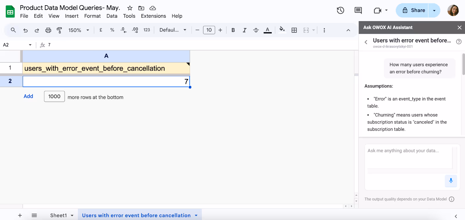
How many users experience an error before churning?
Bugs and usability issues are common drivers of churn. By tracking how often users encounter errors before leaving, teams can identify technical pain points that may be contributing to poor retention. Prioritizing fixes for high-impact issues helps deliver a smoother experience and keeps users from dropping out prematurely.
The report below, built with OWOX Reports shares the logic before giving the report. It shows how many users experienced an error before churning, helping teams trace churn back to technical issues and prioritize impactful fixes.
Assumptions:
- "Error" is an event_type in the event table.
- "Churning" means users whose subscription status is "canceled" in the subscription table.
- I will count users who had an error event before their subscription was canceled.
Segmentation & Behavior
Not all users engage with your product the same way. Analyzing behavior by role, segment, or persona enables teams to deliver more relevant experiences, from feature access to onboarding flows, that cater to the needs of different user types.
How does product usage vary by user role (e.g., admin vs member)?
User roles often drive how people interact with your product. Admins may focus on settings, billing, or team management, while members engage more with core workflows or content. Studying these differences helps tailor interfaces, permissions, and support to each role, which improves usability.
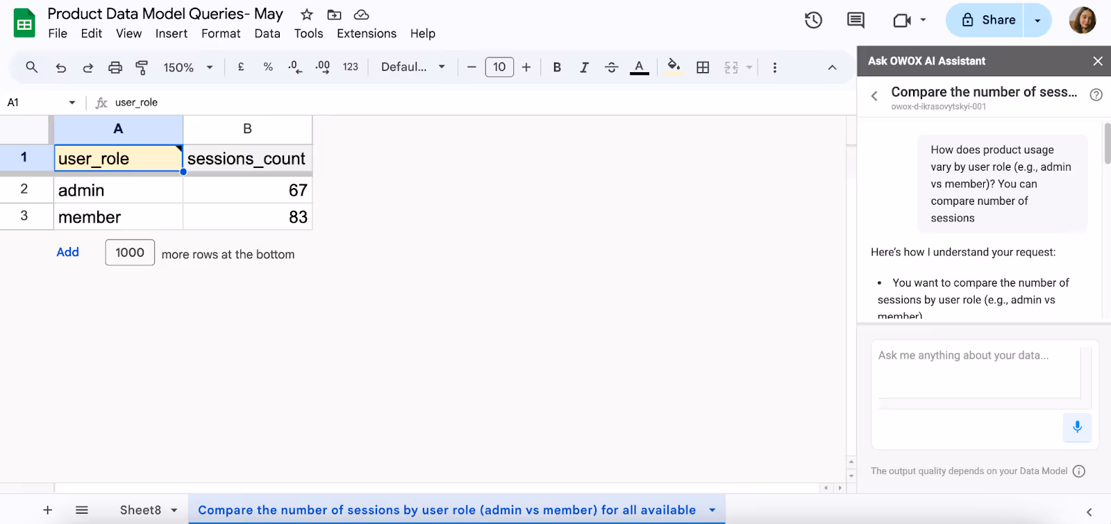
With OWOX Reports, you can compare product usage by user role, revealing how admins and members engage differently.
How These Questions Get Answered with a Data Model
Answering important product questions starts with having the right data structure. The OWOX BI Product Data Model connects essential tables, including events, trials, subscriptions, and features, making it easier to explore all within a single, consistent framework.
For example:
- To understand post-trial inactivity, teams can join the trial and event tables to identify users who stop engaging after their trial ends.
- To compare feature usage across free and paid plans, teams can link the event, feature, and subscription tables and analyze usage grouped by plan_name.
With OWOX BI, product managers and analysts can either write SQL queries or simply ask questions in natural language through a chat interface.
The structured data model ensures that every answer is based on clean, connected data, helping teams make faster roadmap decisions, optimize onboarding experiences, and gain a deeper understanding of different user segments.
Bonus: How to Turn Questions Into Reporting Templates
Asking better questions is only the start; turning them into ready-to-use templates makes insights easier to share and scale. Standardizing how you answer key product questions saves time, reduces reporting gaps, and helps teams stay focused on metrics that truly matter.
Turn Key Product Questions into Reusable Reporting Templates
Converting frequently asked product questions into reusable templates ensures fast and consistent reporting across teams.
Here’s how you can set it up:
- Identify high-value product questions: Focus on areas like trial conversion rates, churn by plan, or feature adoption.
- Build SQL queries: Use the OWOX BI Product Data Model to create reliable and flexible queries.
- Visualize the results: Connect BigQuery or OWOX Reports to Looker Studio or Google Sheets to create easy-to-use reports.
- Standardize templates: Add dynamic filters to your reports, allowing different teams to easily reuse and customize them.
Reusable templates reduce ad-hoc analysis work and keep everyone aligned on the most important product metrics.
Use OWOX BI with Google Sheets for Live, Collaborative Reporting
Google Sheets remains a favorite tool for product managers, analysts, and non-technical teams because of its flexibility. OWOX BI helps you bring live BigQuery data directly into Sheets for real-time collaboration, eliminating the need to write SQL every time.
Here’s how to set it up:
- Install the OWOX Reports extension: Get it from the Google Workspace Marketplace. This BigQuery add-on makes it easy to bring corporate data directly into your Google Sheets.
- Create or use pre-built queries: Build new queries directly in the OWOX Reports UI or select from your team's templates. This allows both technical and non-technical users to start analyzing product data immediately.
- Schedule automatic data refreshes: Set up refresh intervals to keep your Sheets up to date without manual effort. You can control the frequency of updates to match your team’s reporting.
- Visualize in 1-click: Create pivot tables, charts, and dashboards directly in Sheets, using your live data. Share them easily across teams to drive collaboration.
Final Word: Good Questions Drive Great Products
You don't always need more dashboards; you need better questions. The right questions help your team stay focused on what matters most: understanding user needs, delivering real product value, and finding the best growth opportunities.
With the right tools, such as a solid data model and OWOX BI, curiosity can turn into action. Teams can move faster, get clearer answers, and build smarter products. Ultimately, it’s not just about collecting data — it’s about knowing what to ask, learning from the answers, and utilizing that insight to drive meaningful progress.
Learn how OWOX BI Enables Self-service Product Analytics
These questions are just the beginning. OWOX BI helps you turn them into real answers. By connecting directly to your BigQuery data, OWOX BI provides your team with a structured Product Data Model designed for product analytics.
You can ask any of these questions using natural language and instantly pull insights into Google Sheets. No dashboards to wait for, no analyst bottlenecks, just direct, flexible access to the answers you need to drive smarter product decisions.
Frequently asked questions


Finally, a tool that doesn't ask business users to learn a new dashboarding UI. Our marketing team already knows Sheets. OWOX just delivers the right data.
Joinable data marts concept was the thing that sold us. We can now use the semantic layer without building one.
Self-hosted the OSS version on Digital Ocean. Zero vendor lock-in. Contributed a Shopify connector back in week two.