
Reporting ≠ Analytics: Why Your Dashboards Aren’t Telling You Enough
Most dashboards don’t deliver insights. Discover why reporting falls short and how to enable self-serve analytics that drives smarter product decisions.


Dashboards are everywhere, tracking signups, sessions, churn, and conversions. But when product teams face real questions, they often return to SQL or analysts for answers. That’s because dashboards rarely offer insight, just a snapshot of surface-level metrics with no explanation of what’s driving them.

In this article, we’ll explain the key difference between reporting and analytics, why traditional dashboards often fail, and how teams can move beyond static charts to a model-driven, question-first approach that actually delivers answers.
Reporting vs Analytics: What’s the Difference?
Understanding the difference between reporting and analytics is key for product teams. While both deal with data, they serve very different purposes in decision-making.
Reporting is about organizing data into clear formats like charts, tables, or dashboards. It helps teams track performance using past metrics such as sales numbers, website visits, or trial signups. The goal is to make data easy to read and share.
Analytics, on the other hand, goes deeper. It helps teams understand why something happened and what to do next. It uses techniques like trend analysis and predictive modeling to uncover patterns.
The key difference is that reporting shows past results, while analytics explains the reasons behind them. Reporting is used to share information, whereas analytics is used to make decisions. Reporting focuses on what happened; analytics focuses on why it happened and what to do next.
Common Reasons Why Product Dashboards Fail
Many product dashboards look impressive but fail to deliver useful insights. They often overwhelm teams with data, lack context, and miss evolving needs. Below, we’ll cover the key reasons why most product dashboards fall short for modern teams.
Too Many Metrics, No Clear Focus
Dashboards often show too many numbers at once, leaving users overwhelmed. Instead of helping teams focus, they create confusion. Most of the data shown doesn’t impact decisions. When everything looks important, nothing stands out. A useful dashboard should highlight only key metrics that directly affect product growth or business goals, so teams know exactly where to act.
Lack of Context Behind the Numbers
Seeing a drop in revenue or spike in churn isn’t enough. Dashboards that show numbers without any explanation leave teams guessing. Without knowing why something changed, it’s hard to take action. Teams need dashboards that connect data with insights, like trends, causes, or next steps, to help them make smart, informed product decisions quickly.
Static Dashboards That Don’t Evolve with Questions
Dashboards built once often stay the same, even when the product changes. They report the same old metrics, ignoring new features, goals, or user behaviors. When teams have new questions, these dashboards can’t keep up. A good dashboard should allow filtering, deeper exploration, and adapt to changing needs, not just show fixed charts every week.
Overdesigned Visuals That Obscure Insights
Cool-looking dashboards filled with 3D charts and bright colors may grab attention, but often confuse users. When visuals are too flashy or cluttered, they hide what matters. Users struggle to find answers in the design noise. Simple, clean visualizations work better, and they make key metrics easy to read, understand, and act on instantly.
One-Size-Fits-All Dashboards That Don’t Serve Roles
Different teams need different insights, but many dashboards try to show everything in one place. This makes it hard to find the data that matters. What a CEO needs is not what a product manager or marketer needs. Tailoring dashboards by role helps each team focus on the right metrics and make faster, better decisions.
Why Product Teams Need Data Models, Not More Dashboards
Adding more dashboards doesn’t solve the real problem—teams still struggle to get clear answers. This section explores why data models are essential for product teams to uncover real insights, understand behavior, and make confident, data-driven decisions.
Dashboards Show What Happened, Models Explain Why
Dashboards tell you what happened, like a dip in users or revenue, but they stop there. They don’t explain what caused the change. A data model connects all the right details, like which features were used, what plan a user was on, or when they dropped off.
This helps teams go beyond surface-level metrics. Instead of just seeing numbers, you understand the real story behind them, and that’s what leads to smarter product decisions.
Structured Data Enables Better, Faster Answers
Without structure, data can be messy and slow to work with. Saas Teams spend time cleaning, merging, and double-checking numbers. A data model solves that. It organizes everything in a clear format, making it easier to pull reliable reports. Teams don’t have to rewrite queries every time.
They can trust the numbers across different tools. With a model in place, answers come faster, mistakes are fewer, and everyone, from PMs to analysts, can focus on real product work.
Flexible Tools Start with Flexible Data Models
You can’t build flexible tools if the data underneath is rigid. A good data model is reusable and built to adapt. That means teams can change filters, ask different questions, and explore new angles, without rebuilding everything from scratch.
Whether you’re working in Sheets, a dashboard, or a chat tool, the same model powers it all. This makes product analytics smoother, faster, and easier for everyone, not just for analysts or tech teams.
Product Models Reflect Real-World User Behavior
A product model is designed to match how people actually use your product. It connects things like logins, feature usage, trial plans, upgrades, and churn. That way, you don’t just see numbers, you see the journey behind them.
Product teams can trace what users do, when they do it, and what actions lead to success or drop-off. This gives you a complete picture of real behavior, not just charts that miss the context.
Data Models Turn Curiosity Into Action
When a team member asks, “What happened before users churned?” they usually wait for a report. With a data model, they can get answers right away. It supports real questions without needing to build new dashboards every time.
You ask, and the model responds with insight. It helps turn curiosity into action by making data accessible, fast, and useful, so teams don’t just wonder about trends, they can act on them quickly.
How OWOX BI Helps Product Teams Move Beyond Dashboards
Dashboards alone can’t keep up with the fast-changing questions product teams face. This section explains how OWOX BI goes beyond static charts, offering a structured data model, chat-based queries, and reports in tools like Google Sheets to deliver real answers.
One Model Setup That Powers Every Question
OWOX BI allows your data team to define a single product data model that covers everything, from user behavior to revenue. This model becomes your source of truth for reporting and analysis. There's no need to rebuild dashboards or rewrite SQL for every request. It’s built once and used across all tools and teams.
How OWOX BI does it:
- Offers prebuilt templates so your team doesn’t need to start from scratch.
- Centralizes logic for key metrics like churn, milestones, and feature usage.
- Automatically adapts to changes in your BigQuery or data warehouse.
- Works with all tools, so the same model supports dashboards, chat, and Sheets.
Product Managers Get Instant Answers, Not Static Reports
OWOX BI removes the delay between questions and answers for product managers. Instead of waiting on analysts, PMs can ask product-specific questions and get instant insights. Results are delivered in tools they already use, no back-and-forth needed. This empowers faster decisions and removes the roadblocks of static reports.
How OWOX BI does it:
- Includes a chat interface where PMs can ask plain-language questions.
- Translates questions into SQL automatically behind the scenes.
- Works in Google Sheets to deliver insights in familiar UI.
- Removes delays by giving PMs direct access to live data.
For example, a user can ask in OWOX BI AI Assistant about features that were frequently used to get an idea of what exactly is working in the product (and what isn't). It will present the logic used to generate the report for clarification.
Assumption:
I can assume "active users" are those who have triggered any event in the last 30 days. The report will show the features (by name) with the highest event counts among these users.

Insights Delivered in Tools the Team Already Uses
Instead of asking teams to learn another BI tool, OWOX BI delivers insights into Google Sheets, where they already work. Reports refresh automatically and are ready for analysis. There’s no exporting, reformatting, or extra steps. Teams get accurate, updated data without leaving their usual workflow.
How OWOX BI does it:
- Integrates with Google Sheets through the OWOX Reports Extension.
- Refreshes reports automatically on a set schedule or anytime you need.
- Supports drag-and-drop analysis using regular Sheets features.
- Removes the need for other BI tools, so anyone can use the data easily.
How OWOX BI Answers the Product Questions Dashboards Can’t
Most dashboards show metrics but miss the bigger picture. This section explains how OWOX BI helps product teams answer deeper, more specific questions, like what leads to churn or conversion, by using structured data and behavior-driven insights.
What Happens in the 7 Days Before a User Churns?
Most dashboards can show you the churn rate, but not the user behavior that leads to it. They miss the early signals, like reduced logins, skipped features, or dropped sessions. Without this context, teams can’t act early enough. Dashboards only confirm churn after it’s already happened.
OWOX BI helps you see what users stop doing in the days before they leave. It shows timelines, event drop-offs, and usage changes. This helps product teams act fast, improve retention, and personalize win-back strategies.
Try this way to ask questions and get insights from OWOX AI Assistant, it will confirm the logic of report generation before proceeding:
Assumptions:
- "Churn" means subscription status is "canceled" in the subscription table.
- I will look at user actions (events, sessions, pageviews, milestones) in the 7 days before the end_date of canceled subscriptions.
- I will summarize user activity types and counts in that period.

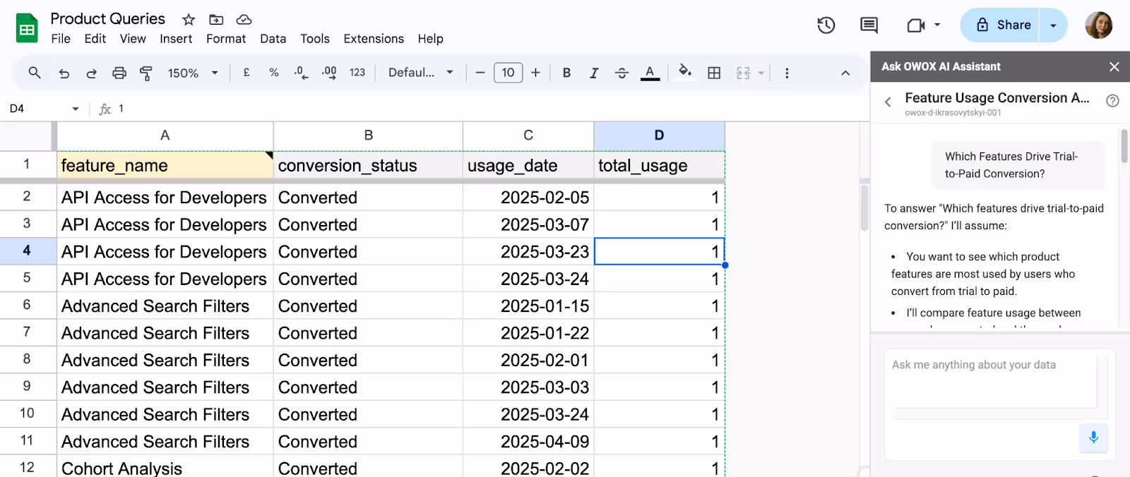
Which Features Drive Trial-to-Paid Conversion?
Dashboards usually report how many users started a trial and how many converted. But they don’t show which features helped drive that conversion. This leaves teams guessing about what’s working and what’s not in the product experience.
OWOX BI connects every user action to their final outcome. It helps teams trace which features users explored before upgrading. By identifying high-impact features, teams can optimize onboarding and highlight the right product value early in the trial journey.
When you ask this question in OWOX AI Assistant, you will be presented with the logic thats used to generate the report.
Assumption:
To answer "Which features drive trial-to-paid conversion?" I’ll assume:
- You want to see which product features are most used by users who convert from trial to paid.
- I’ll compare feature usage between users who converted and those who didn’t.
- Time period is not specified. I’ll assume the last 90 days for relevance.
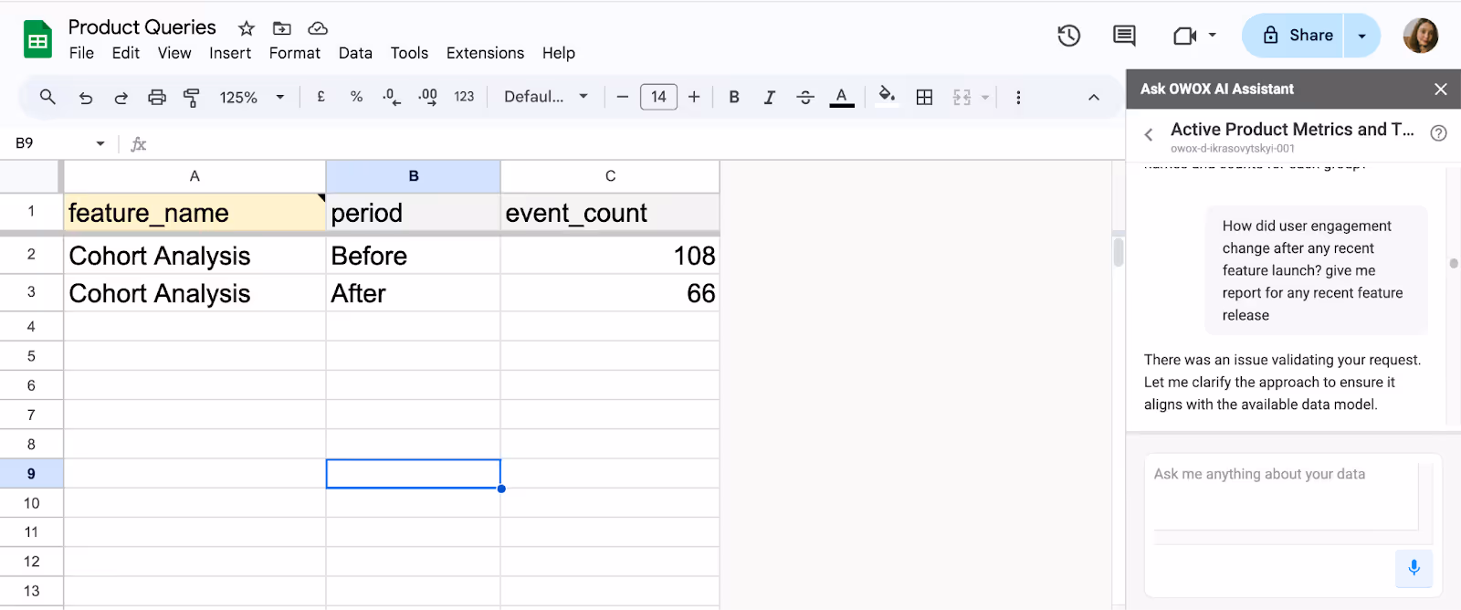
How Does Usage Change After a Feature Launch?
Most dashboards struggle to compare product usage before and after a feature is released. They show raw numbers, but not behavior shifts or adoption trends across user groups. That makes it hard to tell if the launch made any impact.
OWOX BI tracks feature usage over time and compares cohorts. It reveals how different users interact with the new release, showing adoption speed, usage depth, and behavior change. This gives product teams real feedback to iterate smarter and faster.
Here’s how you can interact with OWOX AI Assistant to get the answers you need: you will be presented with the logic before you get the report.
Assumptions:
- Engagement = total number of events (from the event table).
- "Recent feature" = the feature with the latest released_at date.
- Periods: 30 days before and after the release.
What Specific Metrics Are Being Tracked, and Why?
Dashboards often show final outcomes like revenue, churn, or signups- but not the steps that led there. They miss the inputs and don’t explain what actions caused the result. This creates gaps in understanding and limits strategic decisions.
This is how you can phrase your queries to get clear answers from OWOX AI Assistant:

OWOX BI bridges that gap by linking outcome metrics to real user behavior. It shows what actions led to signups or churn, like onboarding completion, feature skips, or ticket delays. Teams can trace the full journey and make smarter, evidence-based improvements.
From Dashboards to Answers: Why Product Teams Must Evolve
Most dashboards are built to show performance summaries. They offer charts and graphs for metrics like signups, churn, or revenue, but often stop there. These dashboards don’t explain what’s driving those numbers or how to respond when something changes.
What product teams actually need are answers, not just reports. They need to understand user behavior, identify patterns, and make informed decisions based on what’s happening inside the product. Knowing that churn increased is useful, but knowing why it increased is what drives action.
OWOX BI fills that gap. It replaces static dashboards with structured product data models and tools like chat and Google Sheets. Teams can ask real questions, explore data on their own, and turn insights into decisions, quickly and confidently.
Turn Your Product Data Into Insights with OWOX BI
Stop relying on dashboards that only show surface-level metrics. With OWOX BI, your team gets direct access to answers that matter through structured data models and self-serve tools.
From churn analysis to feature adoption, OWOX BI helps you explore real product questions inside tools you already use, like Google Sheets. No SQL needed, no analyst delays, just fast, actionable insights. Set up your product reporting with OWOX BI in minutes and start making smarter decisions every day.
Frequently asked questions


Finally, a tool that doesn't ask business users to learn a new dashboarding UI. Our marketing team already knows Sheets. OWOX just delivers the right data.
Joinable data marts concept was the thing that sold us. We can now use the semantic layer without building one.
Self-hosted the OSS version on Digital Ocean. Zero vendor lock-in. Contributed a Shopify connector back in week two.