
The Three Types of Fact Tables
Discover how transactional, periodic snapshot, and accumulating snapshot fact tables power reliable analytics and govern reusable data marts.


Fact tables sit at the center of analytical modeling. They capture measurable business events and make those events usable across dashboards, reports, forecasting models, and decision workflows. In practice, they form the layer that connects raw warehouse data to the metrics teams rely on every day.
That is why fact table design matters so much. If the structure is wrong, analysts spend more time fixing joins, rebuilding KPIs, and explaining inconsistent numbers than generating insight. If the structure is right, the same warehouse can support finance reporting, product analytics, marketing measurement, and executive dashboards without every team reinventing the model.
.png)
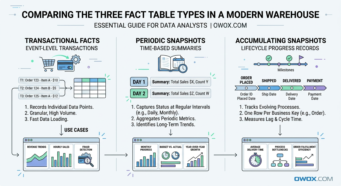
At a high level, there are three core types of fact tables used in dimensional modeling: transactional fact tables, periodic snapshot fact tables, and accumulating snapshot fact tables. Each one answers a different kind of business question. One tracks individual events, another captures performance over a regular interval, and the third follows progress across a lifecycle.
These patterns are not theoretical. They show up in almost every modern analytics environment. Ecommerce teams model purchases and refunds as transactions. Marketing teams summarize campaign performance by day or week using snapshots. Sales, support, and customer success teams often track pipeline stages or onboarding journeys with accumulating snapshots.
The same modeling principles apply whether your data lives in BigQuery, Snowflake, Redshift, Databricks, or Athena. Cloud warehouses differ in storage and query behavior, but the need for clear, reliable fact design does not change. A well-structured fact table still makes SQL simpler, BI more consistent, and metric governance easier to maintain.
In this article, we will break down each fact table type in practical terms. You will see when to use each one, how they differ, and how to model real business scenarios such as orders, marketing performance, and customer lifecycle funnels. We will also connect these patterns to the bigger goal of building governed Data Marts that support reusable reporting and AI-ready analytics at scale.
Why Fact Tables Are the Backbone of Modern Analytics
Once teams move beyond raw event logs and ad hoc SQL, they need a model that turns warehouse data into something stable and reusable. That is where fact tables become essential. In dimensional modeling, fact tables store measurable business activity, while related dimension tables provide the descriptive context needed to analyze that activity by customer, product, channel, campaign, region, or time.
This structure remains foundational in modern data warehouses because it solves a very practical problem: how to make data understandable at scale. Whether you are working with BigQuery dimensional modeling patterns, Snowflake fact tables, or star schemas in Redshift, the goal is the same. You want one reliable place for business events and one consistent way to slice and interpret them.
A good fact table does more than support reporting. It becomes the source for KPIs, experimentation analysis, forecasting inputs, and downstream machine learning features. Instead of recalculating revenue, conversions, or retention logic in every dashboard, teams can define the grain once and reuse it everywhere. That consistency is what makes analytics trustworthy.
It also creates the foundation for reusable Data Marts. When fact tables are modeled cleanly, analysts can build governed reporting layers that are easy to query, easy to audit, and flexible enough for self-service use. That matters even more as companies try to scale analytics across marketing, product, operations, and leadership without multiplying metric definitions.
Fact Tables vs Dimension Tables in Plain Language
A fact table answers the question what happened. It stores measurable events or outcomes, such as orders placed, sessions started, invoices paid, or ad spend recorded. Each row usually represents a business event at a defined grain, and the table includes numeric values like quantity, revenue, cost, or duration.
A dimension table answers the question what it happened to or who it involved. It stores descriptive attributes such as customer name, product category, campaign source, country, or device type. In a star schema, the fact table sits in the center and joins to dimensions around it.
This separation is what makes analysis flexible. You keep the metrics in one place and the descriptive labels in another, then combine them as needed without duplicating logic.
How Fact Tables Power Metrics, Dashboards, and AI
Every dashboard metric depends on a fact table, even if users never see it directly. Revenue trends, conversion rates, average order value, pipeline velocity, and churn all start with a table that records measurable activity at the right level of detail. If that table has inconsistent grain or duplicated rows, every KPI built on top of it becomes harder to trust.
Clean fact tables also improve dashboard performance and maintenance. BI tools can aggregate from a stable source instead of layering complex fixes into each chart. That means fewer broken filters, fewer conflicting totals, and less debate over which report is correct.
The same principle applies to AI and advanced analytics. Predictive models, anomaly detection, and LLM-based data exploration all depend on structured, consistent facts. If the business event layer is unreliable, automated insight generation will be unreliable too.
Why Dimensional Modeling Still Matters in Modern Warehouses
Some teams assume dimensional modeling is outdated because cloud platforms can scan huge raw tables quickly. In reality, scale makes modeling more important, not less. BigQuery, Snowflake, and Redshift are powerful, but they do not automatically resolve ambiguous business logic, mixed granularity, or inconsistent definitions across teams.
Dimensional modeling gives structure to ELT pipelines. It helps define the grain of a table, control joins, and separate measures from attributes in a way that is easy to explain and reuse. That is especially valuable when many analysts work in parallel or when a company has multiple BI tools reading from the same warehouse.
In BigQuery dimensional modeling, for example, teams often use partitioned event facts with lightweight dimensions to support speed and cost efficiency. In Snowflake fact tables, the same concepts help organize shared metric layers for broad self-service access. The platform changes, but the modeling discipline still drives clarity.
Fact Table Fundamentals: What Every Analyst Should Know
Before comparing the three fact table types, it helps to ground the discussion in a few core modeling rules. Most problems in analytics do not come from SQL syntax or warehouse performance alone. They come from tables that were never clearly defined in the first place. If analysts do not know the grain, cannot explain the measures, or are unsure how dimensions relate to the data, the model will eventually break under real reporting needs.
This is why fact tables are such a central concern in analytics engineering best practices. A fact table is not just a large table with numbers in it. It is a business contract. It tells everyone what one row represents, which measurements are valid at that level, and how the table connects to the rest of the model. Once that contract is explicit, teams can aggregate confidently and reuse the same logic across many use cases.
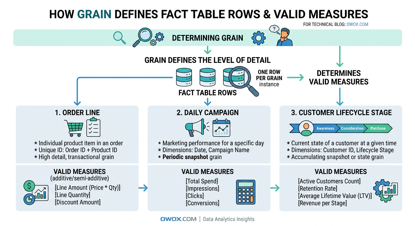
Defining the Grain and Measures of a Fact Table
Grain is the most important concept in fact table design. It defines exactly what a single row represents. For example, one row might equal one ecommerce order line, one website session, one ad campaign per day, or one support ticket at its current stage. Until that is clear, nothing else in the table can be evaluated properly.
A useful test is to finish the sentence: one row in this fact table represents ____. If the answer is vague or has multiple interpretations, the model is not ready. Grain determines which dimensions can join safely, which measures are valid, and how users should aggregate the data. It also protects against duplicate counting. If your fact table is at the order-line level, summing item revenue makes sense, but counting customers directly from that table may require more care.
Measures should match the grain. At an order-line grain, valid measures might include quantity, item price, discount amount, tax amount, and net revenue. At a daily marketing grain, measures could include clicks, impressions, spend, and conversions. Problems start when teams add measures that belong to a different level of detail. A customer lifetime value field does not belong in a per-session fact table, just as monthly budget should not sit in a transaction-level purchase fact unless there is a very specific reason and clear documentation.
Additive, Semi-Additive, and Non-Additive Facts
Not all measures behave the same when aggregated, which is why analysts need to distinguish between additive facts, semi-additive facts, and non-additive facts. This is one of the most practical parts of dimensional modeling because it directly affects how metrics should be calculated in dashboards and reports.
Additive facts can be summed across all dimensions. Revenue, units sold, shipping cost, and ad spend are common examples. If you sum revenue by product, by region, by date, or by campaign, the result still makes business sense. These are usually the easiest measures to work with and the most common in transactional fact tables.
Semi-additive facts can be summed across some dimensions but not all of them. Account balance, inventory on hand, and active subscriptions are classic examples. You can sum inventory across warehouses for a given day, but you should not sum inventory across dates as if yesterday's stock and today's stock were separate contributions to total inventory. Time is usually the dimension that creates trouble here.
Non-additive facts cannot be summed meaningfully at all. Ratios, percentages, and averages often fall into this category. Conversion rate, gross margin percent, and average session duration should usually be recalculated from base additive measures rather than aggregated directly. For example, instead of summing daily conversion rates, keep sessions and conversions in the fact table and compute the rate at query time or in a governed metric layer.
A strong model usually stores the additive building blocks whenever possible. That gives analysts more flexibility and reduces the risk of misleading rollups.
Surrogate Keys, Foreign Keys, and Relationships to Dimensions
Fact tables become useful when they connect cleanly to dimensions, and that connection usually happens through keys. A fact table often contains foreign keys that point to related dimension records such as date, customer, product, campaign, or region. These keys allow the business event to be analyzed from multiple angles without storing descriptive text in every row.
Surrogate keys are system-generated identifiers used inside the warehouse model, rather than business IDs from source systems. They are especially helpful when source identifiers are unstable, duplicated across systems, or affected by slowly changing dimension logic. A customer dimension, for example, may have a surrogate key that tracks versioned customer attributes over time, while the fact table references the correct version for each event.
Even in modern cloud warehouses, this approach improves consistency. It simplifies joins, supports cleaner dimension management, and makes star schemas easier to maintain as the business evolves.
Transactional Fact Tables: Capturing Individual Events
Among the three fact table types, transactional fact tables are usually the most familiar to analysts because they map directly to real business events. They record each event at its lowest meaningful level, preserving the detail needed for flexible analysis later. If a business wants to know exactly what happened, when it happened, and how often it happened, the answer often starts here.
This is the default pattern for atomic processes such as purchases, refunds, shipments, clicks, app events, or invoice payments. A transactional fact table does not summarize activity over time and does not try to represent a process state. Instead, it logs each measurable occurrence as its own row. That makes it especially useful in modern data warehouses, where teams want to keep raw business detail available for ad hoc analysis, attribution work, and metric validation.
What Makes a Fact Table Transactional
A transactional fact table captures one row per event at a defined atomic grain. The event could be an order line created, a payment authorized, a product viewed, an email clicked, or a subscription renewed. The key idea is that the row represents something that happened once, at a specific moment, even if the business later updates or cancels it through separate events.
These tables are often append-heavy because new transactions keep arriving over time. In some systems, source corrections or status changes may require updates, but the analytical value comes from preserving event-level detail. Common columns include timestamps, foreign keys to dimensions, source identifiers, and additive measures such as revenue, quantity, tax, or cost.
A transactional fact table is powerful because it stays close to the source process. Analysts can roll it up by day, week, product, channel, or customer without losing fidelity. The tradeoff is that queries can become expensive if users repeatedly aggregate very large event sets for common dashboards. That is why transactional facts often serve as the canonical detail layer, with downstream marts or summary models built on top for speed and usability.
Example Transactional Models for Orders and Payments
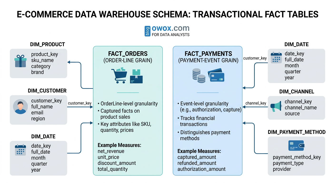
A classic orders fact table example is an ecommerce fact at the order-line grain. In that design, each row represents one product line within one order. Typical columns might include order_line_id, order_id, order_timestamp, customer_key, product_key, channel_key, quantity, gross_item_revenue, discount_amount, tax_amount, shipping_allocation, and net_item_revenue.
This grain is usually more useful than a single row per order because many business questions depend on product-level detail. Analysts can calculate revenue by SKU, category, promotion, or supplier without needing a second transaction model. Returns can be handled either as separate negative transactions or through a related returns fact table, depending on the reporting standard.
Payments often deserve their own transactional fact table because payment activity follows a different process from ordering. A payment fact may include payment_id, order_id, payment_timestamp, payment_method_key, processor_key, authorization_amount, captured_amount, refunded_amount, and transaction_fee. Separating orders from payments helps analysts answer questions such as how many orders were placed versus how many payments were successfully captured, and where failures occur in the checkout flow.
Example Transactional Models for Marketing and Product Events
A marketing performance fact table at the transactional level usually records individual events rather than pre-aggregated campaign totals. For paid media, that might mean one row per click, impression batch event, lead submission, or attributed conversion, depending on the available source data. For product analytics, it often means one row per user action such as page_view, add_to_cart, search, signup, or feature_used.
A typical product event fact could include event_id, event_timestamp, user_key, session_key, device_key, page_key, event_name, event_value, and source_channel_key. A campaign event model might include event_id, ad_platform_key, campaign_key, ad_group_key, creative_key, click_timestamp, cost_amount, and conversion_flag. In both cases, the transactional structure allows teams to reconstruct funnels, analyze pathing, and debug attribution logic with more precision than a daily summary table allows.
The main challenge is scale. Event-level marketing and product data can become extremely large, so partitioning, clustering, and disciplined filtering become important in warehouses like BigQuery and Snowflake. Still, the detail is often worth keeping because it supports investigations that aggregate tables cannot answer.
When Transactional Fact Tables Are the Right Choice
Transactional fact tables are the right choice when the business needs maximum detail, flexible aggregation, or a reliable audit trail of individual events. They are especially valuable for ecommerce orders, payment activity, clickstream analysis, product usage, lead generation, and other processes where sequence and timing matter.
They also work well when downstream use cases are not fully known yet. Keeping atomic facts gives analysts room to answer new questions later without remodeling the entire dataset. The main limitation is performance for repeated high-level reporting, which is why transactional facts are often paired with snapshot or summary layers for common consumption patterns.
Periodic Snapshot Fact Tables: Tracking Performance Over Time
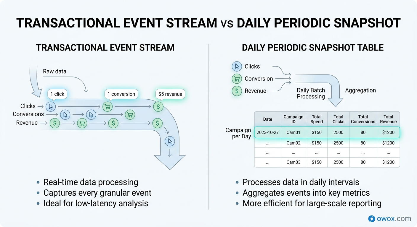
If transactional fact tables tell you what happened event by event, periodic snapshot fact tables tell you what the business looked like at a regular point in time. Instead of storing every click, order update, or CRM change as a separate row, they capture a summarized state for a defined interval such as day, week, or month. This makes them especially useful for performance monitoring, trend reporting, and executive dashboards.
In dimensional modeling, a periodic snapshot fact table is built around a calendar cadence rather than an individual business event. The grain might be one row per campaign per day, one row per sales rep per week, or one row per product per month. Even if no new transaction occurs during that period, a snapshot row may still be recorded because the goal is to measure status consistently over time.
This is why snapshots are so common in marketing and sales analytics. Teams rarely want to read millions of raw events just to answer questions like how spend changed week over week, how many qualified leads were open at month end, or how a campaign performed yesterday compared with the previous seven days. A periodic snapshot gives them a cleaner and more efficient layer for recurring analysis.
What a Periodic Snapshot Is and How It Behaves
A periodic snapshot fact table records facts at fixed intervals. Each row reflects the measured state of a business entity during that interval, rather than a single atomic event. The interval is the defining part of the grain. For example, one row might represent campaign A on 2026-03-14, or account manager B during week 11 of the year.
This design behaves differently from a transactional model in two important ways. First, rows are expected to repeat the same business entity across time. A campaign will appear once per day, not once per click or impression. Second, the table often contains both additive measures such as daily spend and semi-additive measures such as end-of-day open pipeline amount or active subscribers.
Periodic snapshots are typically built from underlying transactions, platform exports, or operational source states. They simplify consumption because analysts no longer need to recalculate the same time-based aggregates in every query. In other words, the snapshot becomes the reporting-friendly layer for recurring business questions, while lower-level facts still remain available when deeper investigation is needed.
Example Periodic Snapshots for Marketing and Sales Performance
A common marketing performance fact table uses a daily snapshot grain: one row per date, campaign, ad group, and channel. Typical columns might include snapshot_date, campaign_key, ad_group_key, channel_key, geo_key, impressions, clicks, spend, conversions, attributed_revenue, and new_customers. This structure supports daily pacing analysis, return on ad spend reporting, and channel comparisons without scanning raw ad or web event logs every time.
The same pattern works well for sales performance. A sales pipeline snapshot might use one row per opportunity per day or one row per sales rep per day, depending on the reporting need. Measures could include open_pipeline_value, stage_1_count, stage_2_count, weighted_pipeline, closed_won_amount, and meetings_booked. That lets leaders track movement over time instead of only seeing the final outcome after deals close.
A key design decision is whether the snapshot captures activity during the interval or status as of the interval end. Daily spend and clicks are interval activity measures. Open opportunities at end of day are status measures. Both can live in a periodic snapshot fact table, but they should be clearly documented because they answer different questions.
Designing Snapshot Granularity and Refresh Cadence
Choosing the right snapshot granularity is mostly about matching the reporting rhythm of the business. If teams monitor campaigns every day, a daily periodic snapshot fact table is usually the right choice. If finance closes on a monthly basis or product adoption is reviewed weekly, coarser intervals may be enough. Going too granular increases storage and maintenance without adding much decision value. Going too coarse removes trend detail that teams may later need.
Refresh cadence matters just as much. Some snapshots are built once after the interval closes, such as a month-end finance summary. Others refresh multiple times during the day so marketers can monitor pacing before budgets are exhausted. In that case, it is important to distinguish between an intraday working snapshot and the finalized daily record used for official reporting.
Cost and warehouse behavior should also influence the design. In BigQuery or Snowflake, daily snapshots often strike a good balance between performance and analytical usefulness. They are compact enough for frequent BI access but detailed enough for trend analysis and anomaly detection. As a rule, choose the lowest time interval that supports real business decisions, not the lowest interval the source system can technically produce.
When a Snapshot Works Better Than Raw Transactions
A snapshot works better than raw transactions when the main goal is tracking performance over time, not reconstructing every individual event. It is ideal for campaign monitoring, sales pipeline reporting, inventory balances, customer counts, and other recurring state-based metrics.
It is also a better fit when the same time-based aggregates are queried repeatedly by dashboards, stakeholders, or automated reporting tools. Instead of asking every BI query to rebuild daily performance from raw logs, the warehouse can serve a curated fact table designed for that purpose. That improves consistency, reduces query complexity, and makes business trends much easier to interpret.
Accumulating Snapshot Fact Tables: Modeling Multi-Step Processes
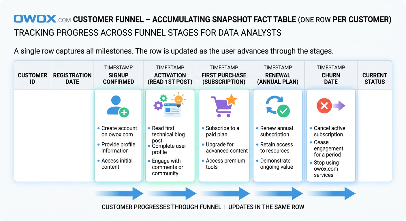
The third fact table pattern is designed for processes that unfold over time through a known sequence of stages. Instead of recording every event separately or summarizing performance at a regular interval, an accumulating snapshot fact table tracks the lifecycle of a single business object as it moves from one milestone to the next. This makes it especially useful for funnels, workflows, and operational journeys where the key question is not just what happened, but how far something progressed and how long each step took.
In a star schema design, this table usually has one row per process instance. That process instance might be a lead, an order, a support ticket, a job application, or a customer onboarding record. As the object advances, the same row is updated with new milestone dates, statuses, durations, and outcome fields. This is the defining behavior of an accumulating snapshot fact table: the record accumulates information as the lifecycle develops.
That structure is ideal for customer lifecycle funnel data models because funnel analysis is fundamentally stage-based. Teams want to know how many users reached activation, how long it took to convert from trial to paid, where prospects stalled, and which segment progresses fastest. Those are not purely event-level questions and they are not best answered by periodic summaries alone. They depend on seeing a journey in one place.
How Accumulating Snapshots Track Progress Through Stages
An accumulating snapshot fact table is built around a predefined process with recognizable milestones. Each row represents one tracked entity and contains fields for the key stage transitions in that workflow. For example, a customer onboarding process might include signup_date, activation_date, first_purchase_date, renewal_date, and churn_date, along with the current_status and elapsed days between stages.
Because the row is updated over time, the table behaves differently from the other two fact types. New records are inserted when the process starts, and then columns are populated as milestones occur. This makes it easy to calculate funnel progression, cycle time, conversion lag, and dropout points without joining many separate event tables together.
The pattern works best when the process has a relatively stable path. It does not need to be perfectly linear, but the business should be able to define the important milestones clearly enough that they belong in fixed columns. If the journey is highly unpredictable or contains unlimited branching paths, a pure transactional event model may remain more flexible.
Example Accumulating Snapshots for Customer Lifecycle and Funnels
A customer lifecycle funnel data model often uses one row per customer or account, depending on how the business defines the journey. Typical columns could include customer_key, acquisition_channel_key, signup_date_key, activation_date_key, first_order_date_key, subscription_start_date_key, renewal_date_key, churn_date_key, current_lifecycle_stage, days_to_activate, days_to_first_order, days_to_renewal, and lifetime_revenue_to_date.
This design lets analysts answer very practical questions. How many users signed up but never activated? Which acquisition channels produce the shortest time to first order? What percentage of activated customers convert to paid within 30 days? Which segment has the highest renewal rate after onboarding? Because the milestone dates live in the same row, those calculations become far simpler than reconstructing the entire journey from raw event history every time.
The same pattern works for B2B funnel reporting. A lead pipeline accumulating snapshot might include lead_created_date, MQL_date, SQL_date, opportunity_date, close_won_date, close_lost_date, owner_key, source_key, and current_stage. Sales and marketing teams can then analyze stage conversion, handoff delays, and average time to close from a single governed fact table.
Handling Dates, Status Changes, and Late Updates Correctly
The biggest architectural challenge with accumulating snapshots is that the same row changes over time. That means pipelines must support updates or merge logic, not just append-only loads. In cloud warehouses, this is typically handled with incremental models that upsert milestone columns when new stage information arrives.
Date handling needs to be deliberate. Many teams store both date keys for dimensional joins and full timestamps for precise duration calculations. It is also useful to include a last_updated_at field and a current_stage flag so analysts can separate active records from completed ones. If a process can skip a stage or move backward, that behavior should be modeled explicitly rather than forced into a misleading linear assumption.
Late-arriving data is another common issue. A CRM sync may deliver a stage change hours or days after it actually occurred, or a source correction may revise a prior milestone date. The safest approach is to treat milestone timestamps as business event dates, not just warehouse load times, and allow controlled overwrites when source truth changes. For auditability, some teams pair the accumulating snapshot with a separate event history table so they can preserve both the latest lifecycle state and the underlying transition log.
Choosing Between Transactional and Accumulating Designs
Choose an accumulating snapshot when the business cares about progression through defined stages and wants to measure elapsed time, bottlenecks, or conversion between milestones. It is especially effective for onboarding, sales pipelines, fulfillment workflows, and customer lifecycle tracking.
Choose a transactional design when every event matters independently, when paths are highly variable, or when the process does not fit cleanly into fixed milestone columns. In many mature warehouse models, both patterns coexist: transactional facts preserve the detailed event trail, while the accumulating snapshot provides a cleaner analytical view of lifecycle progress.
Choosing the Right Fact Table Type for Your Use Case
Knowing the three types of fact tables is useful, but the real value comes from choosing the right one for the business question in front of you. In practice, teams rarely succeed by forcing every process into a single pattern. The better approach is to match the model to how the process behaves, how people need to analyze it, and how often the warehouse needs to serve those queries.
This is where good data mart design becomes practical rather than theoretical. A warehouse can absolutely contain transactional detail, periodic summaries, and accumulating lifecycle views at the same time. The challenge is deciding which table should be the system of record for each use case and how those layers work together without duplicating logic.
Mapping Business Processes to Fact Table Patterns
A simple rule helps: choose the fact table type that matches the natural shape of the business process. If the process is made up of individual events that matter on their own, a transactional fact table is usually the right fit. Orders, payments, shipments, page views, clicks, and product interactions all fall into this category. These are classic fact table examples where event-level detail supports flexible slicing and later investigation.
If the process is mainly reviewed as a trend over time, a periodic snapshot often works better. Daily campaign performance, weekly sales activity, month-end inventory, and open support ticket counts are good examples. These processes may originate from transactions, but the business usually consumes them as time-based performance views.
If the process moves through milestones, use an accumulating snapshot. Customer onboarding, sales pipelines, claims handling, and lead qualification all benefit from lifecycle tracking. In BigQuery dimensional modeling and similar cloud setups, this kind of decision-making prevents teams from building one oversized table that serves no use case especially well.
Combining Transactional, Periodic, and Accumulating Tables in One Model
The most effective analytics models often combine all three fact patterns. A retail business, for example, may keep transactional order and payment facts as the canonical detail layer, build a daily marketing performance snapshot for recurring channel reporting, and maintain an accumulating customer lifecycle fact for onboarding and retention analysis.
The key is to let each table answer a distinct class of questions. Transactional facts explain what happened. Periodic snapshots show how performance changed over time. Accumulating snapshots reveal how entities progress through a process. When these roles are clear, analysts can move between detail, summary, and lifecycle views without redefining business logic at every step.
This layered approach is also what makes a data mart design reusable. Instead of forcing business users to join raw sources or engineer their own metrics in BI tools, the warehouse exposes purpose-built fact tables tied to shared dimensions. That is one reason teams build governed marts with tools like OWOX Data Marts: to make these patterns easier to operationalize and maintain at scale.
Performance and Cost Considerations in Cloud Warehouses
Fact table choice also affects speed, storage, and maintenance cost. Transactional fact tables can grow very large, especially for product analytics and ad event data. In BigQuery, that means partitioning and clustering matter if you want to avoid expensive repeated scans. In Snowflake, the same issue shows up as compute-heavy aggregations when too many dashboards query raw event detail directly.
Periodic snapshots often reduce BI cost because they pre-organize the most common reporting grain. Dashboards that only need daily campaign spend or weekly pipeline counts can query much smaller tables with simpler SQL. The tradeoff is extra storage and a scheduled transformation layer to maintain those snapshots correctly.
Accumulating snapshots are usually compact, but they introduce update complexity. Warehouses handle this well, yet merge-based pipelines still require discipline around late changes, stage corrections, and idempotent loads. In other words, each fact type shifts cost differently: transactional tables cost more at query time, snapshots cost more in modeling and refresh logic, and accumulating tables cost more in lifecycle management.
Real-World Examples of Improved Reporting from Better Fact Design
A common ecommerce improvement looks like this: the team replaces one mixed-grain orders table with separate transactional order-line and payment facts. Suddenly revenue, refunds, and payment success rate stop conflicting across dashboards because each metric has a clear source.
In marketing, a daily campaign snapshot often cuts dashboard complexity dramatically. Instead of rebuilding spend and conversion logic from raw platform exports in every report, teams query one trusted table and get faster pacing insights. For lifecycle analytics, moving from scattered CRM status logs to an accumulating funnel fact often makes stage conversion reporting understandable for the first time. The pattern is consistent: better fact design leads to clearer metrics, faster reporting, and fewer trust issues.
Common Fact Table Design Mistakes and How to Avoid Them
Most fact table problems do not show up on day one. They appear later, when a dashboard total does not match finance, a stakeholder gets two different conversion numbers from two teams, or a warehouse query suddenly becomes too expensive to run every morning. At that point, the issue is rarely just reporting. It is usually a modeling problem that has spread into the BI layer.
The good news is that most fact table design mistakes are predictable. They come from a small set of shortcuts: unclear grain, business logic scattered across tools, and metrics calculated in too many places. Fixing these issues is one of the most effective analytics engineering best practices because it improves both trust and performance at the same time.
Mixing Grains and Overloading a Single Fact Table
One of the most common fact table design mistakes is combining multiple levels of detail in one table. For example, a model may contain order-line rows alongside order-level totals, or daily campaign metrics mixed with individual conversion events. This creates ambiguity about what one row represents and makes aggregation unreliable.
The impact is immediate once analysts start building reports. Sums become inflated, counts behave unpredictably, and users need special-case SQL just to avoid double counting. A table like this may look convenient because everything is in one place, but it usually makes reporting slower and harder to validate.
The fix is to separate facts by grain and purpose. Keep atomic events in one fact table, summaries in another, and process-stage tracking in its own lifecycle model if needed.
Hiding Business Logic in BI Tools Instead of the Warehouse
Another frequent mistake is pushing metric logic into dashboards rather than modeling it in the warehouse. Teams define revenue one way in Looker Studio, another way in Tableau, and a third way in ad hoc SQL. Eventually, the organization stops debating performance and starts debating whose formula is correct.
This approach also makes maintenance painful. A rule change such as excluding canceled orders or redefining qualified leads must be updated in every report manually. That is how inconsistencies multiply.
A better pattern is to keep core calculation logic in governed fact tables or warehouse metric layers. BI tools should consume trusted definitions, not invent their own. That makes metrics easier to audit, version, and reuse across teams.
Duplicating Metric Definitions Across Multiple Tables
Metric duplication often starts with good intentions. A team creates one table for marketing reporting, another for finance, and another for product analysis, each with its own revenue, customer count, or conversion logic. Over time, these definitions drift apart because they were never centralized.
The result is more than confusion. It also increases storage, transformation complexity, and testing effort. Analysts spend time reconciling tables instead of answering new questions, and stakeholders lose confidence in governed metrics in the warehouse because every layer seems to say something different.
The best fix is to define base facts once and let downstream models reference them. Centralized measures are easier to test and far less likely to fragment as the business grows.
Refactoring Toward Clean, Governed Fact Tables and Data Marts
Refactoring starts with documentation, not code. First identify the grain, valid measures, and intended consumers of each existing fact table. Then separate mixed-purpose tables into cleaner models with explicit roles. From there, move shared logic out of dashboards and into the warehouse, where it can be reviewed and tested.
It also helps to standardize dimensions, naming, and metric ownership. A governed Data Mart layer should expose trusted facts that business users can query without reverse-engineering every transformation. Platforms like OWOX Data Marts can support that shift by helping teams organize reusable warehouse models around shared business definitions rather than isolated reports.
The end goal is simple: fewer conflicting numbers, faster BI, and a model that stays understandable as analytics use cases expand.
From Fact Tables to Reusable Data Marts with OWOX
Understanding the three types of fact tables is only the first step. The bigger challenge is turning that modeling knowledge into a warehouse layer that teams can actually use every day without rebuilding logic in every dashboard, notebook, or ad hoc query. That is where reusable data marts become valuable. They take well-designed facts, shared dimensions, and consistent metric logic and turn them into a governed analytics foundation.
This is the practical gap that OWOX helps close. Instead of leaving each analyst to interpret raw tables differently, OWOX Data Marts helps teams organize business-ready models directly in the warehouse. That makes it easier to standardize metric definitions, expose trusted facts to business users, and support reporting across tools without rewriting the same SQL repeatedly.
Implementing Fact Tables as the Core of Your Data Marts
In a strong analytics architecture, fact tables remain the core of every reusable mart. They define the grain of business activity, the valid measures, and the connections to dimensions that give those measures context. OWOX Data Marts builds on that principle by helping teams turn warehouse models into structured, governed layers designed for repeated use.
That matters because most reporting issues are not caused by a lack of data. They come from inconsistent interpretation of the same data. With OWOX Data Marts, teams can model the right fact table pattern for each process and make that structure available as a stable analytical asset rather than a one-off transformation built for a single report.
Defining Reusable Metrics and Dimensions Once for All Teams
One of the biggest advantages of centralized modeling is that metrics and dimensions only need to be defined once. Revenue, conversion, retention, pipeline value, and acquisition cost should not be recalculated differently by marketing, finance, and product every time they open a BI tool. OWOX Data Marts helps teams keep those definitions in one governed place inside the warehouse.
This improves consistency, but it also saves time. Analysts spend less energy maintaining duplicate SQL and more time working on actual analysis. Business users get a cleaner layer to explore, and leadership gets more confidence that dashboards are using the same logic. That is the foundation of governed metrics in warehouse environments, especially as companies scale self-service reporting across departments.
Powering Self-Service Analytics and AI Insights from Governed Facts
Self-service only works when the underlying facts are trustworthy. If users have to guess which table to use or which revenue field is correct, the model is not truly self-service. OWOX Data Marts helps create AI-ready data marts by exposing governed facts and dimensions that are easier for both people and intelligent tools to understand.
That structure supports more than dashboards. It helps business teams ask better questions, lets analysts move faster, and gives AI systems cleaner inputs for summarization, anomaly detection, and insight generation. In other words, governed fact design becomes the bridge between warehouse data and usable decision intelligence.
How to Get Started Free with OWOX Data Marts in Your Warehouse
If you want to turn your fact tables into reusable data marts without adding more reporting chaos, start with OWOX Data Marts. You can try it free and begin building a governed, warehouse-native analytics layer that supports consistent reporting, self-service analysis, and AI-ready insights from day one.
Frequently asked questions

.png)


Finally, a tool that doesn't ask business users to learn a new dashboarding UI. Our marketing team already knows Sheets. OWOX just delivers the right data.
Joinable data marts concept was the thing that sold us. We can now use the semantic layer without building one.
Self-hosted the OSS version on Digital Ocean. Zero vendor lock-in. Contributed a Shopify connector back in week two.