
Which Plans Keep Customers Longest? Customer Retention Reporting for SaaS
Learn how to report on customer retention by plan type. Find out which pricing models keep SaaS customers loyal and reduce monthly churn effectively.


What if you could clearly see which subscription plans retain customers the longest, without relying on gut feeling or digging through spreadsheets? Most SaaS teams average retention metrics across plans, missing crucial signals about where churn hits hardest and which tiers quietly drive the most long-term value.
This article shows you how to analyze SaaS customer retention by plan using a ready-made data model, SQL, and chat-based dashboards with OWOX BI. You’ll learn how to track LTV by plan, spot churn triggers, and build self-serve reports that power real growth decisions.
Understanding Retention Patterns in Your SaaS Data
Customer retention measures how long users stay subscribed to your product. It’s closely tied to churn rate; the lower the churn, the better your retention. For SaaS businesses, strong retention signals customer satisfaction, product value, and steady revenue.
By analyzing retention across different plans, you can spot which tiers keep users engaged longer and where drop-offs happen. This insight is essential for improving your product, pricing, and long-term growth strategy.
Why Retention by Plan Is a Growth Superpower
Looking at retention by plan reveals which pricing tiers drive long-term value. Some plans keep customers engaged for months, while others see a quick drop-off. By identifying which plans retain users longer, you gain a clear view of what drives sustainable growth.
These insights directly impact your Customer Lifetime Value (CLV). When users stay longer, CLV increases, and so does recurring revenue. Calculating CLV by plan helps you decide where to invest, how to price smarter, and which segments deserve more attention. It’s one of the most powerful levers for scaling a SaaS business.
The Problem: Most SaaS Teams Guess Retention Trends Instead of Analyzing Them
SaaS teams often operate with limited visibility into what drives retention. Instead of using detailed plan-level insights. Below are four common pitfalls that stop teams from understanding retention accurately.
Teams Rely on Gut Feel Instead of Data
Many SaaS teams base retention decisions on opinions or isolated cases rather than hard data. This leads to misaligned priorities and missed warning signs. Without a proper data model, there’s no consistent way to measure retention. With tools like OWOX BI, you can track real behavior across plans and replace instinct with actionable insights.
Retention Metrics Are Often Averaged Across Plans
Most teams report retention as a single number across all users. This hides critical differences between pricing tiers. One plan might retain well while another churns rapidly, yet the average looks stable. Breaking down metrics by plan reveals what’s working, what’s not, and where to take action to improve retention on a tier-by-tier basis.
User Behavior Isn’t Tracked at Milestone or Role Level
Tracking retention without user context misses key engagement signals. Roles (e.g., admin vs. viewer) and milestones (e.g., onboarding complete) affect how long users stay. If these dimensions aren’t part of your analysis, patterns get lost. Segmenting users by role or journey stage helps uncover what drives long-term retention in your SaaS product.
Feedback Is Collected but Not Analyzed with Retention
Many teams collect feedback through NPS, support tickets, or surveys, but never tie it back to user retention. As a result, they can’t see which complaints or suggestions come from users who churn versus those who stay. By combining feedback data with retention trends, you can prioritize improvements impacting customer loyalty and revenue.
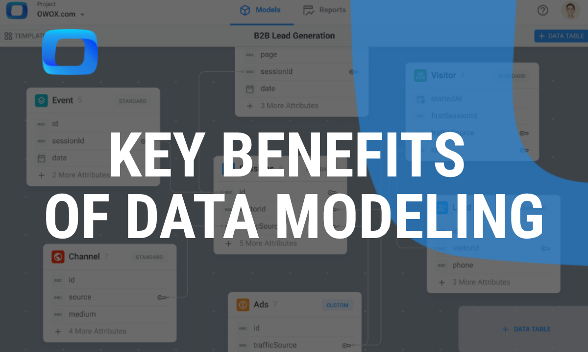
Solution: Use a Product Data Model Built for SaaS Subscription Analytics
To move beyond assumptions, SaaS teams need a data model built specifically for tracking subscriptions, plans, and usage. With the right structure, you can analyze retention across roles, milestones, and plans, turning raw data into clear growth signals.
Measure Retention by Plan, Role, and Usage Milestones
SaaS teams often struggle to connect subscription plans with actual user behavior. A structured product analytics model makes it easy to break down retention by pricing tier, user role (e.g., admin, viewer), and key engagement milestones.
In OWOX AI Assistant, you can ask in natural language, “Which plan and user role combination has the highest 90-day retention rate?”
To answer this, the assistant will likely clarify the following assumptions:
- "Plan" is pulled from the plan or subscription table.
- "User role" comes from the user table.
- "90-day retention rate" means users who are still active 90 days after their signup date.
- The system will return the plan and role combination with the highest retention rate.
The assistant will then ask: “Is this correct? Would you like to adjust any of these assumptions?”
Once confirmed, the tool will run the analysis and return the segments with the strongest retention, so you can focus your efforts where they matter most.
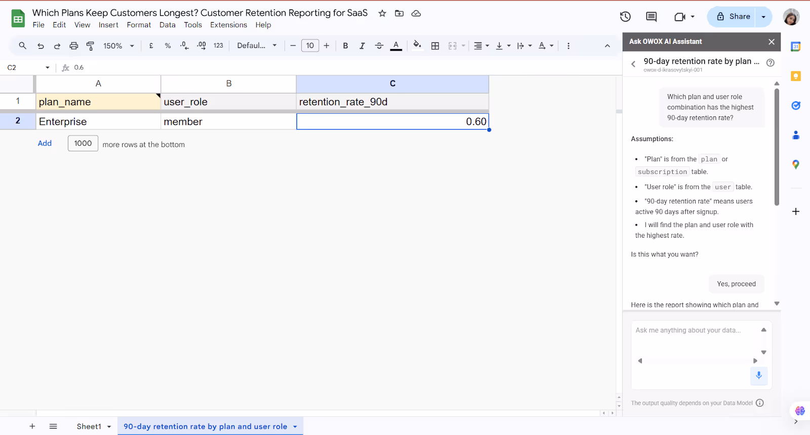
This helps you identify which plans keep users engaged the longest and what actions lead to stronger retention.
Detect Churn Triggers in Product Behavior
Churn rarely happens overnight. It’s often preceded by clear behavioral signals, missed logins, dropped activity, or skipped onboarding steps. With a structured product data model, you can track these patterns and act before it’s too late.
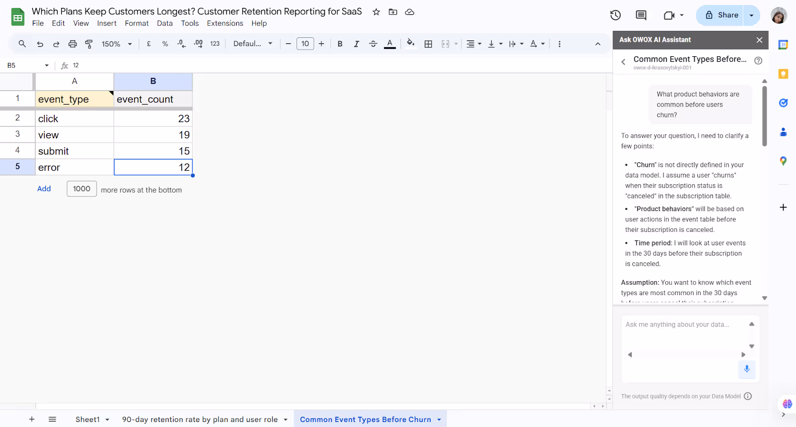
In OWOX AI Assistant, you can ask in natural language: “What product behaviors are common before users churn?”
To answer this, the assistant will likely clarify the following assumptions:
- "Churn" is not directly defined in your data model. It assumes a user has churned when their subscription status is "canceled" in the subscription table.
- "Product behaviors" will be based on user actions from the event table before cancellation.
- The assistant will analyze activity in the 30 days leading up to churn.
- The goal is to identify which event types are most common before users cancel their subscription.
The assistant will then ask: “Is this correct? Would you like to adjust any of these assumptions?”
Once confirmed, the tool will return patterns that typically precede churn, helping your team spot early warning signs and respond proactively.
This insight helps your team intervene early and reduce churn before it happens.
Run Cohort Analysis by Subscription Plan
Cohort analysis helps you spot retention trends across user groups, like those who signed up in the same month or chose the same plan. When grouped properly, cohorts reveal how long users stay, where churn starts, and which plans retain best. A product data model makes this scalable and repeatable without a complex setup each time.
In OWOX AI Assistant, you can ask in natural language: “Can you show cohort retention by subscription plan and signup month?”
To answer your question, the assistant will clarify the following assumptions:
- Subscription plan will be pulled from subscription.plan_name.
- Signup month will be derived by grouping user.created_at by month.
- Cohort retention isn’t directly defined, but will be calculated based on user activity (e.g., events or sessions) after signup.
- The goal is to show, for each signup month and plan, how many users remain active in later months.
The assistant will then ask: “Is this correct? Would you like to adjust any of these assumptions?”
Once confirmed, the tool will generate a cohort retention table, showing user drop-off or engagement trends by signup month and subscription plan.

This helps you understand which plans lead to longer-term engagement across user cohorts.
Connect Subscription Revenue to Product Engagement
SaaS teams often treat revenue and product usage as separate metrics, but they’re deeply connected. By linking events like feature adoption or milestone completion with upgrades, renewals, or churn, you can see what truly drives revenue growth. A unified product data model makes it easy to track these patterns and confidently take action.
In OWOX AI Assistant, you can ask in natural language: “Which features do users use most in the 30 days before upgrading their subscription?”
To answer your question, the assistant will clarify the following assumptions:
- “Upgrading subscription” means the user starts a new subscription plan, based on the subscription table.
- “Features used” are tracked through events in the event table, joined with the feature metadata.
- The analysis will consider the 30 days before each user’s latest subscription start date to detect usage patterns.
- The goal is to find the most commonly used features before an upgrade.
The assistant will then ask: “Is this correct? Would you like to adjust any of these assumptions?”
Once confirmed, the tool will return a list of features most commonly used before subscription upgrades, so your team can understand what drives paying behavior.
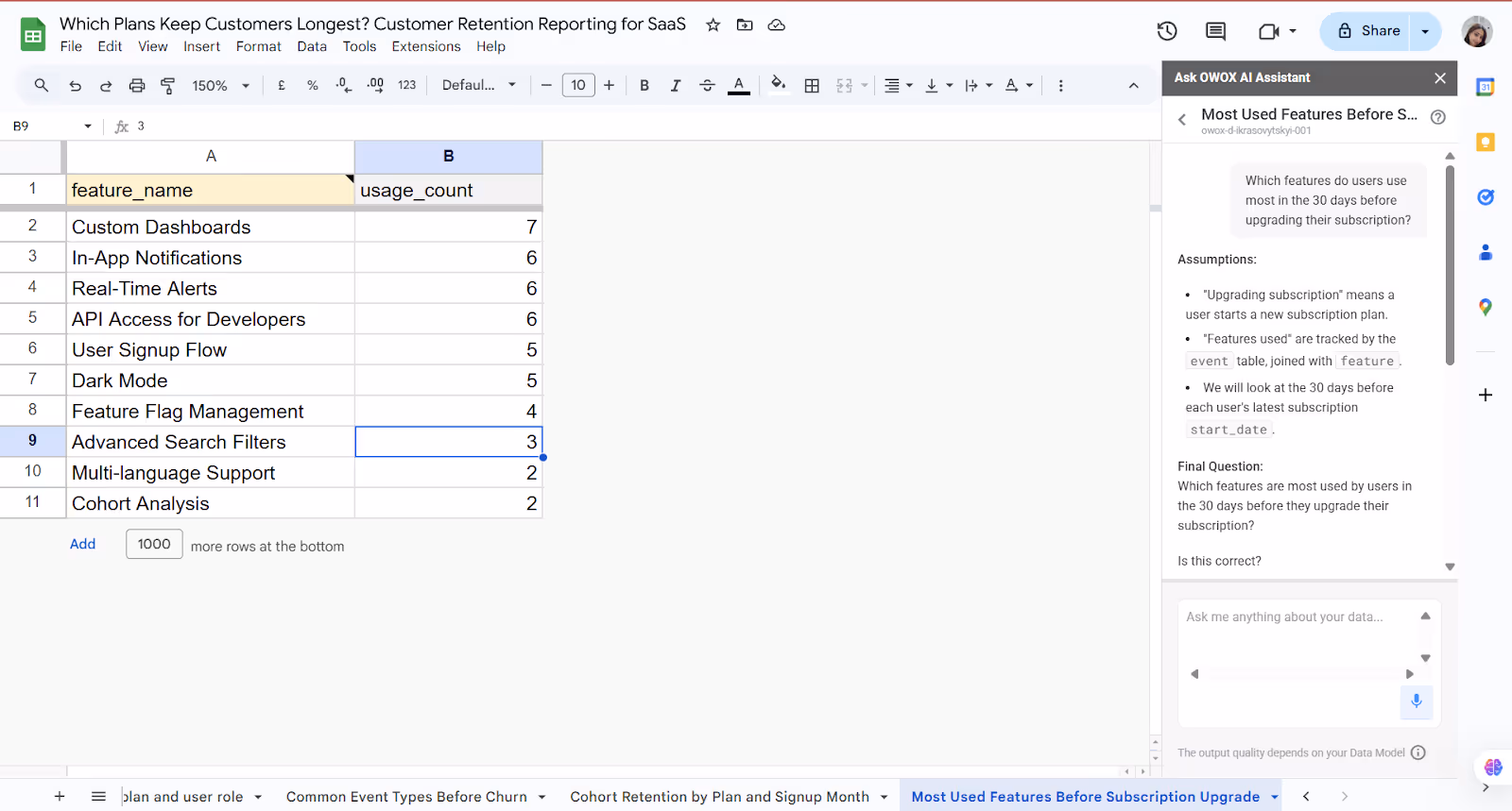
This helps you focus on product features that influence conversion and drive revenue.
What to Measure: Retention Curves, Plan Lifespan, Usage by Plan
Once your data model is in place, the next step is knowing what to track. These key retention metrics will help you understand how users behave and which plans drive long-term value.
Analyze Retention Curves to Understand User Engagement Over Time
Retention curves show how user activity changes over time after signup. Sharp drop-offs often point to friction in onboarding, while flat curves signal sustained engagement. By visualizing retention week by week, you can spot when users lose interest and which plans or cohorts hold attention longer.
In OWOX AI Assistant, you can ask in natural language: “Can you show a retention curve for users grouped by signup month?”
To answer your question, the assistant will clarify the following assumptions:
- "Signup month" will be based on the user.created_at.
- "Retention" means users who continue to generate activity (via events or sessions) in the months following signup.
- Activity data will come from the event or session table.
- The time range for analysis will cover the last 12 months.
The assistant will then ask: “Is this correct? Would you like to adjust any of these assumptions?”
Once confirmed, the tool will generate a retention curve, showing the percentage of users active each month after signup, by cohort.
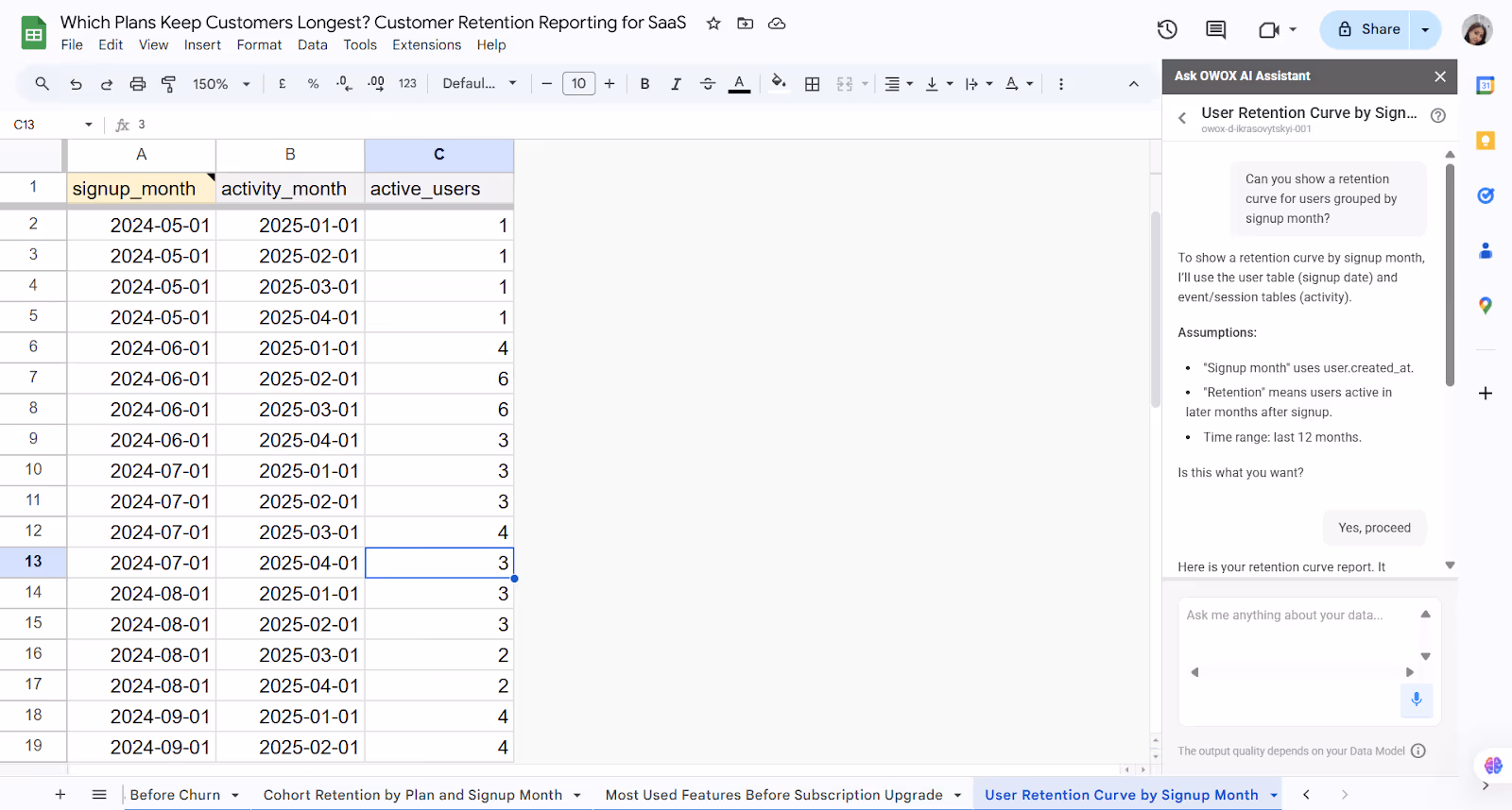
This helps your team visualize drop-off trends and understand how engagement evolves.
Evaluate Plan Lifespan to Determine Subscription Durability
The plan's lifespan tells how long users stay subscribed to each pricing tier. Some plans may lead to quick churn, while others foster long-term relationships. By measuring the average duration of subscriptions per plan, you can identify which tiers deliver lasting value and adjust pricing or packaging accordingly.
In OWOX AI Assistant, you can ask in natural language: “Which plan keeps users subscribed the longest?”
To answer your question, the assistant will clarify the following assumptions:
- It will use the subscription table to calculate each user's subscription duration by subtracting start_date from end_date.
- If end_date is missing (for active users), the current date may be used to calculate duration.
- The analysis will be grouped by plan_name to compare average or median subscription lifespan across plans.
- No time filter will be applied; all available subscription records will be used.
The assistant will then ask: “Is this correct? Would you like to adjust any of these assumptions?”
Once confirmed, OWOX will return a table showing which plans keep users subscribed the longest, giving you insights into plan-level retention performance.
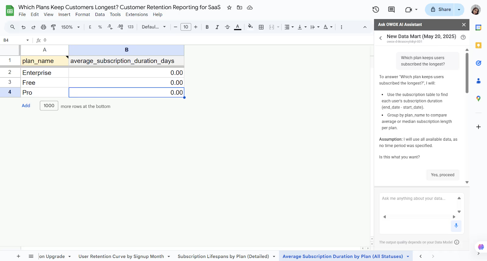
This helps your team identify which pricing tiers deliver the most value and support long-term user engagement.
Assess Usage by Plan to Identify Feature Adoption and Value
Not all features are used equally across pricing tiers. By analyzing how users engage with features based on their subscription plan, you can see what drives retention and whether higher-tier plans offer enough real value. This insight helps improve packaging and prioritize features that matter most to long-term users.
In OWOX AI Assistant, you can ask in natural language: “Which features are most used by users on each subscription plan?”
To answer your question, the assistant will clarify the following assumptions:
- "Features" refers to product features listed in the feature table.
- "Most used" is based on the highest count of user-triggered events per feature in the event table.
- "Subscription plan" comes from the plan table and is joined through the subscription.
- No time filter will be applied; all available data will be used for the analysis.
The assistant will then ask: “Is this correct? Would you like to adjust any of these assumptions?”
Once confirmed, OWOX will return a list of the most-used features for each subscription plan, revealing what drives engagement at every tier.
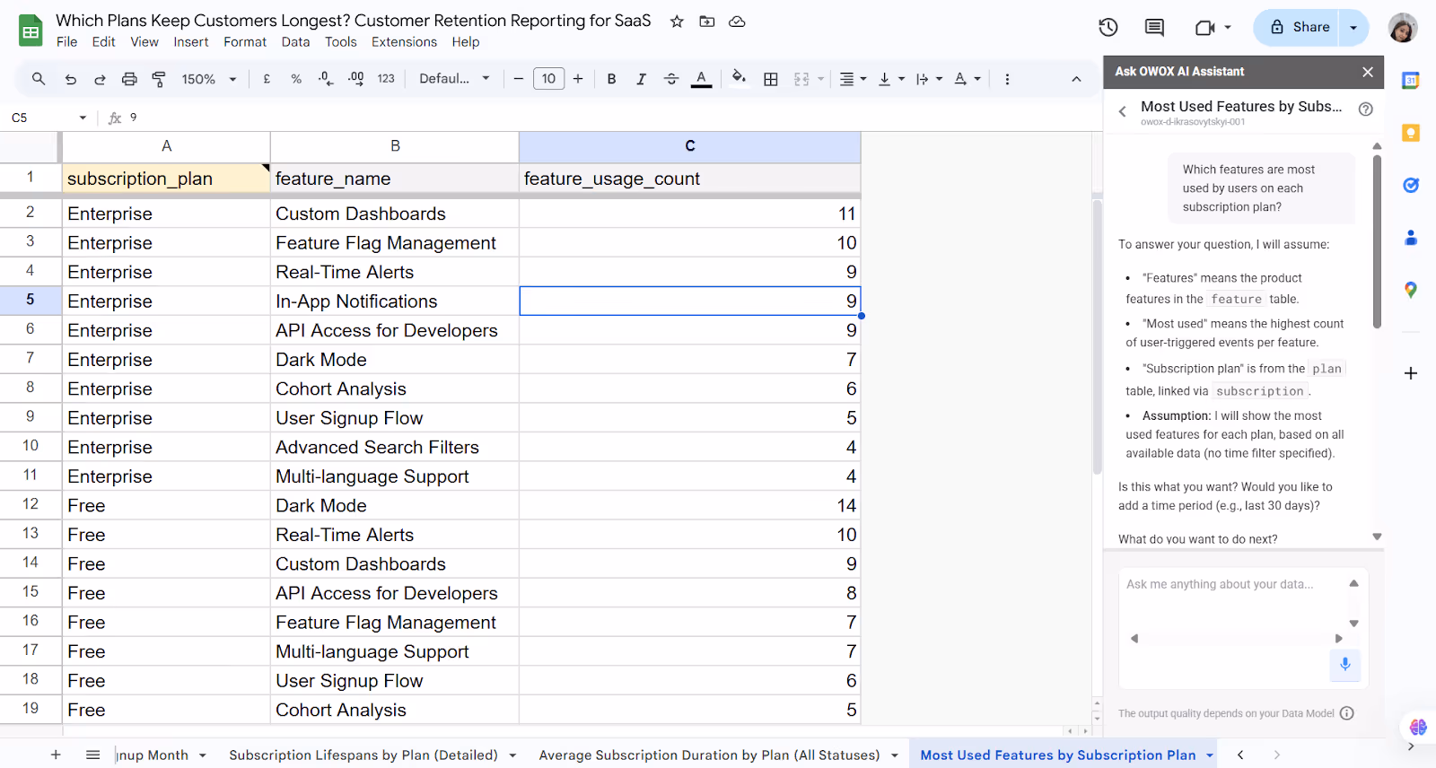
This allows your team to align feature sets with user behavior and deliver more compelling plan experiences.
SQL Query to Compare Retention Across SaaS Plans
Not all subscription plans retain users equally, but most teams don’t track this difference at the data level. With SQL, you can measure retention by plan and see which keeps users engaged beyond 30, 60, or 90 days. This gives you a clearer picture of plan performance and customer loyalty.
For Example, let's assume your product or growth team wants to determine which plan has the highest percentage of active users 90 days after signup.
You might ask:
“Which subscription plan has the highest 90-day user retention rate?”
1SELECT
2  s.plan_name,
3  COUNT(DISTINCT u.id) AS total_users,
4  COUNT(DISTINCT CASE
5    WHEN DATE_DIFF(DATE(e.timestamp), DATE(u.created_at), DAY) >= 90 THEN u.id
6  END) AS retained_90_day_users,
7  SAFE_DIVIDE(
8    COUNT(DISTINCT CASE
9      WHEN DATE_DIFF(DATE(e.timestamp), DATE(u.created_at), DAY) >= 90 THEN u.id
10    END),
11    COUNT(DISTINCT u.id)
12  ) * 100 AS retention_rate_90d_pct
13FROM
14  `owox-d-ikrasovytskyi-001.Product_Data_Model_v1.user` u
15JOIN
16  `owox-d-ikrasovytskyi-001.Product_Data_Model_v1.subscription` s ON u.id = s.user_id
17JOIN
18  `owox-d-ikrasovytskyi-001.Product_Data_Model_v1.event` e ON u.id = e.user_id
19GROUP BY
20  s.plan_name
21ORDER BY
22  retention_rate_90d_pct DESC;
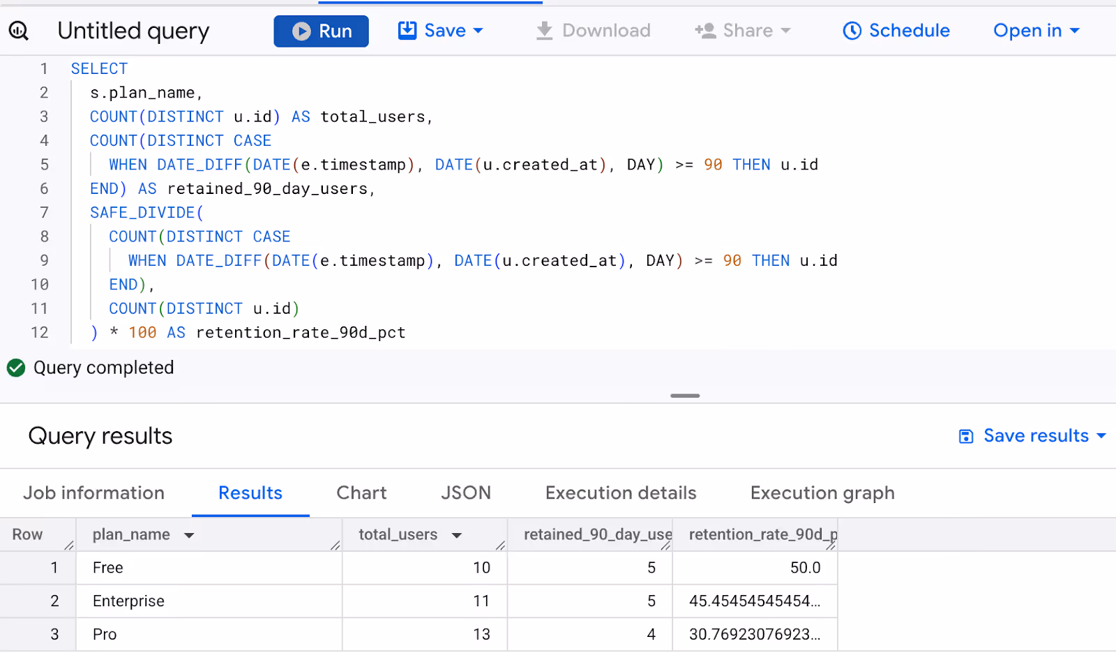
It equips your team to compare retention performance across tiers and optimize plan design accordingly.
Set Up Dashboards & Alerts in OWOX BI to Monitor Retention by Plan
Once your data model is in place, OWOX BI lets you quickly turn it into real-time dashboards and alerts. This gives your team continuous visibility into how different subscription plans are performing, so you can catch issues early and act fast.
Build a Retention Dashboard Using the Product Analytics Template
With OWOX BI’s product analytics template, you can build a full retention dashboard in minutes. Connect your BigQuery data, select subscription plans, and visualize how long users stay active. There’s no need to write SQL or create models from scratch; it’s all prebuilt and ready for self-serve exploration.
Add Custom Alerts for Churn Spikes
Create alerts that monitor churn across specific plans, roles, or usage behaviors. When retention drops unexpectedly, your team will get notified via email, Slack, or Google Sheets. This proactive setup saves time and ensures your team can respond immediately, without needing to constantly refresh dashboards or wait for someone to notice the trend.
Share Dashboards with Product and Growth Teams
Dashboards are only helpful if people can act on them. With OWOX BI, you can easily share your retention reporting dashboards with product managers, marketers, and success teams. Export views to Google Sheets or Looker Studio, so teams can drill into the data and make informed decisions on pricing, onboarding, or engagement strategies.
How to Analyze Retention Using BigQuery + OWOX AI Assistant
To track retention effectively, you need both flexible data access and easy reporting. BigQuery handles the heavy data work, while OWOX AI Assistant makes insights accessible to non-technical teams.
Structure Your Event Data for Retention Tracking
To run accurate retention analysis, your event data in BigQuery must be structured with key fields like user_id, plan_name, signup_date, and activity_date. Clean, consistent data enables cohort grouping, time-based engagement tracking, and smooth integration with tools like OWOX BI. Without proper structure, retention queries will be incomplete or misleading.
Use SQL to Calculate Subscription Lifespan by Plan
Once your data is structured, you can use SQL to measure how long users stay subscribed to each plan. Group users by signup month and plan, then calculate retention at intervals like 7, 30, or 90 days.

These metrics help you compare plan performance and power dashboards or alerts for churn detection and lifecycle tracking.
Enable Chat-Based Reporting with OWOX BI for Growth Teams
Once your BigQuery data model is connected, teams can ask natural language questions like “What product behaviors are common before users churn?” directly in OWOX BI’s chat interface. The assistant translates the question into SQL, runs it on your data, and returns instant results.

This removes bottlenecks, empowers growth and product teams, and speeds decision-making with self-serve insights.
Connect to Dashboards for Real-Time Monitoring
Once your retention queries are set, connect them to dashboards in Google Sheets or Looker Studio. OWOX BI enables automatic data refresh, so teams always see up-to-date retention by plan, feature, or user role. This real-time visibility helps product and growth teams spot changes quickly and act without relying on manual reporting cycles.
Build Your Retention Reports in Minutes with OWOX BI
OWOX BI makes it easy to move from raw data to actionable insights—no complex setup or SQL expertise required. With its ready-to-use product analytics model template, you can analyze retention by plan, role, and behavior in just a few clicks.
Ask questions in plain language, get instant answers, and share reports with your team in Google Sheets or dashboards. It’s the fastest way to understand what’s driving retention, and where to improve it.
Frequently asked questions


Finally, a tool that doesn't ask business users to learn a new dashboarding UI. Our marketing team already knows Sheets. OWOX just delivers the right data.
Joinable data marts concept was the thing that sold us. We can now use the semantic layer without building one.
Self-hosted the OSS version on Digital Ocean. Zero vendor lock-in. Contributed a Shopify connector back in week two.