The advantages of a marketing dashboard when working with data are undeniable. They’re a win-win way to present key indicators clearly and visually to all employees.

Just as a car’s speedometer tells you how fast you’re going, a well-designed digital marketing dashboard example shows you the success of your brand promotions, reveals the effectiveness of marketing channels, and forecasts whether you will be able to achieve your sales goals. To create a marketing dashboard, you need to follow specific steps, use a Designer tool, and customize metrics for different audiences.
In this article, you’ll find examples and templates of the best marketing dashboard for marketers to improve your productivity and marketing ROI in real time.
Note: This post was written in 2022 and has been completely updated with new dashboard templates in November 2024.
What is a Marketing Dashboard, and Why Do You Need One?
A marketing dashboard provides a visual summary of essential data needed to monitor key digital marketing metrics and performance indicators and achieve marketing goals. It compiles high-level marketing reports on a single page for an accessible overview. This marketing dashboard serves as the foundation for deeper marketing analysis.
Digital marketers use these marketing dashboards to track their campaigns and overall online performance, monitoring a variety of metrics across different channels to make informed decisions about marketing strategies and budget allocation.
A marketing dashboard helps you collect data on one screen and visualize tables with calculated results in understandable graphs, tables, and charts. This way of presenting data makes it easier to perceive information, which greatly simplifies the decision-making process.
Benefits of working with dashboards:
- All KPIs are available on one screen.
- You don’t have to compile data manually each time you need it.
- Data is updated automatically.
- You can set the required data refresh rate.
With the help of dashboards, marketers can evaluate the effectiveness of their efforts and report to their superiors on work done. In addition, marketing dashboards have another equally important task — helping managers to make decisions.
The contents of a report depend on who will use the report, how often, and for what purposes.
What Information Can a Marketing Dashboard Contain?
Before you start creating a marketing dashboard, think about what parameters and indicators you want it to show. They should match your needs.
Marketing dashboards are essential tools for measuring the effectiveness of digital marketing campaigns, providing insights into various metrics like engagement and conversions, which are crucial for optimizing overall marketing strategies.
Examples of Parameters and Indicators
- If your task is to increase ad clicks, the report should contain the number of clicks and CPC.
- If your goal is to increase conversions, the report should include CPA and the number of orders or other conversion actions.
- If you want to increase ROMI, the report must reflect advertising costs, revenue, and average check size.
Try to focus on the main thing and not include too much data in the marketing dashboard, as this can make it incomprehensible to the end user. Instead of one universal dashboard, it’s better to make several separate ones. For example, a PPC specialist and a marketing director usually need dashboards with different metrics, frequency, and data granularity.
The parameters and indicators on the marketing dashboard must be interconnected and follow a logical sequence; otherwise, erroneous conclusions can be drawn.
For example, if your CPA has changed, you need to show the conversion dynamics next to it.
Making Your Dashboard More Visual
To make the dashboard more visual and understandable, you can:
- Add context: market trends, competitor data, the impact of seasonal demand, stock, etc. That is, show everything that in one way or another affects the effectiveness of your advertising campaigns.
- You can add comments on the numbers and graphs on the dashboard, explaining to the user how, when, and as a result of what actions an indicator was achieved.
- Even if you’re a fan of tables, think about visualizing data — graphs and charts on dashboards will make your story much clearer than numbers in rows.
Dashboard vs. Report: Key Differences in Data Analysis and Reporting
Understanding the essential differences between marketing dashboards and reports is crucial for anyone looking to manage and interpret data effectively.
What is a Dashboard?
A dashboard is a real-time visual interface providing an interactive and dynamic view of current performance across various metrics. It’s designed to facilitate quick, at-a-glance monitoring and prompt decision-making by presenting data in an easily digestible format.
Key Features of Dashboards
- Real-time data visualization
- Interactive and dynamic interface
- Quick monitoring and decision-making
- Presentation of data through graphs, charts, and indicators
When to Use Dashboards
Dashboards are highly valued in scenarios where time-sensitive decisions are critical, offering a snapshot of the latest data.
What is a Report?
On the other hand, a report is a detailed and often static document that goes beyond the surface to offer a deep dive into data and trends over time. Reports are structured to provide comprehensive analysis and insights, frequently relying on historical data to narrate the "how" and "why" behind performance metrics.
Key Features of Reports
- Detailed analysis of data
- Static document format
- Focus on historical data
- Explanation of performance metrics
When to Use Reports
Reports are typically used for strategic planning, in-depth analysis, and to inform stakeholders of progress, outcomes, and future directions.
Understanding the Differences
While dashboards provide immediate clarity on current conditions, reports are about understanding the journey and the underlying factors that have led to those conditions.
Feature | Dashboard | Report |
Data Presentation | Real-time visual interface | Detailed document |
Format | Interactive and dynamic | Static |
Focus | Current performance | Historical trends |
Purpose | Quick monitoring and decision-making | In-depth analysis and strategic planning |
Both dashboards and reports are indispensable tools in data-driven decision-making, each serving a unique role in the broader context of business intelligence and analytics.
All-in-one Digital marketing Dashboard
Download templateEffective vs. Ineffective Marketing Dashboards
When it comes to monitoring and analyzing marketing efforts, the design and functionality of your marketing dashboard can significantly impact your ability to make informed decisions. Let's look at the characteristics underneath.
Characteristics of a Good Marketing Dashboard
A good marketing dashboard includes:
- Appealing data visualization: You can quickly and easily see where ROI sags or which site is unsuitable for your advertising.
- Accurately selected context: At a glance, it’s clear what the charts are about and what data is presented in graphs.
- Ability to pick specific dates: You can easily change the reporting period for advertising campaigns.
- Interactivity: Data can be filtered according to the selected parameter (for example, country, city, device, or campaign).
- Ability to compare selected indicators with those from a previous period to evaluate the effectiveness of advertising campaigns.
- Ability to track changes as often as you need, such as tracking subsidence in traffic once a day, once a week, or in real-time.
Characteristics of a Bad Marketing Dashboard
Meanwhile, a bad dashboard has:
- Too many details and elements. This throws off the user’s focus and turns the dashboard into a carnival.
- Metrics, chart axes, and charts themselves are incomprehensibly named.
- Poor visualization. The type of data displays selected is incorrect. For example, a pie chart is chosen to show how data changes over time.
- The purpose of the dashboard is not clear from the title, leading to confusion.
A good dashboard accurately presents information, while a bad dashboard is just a collection of data that doesn’t clearly answer your questions. The main purpose of a dashboard is to provide answers to the right questions. Try to specify the goals of the dashboard so it’s convenient to use.
If you want to build cross-channel reports in minutes, use OWOX BI. It will save your team’s resources and help you avoid errors when collecting, processing, merging, and managing data.

Gain clarity for better decisions without chaos
No switching between platforms. Get the reports you need to focus on campaign optimization
How to Build a Marketing Dashboard?
Many companies spend significant amounts on advertising. Marketing dashboards are needed by marketers not only to evaluate advertising campaigns.
They also help justify the budget to management and prove the importance and effectiveness of marketers’ work. Creating a dashboard is a strategic process that involves visualizing critical data for insightful decision-making, so let's explore how to approach it.
Step 1: Select the Ideal Dashboard Software
Choosing suitable dashboard software is essential. Look for a tool that offers intuitive design features, versatile data integration, and customization options to meet your business needs. There are dashboards known for their comprehensive functionality, user-friendliness, and flexibility.
The Google Ads dashboard is crucial for tracking the effectiveness of advertising campaigns, allowing users to monitor key performance indicators (KPIs) and return on investment (ROI). They are highly recommended for their effectiveness in consolidating various data sources and tailoring dashboards to specific business insights, making them an excellent choice for mobile apps and gaming industries.
Step 2: Identify Your Users
Consider who will use the dashboard, such as the marketing team, sales department, or executives, and understand their unique requirements and objectives. Tailor the dashboard to meet these specific needs, ensuring it provides the most relevant and actionable information.
Step 3: Assess Your Data
It’s critical to verify that your data is not only accurate, timely, and relevant but also comprehensive and clean.
A marketing analytics dashboard aids in visualizing campaign effectiveness and optimizing strategies based on data-driven insights. This step ensures the Google Analytics dashboard always reflects an accurate picture of the situation, catering to the specific insights needed, like sales performance for the sales team or customer engagement metrics for the marketing team.
Also, consider the source of your data to guarantee reliability and integrity, which forms the foundation of trust in the insights derived.
Step 4: Choose Appropriate Chart Types
Selecting the suitable chart types is about clarity and immediate comprehension. Beyond line and bar charts, consider using scatter plots for correlation analysis or pie charts for a clear distribution view, ensuring the chosen type enhances the data's story.
Remember, the chart's complexity should match the user's ability to understand it, avoiding misinterpretation of the presented data.
Step 5: Optimize Color Usage
Practical color usage goes beyond differentiation and accessibility; it involves using color psychology to highlight or de-emphasize information, guiding the viewer's attention to what matters most.
Consistency in color coding across the dashboard also helps in quick recognition and comparison, making the visual data digestion process smoother and more intuitive.
Step 6: Incorporate Multiple Data Views
A robust dashboard combines past, present, and future data views to offer a 360-degree perspective on performance and prospects.
Including comparative analysis tools or benchmarking data can further enrich this view, allowing users to measure performance against internal targets or industry standards, thus enhancing the strategic value of the dashboard.
Step 7: Utilize Data Visualization Templates
While starting with templates can accelerate the dashboard development process, tailoring them to include branding elements or to follow specific visualization guidelines can significantly increase its effectiveness and user engagement.
Moreover, templates should be viewed as evolving living documents, encouraging ongoing customization to meet changing business and data needs.
Step 8: Ensure Ongoing Dashboard Relevance
Regular maintenance of your dashboard is essential for its continued usefulness.
This includes not only updating data but also revisiting the dashboard's design and functionality in response to user feedback, technological advancements, or changes in business strategy.
An agile approach to dashboard management ensures it remains a critical tool in decision-making processes.
Step 9: Educate Your Team
Beyond basic training, fostering a data-driven culture within your team enhances the dashboard's overall effectiveness.
Encourage regular feedback sessions to understand user challenges and successes, and consider advanced analytical training for key users to deepen their data interpretation skills.
This investment in education empowers your team to make more informative and sophisticated decisions based on dashboard insights.
After you’ve decided on the requirements for the dashboard, you need to collect data for it. At the same time, it’s necessary to predict possible risks, such as low data quality, sampling, and data insecurity.
Benefits of Using Marketing Dashboards
Streamlining data management for marketing dashboards involves automating the collection, merging diverse sources, and ensuring data quality and security.
This process enhances decision-making by providing accurate, comprehensive insights across campaigns and reducing errors and security risks. Businesses can effectively harness their marketing data for strategic analysis and growth by focusing on these critical areas.
1. Automate Data Collection
You can manually collect data for dashboards if you have under a dozen campaigns. In all other cases, we recommend setting up automatic ad cost importing into Google Analytics 4 or Google BigQuery, as well as collecting raw non-sampled data from the site.
This will help you avoid the routine and avoid mistakes that can cause your company to lose a lot of money every year.
2. Merge Marketing Data
To compare the success of multiple campaigns across platforms, you need to merge data from all your marketing services.
For example, you can collect your data in Google BigQuery.
The structure and format of data differ from source to source. To build reports, data from different sources must be correctly combined.
By itself, the data uploaded through connectors or various ETL services is raw and dirty (contains errors, duplicates, and discrepancies) and lacks a unified logic and structure.
Incorrect and fragmented data needs to be cleaned up and normalized into an analytics-ready format.
3. Take care of Data Quality and Security
You must be sure of the quality of the collected data and the security of the connector or service that you use for collection purposes. Otherwise, you risk making the wrong decision due to errors, data duplication, or data loss.
With OWOX BI, you can quickly complete all these steps, create the report you need in minutes, and visualize it in Looker Studio, Google Sheets, or any other BI tool.
With OWOX BI, your data is ready for analysis and reporting. There is no need for additional manipulations with SQL or a BI tool. Plus, you can save time by using ready-made templates from the OWOX Dashboard Gallery. Just connect your data and enjoy exploring it.
Spend Smarter, See Results Sooner
Learn how to optimize every marketing dollar with personalized insights from OWOX BI
Marketing Dashboard Examples and Templates
Which is better: creating a new dashboard from scratch or using a template? There is no definite answer to this question. You can either take the time to create your own dashboard, or you can save time and use a template, slightly adapting it to your needs.
There’s no guarantee that a template will suit you. However, checking out different marketing dashboard examples and templates is a great way to get an idea of what the perfect dashboard might look like. You can use the selection of templates as marketing dashboard examples below for inspiration.
General Marketing Dashboards
Marketing directors and senior management require general marketing strategy dashboards. These dashboards focus on the marketing department’s overall performance, strategy, and goals over the past year.
Such dashboards usually display the current status of all key indicators and compare them with the plan and results for the previous year.
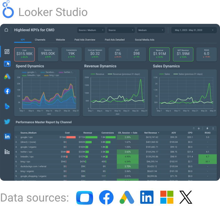
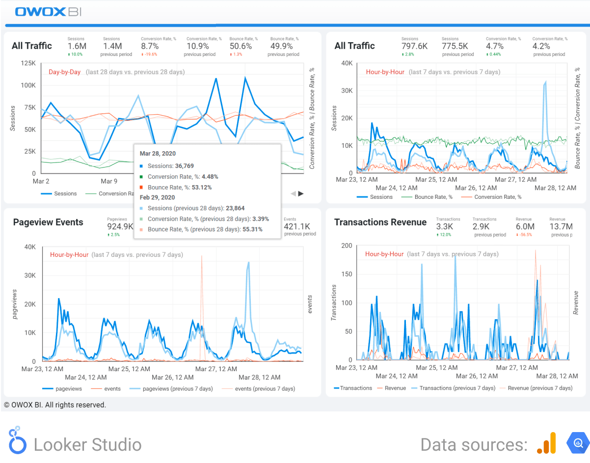
1. Digital Marketing Report Dashboard Template
Get all important business marketing metrics in one dashboard. Find out how much revenue each channel generates, how you’re fulfilling the marketing sales plan, and how to allocate your budget to reach your goals in digital marketing dashboards.
The marketing dashboard templates displays the KPIs of your ad campaigns and compares them to the previous year’s plan and results. You can regularly monitor the dynamics of indicators and quickly make changes to ad campaigns to achieve your goal.
This report helps you discover:
- How users go through your sales funnel and at what stage they most often leave it
- How many online orders are eventually redeemed
- The proportion of first and repeat purchases
This information will help you optimize your funnel and find the channels that perform best at each stage of the marketing funnel.
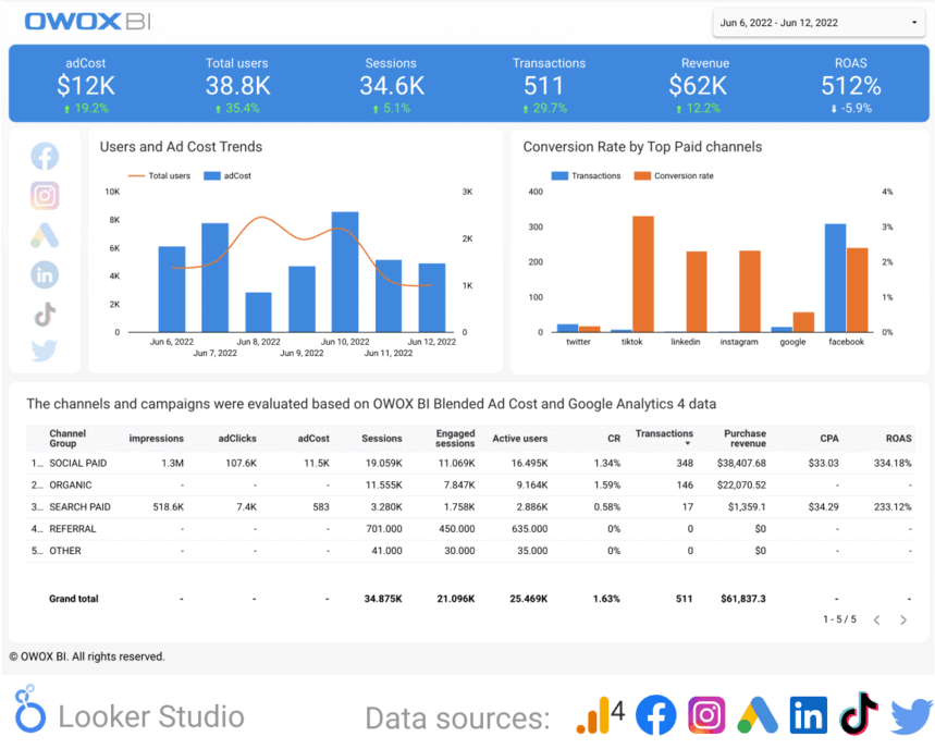
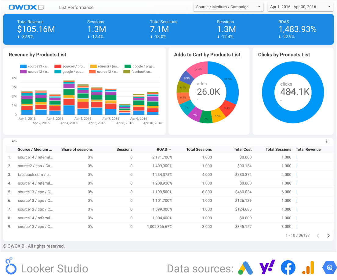
2. Advertising Performance & Attribution Report
How do users from different traffic sources behave?
How much does it cost to attract them?
What profit do they bring?
This dashboard will answer these questions and help you optimize your marketing budget.
Find out how different sources influence user promotion by funnel and which source is most effective at pushing users to purchase (and at what step). This information will help you reallocate your marketing budget based on problem areas in the funnel.
The less likely a user is to pass a certain step, the more attention should be paid to the campaigns that guide the user through this step.
3. Impact of Online Advertising on Offline Sales Report
Learn how your online marketing affects sales in physical stores, popularly known as ROPO. Find out which campaigns and categories of goods bring more purchases offline and which bring more online.
This information will help you manage your marketing and budget more effectively, increasing your overall sales and profit.
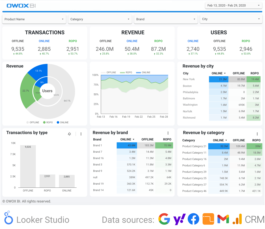
On this dashboard, you will see which sources, channels, and campaigns motivate users to make offline purchases and which motivate them to order on the site. Knowing this, you can manage campaigns based on your goals.
For example, you can increase total sales and profits on the website.
Uncover in-depth insights
Top 30 Handpicked Google Looker Studio Dashboards for Marketers
Download nowBonus for readers
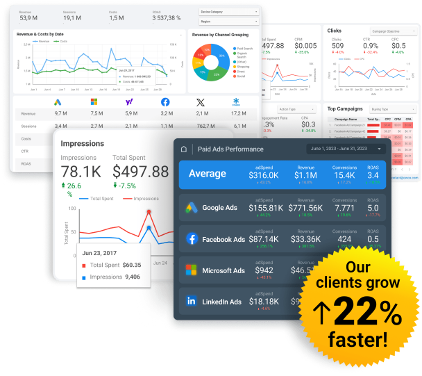
Marketing Performance Dashboards
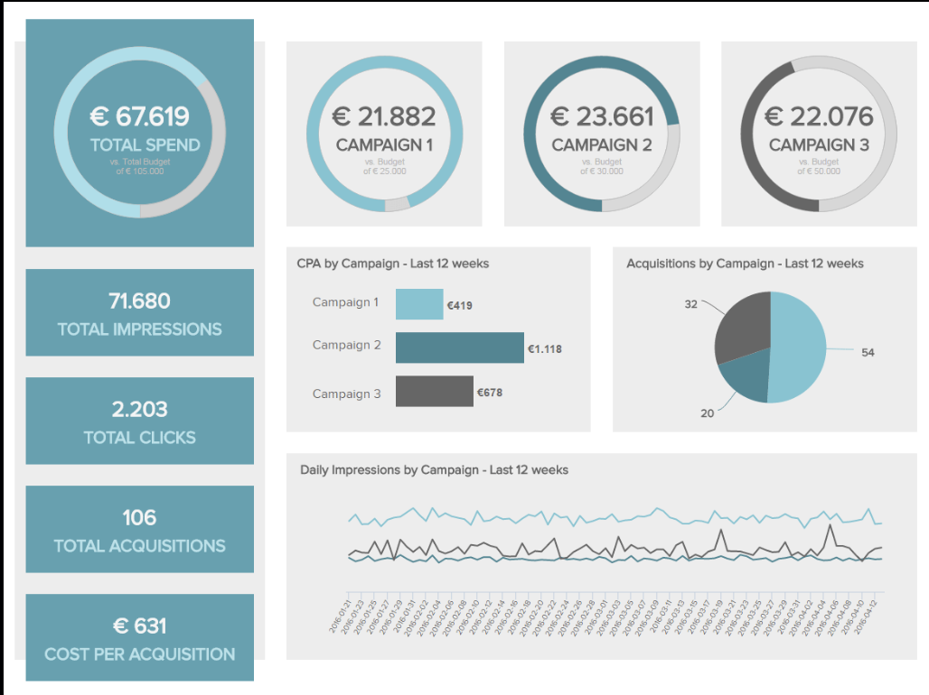
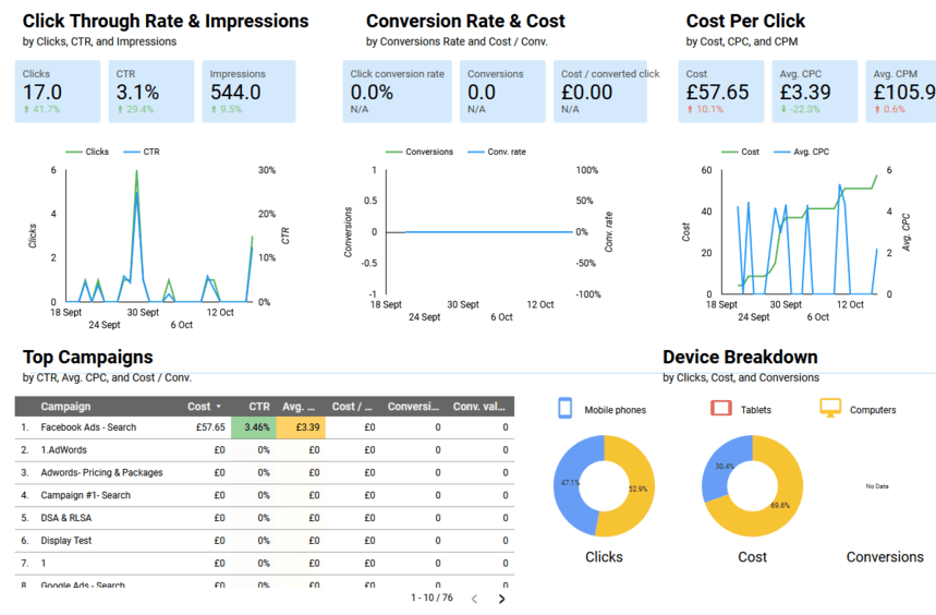
The Marketing Performance Dashboard template offers a comprehensive snapshot of your marketing activities across various channels and campaigns.
It kicks off with an assessment of total versus planned costs, allowing you to immediately gauge whether your spending aligns with your budgetary objectives. This initial comparison ensures that you can quickly identify if your campaigns are on track with their financial goals.
By displaying key metrics such as impressions, clicks, acquisitions, and total costs, this dashboard gives a detailed insight into your marketing performance, facilitating interactive analysis for deeper understanding and insight generation.
It then delves into specific metrics like click-through rate (CTR) for paid search campaigns, providing a basis for comparing performance across campaigns or ad groups and by country, highlighting significant variances.
The dashboard also covers cost per click (CPC) and cost per acquisition (CPA), critical indicators of efficiency and effectiveness.
4. Datapine Marketing Performance Dashboard
The Datapine Marketing Performance Dashboard stands out for its ability to bring together essential marketing metrics, offering a holistic view of campaign success, audience behavior, and investment returns.
With its easy-to-navigate dashboard, robust analytics, and customizable features, it empowers marketers to deeply understand their performance, pinpoint growth opportunities, and make informed decisions to drive enhanced outcomes across various marketing initiatives.
5. Klipfolio Marketing Performance Dashboard
Klipfolio's Marketing Performance Dashboard is an advanced platform that offers real-time insights into marketing metrics, enabling businesses to track and analyze their marketing efforts across various channels.
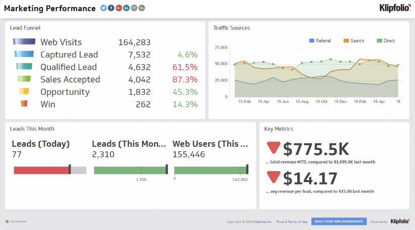
It integrates seamlessly with numerous data sources, providing a comprehensive view of performance indicators such as website traffic, conversion rates, and social media engagement.
With customizable Klips and interactive visualizations, Klipfolio helps marketers identify trends, optimize campaigns, and improve ROI.
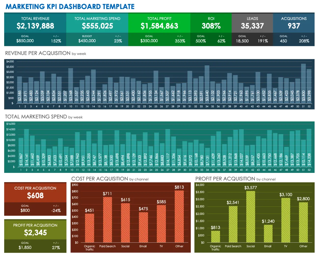
KPI Marketing Dashboards
The marketing KPI dashboard is a versatile and extensive tool for monitoring and analyzing business performance. Various tools on the market offer customization options to meet specific user needs.
By exploring different marketing KPI dashboard examples, you'll find they encompass a wide range of metrics, including CPA, CPL, average order value, CRM data, and sales targets and growth.
This allows for the creation of tailored dashboards that provide a comprehensive overview of your company's progress and performance.
6. Datapine KPI Marketing Dashboard Template
Datapine marketing KPI dashboard delivers an overview of key metrics like cost and revenue, crucial for your bottom line.
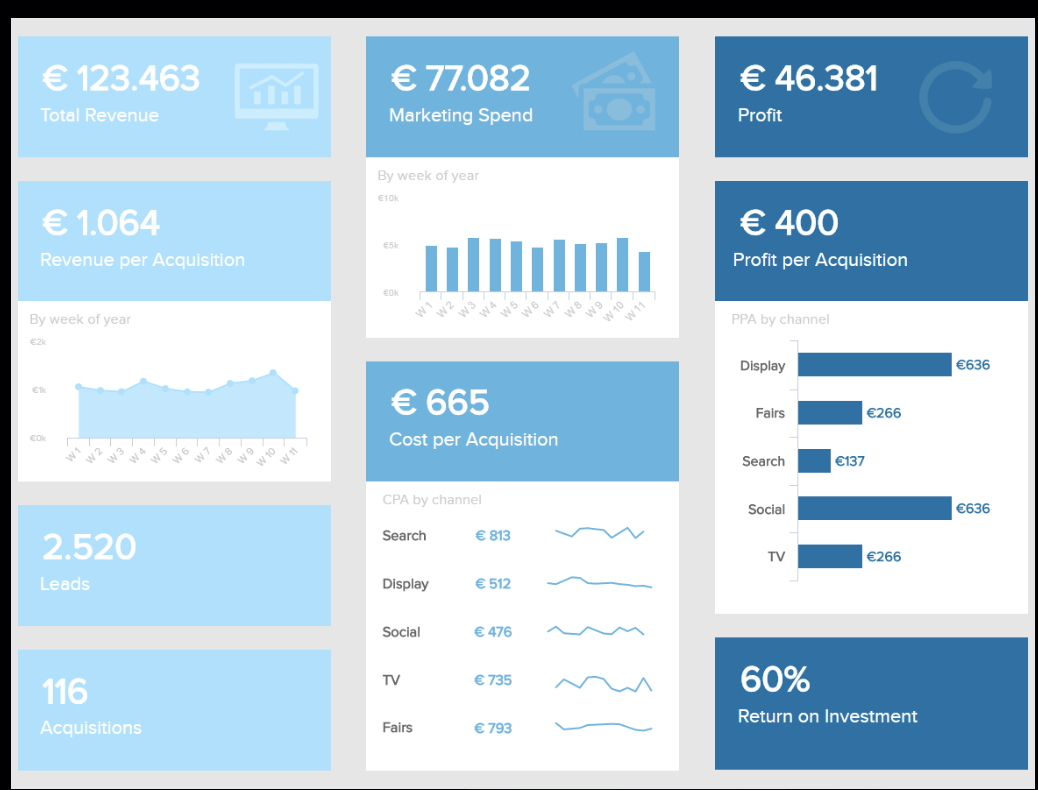
Designed for clarity and ease of use, it emphasizes that while boosting sessions and CTR is valuable, it doesn't always translate to profit or ROI.
Ideal for presenting to CEOs or investors, it consolidates cost, revenue, and profit stats, offering insights into efficient customer acquisition and campaign performance.
This tool helps identify where to allocate marketing resources for optimal impact, supporting strategic business decisions and exceeding expectations.
7. KPI Marketing Dashboard Template by Excel
The KPI Dashboard Template by Excel is a versatile tool designed to track and analyze key performance indicators across various business functions.
Customizable and user-friendly, it enables users to visualize data trends, measure progress toward goals, and make informed decisions.
With features that allow for the aggregation of data from multiple sources, this template simplifies the process of monitoring performance metrics such as sales figures, operational efficiency, and financial health.
Ideal for businesses seeking a straightforward, efficient way to manage their KPIs, it's an essential asset for strategic planning and performance management.
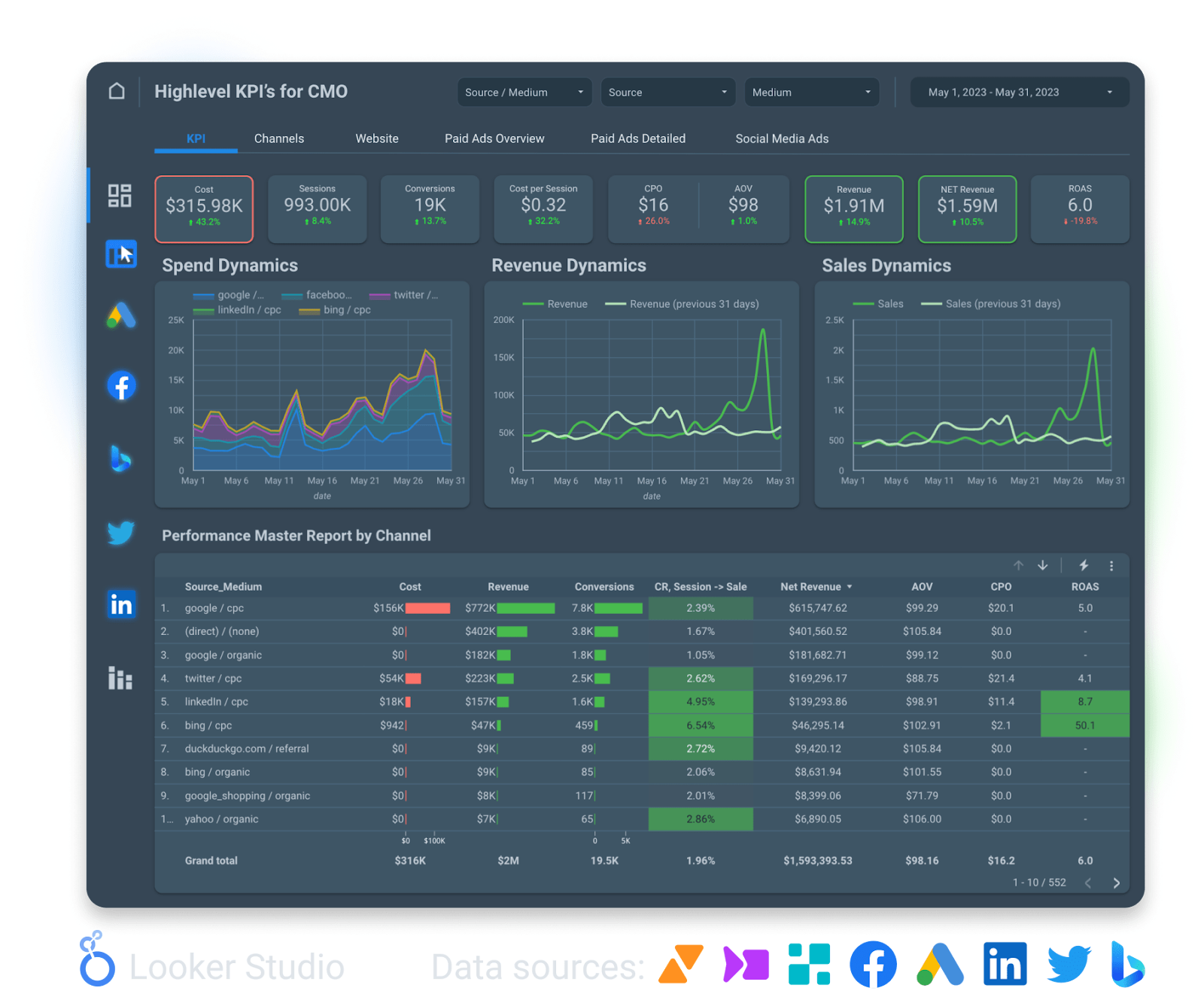
PPC Dashboards
Dashboards in Looker Studio for monitoring paid ads are perhaps the most popular. Budget managers as well as PPC specialists who care about the results of their paid campaigns review these reports daily, weekly, and monthly.
Such a summary dashboard has several advantages compared to classic reports in individual services:
- One tab is better than ten. You have one report for all your campaigns, with the ability to segment and filter them.
- Creating one general report is faster than creating five separate ones.
Only by analyzing all PPC channels together can we answer the main question - which channels should we increase the budget for?
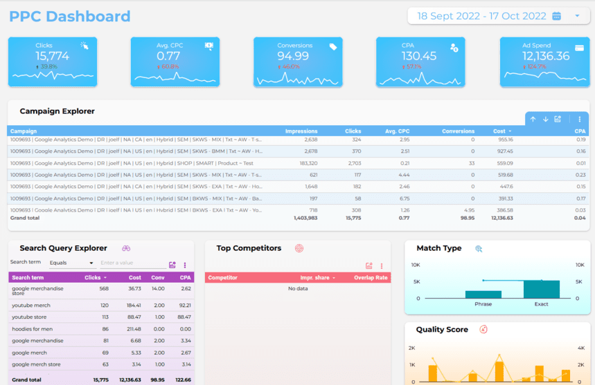
8. PPC Dashboard Template
Evaluate the effectiveness of paid traffic channels. Analyze statistics from Google Ads, Facebook, and other advertising sources in one dashboard.
With the help of this dashboard, you can compare the profits, costs, displays and clicks, CTR, and ROAS of all traffic sources and draw conclusions about their ROI. Find out which sources work best, where you need to invest, and where you shouldn’t waste your budget.
9. Digital Marketing Dashboard
Compare the effectiveness of campaigns from Google Ads, Facebook, and other advertising services to optimally allocate your marketing budget using the digital marketing dashboard.
Monitor key indicators daily to make operational decisions. Track revenue and expense dynamics, CPM, CPC and CPA, conversions, ROMI, and ROAS for each campaign by day. Find out where your customers come from and what devices they use.
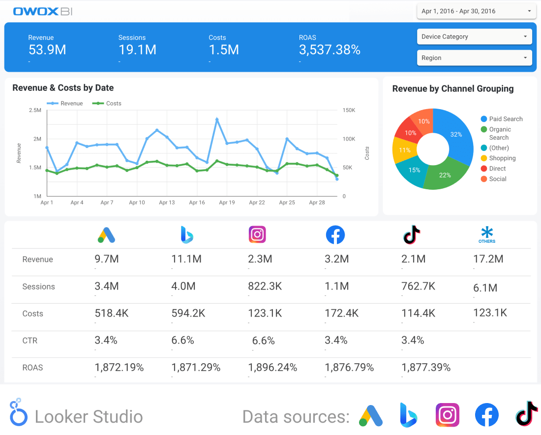
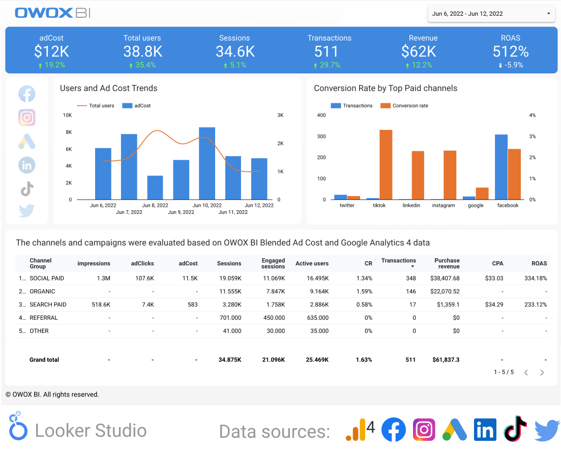
10. Google Analytics 4 & Paid Channels report template
Get a clear overview and analysis of your Facebook, Instagram, LinkedIn, Google Ads, TikTok Ads, and Twitter Ads campaigns as well as Google Analytics 4 events on one Looker Studio dashboard.
Use Google Analytics 4 & paid channels report template to track and analyze the performance of your advertising campaigns across all key metrics down to the campaign level.
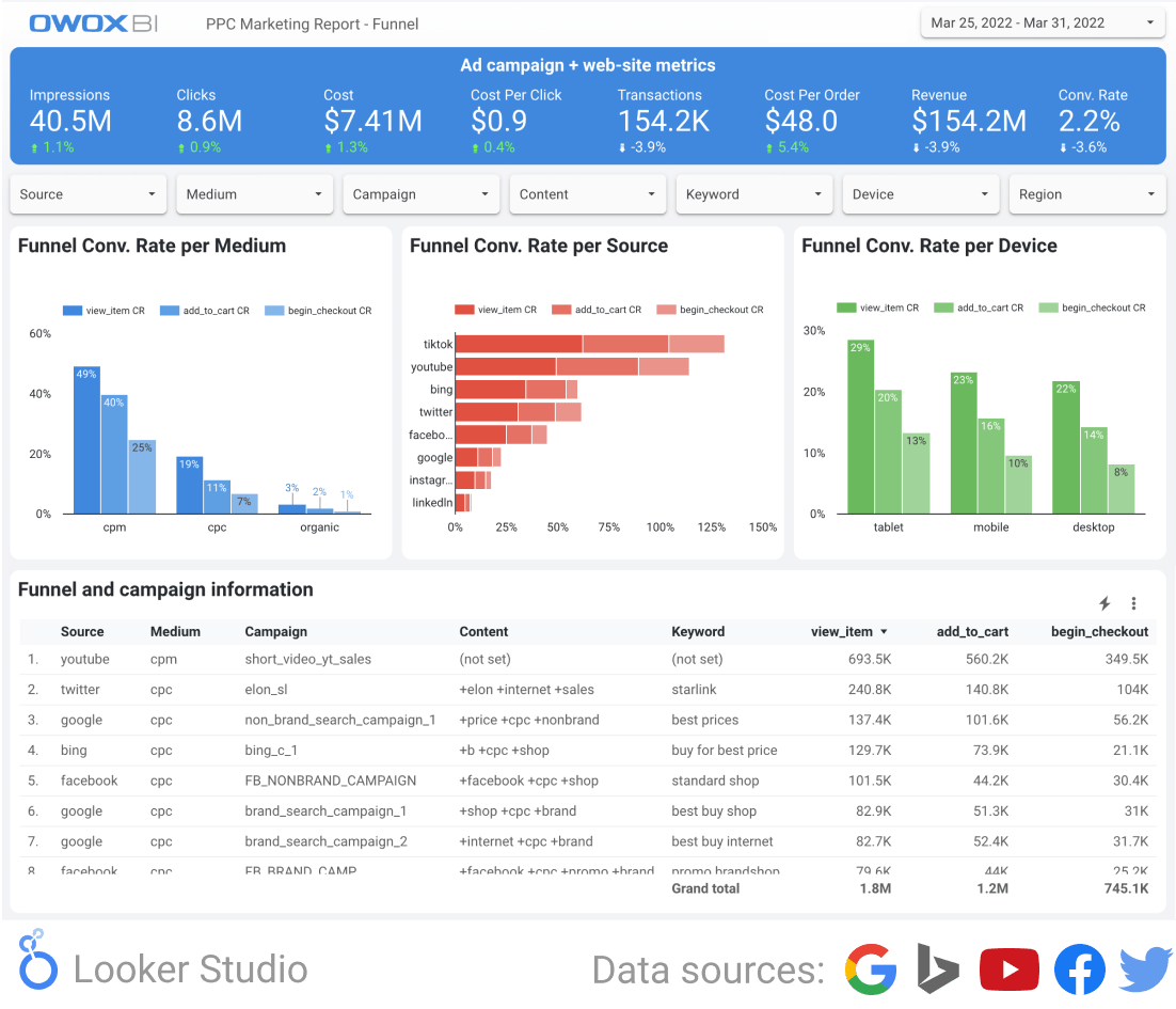
11. PPC Marketing Report Template
Track all paid media campaigns and PPC KPIs in a single Looker Studio report. Analyze all paid campaign channels, get a detailed funnel analysis overview, and highlight your campaign results.
With the PPC marketing report template, you’ll be able to quickly identify ad effectiveness and cross-compare ROAS.
12. PPC Dashboard by Data4Insights
This is a free PPC Google Looker Studio dashboard that you can use to analyze your Google Ads data.
13. Google Ads (formerly Google AdWords) - [Lead Generation] Looker Studio Dashboard by One PPC
This is a 10-page Lead Generation dashboard for easy analysis of Google Ads advertising that includes the following reports:
- Summary
- Scorecard metrics
- Campaigns report
- Devices
- Keywords report
- Ad groups report
- Monthly stats
- Daily stats
- Hour of the day
- Geographic performance
Website Performance Dashboards
In this section, we’ve put together dashboards that monitor e-commerce and overall website performance (errors, broken pages, redirects, etc.).
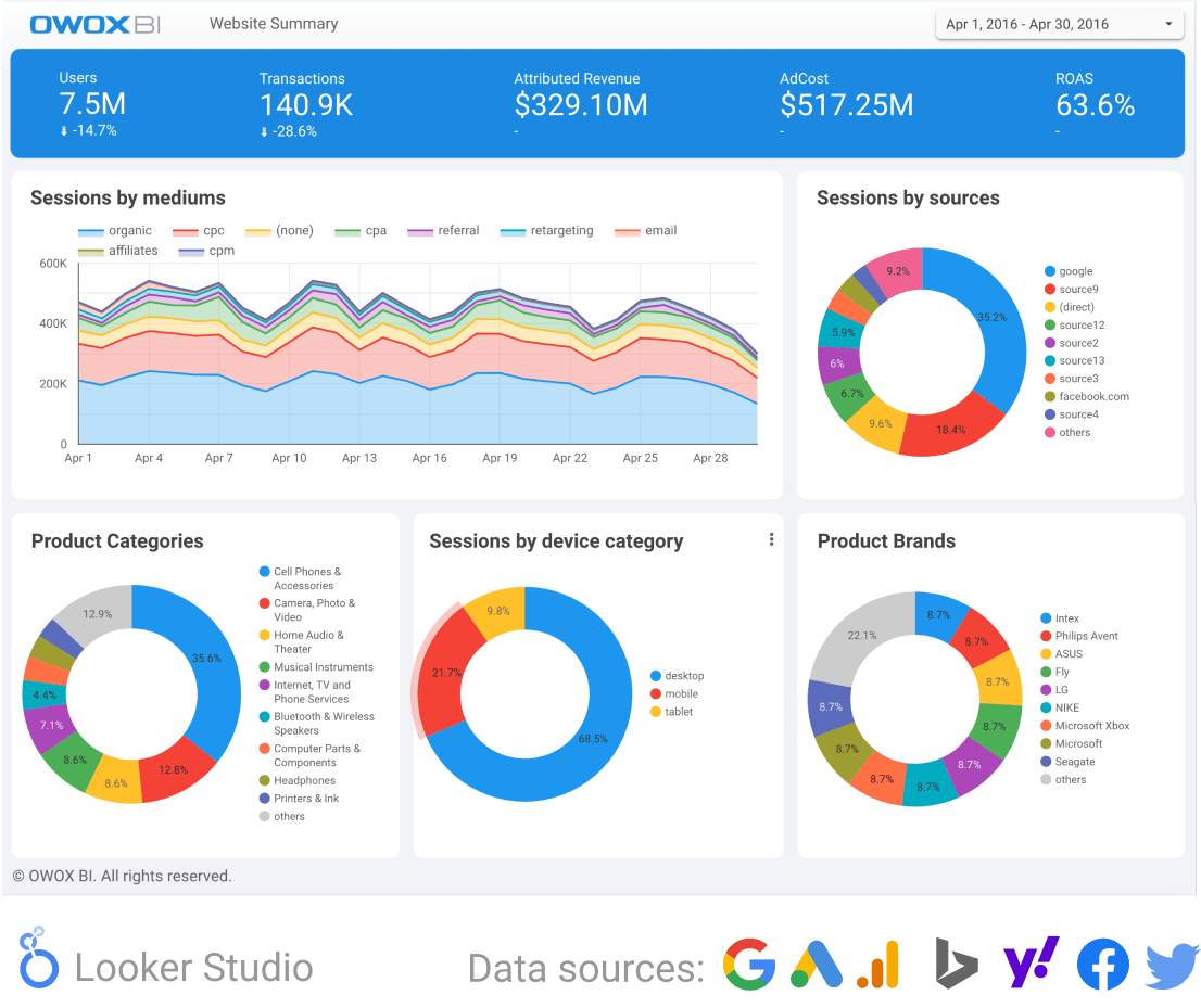
A web analytics dashboard provides insights into website performance metrics, including user interactions and traffic sources, enabling marketers to make data-driven decisions for improving website performance and aligning with marketing objectives.
Top management at online stores love a simple but useful e-commerce dashboard in Looker Studio. These dashboards are sales-focused, so your Enhanced Ecommerce setup needs to be perfect in order for them to show accurate information.
14. E-commerce Dashboard. Item Position Effectiveness Report
Learn how to properly position items on the website to increase conversions and the average check size with this E-commerce dashboard.
Commodity blocks on the website contribute to increasing conversions and average check size. But in which blocks should you place certain goods for the maximum effects
This dashboard will help you optimize the layout of goods on your website by compiling lists of bestsellers and filling related product blocks. It will also be useful for UI specialists to improve the interface.
15. Marketing Dashboard. Landing Page Effectiveness Report
Use this marketing dashboard to find out which items and categories are more profitable to promote, and which landing pages best convert visitors to buyers.
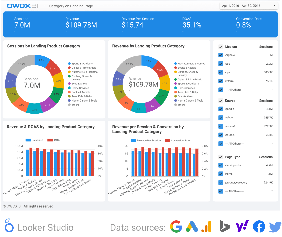
Some products attract users; others sell well. But these are not always the same products. This dashboard will show you how user behavior differs depending on the category of goods to which users are directed by various traffic sources. You’ll be able to understand which product groups are more profitable to promote to boost sales.
16. PPC Report Template Based on Item Availability
With the help of this dashboard, you can find out how much potential profit you lose by attracting users to pages of items that aren’t available.
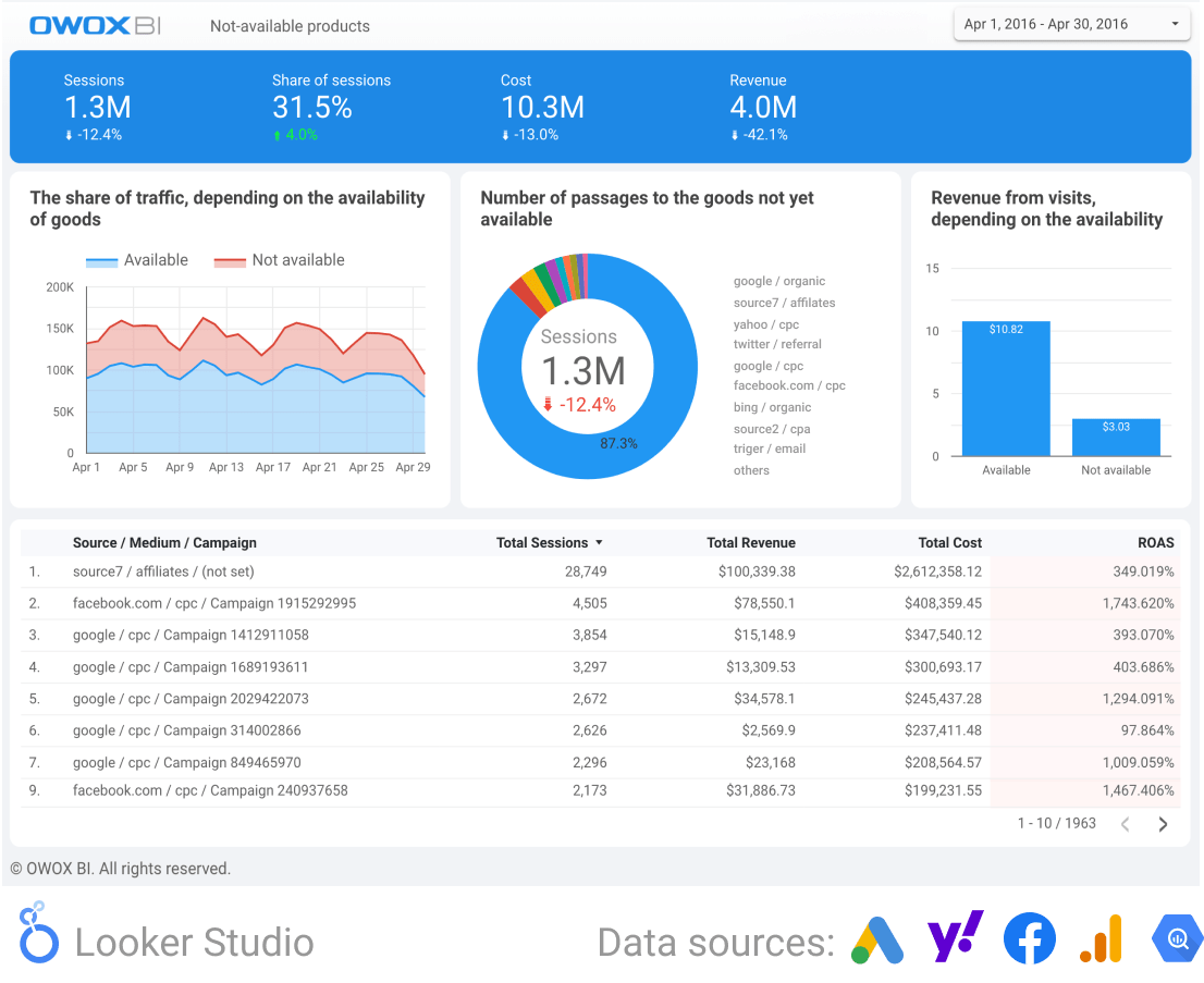
Maybe website visitors who couldn’t get the item ended up buying other items. To check this, compare revenue per visit when the item advertised on the landing page is available vs unavailable.
This will show you how much potential profit you didn’t receive because traffic from paid channels led to pages for out-of-stock items. To get more revenue, you can add recommendations for similar items to such pages.
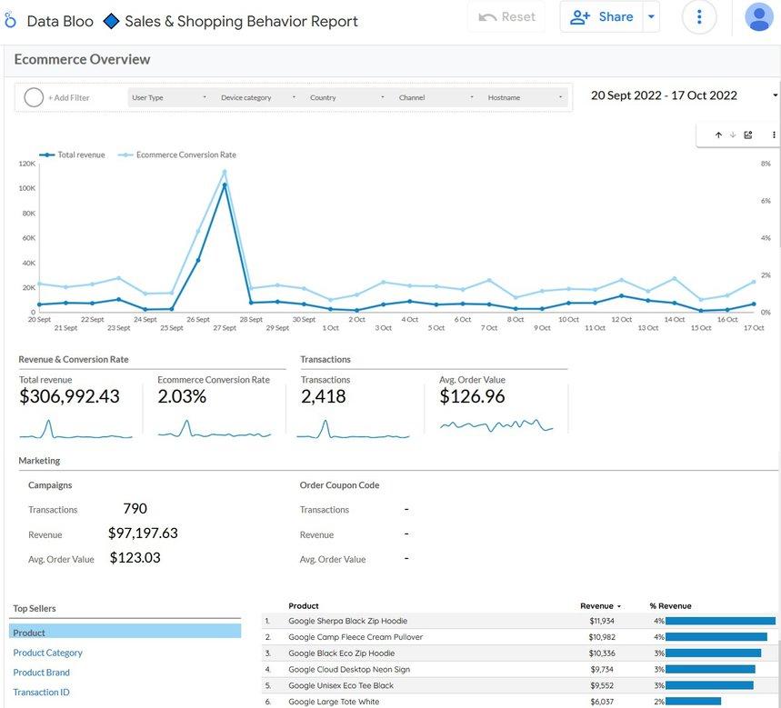
17. Sales and Shopping Behavior Dashboard by My Digital Lab
This dashboard is designed specifically for e-commerce companies to track changes in sales and shopping behavior. You can also use it to get useful insights into channels and devices. It’s suitable for creating a monthly dashboard for a general overview of business performance.
18. Microconversion Report
This dashboard will be useful for both marketers and development teams. It allows you to quickly detect and fix website conversion problems.
If your conversion rate has slipped, you can use the Microconversion report dashboard to check whether the drop in conversions is related to your website as a whole or individual pages.
For example, you may notice that conversions have mostly decreased on product cards in a specific browser. This is a signal to check recent browser updates for an error. Thanks to this dashboard, you can quickly identify and eliminate these types of website issues.
Gain clarity for better decisions without chaos
No switching between platforms. Get the reports you need to focus on campaign optimization
SEO Dashboards
The dashboards in this section will be especially useful for anyone involved in search engine optimization (SEO). Here, you’ll find everything you need to successfully rank your site, from traffic overviews, search engine results, and backlink performance to technical SEO analysis and advanced SERP analysis.
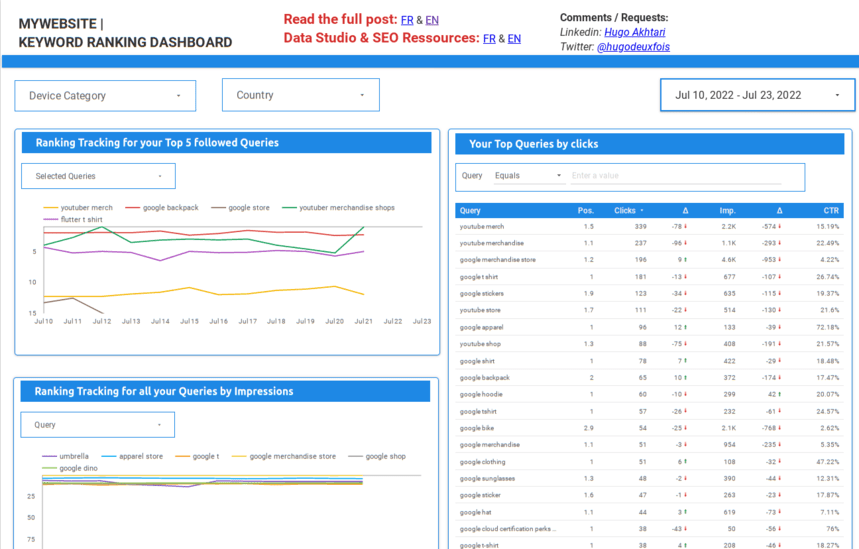
19. Keyword Ranking Dashboard
With this dashboard, you will be able to:
- Explore your keyword searches
- Track how your ranking changes over time
- Find anomalies in search rankings
Content Marketing Dashboards
Content Marketing Dashboards are strategic tools that aggregate and display critical metrics for content strategy effectiveness. They provide insights into audience engagement, content reach, conversion rates, and overall performance, helping marketers optimize strategies, align content with audience preferences, and demonstrate ROI.
20. Content Effectiveness Dashboard by Klipfolio
Designed to maximize the potential of your content, this dashboard tracks top content marketing metrics, including new subscribers, page views, click-through rates, ad impressions, and post-goal conversions. It offers a unified view of your content marketing campaign's success in engagement, reach, and overall success across various channels. Access and customize this template here.
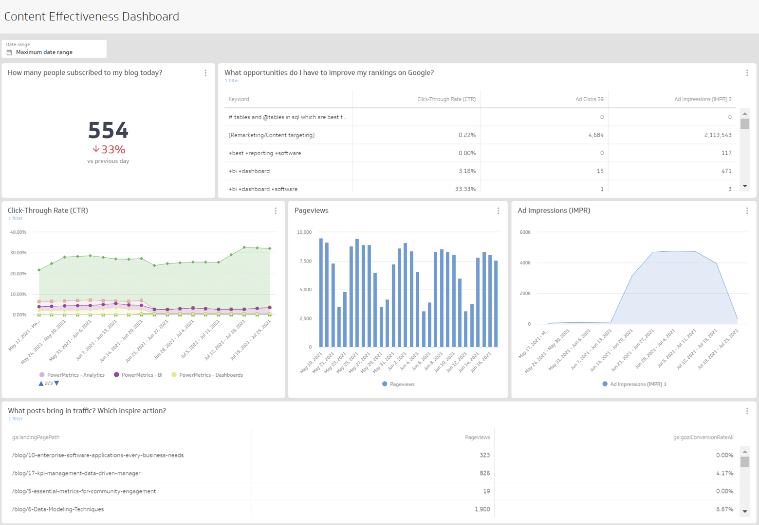
In addition, modern companies use content marketing to build brand awareness and have a deep stake in the success of their blogs.
The number of widgets you need depends on your goals, but you should start with a simple set:
- Customer interactions: link clicks, forms, scrolls, time spent on the page, landing pages, etc.
- Brand awareness: time series chart with impressions
- Table with organic engagement filtered by channel
- Landing page/goal achievement table for easy lead generation verification
Social Media Marketing Dashboards
A social media dashboard is an essential tool that aggregates all your social media channels and activities, facilitating post creation, ad campaign execution, and performance tracking in one centralized location.
Essential features of an effective social media dashboard include the ability to schedule posts across platforms, analyze trends via keyword and hashtag monitoring, conduct competitive and brand mention analyses, manage messaging for audience engagement from a single interface, and generate comprehensive reports.
These capabilities streamline social media management, making maintaining an active and strategic online presence easier. Here is one example of a Social media marketing dashboard.
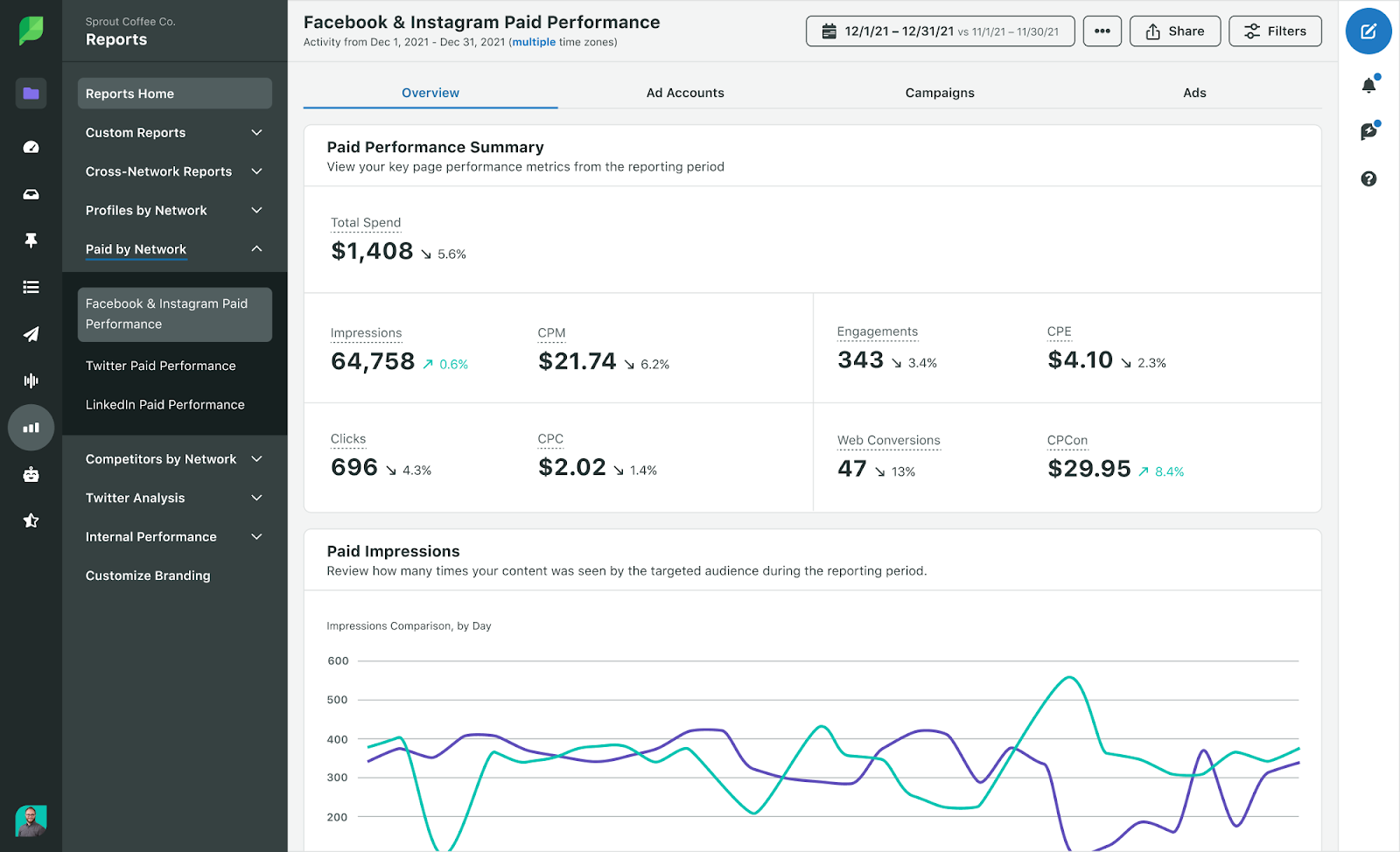
21. Sprout Social Dashboard
Sprout Social provides a robust dashboard for managing your social media activities, including post-scheduling, audience engagement, and performance analytics. Access the Sprout Social dashboard here.
22. Facebook and Instagram Advertising Performance Template
Get a full overview and analysis of your Facebook and Instagram campaigns on one Looker Studio dashboard. Track and measure the performance of your ad campaigns across all key metrics with full-funnel analysis.
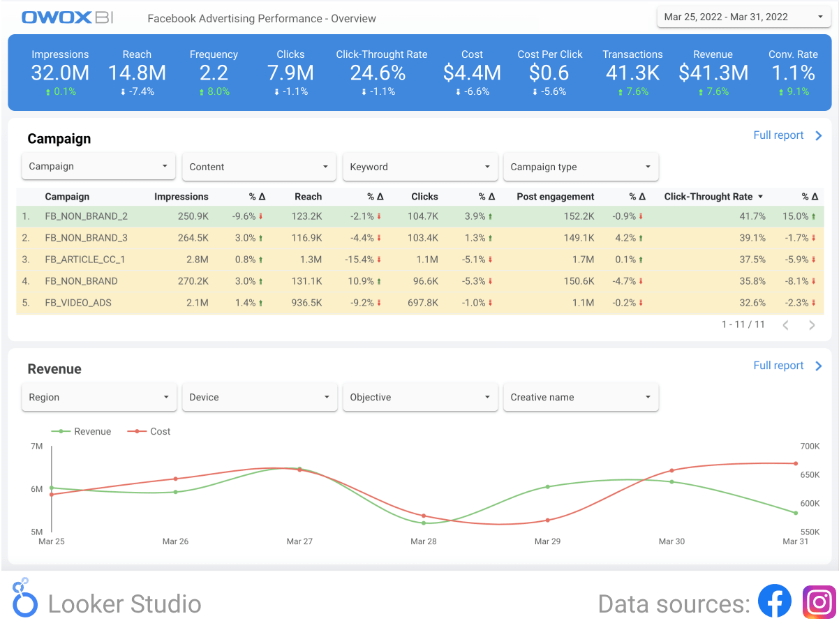
23. Facebook Advertising Dashboard template
Monitor the dynamics of key paid advertising KPIs on Facebook. This dashboard will help you track the impressions, clicks, CPM, CTR, and CPC of your Facebook ads. Respond on time to changes in indicators and optimize campaigns.
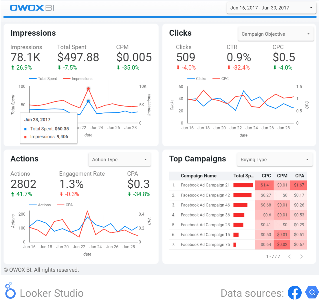
Analyze how advertising costs have changed compared to the number of ad shows. Find days when there were more impressions and clicks and lower costs for impressions. Perhaps it’s on these days of the week that most of your target audience is online, in which case you can schedule your ads accordingly.
24. Twitter Dashboard Template by Databox
The Twitter Growth & Engagement Dashboard Template by Databox offers a focused view on expanding your Twitter presence and enhancing audience interaction.
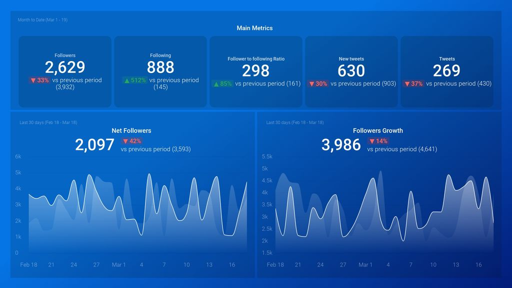
This tool combines vital metrics to track follower growth, engagement rates, and content performance, enabling you to fine-tune your Twitter strategy effectively.
With real-time insights into retweets, likes, mentions, and replies, this template simplifies tweet optimization to ensure maximum reach and engagement. Ideal for those aiming to elevate their Twitter game, this template is a gateway to social media success.
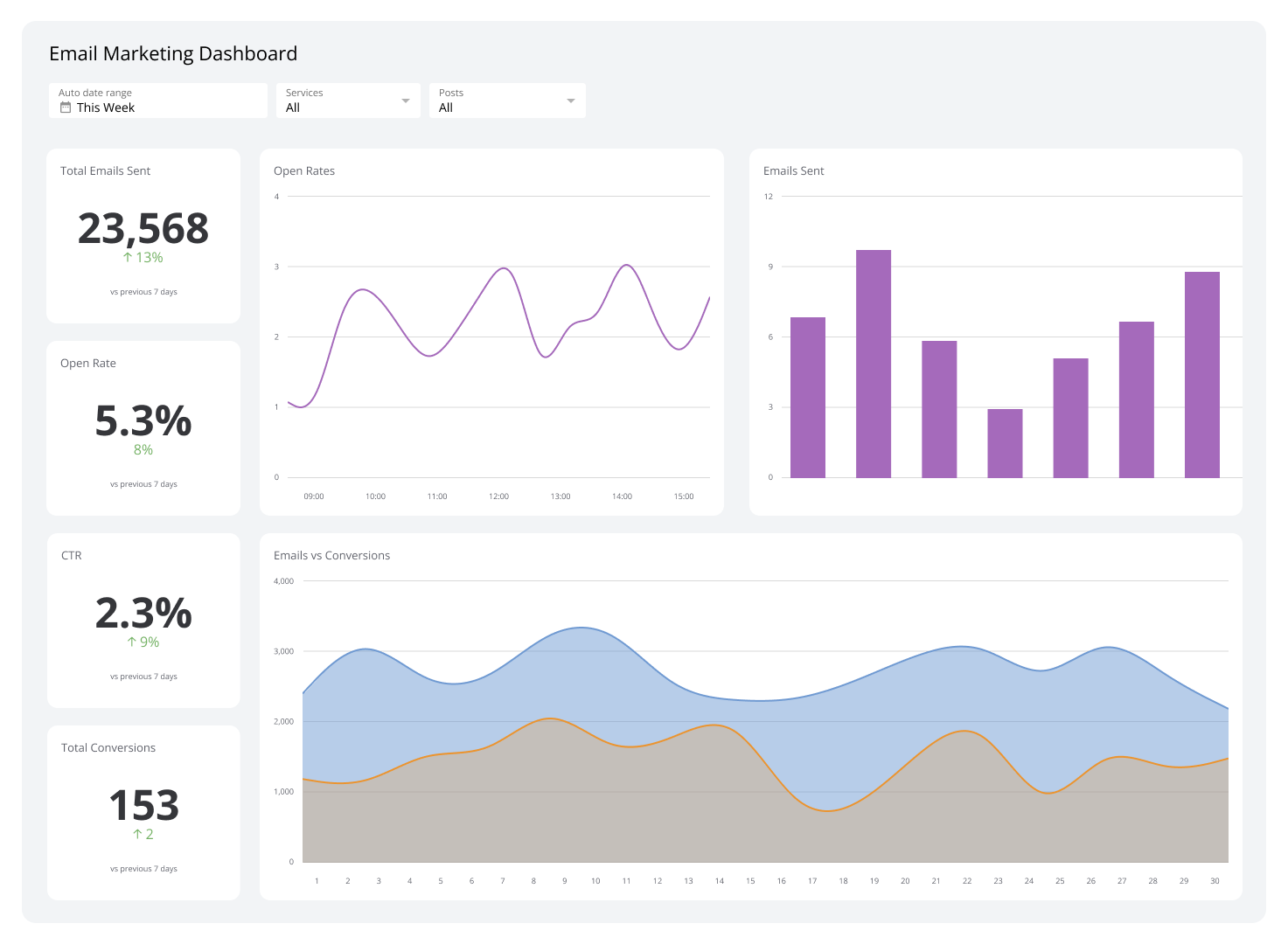
Email Marketing Dashboards
An email marketing dashboard is a comprehensive tool designed to centralize and simplify the analysis of email marketing campaigns. It compiles essential data from numerous campaigns and audiences into a single platform, presenting it in a user-friendly format while automating the analytics process.
This dashboard enables marketers to monitor critical metrics and perform in-depth analysis of their email initiatives in almost real-time. It facilitates the optimization of email strategies and individual sequences by allowing quick identification of patterns and issues.
Additionally, when integrated with a revenue attribution model, the dashboard illustrates the impact of email marketing on revenue and its contribution to the customer journey. Here are some examples of email marketing dashboards
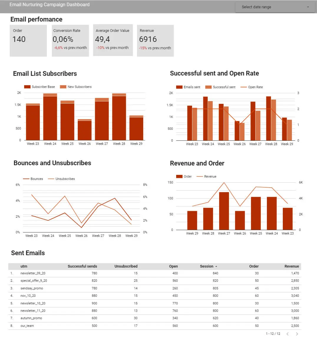
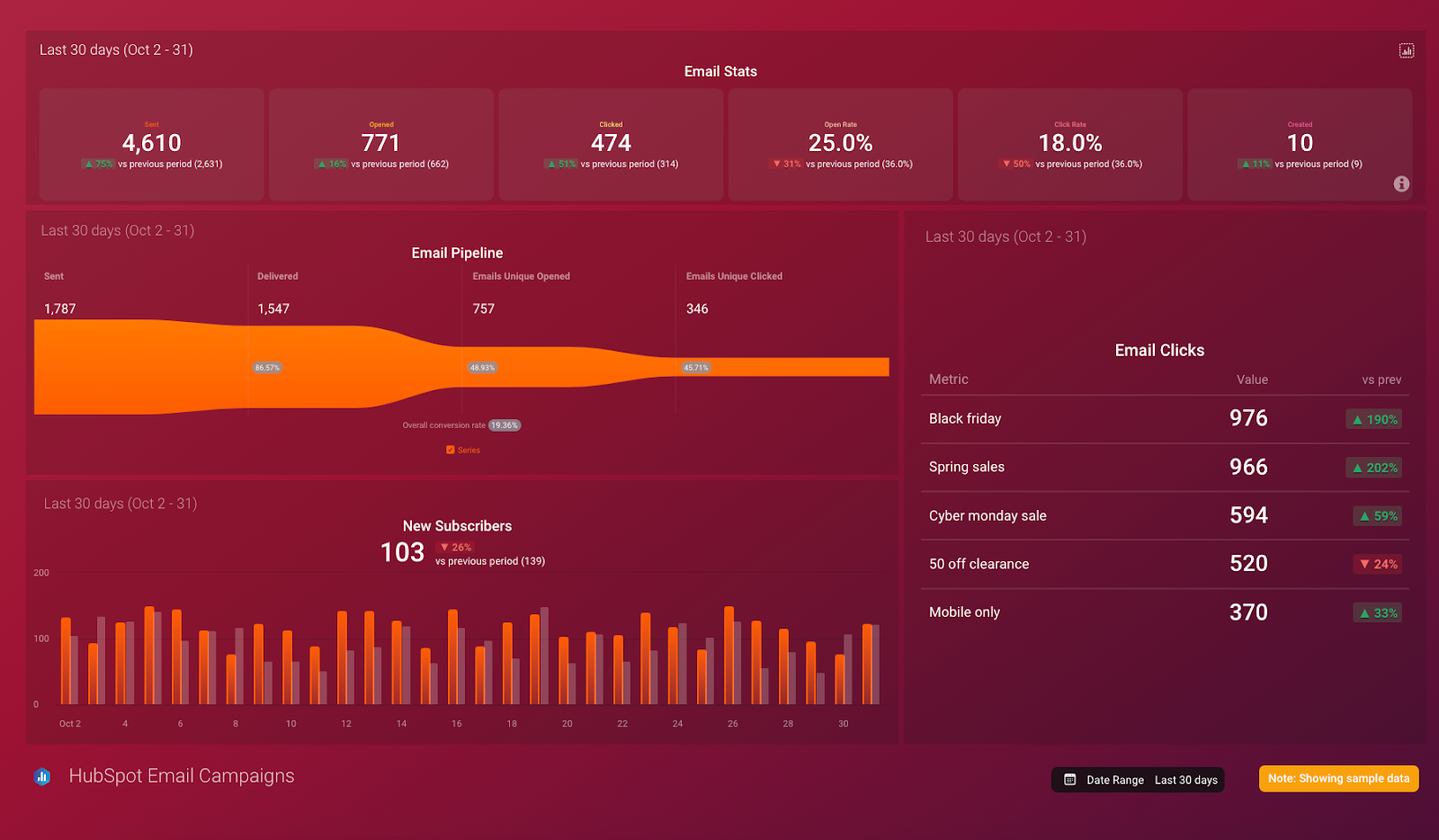
25. Email Marketing Dashboard by Impravado
This email marketing dashboard allows you to track the performance of nurturing, drip, and regular email campaigns.
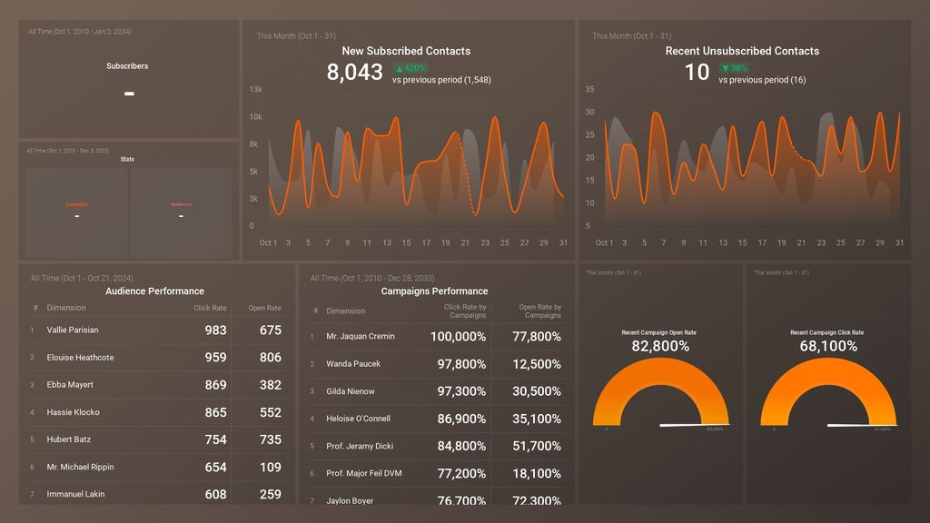
26. Klipfolio Email Marketing Dashboard
The Email Marketing Dashboard by Klipfolio is a dynamic tool designed to enhance the effectiveness of email campaigns. It centralizes key performance metrics, allowing marketers to analyze campaign success, subscriber engagement, and conversion rates in real time.
This dashboard streamlines identifying trends, optimizing email content, and improving overall strategy. With its user-friendly interface, Klipfolio makes it easier to track the ROI of email marketing efforts and understand their impact on business goals, catering to the needs of a digital-first audience.
27. HubSpot Email Marketing Overview Dashboard Template by Databox
The HubSpot Email Marketing Overview Dashboard Template is an advanced tool crafted to elevate email marketing efforts through HubSpot.
It centralizes critical data such as open rates, click-through rates, email deliveries, and engagement statistics, offering a comprehensive view of campaign performances.
Designed for efficiency, this dashboard enables marketers to quickly gauge the success of their email strategies, identify areas for optimization, and drive conversions.
Its intuitive interface and detailed analytics facilitate informed decision-making, helping businesses maximize their email marketing impact and achieve targeted outcomes.
28. Mailchimp Email Dashboard Template by Databox
The Mailchimp Email Dashboard Template by Databox is a specialized tool designed to optimize email marketing strategies using Mailchimp.
It consolidates crucial metrics like open rates, click-through rates, subscriber activity, and campaign performance into a cohesive dashboard.
This integration allows for real-time tracking and analysis, enabling marketers to swiftly adjust tactics, enhance engagement, and improve overall campaign efficacy.
With its focus on actionable insights and user-friendly visualizations, the template aids in driving stronger results and a better understanding of the impact of email initiatives on marketing objectives.
Key Takeaways
Your choice of marketing reporting tools depends on the amount of data your company needs to process.
For small businesses, the capabilities of Google Analytics, Looker Studio, and OWOX BI are enough. For more advanced dashboards, consider systems with more functionality, such as Google BigQuery + OWOX BI +Looker Studio, Tableau, or Power BI.
Are you interested in marketing dashboards to track progress toward your goals? Book a free demo with OWOX BI specialists.
Spend Smarter, See Results Sooner
Learn how to optimize every marketing dollar with personalized insights from OWOX BI
FAQ
-
What is a Marketing Dashboard, and why is it important?
A marketing dashboard is a visual summary of key data and performance indicators relevant to marketing objectives and strategies. It's important because it provides an at-a-glance view of marketing efforts' effectiveness, streamlines data analysis, and aids in decision-making by highlighting successes, opportunities, and improvement areas.
-
What kind of information can a Marketing Dashboard contain?
A marketing dashboard can include data on ad clicks, cost per click (CPC), conversion actions, cost per acquisition (CPA), advertising costs, revenue, average check size, and return on marketing investment (ROMI), among other metrics. The specific data depends on the marketing goals, such as increasing ad clicks, conversions, or ROMI.
-
How does a Dashboard differ from a Report in marketing analytics?
A dashboard is a real-time, visual representation of current performance across various metrics designed for quick monitoring and decision-making. In contrast, a report is a more detailed document that provides an in-depth analysis of data and trends over time, used for strategic planning and comprehensive insights.
-
What are some characteristics of effective marketing dashboards?
Effective marketing dashboards feature competent data visualization, correctly chosen context, the ability to select specific dates, widget interactivity, and the capacity to compare indicators with previous periods to evaluate advertising campaign effectiveness.
-
How can one build a trustworthy Marketing Dashboard?
Building a trustworthy marketing dashboard involves selecting the right dashboard software, identifying the target audience, assessing data accuracy and relevance, choosing appropriate chart types, optimizing color usage, incorporating multiple data views, utilizing data visualization templates, ensuring ongoing relevance, and educating the team on data-driven decision-making.
-
What are the steps to streamline data management through marketing dashboards?
To streamline data management, automate data collection, merge marketing data from various sources for comprehensive analysis, and ensure data quality and security. This process helps reduce errors, enhance data-driven decision-making, and maximize marketing efficiency and effectiveness.