
Product Analytics for Data Analysts: A Crash Course
A hands-on crash course in product analytics tailored for data analysts. Turn data into insights that shape product growth and success.


They say data is the new oil, but what good is oil if it never gets refined?
In many SaaS companies, data teams are buried under a mountain of one-off report requests, trying to make sense of fragmented dashboards and inconsistent metrics. While product teams chase insights, analysts are stuck firefighting. The result? Slow decisions, duplicate queries, and broken trust.
Understanding user behavior needs a better approach.

This guide shows you a more innovative way: model your data once, then make it self-serve. You’ll learn how to structure product data, support real product questions, and skip months of schema setup.
The Role of Data Analysts in Driving Product Insights
A data analyst helps product teams make informed decisions by transforming raw data into meaningful insights. They bridge the gap between technical data systems and business needs. Their role is strategic and hands-on, blending analysis, modeling, and stakeholder collaboration.
Key responsibilities of a data analyst include:
- Analyzing data using statistical methods and delivering clear reports
- Building and managing data collection systems and internal databases
- Acquiring, verifying, and maintaining data from multiple sources
- Detecting trends, anomalies, and key patterns in complex datasets
- Cleaning and preparing data for consistent reporting
- Collaborating with product and business teams to prioritize insights
- Identifying opportunities for optimization and process improvements
Why Analysts Struggle to Support Product Teams
Even skilled analysts face challenges when product data workflows aren’t structured. Without strong models and clear access paths, teams rely heavily on analysts, leading to constant requests, rework, and frustration.
Reactive Reporting
Analysts often respond after problems are raised, instead of identifying them early. This reactive style leads to missed opportunities and delayed insights. Without proactive tracking, they’re stuck catching up, limiting their ability to support timely product decisions or surface early signals that drive improvement.
Dashboard Debt
Dashboards multiply fast; each team wants its view. But without consistent models and shared definitions, they go stale or show conflicting numbers. This “dashboard debt” creates confusion, erodes trust, and pushes teams to request new reports even when the data already exists.
Redundant Ad Hoc Work
Many ad hoc requests overlap, using the same metrics and different filters. Without a reusable data model, analysts rebuild the same logic repeatedly. This wastes time, introduces inconsistencies, and burns out the team. Instead of focusing on scalable analysis, they’re stuck answering similar questions.
What a Good Product Analytics System Looks Like
A strong product analytics setup gives analysts control, ensures everyone speaks the same data language, and allows teams to explore data independently, without compromising accuracy, speed, or clarity.
Empowering Data Analysts with Control
Analysts should be able to explore and use data without needing constant help from engineers. If a product manager wants to know why users drop off during sign-up, the analyst should easily dig into the data and share insights. This helps teams move faster and gives analysts more time for deep, meaningful work.
Establishing Shared Metrics Definitions
Everyone on the team should agree on what key metrics mean. For example, if “active user” is clearly defined, product, marketing, and leadership teams can all work with the exact numbers. This avoids confusion, saves time, and keeps everyone focused on the same goals when reviewing performance.
Ensuring Trusted Data
Good decisions depend on accurate data. If the data is wrong, teams second-guess every result. A solid system ensures the numbers are clean, up to date, and easy to understand. This builds confidence, especially when measuring the impact of new features or changes to the product.
Facilitating Self-Service Access to Business Data
Teams work better when they can answer simple questions on their own. Instead of asking analysts for every update, a system should let PMs and marketers check data themselves, like campaign results or feature usage, through easy tools like Google Sheets. This speeds up decisions and reduces repetitive requests.
Building a Solid Product Data Model for SaaS Applications
A strong product data model turns messy event logs into meaningful, structured tables. It helps analysts and product teams understand how users interact, where they drop off, and what drives value.
Key Entities in SaaS Applications
A SaaS data model should reflect real-world concepts like users, trials, subscriptions, and events. These entities form the foundation for consistent metrics and flexible reporting across teams.
User
The user entity represents an individual who interacts with the application. Each user has a unique identifier and attributes like name, email, and role. This table helps track engagement, segment audiences, and analyze user behavior over time.
Example: A user signs up using an email address and creates a personal profile. They later return to complete onboarding and explore features.
Trial
The trial entity captures the free access period granted to users before a paid subscription begins. It includes start and end dates, status, and links to the user. This entity is essential for tracking trial-to-paid conversion rates and activation timelines.
Example: A user starts a 14-day free trial to explore the product. They actively test key features during this period.
Subscription
The subscription entity defines the user's paid relationship with the service. It includes plan type, billing cycle, start and end dates, and current status. It supports revenue analysis, churn tracking, and cohort studies.
Example: A user subscribes to the monthly premium plan after completing their trial. Their subscription status updates to “active” in the system.
Event
The event entity logs every user action within the product, such as clicks, page views, or feature usage. Each event is time-stamped and tied to a user. This entity is the foundation for behavior tracking, feature adoption, and funnel analysis.
Example: A user clicks the “Upgrade Plan” button from the pricing page. This action is recorded as part of their behavioral data.
Benefits of Effective Data Modeling
A clear, well-designed data model is more than just a technical asset; it’s the backbone of efficient, reliable analytics. Below are three key benefits that make data modeling essential for scalable product analytics.
Enhanced Performance
When data is structured properly, queries run faster, systems are easier to maintain, and fixes take less time. A clear model makes it easier to diagnose issues and improve efficiency. As business needs grow, a strong foundation helps scale data operations without slowdowns.
Improved Clarity
A data model gives everyone a clear view of how data is organized and connected. It removes guesswork and ensures that teams work with consistent definitions. With a shared structure, analysts better understand the data they’re working with, helping them deliver insights, build reports, and launch features.
Reusability
Good data models allow the same logic and tables across different projects, dashboards, and teams. This avoids duplicate work and keeps metrics consistent. Whether tracking activation, churn, or feature usage, analysts can pull from a shared model.
Why Analysts Should Build Models, Not Dashboards
Dashboards may look impressive, but they rarely solve the real problem: scalable and flexible access to product data. A modeled layer gives analysts and product teams what they need and answers that evolve with the business.
Dashboards Often Become Outdated Quickly
Most dashboards are built for a moment in time. As product metrics change or priorities shift, they stop being useful. They often lack context, can’t adapt to new questions, and require constant maintenance. Instead of answering evolving needs, they clutter up tools and leave teams searching for more relevant insights elsewhere.
Data Models Offer Scalability and Flexibility
A strong data model grows with the company. It handles more users, events, and complexity without slowing down. Analysts can define logic once and reuse it across use cases, from feature adoption to churn analysis.
Product Managers Prefer Clear Insights Over Complex Tools
PMs don’t want to explore filters and charts; they want quick, reliable answers. With a data model behind the scenes, analysts can deliver insights directly through tools PMs already use, like Google Sheets or chat. This makes data easier to act on, without adding another learning tool.
Building a Scalable Analytics Stack for Data Analysts
Analysts need a modern, flexible stack to support product teams at scale. The right setup combines centralized storage, structured models, and tools teams already use, reducing friction and boosting insight delivery.
Data Warehouse: Centralizing Your Data
A data warehouse like Google BigQuery is a central hub for all your business data. It consolidates information from different sources into one place, enabling fast, consistent analysis. This centralization ensures accuracy, simplifies querying, and supports scalable reporting workflows across product, marketing, and business teams.
OWOX BI: Modeling and Semantic Layer
OWOX BI adds structure to your stack by offering data modeling and a semantic layer. Analysts define business logic, create reusable datasets, and expose clean tables to teams. Its chat interface supports natural language queries, allowing faster, self-serve insights without technical complexity or dependency on engineering resources for reporting.
Google Sheets: Exploration and Reporting
Google Sheets, when integrated with OWOX BI, becomes a dynamic reporting tool. Users can run BigQuery queries directly in Sheets, build live dashboards, and automate refreshes. This approach gives product teams access to trusted data in a familiar interface, making analysis easier, faster, and more accessible across the organization.
How OWOX BI Enhances Data Analytics Workflows
OWOX BI helps analysts move faster and gives product teams the tools to access insights independently. From ready-made models to natural language queries and real-time reporting, it streamlines the entire analytics process.
Utilize Ready-to-Use Product Data Models
OWOX BI provides pre-built product data models for common SaaS use cases like user behavior, trials, subscriptions, and events. These templates save time on setup, ensure consistent metrics, and reduce manual work. Analysts can start analyzing immediately, without building everything from scratch, making it easier to deliver insights faster and more accurately.
Enable Product Managers to Ask Questions via Chat
With OWOX BI’s chat interface, product managers can ask questions like “How many users converted this week?” in plain English.
If you ask the above question in OWOX AI Assistant, you'll likely be prompted with the following clarification:
To answer "How many users converted this week?", I will assume:
- "Converted" means users who finished a trial and converted to a paid plan.
- I will count unique users with converted_to_paid = true in the "trial" table.
- "This week" means from the start of this week to today.
OWOX Assistant will ask you:
“Is this correct? Should I proceed with this definition of ‘this week’?”
Once confirmed, the OWOX Reports AI Assistant will return the number of users who converted to paid within the current week.

This removes the need for technical skills, reduces analyst requests, and supports faster decision-making across non-technical teams.
Push Insights into Google Sheets Instead of Static Dashboards
OWOX BI connects directly to Google Sheets, letting users import live data from BigQuery. Product teams can filter, explore, and build reports using a tool they already know. This avoids dashboard clutter, supports flexible analysis, and gives teams access to up-to-date insights without learning new platforms.
Example Use Cases to Model Once, Use Forever
Establishing robust data models for these scenarios enables consistent analysis across your organization. Once modeled, these use cases can power multiple reports and product insights without repeated work.
Trial Conversion
Modeling trial conversion helps track how many users move from a free trial to a paid plan. It also allows you to analyze drop-off points, identify high-converting segments, and measure time to conversion.
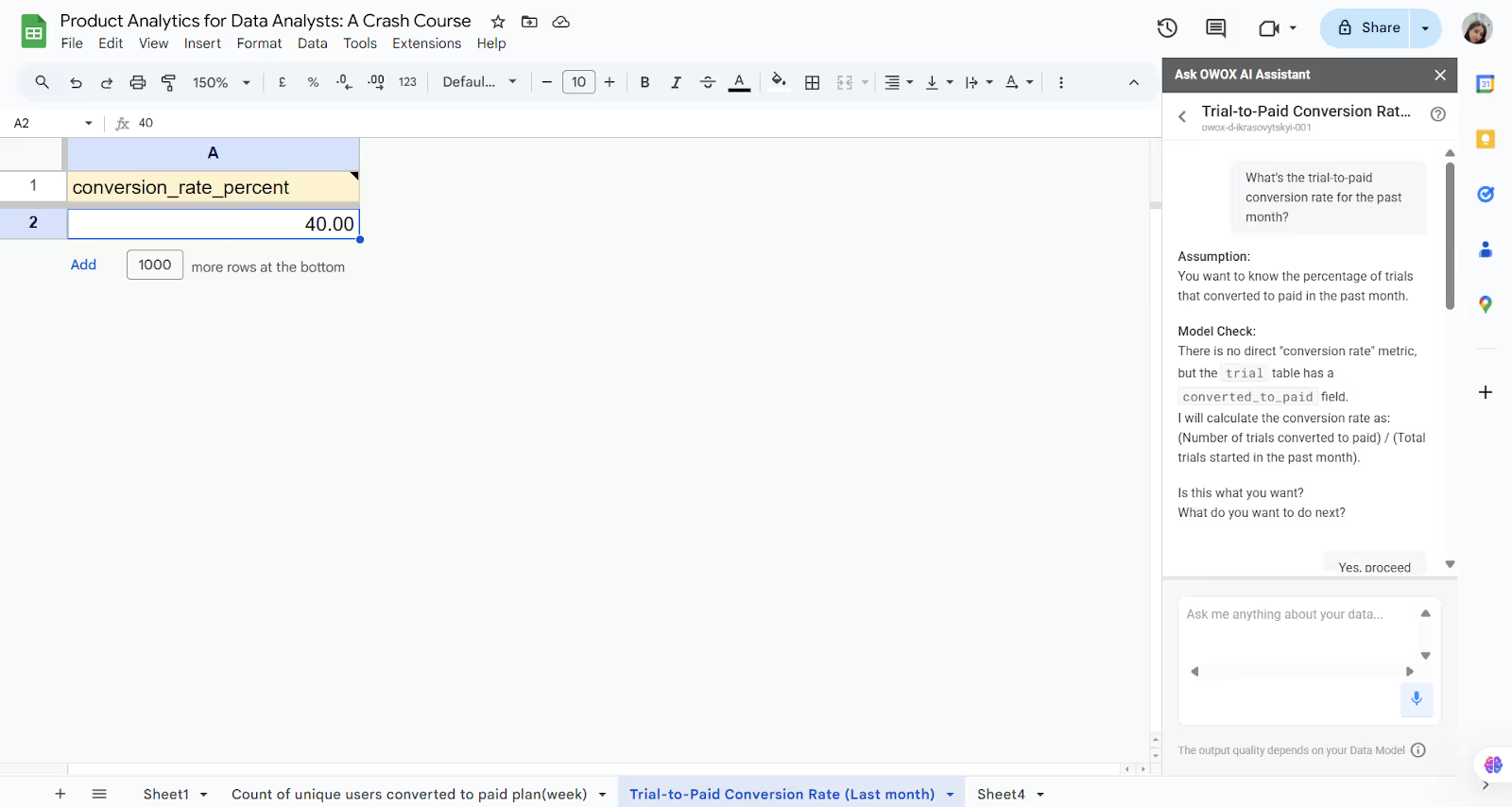
In OWOX reports, you can ask questions like: “What’s the trial-to-paid conversion rate for the past month?”
If you ask this question in OWOX AI Assistant, you'll likely be prompted with the following clarification:
To answer "What’s the trial-to-paid conversion rate for the past month?", I will assume:
- You want to know the percentage of trials that converted to paid in the past month.
Model check:
- There is no direct "conversion rate" metric, but the trial table has a converted_to_paid field.
- I will calculate the conversion rate as:
(Number of trials converted to paid) / (Total trials started in the past month)
OWOX Assistant will ask you: “Is this correct? Should I use this formula to calculate the conversion rate for last month’s trials?”
Once confirmed, the OWOX Reports AI Assistant will return the trial-to-paid conversion percentage for the past month.
With OWOX BI, you can get instant answers using your reporting tools, and no SQL is needed. These insights help improve onboarding flows and guide marketing strategies to boost trial-to-paid conversions.
Feature Adoption
A feature adoption model shows which features users interact with most. This helps product teams understand what's driving engagement and where users might get stuck.
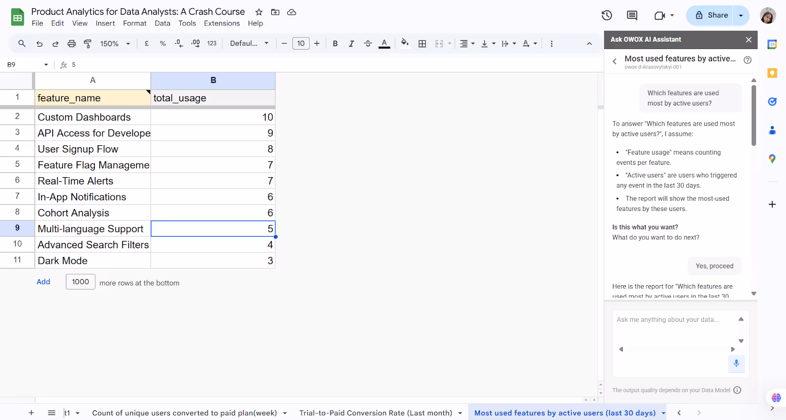
In OWOX Reports, you can ask in natural language: “Which features are used most by active users?”
When you ask the above question in OWOX AI Assistant, you'll likely be prompted with the following clarification:
To answer "Which features are used most by active users?", I assume:
- "Feature usage" means counting events per feature.
- "Active users" triggered any event in the last 30 days.
- The report will show the features these users use the most.
OWOX Assistant will ask you: “Is this correct? Should I focus on users active in the last 30 days and rank features by event count?”
Once confirmed, the OWOX Reports AI Assistant will return a list of top features used by active users in the past 30 days.
The data can guide design improvements, feature prioritization, and communication efforts, ensuring development focuses on what matters to users.
Retention by Plan
This model breaks down user retention by subscription plan, showing which tiers retain customers better over time. You can compare user behavior, upgrade patterns, and churn risks across pricing levels.
In OWOX Reports you can ask in natural language: “What is the 30-day retention rate by subscription plan?”
If you ask the above question in OWOX AI Assistant, you'll likely be prompted with the following assumptions:
To answer "What is the 30-day retention rate by subscription plan?", I assume:
- "30-day retention rate" refers to users who are still active 30 days after their subscription began.
- "By subscription plan" means the results will be grouped by plan_name.
- I will display the number of active users 30 days post-subscription, broken down by plan.
OWOX Assistant will ask you: “Is this correct? Should I proceed with showing active users at day 30 grouped by plan_name?”
Once confirmed, the OWOX Reports AI Assistant will return user counts active 30 days after subscribing, segmented by subscription plan.

This allows teams to compare performance across tiers, adjust pricing or features accordingly, and support strategies for each plan, driving better lifetime value.
Churn Prediction
Churn prediction models use behavioral signals to flag users likely to cancel. By identifying early warning signs, teams can act before it’s too late, through targeted outreach, offers, or product nudges.
In OWOX reports, you can ask in natural language: “What are the top behaviors that predict churn for our users?”
If you ask this question, you'll likely be prompted with the following assumptions:
To answer "What are the top behaviors that predict churn for our users?", I assume:
- "Churn" refers to users whose subscription status is "canceled" in the subscription table.
- "Behaviors" include actions tracked across the event, session, pageview, and user_milestone tables.
- I’ll identify patterns (such as specific event types, milestones reached, or session trends) that frequently occur before a user churns.
- Since no date range was given, I’ll default to the last 90 days for this analysis.
OWOX Assistant will ask you: “Is this correct? Should I use the last 90 days to identify pre-churn behavior patterns?”
Once confirmed, the OWOX Reports AI Assistant will return the recurring behaviors observed before churn in the last 90 days.

This reduces revenue loss and allows support and marketing to focus efforts where they’ll make the biggest difference.
Time to First Action
This model tracks how long it takes for new users to complete their first meaningful action, like creating a project or inviting a teammate. Shorter time-to-first-action often signals a smoother onboarding experience.
In OWOX BI, you can ask in natural language: “What percentage of users perform a meaningful action within the first day?”
If you ask the above question in OWOX AI Assistant, you'll likely be prompted with the following assumptions:
- "Meaningful action" refers to achieving a milestone, as recorded in the user_milestone table.
- "Within the first day" means within 24 hours after the user’s account was created (user.created_at).
- I’ll calculate the share of users who reached at least one milestone within their first 24 hours.
OWOX Assistant will ask you: “Is this correct? Should I proceed with checking milestone completion within a day of account creation?”
Once confirmed, the OWOX Reports AI Assistant will return the percentage of users who hit a milestone within their first day.

Measuring this helps identify friction points and improve activation rates, leading to better long-term retention.
Final Word: Empower Teams by Modeling What Matters
When analysts focus on building strong data models, they stop reacting and start driving impact. A solid model supports consistent insights, reduces repeated work, and helps align teams around shared metrics. With OWOX BI, product data becomes accessible to everyone without technical barriers.
Product managers can ask questions in plain language using the chat interface, while Google Sheets integration supports fast, flexible reporting. This self-serve approach frees analysts to work on deeper analysis and gives teams the confidence to make informed decisions, backed by trusted data they can explore independently.
Get Started with OWOX BI: Build Your Product Reports in Just 10 Minutes
OWOX BI makes it easy for data analysts to launch a complete product analytics setup, no needing to start from scratch. With ready-to-use data models, a direct connection to your warehouse, and seamless Google Sheets integration, you can go from raw data to self-serve reporting in minutes.
Skip months of planning, avoid dashboard clutter, and empower product teams with answers they can access anytime. Set it up once, and stop fielding repeat data requests for good.
Frequently asked questions


Finally, a tool that doesn't ask business users to learn a new dashboarding UI. Our marketing team already knows Sheets. OWOX just delivers the right data.
Joinable data marts concept was the thing that sold us. We can now use the semantic layer without building one.
Self-hosted the OSS version on Digital Ocean. Zero vendor lock-in. Contributed a Shopify connector back in week two.