
Pivots & Charts turns any tabular data in Google Sheets into auto-generated visualizations — giving analysts faster exploration and business users instant clarity.
Select columns and let OWOX auto-detect the best chart types, pivot structures, and cohort analyses. Skip the manual chart-building and get straight to the insight.
No chart wizard. No formatting headaches. Click the OWOX button and get a complete set of visualizations from your data — bar charts, line charts, pivots, and cohorts, ready to share or present.

Select a data range and let OWOX auto-detect the best chart types, pivot structures, and cohort analyses.
Select the columns and OWOX analyzes the structure – then generates bar charts, line charts, pivots, and cohorts automatically. No chart wizard configuration needed.
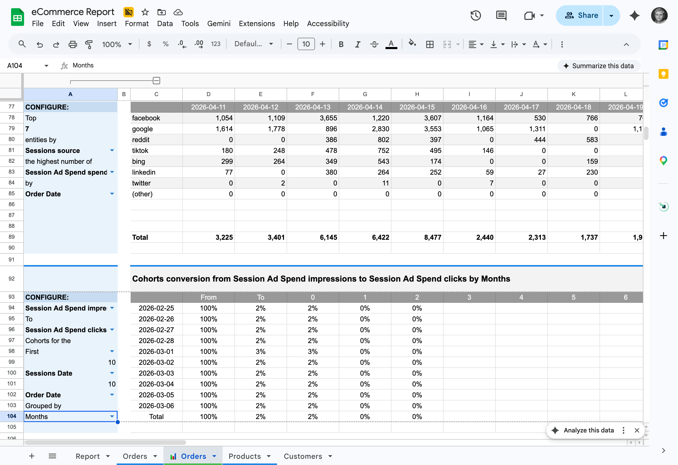
Turn any time-series data into a cohort analysis automatically. Retention, revenue cohorts, engagement patterns — generated without writing a single formula.
Auto-generated charts are standard Google Sheets charts. Change colors, labels, axes, and formatting — they're a starting point, not a locked output.
Click the OWOX button and get a complete set of visualizations — bar charts, pivots, and cohorts, ready to present.
Works with any tabular data in Google Sheets — not just OWOX data marts. CSV imports, manually entered data, data from other tools — one click and it's visual.
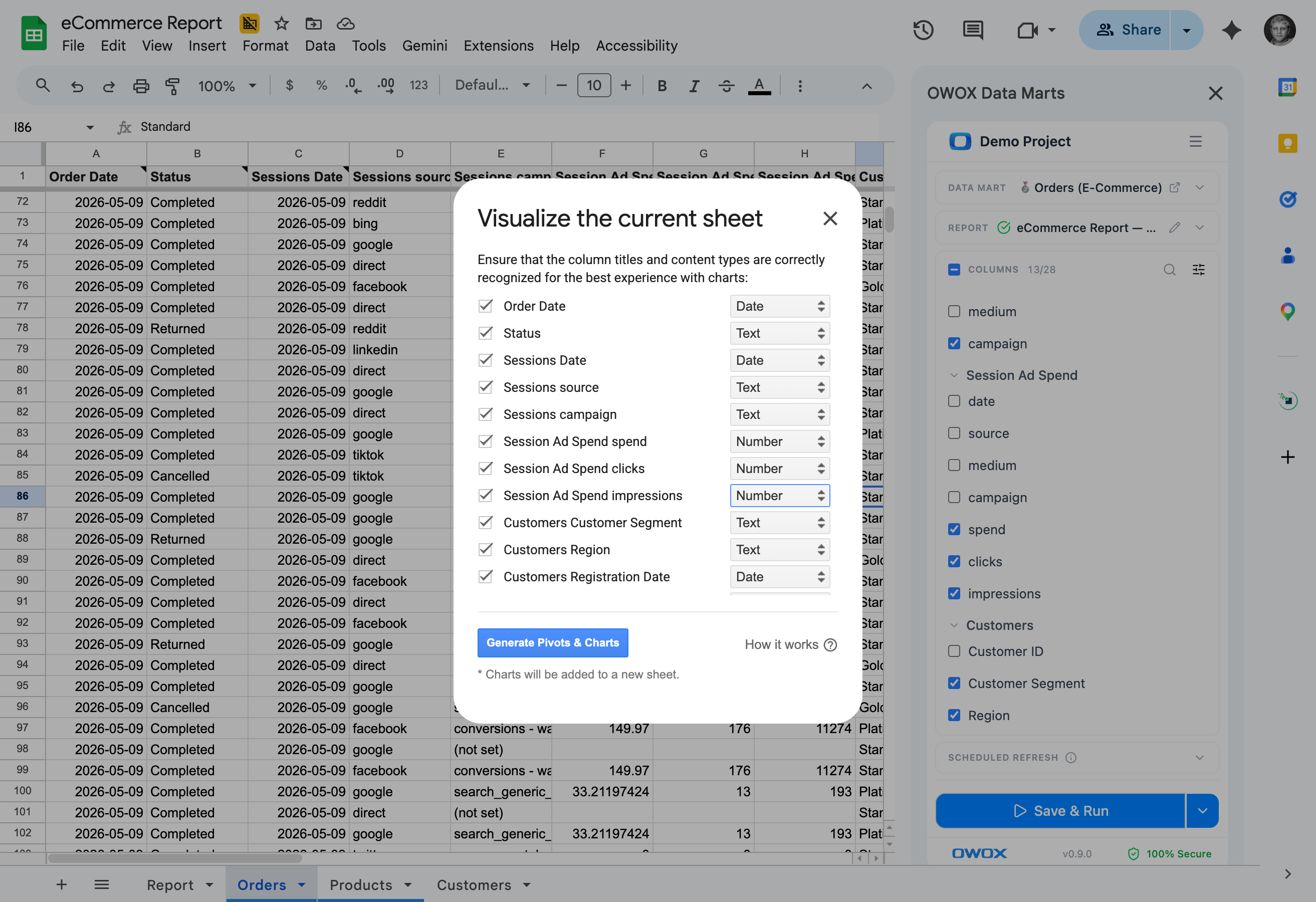
Your manager asks for a visual. Click 'Visualize Current Sheet' button and get a complete set of charts and pivots — ready to screenshot, share, or paste into a deck.

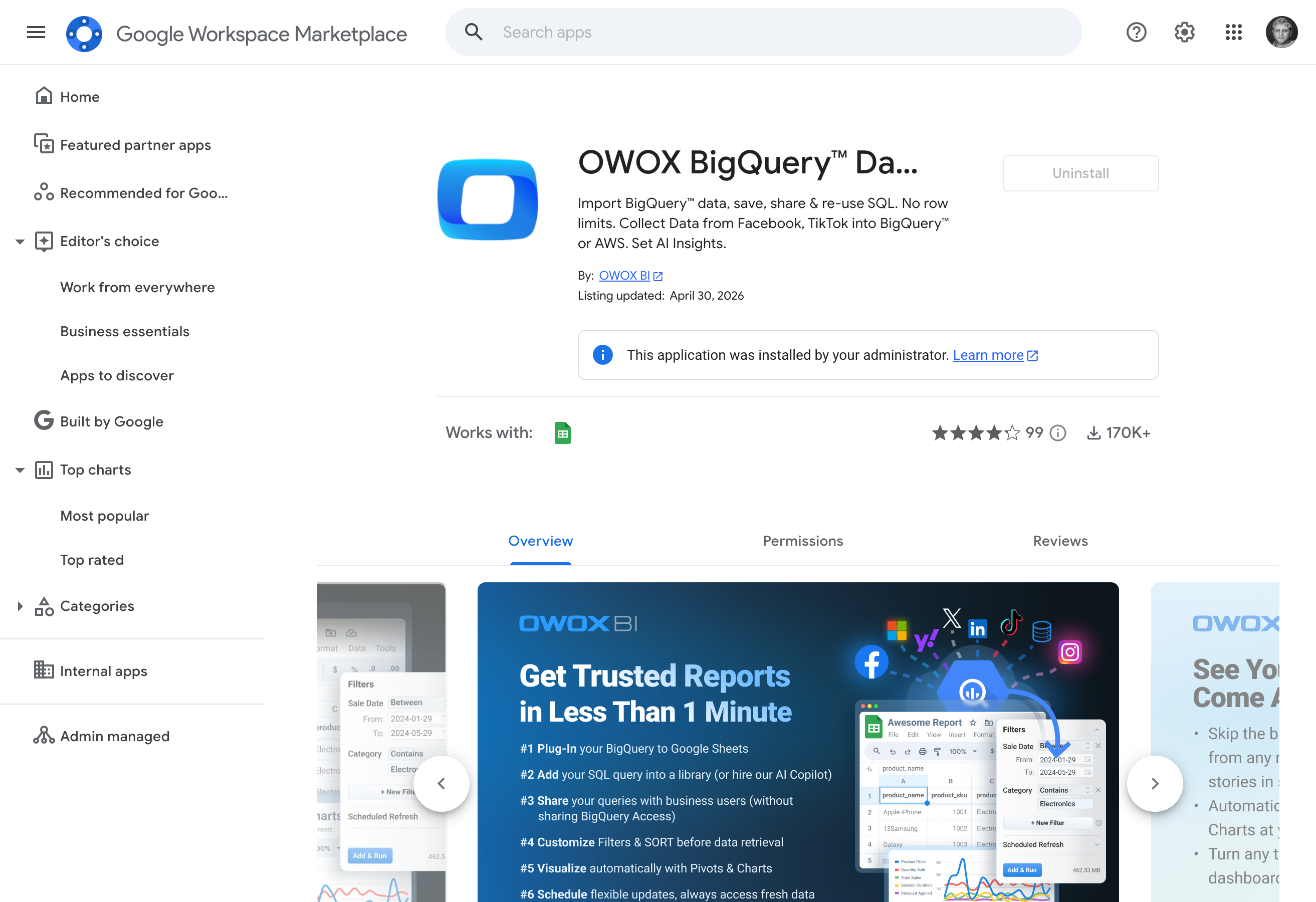
Pivots & Charts is free in every edition. Install the OWOX BigQuery Data Marts extension from Google Workspace Marketplace and start visualizing immediately. No trial, no paywall.
The easiest to get started
OWOX Cloud
Try before you scale
Starter
Free to start — paid plans from $65/mo
For data professionals & teams starting to automate entire business reporting in spreadsheets
MOST POPULAR
OWOX Cloud
Best for teams
Team
Starts at $875/mo + $35/seat (5 seats included)
For small and mid-size teams looking to automate collaborative reporting & get AI insights
OWOX Cloud
Ultimate control in the cloud
Enterprise
Custom contract - talk to our experts
For organizations looking for a tailored solution with an extra layer of flexibility, security & support included
Outcomes your company gets the moment your data marts go live.
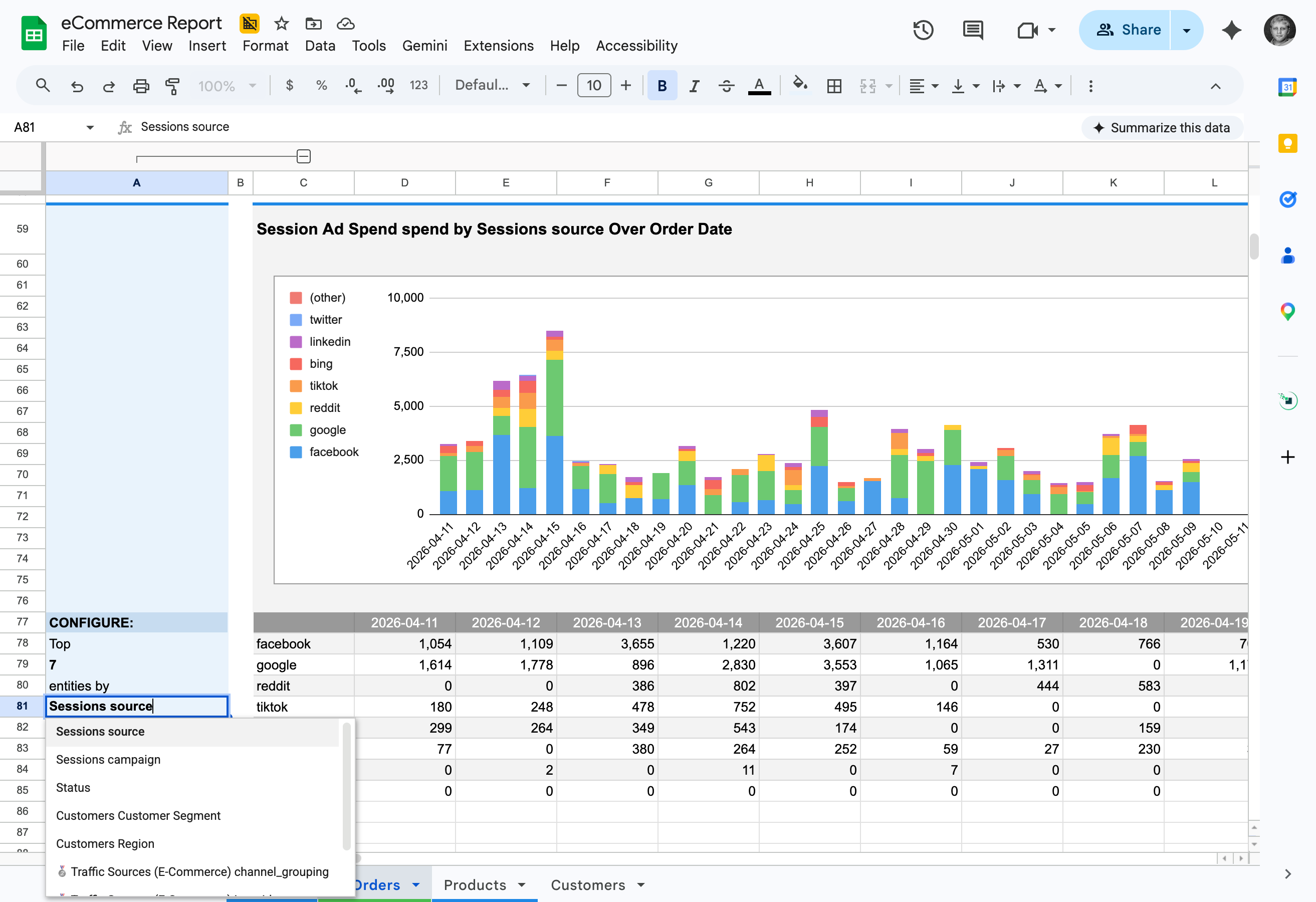
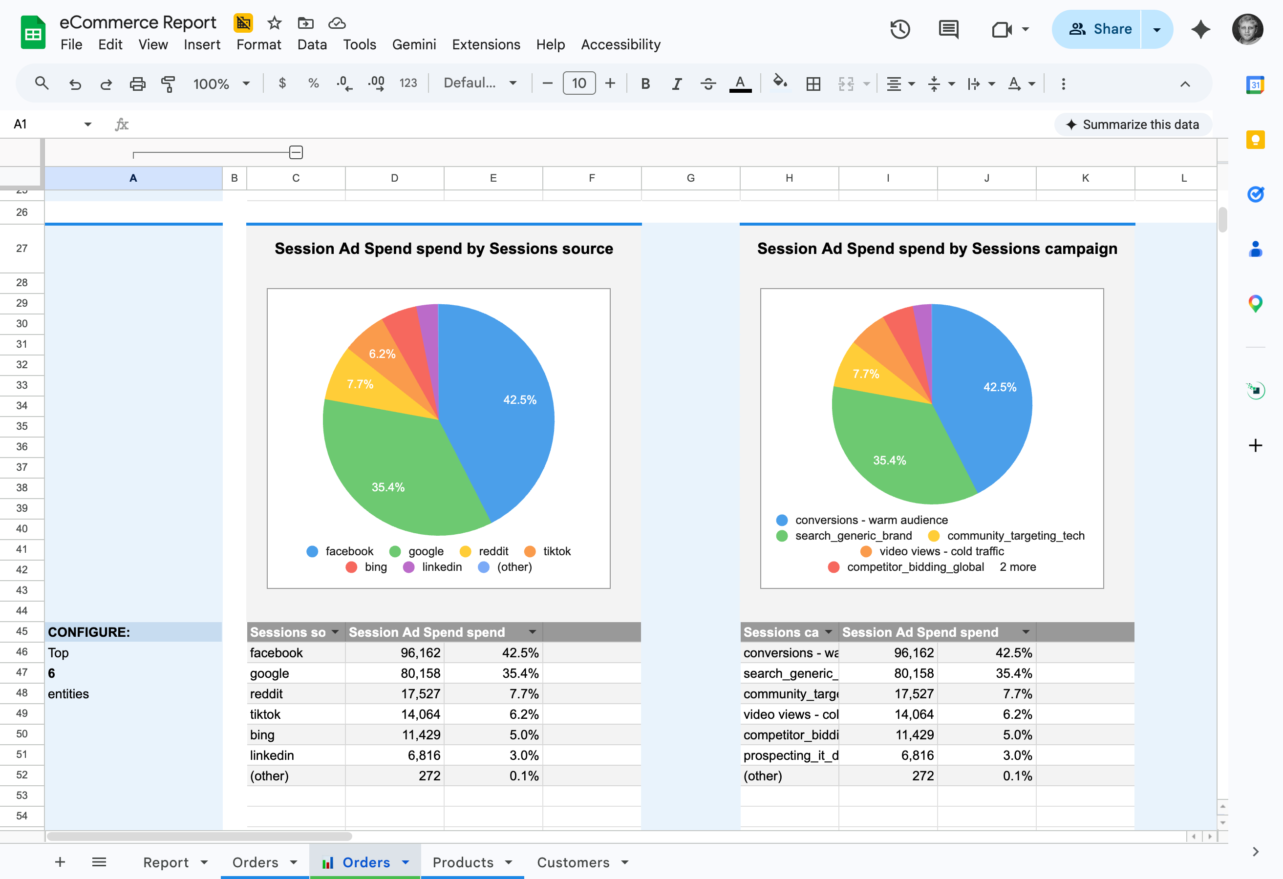
Automatically generate pivot tables, line, bar & pie charts from any Google Sheets data with a single click
Our smart algorithms instantly detect data types and recommend the most effective visualizations for your data.
Easily tailor charts to meet specific business needs - just swap metrics and dimensions through a friendly UI.
Create dynamic reports that automatically update when new data arrives, ensuring your reports remain accurate and current.
Stats with comment threads attached — like a colleague verifying your numbers in a shared sheet.
Connected BigQuery, set up 37 data marts, built a data model and had live reports in Sheets in under 15 minutes. My team thought I was joking when I showed them how they can now get live reports right in their sheets.
Generate charts, pivots, and graphs in Google Sheets with just one click.


We migrated 200+ reports from Looker to OWOX Data Marts. Our team now self-serves without filing a single Jira ticket. Easily the best infrastructure decision we made this year.