
What Features Actually Matter: How to Analyze Feature Adoption in Your SaaS Product
Discover the key steps to measure SaaS feature adoption accurately. Focus on the features that truly impact product growth and customer retention.


SaaS companies pour resources into developing new features, but not every feature matters equally. Some features see high traction and user love, while others get ignored entirely.
Understanding what drives adoption is important for feature success and for the overall health of your product. The success of a SaaS product hinges on how well users adopt and repeatedly engage with its core features.

This guide breaks down how to measure SaaS product adoption, identify what’s working, and use actionable product data to grow smarter.
We will also show you how OWOX BI simplifies everything, from raw data to insight-driven action.
Why Feature Adoption Matters for SaaS Products
Understanding why feature adoption matters is important for building and scaling SaaS products that users love. Here’s why your team should track it closely:
- Validates product-market fit: Feature adoption confirms that the features you’re building align with real user needs and solve relevant problems.
- Boosts retention and satisfaction: Users who frequently engage with key features are more likely to stick around and feel satisfied with the product.
- Reduces churn: High feature adoption is directly linked to lower churn rates, as engaged users are less likely to leave.
- Reveals value perception across user types: Tracking how free vs. paid users adopt features helps segment journeys and personalize experiences.
- Identifies underused features: Low usage flags areas for UX refinement, better onboarding, or additional education efforts.
Essential Feature Adoption Metrics to Track for SaaS Success
Feature adoption refers to the process by which users discover, start using, and continue engaging with a specific feature within your SaaS product. It’s not just about trying a feature once. It’s about repeated, meaningful use that indicates real value. High feature adoption means users integrate your product’s capabilities into their workflows, which is a strong sign of product-market fit and long-term retention potential.
How to Calculate Feature Adoption Rate:
= (Number of Feature Users in a Given Period) ÷ (Total Number of Active Users in the Same Period) × 100
Example: If 1,000 users logged in this month and 300 used a new reporting feature:
Feature Adoption Rate = (300 ÷ 1,000) × 100 = 30%
The following metrics show which features add real value, which need improvement, and how adoption varies across user segments, helping teams boost retention, refine development, and understand what drives conversions.
To understand how users interact with your product features and what drives continued engagement, track these key metrics:
Activation Rate
Activation rate measures the percentage of users who complete a set of defined actions that reflect they’ve experienced the core value of a feature or product. This is often the first key step in the user journey after sign-up.
A strong activation rate is a clear indicator of effective onboarding and immediate perceived value. This means that users understand the benefits of the feature and are compelled to try it early on.
Formula for Activation Rate:
= (Users who activated the feature ÷ Total new users) × 100
What to do with it: Low activation rates may signal a disconnect between user expectations and the product’s value delivery. You can improve this by refining onboarding flows, tooltips, or contextual walkthroughs that lead users to key “aha” moments faster.
Time to Feature Adoption
Time to Feature Adoption tracks the time users take to start using a feature after first being exposed to it. It’s especially important for evaluating new feature rollouts. A shorter time-to-adopt shows the feature is discoverable, intuitive, and valuable. Long delays may indicate unclear messaging, hidden placement in the UI, or low relevance.
Formula for Time to Feature Adoption:
= Timestamp of Adoption Event – Timestamp of First Exposure
What to do with it: Analyse what’s blocking discovery, whether design, copy, or timing. Streamline how you present the feature through nudges or guided flows.
Number of Active Users
This metric tells you how many users actively engage with a specific feature during a given time frame (daily, weekly, monthly). It shows whether the feature is important to your users’ workflows and helps gauge ongoing relevance. It’s also a key input for stickiness and retention metrics.
Formula For Number Of Active Users:
= Count of Unique Users Who Used the Feature in a Timeframe
What to do with it: Trends in active user count can help you assess feature fatigue, the impact of a release, or seasonality. If the user counts dip, revisit usage patterns or UX issues.
Duration of Feature Usage
This tracks how long users spend actively interacting with a feature during each session. Longer durations usually point to deeper engagement and value. Short sessions may signal shallow usage or dissatisfaction.
Formula For Duration Of Feature Usage:
= Session End Timestamp – Session Start Timestamp
What to do with it: Analyze what users do during long sessions. If engagement is short-lived, consider whether the feature solves a real problem or needs UX enhancements.
Breadth of Feature Adoption
Breadth measures how many different features a user interacts with, showing how fully they explore your product. Broad adoption suggests your product is integral to the user's workflow. Narrow usage may imply missed opportunities, discoverability issues, or a lack of perceived relevance.
Formula Of Breadth Of Feature Adoption:
=(Number of Features Used by User ÷ Total Available Features) × 100
What to do with it: Educate users about adjacent features, suggest next steps contextually, and use onboarding sequences that promote holistic product usage.
Depth of Feature Usage
Depth looks at how extensively users use a single feature, such as frequency, advanced actions, or levels of interaction. It helps differentiate casual users from power users. Deeper usage indicates that users have integrated the feature into their regular workflows.
Formula for Feature Usage Intensity:
= Number of Advanced Actions Taken ÷ Total Users Engaging with Feature
What to do with it: If depth is low, provide in-app tips or content to encourage more advanced usage. Use this metric to identify candidates for upselling or customer success outreach.
Feature Stickiness
Stickiness shows how often users return to use a feature after their first interaction. Sticky features often indicate core product value. High stickiness is tied to long-term retention and habit-forming usage patterns.
Formula For Feature Stickiness:
= (Daily Active Users ÷ Monthly Active Users) × 100
What to do with it: Boost stickiness by anchoring the feature in daily routines, through notifications, default settings, or user workflows that encourage return visits.
Feature Exposure Rate
This measures the percentage of users who have seen or encountered a feature, typically via UI placements, announcements, or tooltips. Users can’t adopt features they don’t know exist. High exposure is the first step toward adoption.
Formula for Exposure Rate:
= (Users Exposed to Feature ÷ Total Active Users) × 100
What to do with it: Improve in-app discovery via banners, guided tours, or nudges. Also, segment exposure by plan type or user cohort to better understand reach.
Feature Drop-off Rate
Drop-off rate tracks how many users abandon a feature after starting to use it. It identifies points of friction or failed expectations of the user. A high drop-off rate means that something about the feature doesn’t meet user expectations, including usability, performance, or usefulness.
Formula for Drop-off Rate:
= (Users Who Abandoned ÷ Users Who Started) × 100
What to do with it: Investigate drop-off points through session replays or user feedback. Simplify confusing flows and reinforce the feature’s value proposition to reduce abandonment.
The Challenge: Abundant Data but Unclear Insights in SaaS Feature Adoption
SaaS teams often have no shortage of user interaction data, but that doesn't automatically lead to clarity. Product teams are drowning in dashboards, struggling to separate signals from noise. Feature adoption insights get lost in the clutter, leading to slow decisions and missed opportunities.
Raw data offers more confusion than clarity without the right model or tools. It's not about collecting more; it's about collecting smarter. The challenge isn’t access to data, it’s access to usable insights that drive action.
Before diving into the specific challenges, here are some common issues SaaS teams face when navigating massive product data sets:
Too Much Data Can Be Overwhelming
Collecting massive datasets without a clear plan can lead to analysis paralysis. You need to focus on what truly drives business outcomes. When teams try to track everything, they often end up acting on nothing. The volume of dashboards, charts, and logs can stall decision-making and shift focus away from high-impact areas.
Instead of chasing every data point, teams need frameworks to prioritize. What gets measured should align with business and user goals, not just what’s easy to track.
Data Doesn't Always Reflect User Behavior
Quantitative data without context misses the "why." Numbers alone can't explain intent, confusion, or unmet expectations. For instance, a user clicking a button doesn’t always mean they understood what it does, or found it useful. Without qualitative insights or event context, you risk misreading the data.
Analytics must be paired with UX research, heatmaps, or session recordings to reflect user behavior truly. This helps bridge the gap between what users do and why they do it.
Using Multiple Tools Can Cause Confusion
When analytics tools don’t integrate, teams struggle with inconsistent reports and siloed insights. Cross-functional alignment becomes difficult. Different teams using different tools often interpret data differently, leading to conflicting conclusions. This slows down collaboration and undermines trust in data.
A unified platform or integrated analytics stack helps ensure consistency. It gives everyone a shared source of truth and improves speed to insight.
Focusing on the Wrong Metrics
Vanity metrics like page views or clicks don’t always translate to real value. The goal is to prioritize actionable, outcome-driven metrics. When teams focus on surface-level numbers, they miss deeper insights about usage, engagement, and retention. It can create a false sense of success.
Shifting to metrics that track behavior, outcomes, and long-term impact leads to more meaningful decisions. Metrics should always answer: "What can we do next with this insight?".
The Solution: Feature Adoption Starts with Tailored Product Analytics
Your analytics approach must be as tailored as your product to drive meaningful adoption. Generic dashboards won't give you the depth or precision needed to understand how features perform.
Instead, you need a framework designed around your product's core user events, business model, and growth goals. This ensures you're not just tracking what’s easy to measure, but what truly matters.
Understanding a Purpose-Built Product Analytics Model
A purpose-built product analytics model is a customized framework tailored to track and interpret user interactions specific to your SaaS product. Unlike off-the-shelf tools that offer broad metrics, this model zeroes in on key actions, like trial signups, logins, feature clicks, and upgrades, capturing how users truly engage with your product.
By aligning data collection with your product’s structure and goals, this model empowers teams to make feature-level decisions with confidence. It’s an important component of building a strong product analytics culture in a SaaS company, where data isn’t just tracked, it’s transformed into actionable insights that fuel smarter product development and growth.
How This Model Addresses Feature Adoption Challenges
This model is specifically designed to remove the common blockers that SaaS teams face with data overload and unclear metrics.
Here’s how it solves those issues:
- Simplifies Data Overload: Tracks only high-value interactions like feature launches, trials, or upgrades. This helps reduce noise and allows teams to act on what’s actually moving the product forward.
- Aligns with User behavior: Maps usage patterns to specific user journeys. This ensures the data tells a meaningful story about how users adopt, explore, and return to product features.
- Integrates Tools Seamlessly: Works with tools like BigQuery and Looker Studio for unified dashboards. This accelerates reporting cycles and helps stakeholders align on a single source of truth.
- Focuses on Actionable Metrics: Highlights what moves the needle, like depth of use or drop-off points. These insights guide prioritisation, feature development, and strategic decision-making.
Example: A product analyst uses this model to track how often premium users activate a new feature within their first 7 days. This insight triggers a UX flow change that boosts early adoption by 25%.
Strategies to Boost Feature Adoption in Your SaaS Product
You’ve built great features, now you need users to engage with them. Driving adoption isn’t just about launching features. It’s about educating, guiding, and nudging users at the right time. A proactive feature rollout strategy can increase engagement, reduce churn, and help users realise value faster.
Here are practical strategies you can implement to improve adoption rates:
Announce New Features Directly Inside the App
In-app modals, banners, or tooltips can increase visibility and encourage usage right when users are most engaged.
By embedding announcements in the user journey, you meet users where they are, without needing external prompts. This creates a natural discovery flow that boosts interaction rates. It also allows teams to A/B test messaging effectiveness and placement for maximum impact.
Clearly Show the Value and Next Steps
Explain the benefit of a feature and guide users with prompts or short tutorials. Don’t just ship, educate.
Make it clear how a feature helps users achieve their goals. Combine messaging with contextual cues like progress bars or checklists. When users understand the "why" and "how," they’re far more likely to adopt and retain usage.
Support Feature Adoption After the Launch
Ongoing nudges, guides, and support content reinforce usage. Adoption doesn’t end on release day.
Post-launch engagement can include email sequences, in-app tours, or knowledge base content. These assets help bridge the gap between discovery and long-term habit formation. Continuous support encourages users to explore advanced functionality and integrate the feature into their workflow.
Send Targeted Messages to the Right Users
Use segmentation to deliver feature announcements based on plan type, behavior, or past actions for more relevance.
Personalized messaging increases the likelihood of engagement. Whether you’re targeting power users, trial users, or dormant accounts, timing and context matter. Dynamic segmentation also lets you test messaging variations for different audience cohorts.
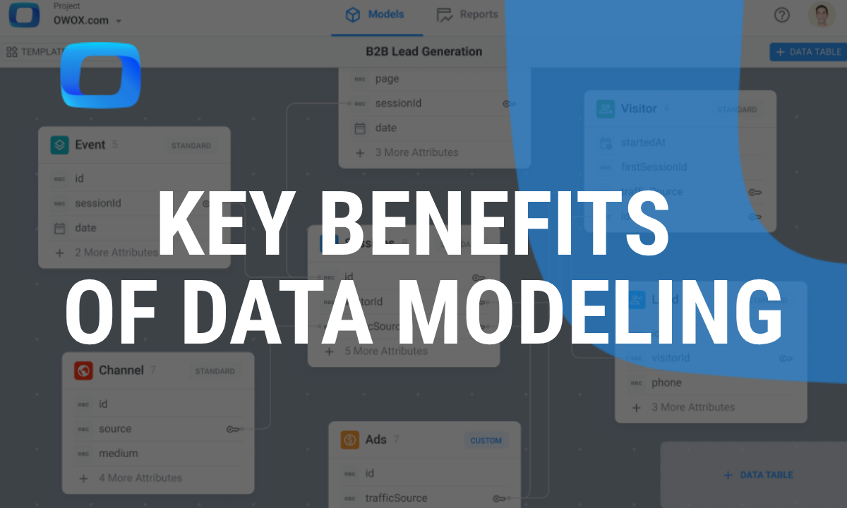
How OWOX BI Helps Analyze Feature Adoption in SaaS Products
OWOX BI was built to solve the exact problems SaaS teams face with feature adoption analysis. It empowers both technical and non-technical users to go from raw data to clear product insights in minutes.
By combining flexible querying, self-service dashboards, and unified data model, OWOX BI enables teams to uncover what drives user behavior and make faster, data-backed decisions.
SQL Interface for Data Professionals
For technical users like data analysts, OWOX BI offers an advanced SQL interface that provides maximum flexibility and control over your feature adoption analysis:
- Advanced Querying: Craft SQL to uncover hidden trends. Build custom queries to explore specific user actions and segmentation, helping you diagnose feature adoption bottlenecks with precision.

- Custom Metrics: Define KPIs like activation rate or feature stickiness. Tailor metrics to your unique business logic and product goals, giving stakeholders more relevant and actionable insights.
- Integration with data warehouses: Powerful storage and lightning-fast processing. Query large datasets in seconds and automate workflows without worrying about infrastructure or scalability issues.

Chat UI for Business Users
OWOX BI also supports business users and non-technical stakeholders with an intuitive chat interface for analytics. Here's what makes it useful:
- Natural Language Queries: Ask "Which features are most used by paid users?" and get answers instantly. This makes data accessible to PMs, marketers, and executives without SQL knowledge, democratizing insight access across teams.
- Automated Reporting: Generate dashboards with no code. Easily build recurring reports for stakeholders, track KPIs, and get updates without engineering support or dependencies.
- Integration with Google Sheets: Live-sync reports into spreadsheets. Collaborate across teams by pulling in real-time data into Sheets for ad hoc analysis, planning, or presentations.

Unified Data Modeling
To create a single source of truth and streamline collaboration, OWOX BI includes a unified data modeling approach.
Here’s what makes it effective:
- Semantic Layer: Ensure definitions are standardized across teams. This eliminates confusion around metrics and ensures consistency in how data is interpreted across departments.
- Reusable Components: Create once, reuse across reports. Save time and reduce redundancy by repurposing validated queries and metrics across teams and dashboards.
- Team Collaboration: Align analysts, PMs, and execs on a single data source. This shared foundation boosts transparency, improves decision-making, and breaks down silos between technical and business stakeholders.
Action: Utilize a Feature Adoption Template to Drive Insights
Even with powerful tools, having a structured framework is essential. A well-designed template ensures your team tracks the right metrics consistently across the product.
Templates standardize reporting and help uncover trends and insights faster, allowing product managers, analysts, and marketers to align on what’s working and what needs improvement.
Feature Adoption Metrics Template
Use this structured template to measure how well each feature performs across the user journey.
These metrics help your team move from assumptions to insights:
- Activation Rate: Percentage of users who use a feature. This shows how many users reach the "aha" moment and recognize the feature’s value early.
- Time-to-Adopt: Average time from sign-up to first feature use. Shorter adoption times suggest effective onboarding and intuitive design.
- Feature Stickiness: Measures how often users return to a feature after first use. High stickiness indicates ongoing relevance in user workflows.
- Drop-off Rate: Percentage of users who abandon a feature after first use. High rates may signal poor UX, unclear value, or low user need.
- Feature Usage by Plan: Compares feature usage across Free, Pro, and Enterprise plans. This highlights which features drive upgrades and justify premium tiers.
- Feature Retention Rate: Tracks how many users reuse a feature after 1, 7, or 30 days. This reveals whether features have lasting engagement.
- Feature Usage Frequency: Average number of times active users engage with a feature over a period. Helps identify features that become part of daily workflows.
- Milestone Completion Time: Measures the time taken by users to reach key product milestones after signing up. Useful for tracking user journey efficiency.
- Usage Spike After Feature Release: Shows the percentage increase in feature usage after a release or improvement. Helps gauge the immediate impact of new launches.
- Error-Prone Feature Churn Correlation: Percentage of users who experienced an error in a feature and churned within 30 days. Helps identify product friction that leads to churn.
Templates standardize tracking and simplify decision-making.
Start Asking Targeted Questions
Once you’ve populated the data, take your analysis further by asking strategic, insight-driven questions like these:
- Which features have the highest and lowest adoption rates? This helps identify what users find valuable and what they overlook, so you can prioritize enhancements or reconsider investments.
- Are there patterns in how different user segments adopt features? Analyzing behavior by user group (e.g., free vs. paid, enterprise vs. SMB) reveals personalized opportunities for onboarding and messaging.
- What factors contribute to users discontinuing feature use? Understanding drop-offs helps teams address usability issues, messaging gaps, or functionality mismatches.
Answers to these questions drive roadmap priorities and UX improvements.
Turn Business Data into Feature Usage Reports Without SQL using OWOX BI
OWOX BI helps product teams move faster by turning raw data into clear, usable insights, no dashboards or complex tools required. With plug-and-play data models, self-service interfaces, and scalable BigQuery integration, teams can go from questions to answers in minutes.
Whether it’s tracking feature usage, improving trial conversion, or comparing free vs paid user behavior, OWOX BI delivers instant clarity. It's built for flexibility and collaboration, so PMs, analysts, and growth teams can drive adoption without bottlenecks.
Frequently asked questions


Finally, a tool that doesn't ask business users to learn a new dashboarding UI. Our marketing team already knows Sheets. OWOX just delivers the right data.
Joinable data marts concept was the thing that sold us. We can now use the semantic layer without building one.
Self-hosted the OSS version on Digital Ocean. Zero vendor lock-in. Contributed a Shopify connector back in week two.