
First 7 Days: What Do Engaged Users Do Differently in SaaS Products?
Learn to track first-week user behavior in SaaS using cohort analysis and product analytics. See what your best users do differently to stay engaged.


They say the first impression is everything, yet most SaaS products waste it.
In the first 7 days, users either find value or silently churn. Product teams scramble to understand why, building onboarding flows based on assumptions. Meanwhile, analysts run ad-hoc reports, trying to explain what went wrong, again. The result? Missed signals, slow iterations, and engagement that never takes off.
Understanding early user behavior shouldn’t be a guessing game.
This article shows you a better way: track what engaged users do in their first week, and make that insight self-serve. With OWOX BI’s product analytics model, you can identify activation patterns, run cohort comparisons, and uncover your product’s Aha moments; no SQL is required.
SaaS Onboarding: Why It’s Critical?
SaaS onboarding is the process of helping users get started with your product and reach value as quickly as possible. It includes everything from sign-up and setup to tutorials, guided walkthroughs, and in-app tips. The goal is to ensure users understand how your product works and how it fits into their goals, right from the first touchpoint.
Let’s look at some key reasons why a strong onboarding experience matters:
- Boosts Retention: A smooth onboarding helps users understand value early, reducing churn and building long-term loyalty.
- Speeds Up Time to Value: Clear steps, tutorials, and guidance help users achieve goals faster with less friction.
- Improves Engagement: When users know what to do, they interact more and return often.
- Drives Adoption: A guided experience encourages users to return, explore, and adopt more features, leading to stickier usage.
- Enhances User Experience: Personalized flows and helpful prompts create a lasting, positive first impression.
Why the First-Time User Experience Shapes Long-Term Engagement?
The first-time user experience (FTUE) is everything a new user thinks, feels, and does when interacting with your product for the first time, whether during a free trial, demo, or paid version. It’s not just about setup steps; it’s about guiding users to value fast.
A great FTUE leads users to their “aha!” moment, where they see how your product helps them. That moment builds trust, drives deeper engagement, and increases the chances they’ll stick around. A poor FTUE, on the other hand, often results in early drop-off and lost growth opportunities.
Why Guesswork Fails in SaaS Onboarding?
Onboarding decisions based on guesswork often lead to weak user experiences and missed growth. Let’s break down why relying on assumptions without data can hold your team back.
Misguided Decisions Waste Time and Resources
When teams don’t use real user data, they often focus on the wrong features. This leads to building things that don’t drive activation or engagement. Time, effort, and development costs go into areas that don’t move the needle. With the correct data, teams can make focused decisions that lead to better outcomes and faster results.
Lack of User Insight
It’s hard to know what’s working without visibility into how users behave. You can’t improve what you can’t see. Guessing leads to onboarding flows that don’t match real user needs, and key moments, like the “aha!” experience, get missed. A clear view of behavior helps teams build better, more relevant onboarding steps that users follow.
Data Gaps Drive Up Development Costs
Missing or poor-quality data forces teams to work in the dark. This often results in back-and-forth development, unclear priorities, and more time fixing issues than moving forward. Clean, accurate data helps product and engineering teams plan smarter, avoid rework, and move faster.
Missed Opportunities in a Fast-Moving Market
In SaaS, speed matters. If your team isn’t acting on data, you risk falling behind. Guessing slows your response to trends, feedback, and feature usage. Meanwhile, competitors who rely on data move faster, adapt better, and win more users. Real-time onboarding insights help your team stay ahead and respond with confidence.
Guesswork vs. Data-Driven SaaS Onboarding: What’s the Difference?
Now that we’ve covered the risks of relying on assumptions, let’s compare how a data-driven approach transforms product onboarding, from understanding users to optimizing features and improving UX.
Smarter Ways to Track and Improve SaaS Onboarding
Great onboarding doesn’t happen by chance; it results from a clear strategy. Instead of relying on generic flows, product teams should tailor onboarding based on real user actions. Below are smarter ways to guide users from sign-up to success using data.
Reduce Friction with Customer Journey Mapping
A customer journey map helps visualize how users move from sign-up to activation. It shows every user step and highlights where friction might slow them down. By mapping the onboarding process, product teams can offer the right help at the right time, through tooltips, guides, or support prompts.
Segment Users by Actions, Not Just Sign-Up Date
Grouping users by when they joined often hides what truly drives engagement. Instead, use behavioral cohorting, segmenting users by what they do (or don’t) in the product. These patterns provide deeper insight, whether it’s completing setup, inviting teammates, or skipping steps.
Identify Early User Actions That Signal Long-Term Success
The first week often contains powerful signals. By analyzing early actions, like uploading data, completing setup, or using key features, you can spot which behaviors link to long-term retention or upgrades. These insights let product teams highlight or guide users toward high-value actions during onboarding. Over time, this boosts activation rates and helps you design onboarding flows.
Use Checklists and Walkthroughs to Drive Activation
Checklists help users complete important tasks without feeling overwhelmed. They work because of the Zeigarnik effect, which makes people more likely to finish things once they’ve started. A simple onboarding checklist and a progress bar give users a clear path and a sense of achievement. This increases the chances they’ll complete the setup and return to the product.
Offer a Self-Service Onboarding Experience
Not every user wants or needs a guided tour. Self-service onboarding allows users to explore the product at their own pace. This can include help docs, videos, tooltips, and in-app guidance tailored to different use cases. When done right, self-service options reduce support requests and increase user satisfaction.
Use a Ready-Made Product Analytics Model
Instead of building onboarding reports from scratch, use a ready-made analytics model like the one in OWOX BI. It’s built for product teams to explore onboarding trends, analyze user cohorts, and measure retention, without needing SQL. The model tracks key events and behaviors, so teams can easily compare what retained vs. churned users did in their first week.
Comparing Retained vs. Churned First-Week Behavior (with SQL Example)
To improve SaaS onboarding, you must understand what retained users do differently from those who churn within their first 7 days. This type of behavioral comparison can highlight key actions, like repeated logins, early feature usage, or team invites, that are strong predictors of long-term engagement.
Let’s take an example of analyzing user behavior in the first 7 days after signup to see what separates retained users from those who churn. This helps product teams identify patterns that lead to long-term engagement and adjust onboarding flows to drive more users toward those actions.
We’ll compare two cohorts: users who stayed active after day 7 (retained) and those who didn’t (churned).
Question: How does the average number of events in the first 7 days differ between users who are retained after day 7 and those who churn?
Here's a sample SQL query to track event counts in the first week:
1WITH user_activity AS (
2  SELECT
3    u.id AS user_id,
4    COUNTIF(DATE(e.timestamp) BETWEEN DATE(u.created_at) AND DATE_ADD(DATE(u.created_at), INTERVAL 6 DAY)) AS events_in_first_week,
5    MAX(DATE(e.timestamp)) AS last_event_date,
6    DATE(u.created_at) AS signup_date
7  FROM `owox-d-ikrasovytskyi-001.Product_Data_Model_v1.user` u
8  LEFT JOIN `owox-d-ikrasovytskyi-001.Product_Data_Model_v1.event` e
9    ON u.id = e.user_id
10  GROUP BY u.id, u.created_at
11)
12
13SELECT
14  CASE
15    WHEN last_event_date > DATE_ADD(signup_date, INTERVAL 7 DAY) THEN 'retained'
16    ELSE 'churned'
17  END AS user_status,
18  COUNT(user_id) AS total_users,
19  ROUND(AVG(events_in_first_week), 2) AS avg_events_in_first_week
20FROM user_activity
21GROUP BY user_status;

This highlights the actions that retained users perform more often, and helps prioritize what to reinforce during onboarding.
How OWOX BI Enables Self-Serve Cohort Analysis
Cohort analysis shouldn't require a data engineering degree. OWOX BI simplifies everything with a pre-built product analytics model, allowing product teams to explore retention patterns, compare behaviors, and track onboarding effectiveness.
Use a Pre-Built Model to Segment Users by Behavior
OWOX BI comes with a ready-to-use product analytics model that automatically segments users based on what they do, like using a feature for the first time, completing an activation step, or triggering churn signals. You can instantly report on actions taken within the first 7 days and filter cohorts by outcomes. This saves hours of setup time and helps teams spot engagement drivers with clarity.

Run Cohort Comparisons Without Writing SQL
With OWOX BI, comparing onboarding cohorts is easy, even for non-technical users. Teams can run reports using a chat interface or guided templates that visualize differences between retained and churned users. Whether you want to explore who activated early, dropped off mid-way, or converted after a key feature, you can do it without touching code.
Analyze Activation, Retention, and Drop-Off Trends Over Time
OWOX BI tracks how user cohorts engage across time and product stages. You can analyze trends in trial-to-paid conversion, feature adoption, and drop-offs after specific actions, like completing setup or skipping tutorials. These insights help you fine-tune onboarding flows and highlight where engagement breaks down.
Empower Non-Technical Teams with Self-Service Reporting
OWOX BI enables product managers, marketers, and support teams to explore data without relying on analysts. With built-in reports and an intuitive chat interface, non-technical users can access cohort insights, filter by behavior, and understand engagement trends. This removes reporting bottlenecks and allows every team to move faster.
Set Up Once, Then Enable Flexible Access for Everyone
Analysts only need to set up the OWOX BI model once. After that, product teams can explore data freely using chat-based tools or adjust simple SQL queries when required. No more repetitive data pulls or one-off dashboard requests. With flexible access, teams can drill into onboarding performance, compare cohort outcomes, and keep iterating, without needing help every time.
Real-World Example: Tracking First-Week Feature Adoption and Engagement
Let’s see how product teams can use OWOX BI to track a new feature’s full lifecycle, from launch to long-term adoption. By leveraging behavioral data and cohort analysis, you can measure early engagement, monitor retention, and evaluate impact without SQL hassle.
Launch a Feature
With OWOX BI’s event-based model, you can track who sees feature announcements via banners, messages, or emails. Events like Feature Announcement Viewed and Feature Banner Seen are captured automatically, allowing for easy segmentation of users for reporting purposes.
Built-in dashboards show how many users viewed vs. clicked the announcement, so no manual tracking is needed. This gives product teams instant visibility into feature launch performance.
In OWOX BigQuery Data Marts, you can ask: “How many users used the Cohort Analysis within 7 days after seeing the launch announcement?” to get real-time insights.
You might get the clarification question:
To answer this, I will assume:
- "Cohort Analysis" refers to a feature in the ProductDataModel_Feature table.
- "Launch announcement" is a tracked event in the ProductDataModel_Event table.
- "Used the feature" means a user triggered an event related to the "Cohort Analysis" feature.
- "Within 7 days" means the usage event occurred within 7 days after the user saw the launch announcement (event_type = launch_announcement).
- I will join both tables by user_id and compare timestamps to enforce the 7-day condition.
And it would kindly ask you: “Is this what you want to see?”
And when you say yes, the OWOX BigQuery Data Marts will return the number of unique users who used the feature within 7 days of its release.

This helps product teams measure real feature adoption following targeted announcements. With event-based tracking, you get precise, time-bound usage insights with no manual setup needed.
Measure Its Early Impact
After launching a new feature, measuring how many users engage with it early on is crucial. OWOX BI’s ready-made cohort model helps you measure how many users engage with a new feature in the first 7 days after seeing it. You can track key metrics like activation rate and engagement depth (e.g., number of sessions with feature usage).
Comparing these metrics across cohorts, such as retained vs. churned users, gives clear visibility into the feature’s impact, without writing SQL or building custom reports.
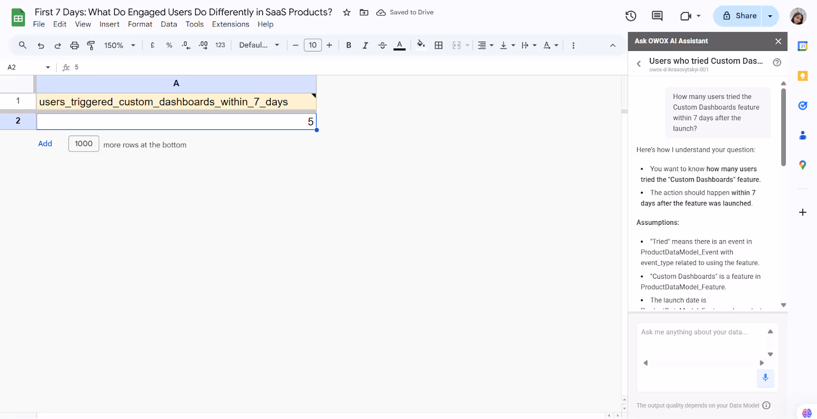
In OWOX BigQuery Data Marts, you can ask: “How many users tried the Custom Dashboards feature within 7 days after the launch?”
When this question is entered into OWOX AI Assistant, it may respond with a clarification like this:
To answer "How many users tried the custom dashboard within 7 days after the launch?"
Assumptions:
- "Tried" means there is an event in ProductDataModel_Event with event_type related to using the feature.
- "Custom Dashboards" is a feature in ProductDataModel_Feature.
- The launch date is taken from ProductDataModel_Feature.released_at for "Custom Dashboards".
- The 7-day window is defined as the period from the release date to the release date + 7 days.
You can proceed with this or adjust the logic as needed.
And when you say yes, the OWOX AI Assistant will return the number of users who tried the Custom Dashboards feature within 7 days of its launch.
Measuring early engagement ensures product teams know if a feature drives meaningful adoption. This helps prioritize enhancements based on real user behavior.
Monitor Ongoing Engagement
After initial adoption, it’s important to see if users keep coming back to a new feature. OWOX BI helps track repeat usage with 30-day cohort reports, highlighting how engagement changes over time.
Using prebuilt templates, product teams can easily spot trends in feature usage without building complex reports. This shows whether a feature is valuable to users beyond their first interaction.
In OWOX BigQuery Data Marts, you can ask: “What percentage of users keep using the In-App Notifications feature after 7, 14, and 30 days?”
If you ask this question in OWOX AI Assistant, you'll likely be prompted with the following clarification:
To answer "What percentage of users keep using the In-App Notifications feature after 7, 14, and 30 days?", I assume:
- Identify "In-App Notifications" in the ProductDataModel_Feature table (likely by name).
- Find users who used this In-app Notifications from ProductDataModel_Event, filtered by feature_id and relevant event_type.
- Calculate the percentage of these users who returned to use the feature again at 7, 14, and 30 days after their first use.
Assumptions:
- "In-App Notifications" is the exact feature name in ProductDataModel_Feature.
- "Using" the feature means any event in ProductDataModel_Event with the matching feature_id.
- The analysis includes users who first used the feature within the last 90 days.
You can proceed with this or adjust the logic as needed.
And when you say yes, the OWOX AI Assistant will return the percentage of users who used the In-app Notifications feature after 7,14, and 30 days.

Tracking ongoing engagement helps teams measure sustained user interest and engagement. This ensures that product improvements are focused on features that keep users engaged and active.
Identify Drop-offs
Not every user who tries a feature will keep using it. Drop-off analysis helps you find where users lose interest or face friction. With OWOX BI, you can track where users stop interacting with a feature, how long they engage before dropping off, and where they abandon key actions. Product teams can identify friction points and plan targeted re-engagement strategies to bring users back by visualizing these patterns.
In OWOX BigQuery Data Marts, you can ask: “What percentage of users dropped off after starting the User Signup Flow feature?”
OWOX AI Assistant may respond to this question with a clarification prompt like this:
To answer "What percentage of users dropped off after starting the User Signup Flow feature?", My Assumptions are:
Assumptions:
- "User Signup Flow" is a feature tracked in the ProductDataModel_Feature table.
- "Dropped off" means users who triggered a start event but did not complete the flow (e.g., no final confirmation or completion event).
- The calculation should be based on users who started the flow in the last 30 days.
You can clarify these based on your data and proceed.

Understanding drop-offs helps identify and address weak spots in the user journey. This ensures product improvements focus on reducing churn and boosting long-term engagement.
Evaluate Long-Term Success
Tracking long-term success means looking beyond initial adoption. OWOX BI helps you measure how widely a feature is used over time and whether it contributes to business goals like retention, conversions, or upsells. We can analyze feature adoption across user plans, compare user engagement with that of non-users, and assess the revenue impact.
With seamless Google Sheets and dashboard integrations, product teams can easily share these insights for leadership reporting, without needing help from data engineers.
In OWOX BigQuery Data Marts, you can ask: “How has the adoption rate of the Custom Dashboards feature changed over the last 90 days?”
If you ask this question in OWOX AI Assistant, you'll likely be prompted with the following clarification:
To answer "How has the adoption rate of the Custom Dashboards Feature changed over the last 90 days?", I assume:
- "Custom Dashboards" is a feature tracked in the ProductDataModel_Feature table.
- Adoption is measured by user events in the ProductDataModel_Event table that are linked to this feature via feature_id.
- The adoption rate will be calculated based on the number of unique users interacting with the feature each week (or another chosen time interval).
- The time window is the last 90 days from today’s date.
Is this what you want to see? Once confirmed, I’ll generate a trend report showing how adoption has changed over time.

Evaluating long-term success ensures product efforts are aligned with real business impact. This helps teams prove ROI and prioritize features that drive lasting value.
Connect Your Data to Start Finding Your Product’s ‘Aha’ Moments
Your product’s ‘aha’ moment is when users experience real value, like sending their first message or completing a core action. These moments drive engagement and are different for every product. By connecting your product data and tracking user behavior, you can uncover which actions signal long-term retention.
Identifying and reinforcing these moments helps product teams build smarter onboarding flows that guide more users to value, faster, consistently, and with measurable impact on growth.
Build Better Onboarding with Better Data Using OWOX BI
OWOX BI gives product teams the tools to improve onboarding using real behavioral data, not assumptions. With its ready-made product analytics model, you can track key actions, compare retained vs. churned users, and uncover what drives engagement.
No need to write SQL or wait on data teams. Once set up, anyone can run cohort analysis, explore user journeys, and spot drop-offs. It’s a smarter, faster way to build onboarding that leads to activation and long-term retention.
Frequently asked questions


Finally, a tool that doesn't ask business users to learn a new dashboarding UI. Our marketing team already knows Sheets. OWOX just delivers the right data.
Joinable data marts concept was the thing that sold us. We can now use the semantic layer without building one.
Self-hosted the OSS version on Digital Ocean. Zero vendor lock-in. Contributed a Shopify connector back in week two.