The Role of Business Data Dashboards: Real-life Examples for Practical Use
Explore real-life business dashboard examples across e-commerce, SaaS, fintech, and retail — and learn how to build them on trusted, unsampled data.
Present-day analytics tools let you track almost every action visitors take on your website. But collecting data is only half the battle. The harder question is: how do you turn all that raw data into something your team can actually act on?
In this article we share real examples of business that help marketing specialists, developers, content managers, and analysts make faster, more confident decisions — using complete, unsampled data.
What is a business dashboard?
A business performance dashboard is a tool that visually presents key information necessary to meet various objectives. Data from multiple sources is consolidated and organized on a single screen, allowing for quick and easy monitoring.
Dashboards are versatile and adaptable. Their customizability allows them to incorporate diverse types of data over different time periods — helping teams analyze past events, understand their causes, predict future trends, and guide appropriate actions.
Why use dashboards in business?
Why use dashboards in business?
Dashboards serve as a centralized platform to display a comprehensive view of data gathered from various sources. By transforming raw data into a format tailored to the user’s specific requirements, they cater to a wide range of professionals — from analysts to executives.
Key areas where dashboards are particularly useful include:
- Tracking customer-related metrics
- Analyzing financial data
- Monitoring sales trends
- Reviewing web analytics
- Managing manufacturing details
- Overseeing human resources information
- Evaluating marketing effectiveness
- Supervising logistics
Their ability to aggregate and visually represent complex data makes dashboards invaluable for professionals who need to communicate insights to those less familiar with the underlying numbers — whether that’s a product team, a finance lead, or a C-suite executive.
OWOX Data Marts
See your first report built in real time. 15 minutes.
- Connect your data warehouse
- Pick your metrics
- Get a live Google Sheets report
In the time it takes to write a ticket. Then imagine never writing that ticket again.
Book a DemoWe'll use your actual use case
Importance of business dashboards
Importance of business dashboards
Business dashboards matter because they close the gap between data and decisions. Here is what they actually deliver:
- Real-time data access: Decision-makers can respond quickly to market changes and internal performance shifts.
- Improved decision-making: Consolidating critical data in one place helps identify trends, patterns, and anomalies that might otherwise go unnoticed.
- Enhanced performance tracking: Teams can track progress against key performance indicators (KPIs) and spot areas that need attention.
- Time efficiency: Aggregating data from various sources eliminates manual report generation, which is time-consuming and error-prone.
- Better communication and reporting: Visual representations make it easier to share complex information with stakeholders who may not be familiar with the data.
- Trend analysis and forecasting: Historical data presented in an easily digestible format is crucial for strategic planning.
- Cost reduction: By highlighting underperforming areas, dashboards help identify where money is being spent inefficiently.
- Enhanced customer insights: For teams that track customer data, dashboards reveal behavior patterns and preferences that shape better marketing strategies.
Difference between business dashboards and reports
Difference between business dashboards and reports
The distinction between dashboards and reports lies primarily in their scope, focus, and purpose in data analysis and presentation.
Dashboards are designed to provide a high-level overview across a wide range of data. They are typically dynamic, offering real-time or regularly updated insights that answer broad questions like “How was our site performance last month?” or “How many units did we sell?”
Reports, by contrast, offer a more detailed and focused analysis. They are generally static and delve deeply into a specific data set — a thorough analysis of a particular marketing campaign, for instance, or a detailed financial audit.
While both are crucial, dashboards are best suited for broad, real-time overviews and quick decision-making, whereas reports are more appropriate for detailed, specific, and often historical data analysis.
Key components of an effective performance dashboard
Key components of an effective performance dashboard
The most effective dashboards focus on five essential elements: measurable KPIs, trend analysis, customization, strong visual design, and data accuracy. Together, these components drive smart, data-backed decisions across teams.
Measurable KPIs
Key Performance Indicators (KPIs) show how well your business is meeting its goals. They must be specific, relevant, and easy to track. When your KPIs are clear and updated in real time, teams can spot what is working and what needs attention — fast.
Trends
Tracking trends helps you understand patterns over time. Whether it is rising costs or changing customer behavior, spotting trends early lets you act before issues grow. Adding trend lines to your dashboard turns raw data into actionable business insight.
Customization
Different teams need different data. Custom dashboards let users filter, rearrange, or highlight the information most relevant to them. This flexibility means everyone — from marketing to finance — can focus on the metrics that matter for their work.
Data visualization
Visual elements like charts, graphs, and color coding make complex data easier to understand. Good visualization highlights what is important at a glance, reducing the time needed to analyze reports and helping teams respond quickly.
Data accuracy and trust
A dashboard is only as good as the data behind it. Numbers that cannot be traced back to a source — or that change unexpectedly — erode trust and slow down decision-making. The most reliable dashboards pull from governed, analyst-approved data sources where every metric can be audited.
Types of dashboards used in businesses
Types of dashboards used in businesses
Dashboards can be broadly categorized into several types, each tailored to specific operational needs and objectives.
- Analytical dashboards: Focused on deriving insights from historical data — identifying trends, opportunities, and the factors behind profit changes, regional productivity, or campaign effectiveness.
- Operational dashboards: Crucial for real-time tracking. Enable quick responses to immediate issues in sales, marketing, customer service, and supply chain management.
- Strategic dashboards: Used primarily by executives. Provide a comprehensive view of long-term goals and high-level KPIs to guide strategic direction.
- Financial dashboards: Track revenue, expenses, and cash flow. Used to monitor financial health, forecast trends, and identify areas to cut costs or invest more.
- Sales dashboards: Show conversion rates, revenue, and new customer counts. Help sales teams monitor progress, spot patterns, and improve performance against quotas.
- Customer dashboards: Focus on satisfaction, retention, and feedback data. Reveal churn risks and highlight opportunities for customer engagement.
- Marketing dashboards: Highlight lead generation, web traffic, and campaign results. Often integrate with ad platforms and CRM tools for deeper insight.
Each type of dashboard can be customized to address specific challenges and align with an organization’s unique goals. This customization allows for targeted decision-making and strategic planning.
Examples of leadership dashboards by industry
Examples of leadership dashboards by industry
Industry-specific dashboards are most powerful when metrics are tailored to each sector’s unique needs. Here are real examples of business dashboards by industry, along with the key metrics they track.
E-commerce
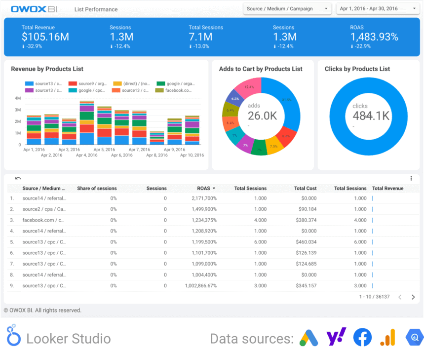
When building a dashboard for an e-commerce company, focus on metrics that give a well-rounded view of financial performance, customer behavior, and marketing effectiveness.
- Total online sales revenue (time series): Display as a line graph showing monthly or quarterly sales — the fundamental indicator of financial health and growth trends.
- Conversion rate: The percentage of visitors who make a purchase — essential for evaluating website and marketing effectiveness.
- Average order value (AOV): Helps understand customer spending habits and the effectiveness of pricing and upselling strategies.
- Shopping cart abandonment rate: Crucial for identifying issues in the checkout process or user experience.
- Customer acquisition cost (CAC): Tracks the cost of acquiring a new customer over time — critical for evaluating marketing ROI.
- Return rate (time series): Provides insights into customer satisfaction and potential issues with product quality or fulfillment.
SaaS
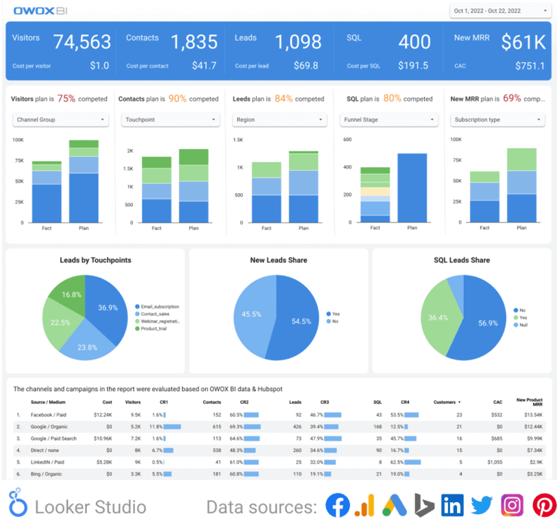
For a SaaS company, the right metrics help you understand financial health, customer retention, and product engagement simultaneously.
- Monthly recurring revenue (MRR): The vital metric for SaaS, showing predictable revenue over time as a trend line.
- Customer acquisition cost (CAC): Measures the efficiency of your marketing and sales efforts.
- Churn rate: Tracks the rate at which you lose customers — a low churn rate is critical for long-term success.
- Customer lifetime value (CLV): Key for determining how much to invest in customer retention and acquisition.
- Net promoter score (NPS): Measures customer satisfaction and loyalty — an indicator of product-market fit.
- Product engagement score: Assesses how actively customers use your product, including daily active users, feature usage, and session duration.
Fintech
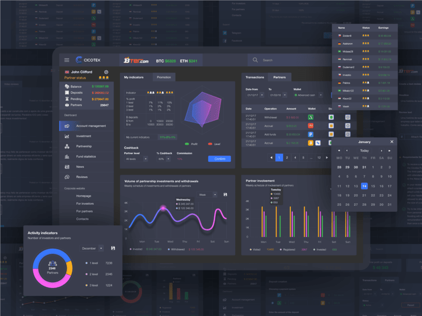
In the context of a fintech company, tracking the right metrics is crucial for understanding the health and growth of your business. Key metrics to include:
- Monthly active users (MAU): Indicates the number of unique users engaging with your platform each month.
- Total transaction volume (TTV): Represents the total value of transactions processed — a direct indicator of the platform’s financial throughput.
- Customer acquisition cost (CAC): Vital for understanding marketing and sales efficiency in a competitive space.
- Churn rate: For fintechs, where long-term customer relationships are crucial, a low churn rate is a key indicator of success.
- Net revenue retention (NRR): Shows the percentage of recurring revenue retained from existing customers, factoring in upgrades, downgrades, and churn.
- Compliance and fraud metrics: Given the nature of fintech, monitoring compliance-related metrics and fraud rates is critical.
Gaming
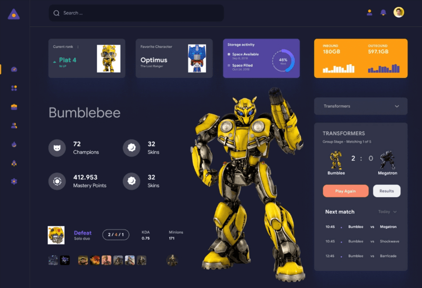
For gaming companies, the most useful dashboards blend financial, user engagement, and operational metrics for a comprehensive view of performance.
- Total revenue (time series): A line graph showing monthly or quarterly revenue gives a quick view of financial health and growth trends.
- Daily active users (DAU) / monthly active users (MAU): A combined chart that provides insights into user engagement and game popularity.
- Churn rate: Essential for understanding player retention. A lower churn rate indicates higher satisfaction and engagement.
- Customer acquisition cost (CAC): Reveals the efficiency of your marketing efforts in acquiring new users.
- Average session length: Indicates engagement depth. Longer session lengths typically correlate with higher satisfaction.
- Server uptime (time series): Critical for online games. High uptime is essential for user satisfaction and retention.
Retail
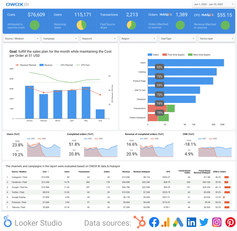
For a retail company, the dashboard should offer a comprehensive overview of financial performance, customer behavior, and operational efficiency.
- Total sales revenue (time series): A line graph showing monthly or quarterly sales — a crucial indicator of financial health.
- Average transaction value (ATV): Indicates average amount spent per transaction, helping understand customer spending behavior.
- Foot traffic (time series): For physical stores, tracking in-store visitors is essential for evaluating location and layout effectiveness.
- Inventory turnover rate (time series): Measures how quickly inventory is sold and replaced — critical for supply chain decisions.
- Gross margin: Reveals the profitability of your products and helps assess pricing strategies.
- Customer satisfaction score (CSAT): Gauges customer satisfaction with their shopping experience.
Industry-agnostic functional dashboards
Industry-agnostic functional dashboards
Sometimes the most practical reporting happens not in a BI tool, but in Google Sheets — using pivot tables and conditional formatting to slice data on demand. Here are three functional dashboard examples that work across industries.
1. Marketing reporting
The following table compares the main indicators of advertising campaigns — sessions, revenue, and ROAS over multiple weeks.
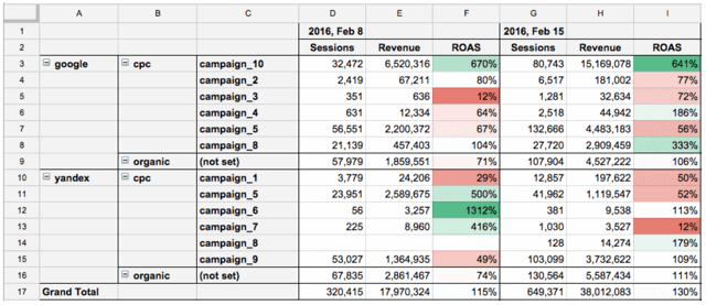
Benefits:
- The level of segmentation (source, medium, or campaign) can be easily changed.
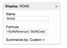
- ROAS is calculated with an account of fulfilled orders, the margin on goods, and orders in brick-and-mortar stores.
Note that, unlike sessions or revenue, the ROAS indicator should be added as a calculated field — otherwise it will produce incorrect values when you change the segmentation depth.
2. Measuring conversion rate
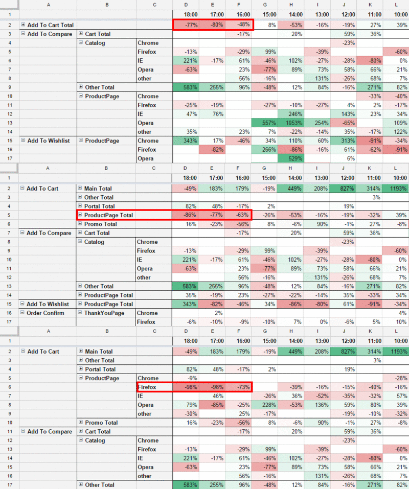
Key micro conversions — adding to cart, proceeding to checkout, and confirming an order — can be used to monitor the efficiency of a website. Segmenting them by page type and browser makes root-cause analysis much faster. Two simple rules that keep these reports manageable:
- One document — one department
- One metric — one sheet (and one SQL query)
If you need to combine several metrics for a pivot table, you can do it with an array formula:

Consider this scenario: your conversion rate drops overnight. The report lets you check whether this is a site-wide issue or limited to a specific page. You might quickly discover that the conversion rate went down mostly on specific product pages — especially on Firefox. A developer introduced a jQuery error in a recent deploy. Without segmented data in your dashboard, that diagnosis could take days.
Benefits:
- Analyze micro-conversions with segmentation by every page type and browser.
- Get relevant data that updates up to every 5 minutes.
3. IT performance tracking
It is also useful to track technical indicators directly in your dashboard:
- Server response time
- Page load time
- Share of JavaScript errors per session
Segmenting these metrics by page type and browser makes it much faster to pinpoint root causes.
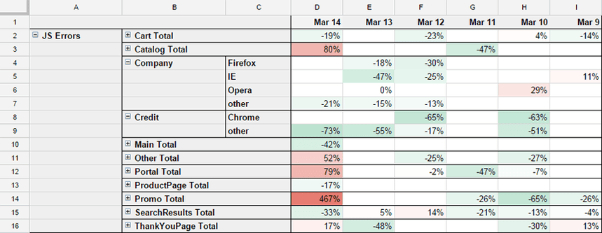
These parameters are measured from the user’s point of view, which makes this data more representative than what server monitoring tools like Zabbix or Munin report.
How to build a data pipeline for business dashboards
How to build a data pipeline for business dashboards
Getting dashboards right requires more than a good template. The underlying data pipeline matters — and the choices you make at each step determine whether your dashboards tell the truth or mislead the people relying on them. Here is how to structure it.
Step 1 – Data collection and storage in your warehouse
Google BigQuery is the tool most of our customers choose as their central data warehouse. The reasons are practical:
- Data can be uploaded from any service in the relevant format and mode.
- You do not need to worry about server space.
- It processes epic amounts of data with SQL queries.
- You only pay for the amount of data stored and processed.
Benefits:
- Quick start without signing contracts or buying servers.
- Data is collected without sampling.
- Low cost — roughly $5 for 1 TB of data processed in a month.
- The data belongs to the owner of the project, not to any connected service. This is a critical point: your warehouse, your data, no vendor lock-in.
To bring advertising and marketing data into your warehouse automatically, you can connect ad platforms, CRMs, email services, and call tracking tools as governed sources. OWOX handles that plumbing for you — data lands directly in your warehouse, and you keep full ownership.
Step 2 – Data preparation with analyst-defined SQL Data Marts
Once your raw data sits in the warehouse, the next challenge is that columns may have different names, formats differ between sources, and advertising costs are not yet joined to your website tracking data.
The right answer here is to have your analyst write SQL that joins, cleans, and models these sources into a governed, reusable Data Mart. With OWOX Data Marts, the analyst defines that SQL logic once, and OWOX governs, schedules, and publishes it — so the whole team can self-serve from a single, trusted source.
This approach has three advantages over ad hoc querying:
- No semantic layer required. Metrics live at the Data Mart level — the analyst defines what “sessions” or “revenue” means in SQL, and that definition is shared across every report that uses the mart. No 6-month semantic layer project needed.
- No AI hallucinations. Every number traces back to analyst-approved SQL. When a number changes, the audit trail shows exactly which SQL produced it.
- Data stays in your warehouse. OWOX does not copy your data to a vendor cloud. The analyst owns the SQL; OWOX governs and schedules it.
For example: an analyst defines session logic, cost attribution, and margin calculations as SQL Data Marts. OWOX publishes those marts. Every marketer, finance lead, and executive now pulls from the same governed definitions — without writing a single line of SQL themselves.
Step 3 – Data visualization in Google Sheets, Looker Studio, or BI tools
Once your data is governed and ready, there are two practical options for visualization:
Option A — BI tools like Looker Studio, Power BI, or Tableau. These work well for standardized, always-on dashboards shared with executives or cross-functional teams. OWOX publishes free Looker Studio templates you can connect directly to your Data Marts.
Option B — Google Sheets. This is the preferred option for analysts and data-savvy managers who need to explore data flexibly. With the OWOX Sheets Extension, business users browse the Data Mart library, join marts by analyst-defined keys, pick columns, and apply filters — inside Google Sheets, without writing SQL.
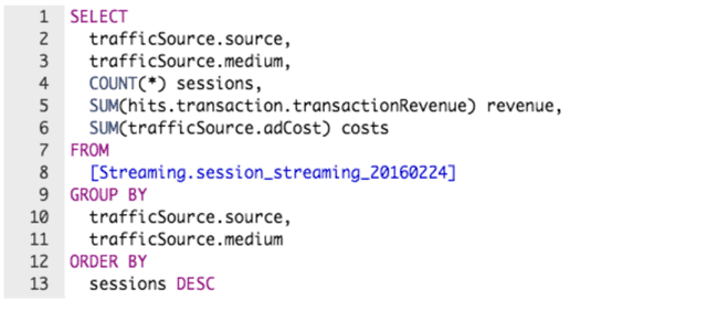
Data professionals define the queries once. After that, data in Google Sheets updates automatically on a schedule or on demand — no manual refreshes, no copy-pasting.
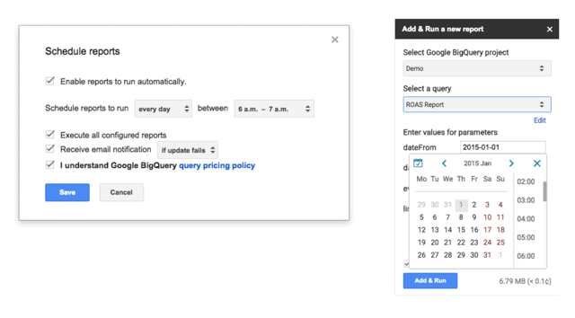
Benefits:
- No need to worry about database indexes or server space.
- Create reports of any structure.
- Process any amount of data quickly.
- SQL knowledge lives with the analyst — not every business user who needs a report.
Limitations:
- SQL knowledge is required for analysts to build and modify Data Mart definitions.
- Very complex queries can take a few minutes to execute.
Why OWOX Data Marts is the right foundation for business dashboards
Why OWOX Data Marts is the right foundation for business dashboards
Having dashboards is valuable. Having dashboards backed by governed, trusted data is what separates teams that make confident decisions from those who spend meetings arguing about which number is correct.
For teams pulling data from Facebook Ads, Google Ads, GA4, CRMs, or call tracking systems, OWOX Data Marts provides the governed layer that ties it all together — without locking your data in a vendor cloud or requiring a months-long semantic layer project.
Governed, analyst-owned SQL
Every Data Mart is defined by SQL that an analyst writes and approves. OWOX governs, schedules, and fans out the output to Sheets, Looker Studio, Slack, or wherever your team works. The transformation logic lives in the analyst’s SQL — not in opaque vendor templates.
This means when a number changes, the audit trail is clear: which SQL produced it, who approved it, when it last ran. No guesswork.
Self-service without SQL for business users
With the OWOX Sheets Extension, marketing managers, finance leads, and operations teams browse a library of analyst-defined Data Marts, join them by pre-defined keys, and pull exactly the data they need — inside Google Sheets, without writing SQL.
When analysts update the mart logic, every connected Sheet refreshes automatically. Business users always see the latest approved data, not a stale export from last Tuesday.
AI-generated briefings from deterministic data
For teams that want narrative summaries delivered to Slack, Teams, or email, OWOX AI Insights generates plain-English briefings on a schedule. Critically, every number in those briefings comes from analyst-approved SQL — not from an AI model guessing at your data.
The analyst creates a Markdown template with placeholders. Each placeholder is filled by a specific, governed Data Mart query. The AI writes the prose narrative around the numbers. The result is an auditable, scheduled briefing — not a chatbot that might confabulate a metric.
Data stays in your warehouse
OWOX is warehouse-native. Your data never leaves BigQuery, Snowflake, Athena, Redshift, or Databricks. You own the SQL, you own the data, and you are never dependent on a vendor maintaining historical access. If OWOX’s API terms ever change, your data stays where it has always been — in your warehouse.
OWOX also provides a wide range of marketing dashboard templates tailored for various industries, including fintech, retail, e-commerce, gaming, and SaaS — ensuring targeted insights that cater to the unique needs of each sector.
Turn your data into decisions.
Governed data marts give you the clean foundation ML needs to actually work.
- No AI hallucinations
- Analyst-governed definitions
- Every number traces to SQL
Frequently Asked Questions
What are Industry Agnostic Functional Dashboards ?
Industry-agnostic functional Dashboards are universal dashboards designed to provide key performance insights across various sectors, focusing on general metrics like financial health, customer satisfaction, and operational efficiency.
How Do Business Dashboards Enhance Marketing Strategies?
They allow marketing directors and senior management to track overall department performance, align strategies with goals, and compare current status with past results and plans.
What are the most critical metrics to track on an e-commerce leadership dashboard?
For an e-commerce dashboard, key metrics include Total Online Sales Revenue, Conversion Rate, Average Order Value (AOV), Shopping Cart Abandonment Rate, Customer Acquisition Cost (CAC), and Return Rate. These metrics collectively provide insights into financial performance, customer behavior, and operational efficiency.
What are the types of Dashboards Used In Businesses?
There are three common dashboards known as Analytical Dashboards, Operational Dashboards, and Strategic Dashboards.
Why are Business Dashboards Important?
They provide real-time data access, enhance decision-making, track performance against KPIs, save time, improve communication, facilitate trend analysis, reduce costs, and offer customer insights.
What is a business dashboard?
A business dashboard is an information management tool that provides an overview of a company's key performance indicators in a graphical or visual format, allowing managers to monitor and analyze data trends and make informed decisions.