
Step-by-Step Guide to Exploratory Data Analysis in Google Sheets
A comprehensive guide to performing EDA in Google Sheets, covering key techniques and functions to clean, analyze, and visualize your data for better insights.


Imagine trying to solve a puzzle with missing or duplicate pieces- it’s frustrating and time-consuming. Working with raw data can feel the same way when it’s messy or unstructured. That’s where Exploratory Data Analysis (EDA) in Google Sheets comes in.
By using built-in functions, charts, and formatting tools, you can clean, analyze, and visualize data efficiently. Whether you're managing business metrics or evaluating marketing performance, EDA in Google Sheets simplifies data interpretation and enhances accuracy.
What is Exploratory Data Analysis (EDA)?
Exploratory Data Analysis (EDA) is the process of examining and summarizing data to understand its structure, patterns, and key characteristics before applying advanced techniques. It helps identify trends, detect anomalies, and ensure data quality.
By using visualizations and descriptive statistics, EDA simplifies complex datasets, making it easier to interpret and extract meaningful insights. Whether analyzing business metrics or research data, this step is essential for making informed, data-driven decisions.
Understanding the Purpose of EDA in Decision-Making
Making sense of raw data is essential before drawing conclusions or making decisions. EDA helps simplify complex datasets, providing clear insights that guide further analysis. Its key purposes include:
- Identifying patterns and trends – Helps uncover recurring behaviors, enabling businesses to make strategic, data-driven decisions.
- Detecting anomalies and inconsistencies – Spots errors, missing values, or outliers to ensure data accuracy and reliability.
- Providing summary statistics – Uses metrics like mean, median, and standard deviation to give a clear dataset overview.
- Laying the groundwork for advanced analysis – Prepares structured, clean data, ensuring accurate results in deeper statistical or machine learning models.
- Supporting decision-making in business, research, and education – Provides insights for optimizing operations, improving strategies, and making informed choices.
Exploratory Data Analysis (EDA) vs. Classical Data Analysis (CDA)
EDA and CDA take different approaches to analyzing data. EDA is flexible, focusing on visualizing patterns, trends, and anomalies without predefined models. It helps uncover insights using graphs, summary statistics, and hypothesis generation.
In contrast, CDA follows a structured, model-driven approach. It applies statistical methods to test hypotheses and draw conclusions based on predefined assumptions. While CDA ensures rigorous analysis, it may overlook unexpected patterns that EDA can reveal, making both methods valuable in different scenarios.
Flexibility and Hypothesis Generation
EDA provides a flexible approach to analyzing data, allowing analysts to explore trends, relationships, and patterns without predefined models. Unlike structured methods, it encourages open-ended exploration, making it easier to detect unexpected insights and refine hypotheses.
By using visualizations, summary statistics, and interactive tools, EDA helps generate hypotheses that can later be tested with formal statistical methods. This iterative process ensures a deeper understanding of the data, guiding better decision-making and model selection for further analysis.
Key Techniques to Perform EDA in Google Sheets
Google Sheets offers powerful tools for Exploratory Data Analysis (EDA), making it easy to clean, summarize, and visualize data. Key techniques include data cleaning, descriptive statistics, and chart creation. These methods help identify patterns, detect anomalies, and gain insights for better decision-making and deeper analysis.
Data Cleaning in Google Sheets
Cleaning data is essential for accurate analysis. In Google Sheets, techniques like filtering, sorting, and removing redundant data help organize datasets. Functions and REGEX can eliminate trailing whitespace and errors, ensuring consistency and reliability before performing deeper exploratory data analysis.
Filtering
Filtering is a useful technique for cleaning and organizing data in Google Sheets. It allows you to display only relevant information while hiding unnecessary rows. This helps in focusing on specific data points, such as dates, test scores, or locations, without altering the original dataset.
To apply a filter, select the desired columns, click on Data > Create a filter, and set conditions based on your criteria. Filters make it easier to analyze large datasets by narrowing down the information you need.
Sorting
Sorting data in Google Sheets helps organize information logically, making it easier to identify duplicates or spot trends. You can arrange rows or columns based on numerical values, names, or other criteria for better readability and analysis.
To sort, select a column and go to Data > Sort sheet or Sort range for specific cells. If your dataset includes headers, use the advanced sorting option to keep them in place. For better visibility, freeze the header row using View > Freeze > 1 row.
Removing Trailing Whitespaces
Extra spaces at the end of values can cause errors when searching, sorting, or analyzing data. These unwanted spaces can lead to inconsistencies, making it harder to match or filter data accurately. Removing trailing whitespaces ensures consistency and accuracy in your dataset.
Google Sheets provides a built-in Trim Whitespace option to clean up extra spaces. To use it, select the columns that need trimming, then go to Data > Data cleanup > Trim Whitespace. This automatically removes unnecessary spaces, preventing mismatches and improving data reliability.
Number Formats
Inconsistent number formatting can lead to errors in calculations and data analysis. When working with numerical data, ensure all values follow the same format, especially when dealing with currencies, percentages, or decimal places. Proper formatting helps maintain accuracy and consistency.
Google Sheets allows you to standardize number formats easily. Select the column, go to Format > Number, and choose the appropriate format. For dates, ensure a uniform structure like dd/mm/yyyy or mm/dd/yyyy to avoid confusion and maintain consistency across the dataset.
Removing Duplicates
Duplicate data can inflate dataset size, slow down queries, and lead to inaccurate analysis. Removing redundant entries helps maintain efficiency and ensures that each data point is counted only once, improving overall data quality. This becomes even more important as datasets grow in size.
Google Sheets provides an easy way to remove duplicates. Select the column or range, then go to Data > Data cleanup > Remove duplicates. Use this feature carefully, as some duplicate values, like names, might be intentional and should not be removed.
Using Lists
Standardizing data entry helps reduce errors and inconsistencies. One effective way to do this is by using pre-defined lists, ensuring users select from a fixed set of options instead of entering data manually. This improves accuracy and keeps datasets uniform.
Google Sheets allows you to create drop-down lists through Data Validation. Select the column or cells, go to Data > Data validation, choose Dropdown under Criteria, and enter the allowed values. This simplifies data entry and maintains consistency across the dataset.
Renaming Columns
Clear and consistent column names make datasets easier to understand and use. Proper naming conventions help both analysts and stakeholders quickly interpret data without confusion. Descriptive column names improve readability and reduce errors in reporting or analysis.
For example, instead of using vague abbreviations like "DOB", renaming it to "DateOfBirth" ensures clarity. To rename a column in Google Sheets, simply double-click the header cell and enter a more descriptive name, making the dataset more structured and user-friendly.
Descriptive Statistics
Descriptive statistics summarize large datasets, making them easier to interpret. They are categorized into three types: frequency distribution (value occurrence), measures of central tendency (mean, median, mode), and measures of variability (range, standard deviation), helping identify patterns, trends, and anomalies in data.
Mean (Average)
The mean, or average, is calculated by summing all values in a dataset and dividing by the total number of values. It provides a quick way to understand the central tendency of data.
In Google Sheets, you can find the mean using the AVERAGE function. Click on the desired cell, type =AVERAGE(), and enter the range of numbers inside the parentheses. You can either manually input the range (A1:A10) or select it by clicking and dragging across the cells.
Median
The median is the middle value in an ordered dataset. If the dataset contains an odd number of values, the median is the exact middle number. If the dataset has an even number of values, the median is the average of the two middle numbers. This helps represent the central tendency without being affected by extreme values.
In Google Sheets, you can quickly find the median using the MEDIAN function. Click on a cell, type =MEDIAN(), and enter the desired range of numbers inside the parentheses.
Mode
The mode is the number that appears most frequently in a dataset. A dataset can have one mode, multiple modes, or no mode if all values appear only once. Identifying the mode helps in understanding common trends or repeated values in data.
To calculate the mode in Google Sheets, select a cell, type =MODE(), and enter the range of values inside the parentheses. If needed, you can also find this function under Insert > Function > Statistical for quick access.
Range
The range measures the spread of a dataset by calculating the difference between the highest (MAX) and lowest (MIN) values. A larger range indicates more variability, while a smaller range suggests that the data points are closer together.
Since Google Sheets doesn’t have a built-in range function, you can calculate it manually. Select a cell, type =MAX(range) - MIN(range), and enter the desired cell range inside the parentheses. This formula subtracts the MIN value from the MAX value, giving you the dataset’s range.
Standard Deviation
Standard deviation measures how spread out the data points are from the mean. A lower standard deviation indicates that values are closer to the mean, while a higher standard deviation suggests greater variability within the dataset. It helps assess consistency and detect unusual fluctuations in data.
Google Sheets simplifies this calculation with the STDDEV function. Select a cell, type =STDDEV(range), and enter the desired cell range inside the parentheses. This automatically computes the standard deviation, saving time compared to manual calculations.
Visualizing Data in Google Sheets
Visualizing data helps identify patterns, trends, and outliers during EDA. Google Sheets provides various chart options, including bar graphs, line charts, and scatter plots.
Line Graph
A line graph connects data points with a continuous line, making it useful for tracking trends over time. It works best when data follows a somewhat linear pattern, allowing for clear visualization of increases or decreases. However, if the data is highly scattered, the connecting lines may make interpretation more difficult.
In Google Sheets, line graphs can help analyze trends like sales growth or depreciation of assets over time. To create one, select your data, click Insert > Chart, and choose Line chart from the options.
Bar or Column Chart
Bar and column charts are used to compare values across different categories. In a bar chart, data is represented with horizontal bars along the x-axis, while a column chart uses vertical bars along the y-axis. Both charts help visualize differences between groups clearly.
In Google Sheets, bar or column charts are useful for comparing sales figures, inventory levels, or other categorical data. To create one, select your data, click Insert > Chart, and choose either a Bar chart or Column chart from the options.
Scatterplot
A scatterplot is used to analyze the relationship between two variables by plotting data points on an x-y axis. It helps identify patterns, correlations, and outliers in a dataset. This type of chart is ideal for comparing numerical values, such as mapping car mileage against its current value.
In Google Sheets, create a scatterplot by selecting your data, clicking Insert > Chart, and choosing Scatter chart. You can customize the x-axis, add labels, and adjust titles in the Chart Editor to improve clarity and interpretation.
Spotting Outliers
In EDA, spotting outliers helps identify data points that don't fit the general pattern. Outliers can be caused by errors or unusual events. For example, a negative number of apples in stock or a fraction of a horse in a barn would be considered outliers.
It’s important to examine these outliers closely. Sometimes, they may be valid, but other times they could indicate mistakes. Understanding why outliers exist helps you decide whether to keep or remove them, ensuring more accurate results in your analysis.

Practical Analysis Techniques in Exploratory Data Analysis
Exploratory Data Analysis (EDA) in Google Sheets involves using various techniques to analyze and interpret data effectively. Methods like charts, conditional formatting, filters, and aggregation functions help uncover patterns, identify trends, and summarize key insights for better decision-making.
Using Charts and Graphs
Charts and graphs in Google Sheets help visualize data trends and relationships clearly. They make it easier to interpret complex datasets and present insights effectively.
Example:
Suppose you want to compare Sales ($) and Quantity, so for each product, we will create a column chart. This will highlight top-selling products and how they relate to the quantity sold.
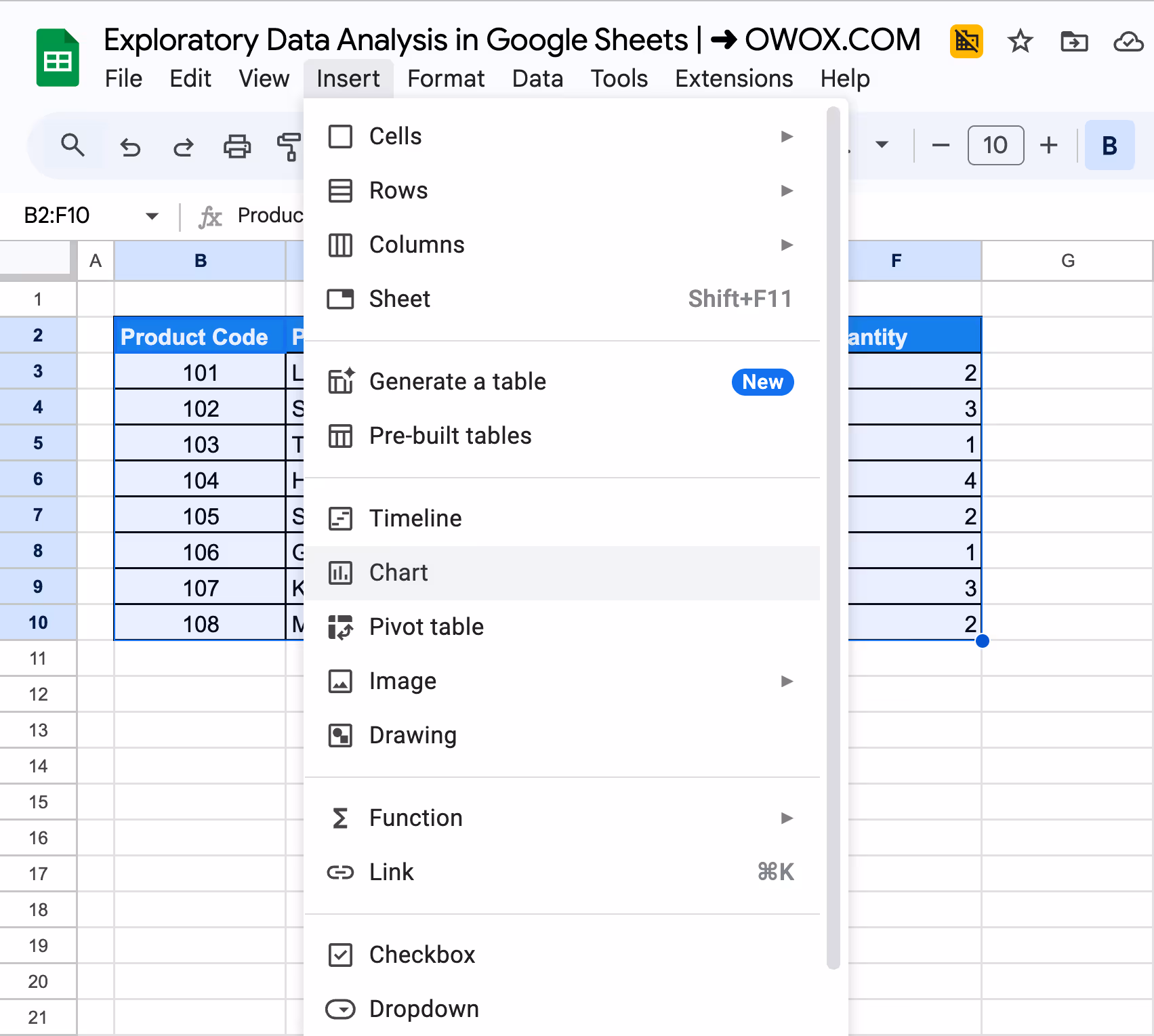
Step 1: Select Data and Insert Chart
Highlight the dataset (B2:F10), go to Insert > Chart, and Google Sheets will generate a chart automatically.
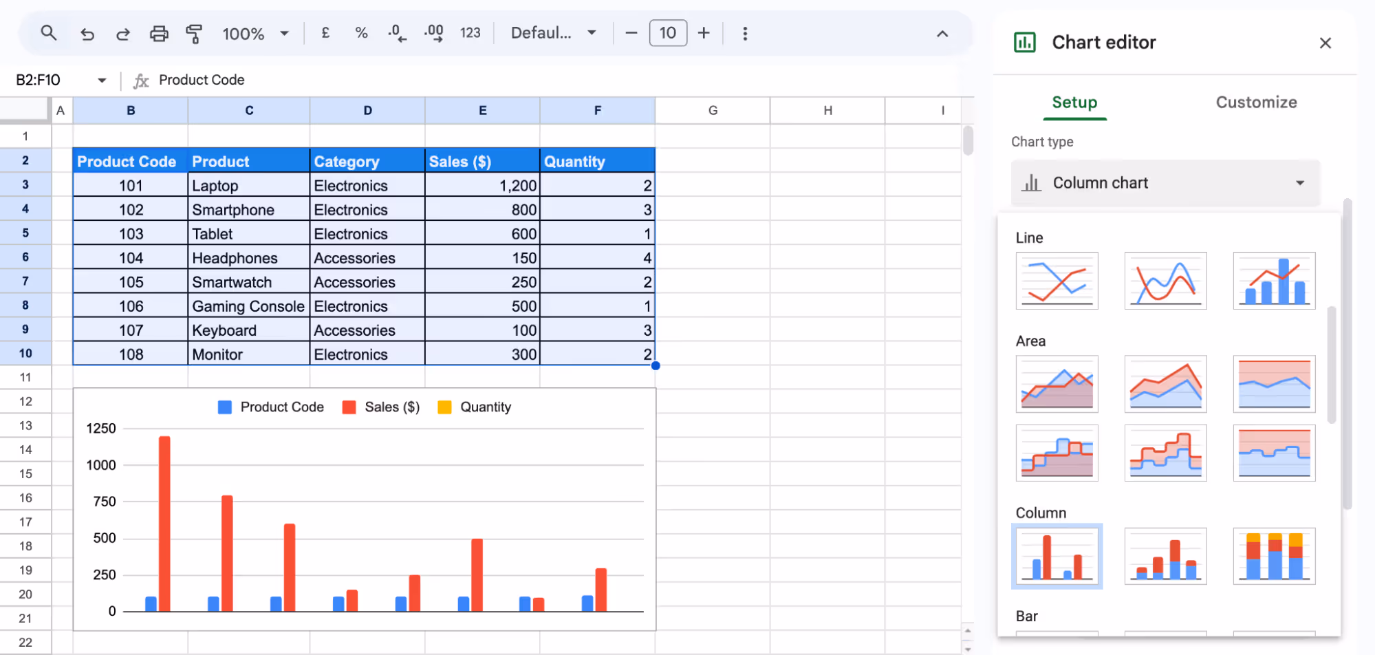
Step 2: Change the Chart Type
If needed, open the Chart Editor, go to Setup, and select a suitable chart type like Column Chart.
Step 3: Customize and Adjust
Use the Customize tab to modify titles, axis labels, colors, and fonts. Drag and resize the chart as needed for better visibility.
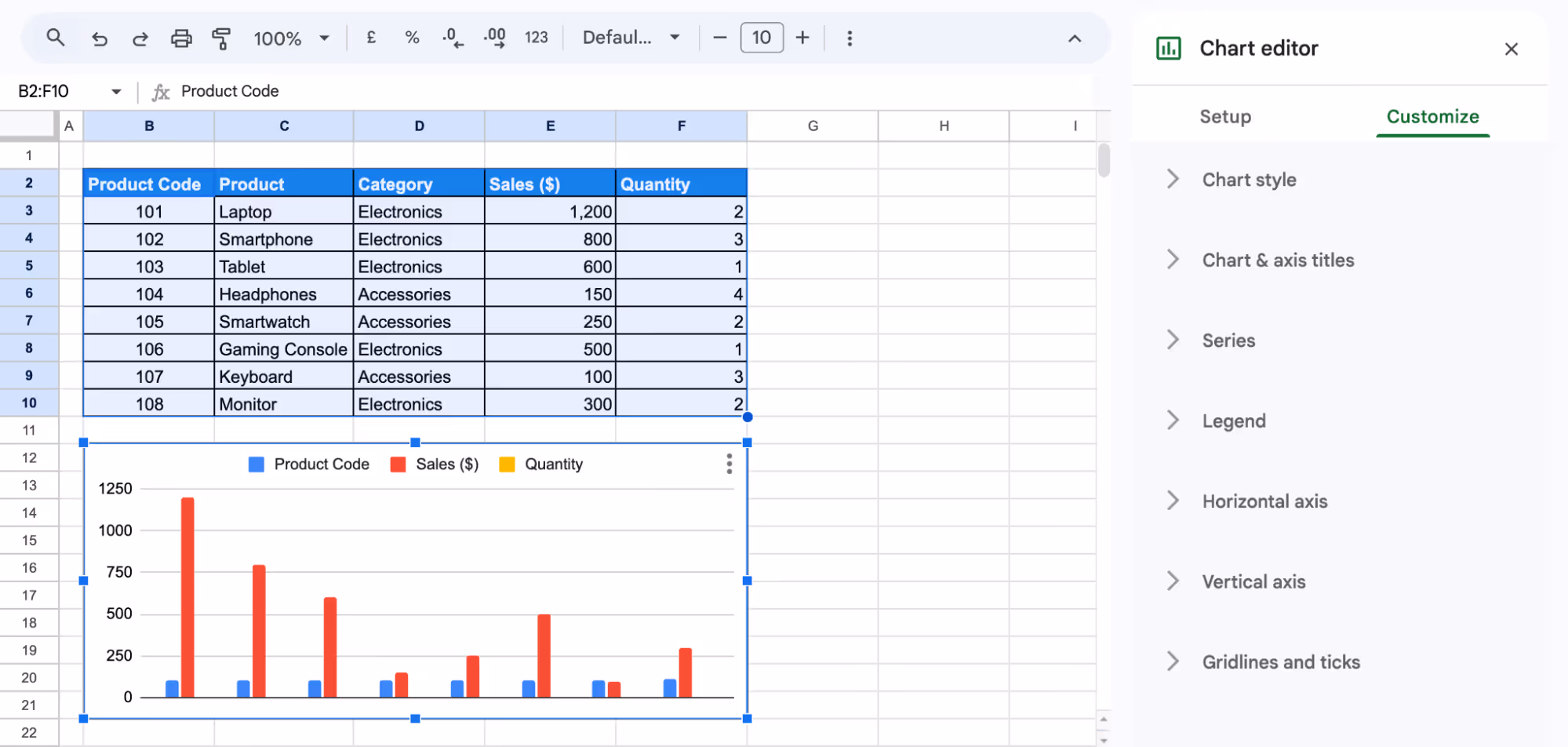
Following these steps, you can create a sales comparison chart for easy performance analysis.
💡Explore our latest guide on Pivot Tables and Charts in Google Sheets to turn raw data into meaningful insights. Follow step-by-step instructions to create interactive pivot tables, customize charts, and identify trends that support better decision-making.


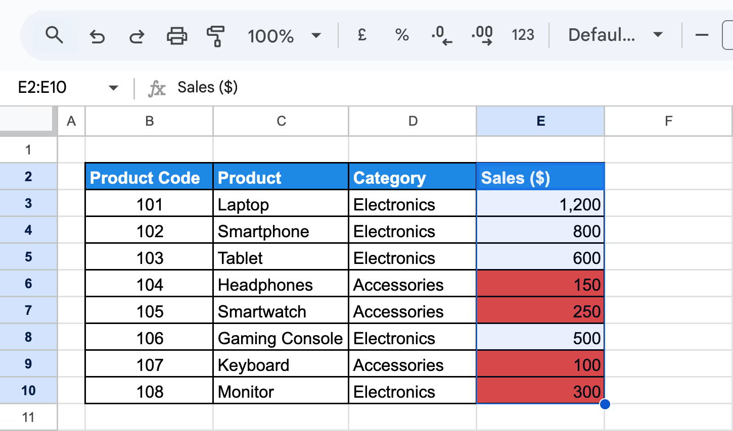
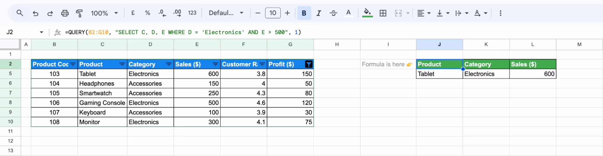
Using Conditional Formatting for Trends and Outliers
Conditional formatting in Google Sheets highlights trends and outliers by applying colors based on conditions, making data easier to analyze.
Example:
Suppose you want to analyze sales performance, apply conditional formatting to the Sales ($) column. Products with low sales ($500 or below) appear in red for quick identification.
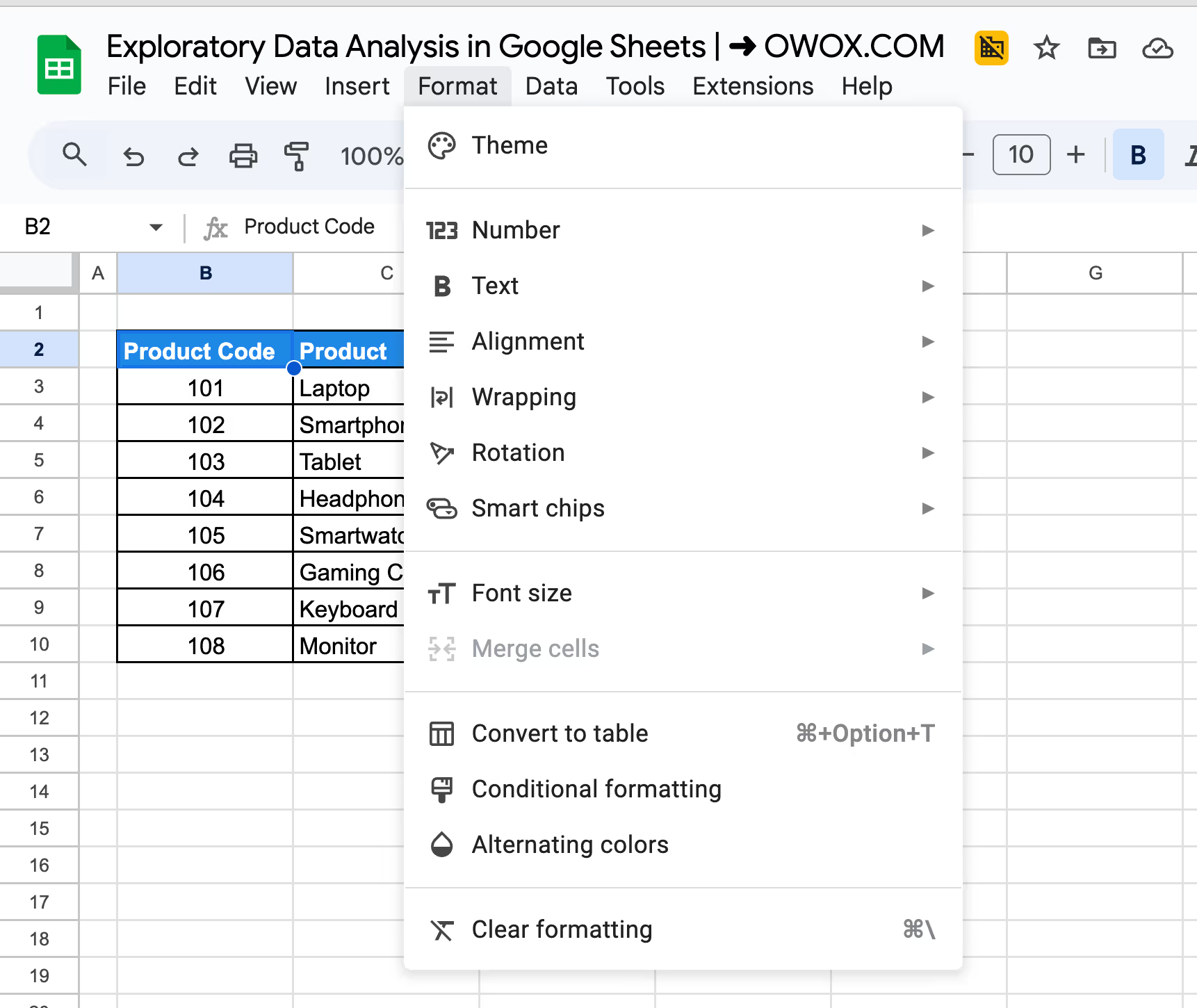
Step 1: Select Data and Open Conditional Formatting
Highlight the Sales ($) column (E3:E10) and go to Format > Conditional formatting.
Step 2: Apply Formatting Rules
For low sales, select "Less than", enter 500, and apply a red background to highlight underperforming products.
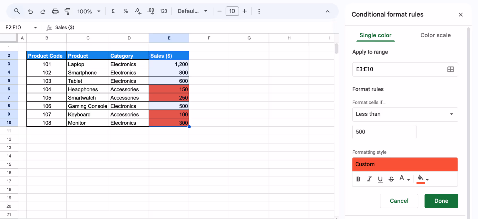
Step 3: Apply and Review
Click Done, and the formatting will be applied automatically, making trends easy to identify.
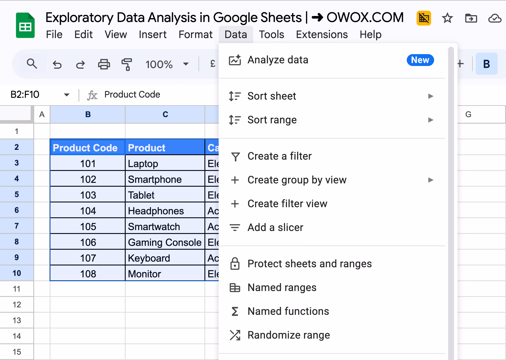
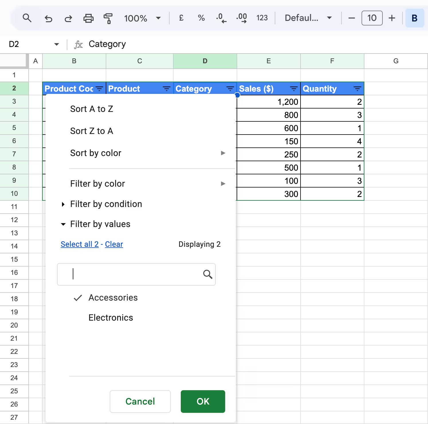
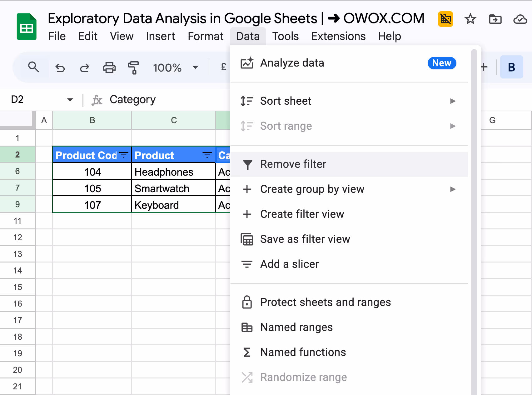
Making Filters
Filters in Google Sheets allow you to focus on specific data without modifying the original dataset. They help streamline analysis by displaying only relevant information.
Example:
Suppose you want to view only Electronics or Accessories in the Category column. Applying a filter will show only the selected category, making comparisons easier.
Step 1: Select Data and Enable Filter
Highlight the dataset (B2:F10) and click Data > Create a filter. Filter icons will appear in the column headers, allowing you to refine your view.
Step 2: Apply Filter Criteria
Click the filter icon in the Category column, uncheck Select all, then choose Electronics or Accessories. Click OK to display only the selected products.
Step 3: Remove or Modify the Filter
To remove the filter, click Data > Remove filter. To change criteria, reopen the filter menu and adjust selections as needed.
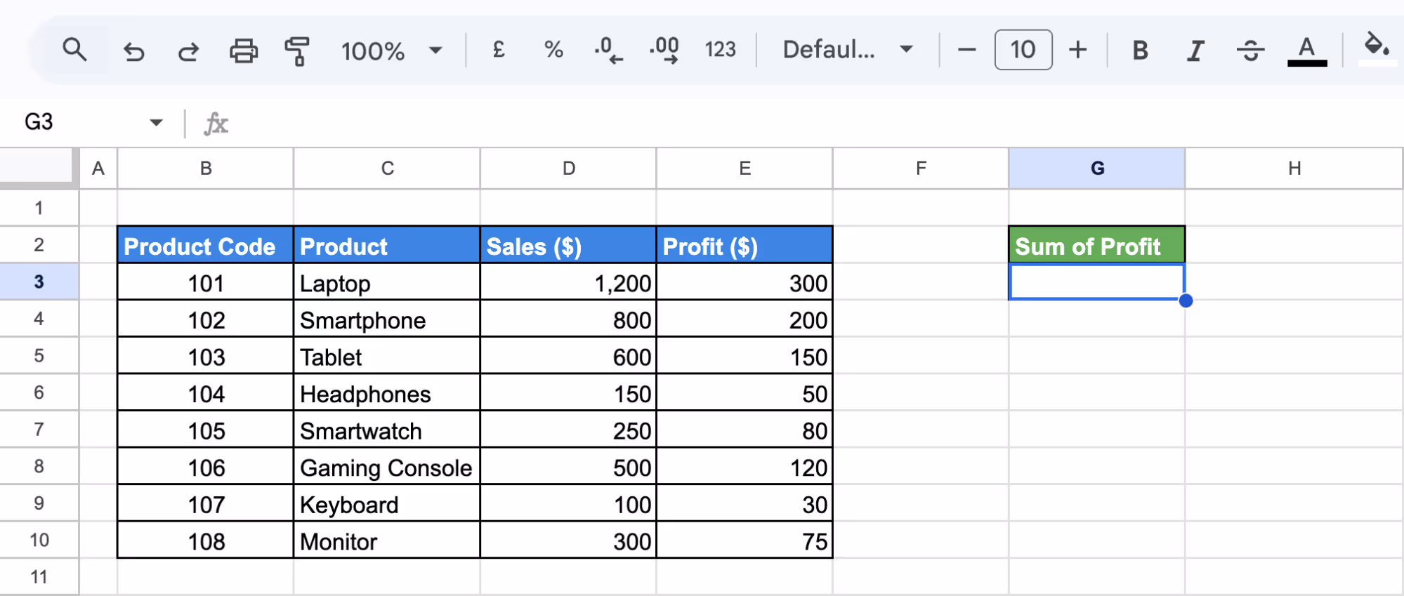
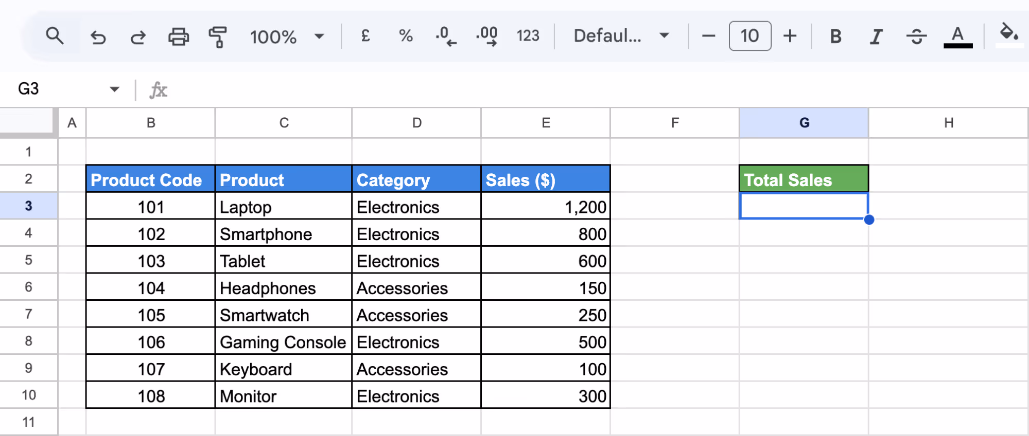
SUM Function for Aggregation
The SUM function in Google Sheets helps calculate the total of a numeric column, making it useful for analyzing total sales, profit, or other key metrics.
Example:
Suppose you want to find the total profit from the dataset. Using the SUM function on the Profit ($) column (E3:E10) will give the overall profit earned from all products.
Step 1: Select a Cell for the Total
Click on an empty cell where you want to display the total profit, such as G3.
Step 2: Enter the SUM Formula
Enter the SUM Formula and press Enter. This adds all profit values in the selected range.
=SUM(E3:E10)
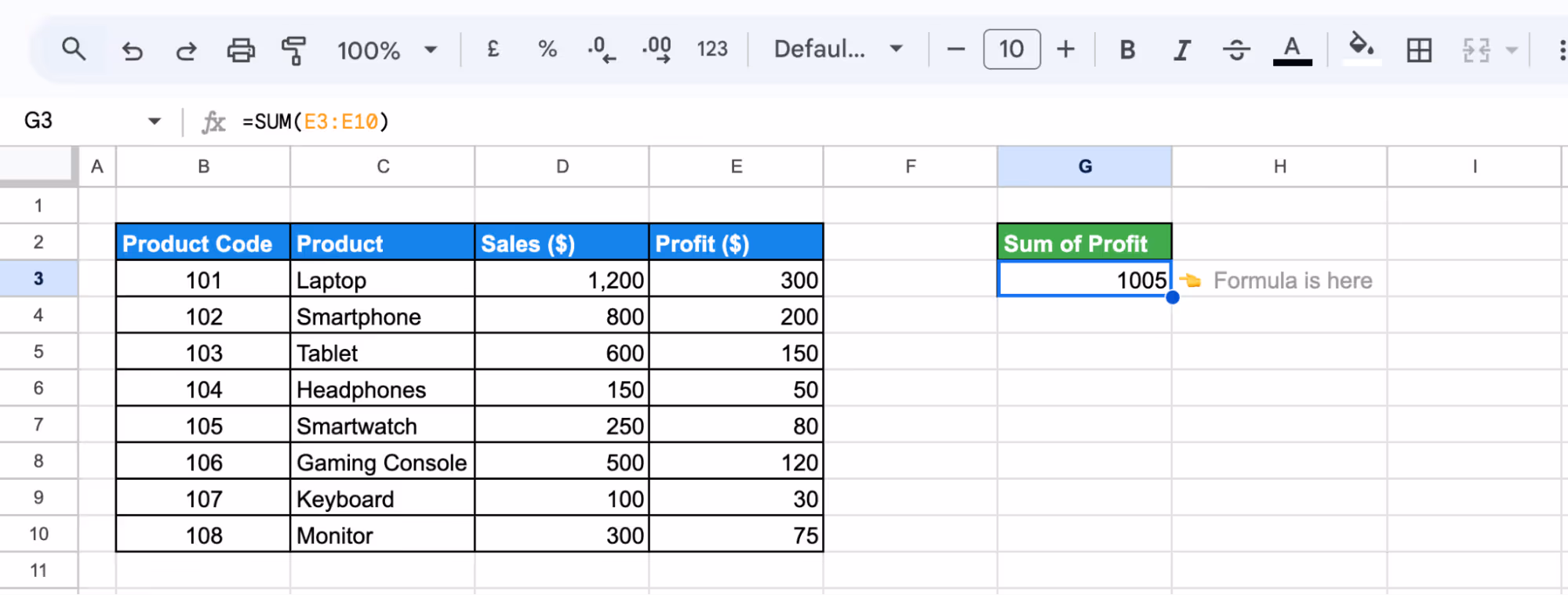
The total profit amount will appear in the selected cell and update automatically if the data changes.
Using COUNT Functions for Quantification
The COUNT function in Google Sheets helps determine how many numeric values exist in a dataset. It is useful for analyzing inventory, sales, or other numerical data.
Example:
Suppose you want to count the total number of products sold from the dataset. The COUNT function on the Quantity column (E3:E10) will show how many products have recorded sales.
Step 1: Select a Cell for the Count
Click on an empty cell where you want to display the count, such as G3.
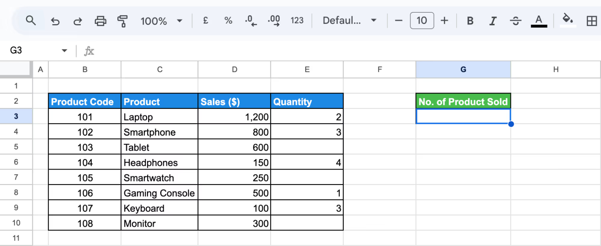
Step 2: Enter the COUNT Formula
Enter the COUNT Formula and press Enter. This counts all numeric values in the Quantity column.
=COUNT(E3:E10)
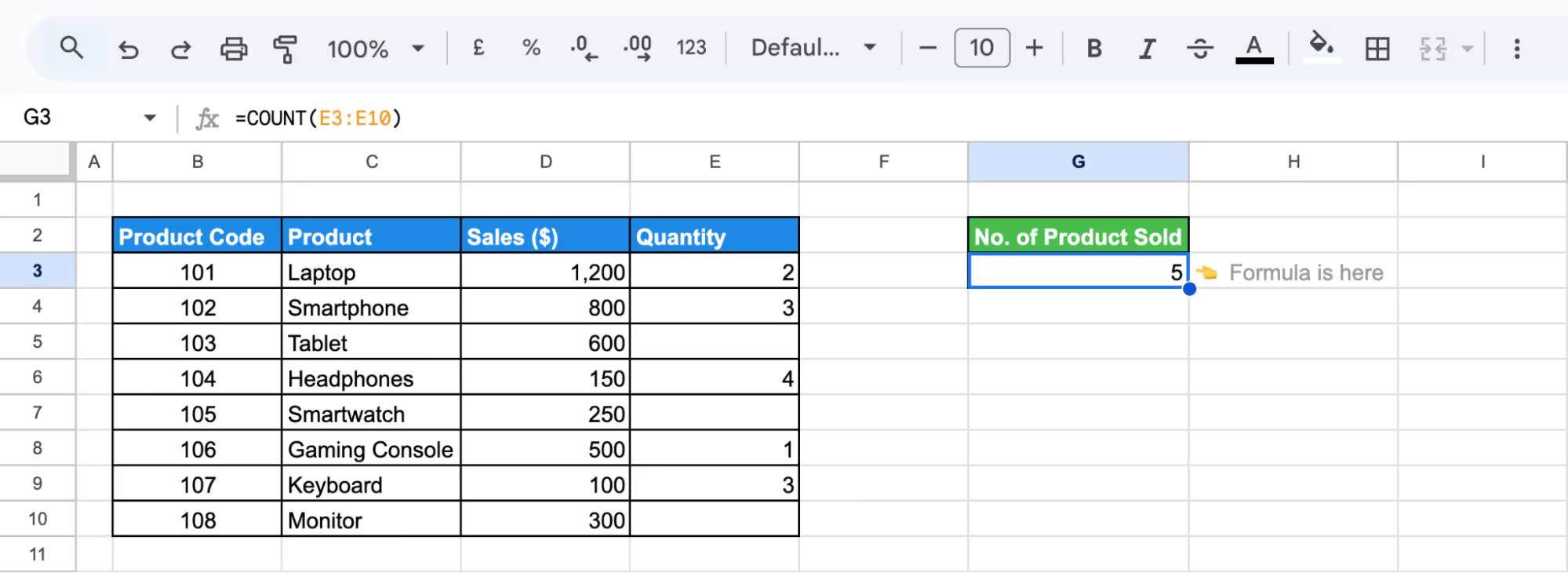
The total number of product entries will now appear in the selected cell and update automatically if the data changes.
SUBTOTAL Function for Various Calculations
The SUBTOTAL function in Google Sheets performs calculations like SUM, AVERAGE, or COUNT while ignoring filtered-out or hidden data. It dynamically updates based on visible values, making it useful for data analysis.
Example:
Suppose you want to find the total sales from the dataset while ignoring hidden or filtered-out values. Using the SUBTOTAL function on the Sales ($) column (E3:E10) will provide a dynamic total that updates as filters change.
Step 1: Select a Cell for the Calculation
Click on an empty cell, such as G3, where you want the subtotal to appear.
Step 2: Enter the SUBTOTAL Formula
Enter the SUBTOTAL Formula in G3 and press Enter. The function code 9 calculates the sum of visible sales values.
=SUBTOTAL(9, E3:E10)
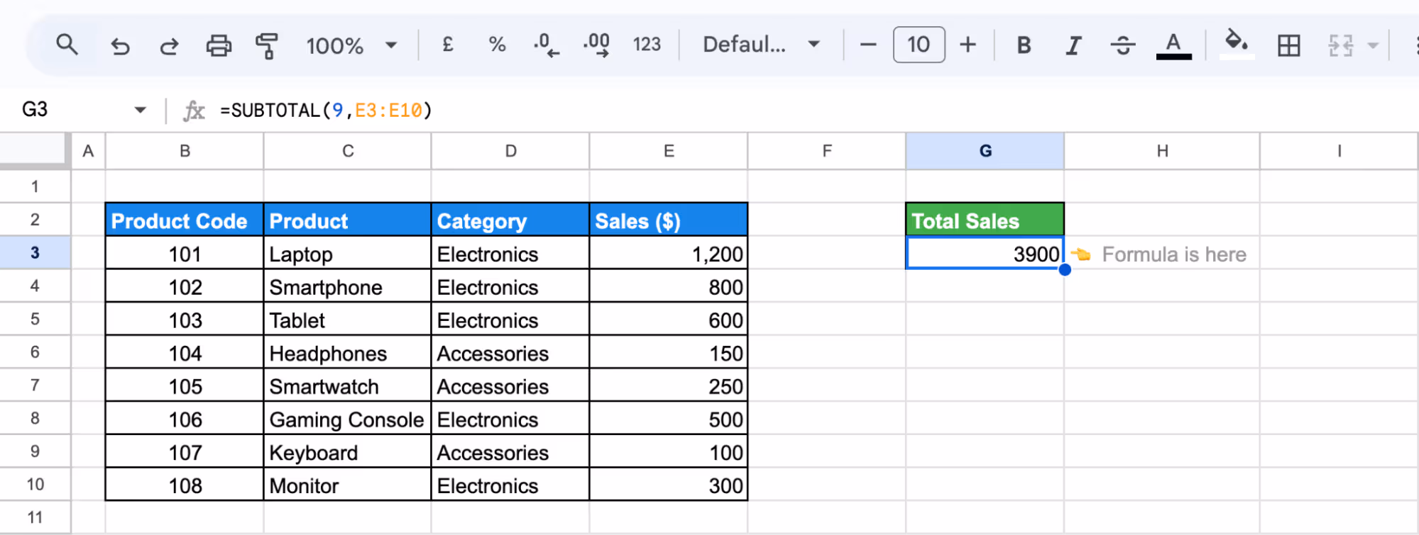
Step 3: Apply Filters and Review the Total
Filter the dataset, and the subtotal will automatically adjust, showing only the total for the visible rows.
Advanced Analysis Techniques in Exploratory Data Analysis
Advanced EDA techniques in Google Sheets help uncover deeper insights by organizing, filtering, and analyzing data efficiently. Methods like Pivot Tables, QUERY, IMPORTRANGE, and COUNTIF/SUMIF enable better data summarization, correlation analysis, and pattern detection for informed decision-making.
Grouping and Summarizing Data with Pivot Tables
Pivot tables in Google Sheets help summarize large datasets, making it easier to group, analyze, and compare key metrics efficiently. They allow dynamic data exploration without modifying the original dataset.
Example:
Suppose you want to analyze total sales by category. A pivot table will group products under Electronics and Accessories, summarizing sales for each category and providing clear insights into their performance.
Step 1: Select Data and Insert Pivot Table
Highlight the dataset (B2:F10), go to Insert > Pivot table, and place it in a new sheet.
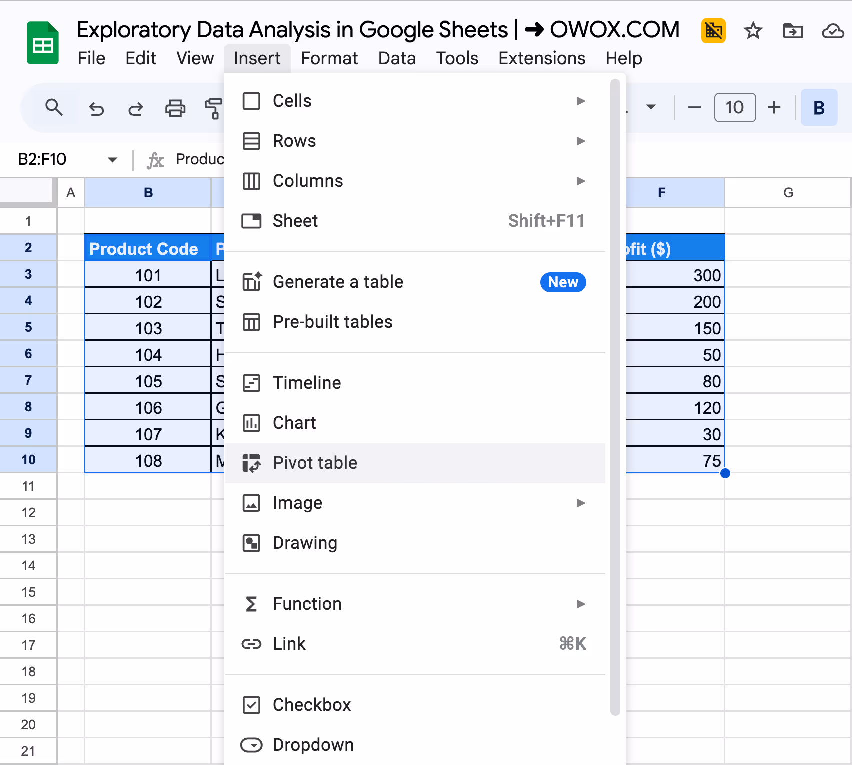
Select the New Sheet option to place it in a new sheet and click on Create.
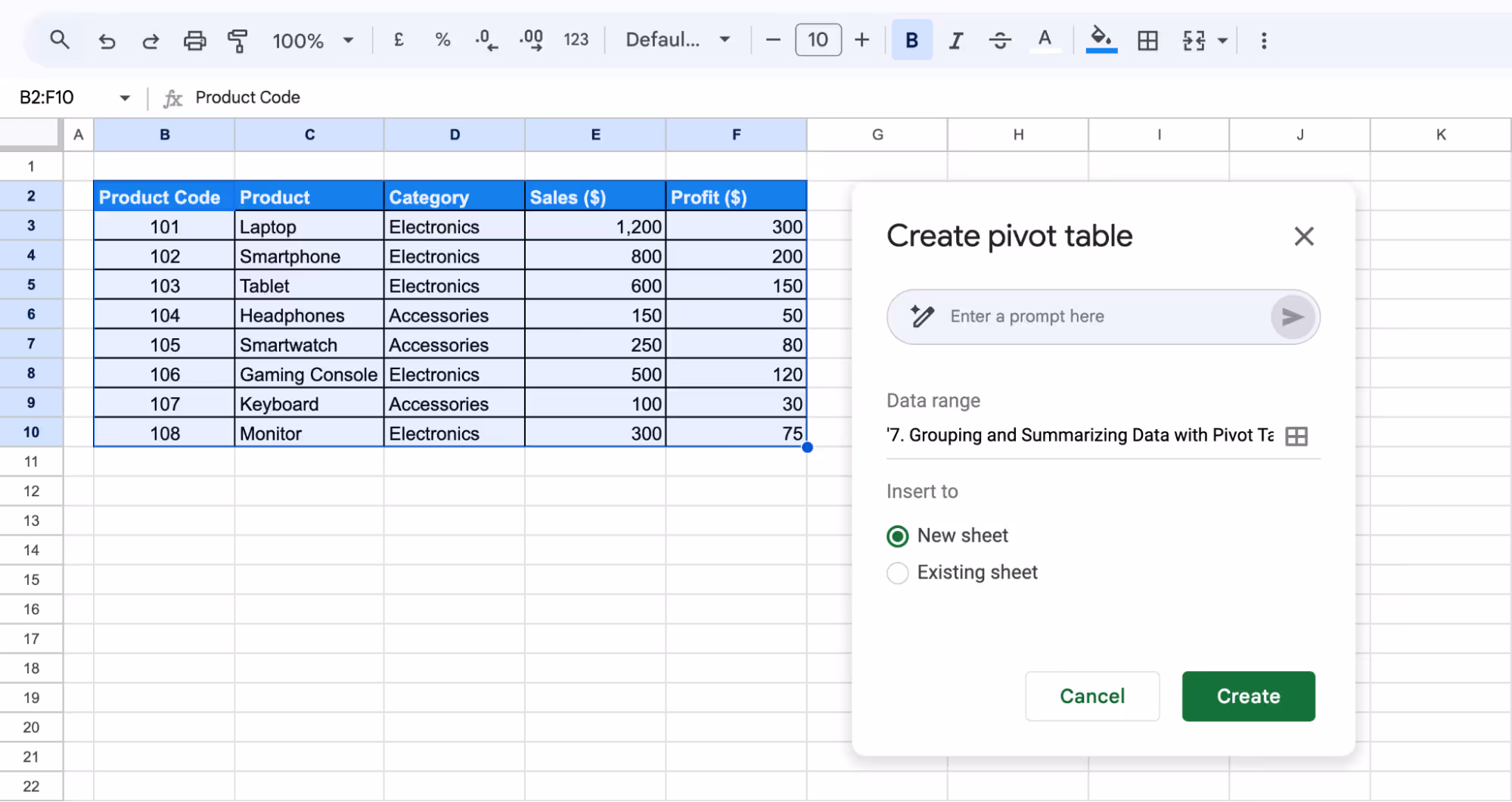
Step 2: Set Up Rows and Values
In the Pivot Table Editor, under Rows, select Category. Under Values, select Sales ($) and summarize by SUM.
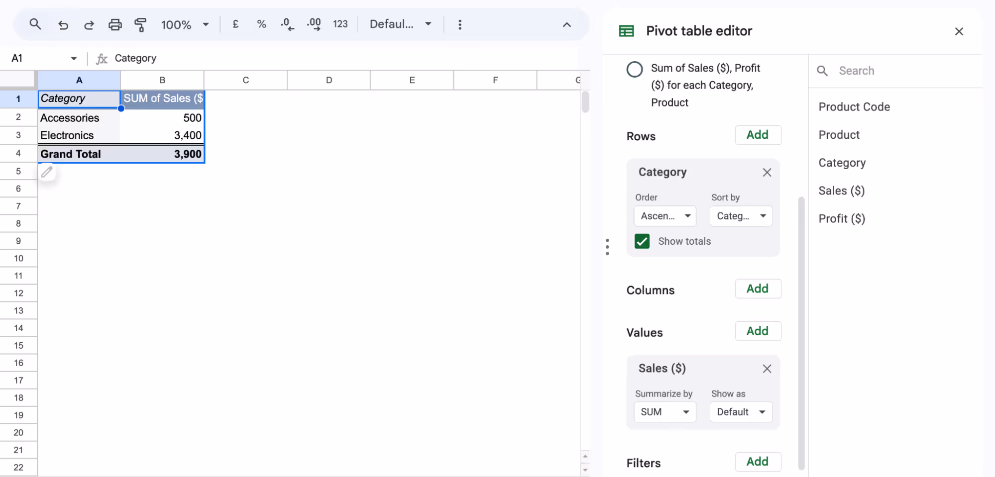
The pivot table will now display total sales by category, helping you analyze performance efficiently.
Correlation Analysis with CORREL and Scatter Charts
The CORREL function in Google Sheets helps measure the relationship between two variables. A scatter chart visually represents this correlation, making it easier to identify trends.
Example:
Suppose you want to see if higher customer ratings lead to higher profits. Using the CORREL function, you can determine the strength of their relationship.
Step 1: Apply the CORREL Function
Select a blank cell G3 and enter the CORREL Formula:
=CORREL(D3:D10, E3:E10)
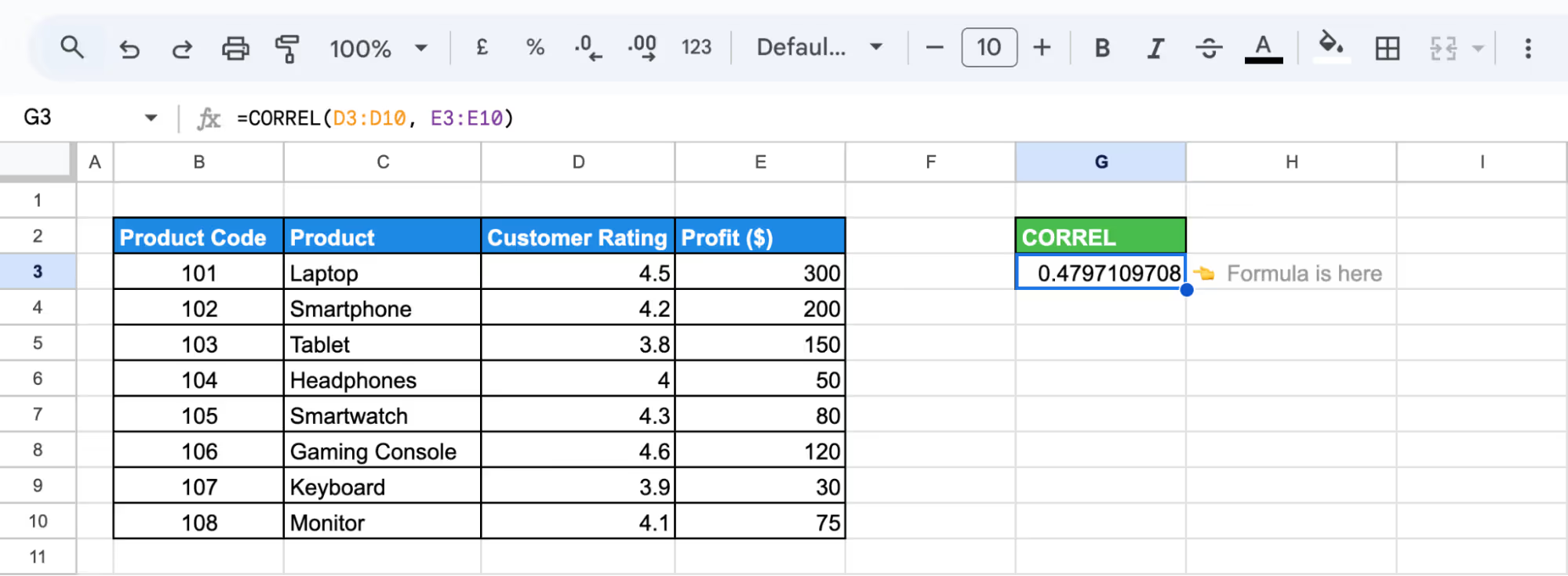
A positive value indicates a positive correlation, while a negative value suggests an inverse relationship.
Step 2: Create a Scatter Chart
Highlight the Customer Rating and Profit columns, go to Insert > Chart, and set the chart type to Scatter Chart to visualize the trend.
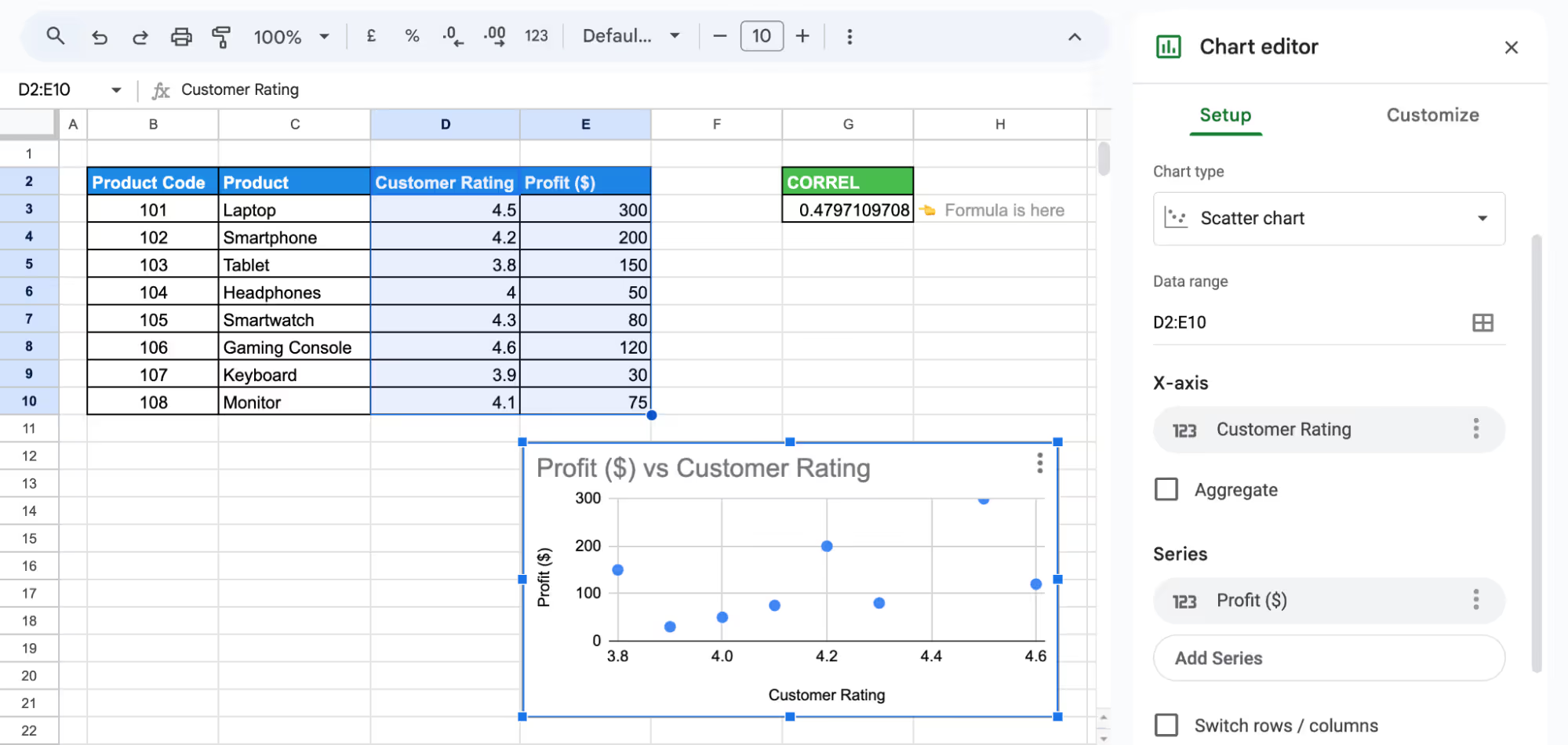
The correlation coefficient (0.48) suggests a moderate positive relationship between customer ratings and profit. While higher ratings tend to be associated with higher profits, the trend is not strong enough to indicate a direct or consistent relationship.
Dynamic Filtering with the QUERY Function
The QUERY function in Google Sheets helps filter and extract specific data efficiently. It allows you to apply multiple conditions without altering the original dataset.
Example:
Suppose you want to list only Electronics products with sales above $500. By using the QUERY function, you can extract relevant data efficiently.
Step 1: Enter the Formula
Click on a blank cell, enter the QUERY formula, and press enter.
=QUERY(B2:G10, "SELECT C, D, E WHERE D = 'Electronics' AND E > 500", 1)
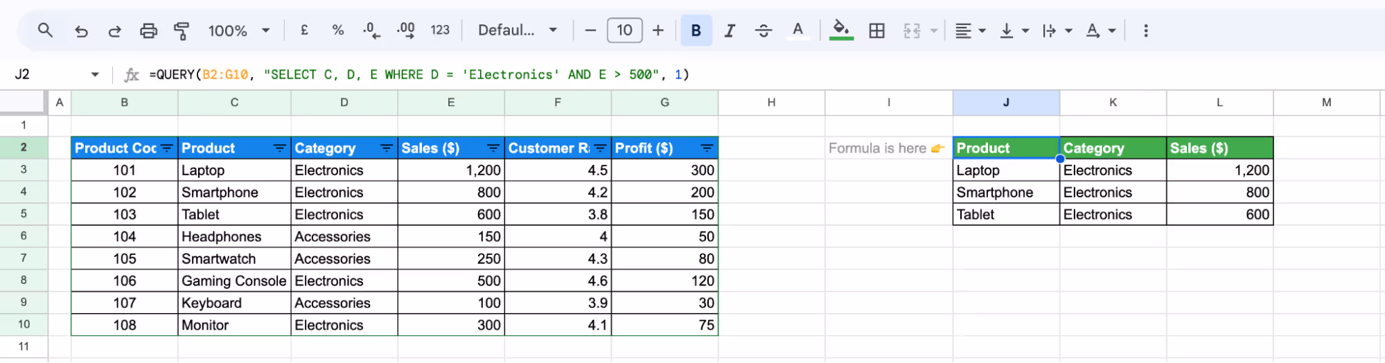
This displays only Electronics products with sales greater than $500.
Step 2: Adjust as Needed
Modify conditions to filter by Profit ($), Customer Rating, or sort results as required.
The formula filters and displays Electronics products with sales over $500 and can be adjusted to filter by profit for more targeted analysis.
Consolidating Data with IMPORTRANGE
The IMPORTRANGE function in Google Sheets allows you to pull data from multiple sheets into one, making it easier to analyze and manage information.
Example:
Suppose you have sales data split across two sheets and want to combine them into one for analysis.
Step 1: Enter the Formula
Click on a blank cell and enter the IMPORTRANGE formula and press enter.
={IMPORTRANGE("https://docs.google.com/spreadsheets/d/1R9PgvI8qSl-D9QrwHBBkH1n2x7PkVD0u8iPWUADDMyI/edit?gid=0#gid=0", "IMPORTANGE Sheet 1!B2:E6")}
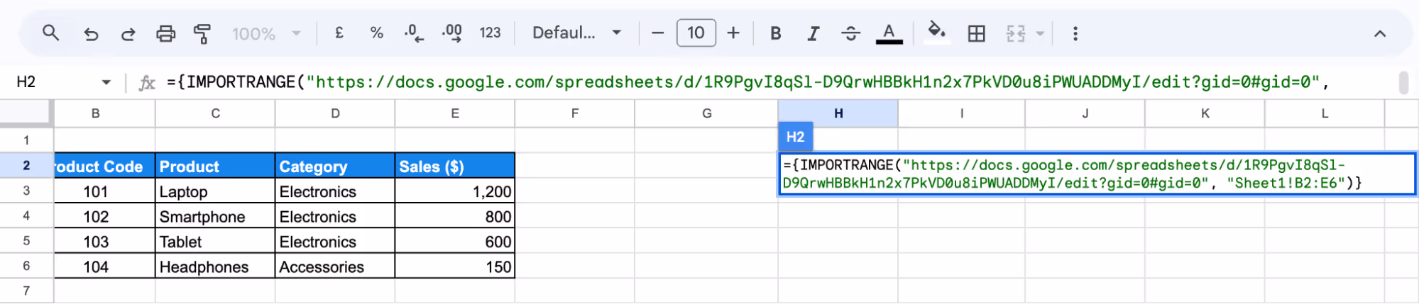
Step 2: Click Enter and Format
Press Enter and Format the table.
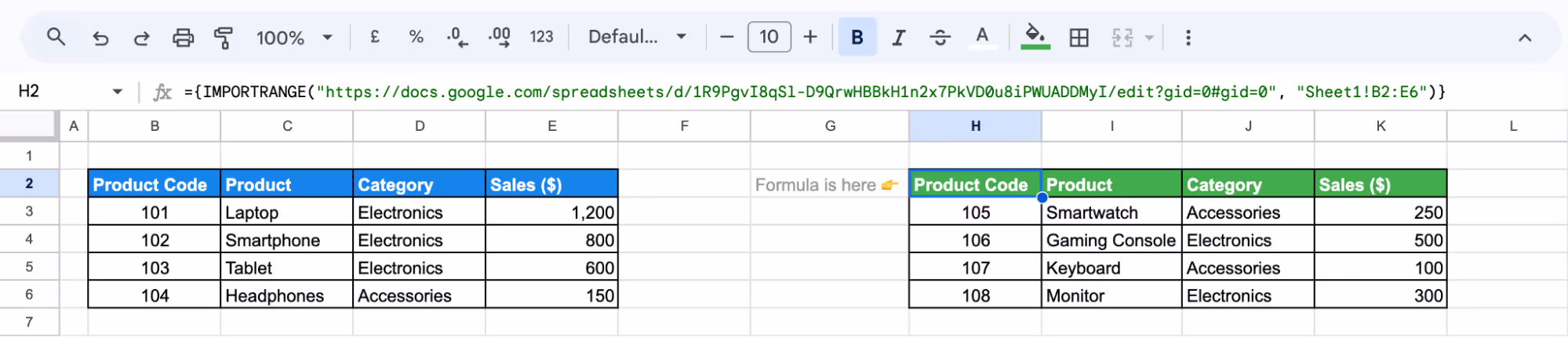
The formula imports and consolidates sales data from multiple sheets into a single table for easier analysis and management.
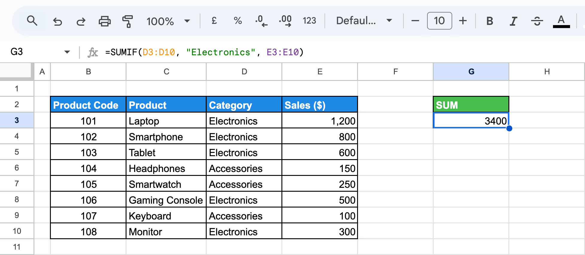
Aggregating Patterns with COUNTIF and SUMIF
The COUNTIF and SUMIF functions in Google Sheets help analyze data by counting or summing values based on specific conditions.
Example:
Suppose you want to find the total sales for Electronics and count how many products belong to this category.
Step 1: Calculate Total Sales for Electronics
Enter the SUM formula in a blank cell and press enter:
=SUMIF(D3:D10, "Electronics", E3:E10)
Step 2: Count Electronics Products
Enter the COUNTIF formula in another blank cell and press Enter:
=COUNTIF(D3:D10, "Electronics")
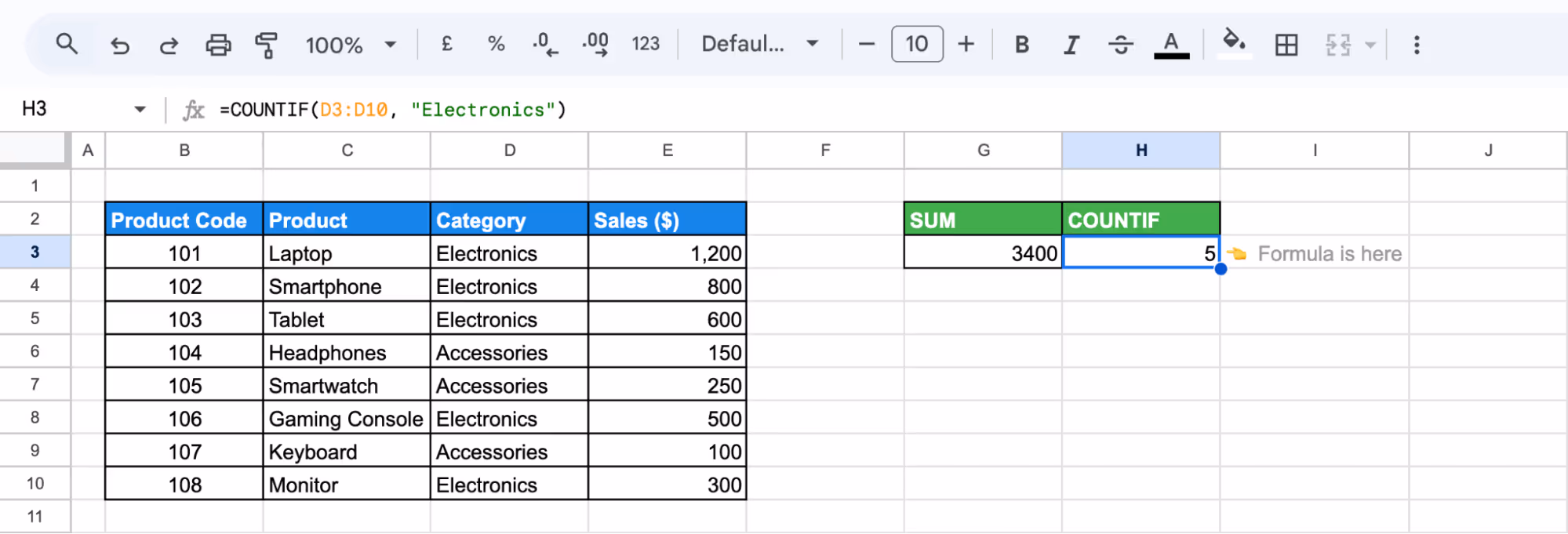
The first formula returns total sales for Electronics, while the second counts how many products belong to this category.
Addressing Common Errors in Exploratory Data Analysis
Addressing errors in Exploratory Data Analysis (EDA) is essential for accurate results. Issues such as incorrect formulas, scatter chart errors, or data validation problems can disrupt analysis. Identifying and fixing these errors helps maintain data integrity and improves your overall analysis process.
Troubleshooting Formula Errors
⚠️ Issue: Formula errors in Google Sheets can occur due to incorrect syntax, invalid references, or unsupported operations, resulting in errors like #VALUE!, #DIV/0!, or #REF!.
✅ Solution: Use the ERROR.TYPE function to identify the error type in a cell. This function returns a number corresponding to the specific error, helping you quickly troubleshoot and fix issues in your formulas for accurate results.
Errors in Scatter Charts
⚠️ Issue: When creating scatter charts in Google Sheets, common errors include missing x-axis values, incorrectly placed data point labels, and errors in the trendline equation due to improper scaling.
✅ Solution: Ensure your data range is correctly selected, and check the Chart Editor settings. Uncheck “Treat Labels as Text” and make sure the correct series and labels are added to the chart. This will resolve common scatter chart errors and help generate accurate visualizations.
Data Validation Not Working
⚠️ Issue: If the Data Validation button is grayed out, it could be due to the worksheet being protected, shared, or in group mode.
✅ Solution: To fix this, unprotect the sheet by selecting Review > Protect > Unprotect Sheet, unshare the workbook by going to Review > Protect > Unshare Workbook, or ungroup tabs by selecting an individual sheet tab. These steps will restore the Data Validation functionality.
Best Practices for Effective Exploratory Data Analysis
Exploratory Data Analysis (EDA) plays a crucial role in understanding your dataset. By following best practices, you can ensure that your analysis is both thorough and insightful. Here are key techniques to help you perform EDA effectively and uncover meaningful patterns in your data.
Understand Your Data for Analysis
Before analyzing data, review its structure, including the number of observations and variables. Identify whether variables are numerical or categorical and understand their significance to ensure accurate interpretation.
Examining summary statistics like mean, median, and standard deviation helps assess data distribution and variability. This ensures better analysis decisions and meaningful insights from the dataset.
Documenting Steps and Formulas for Reproducibility
Keeping a record of assumptions, steps, and formulas used during EDA ensures transparency and consistency. Documenting these details makes it easier to replicate analyses, verify results, and share findings with others.
A well-documented process also helps track decisions, identify errors, and refine future data analysis. It enhances collaboration by allowing others to understand and build upon your work effectively.
Using Sample Datasets for Testing
Testing formulas and analysis techniques on a smaller dataset helps ensure accuracy before applying them to the full dataset. Using a simplified version minimizes errors and allows for adjustments without affecting large amounts of data.
This approach improves efficiency, reduces mistakes, and ensures reliable results when scaling up to complete datasets. It also helps identify potential issues early, saving time in the long run.
Focus on Visualizing Data
Visual tools like scatter plots, bar charts, and heatmaps help present findings clearly and highlight key patterns in data. Using these tools makes it easier to identify trends and anomalies, ensuring a deeper understanding of the dataset.
Effective visualization improves communication, allowing stakeholders to quickly interpret insights and make informed decisions based on the data presented.
Explore Relationships
EDA goes beyond analyzing individual variables—it also examines how they interact. Tools like correlation matrices, scatter plots, and heatmaps help visualize relationships, revealing trends and dependencies that might not be obvious at first glance.
Identifying these connections is essential for accurate analysis. Understanding variable relationships allows for better predictions, informed decisions, and deeper insights from the dataset, ultimately improving overall data interpretation.
Essential Google Sheets Functions for Efficient Data Handling
Google Sheets provides powerful functions that simplify data processing, organization, and analysis. These functions help users search, manipulate, and structure data more effectively.
- MATCH: Finds the position of a value within a specified range. Useful for lookups and comparisons when combined with INDEX.
- TIME: Creates a time value using hour, minute, and second inputs, helping format and work with time-based data.
- WORKDAY: Calculates a future or past workday while skipping weekends and specified holidays, making it ideal for project planning.
- ROUND: Rounds a number to a specified number of decimal places, useful for financial calculations and standardizing numerical data.
- INDEX MATCH: A flexible alternative to VLOOKUP, where INDEX retrieves a value from a specific row/column, and MATCH finds the position of the lookup value.
- CONCATENATE: Combines multiple text strings into one, simplifying the process of merging data from different cells or sources.
Gain Insights with OWOX: Reports, Charts, & Pivots Extension
OWOX: Reports, Charts, and Pivots extension enhances data analysis in Google Sheets by providing advanced tools for creating detailed reports, interactive charts, and dynamic pivot tables. It streamlines workflows, minimizes manual effort, and helps extract valuable insights efficiently.
Seamlessly integrating with your data systems, OWOX ensures precise and real-time reporting. Its user-friendly interface allows easy customization of charts and pivot tables, making it simple to transform raw data into clear, visually compelling insights for better decision-making.
Frequently asked questions


Finally, a tool that doesn't ask business users to learn a new dashboarding UI. Our marketing team already knows Sheets. OWOX just delivers the right data.
Joinable data marts concept was the thing that sold us. We can now use the semantic layer without building one.
Self-hosted the OSS version on Digital Ocean. Zero vendor lock-in. Contributed a Shopify connector back in week two.