
Bad Data Visualization: Examples to Learn From
See how poor data visuals can mislead and learn what to fix, from chart types to colors, labels, and scaling issues.

Misleading charts. Confusing axes. Overcrowded visuals.
We’ve all seen dashboards or presentations where the data should be telling a story, but instead, it leaves the audience lost, frustrated, or worse, misinformed. Poor data visualization doesn’t just fail to inform, it actively leads teams down the wrong path. That’s why it’s crucial to understand what not to do.

In this article, we'll walk you through real-world examples of misleading charts, explain what went wrong, and show you how to fix them. By the end, you'll know how to spot common pitfalls, avoid becoming misled by mistake, and improve clarity in your dashboards.
What Is a Bad Data Visualization?
A bad data visualization fails to accurately or clearly convey the intended message from the data. Even when the data is valid, poor design choices can distort meaning, confuse the viewer, or even mislead decision-makers. This typically happens when visuals prioritize aesthetics over clarity, or when creators fail to consider the audience’s needs and context. Here are common signs that a data visualization has gone wrong:
- Misleading scales: Axes that don’t start at zero or are unevenly spaced can distort the message.
- Inappropriate chart types: Using complex or unsuitable charts makes it harder to understand the underlying trend.
- Poor color choices: Clashing colors or too many hues can confuse viewers and hide key data points.
- Lack of context or labeling: Omitting units, sources, or explanatory labels reduces trust and clarity. Even when using tools like Looker Studio, these errors can occur if the design focuses on style over clarity.
- Visual clutter: Overusing icons, effects, or excessive data points creates noise instead of insights.
- Distorted dimensions: 3D effects or skewed graphics can make data comparisons unreliable.
How Poor Data Visualization Can Impact Decision-Making
The way data is visualized plays a major role in how people interpret and implement decision-making at various levels. A misleading chart can cause more harm than incorrect data, as it appears credible while conveying the wrong message.
For businesses, products, and policy teams, bad visuals don’t just lead to confusion; they can lead to lost opportunities, incorrect conclusions, or even long-term strategic errors. Here are the key risks that poor data visualization introduces:
- Faulty conclusions: Inaccurate visuals can lead to wrong assumptions and misguided actions.
- Loss of trust: Repeated exposure to bad charts erodes stakeholder confidence in your data team.
- Wasted resources: Misinterpreting trends may cause teams to invest in the wrong areas.
- Poor communication: Teams struggle to align when dashboards and reports are hard to decode.
- Decision paralysis: Overcomplicated visuals can overwhelm audiences and stall progress.
- Confirmation bias: Cherry-picked visuals may support personal opinions instead of the objective truth.
Common Characteristics of Bad Visualizations
Bad visualizations don’t always stem from bad intentions; often, they result from a lack of clarity, poor design choices, or an attempt to convey too much information in one chart. These visual mistakes can distort meaning, mislead the audience, or simply confuse them.
Here are the most common ways visualizations go wrong:
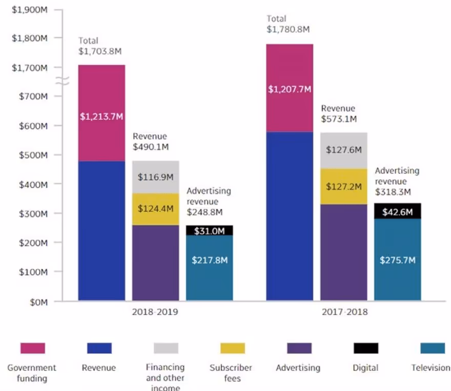
1. Designing Scales That Mislead
Even widely used reporting tools can fall into this trap if default chart settings aren’t adjusted for visual integrity. When axis scales are manipulated, even honest data can tell a false story. These tactics exaggerate trends and damage credibility. The most common ways scales distort data include:
- Starting the y-axis above zero to make small differences appear dramatic
- Using inconsistent intervals between scale values, which distorts the slope or height
- Zooming in excessively to draw attention to insignificant variations
2. Choosing the Wrong Chart Type for the Data
Using the wrong chart type can obscure the insight or confuse the viewer. The goal of a visualization should be to make interpretation effortless. For example, an e-commerce guide often recommends using line charts for revenue trends and bar charts for category-wise sales to make key metrics more digestible. Here are the key mistakes to avoid when selecting a chart type:
- Using a pie chart to compare more than 3 – 4 values, which leads to visual clutter
- Choosing a line chart when data points aren’t continuous or sequential
- Using pictograms or area-based visuals for precise numerical comparisons
3. Poor Color Usage
Color should help guide attention and group related data, not distract or confuse. Thoughtless color use can ruin otherwise clean visuals. Common color-related issues include:
- Using too many similar hues makes it hard to differentiate segments.
- Low contrast between the background and data points reduces readability. This issue frequently appears in a social media dashboard, where color overload can drown out engagement insights or campaign reach.
- No color legend or inconsistent color mapping across dashboards.
4. Misusing Pie Charts and Donut Charts
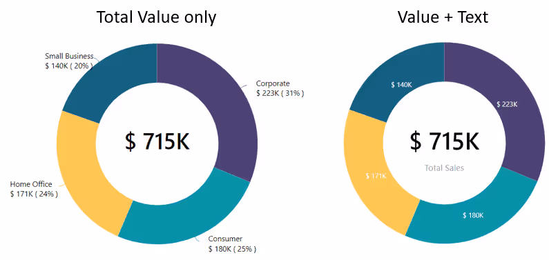
Circular charts are often misapplied to datasets that don’t suit them. When the number of segments increases, they become hard to read. Avoid these common pie chart mistakes:
- Overloading charts with too many slices, especially small ones
- Using similar colors for adjacent slices, which leads to confusion
- Forgetting to order slices by size, which makes comparisons harder
5. Unnecessary 3D Effects That Distort Data
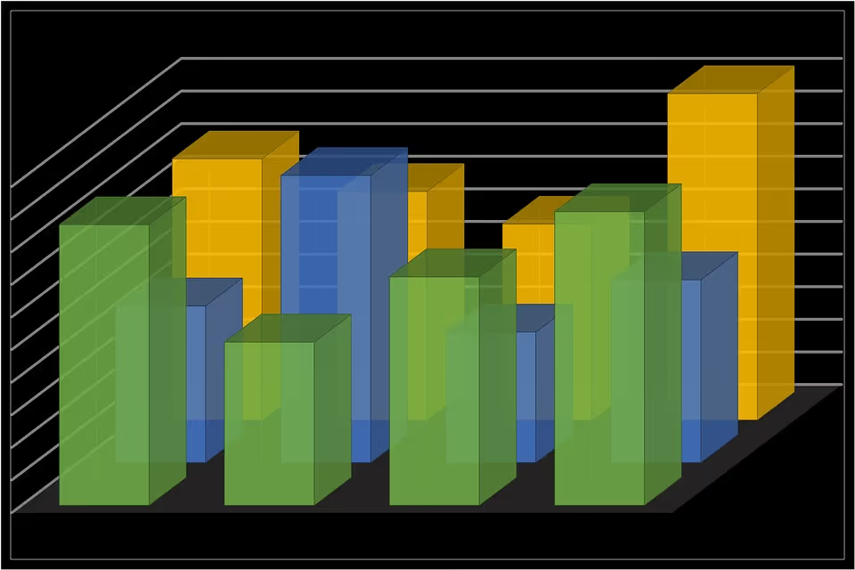
3D visuals may look impressive, but they often mislead viewers by warping perspective and hiding actual values. Here’s how 3D effects reduce clarity:
- Skewing bar heights or angles, so values appear larger or smaller than they are
- Creating overlapping visual elements that obstruct data in the background
- Adding depth for no functional reason, which serves style over substance
6. Truncating the Y-Axis to Exaggerate Differences
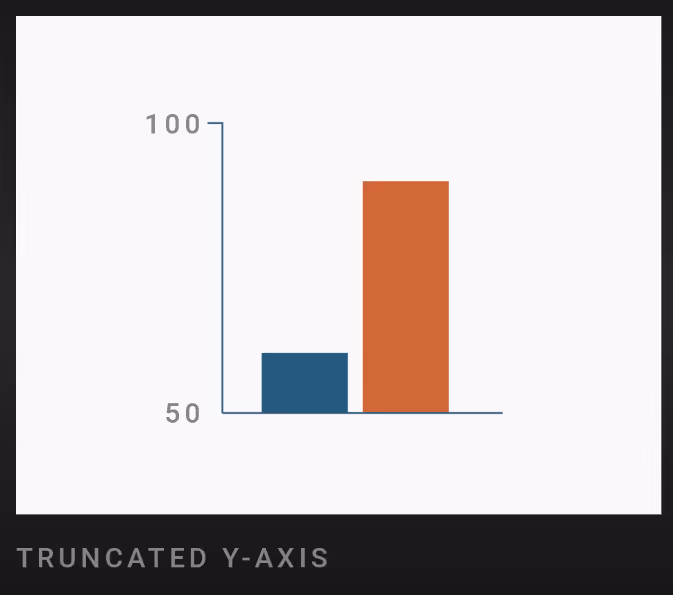
Charts that don’t start at zero can make small changes appear disproportionately large. This misleads even well-intentioned viewers. Common ways the y-axis is misused:
- Cropping out the baseline to exaggerate upward or downward trends
- Using compressed ranges to show volatility that isn’t statistically significant
- Making differences look dramatic, even when the actual variation is minor
7. Overcomplicating Instead of Simplifying the Message
Including too much data or too many design elements can overwhelm users. A good chart should lead the eye, not make it search. Visual clutter often happens due to:
- Too many metrics or axes are packed into one chart. This is a common issue in business dashboards, where cramming financial, sales, and customer data into one view dilutes the impact of each.
- Overuse of gridlines, legends, and tick marks makes the chart harder to read
- Labels that overlap or compete for attention, reducing legibility
8. Ignoring the Narrative Behind the Data
Without context, a data report has no direction. A chart may look clean, but if it doesn’t tell the viewer why it matters, it misses the point. These common habits kill narrative clarity:
- Presenting raw numbers without a clear takeaway or headline
- Failing to explain trends or why they’re significant
- Skipping contextual elements like date ranges, source notes, or annotations
9. Overlapping Visual Elements That Obstruct Clarity
Too many overlapping objects make charts hard to interpret. Whether it’s lines, shapes, or labels, every element should have space to breathe. Watch for these spacing issues:
- Multiple chart series are crowding each other out with no separation
- Text or labels colliding, especially on smaller screens or exports
- Icons or markers overlapping, making individual values impossible to read
Real-Life Examples of Bad Data Visualization
Even well-known brands and media outlets can get visualizations wrong. These real-world examples demonstrate how design choices, even if unintentional, can distort meaning, confuse readers, or lead to poor decisions. Here’s what went wrong in each case:
BBC's Avocado Toast Index - Misleading Scale and Context
The BBC attempted to compare property prices with the cost of avocado toast across regions. While catchy, the chart used unclear logic and lacked context. Key issues with this visualization include:
- No defined units or conversion logic, leaving the comparison open to interpretation
- Visual exaggeration of small differences, making housing unaffordability seem uniform
- Trivializing a serious issue using a novelty index, which undermines credibility

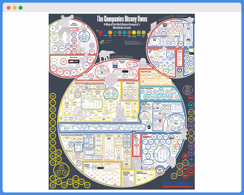
Disney's Worldwide Assets Map - Overcomplicated and Hard to Read
Disney’s visual showing its global assets used an overly complex map filled with logos, arrows, and text, all crammed into a single graphic. This visual was ineffective due to:
- Overuse of symbols and branding makes it hard to focus on the actual information
- Lack of visual hierarchy, so everything competes equally for attention
- No clear geographic boundaries, which hurts spatial interpretation
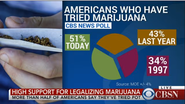
CBSN's Data Visualization - Confusing Representation
CBSN used a pie chart to show how Americans feel about an issue, but packed it with too many tiny slices and similar colors. The chart failed in multiple ways:
- Too many segments, each too small to read or distinguish
- Visually similar colors, reducing clarity between categories
- No sorting or grouping, leaving the viewer to guess the takeaway
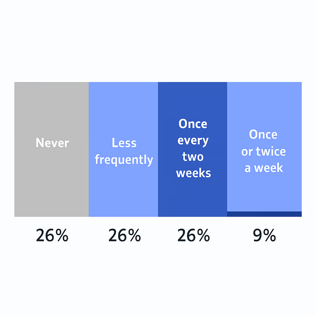
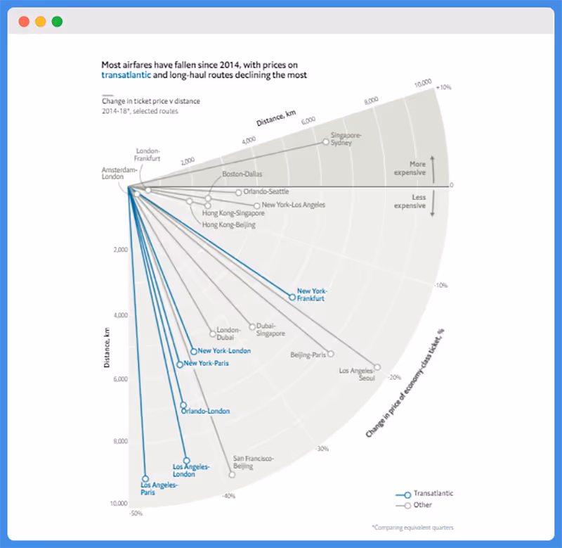
The Economist's Flight Price Chart - Overlapping Lines and Confusing Axes
A line chart from The Economist showed changes in flight prices, but the overlapping lines and axis labels made it hard to follow. The main problems were:
- Too many overlapping trend lines, without clear differentiation
- Crowded axis labels, which blurred the chart’s scale
- No clear legend placement, forcing viewers to toggle between the chart and the key
Venezuelan Election Results - Perfect Percentages Raise Flags
This election result chart showed suspiciously perfect percentages using cylindrical 3D bars, leading to doubts about legitimacy. Here’s where it went wrong:
- Rounded numbers that seem too clean, creating suspicion
- Use of 3D cylinders, which distorts proportional representation
- Lack of source or margin of error, decreasing transparency

Cherry-Picked Data - Selective Presentation Leading to Bias
Some charts only show a subset of data to support a point, ignoring broader context. This is known as cherry-picking.
Common signs of biased visuals include:
- Omitting relevant data ranges, which skews trends
- Highlighting only favorable data points, ignoring contradictions
- Framing data with loaded annotations, guiding viewer opinion
Vox's Life on Earth Chart - Overwhelming Detail
Vox’s chart tried to visualize all life on Earth in one graphic. While ambitious, the level of detail made it difficult to read. This chart failed to communicate due to:
- Information overload, cramming too much into one frame
- Small font sizes and dense labels reduce accessibility
- No progressive reveal or grouping, making the chart visually exhausting

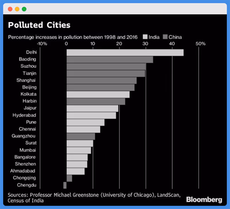
Bloomberg Pollution Map - Poor Color Use
Bloomberg created a global pollution map, but the color choices didn’t clearly reflect the severity of the data. Here’s why it didn’t work:
- Similar shades for very different pollution levels, leading to misinterpretation
- No clear color scale or legend, making comparisons difficult
- Poor contrast with the base map, making high-pollution areas easy to overlook
Good vs. Bad Data Visualization: Before and After
Sometimes, you only recognize a bad visualization when you compare it to a better version. Seeing side-by-side examples of poor vs. improved visuals can highlight just how powerful thoughtful design can be. Here’s how common chart types go wrong, and what to do instead:
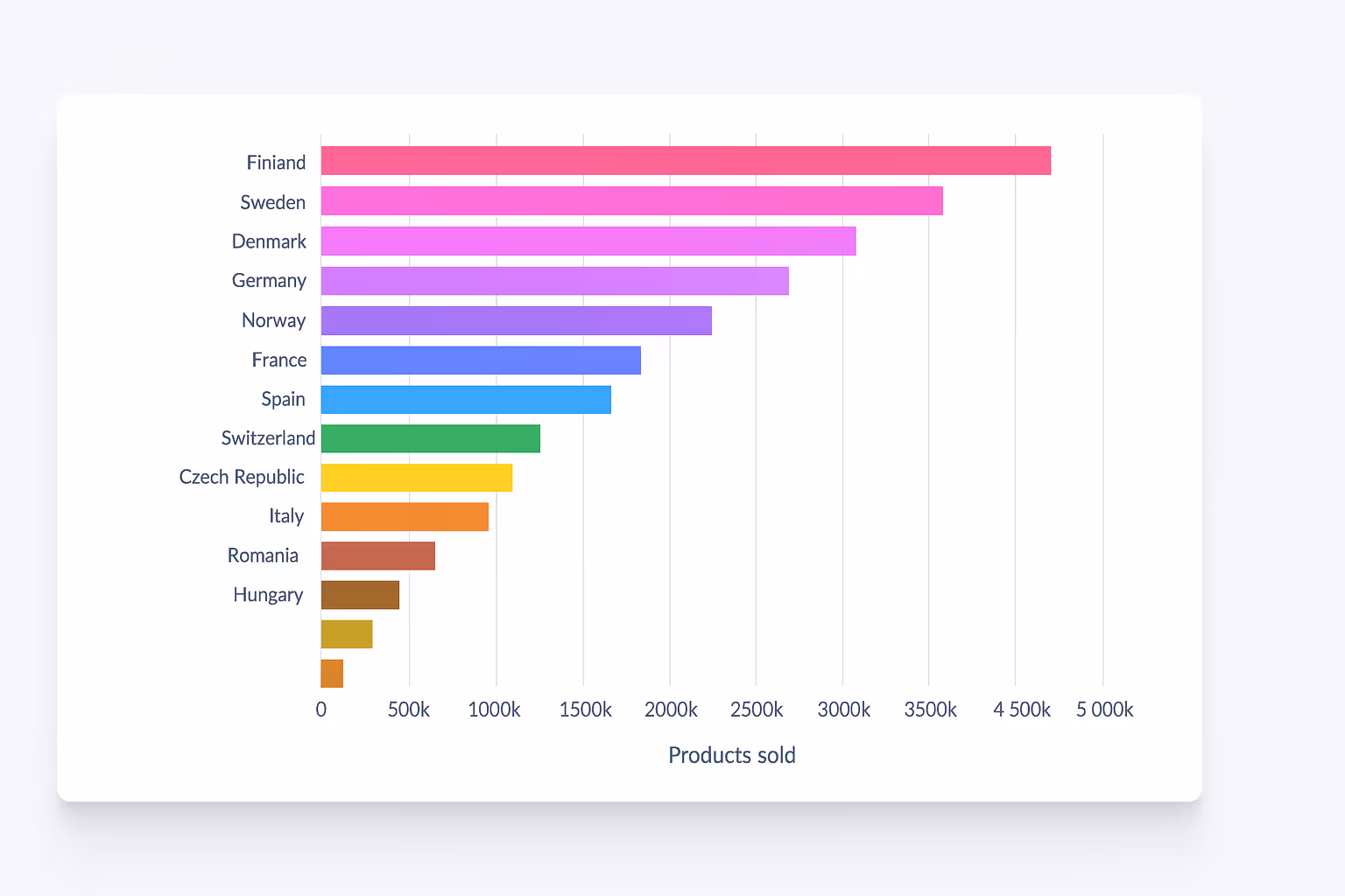
Bar Charts
Bar charts are one of the most effective ways to compare discrete categories. But they’re often misused with distorted axes or visual clutter. Here’s how bar charts can go wrong, and how to fix them:
- A bad example is a marketing report that compares ad spend across five channels, but the Y-axis starts at 60%, making small differences look massive. This distorts the actual ROI impact across channels.
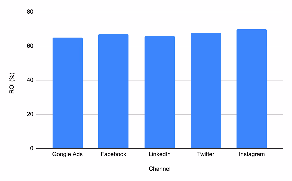
- A good example is a campaign performance chart that shows evenly spaced bars, sorted by spend, with a Y-axis starting at zero for fair visual comparison.
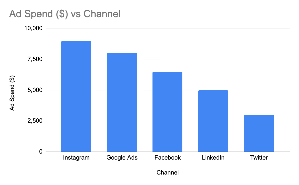
- Tip: Always start axes at zero and order bars logically to help users scan easily.
Line Charts
Line charts are most effective for displaying trends over time. But too many lines, poor labeling, or uneven intervals can make them hard to interpret. Before and after improvements in line charts include:
- A bad example - A SaaS dashboard tracks churn rate over time but includes seven overlapping product lines in similar colors, making the trends impossible to follow.

- A good example is a user retention report that highlights the top three subscription plans in distinct colors, with direct labels showing key changes month-over-month.

Tip: Limit to 3 – 4 lines per chart and use direct labels to avoid sending users to a legend.
Maps
Maps are excellent for displaying geographic data, but their effectiveness depends heavily on the use of color, scale, and clarity. Here’s what separates poor map visualizations from useful ones:
- Bad example - A sales territory map uses nearly identical shades of blue to show revenue by region, making high and low performers hard to distinguish.
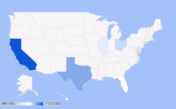
- A good example is a regional performance heatmap that uses warm-to-cool gradients with a clear legend, helping leadership identify growth opportunities at a glance.

- Tip: Use choropleth maps with clear legends and accessible color schemes.
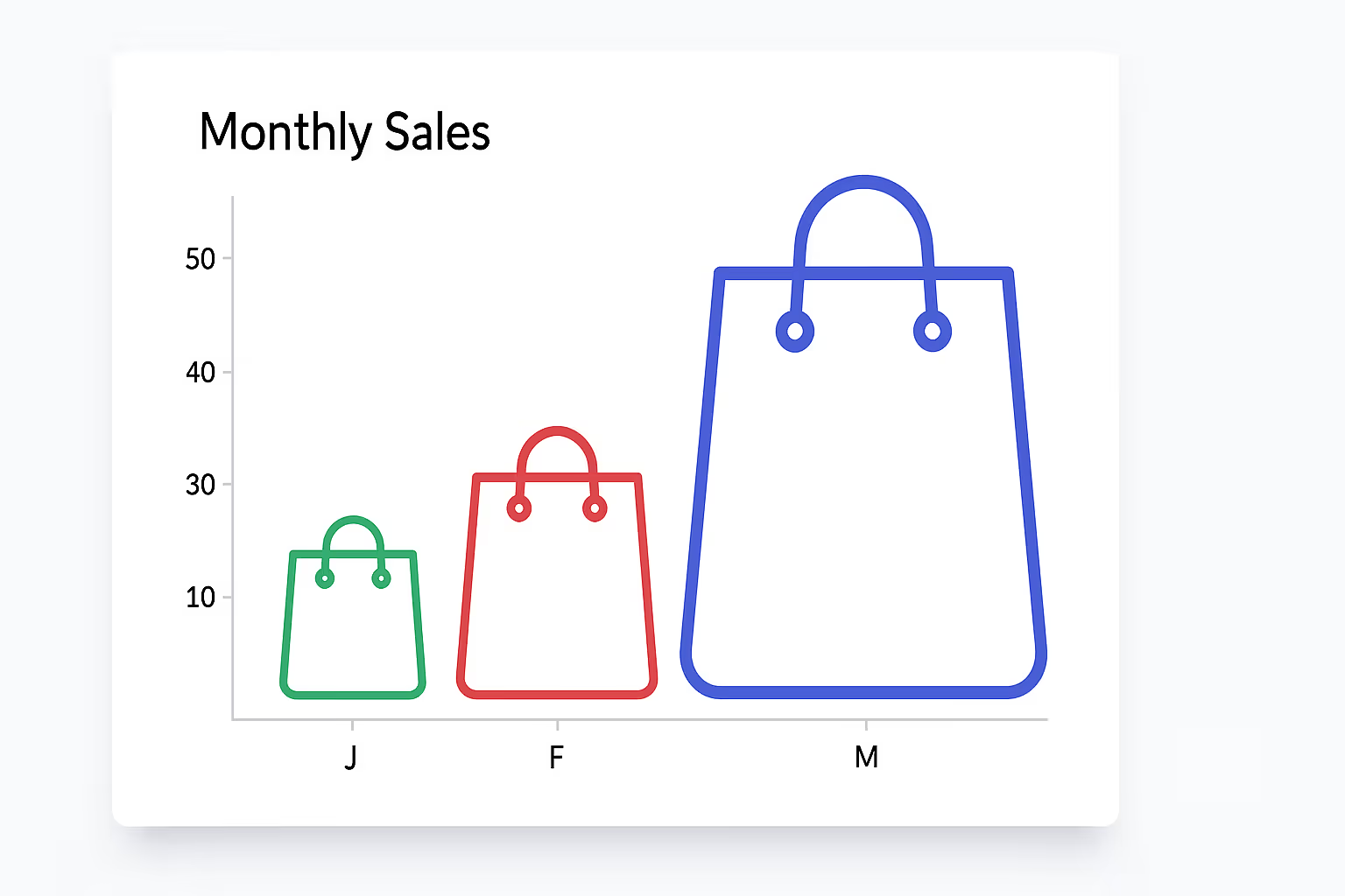
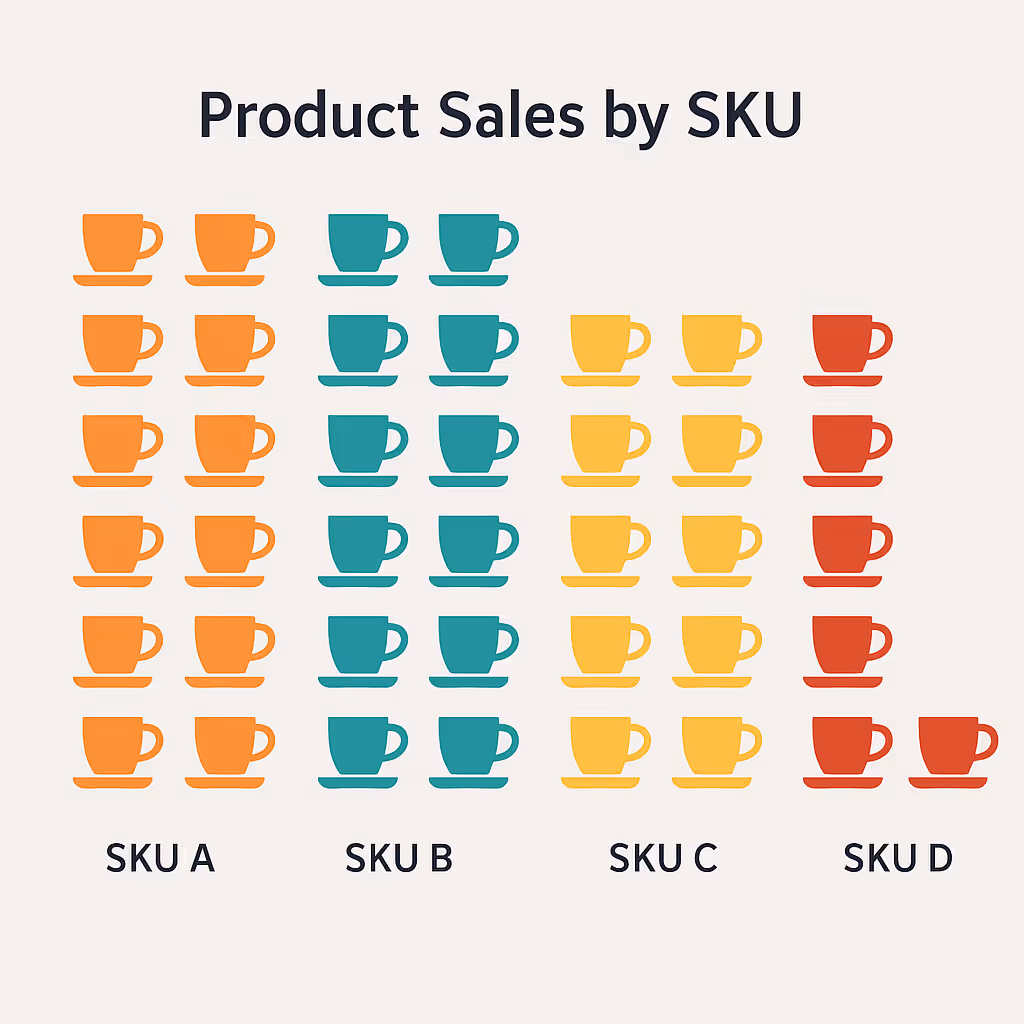
Pictorial Charts
These are often used in marketing reports, UX, or product dashboards to represent data with icons visually. However, they can be easily misused and may feel gimmicky. What to watch for in pictorial charts:
- A bad example, A B2C brand uses 50 coffee cup icons to represent product sales by SKU, cluttering the visual and making value comparison nearly impossible.
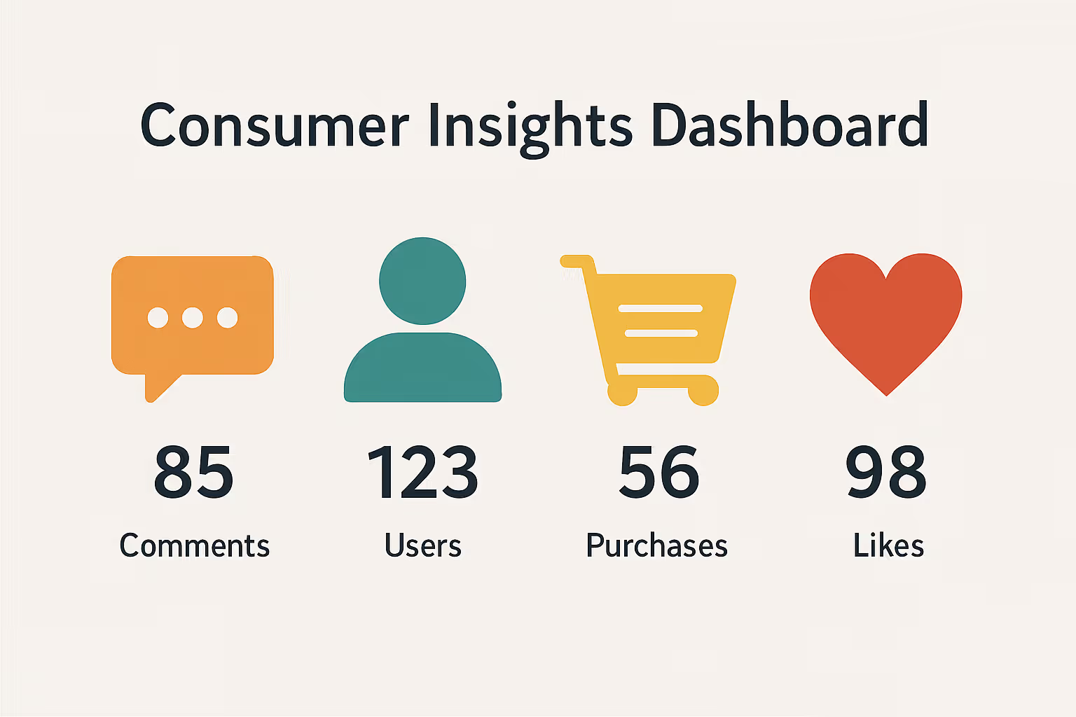
- A good example is a consumer insights dashboard that uses a row of simplified icons with numeric labels below each, keeping it readable while still engaging.
- Tip: Use pictograms sparingly, only when they add meaning, not just decoration.
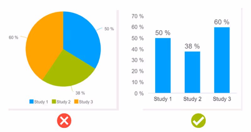
Pie Charts
Pie charts can work well with up to three values, but beyond that, they tend to confuse more than clarify. Before and after improvements often include:
- Bad example - A digital campaign report uses a pie chart with 12 segments to show traffic sources, most of which are too small or similar in color to tell apart.
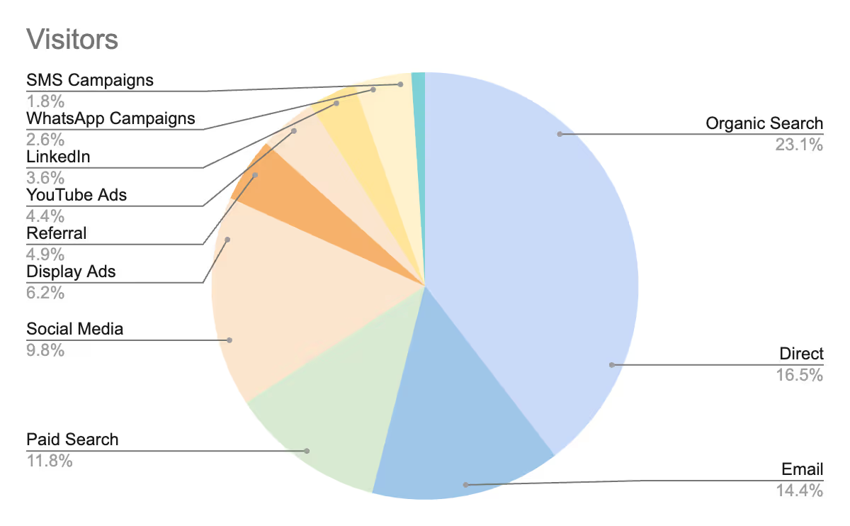
- Good example - The same report groups minor sources into “Other,” using a bar chart beside the pie for deeper insights and clearer attribution.
- Tip: Avoid pie charts for comparison-focused insights; use bar charts instead when precision matters.
Funnel Charts
Funnel charts are ideal for visualizing drop-off in stages, such as marketing reports or sales pipelines. However, poor design can make them appear distorted or misleading. Here’s how to improve funnel visuals:
- Bad example - A lead gen funnel visual uses 3D slanted layers, making the drop from MQL to SQL appear far more dramatic than it actually is.

- A good example is a clean, flat design with labeled stages and exact counts, which shows the real conversion rates across the marketing pipeline.

- Tip: Keep the funnel layout clean, use labels outside the shapes, and add absolute values alongside percentages.
Best Practices for Clear and Trustworthy Visualizations
Great visualizations don’t just look good; they communicate clearly, build trust, and help people make better decisions. By following some key principles, you can ensure your visuals inform rather than mislead. Here are essential practices to follow:
Design Visuals for Your Audience
Visuals should be created with the viewer in mind. Consider their level of data literacy, goals, and what they need to take away at a glance. To align visuals with your audience’s needs:
- Define who will view the visualization: executives, analysts, marketers, etc.
- Tailor the level of detail to match their decision-making context
- Use familiar terms and visual styles that resonate with their role
Use Color Purposefully, Not Decoratively
Color should enhance meaning, not distract or mislead. Thoughtful use of color supports comparison, focus, and accessibility. Here’s how to use color effectively:
- Limit color palettes to 6 – 8 hues to avoid visual overload
- Use color to encode meaning, such as showing positive vs negative trends
- Avoid decorative gradients or overly saturated tones, which reduce clarity
Minimize Clutter to Maximize Clarity
Every element on a chart should serve a purpose. Removing unnecessary labels, gridlines, and icons allows the core message to stand out. To reduce clutter in your visualizations:
- Eliminate redundant elements, like repeated axis labels or duplicate legends
- Group related data and leave whitespace for breathing room. In a KPI dashboard, this helps separate performance indicators like churn rate and MRR, allowing faster scanning and better focus.
- Use concise labels and tooltips instead of large text blocks
Match Chart Type to the Data Purpose
Choosing the right chart type is key to clear communication. The format should match the kind of insight you want to highlight. To select the best chart for your data:
- Use bar charts for comparisons, line charts for trends, and pie charts for parts of a whole (sparingly)
- Avoid complex formats unless necessary for advanced analysis
- Test different visual types to see which delivers the clearest result
Highlight What Truly Matters
Your visualization should guide the viewer’s eye to the most important insights. Emphasis helps people interpret data reports more quickly and with greater confidence. To draw attention where it’s needed:
- Use bold colors or size to spotlight key data points
- Add direct labels to critical values, rather than using a general legend. This is especially relevant for a marketing dashboard, where highlighting lead sources or cost-per-acquisition directly can influence immediate decisions.
- Remove or fade out background elements to reduce distraction
Tell a Clear Story Through Layout and Context
Every visualization should have a narrative flow. The layout should support the journey from data to insight. Build a narrative-driven visual by:
- Placing charts in a logical order that mirrors how a user thinks
- Adding contextual clues like titles, subtitles, and notes
- Making use of consistent design to connect multiple visuals in one dashboard. Many businesses now rely on automated reporting, ensuring that visuals are consistently updated, and that narrative clarity is maintained over time.
Build Dashboards That Communicate Clearly with OWOX Data Marts
Dashboards should do more than just display charts; they should clarify, inform, and drive confident action. OWOX Data Marts provides structured, business-ready data that flows directly into tools like Google Sheets and Looker Studio, ensuring your dashboards stay consistent and trustworthy.
Here’s how OWOX Data Marts helps you create dashboards that actually communicate:
- Start with structured Data Marts to ensure consistency and trust in every metric
- Deliver clean, reusable datasets that simplify reporting across Sheets and Looker Studio
- Standardize definitions so every chart and KPI reflects the same truth
- Enable flexible filters and interactions without breaking analyst logic
- Keep dashboards aligned to business questions, not scattered SQLs
- Support narrative flow by connecting data points into a cohesive story
Build dashboards that work. Power them with OWOX Data Marts and avoid the mistakes that come from messy, inconsistent data.
Frequently asked questions
.png)


Finally, a tool that doesn't ask business users to learn a new dashboarding UI. Our marketing team already knows Sheets. OWOX just delivers the right data.
Joinable data marts concept was the thing that sold us. We can now use the semantic layer without building one.
Self-hosted the OSS version on Digital Ocean. Zero vendor lock-in. Contributed a Shopify connector back in week two.