The 5 Signs Your Marketing Reports Are Lying to You
5 signs your marketing reports are misleading you — from shifting numbers to clashing metrics. Fix the broken data foundation behind it.

You’ve built the dashboards. You’ve defined the KPIs. But when you open your reports, something feels wrong. The numbers shift, definitions clash, and teams argue about what’s “correct.” You’re not alone — and the problem isn’t your tools or your tagging. It’s your foundation.
When your marketing data foundation is undefined or misaligned, your reports will keep misleading you — no matter how polished they look. This article breaks down five signs of a broken data foundation and explains how governed, analyst-defined data marts are the real solution.
Why your marketing reports seem fine but mislead you
Why your marketing reports seem fine but mislead you
Marketing dashboards are often the most trusted artifacts in a team’s decision-making process. But that trust is built on a dangerous assumption: that the numbers reflect a single version of the truth. In reality, most dashboards are built on fragmented logic and isolated queries — not a shared, governed foundation.
Same report, different numbers every time
You open your campaign performance dashboard on Monday. On Thursday, someone else opens the same one and the numbers don’t match. Neither of you changed anything. But the revenue, sessions, or cost-per-lead is suddenly different.
This isn’t a fluke — it’s a sign of broken metric governance. Metrics are being calculated on the fly, often in different BI tools or SQL layers, using slightly different logic.
For example:
Even if these reports look similar, the queries behind them vary. The same metric — “conversion” — ends up meaning three different things, and every misalignment erodes trust.
The inconsistency isn’t in the report
Many teams respond to reporting discrepancies by adjusting the dashboard visuals — modifying charts, renaming columns, or fine-tuning filters. But the real inconsistency lies in how data is being pulled, joined, and calculated.
Reporting tools are only as reliable as the data logic behind them. If your pipeline pulls platform-specific metrics — each with its own time zones, attribution models, and conversion windows — your dashboards will reflect that mess.
Each data source applies its own business logic. Without a centralized, governed foundation to standardize joins, filters, and definitions, your dashboards simply mirror the chaos. Reporting discrepancies are not reporting issues — they are modeling issues.
Your real problem is the missing data model
Without a shared data model, you’re not building reports — you’re guessing. When every tool applies its own rules, your team spends more time validating numbers than making decisions.
A clean, governed data foundation solves this by doing three things:
Without this foundation, you’ll always be stuck in “reporting therapy” — debugging, explaining, re-justifying — instead of delivering insight.
5 signs your marketing reports are misleading you
5 signs your marketing reports are misleading you
The symptoms might look minor — a number that feels off, a question from sales about attribution, a dashboard clone someone created “just to be safe.” But these are more than annoyances. They are signs your reporting stack is misaligned and your data foundation is either missing or broken.
Sign #1: The same metric means different things
Metrics like “lead,” “session,” or “conversion” seem universal — but they’re often interpreted differently across tools, teams, and individual analysts. One team tracks a lead as a form submission, another counts only MQLs, and a third logs any sign-up event. Without a clear agreement, your metrics lose meaning.
A “lead” isn’t always a lead
What counts as a lead?
This creates massive misalignment. Your ad campaign might show 300 leads while your CRM shows 60. Both are technically correct, but they’re measuring different things. Unless this is documented and agreed upon, teams will continue to pursue different goals.
Teams build reports on their own logic
In the absence of a shared model, individual marketers or analysts create logic ad hoc. They write SQL that filters traffic in unique ways. They use calculated fields in Looker Studio. They tweak GA4 segments to fit campaign needs.
Each version might be valid, but together they add up to inconsistency. Without a defined layer of metric logic, every report becomes a personal interpretation of what’s important.
Dashboards become opinions, not truth
When data lacks shared definitions, dashboards cease to be sources of truth — they become subjective narratives. One dashboard says conversions are up. Another says they’re flat. Teams debate the numbers instead of acting on them.
What you need isn’t more dashboards — it’s metric logic defined once, at the data mart level, and reused everywhere. That’s how reporting regains its power. And critically, because every number traces back to analyst-approved SQL, there’s a full audit trail — no AI hallucinations, no mystery formulas, just logic you can verify.
Sign #2: Rebuilding the same SQL (or view) every week
One of the clearest signs your data model is broken — or never existed — is that your analysts are constantly rebuilding logic. They copy old queries, tweak filters, add custom joins, and rerun the same logic over and over. It’s inefficient, error-prone, and wastes the one resource analysts don’t have: time.
This isn’t a workflow problem — it’s a structural problem. Repetition reveals the absence of reusable, governed data artifacts.
Analysts copy-paste the same queries with minor tweaks
Someone needs to add a new region, change an audience filter, or include a campaign dimension. Instead of referencing a shared model, the analyst finds the last working query, makes minor edits, and saves it as “_v3_final_FINAL.sql.”
This behavior is a symptom of two larger issues:
Without reusable, published data marts, even basic metrics like sessions, spend, and conversions require rebuilding logic from scratch every time.
Dashboards get duplicated because nobody trusts the original
When one dashboard starts returning inconsistent or unexplained results, what’s the most common solution? Someone clones it, makes changes “just to be safe,” and creates a new version. Before long, teams are choosing from five dashboards — all showing different results, none fully trusted.
This proliferation is a direct result of poor model governance. Without confidence in the shared logic behind the report, every team builds its own.
Lack of reusable modeled objects equals wasted analyst time
Reusable data artifacts — whether BigQuery views, governed SQL data marts, or published tables — serve as the backbone of scalable reporting. When those don’t exist, analysts are stuck doing repetitive, low-value work:
This is a sign your reporting stack lacks structure at the core.
Sign #3: Ad hoc reports break after every new campaign
You launch a new campaign. Fresh creatives, new UTMs, maybe even a new landing page or funnel. Then your dashboard breaks — rows go missing, metrics flatline, attribution falls apart. This happens not because the campaign was poorly designed, but because the reporting logic was never built to adapt.
Reports that rely on hardcoded logic crumble under change. A resilient reporting layer requires flexibility — which can only come from structured, governed data foundations.
New campaigns disrupt existing reports
If your reports assume fixed campaign names, specific UTM structures, or static events, any deviation will skew the numbers.
This is a sign your report logic is hardwired into the presentation layer — not abstracted in a reusable model that anticipates growth or change.
UTM tagging inconsistencies lead to data gaps
Marketing teams often treat UTMs as a one-time setup. But in reality, they require consistent enforcement. When teams use lowercase vs. uppercase tags, or mislabel source/medium, data collection becomes fragmented:
If your data foundation doesn’t normalize these inputs at the transformation layer, every new campaign becomes a new risk.
Unregistered event parameters remain invisible
In GA4, tracking an event is not enough — its custom parameters must be registered in advance to show up in reports. If your model doesn’t account for these updates:
This makes campaigns feel broken post-launch, when in fact the reporting structure was too fragile to begin with.
Sign #4: Marketing and sales don’t trust each other’s numbers
This is one of the most expensive signs your reporting model is broken — misalignment between the teams that rely on each other the most. Marketing says they drove 500 leads last week. Sales says only 120 showed up in the CRM. The executive team sees both numbers and doesn’t know who to believe.
This disconnect doesn’t stem from a lack of effort — it stems from a lack of clarity in modeling. When each department relies on different tools and definitions, trust falls apart.
Misalignment between CRM and GA4
CRM systems and GA4 rarely agree. And they’re not supposed to — they measure different things. But without a data model that reconciles these views, the differences cause confusion and friction.
Both systems are “right,” but without a model that maps the journey between them, neither helps the business understand performance holistically.
Leads don’t match, conversions don’t sync
Conversions that show up in your ad platform may never appear in your CRM. And sales-qualified leads may not map back to specific campaigns. This lack of visibility leads to attribution wars and a breakdown in alignment.
Attribution is a battlefield
Attribution differences are a core reason for distrust. One team uses last-click, another uses data-driven, and another builds custom logic in BigQuery. Without alignment:
The attribution problem isn’t just technical — it’s structural. Only a unified data foundation can apply attribution rules consistently and visibly across platforms.
The root issue: siloed data and unaligned models
Disconnected systems, multiple dashboards, and no unified schema create silos. Each team optimizes for what they can measure, but not for what actually drives results. Only when data from ads, web analytics, and CRM is modeled into a unified view can you unlock true cross-functional reporting.
Sign #5: Analysts spend more time explaining metrics than driving insight
If your analysts are constantly defending numbers instead of delivering insights, it’s time to look at your data foundation. When stakeholders don’t trust the metrics, analysts become interpreters rather than strategists — and that leads to burnout, backlogs, and a complete loss of confidence in what reports are actually saying.
Stakeholders frequently question why metrics have changed
When the conversion rate jumps one week and drops the next — without a corresponding change in business performance — stakeholders start asking questions. If the answer is “we updated a filter” or “GA4 changed attribution settings,” confidence crumbles.
Without governed, version-controlled metrics, changes feel random and explanations feel like excuses.
Column names and definitions are unclear
When people don’t understand what they’re looking at, they stop trusting the report. Many reporting tables are filled with ambiguous fields: “event_label_1,” “conversion_flag,” or “qualified_stage.” If the name doesn’t clearly reflect what’s being measured — or if the definition varies by source — stakeholders won’t trust it.
A mature data foundation includes:
Analysts defend numbers instead of driving insights
When a CMO or VP asks, “Why don’t these leads match last week’s?” — and the analyst has to run three SQL queries just to explain — that’s a system failure.
The analyst should be surfacing patterns and recommendations. Instead, they’re stuck babysitting definitions and debugging dashboards. The fix is providing them with a well-defined, governed model where metric definitions are codified, transparent, and shared. Only then can analysts shift from defense to strategy.
OWOX Data Marts
See your first report built in real time. 15 minutes.
- Connect your data warehouse
- Pick your metrics
- Get a live Google Sheets report
In the time it takes to write a ticket. Then imagine never writing that ticket again.
Book a DemoWe'll use your actual use case
The real fix: build the model first, then report on it
The real fix: build the model first, then report on it
Most reporting problems don’t come from visualization tools — they come from what happens before the data ever reaches the dashboard. If your logic is spread across ten different queries, your metrics are undefined, and your joins change per analyst, no BI tool will save you. The solution is fundamental: model before you report.
More dashboards won’t fix reporting misalignment
Many teams respond to mistrust in reports by adding more dashboards. One for leadership. One for paid media. One for the CRM. One for “just in case.”
But more dashboards don’t fix misalignment — they multiply it. Every time a metric is rebuilt instead of reused, inconsistency creeps in. A dashboard is only as trustworthy as the model behind it. Until your logic is centralized in one place, adding more charts just adds to the confusion.
A centralized model brings consistency to every metric
A strong data foundation enforces the same logic across every system. Whether you’re reporting on GA4 sessions, Meta ad spend, CRM leads, or revenue, a centralized model ensures that all metrics are joined, filtered, and defined consistently.
This doesn’t just prevent mistakes — it creates confidence. Teams stop questioning the numbers and start acting on them. Leadership stops asking “why are these different?” and starts asking “how do we improve this?” A centralized model turns dashboards into decisions.
Define metrics once, use them everywhere
Instead of rewriting “Qualified Leads” logic in four different tools, define it once in a governed data mart and reuse it everywhere. This is how scalable reporting works:
The result: analysts spend less time coding. Marketers get faster answers. Executives get aligned views. And your reporting stops breaking every time a campaign changes.
How OWOX Data Marts solves the root problems in marketing reporting
How OWOX Data Marts solves the root problems in marketing reporting
Most tools promise better dashboards. OWOX does something better — it fixes what’s underneath. Rather than adding another visualization layer on top of broken logic, OWOX gives analysts the infrastructure to define, govern, and publish reusable data marts that every team can trust.
Analyst-defined, governed, reusable data artifacts
OWOX Data Marts are not pre-built templates or automatic transformations. The analyst writes the SQL — defining session logic, attribution rules, lead qualification, or whatever the business requires. OWOX governs, schedules, and publishes that SQL as a managed data mart that every downstream tool can consume consistently.
This is the key difference: the transformation logic lives in the analyst’s SQL, not in a vendor’s black box. Every number traces back to logic you can read, review, and audit.
Pre-modeled objects for every key marketing entity
Need to track leads, sessions, conversions, spend, or touchpoints across channels? Analysts can define those datasets as SQL Data Marts and publish them to the shared Data Mart Library. Each entity — user, session, campaign, channel, lead — is cleanly defined with analyst-approved join keys and relationships.
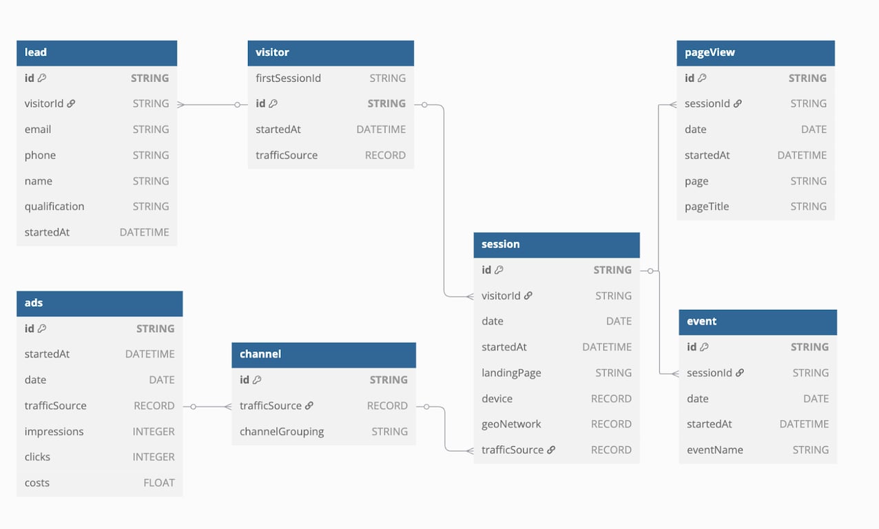
That means less time structuring raw data and more time answering business questions — with full confidence that the numbers are right.
No AI hallucinations — every number is analyst-approved
Because every metric in OWOX flows from deterministic, analyst-approved SQL, there are no hallucinated numbers and no mystery calculations. When a stakeholder asks “where did this come from?”, the answer is always a specific SQL statement the analyst wrote and published.
This patented approach — metrics governed at the data mart level, with a full SQL audit trail — is what makes OWOX fundamentally different from tools that generate numbers from opaque models or AI inference.
Analysts define, marketers self-serve from Sheets
Once an analyst publishes a Data Mart, the whole team can use it without writing a single line of SQL. Through the OWOX Sheets Extension, business users browse the Data Mart Library, join marts using analyst-defined join keys, pick the columns they need, apply filters, and refresh — all inside Google Sheets.
When the analyst updates the mart logic, every connected Sheet refreshes automatically. No more Slack threads asking “which number is right?” No more dashboard clones. One definition, many reports, zero drift.
Data stays in your warehouse, no vendor lock-in
OWOX is warehouse-native. Data lands in your BigQuery, Snowflake, Redshift, Athena, or Databricks environment and stays there. OWOX never copies your data to a vendor cloud.
That means every number in every report traces back to SQL in your warehouse — SQL the analyst owns. If you ever stop using OWOX, you keep the data, the SQL, and the history. No lock-in. No risk of a vendor cutting off historical access.
Why data trust is the real barrier to insight
Why data trust is the real barrier to insight
Without trust, even the most beautiful dashboard becomes background noise. No one wants to act on a number they don’t understand or believe. And when every team sees a different version of the same metric, decision-making grinds to a halt. The problem isn’t the data — it’s the model behind it.
Trust is the foundation of data-driven decisions
Every marketing team wants to be data-driven. But being data-driven isn’t about volume — it’s about confidence. Confidence that the numbers are right. That everyone is seeing the same thing. That metrics reflect shared goals and agreed-upon definitions.
Only when this trust exists can teams move fast, experiment meaningfully, and make decisions backed by truth, not politics.
Build the trust layer once, and let the rest follow
You don’t need to build trust into every dashboard manually. You build it once — in your data mart definitions — and it flows through every report automatically.
This is what mature data organizations do:
Trust isn’t a dashboard feature — it’s a modeling choice. And unlike full-platform semantic-layer projects that take six months to stand up and often stall, data mart-level governance can be in place in days, not quarters.
You don’t need more tools — you need a data model
More BI tools won’t save you. More dashboards won’t align your team. What you need is a consistent foundation — a shared, governed model that everyone uses.
This is where real transformation happens:
Start with the model. Everything else gets easier.
Analyze your marketing metrics with OWOX Data Marts
Analyze your marketing metrics with OWOX Data Marts
If you’re constantly fixing dashboards that break every quarter, spending hours aligning numbers between GA4 and your CRM, or second-guessing every campaign report — it’s time to stop patching symptoms and fix the root cause.
OWOX Data Marts gives your analysts the tools to define clean, governed, reusable data artifacts — and gives every business user a self-serve path to trusted numbers in Google Sheets. Define your metrics once. Apply them everywhere. And finally start reporting like a team that knows what it’s doing.
Turn your data into decisions.
Governed data marts give you the clean foundation ML needs to actually work.
- No AI hallucinations
- Analyst-governed definitions
- Every number traces to SQL
Frequently Asked Questions
Do I need more dashboard tools to fix reporting problems?
No. Adding tools without fixing the underlying logic creates more inconsistencies. The real fix is defining metrics once in a centralized model, so every tool reflects the same trusted data.
How can I reduce the time spent explaining report numbers?
Use a governed data model with clearly defined metrics and consistent logic across tools. This shifts the burden from analysts defending numbers to stakeholders trusting what they see.
What causes mismatches between CRM and analytics platforms like GA4?
CRM systems and GA4 track leads differently, based on timing, interactions, or qualification stages. Without a unified model to reconcile them, you’ll always see discrepancies between source data.
Why do new campaigns keep breaking my reports?
New campaigns introduce unregistered events, inconsistent UTM tags, or new dimensions that static reports can’t handle. A flexible data model helps adapt to campaign changes without manual rework.
How can I make my marketing reports more consistent?
Start by building a shared data model where key metrics are defined, joined, and calculated in one place. When every team pulls from the same logic layer, reports across tools become consistent by design, not coincidence.
Why do the same metrics show different values across tools?
Different tools apply different logic, filters, and attribution rules to calculate the same metric. Without a centralized data model, each platform defines “conversions” or “leads” differently-leading to mismatched numbers across dashboards.