
Mastering Slicers in Google Sheets: The Ultimate Guide
Discover how to add, customize, and use slicers in Google Sheets to filter data efficiently and enhance your spreadsheet experience.


Working with large datasets in Google Sheets can quickly become overwhelming, especially when you need fast, accurate answers. Whether you analyze sales figures, campaign performance, or project timelines, traditional filters often fall short.
Slicers in Google Sheets offer a smarter way to interact with your data, giving you instant control over what you see. With just a few clicks, you can create cleaner, more dynamic reports.
In this guide, you'll learn what a slicer is in Google Sheets, how to use one effectively, and how it compares to traditional filters. Plus, we’ll walk through practical examples, best practices, and troubleshooting tips to help you use slicers like a pro.
What Is a Slicer in Google Sheets?
A Slicer in Google Sheets is a simple, visual tool that helps you filter data in pivot tables, charts, and connected tables. Instead of using dropdown menus or filters in columns, a slicer sits on top of your sheet like a control panel.
You can click to show or hide specific data based on values like region, category, or status. Slicers make it easier to explore large datasets, especially in shared dashboards. They don’t change the original data; they just let you focus on what matters most with a clean, interactive view.
Why Slicers Are Useful in Google Sheets
Slicers bring flexibility, speed, and clarity to your data analysis in Google Sheets. Below are the key ways slicers make your workflow more efficient and insightful.
Filter Data Instantly with Slicers
Slicers allow users to filter data directly on the sheet with just a click; no need to open complex menus or adjust the dataset. This makes filtering quick, accurate, and user-friendly. Slicers are ideal for anyone exploring data on the go without editing the spreadsheet's structure.
Build Dynamic Dashboards with Slicers
With slicers, dashboards become fully interactive. Users can adjust views by selecting categories, dates, or statuses, and the charts and pivot tables respond immediately. This makes dashboards more flexible and better suited for real-time analysis, all without the need for duplicated sheets or manual filtering.
Enhance Data Visualization with Slicers
Large spreadsheets can overwhelm users, especially when multiple filters are involved. Slicers improve visual clarity by displaying only the data relevant to a user’s selection. This enhances the readability of pivot tables and charts, helping viewers focus on the most important insights.
Save Time with Slicers
Slicers reduce the time spent navigating menus or modifying formulas by simplifying how filters are applied. Users can switch between different views quickly, which speeds up routine reporting and analysis tasks. For busy professionals, this time-saving feature is a major advantage.
Enhance Collaboration with Slicers
In shared Google Sheets, slicers give each user the ability to explore the data in their own way without disrupting others. This makes it easier to collaborate on reports, presentations, or dashboards. The original dataset stays untouched, avoiding confusion and maintaining data integrity across the team.
Here's How to Add and Customize a Slicer in Google Sheets
Adding a slicer in Google Sheets is quick and straightforward. This section describes the exact steps to insert, customize, and link slicers for smarter data filtering.
Steps to Add a Slicer in Google Sheets
Adding a slicer in Google Sheets is simple and helps you filter data efficiently.
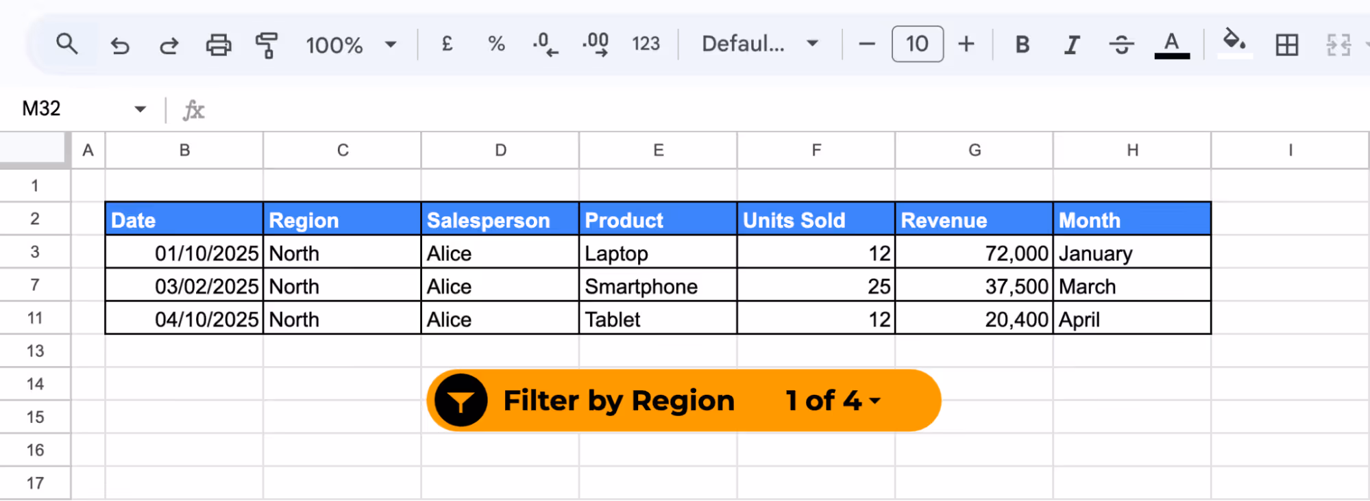
Imagine a sales manager is tracking sales across multiple regions in a monthly report. With a slicer, he can instantly view data for just one region, like “North”, without editing anything.
Follow these steps to create an interactive filtering tool on your sheet:
Step 1: Open Your Google Sheet
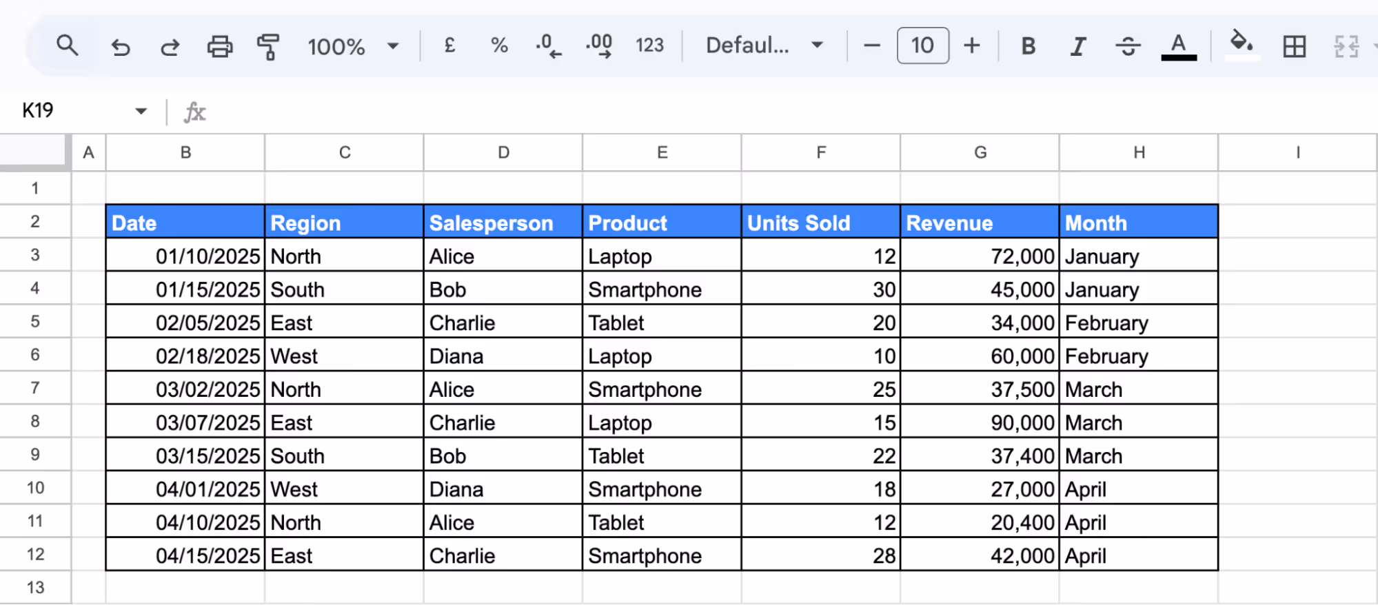
Open your spreadsheet containing a structured dataset. Slicers work best with clean, tabular data or pivot tables where columns represent categories like Region, Product, or Status.
Step 2: Select the Data Range
Click anywhere inside the dataset you want the slicer to control. This ensures the slicer links to the correct data.

Step 3: Insert a Slicer
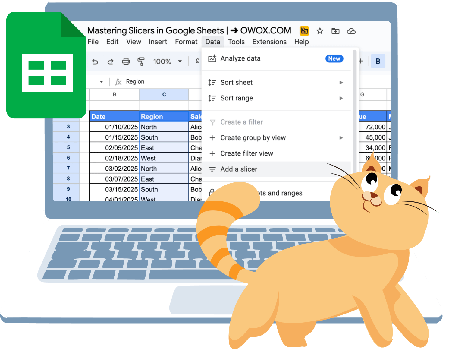
- Go to the top menu and click Data.
- From the dropdown, select Add a Slicer.
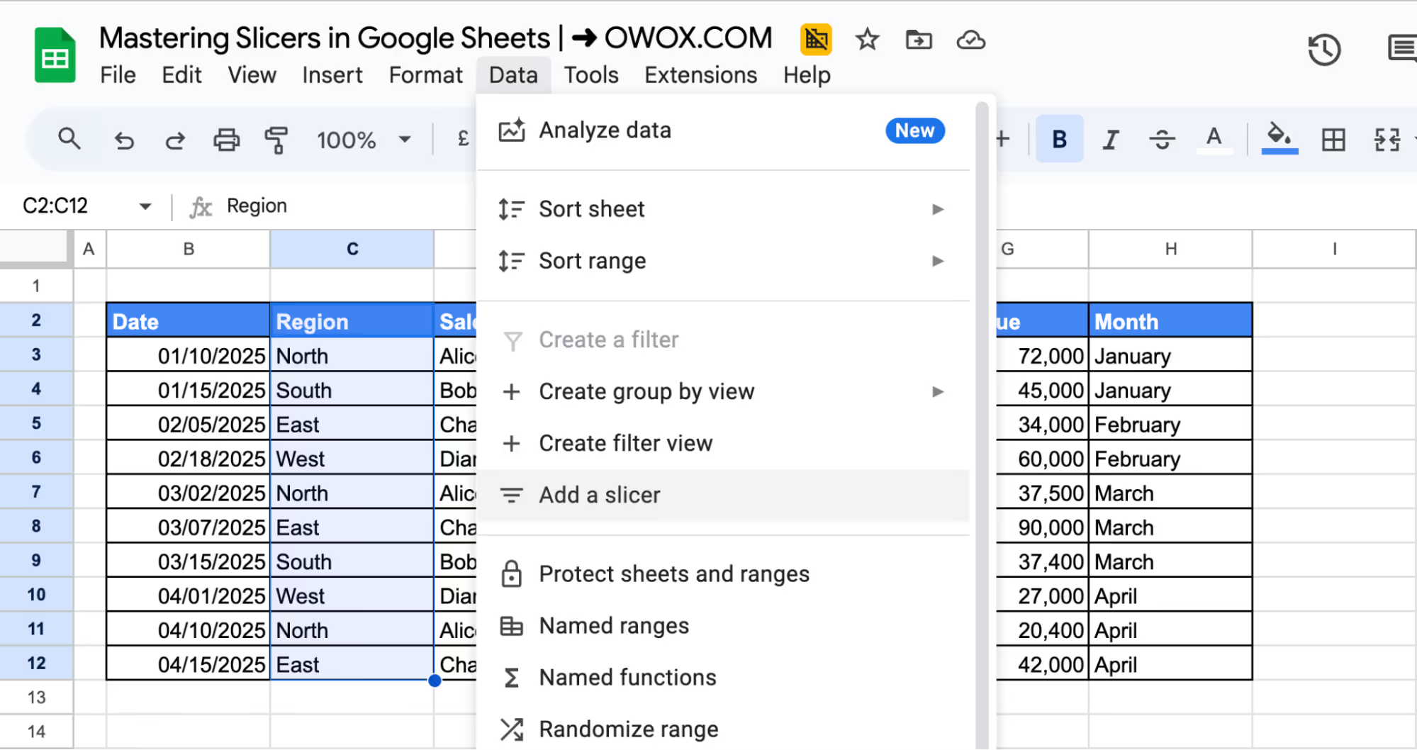
- A slicer box will appear on your sheet, along with a settings panel on the right.
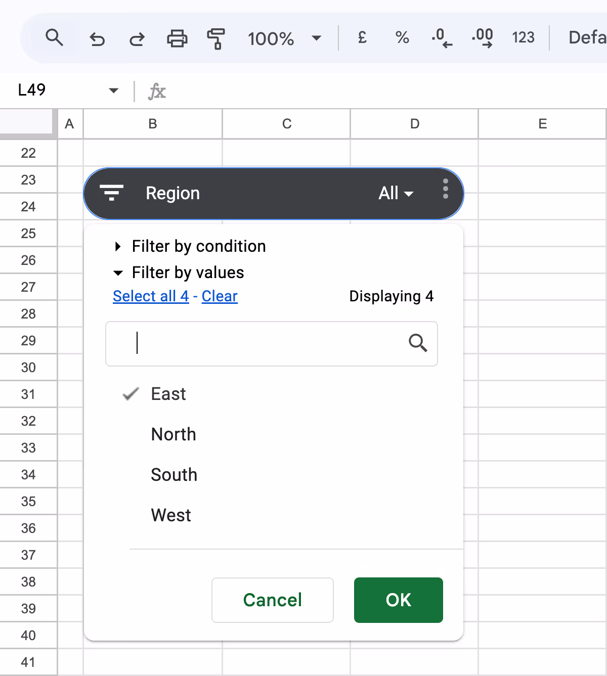
Step 4: Choose the Column to Filter
- In the Slicer settings panel, click the dropdown under Column.
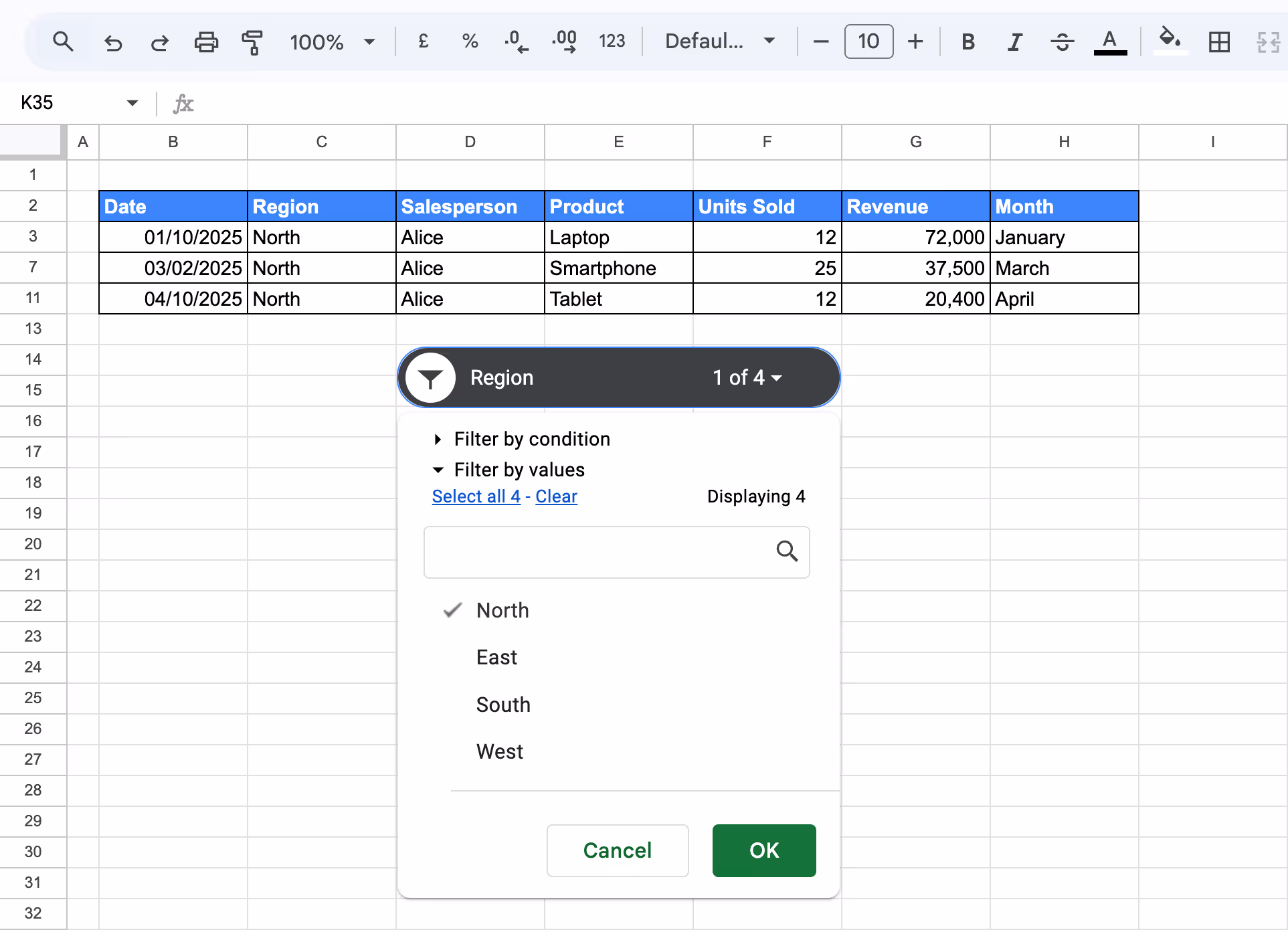
- Choose a column to filter by, for example, Region, Salesperson, or Month. Here, we have chosen ‘Region’.

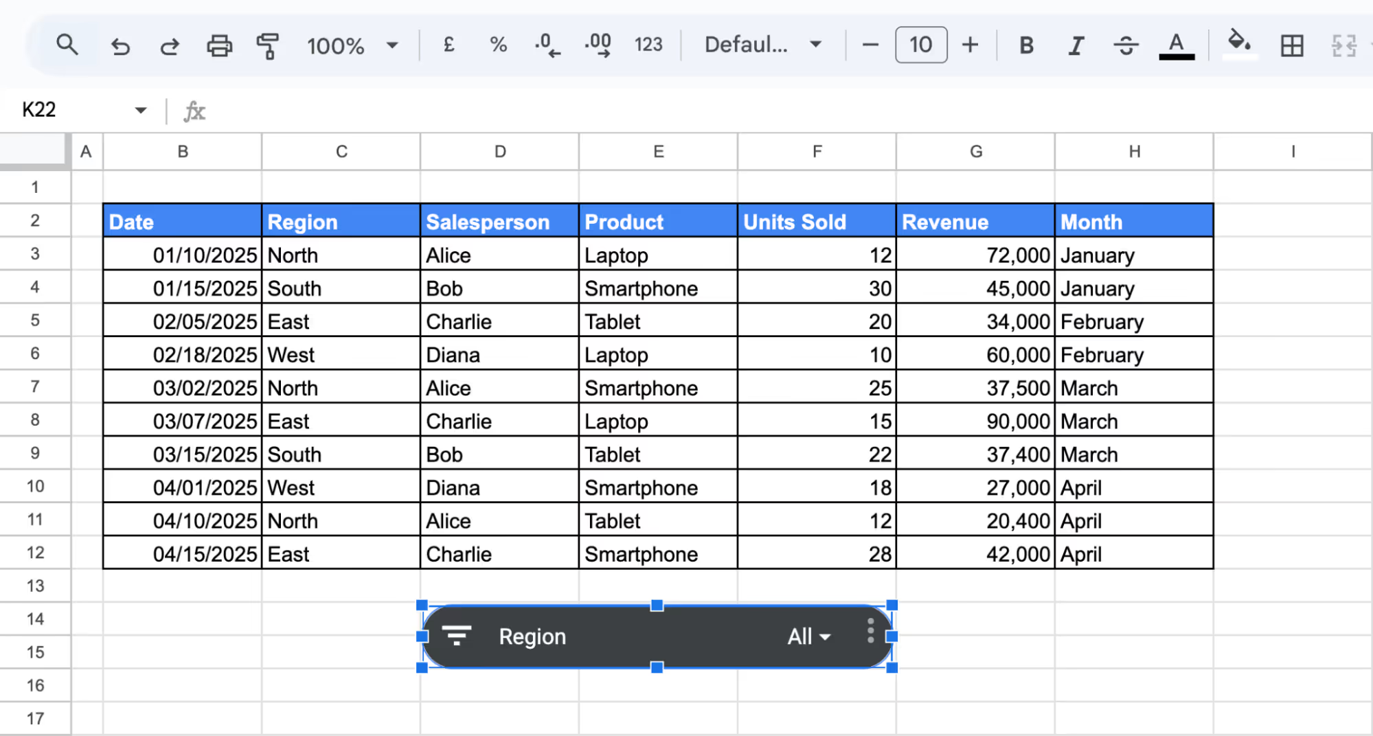
Step 5: Position the Slicer
Drag the slicer box to a convenient location on your sheet, typically near your Dataset. Resize it as needed for better readability.
Step 6: Use the Slicer to Filter Data
Click the slicer’s dropdown arrow and deselect all values except North. The connected table or chart will update automatically based on the selection.
Using a slicer makes it easy to filter data with just a click; no formulas or manual edits are required. It's a simple way to create dynamic, user-friendly reports in Google Sheets.
Please Note: Google Sheets slicers do not retain user selections after the sheet is closed and reopened. When the file is reopened, all slicers revert to their default state, showing all data instead of any previously applied filters.
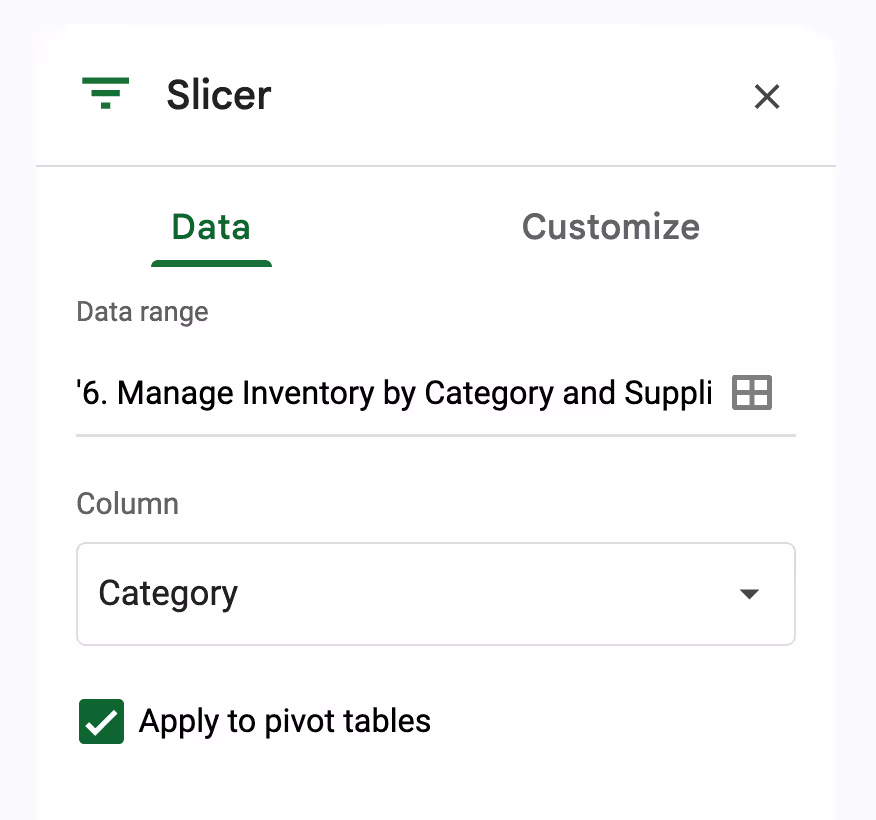
Customizing the Slicer in Google Sheets
Once your slicer is added, you can easily customize it to improve functionality and visual appeal.
Click on the slicer box and select the three-dot menu in the corner, then choose “Edit slicer”. This opens the Slicer sidebar, where you'll find two tabs: Data and Customize.
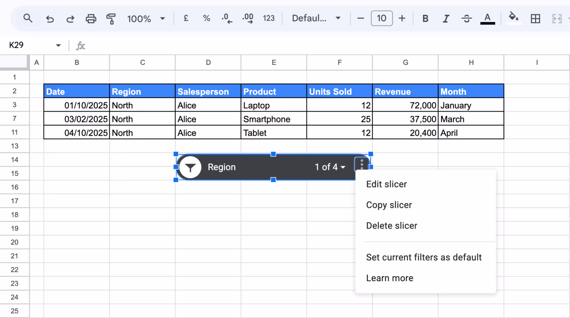
This opens the Slicer sidebar, where you'll find two tabs: Data and Customize.
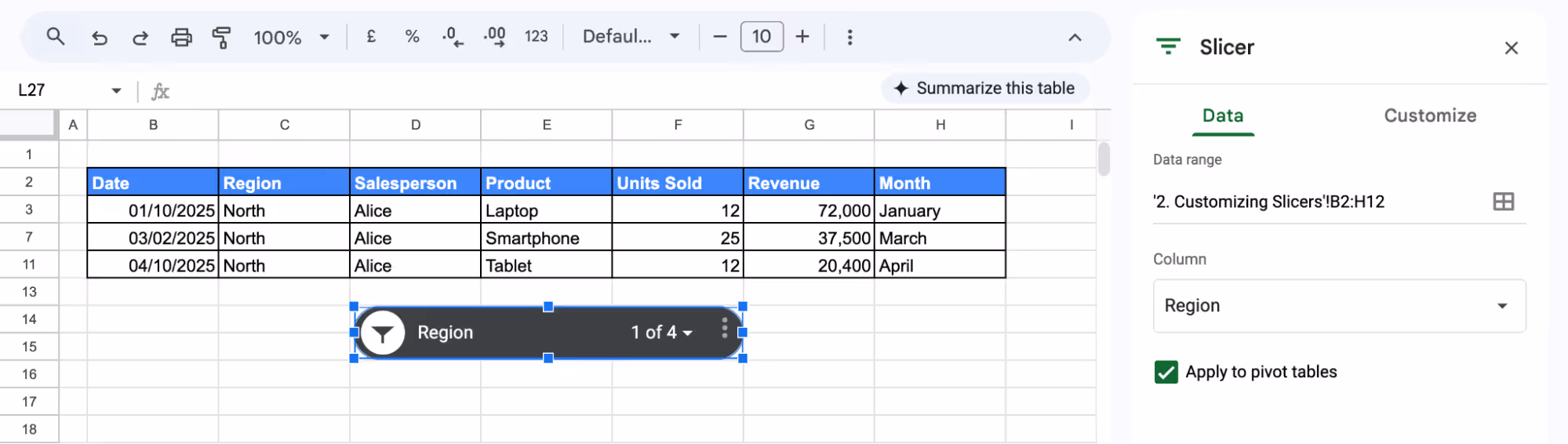
In the Data tab, you can:
- Set the column to filter to Region.
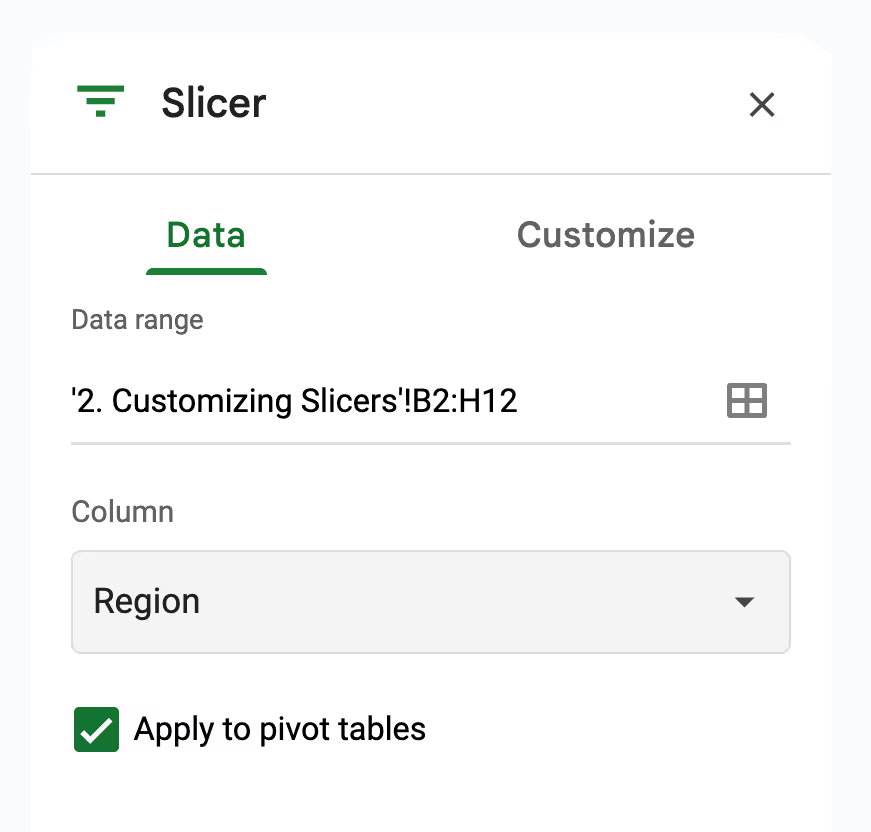
- Adjust the data range if your dataset grows.
In the Customize tab, you can:
- Edit the title to something like "Filter by Region"
- Change font size, style, or text alignment.
- Apply background colors or borders to make it stand out on your sheet.
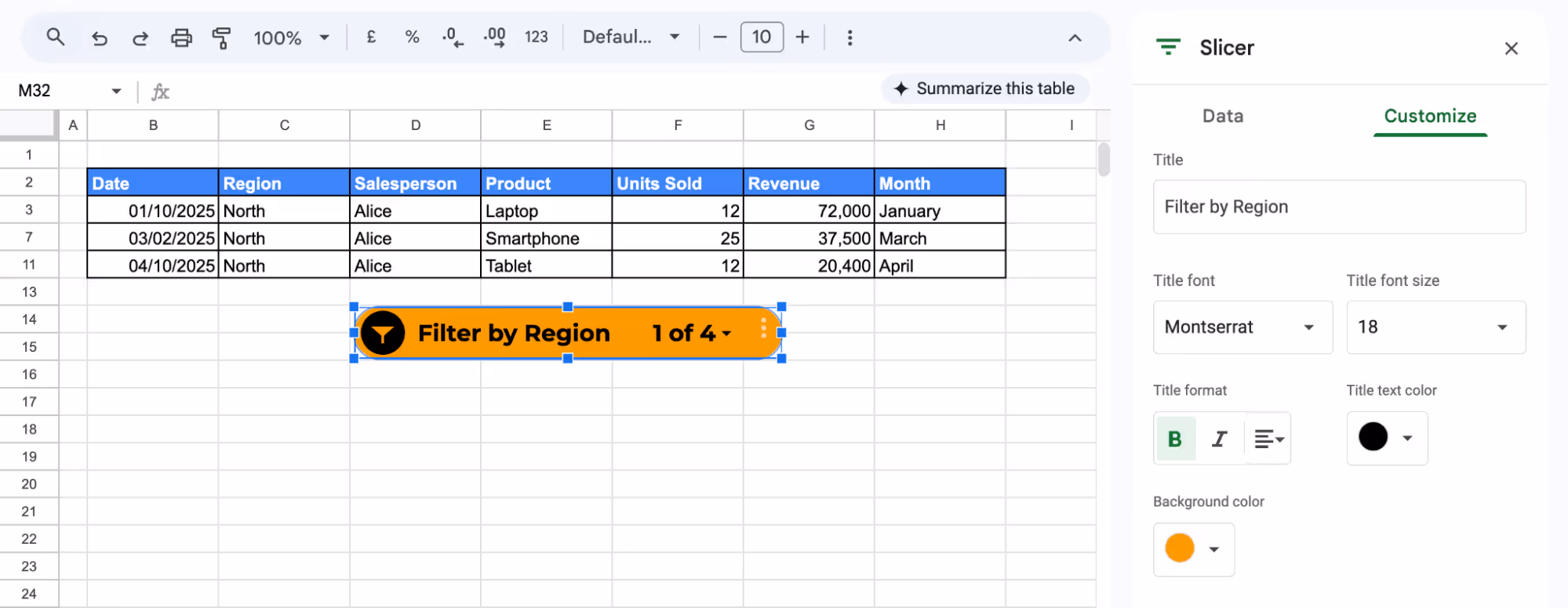
For example, if you're filtering sales data by region and want to focus on North, customize the slicer with a bold title and bold background color. This makes the filter more intuitive and visually aligned with your dashboard layout.
Linking to Multiple Pivot Tables
In Google Sheets, you can connect a single slicer to multiple pivot tables to control data filtering consistently across all of them. This is especially useful when building reports that analyze the same dataset from different angles.
Let's assume a sales manager wants to review January’s performance. Instead of manually adjusting each pivot table, they use a Month slicer. With one click, they can instantly compare who contributed the most revenue and which products drove the highest volume, all in the same view.
Step 1: Use a Shared Dataset
Make sure both pivot tables pull from the same data range – in this case, the original data sheet (with columns like Date, Region, Salesperson, etc.). This is essential for the slicer to work across both.
Step 2: Create Two Pivot Tables on the Same Sheet
Highlight your full dataset (including headers) and go to Insert > Pivot table. Choose a New sheet, and place Pivot Table 1 in one area and Pivot Table 2 slightly below or beside it.
For Pivot Table 1:
- Rows: Salesperson
- Values: Revenue (SUM)

This table will show how much revenue each salesperson has generated.
For Pivot Table 2:
- Rows: Product
- Values: Units Sold (SUM)
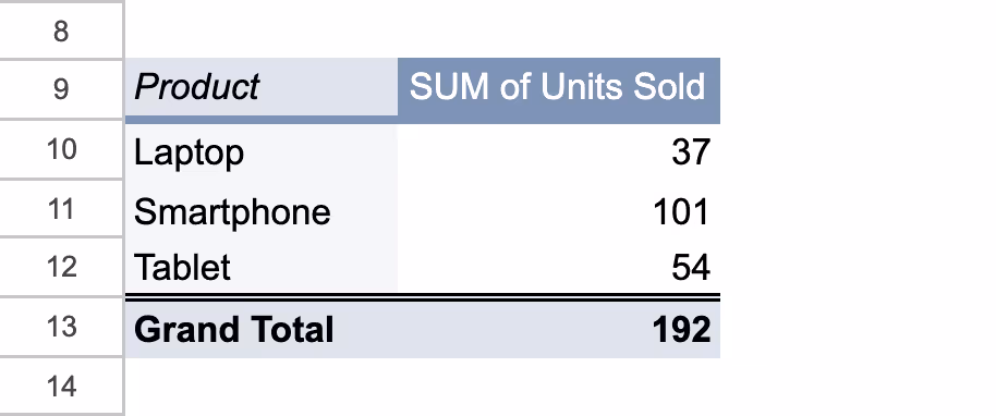
Now you have two pivot tables pulling from the same source, ready to be filtered together.
Step 4: Add a Slicer
- Click inside one of the pivot tables
- Go to Data > Add a slicer
- A slicer box will appear, and the Slicer settings panel will open on the right.

Step 5: Configure the Slicer
In the slicer settings panel:
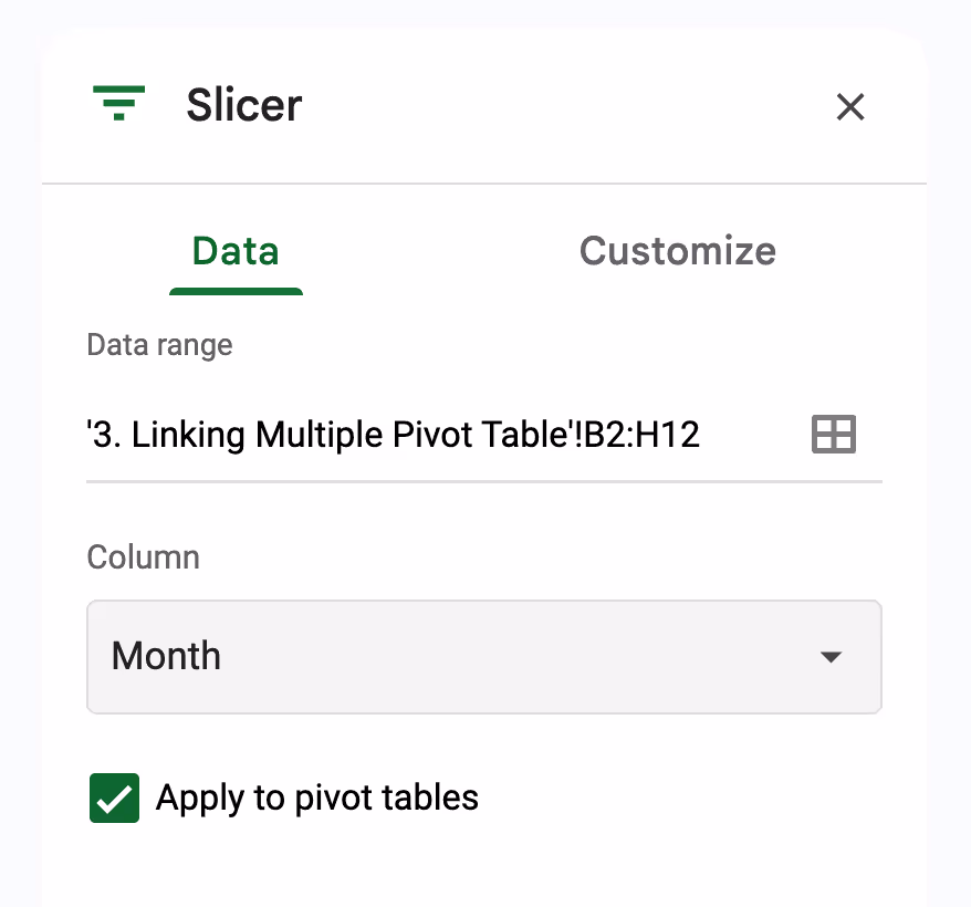
- Ensure the data range matches your full dataset
- Choose a column to filter by, such as Month, and the slicer will let you filter both pivot tables by January, February, March, and April.
Step 6: Test the Slicer
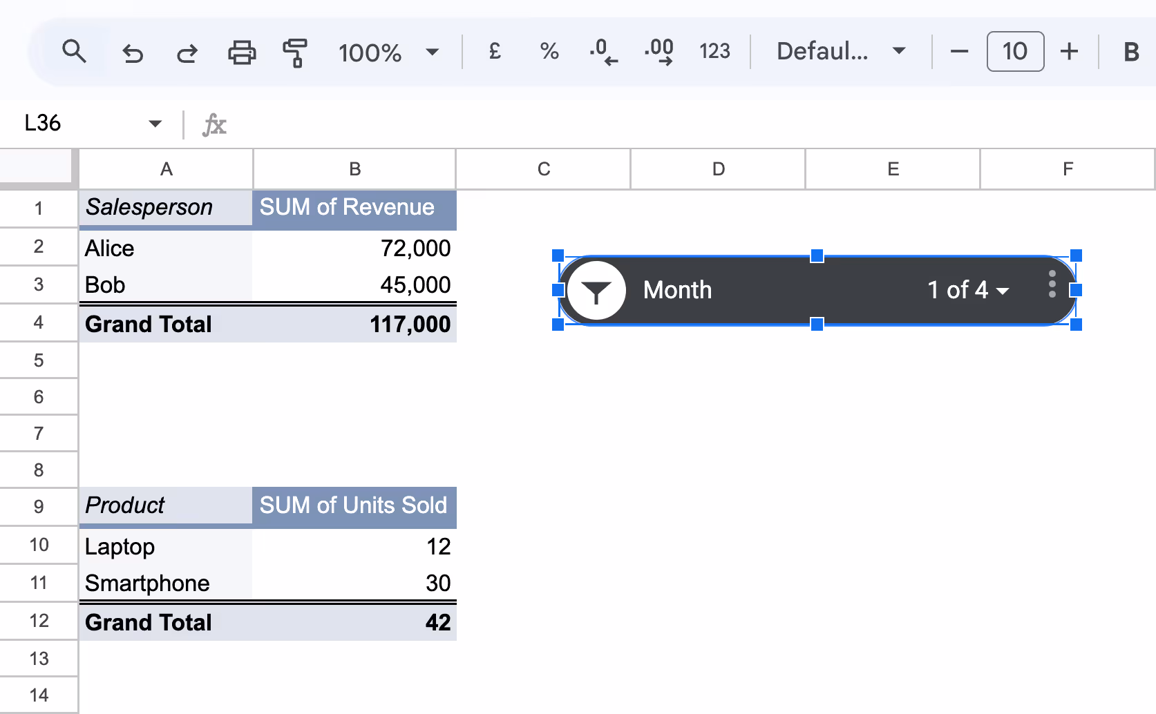
Use the dropdown arrow in the slicer box to select a Month like January.
Both pivot tables will instantly update to show only the data from that region, without you having to manually filter each one.
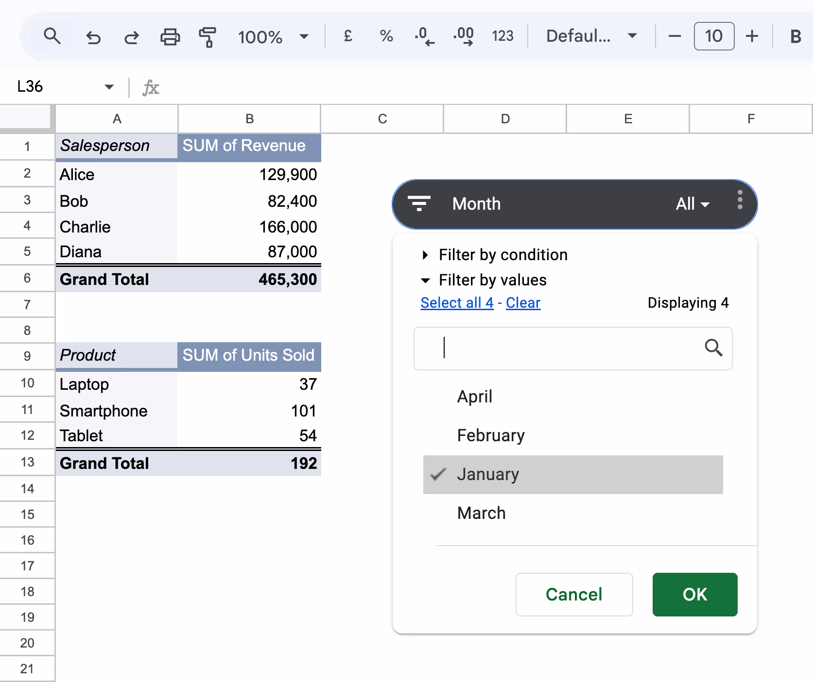
By linking both pivot tables to a single slicer filtered by Month, you can instantly view performance for a specific period, like January, across multiple tables.
💡 Looking to simplify your analysis and build dynamic reports faster? Learn how to organize, summarize, and visualize your data like a pro with this hands-on guide.
👉 Read the full article and take your Google Sheets skills to the next level!


Practical Examples of Using Slicers in Google Sheets
Slicers in Google Sheets aren’t just for filtering. They’re powerful tools for building interactive, user-friendly reports. Here are some practical examples of how they can simplify real-world analysis.
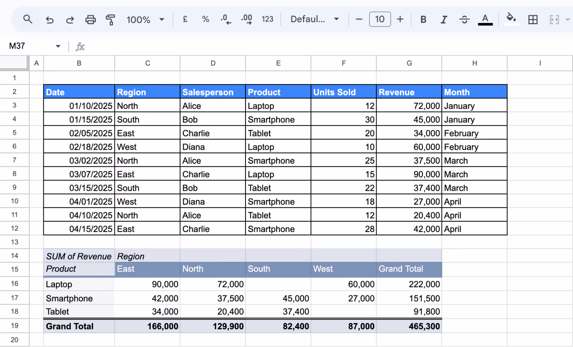
Filtering Sales Data by Region and Product
If you're tracking sales across various regions and product categories, keeping reports flexible is key. Slicers in Google Sheets make it easy to filter and analyze performance in just a few clicks. Whether you're comparing revenue by region or focusing on a single product line, slicers help you explore insights without manually adjusting your data.
Let’s say you're reviewing a monthly sales summary. You want to compare revenue from different regions or focus on a specific product, such as Tablets in the East. Instead of applying manual filters each time, slicers let you switch views with a single click.
1. Create a Pivot Table
- Select your full dataset (including headers)
- Go to Insert > Pivot table and choose to place it on an existing sheet
- In the Pivot Table Editor:
- Rows: Select Product
- Columns: Select Region
- Values: Add Revenue (Summarize by SUM)
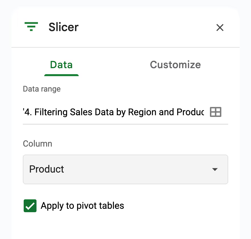
2. Add a Slicer for Region
- Click inside the pivot table
- Go to Data > Add a slicer
- In the Slicer settings panel, set the filter column to Region.

3. Add a Slicer for Product (optional but recommended)
- Repeat the steps above
- Set the filter column to Product
4. Use the Slicers
- Click the dropdown on the Region slicer and choose “East”
- Do the same on the Product slicer and select "Tablet"

The pivot table will update instantly to show revenue for Tablets in the East region only. With this setup, you can review any product or region in seconds, with no need to recreate or edit your pivot each time.
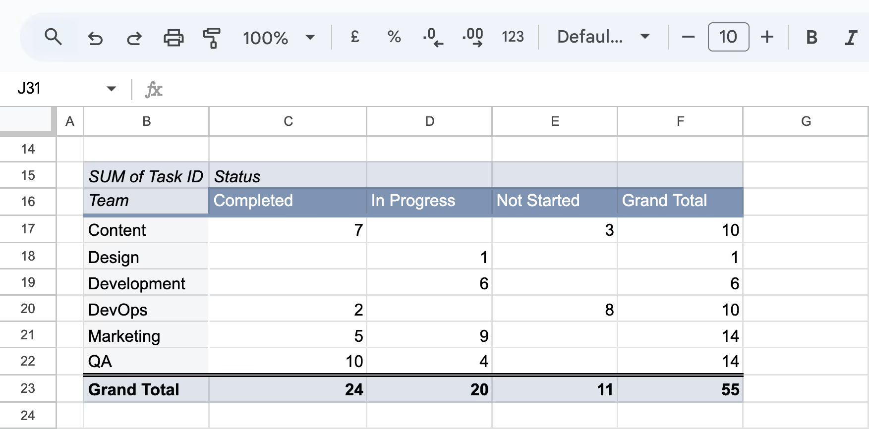
Track Project Tasks by Team and Status
If you're managing multiple teams and projects, keeping a clear view of task progress is essential. Slicers in Google Sheets can help you filter tasks by team or status in real-time, making it easier to monitor workloads, identify bottlenecks, and prioritize action.
Let’s say a project manager is overseeing a cross-functional team and needs to quickly assess which departments are still working on their assignments or identify tasks currently marked as “In Progress.”
1. Create a Pivot Table
- Select your full dataset
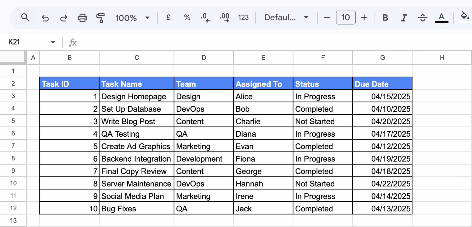
- Go to Insert > Pivot table, and place it on an existing sheet
- In the Pivot Table Editor:
- Rows: Select Team
- Columns: Select Status
- Values: Add Task ID (Summarize by COUNTA)
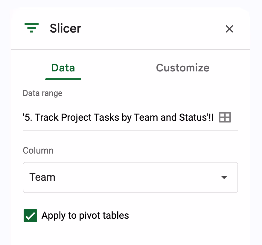
2. Add a Slicer for Team
- Click inside the pivot table
- Go to Data > Add a slicer
- In the Slicer settings panel, set the filter column to Team
3. Again, Add a Slicer for Status
- Set the filter column to Status

4. Use the Slicers
- Click the dropdown on the Team slicer and choose “DevOps”
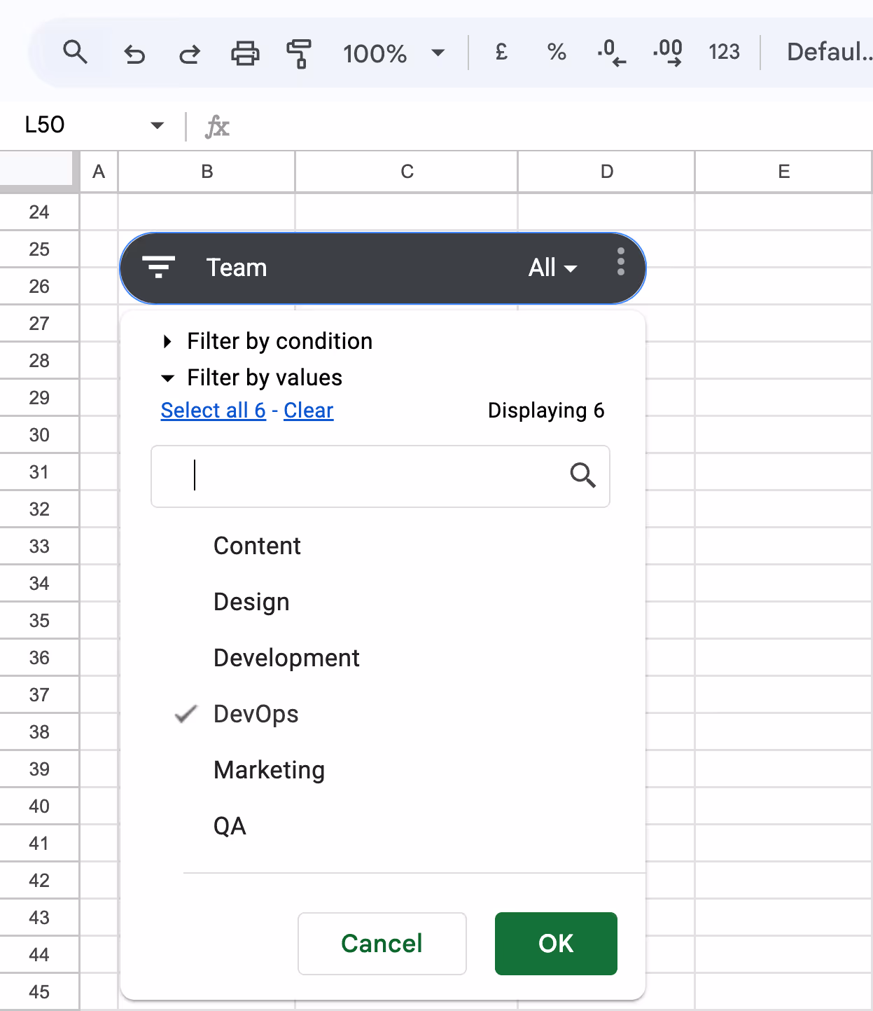
- Do the same on the Status slicer and select “Completed”
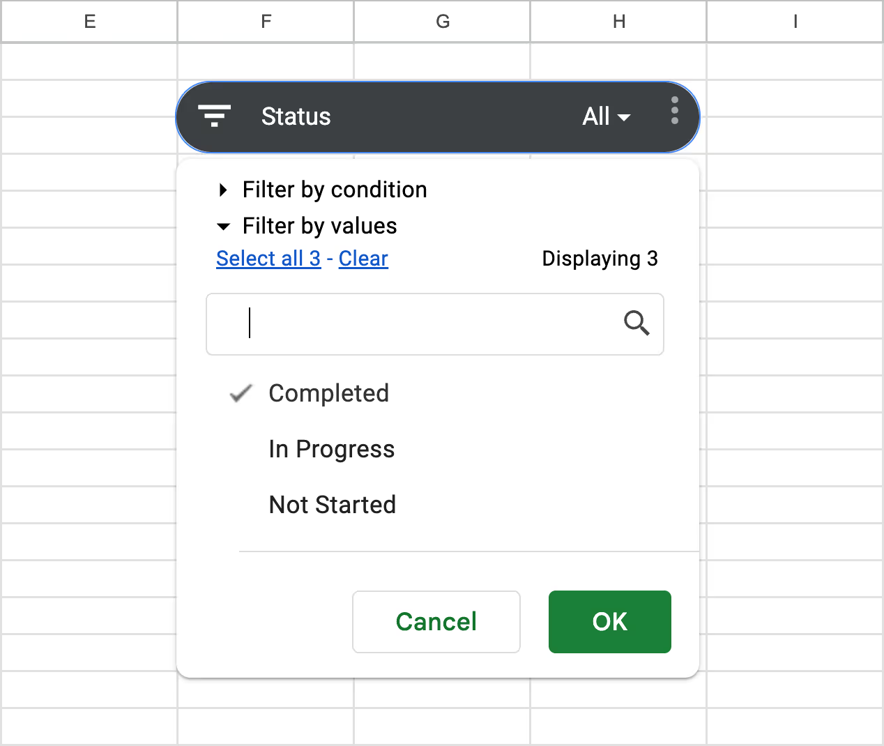
With this setup, you can quickly drill down into any team or task status, without touching your pivot logic. It's a simple, visual way to manage task loads and keep project progress transparent.
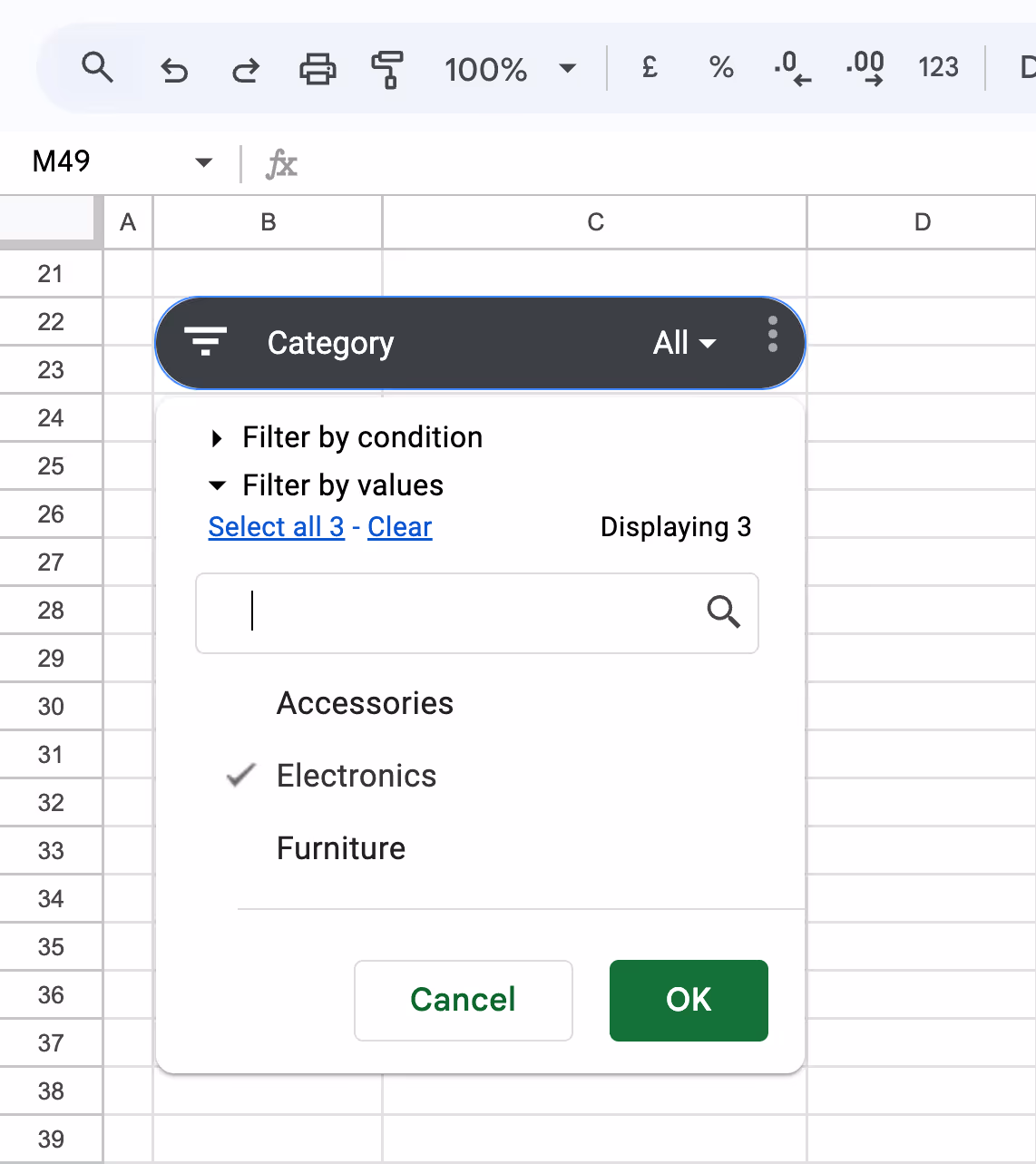
Manage Inventory by Category and Supplier
When managing inventory, slicers help in checking stock levels for specific categories or suppliers, making it easier to plan restocks without sifting through all the data.
Let’s say an inventory manager wants to review how much stock is available across different product categories, or filter the view to only show items supplied by TechZone. Instead of scanning rows or using manual filters, slicers allow quick toggling by category or supplier, making stock tracking far more efficient.
1. Create a Pivot Table
- Select your full inventory dataset
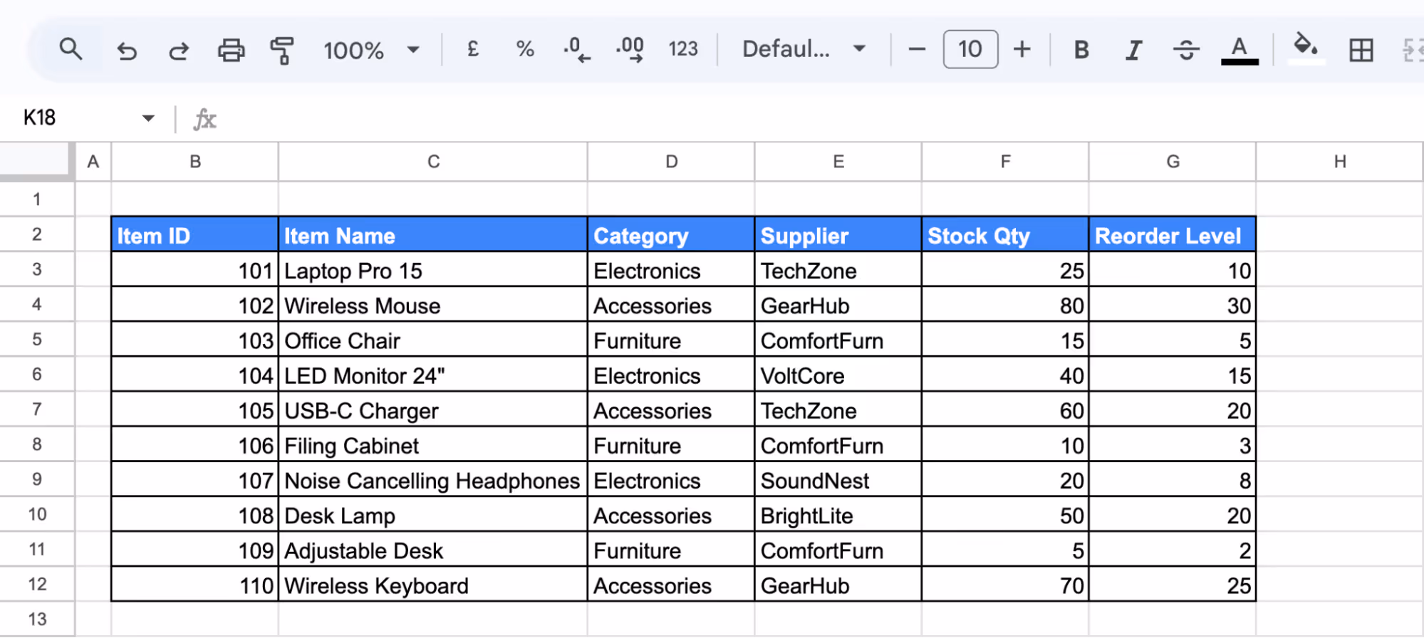
- Go to Insert > Pivot table, and place it on an existing sheet
- In the Pivot Table Editor:
- Rows: Select Category
- Columns: Select Supplier
- Values: Add Stock Qty (Summarize by SUM)
2. Add a Slicer for Category
- Click inside the pivot table
- Go to Data > Add a slicer
- In the Slicer settings panel, choose Category as the filter column
3. Add a Slicer for Supplier
- Set the filter column to Supplier

4. Use the Slicers
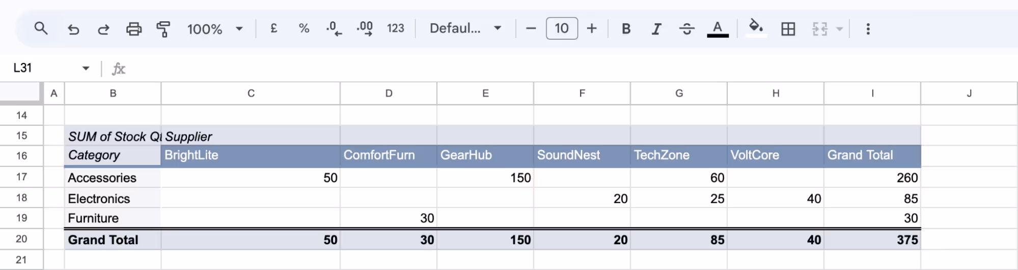
- Click the Category slicer and select “Electronics”
- Click the Supplier slicer and choose “TechZone»
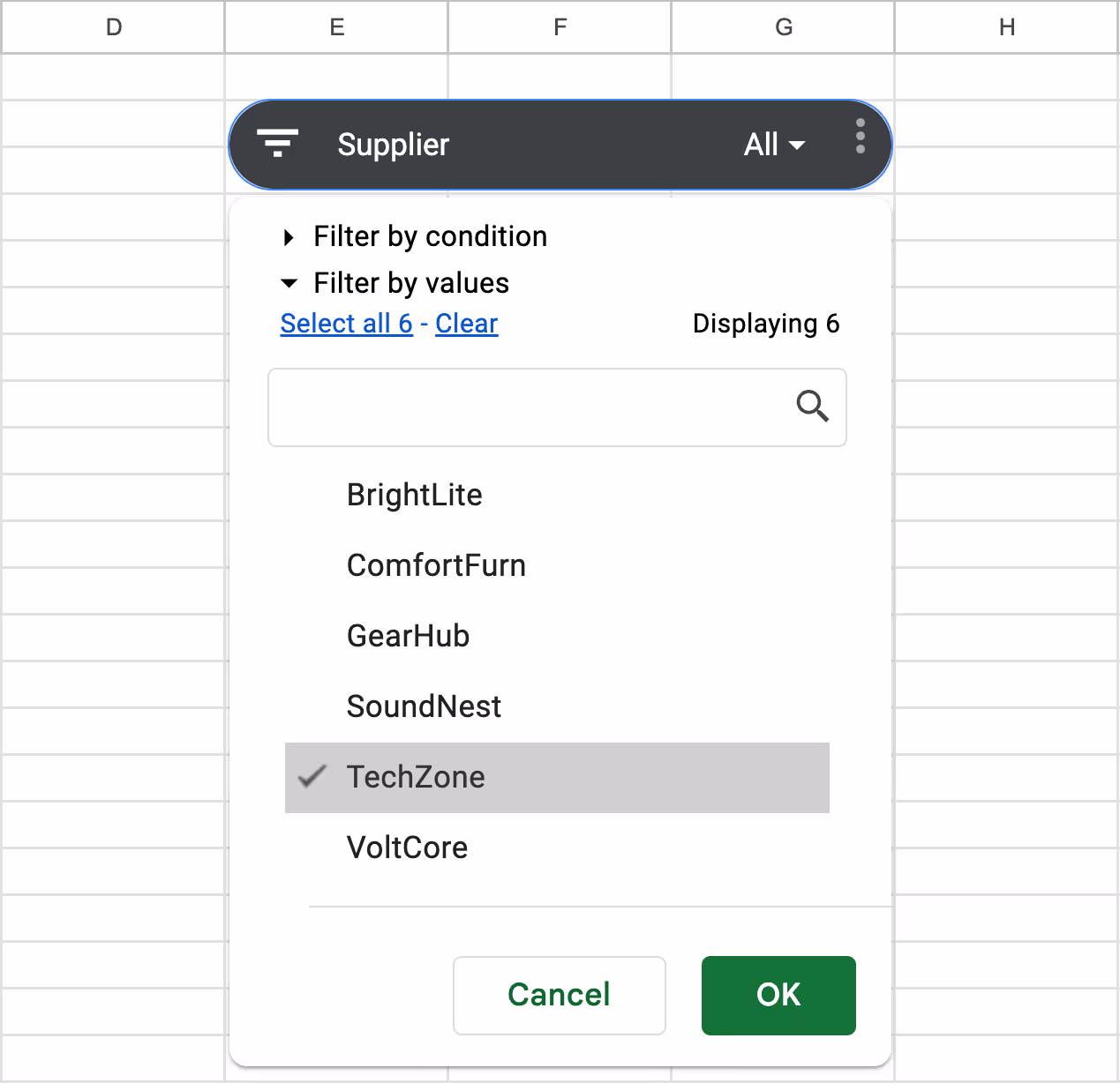
With this setup, your inventory dashboard becomes much more dynamic. You can check specific product availability, supplier contributions, and reorder needs in just a few clicks.
Slicers vs. Filters: Key Differences and When to Use Each in Google Sheets
Slicers and Filters narrow down data in Google Sheets, but they serve different purposes. Understanding the strengths of each helps choose the right tool for any task.
Interactivity and User Experience
Slicers offer a highly interactive experience. They are easy to click, update in real-time, and don’t require users to open menus or understand the sheet’s structure. Filters, however, need manual adjustments and are better suited for those actively editing or preparing the data.
Data Range and Sheet Impact
Slicers are applied to specific pivot tables or charts and don’t interfere with the rest of the sheet. Filters typically apply across columns and can affect multiple parts of the sheet. In shared environments, this can lead to confusion or accidental changes to others’ views.
Visual Appearance
Slicers appear as standalone boxes on the sheet, making filtering options visible at a glance. This adds to the dashboard-like feel. Filters, in contrast, are built into column headers and are less noticeable, making it harder for users to identify what’s being filtered.
Persistence
Slicer selections remain active even when the sheet is refreshed or reopened, which is helpful in shared or presentation-based documents. Filters, however, often reset after closing or when another user makes changes, making them less reliable for consistent, long-term views.
Purpose and Practical Applications
Slicers are ideal for visual reporting, dashboards, and collaborative views where users explore data without making changes. Filters are best for behind-the-scenes work like cleaning data, sorting lists, or preparing content. Each has value, depending on the goal of your spreadsheet.
When to Use Slicers Instead of Filters?
Slicers are ideal when sharing dashboards with others who need to explore data without editing the sheet. View-only users can interact with slicers, adjusting filters visually without altering the data structure.
They’re also helpful when applying multiple filters at once or needing filters that stay active after refresh. Unlike standard filters, slicers are always visible, reusable, and better suited for collaborative or presentation-ready reports.
💡 Want to filter data in Google Sheets using formulas instead of menus? Learn how the FILTER function works with clear examples and real use cases. Read the full guide to simplify dynamic data analysis like a pro.

Common Issues and Fixes for Slicers in Google Sheets
Even with a clean setup, slicers in Google Sheets can sometimes cause confusion or stop working as expected. Here are the most common problems users encounter and how to fix them with simple, effective steps.
Slicer Not Filtering Correctly
❌ Issue: If a slicer isn’t changing the view of your pivot table or chart, it’s likely not linked to the correct column or data range. This often happens when the pivot table doesn’t include the field selected in the slicer.
✅ Fix: Open the slicer settings and confirm the selected column exists in the pivot table. Double-check that the data range includes all relevant rows and columns. If needed, adjust the pivot table to reflect the field you want to filter by.
Slicer Not Responding
❌ Issue: Sometimes, clicking on a slicer does nothing; no dropdown appears, or no changes occur in the sheet. This can be caused by minor technical issues like a browser glitch, an outdated sheet version, or temporary internet connectivity problems.
✅ Fix: Refresh the browser tab or reopen the spreadsheet. If the issue continues, try removing and reinserting the slicer. Updating Google Sheets or switching browsers may also help resolve responsiveness problems.
Overlapping Slicers Causing Clutter
❌ Issue: When multiple slicers are placed too close together, they can overlap and crowd the spreadsheet. This makes it hard for users to tell which slicer controls which data, especially in larger dashboards.
✅ Fix: Position slicers in a clean, dedicated sheet section, such as the top or side margin. Resize each slicer so all labels and values are easy to read. Group related slicers together to create a clear, organized layout.
Best Practices for Using Slicers in Google Sheets
Slicers are powerful, but using them well takes a bit of planning. These best practices will help you get the most out of slicers, whether sharing reports with others or exploring data independently.
Keep Slicers Simple and Relevant
Avoid adding too many slicers to a single sheet. Focus on the key dimensions your team needs to filter, like region or product type. This keeps your dashboard clean, easy to use, and avoids confusing viewers with too many options.
Use Clear Labels for Slicer Fields
Always give slicers clear, descriptive labels. Instead of a generic title like “Category,” use something more helpful like “Select Product Category.” This helps users understand what they’re filtering and makes your dashboard more organized and user-friendly.
Enhance Slicers with Conditional Formatting
Pair slicers with conditional formatting to highlight important data. For example, use color to call out high-performing sales or overdue tasks, then filter with a slicer to narrow the view. This makes your spreadsheet more visual and easier to interpret.
Experiment with Slicer Settings
Try different slicer settings, like filtering by values or conditions. Adjust the display layout or sort order to see what works best for your report. Small changes in slicer behavior can help you uncover trends or make filtering more efficient.
Regularly Update and Validate Data Sources
Slicers rely on clean, accurate data. Make sure your source ranges are up to date and correctly formatted. Fix missing or incorrect values to avoid filter issues and keep your dashboards running smoothly without disruptions.
Must-Know Google Sheets Functions for Smarter Data Workflows
Working with large datasets in Google Sheets becomes much easier when you know which functions to use. These built-in tools help you search within cells, calculate key metrics, and automate tasks without repetitive formulas.
- SEARCH: Helps locate the position of a specific text within a string, useful for identifying keywords or tags in names, descriptions, or comments.
- SUM: Calculates the total of all numeric values in a given range, ideal for adding up sales, revenue, hours worked, or quantities.
- AVERAGE: Returns the mean value from a list of numbers, helping you find trends like average order value or performance scores.
- CONCATENATE: Merges two or more text strings into one, simplifying the process of creating full names, combined labels, or custom IDs.
- ARRAYFORMULA: Automatically applies a formula to an entire range of cells, making it perfect for scaling calculations without manual repetition.
- COUNTA: Counts all non-empty cells in a range, helping track the number of entries, responses, or items filled in a dataset.
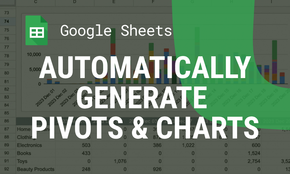
Streamline Your Data with OWOX: Reports, Charts & Pivots Extension
Supercharge your data analysis with a tool that makes it easy to build dynamic reports, charts, and pivot tables, all within Google Sheets. Whether you're analyzing sales performance, tracking marketing KPIs, or summarizing financials, this solution helps you structure and visualize your data in just a few clicks.
Designed for accuracy and speed, OWOX Reports automates repetitive tasks, reduces errors, and offers deep customization options for cleaner, more impactful dashboards. With clear visuals and real-time data handling, you can spot insights faster and make confident decisions without switching between tools.
Frequently asked questions


Finally, a tool that doesn't ask business users to learn a new dashboarding UI. Our marketing team already knows Sheets. OWOX just delivers the right data.
Joinable data marts concept was the thing that sold us. We can now use the semantic layer without building one.
Self-hosted the OSS version on Digital Ocean. Zero vendor lock-in. Contributed a Shopify connector back in week two.