
How to Use SPARKLINE in Google Sheets for Data Visualization
Create mini charts in Google Sheets using SPARKLINE. Explore line, bar, and win/loss charts, plus SQL integration with OWOX Reports for automation.


Ever wished you could show trends, progress, or comparisons right inside a Google Sheets cell, without inserting bulky charts? That’s precisely what the SPARKLINE function lets you do. Whether you're managing marketing metrics, tracking sales performance, or reviewing project timelines, sparklines help turn raw numbers into compact visuals.
In this article, you’ll learn how to create and customize sparklines using real data. We’ll walk through different chart types, line, bar, column, win/loss, and share advanced tips, formulas, and automation techniques using OWOX Reports. If you want clean, actionable insights inside every cell, this guide is for you.
Understanding SPARKLINE in Google Sheets
Sparklines are a handy way to show small charts inside a cell. They let you highlight changes, patterns, or comparisons without building full charts. This makes them useful for things like dashboards, reports, or daily logs where space is tight.
Why use sparklines:
- Fits into small spaces – Useful when you don't have room for full charts
- Highlights trends at a glance – Makes it easy to notice changes or outliers
- Keeps up with your data – Updates automatically as values change
- Simple to set up – One formula creates the entire chart
- Flexible formats – Use lines, bars, columns, or win/loss styles depending on what you need
Syntax of Sparkline
The syntax for the SPARKLINE function in Google Sheets is:
=SPARKLINE(data, [options])
Let’s break it down:
- data – This is the range of numeric values you want to visualize. It can be a single row, column, or array of values.
- options (optional) – A set of key-value pairs used to customize the sparkline. This includes chart type, color, axis, line width, and more.
If no options are provided, Google Sheets creates a basic line chart by default using the data range.
Example of Sparkline
To start, let’s use a basic line sparkline to show how a customer's sales have changed over the past 10 months. This helps track performance trends in a compact, cell-based format, ideal for dashboards or client summaries.
Formula:
=SPARKLINE(C3:L3)
Assuming C3:L3 contains monthly sales data for the first customer (Alice).
Here,
- SPARKLINE – The function used to generate the in-cell chart.
- C3:L3 – This range includes Alice’s monthly sales from January to October.
Since we didn’t include any additional options, this creates a default line sparkline.
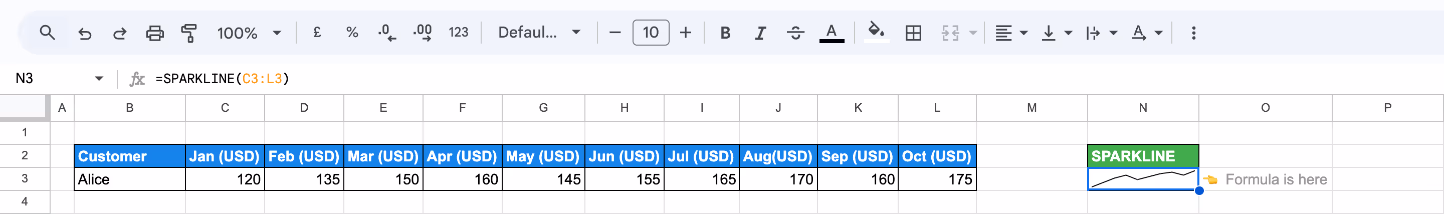
You’ll get a small line chart inside the cell showing the trend of Alice’s revenue across 10 months. Spikes and dips will appear based on the monthly values.
Curious how to turn your pivot tables into clear, visual insights?
Learn how to create and customize pivot charts in Google Sheets, step by step.
Whether you're reporting to stakeholders or just making trends easier to spot, this guide walks you through it all.
Importance of SPARKLINE Function in Google Sheets
Sparklines are a smart way to add quick visuals directly into your data tables. They help highlight trends, changes, or comparisons without needing extra charts or tools. Whether you're working with sales reports, campaign metrics, or task trackers, sparklines make insights easier to see at a glance.
Here’s why sparklines are so helpful:
- Save space by fitting charts inside single cells
- Spot trends quickly without scanning rows of numbers
- Highlight key values like peaks or drops using color
- Compare multiple items side by side across rows
- Update in real time as your data changes
- Work across chart types, line, bar, column, or win/loss
Practical Examples of Using SPARKLINE Charts in Google Sheets
In this section, you'll learn how to build line, column, bar, and win/loss charts using real sales data, perfect for dashboards, quick analysis, or compact reporting.
Line Charts
Line charts are the default chart type for SPARKLINE in Google Sheets, so you don’t need to specify the chart type explicitly. They are ideal for quickly visualizing trends, such as monthly performance or customer activity.
Example setup:
We’ll use line sparklines to visualize monthly sales trends for each customer across the January to October period using their row data.
Formula:
=SPARKLINE(C3:L3)
Drag this formula down for other rows like Bob, Charlie, Diana, and so on.
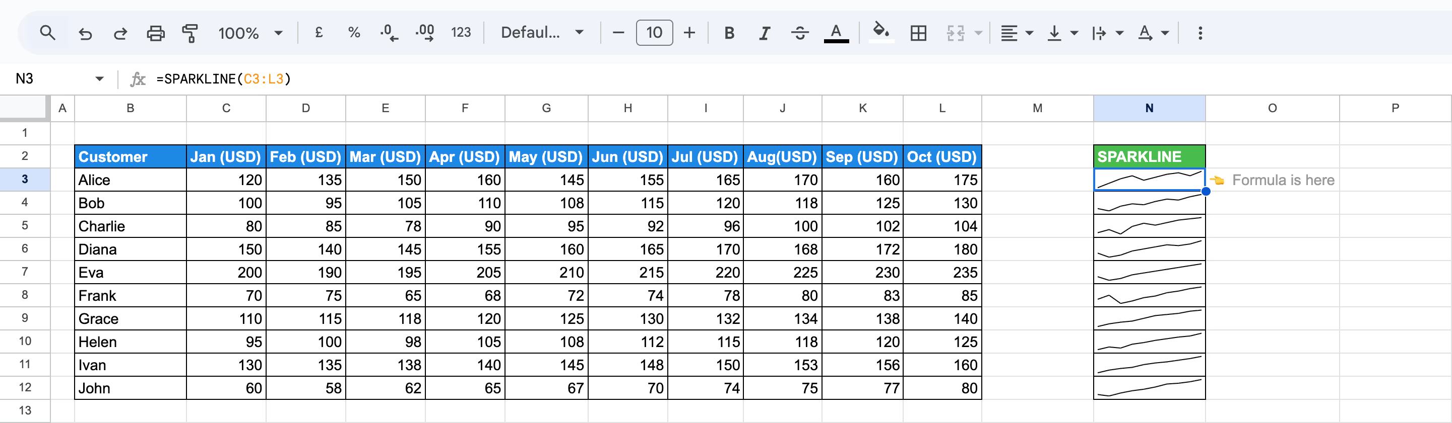
Line sparklines offer a simple yet effective way to visualize data movement over time, enabling the identification of trends without resorting to full-sized charts.
Changing the Color in SPARKLINE
To customize the appearance of your line sparkline, you can change its color using the "color" option. This is useful when you want to match brand colors, highlight performance changes, or improve readability.
Example:
To make monthly sales trends easier to read across all customers, we’ll apply color to each sparkline. This helps quickly identify who’s growing, declining, or remaining steady.
=SPARKLINE(C3:L3, {"color", "#009b3b"})
You can apply the same formula structure for each customer row by simply adjusting the row number. Replace the row with the actual row number for each customer, and choose a color name or hex code based on your preference.

Whether you're showing growth, decline, or stability, using consistent color rules helps make comparisons quick and visually clear.
Setting Min and Max Values for Line SPARKLINE (Y‑Axis and X‑Axis)
By default, sparklines automatically adjust their axis scale based on each data range, which can make trend comparisons between rows inconsistent. To create uniform charts, you can manually define minimum and maximum values for both the vertical (Y-axis) and horizontal (X-axis) axes.
Example:
To ensure that all sparklines are visually comparable, it's essential to standardize the scale across both axes. We’ll use Grace’s sales data to demonstrate. The 10 months (Jan to Oct) represent the x-axis (1 to 10), while her monthly sales figures form the y-axis.
Formula:
=SPARKLINE(B3:C12, {"xmin", 1; "xmax", 10; "ymin", 60; "ymax", 240})

Applying fixed minimum and maximum values ensures consistent scaling across all customer sparklines. This makes trend comparisons more accurate, especially when visualizing multiple rows in a table.
Adjusting the Line Width in SPARKLINE
If your sparklines appear too thin or faint, you can thicken the line using the "linewidth" option. This makes trends easier to spot, especially in dashboards or shared reports.
Example:
To improve visibility across all customer rows, we’ll set the sparkline line width to 5. This makes trends easier to compare, especially in dense reports or shared dashboards.
=SPARKLINE(C3:L3, {"linewidth", 5})
Repeat this for each row, updating the range accordingly, for example, Bob, for Charlie, and so on.
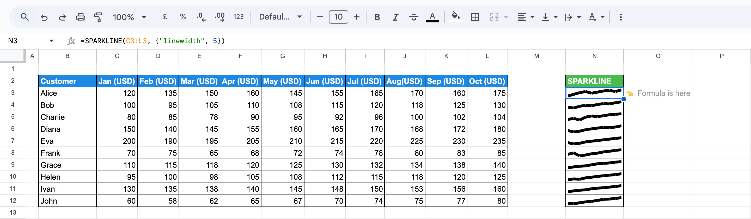
A consistent, thicker line width across sparklines enhances readability and makes your trend visuals more effective, eliminating the need for external charts.
Handling Blank Cells Using the "empty" Option
Blank cells can distort your SPARKLINE by creating dips or interruptions in the trend line. The "empty" option lets you decide whether to treat missing values as 0 or skip them entirely.
Example setup:
We’ll apply this to all customers using the "empty", "zero" setting. This ensures blank cells are treated as zeroes, creating visible dips where data is missing, which can help spot data entry gaps or operational pauses.
Formula:
To treat blanks as zeros:
=SPARKLINE(C3:L3, {"empty", "zero"})
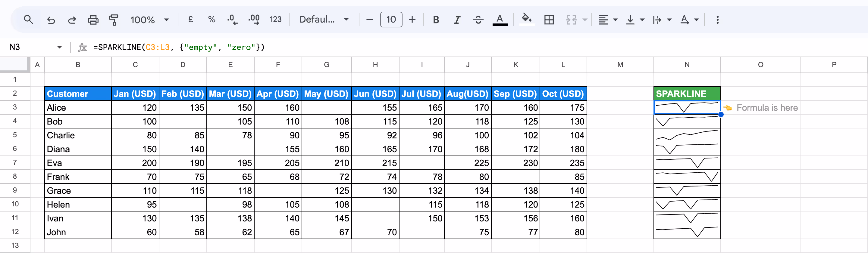
Note: Apply this formula to all customers by dragging the fill handle down the column.
Accurately handling gaps prevents misinterpretation in your data visuals. This option works the same for line, column, and win/loss sparklines.
Managing Non‑Numeric Values with "nan"
When your dataset contains text or non-numeric values, the "nan" option lets you decide whether to convert them into 0 or ignore them entirely in your sparkline.
Example:
We’ll use the "nan", "convert" setting to treat any text or non-numeric cells as 0. This is helpful when data inconsistencies exist, and you want the sparkline to reflect those drops. This option works the same for both column and win-loss charts.
Formula:
=SPARKLINE(C3:L3, {"nan", "convert"})
Note: Apply this formula to all customers by dragging the fill handle down the column.
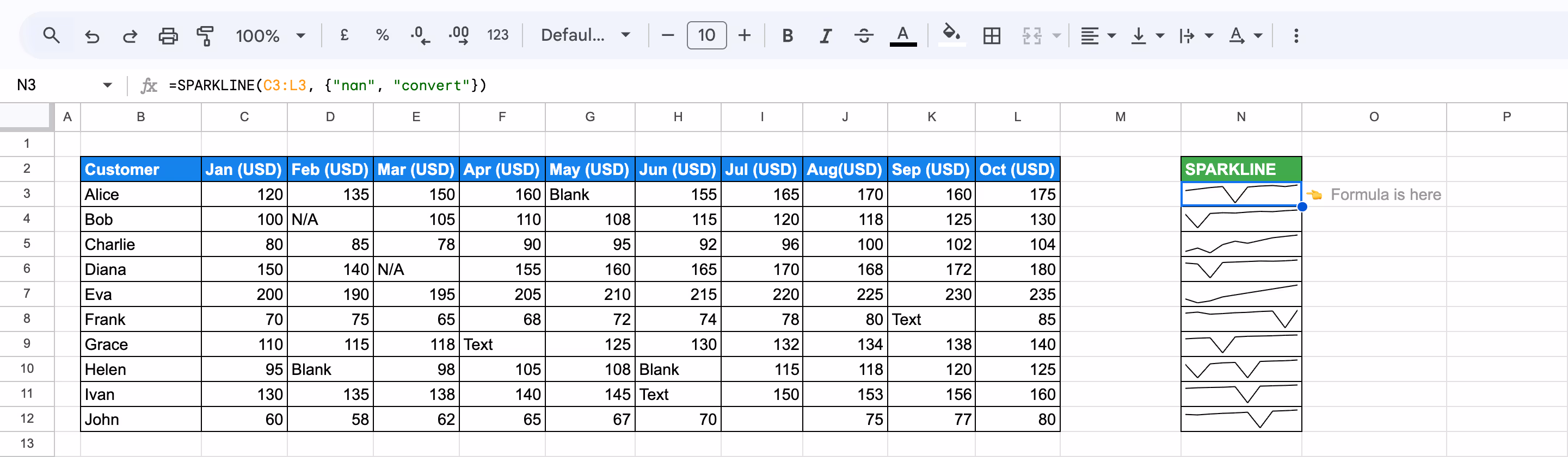
Using "nan" ensures that unexpected text entries don’t break your sparkline and instead show a visible drop or skip, making the chart more reliable for trend spotting.
Displaying SPARKLINE from Right to Left (RTL Option)
If you prefer to display the most recent months first in your chart, you can flip the sparkline direction using the "rtl" option. This is especially useful when highlighting recent performance.
Example setup:
We’ll apply the right-to-left setting across all customer rows so that sales data for October appears first and January last. This helps teams focus on the latest trends immediately.
Formula:
=SPARKLINE(C3:L3, {"rtl", true})
Drag this formula down to apply it for Bob, Charlie, Diana, Eva, and all other customers.
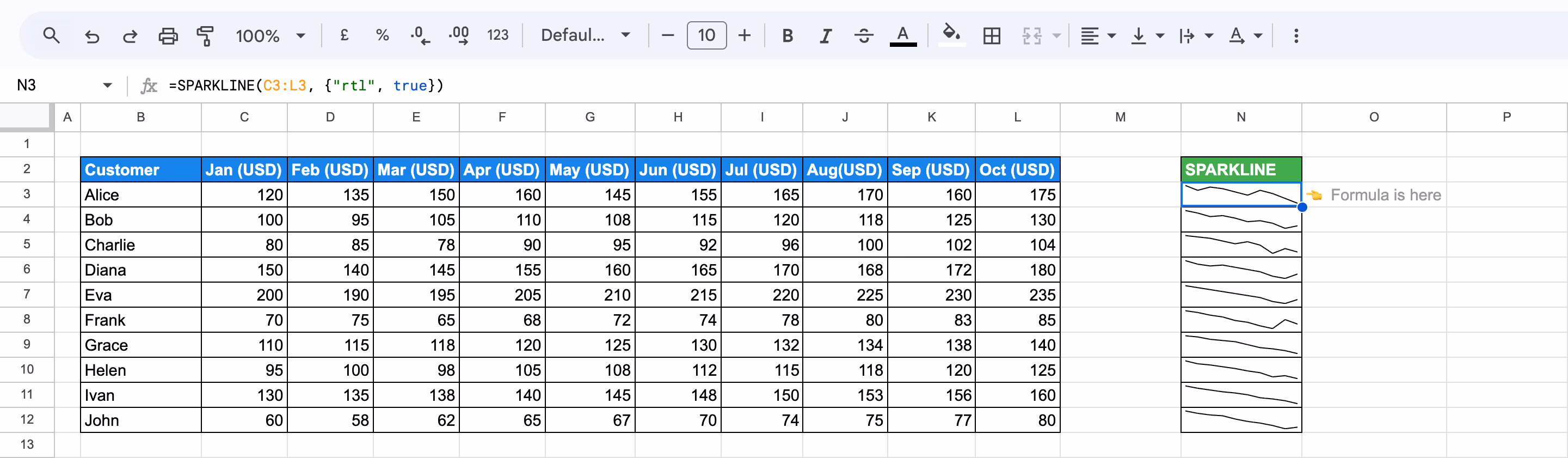
Using the RTL option flips your data view, making recent activity more prominent and aiding faster insights in review meetings or dashboards.
Column Chart
Column sparklines use vertical bars to show trends over time or across categories within a single cell. They work well for visualizing multiple values, like monthly sales or weekly performance, allowing you to spot peaks, dips, and patterns at a glance.
Example:
We’ll use the same customer dataset as the line chart section (January to October sales) to create column-style sparklines in each row.
Formula:
=SPARKLINE(C3:L3, {"charttype", "column"})
Drag this formula down to apply it for the rest of the customers.

Column sparklines make it easy to compare value spikes and dips within a series, all inside one cell, ideal for quick, space-saving visualizations.
Adding an Axis to a Column SPARKLINE
Column sparklines with both positive and negative values can be hard to interpret without a clear divider. Adding a horizontal axis helps visually separate values above and below zero.
Example:
Let’s say your dataset includes profit/loss data with positive and negative values. We’ll insert a column sparkline with a visible axis line to highlight this distinction.
Formula:
=SPARKLINE(C3:L3, {"charttype", "column"; "axis", true})
Drag this formula down to apply the same formatting for all customer rows with similar data.
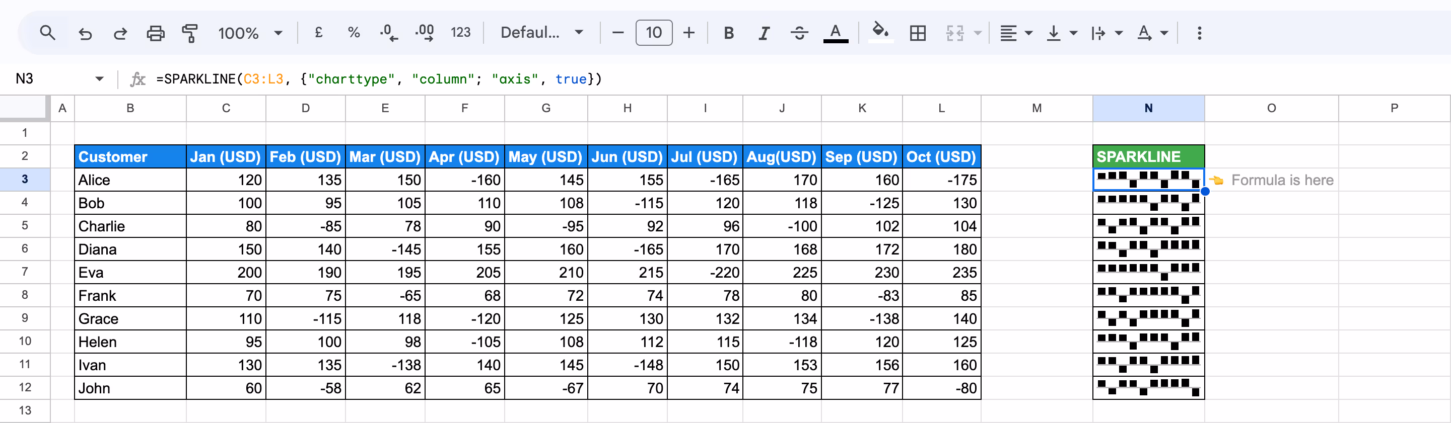
Including an axis line improves readability by clearly distinguishing between gains and losses, especially in financial or balance-based reports.
Changing the Axis Color in Column SPARKLINE
If your sparkline contains both positive and negative values, adding an axis helps, but the default axis color might not stand out. To improve visual clarity, use the "axiscolor" option to customize the axis color.
Example:
We’ll apply this setting to highlight the axis in red, making it easier to distinguish positive vs. negative bars across the dataset.
Formula:
=SPARKLINE(C3:L3, {"charttype","column";"axis",true; "axiscolor","red"})
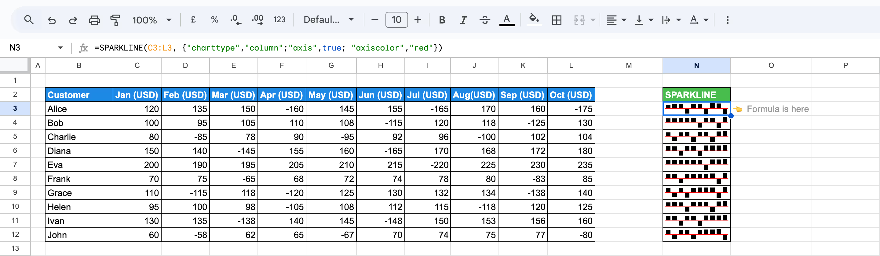
Customizing the axis color helps your sparkline stand out in dense reports and ensures that negative values are clearly distinguished from positive ones. Use drag to apply this across all rows.
Customizing Column Colors in SPARKLINE
You can highlight specific data points in a column sparkline by using the highcolor, lowcolor, negcolor, and lastcolor options. This adds visual meaning to peaks, lows, negatives, or the most recent values.
Example setup:
We’ll apply this to Alice's sales row. The highest value will be green, the lowest yellow, the last value blue, and any negative values will appear in red. You can customize these color codes or names as needed for each customer.
Formula:
=SPARKLINE(C3:L3, {
"charttype", "column";
"highcolor", "green";
"lowcolor", "yellow";
"lastcolor", "blue";
"negcolor", "red"
})
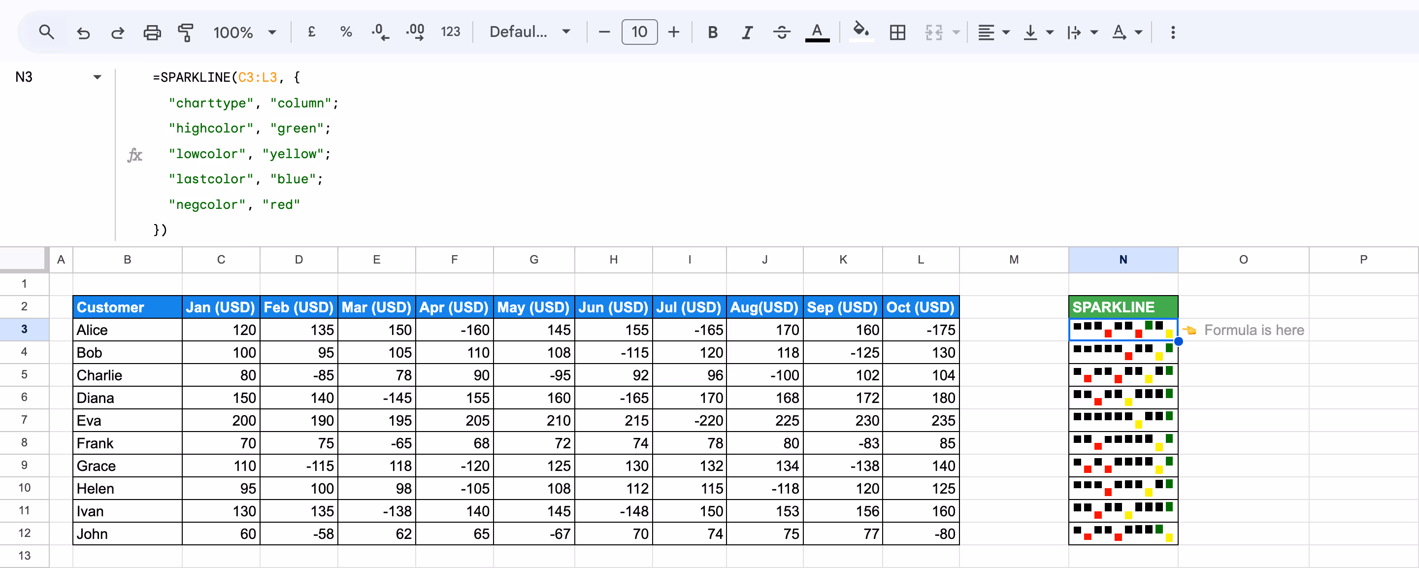
This approach enables you to identify performance extremes and trends quickly and easily. Drag the formula down to apply it to other customers and adjust the colors to match your visual preferences.
Setting Min and Max Values in Column SPARKLINE
Column sparklines scale automatically based on your data. But when comparing rows with different ranges, inconsistent scales can be misleading. You can fix this by manually setting minimum and maximum values for the vertical axis using the ymin and ymax options.
Example setup:
Let’s say you're comparing sales performance across all customers. To keep the visual scale consistent, we’ll fix the min to 60 and max to 240, so every sparkline aligns proportionally regardless of actual range.
Formula:
=SPARKLINE(C3:L3, {"charttype", "column"; "ymin", 60; "ymax", 240})
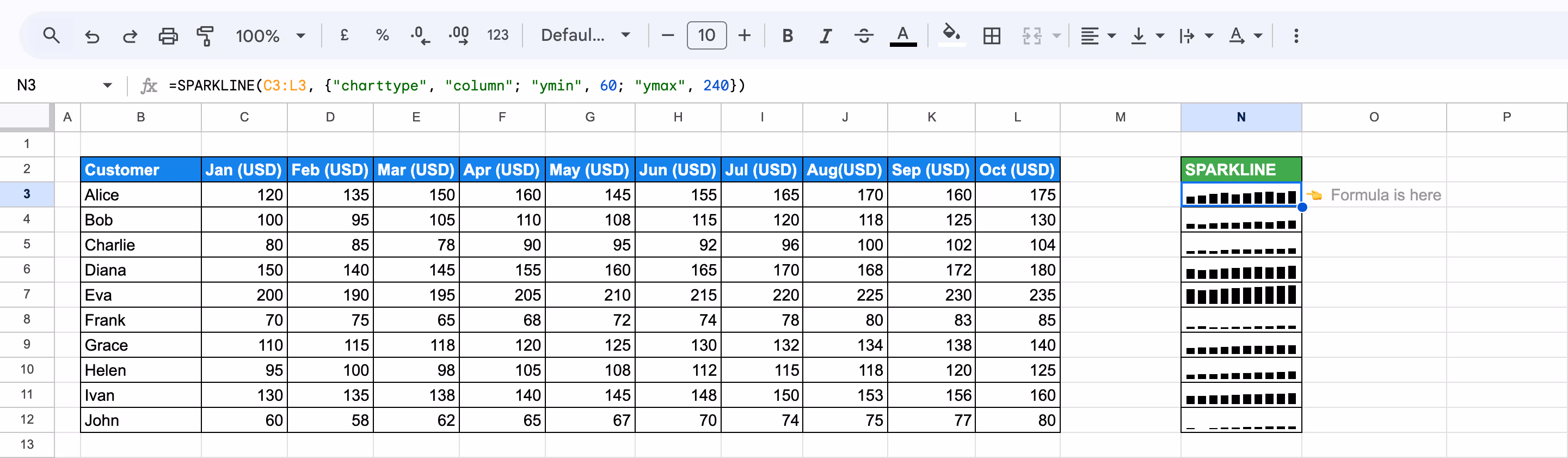
Using consistent min/max values improves visual comparison across rows. Drag this formula down to apply it to other customers in the dataset.
Simulating a Reference Line in Column SPARKLINE
Simulating a reference line in a column SPARKLINE involves using helper columns to indicate a threshold within the chart visually. By stacking base and excess values, you can highlight when data points exceed or fall below the desired level, even though SPARKLINE doesn’t support reference lines natively.
Example:
Imagine you're tracking monthly purchase values of a customer and want to highlight how much each month's total exceeds a threshold of 100. While SPARKLINE can't display a horizontal reference line directly, you can simulate it using helper columns and two stacked SPARKLINEs.
Step 1: Create Helper Columns
Assuming that the Monthly Purchase Amounts are in Column C, paste the following formula in cell D3:
=IF(C3<100,{C3,0},{20,C3-20})
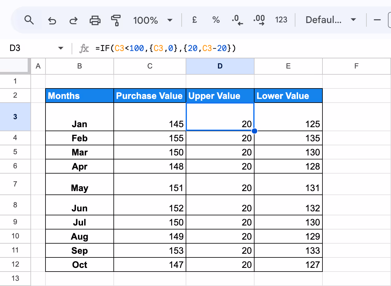
Drag the formula down from D3 to D12. This formula splits the Purchase Value in column C into two parts:
- Column D = base value (up to 100 or the actual value, whichever is lower)
- Column E = excess value (above 100, or 0 if below threshold)
Step 2: Create Two SPARKLINEs
In a new cell, preferably G3 and G4, paste the following Formulas:
- Top sparkline (Column E):
=SPARKLINE(E3:E12, {"charttype", "column"})
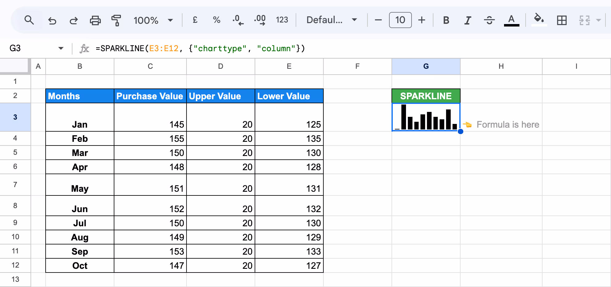
- Bottom sparkline (Column D):
=SPARKLINE(D3:D12, {"charttype", "column"})

Place these one above the other (e.g., in two stacked rows), so the excess values visually sit on top of the base, creating the effect of a reference line at 100.
With the formula, you can break values into two ranges and simulate a horizontal reference line. This method is useful when you need to compare values against a set threshold inside compact SPARKLINE visuals.
Bar Charts
Bar sparklines display horizontal bars within a single cell to represent and compare exactly two values side by side. They're ideal for visualizing simple comparisons, such as actual vs. target performance or current vs. previous period values, using a clean and compact layout.
Example setup:
We’ll compare January and February sales to help customers quickly visualize how their performance changed between the two months.
Bar sparklines are ideal for such side-by-side comparisons.
Formula :
=SPARKLINE(C3:D3, {"charttype", "bar"})
Once set, the same formula can be dragged down to show comparisons for all other customers.
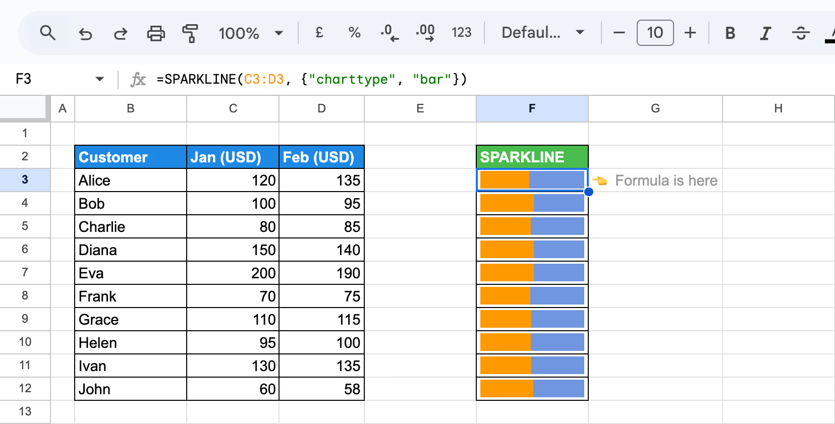
Using bar sparklines for January versus February lets you visually compare early trends for each customer. It’s a compact and effective way to spot shifts or consistencies at a glance.
Setting the Maximum Value for a Bar SPARKLINE
The max option allows you to fix the horizontal scale in bar sparklines, making it easier to compare values across different rows. Without it, each bar adjusts to its max, which distorts comparisons.
Example setup:
To ensure consistent bar lengths across all customers, we’ll use the highest January sales value as a fixed maximum. This lets you compare each customer's January performance on the same scale. Simply drag the formula down to apply it across all rows.
Formula:
=SPARKLINE(C3, {"charttype", "bar"; "max", MAX($C$3:$C$12)})

Fixing a shared maximum makes your bar sparklines more reliable for comparison in dashboards or summary tables.
Customizing Bar SPARKLINE Colors
Bar sparklines in Google Sheets use two colors: one for the first value and another for the second. You can customize these colors using "color1" and "color2" to match your brand, category, or status indicators.
Example:
We’ll use bar sparklines to compare January and February sales for each customer. By customizing "color1" and "color2", we’ll clearly distinguish between the two months.
Formula:
=SPARKLINE(C3:D3, {"charttype", "bar"; "color1", "green"; "color2", "red"})
You can apply this format to all customer rows by dragging the formula down and adjusting colors as needed for your use case.

Custom bar colors enhance visual clarity, especially when comparing multiple periods or data types within a single sparkline. Use consistent color coding across customers for better pattern recognition.
Using Two‑Series Data in Bar SPARKLINES
Bar sparklines can also represent two data values side by side in a single cell, simulating a stacked bar. This helps visually compare contributions to a total, for example, product A vs. product B sales or revenue from two regions.
Example setup:
To simulate a stacked bar, we’ll pick two months, say, January and October, for each customer and use them as two values in the bar sparkline. By setting "max" to their SUM, each bar always fills 100% of the cell width. This technique gives a clear breakdown of proportions at a glance.
Formula:
=SPARKLINE(C3:D3, {"charttype", "bar"; "max", SUM(C3:D3)})
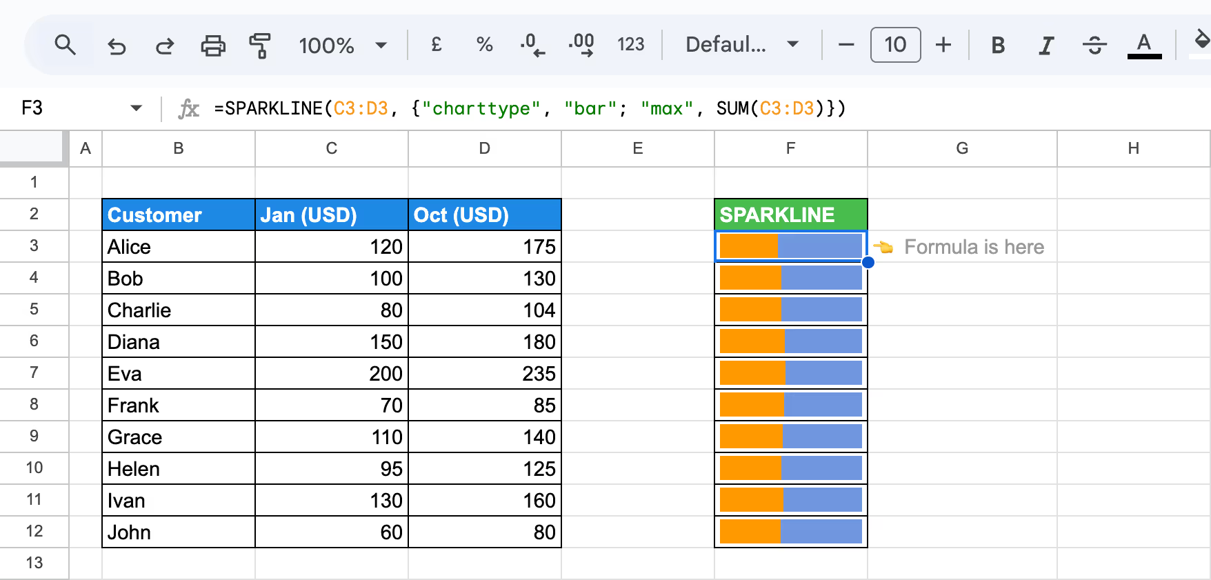
Using a two-value bar sparkline with a calculated maximum is an effective way to highlight relative differences while maintaining a consistent scale and layout across your sheet.
Creating a Stacked Percentage Bar SPARKLINE
Stacked percentage bar sparklines allow you to visualize the proportion between two values that sum up to 100%. They’re ideal for comparing parts of a whole, such as new vs returning customers.
Example setup:
We’ll show New Sales% % and Returning Sales% % for each customer. Since these percentages must always add up to 100%, we’ll convert them to decimal form and fix the total width using "max", 1.
Formula:
=SPARKLINE({0.9, 0.1}, {"charttype", "bar"; "max", 1})
You can repeat this for each customer by adjusting the percentage values for that row. Once set up, use the drop-down handle to apply across all rows.
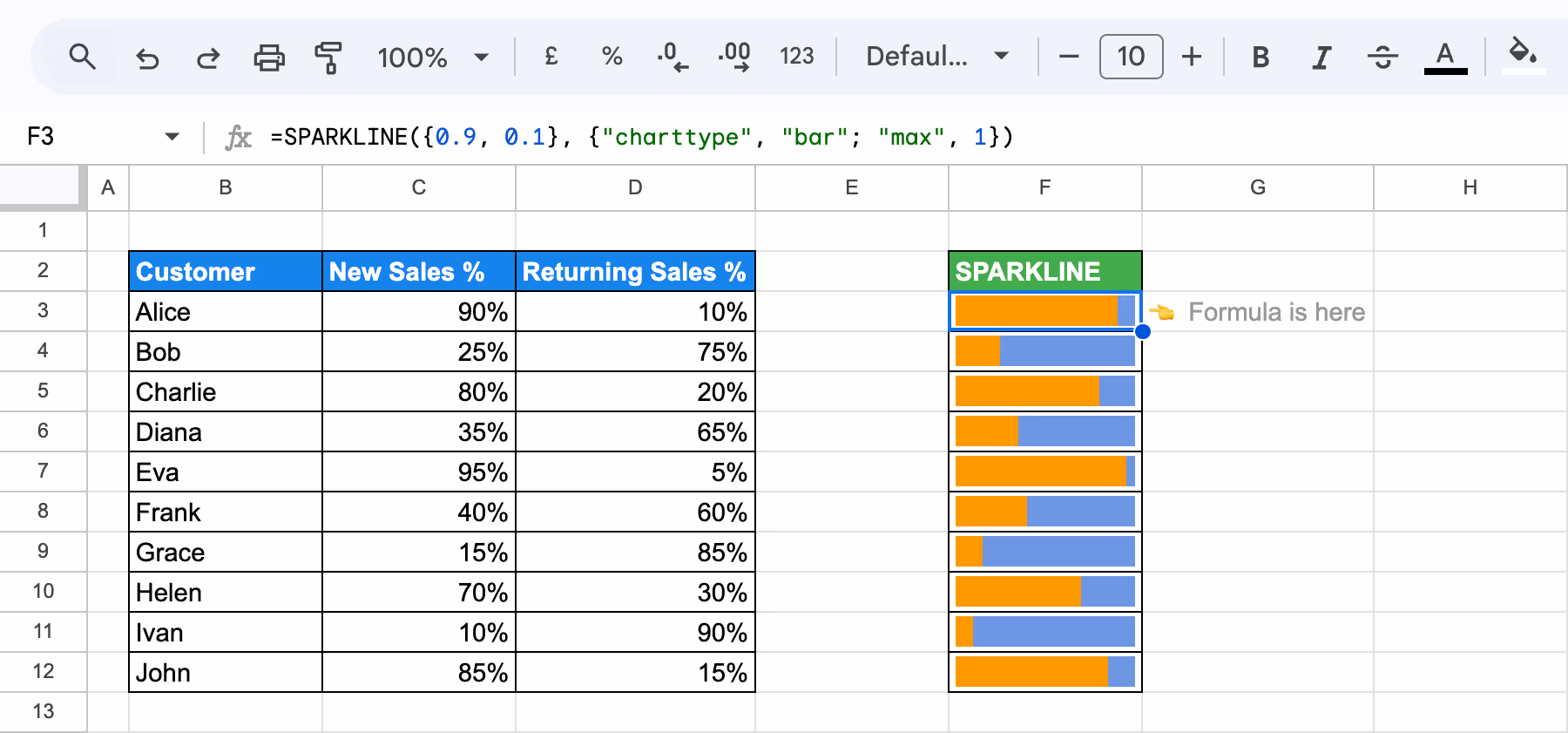
Stacked percentage bar sparklines offer a clear way to visualize part-to-whole relationships, making it easier to compare how customer sales are distributed across different periods.
Win-loss Charts
Win-loss sparklines help visualize positive vs. negative values, ideal for showing wins (positive) and losses (negative) across time. Each bar in the chart is the same height, representing only the direction of change, not the magnitude.
Example setup:
We’ll use a few months of sales data for the customers, including both positive and negative changes, to create a win-loss sparkline. This chart helps quickly identify which months had better or worse performance without focusing on the magnitude of the variation.
Formula:
=SPARKLINE(C3:L3, {"charttype","win-loss"})

Win-loss sparklines provide a simplified view of trends, highlighting performance direction over time. Drag the formula down for each customer to compare patterns across rows.
Customizing Win-loss SPARKLINE Colors
By default, win-loss sparklines use a single color. However, to enhance clarity, you can customize how different values appear using options such as "color", "lowcolor", "highcolor", "firstcolor", "lastcolor", and "negcolor".
Example:
We’ll apply the win-loss sparkline to Alice’s monthly sales trend and use color options to make it easier to interpret. For instance, we’ll mark the first bar in blue, the last in orange, negative values in red, and so on.
Formula:
=SPARKLINE(C3:L3, {
"charttype", "win-loss";
"color", "gray";
"negcolor", "red";
"firstcolor", "blue";
"lastcolor", "orange";
"highcolor", "green";
"lowcolor", "purple"
})
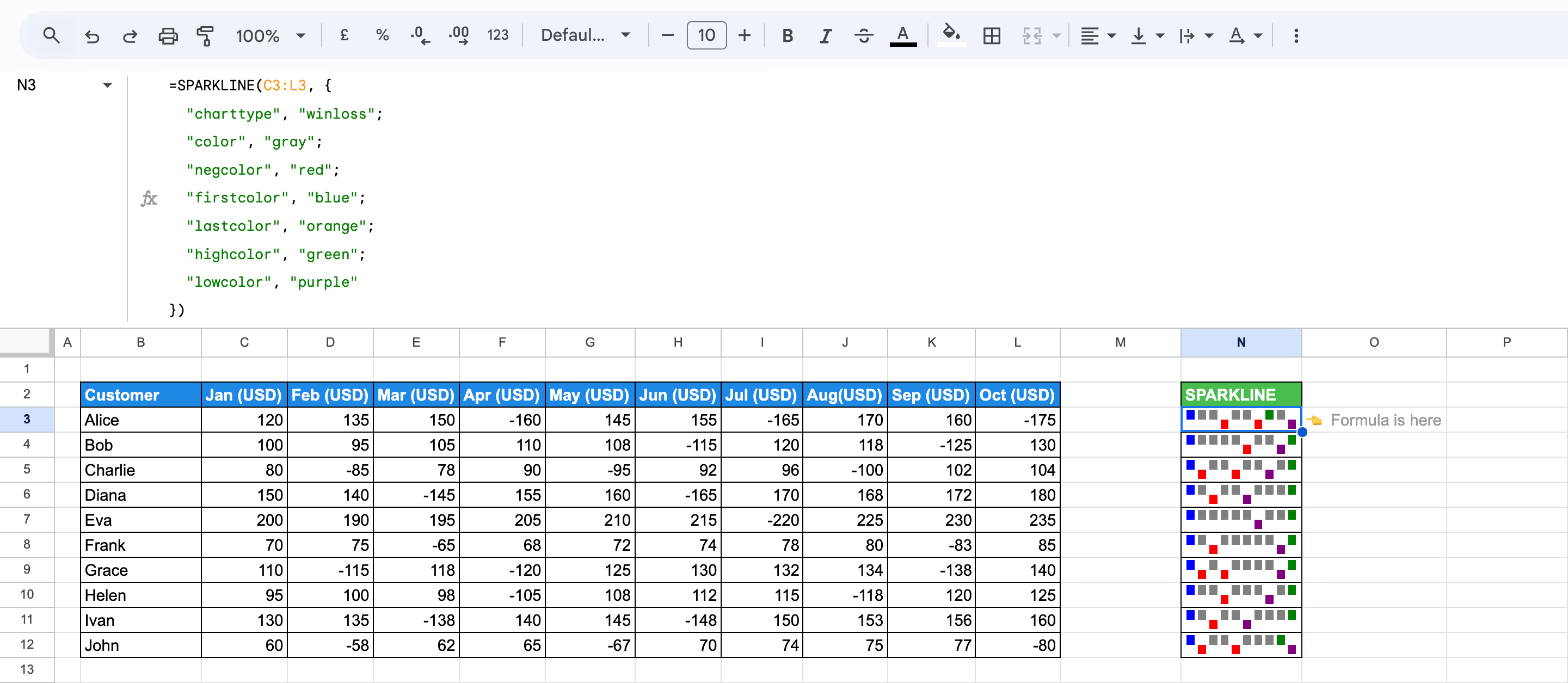
Customizing colors in a win-loss sparkline makes performance shifts more readable, highlighting trends like first and last periods, highs and lows, and losses at a glance. Drag the formula down to apply across all customers.
Adding and Customizing the Axis in Win/Loss SPARKLINE
The axis option helps separate positive and negative values clearly in win/loss sparklines. Use "axiscolor" to highlight it for better visibility. This is especially useful when comparing performances that fluctuate around zero, like monthly gains and losses.
Example:
We’ll show Alice’s performance with a red axis line to mark zero. You can drag the formula to apply it across all customers.
Formula:
=SPARKLINE(C3:L3, {"charttype", "win-loss"; "axis", true; "axiscolor", "red"})
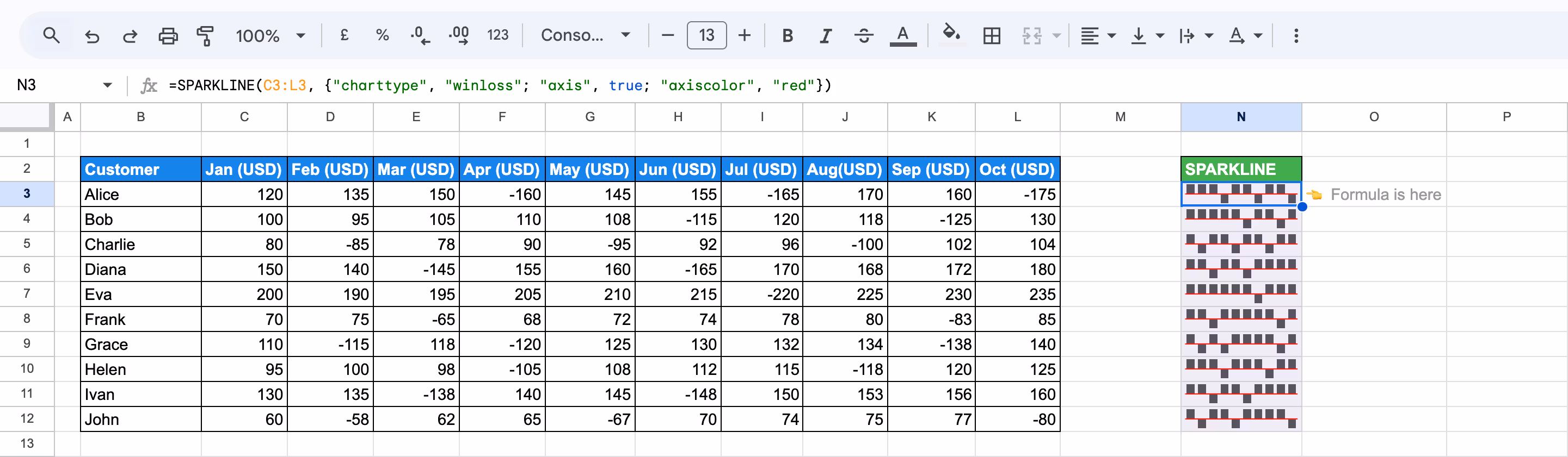
A visible axis line makes win/loss sparklines easier to read and interpret.
Advanced Applications of the Sparkline Function in Google Sheets
Take your sparklines further with advanced options like custom axes, color settings, and simulated reference lines. These advanced applications make in-cell charts more insightful and easier to read.
Defining SPARKLINE Options Using Cell References
Instead of typing every setting manually into the SPARKLINE formula, you can use cell references to control chart attributes like color, line width, max value, and direction. This approach is beneficial when building flexible dashboards or interactive reports.
Example:
Let’s build a dynamic line chart for each customer. The sparkline color and line width will be picked up from nearby cells, so you don’t need to edit the formula every time.
Formula:
=SPARKLINE(C3:L3, {"linewidth", M3; "color", N3})
Here,
- C3:L3: The main data range for the SPARKLINE — this pulls values (e.g., monthly sales) from columns C to L in row 3.
- "Linewidth": sets the thickness of the sparkline line.
- M3: is a reference to the cell that holds the desired line width (e.g., 1, 2, or 3).
- "color": sets the line or column color.
- N3: is a reference to the cell that holds the color.
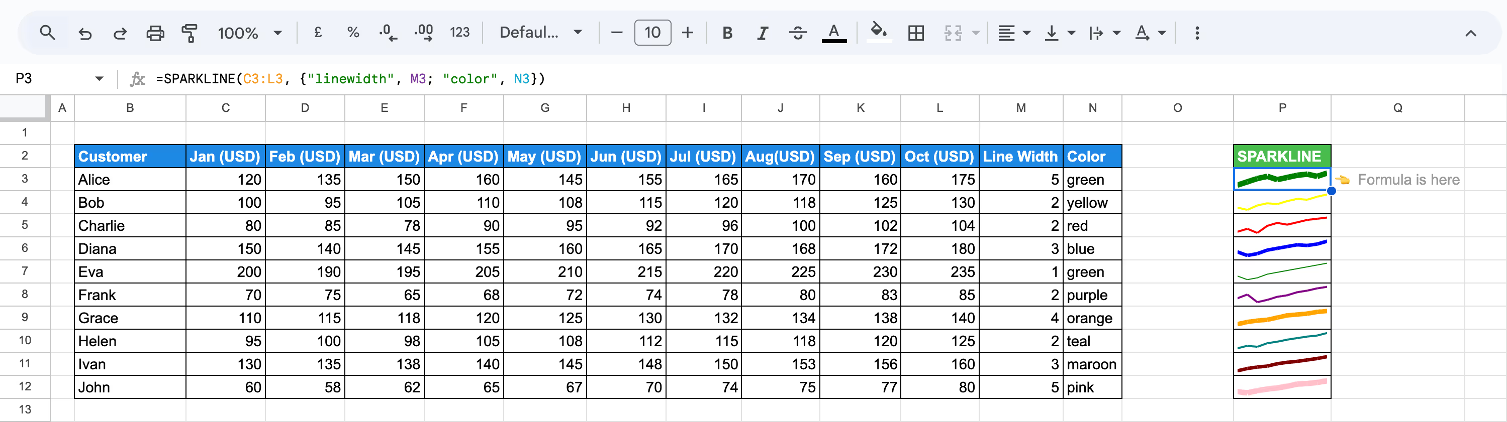
This method makes your SPARKLINE formulas more flexible, allowing you to update the reference cells to adjust visuals without editing the formula structure.
Creating Stock Price SPARKLINES Using GOOGLEFINANCE
If you want a quick, visual way to track stock performance inside Google Sheets, combining the GOOGLEFINANCE function with SPARKLINE is an innovative solution. This method allows you to display a compact line chart of historical stock prices directly within a single cell.
It’s handy for monitoring daily closing prices of well-known tickers like AAPL, MSFT, or GOOG.
Example:
To visualize recent stock trends of major tech companies like AAPL, GOOG, and MSFT, we’ll use the GOOGLEFINANCE function combined with SPARKLINE. This setup fetches daily closing prices from the last 60 days and renders them as a sparkline chart within a single cell.
Formula:
=SPARKLINE(GOOGLEFINANCE($C3,"price",TODAY()-60,TODAY(),"DAILY"), {"charttype","line";"linewidth",2;"color","#5f88cc"})
Here,
- $C3: Ticker symbol for the stock (e.g., "AAPL").
- "price": Retrieves daily closing prices.
- TODAY()-60 to TODAY(): Gets data for the last 60 days.
- "DAILY": Sets frequency to daily.
- "charttype","line": Draws a line chart.
- "linewidth",2: Sets line thickness to 2px.
- "color","#5f88cc": Applies a custom blue color.
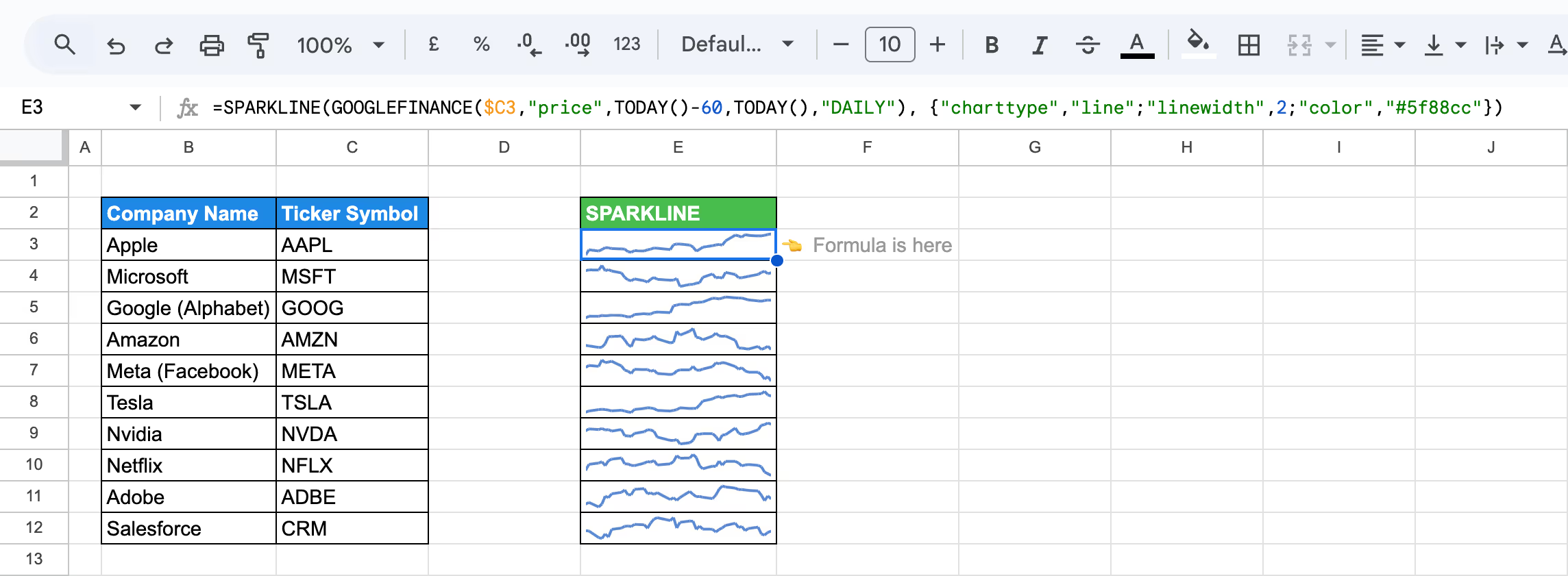
This approach provides a quick and compact way to monitor stock performance directly in your spreadsheet. It’s beneficial for comparing price trends across multiple tickers without needing separate charts.
Using QUERY with GOOGLEFINANCE for Column SPARKLINES
When pulling stock data using the GOOGLEFINANCE function, the returned dataset includes both dates and price values. However, for creating column sparklines, you only need the price values. To isolate these, you can wrap the GOOGLEFINANCE call inside a QUERY function and select only the second column, which contains the daily closing prices.
Example:
We want to show daily closing prices of major stocks like Apple, Google, or Microsoft as compact column sparklines. However, GOOGLEFINANCE returns both date and price columns, and SPARKLINE only works with numbers. So, we use the QUERY function to extract just the prices.
Formula:
=SPARKLINE(QUERY(GOOGLEFINANCE($C3,"price",TODAY()-60,TODAY(),"DAILY"),"select Col2",-1), {"charttype","column";"highcolor","red"})
Here,
- $C3: Cell containing the stock ticker (e.g., "AAPL").
- GOOGLEFINANCE(...): Fetches 60 days of daily stock prices.
- QUERY(...,"select Col2",-1): Extracts only the price column from the result.
- "charttype","column": Renders a column (bar) chart.
"highcolor","red": Highlights the highest column in red.
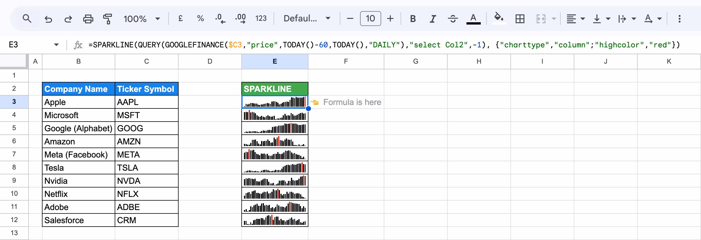
Using QUERY with GOOGLEFINANCE ensures only numeric data is passed into SPARKLINE, enabling clean column chart visuals. This approach helps track stock trends clearly, eliminating the need for manual data cleanup.
Creating Dynamic SPARKLINE Ranges with INDIRECT and MATCH
Dynamic SPARKLINE ranges allow your charts to update automatically as new data is added. By combining INDIRECT and MATCH, you can create flexible formulas that respond to the changing positions of headers or values, making them ideal for real-time dashboards and ongoing data tracking.
Example:
Suppose you're tracking Alice's monthly sales, where column B contains month names from Jan to Oct, and column C holds her corresponding sales figures. Now you want a SPARKLINE that automatically picks and displays the last 4 months of sales, without manually selecting the range.
Formula:
=SPARKLINE(INDIRECT("C" & MATCH("Oct", B:B, 0) - 3 & ":C" & MATCH("Oct", B:B, 0)))
Here:
- MATCH("Oct", B:B, 0): Finds the row number where "Oct" appears in column B.
- MATCH(...) - 3: Moves up to include the previous 3 months (i.e., Jul to Oct = 4 months total).
- INDIRECT("C" & ... & ":C" & ...): Dynamically creates the range C7:C10 if Oct is in row 10.
- SPARKLINE(...): Generates a mini chart showing Alice’s sales trend for Jul to Oct.

This method gives you a flexible way to visualize recent trends. Just update the month in the formula to shift the window.
Combining Multiple Data Ranges in a Single SPARKLINE Chart
Combining multiple data ranges in a single SPARKLINE allows you to visualize non-contiguous values together within one chart.
It’s useful when you want to display selected data points, such as specific months or categories, without including the entire range. This is done using curly braces {} to join the ranges.
Example:
You’re analyzing monthly sales data (Jan–Oct) for multiple customers and want to compare only Q1 (Jan–Mar) and Q3 (Jul–Sep). The goal is to create a compact SPARKLINE chart for each customer that highlights these two periods, skipping the rest.
=SPARKLINE({C3:E3, H3:J3}, {"charttype","column"})
Here,
- C3:E3: Alice’s sales from January to March
- H3:J3: Alice’s sales from July to September
- {C3:E3, H3:J3}: Combines Q1 and Q3 data for a single SPARKLINE
- "charttype", "column": Displays the combined data as vertical bars
Place the formula in a new column. And drag it down for all rows. Each row’s formula will automatically adjust to that customer’s data.
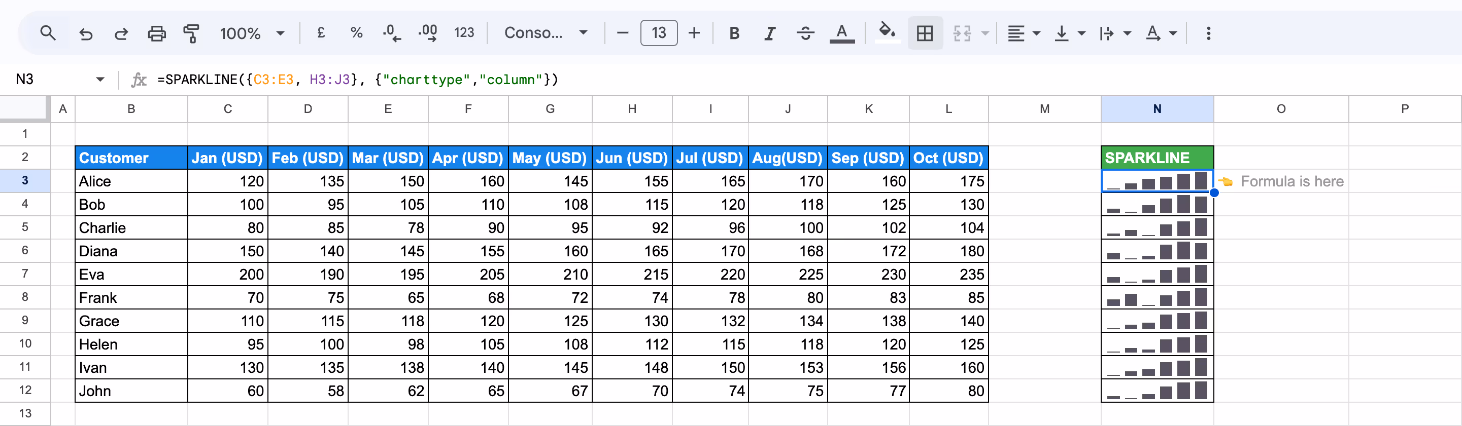
This approach enables you to create targeted visual summaries for selected months across multiple rows without modifying the structure of your spreadsheet. It's beneficial for spotting quarter-over-quarter trends or excluding noisy data.
How to Generate SPARKLINE Charts from SQL Queries with OWOX Reports
If you want to automate your SPARKLINE dashboards in Google Sheets, OWOX Reports makes it easy. You can generate SPARKLINE formulas directly from SQL queries, no manual formulas, no chart setup. Here’s how it works step by step.
Step 1: Install OWOX Reports Extension for Gogole Sheets
Go to the Google Workspace Marketplace and install the OWOX Reports. Once installed, open Google Sheets and launch the extension from the Extensions menu.
Step 2: Create a New Data Mart in OWOX Reports
Click on "Create Data Mart", choose your data source (e.g., BigQuery), and configure the parameters you want to use for filtering, like date range, medium, or project ID. You’ll use this setup to build a reusable SQL query.
Step 3: Use SQL to Generate SPARKLINE Graphs
In this step, you'll use SQL to generate SPARKLINE formulas dynamically using OWOX Reports. We’ll work with public GA4 ecommerce data from BigQuery and generate SPARKLINE strings that update directly in Google Sheets.
This example uses the dataset:
bigquery-public-data.ga4_obfuscated_sample_ecommerce
You can copy and run the following SQL in your OWOX Data Mart:
1WITH
2dates AS (
3  SELECT
4    FORMAT_DATE('%Y%m%d', DATE('{endDate default="2021-01-30" type="datetime"}')) AS e,
5    CAST({LookBackWindow default="30" pattern="^[0-9]+$" type="input"} AS INT64) l1
6),
7
8initial_data_last_30_days AS (
9  SELECT
10    PARSE_DATE('%Y%m%d', event_date) AS date,
11    (SELECT MAX(IF(ep.key='medium', ep.value.string_value, NULL)) FROM UNNEST(event_params) AS ep) AS medium,
12    (SELECT MAX(IF(ep.key='page_location', ep.value.string_value, NULL)) FROM UNNEST(event_params) AS ep) AS pageURL,
13    i.item_id, i.item_name, i.item_brand, i.item_category,
14    IF(event_name='view_item', i.item_id, NULL) AS item_views,
15    IF(event_name='add_to_cart', i.item_id, NULL) AS item_adds_to_cart,
16    IF(event_name='begin_checkout', i.item_id, NULL) AS item_begin_checkout,
17    IF(event_name='purchase', i.item_id, NULL) AS item_purchase
18  FROM
19    dates AS d,
20    `{project default="bigquery-public-data"}.{dataset default="ga4_obfuscated_sample_ecommerce"}.events_*`,
21    UNNEST(items) AS i
22  WHERE
23    _TABLE_SUFFIX BETWEEN FORMAT_DATE('%Y%m%d', DATE_SUB(PARSE_DATE('%Y%m%d', d.e), INTERVAL l1-1 DAY)) AND d.e
24    AND event_name IN ('view_item','add_to_cart','begin_checkout','purchase')
25),
26
27-- Additional CTEs: initial_data_last_60_days, corrections, aggregations...
28
29final_data AS (
30  SELECT
31    CONCAT('=HYPERLINK("', pageURL,'","', item_name, '")') AS Product,
32    item_brand AS Brand,
33    item_category AS Category,
34
35    CONCAT('=SPARKLINE({', item_views_trends, '}, {"color", "',
36      IF(item_views_30_days < item_views_31_60_days, "red",
37         IF(item_views_30_days = 0 AND item_views_31_60_days = 0, "WhiteSmoke", "green")),
38      '";"linewidth", 2})') AS `Views Trend`,
39
40    CONCAT('=SPARKLINE({', item_adds_to_cart_trends, '}, {"color", "',
41      IF(item_adds_to_cart_30_days < item_adds_to_cart_31_60_days, "red",
42         IF(item_adds_to_cart_30_days = 0 AND item_adds_to_cart_31_60_days = 0, "WhiteSmoke", "green")),
43      '";"linewidth", 2})') AS `Adds To Cart Trend`,
44
45    CONCAT('=SPARKLINE({', item_purchase_trends, '}, {"color", "',
46      IF(item_purchase_30_days < item_purchase_31_60_days, "red",
47         IF(item_purchase_30_days = 0 AND item_purchase_31_60_days = 0, "WhiteSmoke", "green")),
48      '";"linewidth", 2})') AS `Purchases Trend`
49
50  FROM (
51    -- Aggregate + ARRAY_TO_STRING + ARRAY_AGG logic here
52  )
53)
54
55SELECT *
56FROM final_data
57ORDER BY `Views Last 30d` DESC;
This SQL approach enables you to transform raw GA4 data into dynamic, color-coded sparklines, ready for use in Google Sheets. I
Step 4: Convert Data into SPARKLINE Formulas
Once your SQL query gathers and formats data, the next step is to generate complete SPARKLINE formulas that will render directly in Google Sheets. This involves combining key SQL functions to build dynamic, styled formulas.
Code Breakdown: How the SPARKLINE Formula is Built:
1. Collecting Data into Arrays:
ARRAY_AGG(item_views) AS item_views_30_days
This gathers all view values for the last 30 days into a single array.
2. Converting to String for SPARKLINE:
ARRAY_TO_STRING(ARRAY_AGG(CAST(item_views AS STRING) ORDER BY date ASC), ',') AS item_views_trends
Here,
- Sorts values by date
- Converts each number to a string
- Joins them with commas (e.g., 120,130,145,160)
3. Forming the SPARKLINE Formula:
CONCAT('=SPARKLINE({', item_views_trends, '}, {"color", "',
IF(item_views_30_days < item_views_31_60_days, "red",
IF(item_views_30_days = 0 AND item_views_31_60_days = 0, "WhiteSmoke", "green")),
'";"linewidth", 2})') AS `Views Trend`
Here,
- Builds a complete sparkline formula as a text string
- Applies color logic:
- Red if 30-day value is less than the previous period
- Green if higher
- Light gray if both are zero
- Sets line width to 2 for visibility
4. Repeat for Other Metrics (e.g., Add to Cart):
You can apply the same logic to other metrics like add-to-cart counts, using the same structure to generate their SPARKLINE formulas.
CONCAT('=SPARKLINE({', item_adds_to_cart_trends, '}, {"color", "',
IF(item_adds_to_cart_30_days < item_adds_to_cart_31_60_days, "red",
IF(item_adds_to_cart_30_days = 0 AND item_adds_to_cart_31_60_days = 0, "WhiteSmoke", "green")),
'";"linewidth", 2})') AS `Adds To Cart Trend`
5. Final Data Output with HYPERLINKS:
In the final step, combine all fields and formulas into a clean output table, using HYPERLINK to make product names clickable.
SELECT
CONCAT('=HYPERLINK("', pageURL, '", "', item_name, '")') AS `Product`,
item_brand AS `Brand`,
item_category AS `Category`,
item_views_30_days AS `Views Last 30d`,
-- SPARKLINE fields here
FROM
final_data
ORDER BY `Views Last 30d` DESC;
You can also use Google Sheets formulas like HYPERLINK to make product names clickable inside the report.
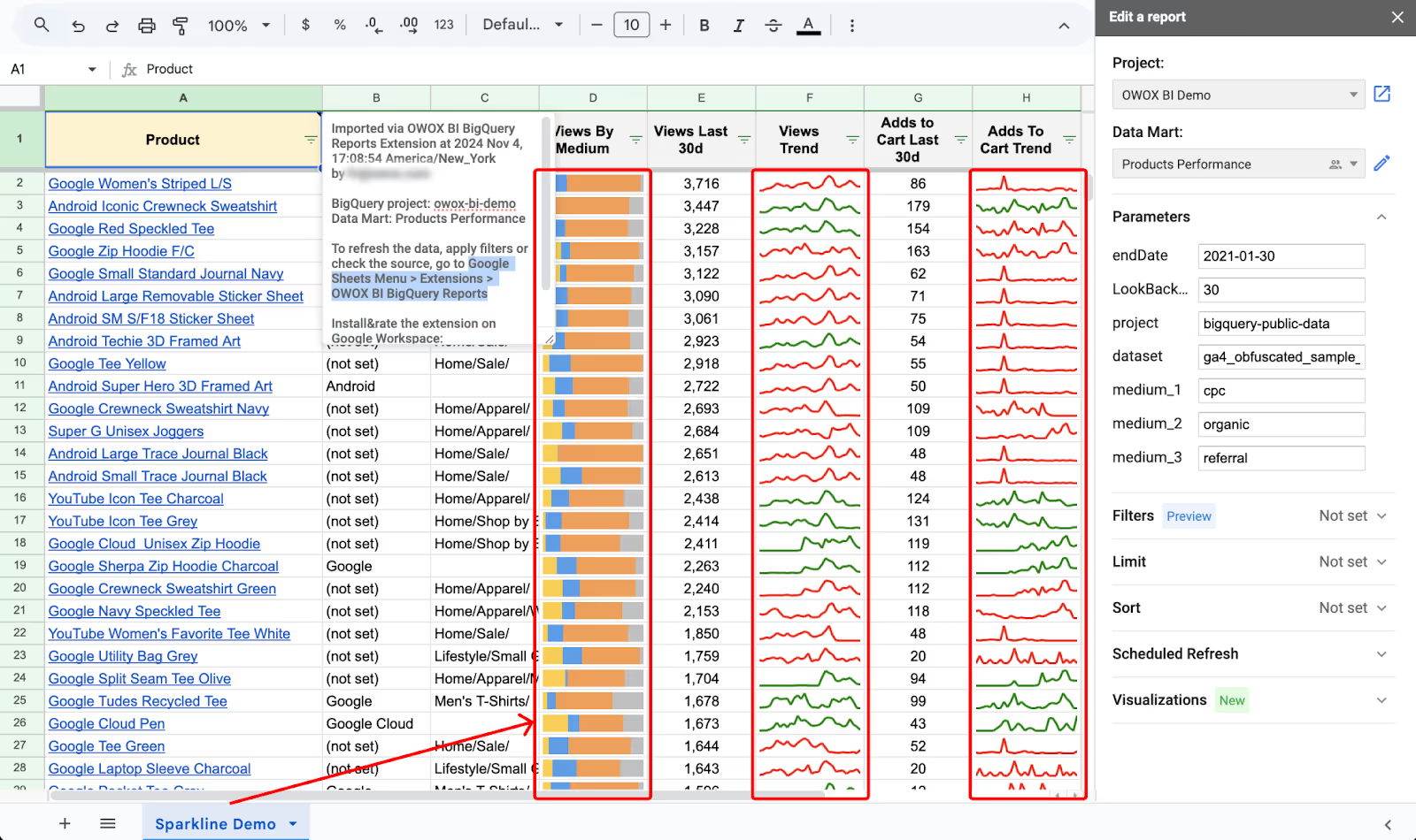
Step 5: Customize Your SPARKLINE Graphs
OWOX Reports makes it easy to adjust your SPARKLINE dashboards without rewriting SQL. You can tweak key inputs using parameters directly in the sidebar.
In this example, the SQL uses seven editable parameters:
- endDate – The final date for the reporting period.
- LookBackWindow – How many days of data you want to analyze.
- project – Your BigQuery project name.
- dataset – The dataset you’re querying.
- medium_1, medium_2, medium_3 – Traffic sources you want to include (like cpc, organic, or referral).

By updating these values, you can instantly adjust the analysis window, source filters, or dataset without modifying the main SQL block.
Step 6: Automate Data Refreshes for Real‑Time Updates
With OWOX Reports, keeping your dashboard up to date is simple. You can configure automated data refreshes on an hourly, daily, weekly, or monthly basis, choosing the exact day and time that fits your workflow.
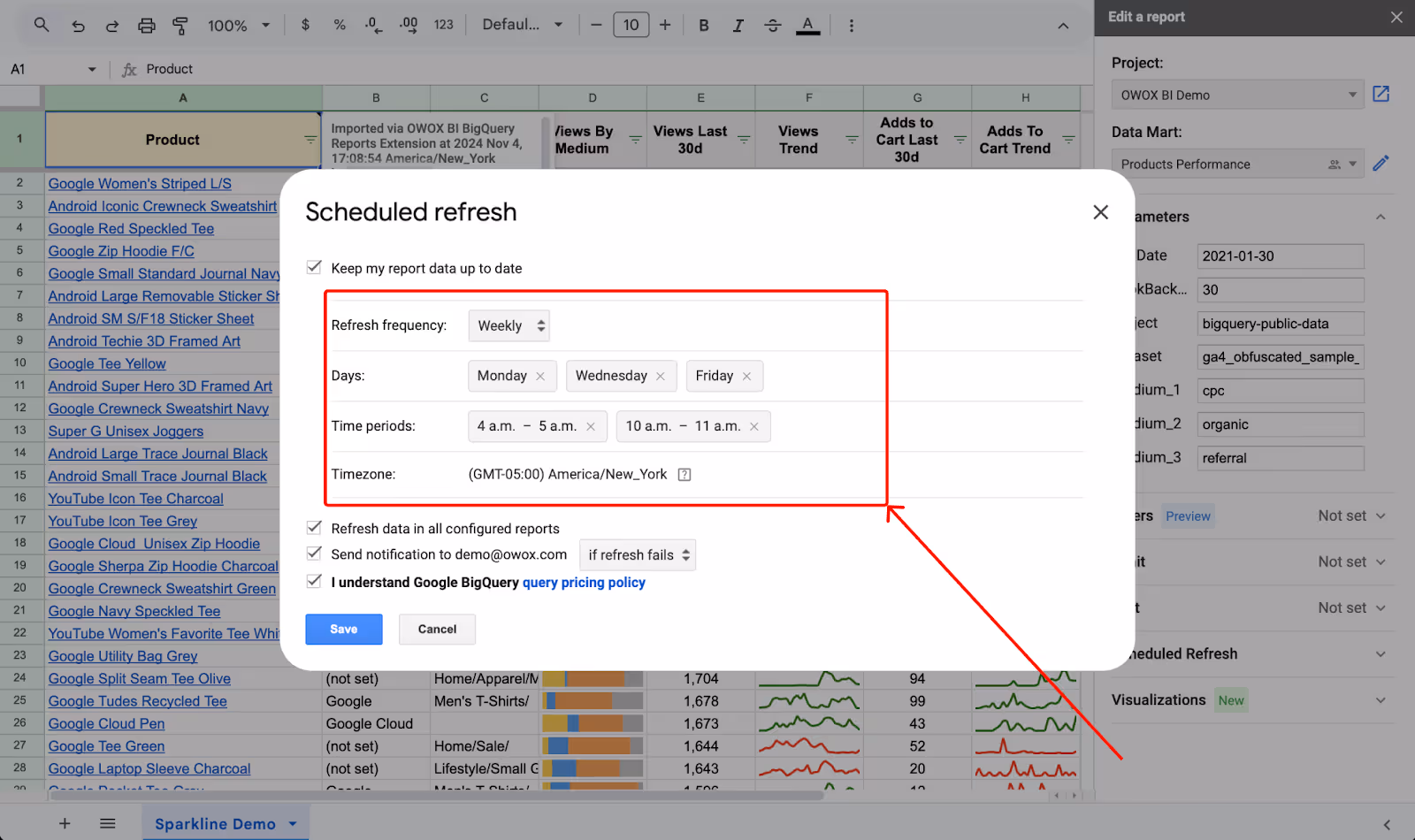
This automation ensures your reports reflect the latest data, saves processing resources by preventing redundant updates, and removes the need for manual refreshes.
Troubleshooting Common Errors in Sparkline Function in Google Sheets
SPARKLINE formulas can occasionally fail or produce confusing visuals, especially when working with dynamic data or multiple metrics. Below are common issues and their resolutions to ensure your sparklines remain accurate and functional.
Data Range Issues in SPARKLINE
❌ Issue: Sparklines may break or display incomplete trends if the data range includes empty cells, non-numeric values, or improperly referenced arrays.
✅ Fix: Always ensure your selected range is numeric and consistently formatted. If your dataset contains empty or irregular cells, adjust the settings to ignore them rather than breaking the chart.
SPARKLINE Not Showing Up in the Cell
❌ Issue: Sometimes a sparkline doesn't appear at all. This typically occurs when the formula is incorrect, the range is invalid, or the cell size is too small.
✅ Fix: Double-check the formula for syntax errors, make sure the data range exists, and increase the row height or column width so the sparkline has room to display.
Inconsistent SPARKLINE Sizes Due to Scale Differences
❌ Issue: If each sparkline uses its scale, the charts can become visually misleading when comparing trends side by side.
✅ Fix: To ensure fair visual comparisons, set the same scale across all sparklines. This means defining a consistent minimum and maximum value for the entire group.
SPARKLINE Colors Not Displaying as Expected
❌ Issue: Sometimes the sparkline appears, but the color doesn’t change as intended, or defaults to black. This typically occurs when there are issues with the color configuration.
✅ Fix: Review your color names or hex codes for any typos. Make sure you're using valid color names supported by Google Sheets or properly formatted hex codes.
Best Practices for Using Sparklines in Google Sheets
Sparklines are a compact way to visualize data trends, but they’re most effective when used with care. To make your mini charts truly insightful, not misleading, follow these key practices that help maintain clarity.
Keep SPARKLINES Simple for Clear Visualization
Avoid trying to show too much in a single sparkline. They work best when used to highlight a basic trend or pattern over time. If your data includes too many values or categories, consider switching to a full-sized chart to avoid clutter.
Use SPARKLINES for Easy Trend Comparisons
Sparklines make it easy to compare how different rows or columns are performing over time. For example, placing customer sales trends side by side lets you quickly spot who’s growing or declining, without needing to analyze individual values.
Enhance SPARKLINES with Conditional Formatting
Combine sparklines with conditional formatting to add more context. While the sparkline shows the direction of change, formatting like color scales or icons can highlight extremes, such as top-performing months or unusually low sales periods, all in one glance.
Maintain a Consistent Scale for SPARKLINE Comparisons
When comparing multiple sparklines, they must share the same minimum and maximum values. If each one auto-scales, small changes might look dramatic or vice versa. Set a fixed scale to ensure all trends are interpreted fairly and consistently.
Essential Google Sheets Functions to Boost Your Daily Workflow
Whether you're cleaning up raw data, building dashboards, or comparing reports, the right functions can save hours of manual effort. Below are six key functions every data user should be familiar with:
- SEARCH: Quickly locate specific text within a string, ideal for scanning campaign names, tracking keywords, or isolating tags.
- Pivot Tables: Instantly summarize and explore your dataset by grouping, counting, or averaging data, no formulas needed.
- AVERAGE: Get the average of any numeric dataset to spot central trends in spending, usage, or performance.
- IMPORTRANGE: Connect multiple sheets and pull live data across files for seamless cross-sheet reporting.
- VLOOKUP: Match values from different tables, great for syncing records like SKUs with product details or campaign IDs with spend.
- LEN: Measure text length in cells to spot inconsistencies, check limits, or clean up lengthy entries.
Enhance Your Data Analysis with OWOX: Reports, Charts & Pivots Extension
The OWOX Reports brings together sparklines, pivot tables, charts, and SQL-based dashboards, all inside Google Sheets. No need for external tools or coding. Your reports refresh on schedule, adapt to new data, and stay organized in one place.
It’s built for analysts and teams who want fast, flexible reporting without the need for heavy setup. Whether you're visualizing trends or building executive summaries, OWOX makes your workflow more straightforward, cleaner, and fully connected to BigQuery and beyond.
Frequently asked questions


Finally, a tool that doesn't ask business users to learn a new dashboarding UI. Our marketing team already knows Sheets. OWOX just delivers the right data.
Joinable data marts concept was the thing that sold us. We can now use the semantic layer without building one.
Self-hosted the OSS version on Digital Ocean. Zero vendor lock-in. Contributed a Shopify connector back in week two.