Vibe coding dashboards: why teams do it and how to do it right
Building a dashboard by describing it to an AI now works, and business users are doing it. The charting is rarely the problem. The problems are whose access the dashboard uses, what its numbers mean, whether the data behind it is sound, and whether anyone can see what it asked for. This guide takes those questions one by one and walks one dashboard from the prompt to the logged request.
“I built this dashboard myself in ten minutes. Can you just confirm the numbers so I can share it with the leadership team?” That is vibe coding: describing the dashboard you want to an AI in plain words and letting it build the page, with no BI tool and no developer. If you are the analyst who got that message, you know the position it puts you in. The dashboard looks good and answers a real question. Nobody has yet checked what its revenue figure counts, and it may not be what yours counts. That is the first thing to find out, not a verdict on the dashboard.
If you are the person who built the dashboard, go straight to the last section. It is written for you, in plain words, and you do not need the rest. Everything in between is working detail for the analyst: what to do this week with the tools you already have, the questions to settle before a dashboard like this is shared, and one example traced from the request to the log.
The short answer
Vibe coding a dashboard works, and it is worth encouraging. What the AI cannot do from a prompt is know what your company means by revenue, whose access it should be using, or whether the table it read was complete.
What matters is what the AI was given to build from. If it got a file or raw tables, the meaning of every number came from whatever the file happened to contain. If it got a definition someone wrote down and owns, it decided only the layout. You can get to the second state by hand, this week, with no new tool; the second half of this guide is how to stop doing it by hand.
Why the dashboard you already have falls short
Why the dashboard you already have falls short
People vibe-code a dashboard because the one they have stops at the first question that matters:
- It is expensive to change. The builder: “I only wanted it by channel.” The analyst: “and that was a ticket, a new column and a release, behind six other tickets.” A in a BI tool changes at the speed of whoever owns it.
- It answers the question it was built for, and stops. “Why did it drop?”, “is that all channels or only paid?” and “what should we do next?” are outside it.
- It cannot test a hunch. “Was it the price change or the campaign?” needs a cut nobody built.
- It shows numbers, not their condition. Nothing on the chart says the source was last refreshed five days ago, or that a join is dropping rows.
Asking an AI for the page fixes the first three, which is a real improvement, and telling people to stop will not work. It does not fix the fourth. Why so many ready-made dashboards go unopened is in why dashboards fail.
OWOX Data Marts
See your first report built in real time. 15 minutes.
- Connect your data warehouse
- Pick your metrics
- Get a live Google Sheets report
In the time it takes to write a ticket. Then imagine never writing that ticket again.
Book a DemoWe'll use your actual use case
When a vibe-coded dashboard is fine, and when it is not
When a vibe-coded dashboard is fine, and when it is not
Most of them are fine. It depends on who will read it and what they will do next.
| Situation | Verdict |
|---|---|
| Exploring your own export to decide what to ask for | Fine. It is a sketch |
| A one-off view for yourself, thrown away after | Fine |
| A prototype to show the analyst what you want | Good. It beats a written request |
| A number that goes to leadership, finance or a client | Not until the definition is one somebody owns |
| A page other people will open next week | Not until you know whose access it uses and how it refreshes |
| Anything built on customer or salary data | Not until you know where the rows are sent |
Why a vibe-coded dashboard breaks on real data
Why a vibe-coded dashboard breaks on real data
Your data has several columns that could be revenue, test accounts mixed in with customers, and rules that live in the analyst’s head. The AI is not careless. It was never told.
| What goes wrong | What it looks like | Why the AI could not know |
|---|---|---|
| Wrong measure | “Revenue” is gross when finance reports net | Several columns fit the word |
| Wrong grain | Totals counted twice | Nothing says what one row is |
| Wrong scope | Test orders, a sunset channel, all regions | Exclusions are habits, not columns |
| Wrong join | Customers multiplied by their orders | Two tables share a key name |
| Missing context | No fiscal calendar, no one-off events | It is written down nowhere |
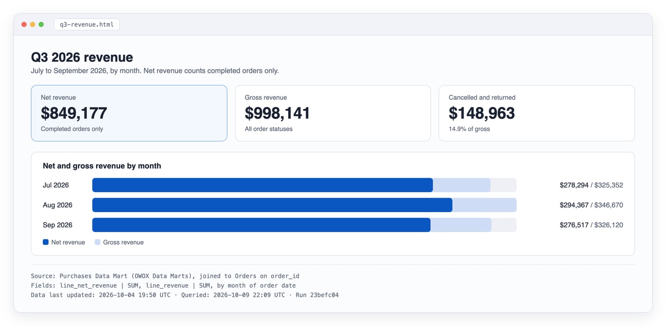
The first row is not hypothetical. In the small, clean demo e-commerce project we use for examples, summing every order line for the third quarter of 2026 gives $998,141. Counting completed orders only gives $849,177. Both are reasonable answers to “what was our revenue”, the gross figure is 17.5% above the net one, and a dashboard shows one of them under the title “Revenue”.
We tried it: the export decided the number
On 11 October 2026 we gave one request to fresh AI sub-agents (Claude Opus 5.5, run through Claude Code, none aware of the others), five times per version, and asked each for the figure it would put on the “Revenue” tile and how it got there. The data is the demo project’s Q3 2026 orders, exported two ways. The request:
Here is an export of our orders for Q3 2026 as CSV. Build me a one-page revenue dashboard for Q3 2026.
order_month,status,orders,items,line_revenue
2026-07,Cancelled,61,124,27352.19
2026-07,Completed,563,1270,278294.05
2026-07,Returned,45,108,19705.35
2026-08,Cancelled,60,138,28862.64
2026-08,Completed,552,1270,294366.53
2026-08,Returned,36,97,23440.35
2026-09,Cancelled,61,143,31710.90
2026-09,Completed,537,1251,276516.83
2026-09,Returned,27,79,17892.02
The second export is the same data without the status column: three rows, one total per month.
| Export | Definition pasted | Revenue tile, five runs |
|---|---|---|
| Monthly totals, no status | No | $998,141 in 5 of 5 |
| Split by status | No | $849,177 in 5 of 5 |
| Split by status | Yes, the block in the next section | $849,177 in 5 of 5 |
The result went against what we expected. With the status visible, no run picked the larger number: every one counted completed orders only, unprompted, one explaining that the rest “was not kept”. The AI was not the weak point.
The export was. Given monthly totals, no run could reach net revenue, because cancelled and returned orders were already inside the one column. All five said they had adjusted nothing for refunds, tax or shipping “because the file does not include them”; none could know the figure contained cancelled orders. Same request, same shop, same quarter, $148,963 apart, decided by which export somebody happened to download.
The definition changed what was said, not the number. With it pasted in, all five added that the export could not confirm test orders, tax and shipping were excluded, and one noticed the definition named a column the file did not have.
How far this goes: fifteen runs, one model, three and nine rows of clean demo data, and sub-agents answering a question, not the Claude app building and sharing a page. That test, and what a second account sees on a shared page, are still not done.
Revenue is only the example. Churn works the same way: whether a customer counts as churned when they cancel, when a payment lapses or when they pause, and on which date, is a definition somebody has to own. What happens when the AI writes the query itself is covered in why vibe analytics hallucinates.
What to do this week, with the tools you already have
What to do this week, with the tools you already have
Reconcile the two numbers before you judge either
- Ask for the inputs: the file that was uploaded, or the connection used, and the prompt as typed.
- Reproduce their number from your side. Do not start from yours. The usual candidates, in the order worth trying: all order lines against completed orders only; refunds and returns; tax and shipping; test and internal orders; the date used and its time zone; currency conversion.
- Name the difference in one sentence. “Yours counts every order placed; mine counts completed orders only.”
The dashboard may turn out to be right and your report wrong, so the next step is not yours alone.
Write the definition down and get finance to name the official one
A few lines are enough:
Net revenue
Counts: order lines of completed orders
Excludes: cancelled and returned orders,
  test orders, tax, shipping
Date: order date, company time zone
Source: the orders export, columns
  status, line_total, order_date
Owner: finance (name), agreed on (date)
Send it to whoever signs off the company’s numbers and ask one question: is this the revenue we report? You are not the right person to decide that alone, and you should not be the only name on it.
Hand the builder the definition and have them rebuild
They paste the definition into the same prompt, rebuild, and ask for a footer naming the source, period, definition and build date. In our runs above the definition did not move a number the export already allowed; it made the AI say what the export could not confirm. If the new figure still differs from yours, a rule is missing from the text, or the export cannot carry it.
Check what was uploaded, and who decides
A file uploaded to an AI tool was sent to the company that runs the tool. Check what was in it (daily totals are one thing, customer emails another) and whether your company’s rules allow it in that tool and account. Whoever owns data protection or security in your company decides that, not you or the builder.
Before the link is shared, or after
A dashboard built from an uploaded file carries its numbers inside the page, so whoever can open the page sees the numbers, whatever their own access to the data would have been. Anthropic says artifacts, its name for the pages Claude builds, “start private to you” (help centre, read October 2026); sharing is a step somebody takes. Of connected artifacts it says “Everyone connects their own apps, even when using a shared or published artifact.” We have not tested that with a published artifact, so treat it as the vendor’s statement.
If the link has already gone out, find out who has it, tell them the numbers are being checked, and send them the corrected version.
That answers one dashboard. A pasted definition holds only as long as everyone pastes it.
The questions to settle before a dashboard like this is shared
The questions to settle before a dashboard like this is shared
Each answer below gives what has to be true whatever tool you use, then how OWOX Data Marts does it and where it stops. Two carry most of the weight: access that follows the person asking, and joins somebody declared, are what separate a dashboard you can share from a demo.
Two terms. A Data Mart is a dataset an analyst defines on top of a table, a view or a SQL query, with a description for every field and declared joins. MCP, the Model Context Protocol, is the standard way an assistant such as Claude or ChatGPT calls an outside system; the OWOX MCP server and the OWOX API are the routes by which AI tools read Data Marts. Product claims were checked against the documentation on 9 October 2026.
If you already run dbt, a semantic layer or a BI tool
A Data Mart does not have to redefine anything. It can be defined directly on a table or a view that already exists in your warehouse, which is what a dbt model usually becomes, “when your logic is already encapsulated in a warehouse view” (view-based Data Mart). It adds what an AI tool needs: field descriptions it reads, declared joins, quality checks, a request log and access by project member. It duplicates field descriptions you may keep in dbt or your BI layer, and checks that overlap with dbt tests. Your BI tool, Looker or another, keeps reading the warehouse as before; Data Marts serve AI assistants and the documented destinations, such as Google Sheets, Microsoft Excel and Data Studio. They run on Google BigQuery, Snowflake, AWS Redshift, AWS Athena and Databricks; the example in this guide is on BigQuery.
Whose access does it use?
The numbers are either inside the page (everyone with the link sees them), fetched through one shared login (everyone sees what it sees), or fetched as each viewer. Only the third respects the access you already manage.
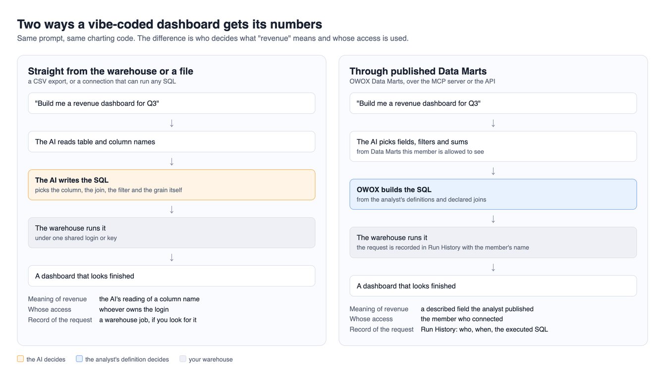
In OWOX Data Marts every request is made as a named project member: through MCP with an OAuth token bound to that user, through the API with a key that belongs to a member, where “available data and actions depend on the permissions granted to the project member who owns the key” (API keys). What a member reaches is set by their role, by whether a Data Mart is shared for reporting, and optionally by Contexts, labels such as Marketing or Finance that narrow a member to the Data Marts attached to theirs (roles, Contexts). The limit: a key pasted into a hosted page shows its owner’s data to everyone who opens the page.
How do you know the data behind it is good?
Four checks before you put your name near a number, each one query: row counts by day for the period, the latest date loaded, rows against distinct keys, and the row count before and after the join.
In OWOX Data Marts, data quality is part of the Data Mart, not a post-mortem after a wrong number. Data Quality Checks cover duplicates, keys, nulls, freshness and join integrity, and the quality report gives each check’s status and the SQL to reproduce it. Here is the summary the API returned for the Purchases Data Mart in the demo project on 9 October 2026:
{
  "state": "EXECUTION_FAILED",
  "enabledChecks": 7,
  "passedChecks": 6,
  "failedChecks": 0,
  "errorChecks": 1,
  "violationCount": 0,
  "lastRunAt": "2026-09-23T16:22:23Z"
}
We left it as we found it, because it is the honest picture: six checks passed, one could not execute, and the last run was sixteen days old. A status is only as fresh as its last run, so schedule the checks. Every query also returns a data last updated time, measured live. The limit: the MCP tools documented today do not hand the quality status to the assistant, so a person has to look.
Where do the joins and the meaning come from?
They should be written once, by someone who knows the data, in a place the AI reads from, not worked out again from column names on every prompt. A view in your warehouse is the plainest form of this.
In OWOX Data Marts a relationship links two Data Marts on named fields and is declared on the Data Mart. The assistant selects fields, OWOX generates the SQL with the declared keys, and the assistant “cannot run arbitrary SQL” (MCP documentation). The documentation says joined Data Marts are first reduced to one row per join key and then left-joined, so “the result row count never exceeds the source Data Mart’s row count” (Joinable Data Marts). That is the documentation’s claim; try to break it on your own data. The SQL further down shows the mechanism.
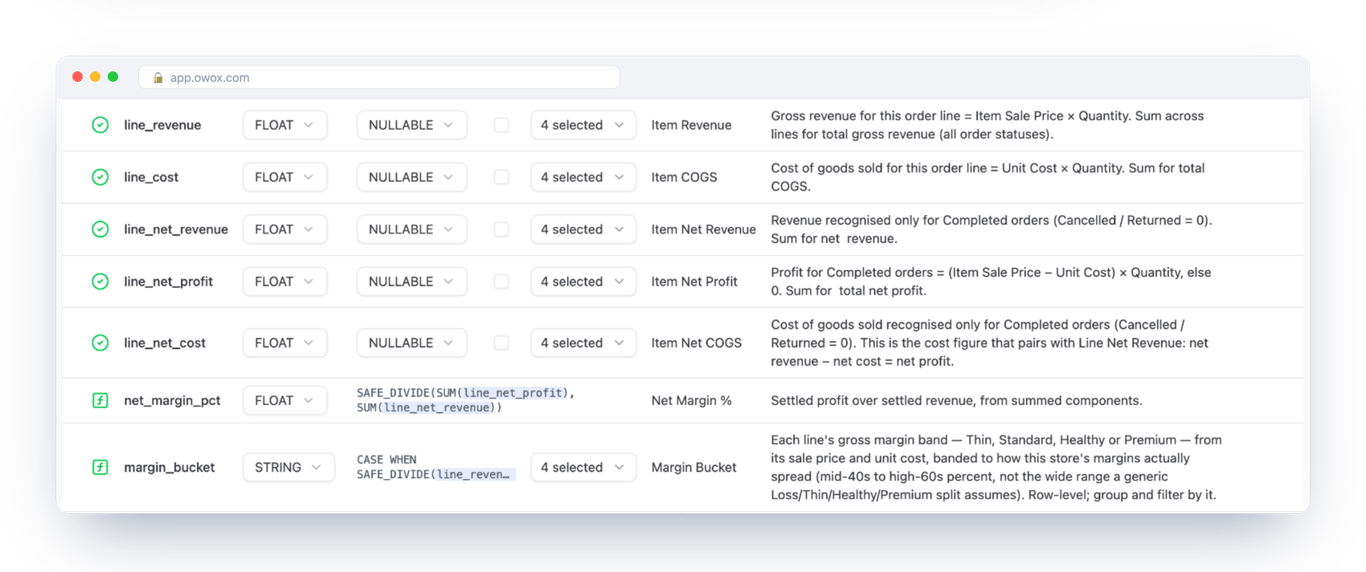
None of this makes the AI right. It can pick the wrong Data Mart or lead with gross when you meant net. Our demo is small and clean, so test on yours: the three-phrasings test in governed AI analytics on BigQuery includes an answer that led with gross and came from chat memory, not from the warehouse. What you get is the same definitions behind every build, and a query you can open.
Who asked for what?
You need to get from a number on a dashboard to the calculation behind it. If it queried your warehouse, the query log has it; if it was built from a file in a chat, keep the prompt and the file with the dashboard.
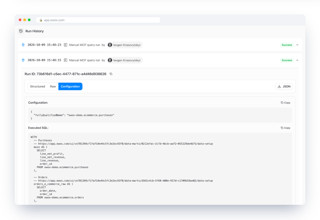
In OWOX Data Marts each request is recorded in Run History with the member’s name, the request and the executed SQL, “never row values”. That record is what makes a vibe-coded dashboard auditable: when its number is questioned, you open the run and read the SQL instead of asking the AI what it did. It does not record what the AI did with the rows afterwards. The screenshot shows two runs made from a Claude chat on 9 October; the API run traced further down is a separate, later entry in the same history.
Recommendations, and changes by prompt
Commentary deserves the same scrutiny as the numbers. In the BigQuery guide’s chat walkthrough, Claude’s answer, shown in a screenshot there, added unprompted that Q3 net revenue “was $849,177 on $998,141 gross, so 14.9% of booked value ($148,963) never settled” (14.9% of the gross figure; the same gap is 17.5% of the net one). That rests on rows it fetched and arithmetic you can check, and on nothing about why orders were cancelled or whether 14.9% is normal; OWOX supplies the facts, and the judgement is the assistant’s.
The builder can change dates, breakdowns and chart types by prompt, within what was published, without a ticket. They cannot change a definition that way: the MCP tools “cannot edit a data mart”, so a change to what net revenue means is a change to the analyst’s SQL, made once, and every dashboard built on it follows.
Making it the default
For one analyst the setup is, once per number: agree the definition with finance (the long part, which no tool shortens); connect your warehouse as a storage; publish one Data Mart on the table, view or query that already holds the number, with each field described in the business’s words (OWOX Data Marts does not write that SQL; you do); declare the joins and schedule the checks; share it for reporting with the people who build on it, each connecting under their own account. Then they rebuild with the same prompt. For the wider rollout, see data governance for an AI rollout. The wider question is in can you trust AI with your business numbers?
The evidence: one request from the prompt to the log
The evidence: one request from the prompt to the log
It ran on 9 October 2026 against the demo project, through the API: an AI coding agent with the owox-ctl command-line tool and a member’s API key, given this task:
Build a one-page revenue dashboard for Q3 2026 from the Purchases Data Mart: net and gross revenue by month. Print the source and the data freshness time at the bottom.
The request contains no SQL: three fields, two sums and a monthly bucket. Its Run History entry, trimmed and flattened, with the member’s name replaced:
{
  "type": "HTTP_DATA",
  "createdAt": "2026-10-09T22:09:35Z",
  "createdByUser": "(the key's owner)",
  "columns": [
    "orders_e_commerce__order_date",
    "line_revenue",
    "line_net_revenue"
  ],
  "rowCount": 3
}
The agent built the page below from the three rows that came back, with net as the headline because the field’s description says it counts completed orders only. On three tidy rows that is an easy call, not evidence of how an assistant reads messier data.
The same entry holds the SQL OWOX built. The part that matters, with the column list shortened to ...:
  orders_e_commerce AS (
    SELECT order_id,
      MAX(order_date)
        AS orders_e_commerce__order_date
    FROM orders_e_commerce_raw
    GROUP BY order_id
  )
SELECT ...
FROM main
LEFT JOIN orders_e_commerce
  ON main.order_id
   = orders_e_commerce.order_id
Orders is reduced to one row per order_id before the join, so the sums are not inflated, and the agent wrote none of it.
The route in the opening story, a dashboard built in a chat and then shared, is different. We did not capture or test that route, including what a second person sees, so nothing here shows it is safe.
What this does not fix
Rows go to the AI provider. When an assistant queries a Data Mart, “the resulting data rows and totals are sent to that provider”, with the Data Mart’s metadata. If a field must not leave, do not publish it. The MCP server is part of OWOX Data Marts Cloud; the queries run in your own warehouse.
The dashboard is a snapshot until someone asks again. For one that refreshes, create a report on the same Data Mart: Google Sheets on a schedule, or Data Studio.
The definitions are still yours and finance’s. The product holds every dashboard to a definition; it does not tell you whether the definition is right.
What to send back to the person who built the dashboard
What to send back to the person who built the dashboard
Short enough to forward, and written to be read on its own:
- Keep building. The dashboard is a good idea and I do not want you to stop.
- I have not found anything wrong with it. The one thing I need to check is what your numbers count. The AI had to decide that by itself from the file: for revenue, whether cancelled and returned orders are in or out; for churn, whether someone counts as gone when they cancel, when a payment fails or when they pause. It may have decided differently from finance. In the example data of the guide I read, not our own numbers, one way of counting revenue gave a figure 17.5% higher than the other.
- Before it goes to the leadership team, three things happen on my side. I agree with finance which way of counting is the official one. I write that down in a few lines. And I give it to the AI once, so that it uses the written rule and stops deciding for itself. I will tell you as each one is done.
- Then you rebuild the dashboard with the same request you typed before. Its numbers will follow the written rules, the same ones finance uses.
- From then on you change it yourself, whenever you like: other dates, by channel, by product. You will only need me when you want a number nobody has written a rule for yet.
- One thing for us to look at together now: what was in the files you uploaded, and whether our company rules allow them in that AI tool. That is not my decision or yours; I will find out whose it is. Please do not send the link to anyone new until then. If you have already shared it, that is fine: tell me who has it, so that we can send them the checked version when it is ready.
Turn your data into decisions.
Governed data marts give you the clean foundation ML needs to actually work.
- No AI hallucinations
- Analyst-governed definitions
- Every number traces to SQL
Frequently Asked Questions
What is a vibe-coded dashboard?
A dashboard built by describing it to an AI in plain language and letting the AI write the code, instead of assembling it in a BI tool. The person asking decides what the page should show. The AI decides how to build it and, unless it is given definitions to read from, what each number means.
Are vibe-coded dashboards accurate?
The charts usually are. The numbers depend on the source. From a file or raw tables the AI chooses the column, the join and the filter, and nothing on the chart shows which it chose: in our demo data two reasonable readings of revenue, $998,141 and $849,177, differed, the larger 17.5% above the smaller (both figures are shown in governed AI analytics on BigQuery). Built on published Data Marts, every dashboard uses the same definitions and the query behind it can be opened. The AI can still pick the wrong Data Mart or a misleading chart, so compare the first build with a report you trust.
Does a vibe-coded dashboard update automatically?
Usually not. A page built from the rows an AI fetched is a snapshot and shows those rows until someone asks again. For a view that refreshes on its own, create a report on the same Data Mart instead: to Google Sheets with a run schedule, or to Data Studio (OWOX MCP documentation). The numbers then update and the definition stays the same one.
Who can see the data in a vibe-coded dashboard?
It depends on how the page is shared. With OWOX Data Marts every request runs as a named project member, so the builder gets only the Data Marts their role allows (roles and permissions). That protection holds for viewers only when each of them signs in as themselves. A page deployed with one person's API key inside it shows that person's data to everyone who opens it, because a key carries its owner's permissions (API keys).
Can an AI assistant build a dashboard from my warehouse data?
Yes. Claude can build a dashboard as an artifact and read data through the apps connected to it (Anthropic's help centre, read October 2026), and a coding agent can do the same through an API. Settle first what it reads from. Given raw tables, the AI writes its own SQL and picks the meaning of each number. Given published Data Marts, the SQL is built from an analyst's definitions and the AI chooses only fields, filters and layout: the OWOX MCP tools "cannot run arbitrary SQL" (documentation).