Dashboards nobody opens: the real reason, and the fix

Check the usage logs. I’ll wait…
Nobody opens the dashboards that were built for months…
That’s not an accusation – it’s a prediction, and it’s checkable in five minutes: ask your data team admin for 30-day active users on your top ten dashboards. If the numbers don’t make you wince, this article isn’t for you. For everyone else: the reason isn’t design, training, or your team. It’s geography.
The invoice versus the login logs
The invoice versus the login logs
Somewhere in your budget is a line for business intelligence – licenses, the analyst hours that built the dashboards, maybe a consultant who set up the “single pane of glass.” The line renews annually. The usage doesn’t.
I’ve sat with CEOs and CMOs running exactly this audit, and the pattern repeats: spend justified by the dashboards existing, decisions still made the old way – gut, plus whatever number someone remembered from the last meeting, plus a screenshot pasted into a slide by the one person who still logs in. The dashboards weren’t wrong. They were just… elsewhere. And information that lives elsewhere loses to instinct that lives here, every single day.
If you’re the CMO, this hits twice: marketing usually owns the biggest dashboard estate in the company – channel views, campaign views, funnel views – and marketing also owns the meeting where a number gets challenged and someone says “let me check and get back to you.” That sentence, in a room where four dashboards allegedly cover the question, is the sound of the estate not working.
The uncomfortable question isn’t “why did we buy this?” It’s the quieter one: if the dashboards all went dark tomorrow, how many days until anyone noticed?
Why nobody opens them: every dashboard demands a commute
Why nobody opens them: every dashboard demands a commute
Here’s the real reason, and it has nothing to do with chart choices.
A is a destination. To use one, a person must stop what they’re doing, log into a separate tool, remember which of the forty dashboards holds their answer, and relearn the filters – at exactly the moment they have a question and zero patience.
That commute costs more than it looks, and people pay it exactly as often as the industry numbers suggest:
- up to 90% of BI dashboards go unused after six months,
- only 16% of organizations achieve full dashboard adoption – 58% sit below 25%,
- and overall BI adoption has been stuck around a quarter of employees for a decade.
A decade! That’s not a rough patch; that’s a verdict.
And there’s a second, quieter mismatch: a dashboard is a pre-answered question – it monitors what somebody expected you to ask. But the questions that drive decisions are the new ones, the follow-ups, the “okay but why” – and for those, the dashboard sends you right back to the data team. Your CMO doesn’t live in a BI tool; she lives in Sheets and slide decks. You don’t live there either; you live in chat and email. The dashboards were built in a country nobody commutes to.
Watch the mismatch in one concrete exchange. The revenue dashboard shows the quarter tracking green. Fine – but the question in your head is “green because of what? Is the new pricing holding or are we just riding one big deal?”
The dashboard has no tab for that, because nobody predicted the question in March. So you either commute to the data team’s queue – or you shrug and carry the green checkmark into your next decision, context unknown.
One claim, one proof: adoption isn’t a design problem, it’s a geography problem. People don’t refuse answers. They refuse the commute.
OWOX Data Marts
See your first report built in real time. 15 minutes.
- Connect your data warehouse
- Pick your metrics
- Get a live Google Sheets report
In the time it takes to write a ticket. Then imagine never writing that ticket again.
Book a DemoWe'll use your actual use case
The fix: answers where people already work
The fix: answers where people already work
So flip the geography. Don’t move your people to the data – move the answers to your people.
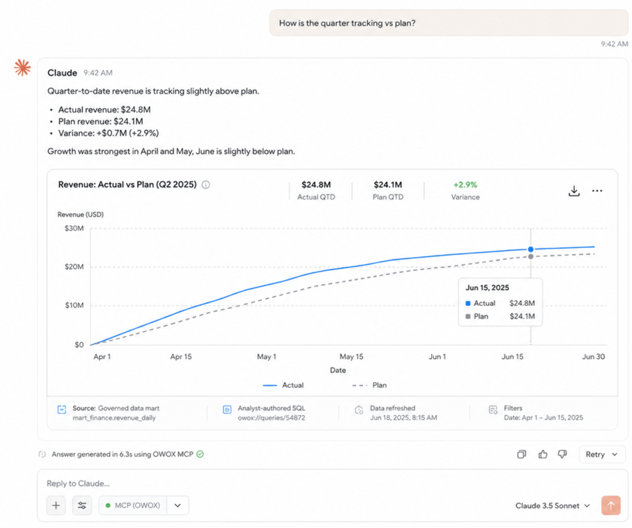
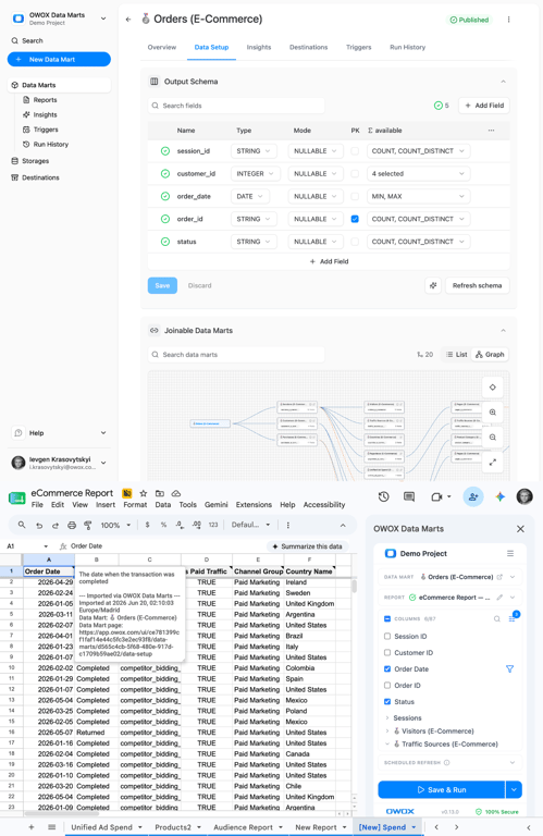
The plumbing: your data analyst publishes data marts – the definitions, joins, and quality checks, authored once. On top of that single governed source, answers appear where the workday already happens: your CMO’s ROAS breakdown lands in the Google Sheet she was already building the board slide in; your own “how’s the quarter tracking?” gets answered in the AI chat you already have open – with a chart, in seconds, every figure computed by the analyst’s SQL.
_
(The AI narrates; it never does the math itself – that’s what keeps the numbers honest.)_
Nobody logs into anything new.
Nobody relearns filters.
Nobody gets trained, because there’s nothing to train – asking a question in your own chat and reading a Google Sheet are skills your team had before you hired them.
Adoption stops being a program you run and becomes a thing that simply happens, because you removed the only obstacle that ever mattered: the trip.
The dashboard farm
A scene from a company I’ll keep anonymous, because you might recognize your own numbers in it.
They had 140 dashboards. A genuinely good BI team, proud of the estate, still building more on request. Then someone ran the usage audit: about a dozen dashboards had any weekly traffic at all – and half of those were opened only by the people who built them, checking that they still worked. The other 128 sat in the catalog like exhibits in a museum after closing time.
Meanwhile, the company’s actual analytics ran on a gray market: screenshots exported into slide decks, numbers copy-pasted into Sheets, one analyst DM’d forty times a week. The dashboards weren’t failing at their job. They were doing, faithfully, a job nobody had – answering last quarter’s questions in a place nobody visits.
The ending is the instructive part. They didn’t fix it by deleting dashboards or buying a prettier BI tool. They fixed it by noticing where the gray market already was – Sheets, chat, slides – and putting governed answers there. The gray market was never the problem. It was the users voting, every day, on where answers should live.
The numbers on the morgue
If you think your company is unusually bad at BI, absolve yourself with the industry data: 60–80% of dashboards unused, 90% within six months, full adoption achieved by 16% of organizations, and 60–73% of all enterprise data never used for analytics at all.
This is not your company failing at BI. This is BI’s steady state – the predictable result of putting answers at a destination and expecting busy people to commute. You can’t train your way out of geography.
“So we need better dashboards”
“So we need better dashboards”
That’s the reflex – bigger BI investment, a redesign, an adoption program with lunch-and-learns. I understand the instinct, and it repeats the mistake: a better destination is still a destination. You’ll get the initial-curiosity bump, and six months later the logs will tell the same story, because the commute didn’t get shorter – it got prettier.
Let me be fair to dashboards, though: they’re excellent at what they were actually built for – monitoring. A wallboard of known metrics for an ops team, a shared view everyone glances at – keep those; keep a few great ones. The failure mode is asking dashboards to be the company’s answer machine – the place where new questions get resolved. That was never their job, and ten years of self-service disappointment is the receipt.
Split the roles and both sides win: dashboards monitor the known; governed self-serve answers the new – in your CMO’s Sheets, in your chat, on one set of definitions your analyst controls. Fewer dashboards, more answers, and a BI line item that finally correlates with the login logs.
There’s a bonus your data team will appreciate: every dashboard you don’t build is maintenance they don’t carry – no broken filters to field tickets about, no orphaned views to keep alive. The governed data marts underneath do get maintained, once, centrally – and everything built on them inherits the fix. That includes the dashboards people now build for themselves with AI: see vibe coding dashboards.
Run the audit, then run the experiment
Run the audit, then run the experiment
Today: pull 30-day active users on your top ten dashboards.
That number is your real BI adoption, and it’s the honest baseline for everything else.
This month: the experiment. Have your analyst publish one data mart for the metric your team asks about most, and deliver it where they already are – the Sheet and the chat.
Then compare: not which is prettier, but which one gets used when a real decision is on the clock. Start free here, and hand your analyst model.owox.com to map the data assets first.
The dashboards were never the point.
The answers were.
Put them where your people already live, and watch what happens to adoption when there’s nothing left to adopt.
Turn your data into decisions.
Governed data marts give you the clean foundation ML needs to actually work.
- No AI hallucinations
- Analyst-governed definitions
- Every number traces to SQL
Frequently Asked Questions
What's the difference between monitoring and answering?
Monitoring is checking metrics someone predicted you'd need — a dashboard's job. Answering is resolving a question that didn't exist last quarter — "green because of what?" — which requires querying governed data on demand. Companies fail when they buy monitoring tools and expect answering; the fix is one governed source feeding both.
Are dashboards dead?
No — they're miscast. Dashboards are excellent monitoring instruments: known metrics, shared views, ops wallboards. They were never good at answering new questions, which is what most companies quietly expect of them. Split the roles: dashboards monitor the known, governed self-serve answers the new.
How do I get executives to actually use data?
Stop asking them to commute to it. Executives don't refuse answers — they refuse destinations. Put governed answers in the chat and email where they already live, and usage stops being an adoption program: asking a question in your own chat requires no training at all.
What replaces dashboards for answering business questions?
Governed self-serve in the tools people already use: analyst-authored data marts underneath, with answers delivered into Google Sheets and AI chats like Claude. Questions get asked in plain language at decision time; answers are computed by analyst-written SQL from one governed source. Nothing new to log into, nothing to relearn.
Should we build fewer dashboards?
Usually yes — but the point isn't the count, it's the role. Keep a small set for what dashboards do well: monitoring known metrics on shared views. Stop using them as the company's answer machine for new questions — that's where they structurally fail, and where governed self-serve in Sheets and AI chat takes over.
What is a good dashboard adoption rate?
Benchmarks are sobering: only 16% of organizations achieve full dashboard adoption, 58% sit below 25%, and overall BI adoption has hovered around a quarter of employees for a decade. The more useful metric than any benchmark: 30-day active users on your top ten dashboards, tracked honestly.
Why do dashboards go unused?
Because a dashboard is a destination: it requires logging into a separate tool, finding the right view, and relearning filters at the exact moment someone has a question. Industry data shows up to 90% of BI dashboards go unused within six months. It's a geography problem — the answers live where people don't work — not a design or training problem.