Healthcare Data Model: Free Analytics Template
A healthcare provider generates two very different kinds of numbers from the same patient visit. One kind is clinical — did the patient show up, how long did they stay, did they come back within 30 days. The other kind is financial — what got billed, what the payer actually paid, how long the money sat in accounts receivable. Most reporting setups model one of those well and bolt the other on as an afterthought.
This template models both. The hard thing it gets right is grain: it keeps the clinical story (encounters) and the revenue story (claims) as two separate fact tables, each at its own natural level of detail, joined through shared dimensions. That means no-show rate and denial rate live in the same model without fighting each other. It’s one of nine in our data model template gallery; this one is built for healthcare provider analytics. For a group of clinics that also needs clinician capacity, late cancellations and the insurer’s and patient’s share of each treatment, see the clinic network data model.
What a healthcare data model is
What a healthcare data model is
A healthcare model is a structured layout of the tables a provider organization needs to answer operational and financial questions — who the patients and providers are, what happened during each visit, and what money moved as a result. It differs from a generic business model because healthcare has two grains that both matter and rarely line up one-to-one: a single clinical encounter can spawn many claim lines, and a claim line can be denied and resubmitted while the encounter itself never changes.
Get the grain wrong and every metric downstream inherits the error — length-of-stay gets double-counted across claim lines, or denial rate gets diluted because it’s measured against visits instead of claims. A good model fixes the grain per table up front. If this is new territory, start with our guide to data modeling and our explainer on understanding star schema, because this template is a textbook star: dimensions on the outside, facts in the middle.
The healthcare template, mart by mart
The healthcare template, mart by mart
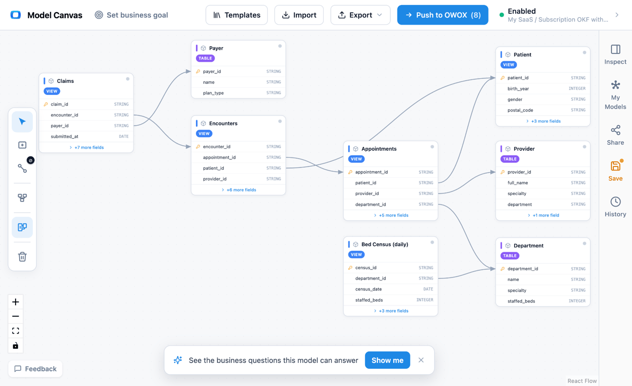
Entity relationship diagram of a healthcare data model: three dimensions (Patient, Provider, Payer) surrounding three fact tables (Appointments, Encounters, Claims), with Claims joined to Encounters and Payer. Open the healthcare model in the canvas →
• Patient (dimension) — one row per patient. Primary key patient_id, plus demographics, birth date, insurance status, and primary care assignment. Referenced by every fact.
• Provider (dimension) — one row per clinician or care provider. Primary key provider_id, plus specialty, department, and NPI. Referenced by appointments and encounters.
• Payer (dimension) — one row per insurer or payer program. Primary key payer_id, plus payer type (commercial, Medicare, Medicaid, self-pay) and plan. Referenced by claims.
• Appointments (fact) — one row per scheduled appointment. Primary key appointment_id; foreign keys patient_id, provider_id; measures scheduled date, status (kept, cancelled, no-show), and lead time. This is where no-show analysis lives.
• Encounters (fact) — one row per clinical encounter or visit; the central clinical fact. Primary key encounter_id; foreign keys patient_id, provider_id; measures admit and discharge timestamps, length-of-stay, encounter type, and a readmission flag.
• Claims (fact) — one row per claim line; the central revenue fact. Primary key claim_line_id; foreign keys encounter_id, payer_id; measures billed amount, paid amount, denial flag, denial reason, and AR days.
The joins make it a star: Appointments → Patient, Appointments → Provider, Encounters → Patient, Encounters → Provider, Claims → Encounters, Claims → Payer. Every measure rolls up through a dimension, and Claims reaches Patient and Provider transitively through Encounters. That layered approach to data marts is what keeps clinical and financial reporting from colliding.
OWOX Data Marts
See your first report built in real time. 15 minutes.
- Connect your data warehouse
- Pick your metrics
- Get a live Google Sheets report
In the time it takes to write a ticket. Then imagine never writing that ticket again.
Book a DemoWe'll use your actual use case
Two grains: the encounter and the claim
Two grains: the encounter and the claim
The one modeling decision that carries this whole template is choosing two fact grains instead of one. Encounters sit at the grain of “one clinical visit.” Claims sit at the grain of “one billed line.” A three-day inpatient stay is a single encounter row but can generate a dozen claim lines across procedures, supplies, and room charges — and some of those lines get denied while others get paid.
If you flatten both into a single visits table, length-of-stay and readmission (encounter-grain facts) get repeated on every claim line and any average you compute is silently weighted by billing volume. Keeping them separate means Encounters answers clinical operations — no-show, readmission, length-of-stay — while Claims answers the revenue cycle — denial rate by payer, AR days, collection ratio. Claims joins up to Encounters, so you can always trace a denied line back to the visit that produced it. This is the classic three types of fact tables distinction in practice, and it’s the heart of dimensional data modeling.
What this model answers
• What’s our no-show rate by provider and specialty? Appointments (status = no-show) → Provider.
• Which payers deny the most, and why? Claims (denial flag, denial reason) → Payer.
• What’s the average length-of-stay by encounter type? Encounters (length-of-stay, encounter type), one row per visit — no claim-line double counting.
• How many days does our money sit in AR by payer? Claims (AR days) → Payer.
• Are readmissions concentrated in specific patient segments? Encounters (readmission flag) → Patient.
This model vs a single visits table
This model vs a single visits table
The tempting shortcut is one wide “visits” table that carries both clinical and billing columns. It’s simpler to load, but it forces two grains into one row and every metric pays for it. Splitting into an encounter fact and a claim fact keeps each measure at its true grain.
| Aspect | Single visits table | This template (encounters + claims) |
|---|---|---|
| Grain | Mixed — clinical and billing crammed into one row | Two clean grains: one per encounter, one per claim line |
| Length-of-stay | Repeated on every claim line, easy to double-count | Lives once on the encounter row |
| Denial rate | Diluted against visits | Measured against claim lines, joined to Payer |
| Revenue cycle | Hard to isolate from clinical data | Self-contained Claims fact with AR days and denial reason |
| Traceability | Billing detail lost or duplicated | Every claim line joins back to its encounter |
How to open and customize the template
How to open and customize the template
(1) Open the healthcare model in the OWOX canvas from the link in this article — it loads with all six marts and their joins already wired.
(2) Reshape the dimensions to your reality: add facility or department to Provider, add plan tiers to Payer, add risk cohorts to Patient.
(3) Set grain and keys deliberately: confirm Encounters stays one row per visit and Claims stays one row per claim line, and keep encounter_id as the foreign key that binds Claims back to the clinical side.
(4) Export the finished model and push it into OWOX Data Marts to turn the design into live, queryable tables.
Prefer to sketch first? Our roundup of free database diagram design tools covers the alternatives.
Export to OKF: a portable healthcare model
Export to OKF: a portable healthcare model
Once the model fits your organization, export it to OKF — the Open Knowledge Format — so the design lives as a plain, version-controllable file rather than being locked inside one tool. That matters in healthcare, where the same model often has to travel between an analytics team, a revenue-cycle vendor, and a data warehouse without being redrawn each time.
OKF captures the tables, the grains, the keys, and the joins as portable text you can review, diff, and hand off. Read what OKF is for the full format, or open the healthcare model and export it yourself in a couple of clicks.
Ask this model a question
The template above is a diagram you can edit. The same business is also published as a ready Healthcare Data Model of 8 Data Marts with their relationships, which can be imported into OWOX Data Marts. Once it is in your project, a business user can ask it a question in Claude or ChatGPT through the OWOX MCP server.
Data Model: Healthcare (8 Data Marts)
Prompt: “What is the claim denial rate by payer, and how many days do denied claims sit in accounts receivable compared with paid ones?”
The reason to ask the Data Model and not the warehouse is what the assistant gets to read.
| Asked of raw tables | Asked of the Data Model | |
|---|---|---|
| What the assistant sees | Every table in the warehouse | The published Data Marts and their declared joins |
| What it does | It treats the billed amount as revenue and counts every claim as paid, because billed, allowed and paid amounts sit side by side with no rule attached | It reads the Claims Data Mart, where billed, payer-allowed and paid amounts, status, denial reason and days in accounts receivable are separate, described fields |
| What you get | A plausible number with no way to check it | The number, and the query that produced it |
MCP is only the way the question arrives. What makes the answer safe is the Data Mart behind it: SQL an analyst wrote and published, which the assistant reads and does not write. A question the Data Marts do not cover is not approximated. It goes back to the data owner. More on how that works in governed MCP analytics.
Turn your data into decisions.
Governed data marts give you the clean foundation ML needs to actually work.
- No AI hallucinations
- Analyst-governed definitions
- Every number traces to SQL
Frequently Asked Questions
Does it work for both inpatient and outpatient data?
Yes. Encounter type distinguishes inpatient from outpatient at the encounter grain, and length-of-stay simply stays null or zero for same-day outpatient visits. The claim grain is identical either way.
Is this a star schema?
Yes. Patient, Provider, and Payer are the dimensions; Appointments, Encounters, and Claims are the facts. Claims reaches Patient and Provider transitively through Encounters, which keeps the design a clean star rather than a snowflake.
Can I track no-shows with this template?
Yes. The Appointments fact carries a status field (kept, cancelled, no-show) and joins to Provider and Patient, so you can compute no-show rate by provider, specialty, or patient segment.
How does this model measure the revenue cycle?
Through the Claims fact: billed amount, paid amount, denial flag and reason, and AR days, all joined to the Payer dimension. That gives you denial rate by payer, collection ratio, and days in AR without touching the clinical tables.
What grain should the claims table use?
One row per claim line. That's the level at which denials, paid amounts, and AR days actually occur, and it lets you compute denial rate against the true denominator while still joining each line back to its encounter.
Why separate encounters from claims?
Because they live at different grains: one clinical visit can produce many billed claim lines. Modeling them separately keeps length-of-stay and readmission at the visit level and denial rate and AR days at the claim-line level, so neither metric distorts the other.
What is a healthcare data model?
It's a structured layout of the tables a provider needs to analyze care and billing — patients, providers, payers, appointments, encounters, and claims — with defined keys and joins. This template arranges them as a star schema so clinical and financial questions can both be answered from one model.