SaaS data model: a free subscription analytics template
A SaaS model is the set of tables – accounts, subscriptions, invoices, usage – and the keys that join them into something you can answer revenue questions from. Get the subscription part right and net revenue retention, the MRR waterfall, and “which usage predicts churn” are one query away. Get it wrong and every board deck becomes a reconciliation exercise.
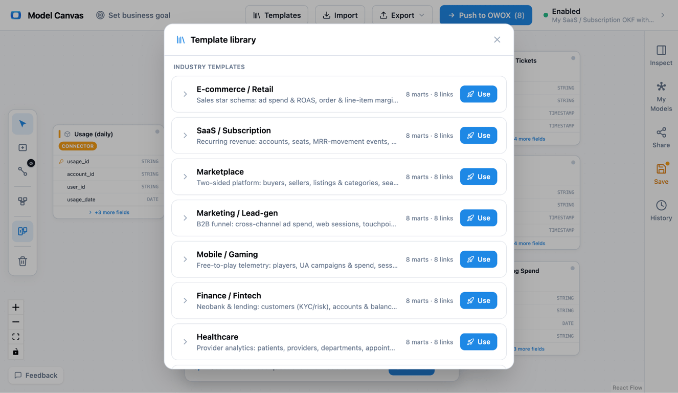
This page gives you a free, ready-made SaaS data model you can open in your browser, edit like a diagram, and export to OKF – Google’s open, portable format. No sign-up. It’s one of nine in our data model template gallery; this one is built for subscription analytics.
What a SaaS data model is, and the three things people mean
What a SaaS data model is, and the three things people mean
Search “SaaS data model” and you get three different answers, because the phrase hides three jobs.
The first is the multi-tenant app schema – how you store tenants, orgs, users, and permissions so the product runs. The second is a GTM metrics framework – the conceptual volume/conversion/time metrics behind a go-to-market motion. The third, and the one analysts actually build, is the subscription-analytics model: the warehouse tables you compute MRR, churn, and retention from.
This template is that third thing. It’s a dimensional model – facts surrounded by dimensions – with one design decision at its heart: subscription change is captured as events, not monthly snapshots. If the vocabulary is new, start with what data modeling is, and for the product-team case, see why every SaaS product team needs a data model.
The SaaS template, mart by mart
The SaaS template, mart by mart
The template is six data marts – two dimensions and four facts – wired around subscription revenue. Here’s the whole thing.
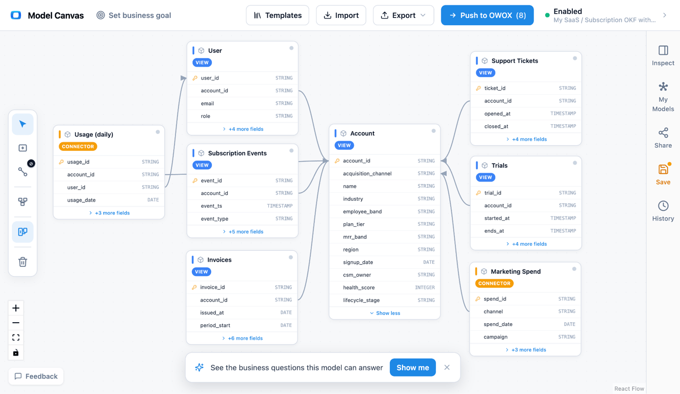
Entity relationship diagram of a SaaS data model: Account and User dimensions joined to Subscription Events, Invoices, Usage, and Support Tickets fact tables, centered on the MRR-movement event table.
Open the SaaS model in the canvas →
• Account (dimension) – one row per customer account: plan, segment, region, signup date.
• User (dimension) – one row per seat/user, joined to Account, for activation and engagement.
• Subscription Events (fact) – the centerpiece: one row per MRR movement (new, expansion, contraction, churn, reactivation).
• Invoices (fact) – one row per invoice/line: billed amount, period, status – the cash view next to the recognized-MRR view.
• Usage (fact) – one row per account-day (or user-day) of product usage, the leading indicator for churn and expansion.
• Support Tickets (fact) – one row per ticket, joined to Account, for the CSAT-vs-renewal question.
The joins make it a star: User → Account, Subscription Events → Account, Invoices → Account, Usage → Account and Usage → User, Support Tickets → Account. Every table is a reporting-ready data mart in the sense we describe in our approach to data marts.
OWOX Data Marts
See your first report built in real time. 15 minutes.
- Connect your data warehouse
- Pick your metrics
- Get a live Google Sheets report
In the time it takes to write a ticket. Then imagine never writing that ticket again.
Book a DemoWe'll use your actual use case
The MRR-movement table (the centerpiece)
The MRR-movement table (the centerpiece)
If you take one idea from this template, take this: model subscription change as a stream of movements, not a monthly balance.
A row in Subscription Events is a single change to recurring revenue – a new subscription, an expansion, a contraction, a churn, a reactivation – each with an account, a date, a type, and a signed MRR delta. From that one table you can reconstruct the MRR waterfall for any period (new + expansion − contraction − churn), and compute net and gross revenue retention by summing deltas per cohort.
A monthly-snapshot table can’t do this cleanly – it tells you the balance changed but not why. The event grain keeps the reason, which is the whole point. This is a classic transaction-grain fact table; for the grain choices behind it, see the three types of fact tables and understanding star schema. For subscriptions of physical goods, where pauses, skips and prepaid boxes are movements of their own, see the subscription e-commerce data model.
What this model answers
Because the events carry the reason and the dimensions carry the context, the hard SaaS questions become joins, not projects:
• Net & gross revenue retention – sum signed MRR deltas per cohort over time.
• The MRR waterfall – new / expansion / contraction / churn for any month or segment.
• What usage predicts churn – Usage joined to the churn events that follow it.
• CSAT vs. renewal – Support Tickets joined to Account against subsequent churn/expansion.
• Quick ratio & expansion rate – straight from the movement types.
None of these need a new table. They’re different paths across the same six data marts.
Analytics model vs. the multi-tenant app schema
Analytics model vs. the multi-tenant app schema
A common first question: “where are the tenants, orgs, and permissions?” Those belong to the multi-tenant app schema that runs the product – a separate, normalized model. The analytics model sits downstream and starts at the account and the subscription event, because that’s the grain reporting needs.
| Aspect | Multi-tenant app schema | Analytics data model (this template) |
|---|---|---|
| Shape | Normalized (tenants, orgs, roles) | Dimensional star (facts + dimensions) |
| Tuned for | App correctness, isolation, fast writes | Revenue & retention questions |
| Subscription change | Current state (a status column) | MRR-movement events (the history) |
| Export | SQL DDL | OKF + diagram image |
How to open and customize the template
How to open and customize the template
Opening it and shaping it to your business takes about two minutes, then as long as you want to refine.
(1) Open it. Use the link under the diagram above – loads in your browser, no sign-up.
(2) Reshape it. Add fields (plan tier, billing interval, CAC), split usage by feature, or add a Cohorts dimension; redraw joins on the canvas.
(3) Set grain and keys. Confirm Subscription Events is one row per movement and the keys that tie each fact to Account.
(4) Export it. Use Export → OKF for a portable model, or grab a diagram image. Keep the OKF in git or push it into OWOX Data Marts to make it live in your warehouse.
Comparing tools while you’re here? Our roundup of free database diagram design tools puts the canvas in context.
Export to OKF: a portable SaaS model
Export to OKF: a portable SaaS model
The reason this beats a static ER picture is what happens after the diagram. A drawing can’t be diffed or fed to a warehouse.
This template exports to OKF (Open Knowledge Format), Google’s open, markdown-based standard. Because it’s plain text, you can keep the model in git, review it in a pull request, and hand it off without lock-in. New to it? See our explainer on what OKF is, then open the SaaS model and export your own.
Ask this model a question
The template above is a diagram you can edit. The same business is also published as a ready SaaS Data Model of 10 Data Marts with their relationships, which can be imported into OWOX Data Marts. Once it is in your project, a business user can ask it a question in Claude or ChatGPT through the OWOX MCP server.
Data Model: SaaS (10 Data Marts)
Prompt: “What is our net revenue retention, split into expansion, contraction and churn?”
The reason to ask the Data Model and not the warehouse is what the assistant gets to read.
| Asked of raw tables | Asked of the Data Model | |
|---|---|---|
| What the assistant sees | Every table in the warehouse | The published Data Marts and their declared joins |
| What it does | It rebuilds recurring revenue from invoices or from the current subscription table, and has to guess how a plan change or a cancellation should be counted | It reads the Subscription Events Data Mart, where each change is already one row typed as new, expansion, contraction, reactivation or churn, with its signed revenue delta |
| What you get | A plausible number with no way to check it | The number, and the query that produced it |
MCP is only the way the question arrives. What makes the answer safe is the Data Mart behind it: SQL an analyst wrote and published, which the assistant reads and does not write. A question the Data Marts do not cover is not approximated. It goes back to the data owner. More on how that works in governed MCP analytics.
Turn your data into decisions.
Governed data marts give you the clean foundation ML needs to actually work.
- No AI hallucinations
- Analyst-governed definitions
- Every number traces to SQL
Frequently Asked Questions
Is the SaaS data model template free, and what can I export?
Yes, it is free with no sign-up. You can export the model as OKF or a diagram image. An OWOX account is only needed if you push the model into OWOX Data Marts.
What is MRR data?
MRR (Monthly Recurring Revenue) is the predictable monthly subscription revenue, including upgrades and discounts but excluding one-time fees. In this model it is derived from the Subscription Events deltas.
How do you calculate net revenue retention from a SaaS data model?
Take a cohort of accounts, sum their signed MRR deltas (expansion minus contraction and churn, excluding new logos) over the period, and divide by their starting MRR.
What is the grain of the subscription events table?
One row per MRR movement – a single change to recurring revenue – not one row per month or per subscription. That grain keeps the reason a balance changed, which is what makes the waterfall and retention computable.
How do you model MRR movements (the MRR waterfall)?
As a Subscription Events fact at movement grain: one row per new, expansion, contraction, churn, or reactivation, each with a signed MRR delta. Summing the deltas by type and period reconstructs the MRR waterfall.
Is a SaaS data model a multi-tenant app schema or an analytics model?
This template is an analytics model: a dimensional star you compute MRR, churn, and retention from. The multi-tenant schema that runs the product is a separate, normalized model that lives upstream.
What tables are in a SaaS data model?
For analytics: an Account dimension, a User dimension, a Subscription Events fact (MRR movements), an Invoices fact, a Usage fact, and a Support Tickets fact. The multi-tenant app schema (tenants, orgs, roles) is a separate model upstream.