How to Get Quick Access to All Product KPIs Important to E-commerce
![]() Get in-depth insights
Get in-depth insights
![]() Get in-depth insights
Get in-depth insights
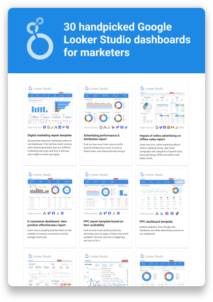
Top 30 Handpicked Google Looker Studio Dashboards for Marketers
How a large fashion retailer built a system of product dashboards for quick access to streaming data from OWOX BI.
Spend Smarter, See Results Sooner
Learn how to optimize every marketing dollar with personalized insights from OWOX BI
Task
To develop a system of dashboards, our client, a large fashion retailer, needed to rely on complete data and current performance metrics. Since the market is rapidly changing and retailers need to respond quickly, especially to critical changes in the average check size and units per transaction (UPT), data needs to be available as soon as possible. However, constantly asking an analyst to calculate the same thing takes time and is expensive. In addition, our client needed not just a simple report but a tool that allows them to analyze metrics in different slices over different periods.
Solution
Define the scorecard
Before starting to create a dashboard, our analysts, together with the product team, identified the necessary metrics and slices.
Analysis of performance required metrics for all user touchpoints on the website: conversions at key stages of the funnel, including additions to the cart and orders; average check size; number of items in the check; ARPV; number of subscriptions; days before the transaction; and other metrics important for decision-making.
For data slices, analysts selected both standard audience segments (device type, region, source) and specific segments that are calculated based on data (client/non-client, signed up for an email newsletter, etc.).
Many standard data slices have been merged into higher-level concepts. For example, the product team doesn’t need to drill down to the level of a specific advertising campaign to analyze segments according to various acquisition sources. Still, it’s necessary to separate brand traffic from non-brand traffic, organic traffic, or traffic from SMS.
Build a data architecture
Our client had already collected raw user behavior data from their website in Google BigQuery using OWOX BI. But they couldn’t connect raw data to the visualization system, so they needed to create a separate dataset specifically for dashboards.
Realizing that dashboards would be constantly supplemented and the number of scripts for collecting datasets would increase, their analysts decided to build a data architecture based on micro tables. They created separate tables to calculate session characteristics, orders, funnels, layers, and metrics.
These micro tables are updated daily and combined according to such keys as date, sessionid, and owox_user_id into one resulting dataset, which is transmitted to the visualization system.
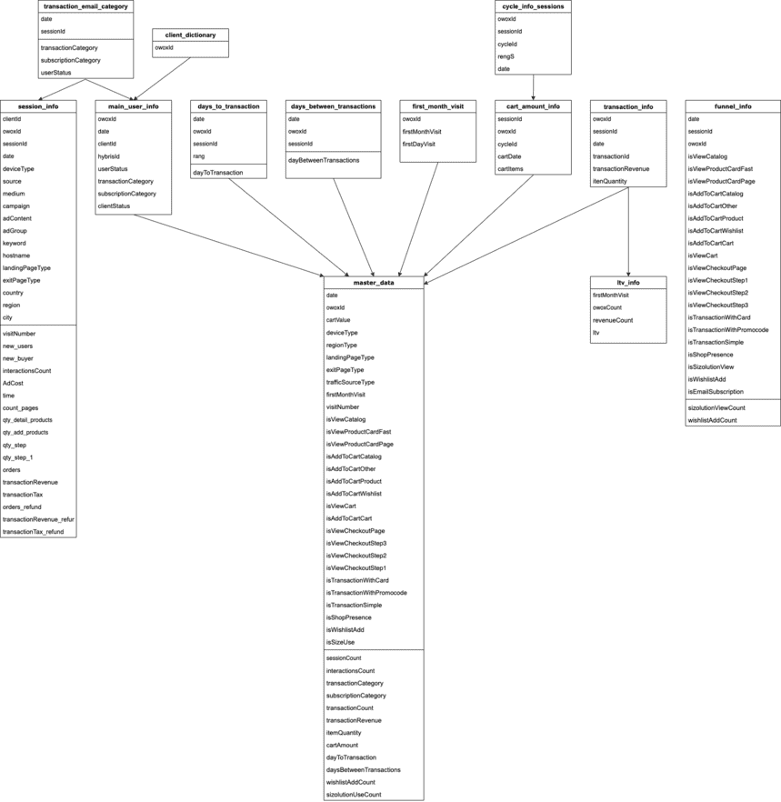
At the same time, the dataset contains aggregated data for an individual user within the day, and it doesn’t have high-level aggregates — they are calculated in the visualization system. This is done so the filtering system works accurately.
This kind of microservice architecture allowed the company not to break what was built earlier and to quickly add new entities to the resulting dataset.
Dashboard creation
Dashboards in Google Data Studio were created on the principle that the most important things should be located on the first screen, while detailed information should be on individual pages.
Below is an example of the dashboard home screen, which contains all the website’s key performance indicators, a simplified funnel, and other metrics necessary for prompt decision-making.
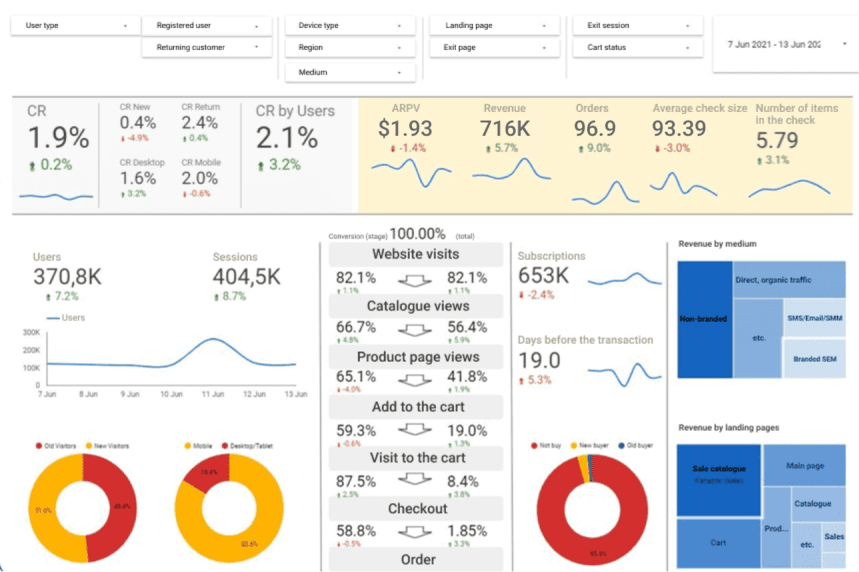
By default, the dashboard shows data for the previous week compared to two weeks ago, but you can set any period and analyze, for example, data for the quarter.
The dashboard allows our client to filter data, analyzing only an essential audience segment. Users can apply multiple filters at once to refine a specific group of users. For example, our client can find out what the conversion rate is for new users from mobile devices who came to the sales catalog.
There are also pages on the first touchpoints, detailed funnels inside the website, analysis of shopping carts, and more.
Despite the dashboard being built on a weakly aggregated dataset with millions of lines, metrics are calculated quickly. When using complex filters, data is visualized in 10 seconds.
Results
- The client’s product team received a convenient tool for quick access to most necessary metrics.
- Now, any conversation in the product team about improving the website starts with using the dashboard: bottlenecks are found in the dashboard, and necessary improvements are argued based on the data. For example, a funnel analysis showed that the largest drops (compared to benchmarks) appear in the stages between viewing the product card and the checkout page. This knowledge set the focus of the product team six months in advance and led to an increase in metrics for these funnel steps.
- The analytics team doesn’t spend time constantly calculating the same metrics but is engaged in expanding the volume and depth of metrics that are calculated automatically and can devote more time to complex ad hoc queries.
![]() Get in-depth insights
Get in-depth insights
![]() Get in-depth insights
Get in-depth insights
Top 30 Handpicked Google Looker Studio Dashboards for Marketers